


The new trend is to paint both your walls and trim white (or cream). Before you run out and buy just any white paint colour for your room, you need to consider contrast and be ready to repeat white in your decor. Here’s how to choose the right white or cream for your walls and trim.
Tricia and I have been noticing a trend with trim colours lately in our e-Design consultations.
And that is, if you have an earthier colour palette in your house – either because you prefer cream over white OR you have a Tuscan brown colour palette from that trend – AND you are craving a fresher look and feel, it’s hard to do without painting all your trim white.
Because the traditional way of creating contrast between the trim and walls means if you keep your creamy trim, your walls still need to be darker so that your trim doesn’t end up looking dirty.
But it can be a lot easier and definitely less expensive to just paint the walls the same white or cream colour as the trim.
So, I asked Tricia to write a post explaining how it all works! Here it is:
_________________________________________________________
How to Choose the Right White or Cream for Your Walls and Trim
Painting the trim white has become so conventional that if you ask your painter to do anything else, he might look at you funny and launch into a diatribe about why it is a bad idea.
He wants to slap gloss white right outta-the-can on all that woodwork like he always does, because that is his process.
And painting is his area of expertise, so he feels like he should advise you on the right way of doing things. Bless his steady hand and heart.

David Hicks La Fiorentina Wallpaper: Decorpad
And there is ample reason for this norm. It works. It makes rooms look crisp and finished and shows off the depth and tone of the pretty wall colour. Painting your trim white is a no brainer to paint. And probably, if you want to keep life simple, you might not even want to keep reading this post 😉

From Hunted Interior
Oh good, you’re still with me… With paint colour trends getting ever paler and with the range of white paint colours pretty much reigning supreme these days, we tend to run into some exceptions to the rule.
Sometimes we don’t want to see the “depth and tone” of our paint colours so much as the fresh bright whiteness of them. And there is nothing “fresher” than white walls, right?
How to put together the perfect all-white kitchen.
One situation that comes up quite often is how to put together the perfect all-white kitchen. If you have a crisp off-white on your cabinets like Benjamin Moore Simply White, is it necessary to get contrast from your walls? Do you need to paint them Creamier? Greyer? Whiter?
Possibly. White cabinets and a soft greige on the walls is a gorgeous and classic look. And there are lots of good reasons to choose a greige over a white for your walls (below).
NOTE: In my system, greige refers to the very palest colours in the taupe, violet grey and green grey categories.

White Kitchen with BM Classic Gray Walls by Studio McGee
Much also depends on the layout and details of the kitchen. But in many cases, a simple shift in paint sheen between the cabinets and walls is all that is needed. Very pale colours and whites excel at showing off sculptural and architectural detail, so it is often enough to create the all-white kitchen look.
This strategy can also eliminate the common issue in kitchens of drawing attention to oddly shaped little bits of wall surrounding windows and cabinetry. You can keep it simple and create contrast and interest in other design materials such as hardware, flooring and finishes instead.

From Home Bunch
This kitchen below has enough (and possibly a bit much?) going on with the black windows and hardware. With all those competing details, a contrasting paint colour on the walls would just be more, but not better.
Read more: How to Decorate with Black (don’t overdo it)

From Blog Pure Home
Simplifying exerts a powerful tug on many of us these days. Modernism and our whole idea of progress had a general thrust toward simplification of form, which many of us still associate with anything modern or contemporary. Painting out fussy details in woodwork and trim creates a more relaxed, serene, and less distracting backdrop for well-edited decorating.

From Architectural Digest
And it’s not merely a contemporary or minimalist design thing. Many decorating styles benefit from reducing distracting and unnecessary details.
Gorgeous old woodwork looks elegant when it is all painted out in the same white or pale colour. (Actually, this works well with dark colours too, but that is a different post).

From the Design Files

The Apartment of Nate Berkus and Jeremiah Brent From Architectural Digest
Classicists like design royalty Albert Hadley used this strategy often. Trim and woodwork is dealt with deliberately in his rooms to create symmetry and balance. If he wanted doors and windows to fall away, he would have them painted out the same colour as the walls, like in his own dining room below.
It lets the artwork and furniture be the focal point. A contrasting trim colour on those flanking doors would distract from the drama here.
Albert Hadley’s Dining Room
And who wants to draw attention to awkward architectural detail and too many bizarre and unbalanced angles, out of proportion windows and oddly placed doors? If you can’t change it, design around it.
How to create contrast with white walls and trim.
The main thing to know is that handling contrast well is one of the hallmarks of successful design. Where you create contrast is where the eye goes.
Outside of paint colour, contrast can be created in many ways with texture, and even mood. But what I’m considering mainly here is contrast in value. Light and dark.
Using contrast well and deliberately creates interest, balance and well-designated focal points. Using it badly, haphazardly or automatically (like when reaching for the gloss white for the trim, haha) often amounts to clutter and visual “noise.”
And too much noise, visual or otherwise, is something many of us would generally like to avoid.

From HGTV
Here’s a great example of too much noise. This room above is pretty enough, but I think it could be better if the bottom half of the wall was painted all white like proper wainscoting, or if the walls and trim were one seamless colour for a more current look. Would you agree?
via Decorpad
One of the most common instances of superfluous trim contrast that bugs me – indulge me here 😉 – is when a skinny little chair rail halfway up a wall is painted gloss white presumptuously drawing attention to itself, when really, it has little to offer except vacuous distraction.
Beautiful board and batten or wainscoting is a different story of course.
Balance is at the heart of the issue.
Don’t forget to repeat white in your decorating.
If you are creating a room with a pale neutral on the wall and lots of crisp white trim, you need to repeat that crisp white in your décor as well.
If it is the only white in your room, it is going to stick out as too stark and wrong. Possibly only acceptable because we are so “used to” seeing white trim.
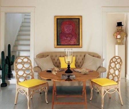
Because this room (below) is not decorated decorated with layered creams and whites, it would look better if the trim and walls were both painted the same cream instead.
How could we fix this? Layering some white and cream in the throw pillows or sofa and the area rug.

Via Garden Web
So here’s the trick: your trim colour, which is also often your cabinet colour, sets your “foundation palette.” In other words your trim or cabinet white should be the whitest white you work with in your décor.
Read more: 4 Reasons Your White Walls Look Bad

A Manhattan Brownstone by Jeffrey Bilhuber and Peter Pennoyer from Architectural Digest
Let me explain further. I had fairly deep cream floor tile installed in my house ten years ago and I have some aging (let’s call it patina?) creamy pale beige vintage furniture.
My foundation palette is cream because I don’t want any crisp clean ivories or whites outshining my vintage pieces and tile in brightness. White would be way too stark. Once I got tired of decorating with green greys and beiges to contrast with it, I simply painted the walls the very same cream colour. I LOVE it. It is soft, bright and serene. And my sofa looks as fresh as it possibly can without painting the walls some dramatic deep colour.

Albert Hadley
The same idea applies for updating homes from the earthier Tuscan trend. Often, the trim everywhere is cream to work with the warmer wall colours we were choosing back then. And the best way to update a Tuscan wood-stained kitchen is to paint the cabinets cream or even a creamy beige. Thinking of painting your cabinets, you must read my Third Rule of Design: Expensive Does Not Equal Timeless.
Sometimes (as long as it works with your decor) the freshest, brightest look you can create is to take this same creamy colour up on to the walls and throughout the house for a clean and bright backdrop to refresh your rooms. You can liberate yourself from the necessity of creating contrast with your creamy trim, which dictates deeper neutral wall colours than you want to use. Yay!
Designs for Living
Work with the whitest white in your palette.
In other words, your whitest white, even if it is a cream bordering on beige will look whiter and brighter – even without a bright white wall colour to show it up. If you are in the range of cream, even a deep cream, you can keep that as your brightest white to work with. Or you can create a soft contrast by pairing it with a creamy off-white. You just don’t want to go too white on your trim, which often makes your creamy colour look more yellow and possibly dirtier than it is.
Not sure what clean and dirty means? Here’s a post I wrote with clean and dirty dilemmas.
So let’s review. The traditional way of thinking is to have contrasting trim. But, there are lots of exceptions and ways to create contrast without using the wall colour.
And because paler walls are what we are all craving these days, painting your trim and walls the same colour can work. Just remember to identify the whitest white already in your room (and it could be an off-white, greige or cream). Most importantly, getting the contrast right is more nuanced than grabbing the whitest white paint colour you can buy.
White doesn’t exist in a vacuum, nor is it neutral. It needs to be treated like a colour, chosen deliberately and repeated often.
—-
Thanks Tricia, this is a fabulous post!
Related posts:
When White Walls are the ONLY Solution
Related posts:
The Best Trim Colours NOT Cloud White
The Best Exterior Trim Colours NOT Cloud White
How to Choose Ceiling Colours: Do’s and Don’ts

What a great post! So helpful in thinking about a top to bottom assessment of your home.
Wish I could be with you all there in Seal Beach today. It looks wonderful. I will keep on dreaming!
The best, well written interesting post ever! Excellent job Tricia!
Such a helpful analysis. I’ll keep this post handy for future reference. Thank you Tricia.
Interesting post. But, for those of us who live in more modest homes, is our trim color supposed to relate to the white of our vinyl windows or can it be a bit more off-white and still look right? Thank you for your insight!
One of my questions as well. I never really noticed that my windows were white white and my trim was off white until I started reading Maria’s blog so I think it is ok if it is already that way. Blinds, curtains cover most of it anyway.
Great info, but what do I do with the ceiling if I have creamy white on cabinets and walls in my bathroom?
Your ceiling should be one shade of white lighter than the white on your trim/walls, whites for ceilings is covered extensively in my White is Complicated eBook 🙂
Ok i would like to change my livi g room to a more fresher look.my furniture are drk. Brown leater i have wooden floor i think they cedar or maple brown..my windows are vinyle white..my fire is done in marble color of like terracotta with whit n black little treading design.. Would like to paint my wall white or cream..but not sure which white or cream..can you help me not sure..and would like to do the same with bedroom thanks in advance
Tricia, lovely examples! Wonderful ideas to update all those Floridian homes with “Tuscan era” tile that may be too expensive to rip out. What do you suggest doing in the bathrooms of these same homes that have white fixtures but “Tuscan-like” tile? Same creamy trim?
Sue
It depends which white is more prominent. Sometimes it might look better to relate the trim to the white fixtures in the bathroom. But if your tile is creamy in general your trim should match your tile.
Thanks for your comment!
Maria
Thank you Maria
Great post, Tricia! Thanks for the valuable insight, explanation, and examples!!
A really interesting article! It makes me think about things that never occurred to me before. Great job, Tricia.
Seeing all the photos of rooms with great, elaborate millwork makes me want to rip out all of my skimpy trim & replace it. But it would be cheaper to paint it the same color as my walls so it doesn’t get noticed.
That’s what I did in our dining room. I dislike the existing picture frame and chair rail molding but couldn’t afford to replace the drywall. I just painted it all the same color and sheen as the wall. It disappears now; just adds a little texture and dimension. So happy with it!
Great post! Those of us with skimpy builder basic trim can just match walls to trim. I ordered and loved your ebooks but can’t find them on my computer. Can they be downloaded again? My cabinets are 6 years old and off white and I was thinking of painting them white so this post was very helpful. They can stay off white and instead of painting every wall a shade of gray I’ll just match the trim on the walls. I have asked for a consultation for my bday and xmas, let’s hope they have heard my not so subtle hints!! xo
Hi Brooke, email [email protected] and she’ll send them to you again ASAP.
White on white won’t automatically work for every house, it’s what everyone wants right now but make sure you have lots of white in your decor to pull it off.
Thanks for your comment!
Thank you and Lisa for sending the books again! I have read each twice and learned so much more from them. The white, off-white and cream paint color charts are a big help.
Brooke
Well written and enjoyable post with lots of supporting images – thank you, Tricia!
I loved a few of these that had high contrast dark accents. But I once staged a home owned by a surgeon who had painted everything white. It was a gorgeous loft, but impossible to sell because people would walk in and walk right out again. It felt cold. I think if you’re going white, a blend of white shades softens and warms a space.
There is so much I love about this post, that I don’t even know where to begin.
One of your best, Maria! Thanks.
Excellent advice. I have an old Tuscan kitchen (tobacco cabinets, earth tone tiles) . Its ok with Navajo White trim. I was going to paint the cabinets white to match the appliances but think the NW would be much better – but will it will stark white appliances
Great read, Tricia! White IS complicated, that’s why you will be picking out my kitchen and dining room colors next! Maria, thanks for taking the time to respond to comments while you are in sunny CA. Personal interaction is what sets you apart from the rest, and it is much appreciated. 🙂
Great post. I have one question though, do you also paint risers and spindles and skirtboard the same color as the trim and mould. Or can different white or off white be used? Thanks
I found this meaty enough that I’m going to have to read it a few more times (I’m not a design pro). Tricia is a real find!
Thanks so much for this great post! We bought a house a year ago that has those “skinny chair rails” in all the main living/dining areas of the house. I thought it looked so weird to have it painted bright white splitting up the walls, so I asked my husband to please remove it. We are DIYers and he said that it would be a heck of a job to patch the drywall well, so we’ve left it. I’m used to it now so it doesn’t bother me anymore, but thanks to this great article I finally understand why it was bugging me and now I know what to do about it!! Thank you Maria and Tricia, y’all are wonderful!!
I found this to be very confusing; and somewhat contradictoy
Oh good, I thought it was my “morning after a late night” state that caused my comprehension issues! I think the info is good, but some editing is needed for coherency.
Thoughtfully written, and extremely helpful as we proceed with my kitchen redesign and living room refresh packages. My home has always been one construction grade color. Reading the “why” behind your ideas, I am assured that our paint choices will be the right one’s for the overall design, and money will be well spent repainting. Thank you Tricia.
Thank you Tricia. What a fabulous, helpful post!
Enjoyed this post. Maria what white did you choose for your own kitchen cabs, doors, moulding, and ceilings?
I’m paralyzed regarding the decision. All walls, trim and doors were painted Navajo White when bought our new home in the late 80’s. Just stuck with it because when installed wood plantation shutters I chose the same color because I didn’t want contrast.
Well now time to remodel our kitchen for the 3rd time and will not be talked out of white, but stumped by what white, because I know I’ll want all doors and trim to match, including the shutters if I can find someone who can refinish those expertly.
I know it won’t be Navajo! Too dark.
You will find the answer to your questions and much more in Maria’s eBook ‘White is Complicated: A Decorator’s Guide to Choosing the Right White” you can download it here https://mariakillam.com/product/white-is-complicated/
Interesting article. So do you still use different finishes, flat and semi-gloss?
Hi Susan, good question I would say yes, trim and woodwork should be at least satin for durability and walls can be as low sheen as flat, but usually a colour goes lighter and chalkier in a flatter finish, so maybe eggshell and satin would be the way to go to minimize the difference in sheen.
We did have a gorgeous venue in Seal Beach!
Since I have read & listened to pretty much everything that Maria has put out there, and I’ve used her large boards for several years for color consults, I hesitated on whether or not to invest in the live class. I’m so glad I did! Not only did I learn much and clarify many questions, I could also see clearly where I’m lacking in knowledge and now know how to proceed to get to where I want to go. Thanks, Maria!
Agree with those that found the contradiction. I’ll be reading again tomorrow.
Very well explained! Darryl Carter often does this too using only the sheens of paint to provide subtle “contrast.” In fact, we just painted our cabinets Simply White and now the walls are the same color. It opens up our once dreary room and keeps the focal point on certain pieces I’ve chosen to highlight…I love it and plan to replace the greige in the living room down the road to the same trim color 🙂
Do the cabinets have to match the trim? I have white trim, but would really like my cabinets to be a warmer white. But, the painter says I need to use the trim color for the cabinets, otherwise they will end up looking cream.
Thank you. This was so helpful to me. I am painting now. I need to read about the ceiling also.
Excellent article – literally the very issue I’m dealing with now. My trim is off white (light cream). Is it ok to paint the walls with a light griege with this trim color? I’m loving SW Accessbile Beige or Repose Gray too. Thoughts?
Definitely no, it will look dirty because there won’t be enough contrast. Maria
I almost wrote Maria a few weeks ago because I was just not understanding how to contrast light walls and light trim. This article answers all my questions! I finally get it!! Thanks so very much!!!!!
I love how you mentioned that white trim trends works by making rooms look crisp. My aunt recently redecorated her kitchen, and she chose a light robin’s egg color. She also made the trimming white, which really makes the wall color pop brightly.
My cabinets are bright white and walls green, appliances are white and roller shades are white. The ceiling which connects to another room was painted the same bright white but there is a noticeable line as the rest of the house is an off white. Shouldn’t the ceiling be the same color in adjoining rooms even if it is off white and cabinets and trim are bright white?
Yes.
Hi,
I am painting walls with wainscoting and chair rail. I plan to paint all the same color. My question is, should the wainscoting and chair rail be a different sheen than the eggshell wall? This is a commercial project for a condo building lobby.
Thanks so much,
Iris
Well you need it to be durable so yes it should be, however you do need to know that they will look slightly different. Maria
Great article about a subtle, challenging topic in design. I found it illuminating and instructive, with good photo examples. Thank you.
Maria, Great post. My kitchen cabinets are a cream color. A designer from ppg came to my house and matched the color macaroon cream to put on trim in kitchen. she suggested I use this trim throughout the house. Part of me knows that this will look great…but part of me wants a whiter trim:(. I know that the whiter trim will make my kitchen look dingy and drab and I don’t really want to have to repaint cabinets. Do you agree that color matching cabinets and using that color on trim throughout will look most cohesive???
Hi Kate, do you have my white ebook? It’s hard for me to say without seeing photos but you’ll find the answer there, you can buy it here: https://mariakillam.com/product/white-is-complicated/
Maria
Hi Kate, since the trend now is white and light I would choose an off-white that coordinates with your cream kitchen cabinets so that you can go with a lighter colour on the walls throughout your house. Before the white trend, I said cabinets and trim should match however now that the trend is pale and fresh on the walls, your creamy trim will look dirty so go with an off-white that coordinates. Hope that helps, Maria
I have cloud white trim and bright white IKEA furniture in my sons room. I’m wanting to paint his walls white with a black accent wall. Would you suggest the walls cloud white or something else like simply white from BM.
Thanks
Either one will work the contrast will be so high they will both look like art gallery white. Hope that helps, Maria
Hello Maria, LOVE your article !!!! I am still not sure about one thing though……If my cabinets and ceilings are white, can I still do the walls and trim and doors in a warmer white (Phoenix villa by Dunn Edwards). Thanks!!!!!
As long as there’s enough contrast between both so it doesn’t look like you tried to match it and failed then you’re fine! Maria
Love the article. Can you please tell me what the color is on the walls of the photo marked “Via Garden Web?”
Thank you.