Help! I Hate my Bathroom Floors!
04/25/2024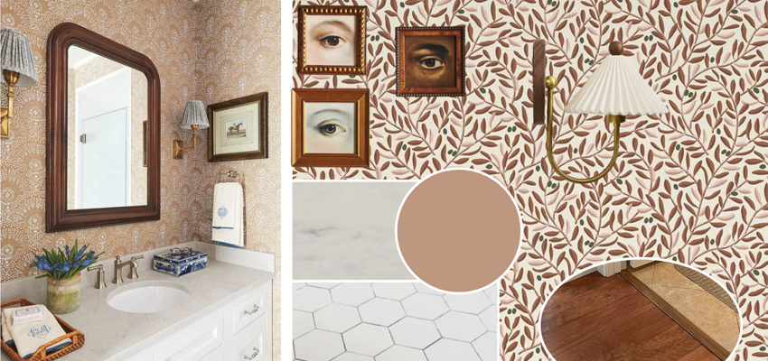
8 Comments
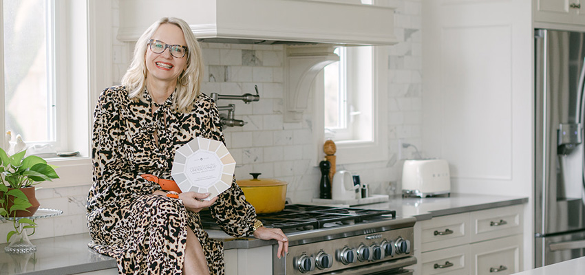
Colour Rescue has become a popular series here on my channel and in this weeks episode, we’re talking about three bathrooms. The theme is, can we keep the tile floors? As I’ve said many times before, if you don’t know what changes to make in your dated bathrooms, you start thinking brand new is probably…