


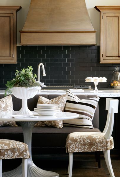
via Pinterest (click on image)
Recently while consulting with clients around their fixed finishes like tiles and countertops or exterior stone I have have been hearing phrases like:
‘It’s matchy, matchy but I think it’s okay’.
or
‘It’s matchy, matchy is that okay?’
or
‘I don’t want it to look matchy matchy’.
This same conversation came up again recently when I was in Toronto teaching one of my Specify Colour with Confidence™ classes.
I was wondering out loud why so many people make those statements as if matching finishes was to be avoided at all costs and a participant piped up that HGTV designers are constantly saying ‘We don’t want to be be matchy matchy!’ (or something along those lines).
And then I saw something big that I haven’t seen before and here’s what it is:
When you are selecting fixed elements for your home, countertops, tile, carpet, paint, fireplace stone, sinks, toilets, siding, roofs, etc, etc, if you don’t go out of your way to ensure that all the colours and especially the neutral undertones and whites coordinate, you will in most cases, end up with a mess.
If you need to paint your cabinets and have whites instead of creams in your countertop or tiles and you choose cream instead of a plain white? It will look wrong.
If you chose standard bright white vinyl windows instead of the standard beige [which usually has a green undertone] for the exterior of your house covered in earthy ledge stone, your exterior will look wrong, forever.
A bright white tub in an earthy bathroom without a stitch of white anywhere–bad.
If your old tile doesn’t relate to the new countertop you are installing in your kitchen, or the broadloom you chose doesn’t relate to the connecting tiled entry for example, it will always look like you made the wrong choice.
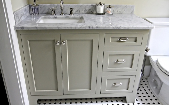
Via Pinterest
A Carrara tiled bathroom with green gray (above) instead of blue gray cabinets? Not quite right.
And of course, I could go on and on with similar examples.
So here’s the bottom line: If you don’t go out of your way to make sure that you match the undertones and whites or creams in the fixed finishes you are installing or adding (if you’re renovating), you will not be happy with the result.
There’s nothing fabulous about tile that doesn’t match the carpet that doesn’t match the countertop that doesn’t match the backsplash and doesn’t match the cabinets.
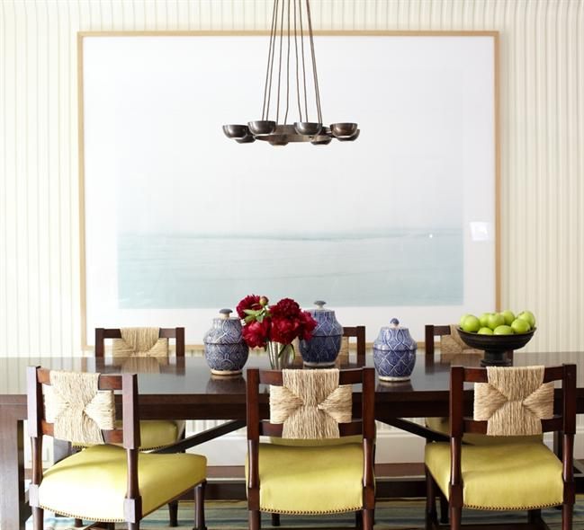
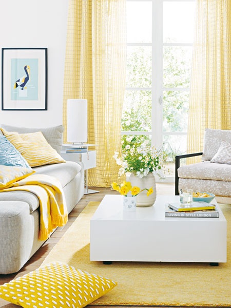
Via Pinterest
What designers refer to when they say ‘We don’t want it to be matchy matchy’ is around coordinating furniture.
A designers job is to create a ‘collected’ look for any given space that they’ve been hired to decorate.
Via Pinterest
Look at any beautifully decorated room and you will be hard pressed to find three matching coffee tables, a matched bedroom set or a matchy matchy dining room set.
Via Pinterest
However, do not under any circumstances assume that the same applies to fixed elements. If you do, you will be annoyed instead of happy every time you see that thing you paid perfectly good money for and now want to rip out.
That is the look I’m trying to save the world from.
If you would like to join me in my mission, sign up for my Specify Colour with Confidence™ training.
Houston and San Francisco are filling up fast! You’ll only pay 1/2 the total price as a deposit now, with the rest due 3 weeks prior to the course.
“Maria’s True Colour Expert™ [training] changed my business completely. Before Maria’s class I would help my decorating clients choose color more by default than anything else. After Maria’s class I had the self-confidence and knowledge to refocus my business to making color my [primary] focus. I had taken two previous color courses and ended both of them more confused than when I began. Maria’s True Colour Expert™ [course] was the first training that explained undertones and showed me the exact steps needed to pick the perfect color.” Linda Holt, True Colour Expert™ Principal, Linda Holt Interiors
Related posts:
When Should you Rip out Brand New Tile?
How to be Smart in a World of Dumb Designers?
One more Reason you Should Skip Accent Tiles Altogether
If you would like your home to fill you with happiness every time you walk up to the front door, become a client. On-line or In-person.
Download my eBook, How to Choose Paint Colours – It’s All in the Undertones to get my complete step-by-step system on how to get colour to do what you want.
To make sure the undertones in your home are right, get some large samples!
If you would like to learn how to choose colour with confidence, become a True Colour Expert.

Just posted my review! Happy to do so!
Great post, Maria. So very true – when the fixed elements “match,” you can play with mixing other elements to make a space your own!
I always though Carrara looked great with green grey! I think the example above doesn’t look right because it’s too warm/ yellow. A cooler green grey works better I think 🙂
It doesn’t clash with the Carrara but could the colour choice have been more perfect? I think so. Maria
I totally agree Maria.
I was thinking the same thing. Would a blue-gray be a ‘more perfect’ match? Likely, unless you really don’t care for blue … then you’d just be annoyed that you didn’t stick to what you like.
Personally, I think the fixed elements should relate to each other based on choosing them on one’s individual taste rather than choosing ‘the perfect’ color in something one doesn’t care for. Just my opinion! 🙂
You are right – the basics should be consistent thorough out the house with the accents being the focal points. If you have a uniform base palette you can create anything on top of it.
When I hear matchy matchy I think of the furniture ads showing complete room suites of the same pieces. Or the Restoration Hardware catalog…save us from a room full of grey beige!
It just surprises me when one cannot “feel” that the color is…right. I guess some’s got and some’s don’t. Thank goodness for Maria! 🙂 franki
Well I don’t “got it” not untill its already installed and payed for at least. Then I’m sentenced to live with it for years (ie. my carrera marble counter and cabinets). My husband cannot understand why I procrastinate at making design desicions, “Just pick what you like” he says. But I know just enough to know I don’t know what I’m doing. Learning a lot here though,
thank you!
I’ve tended to think of matchy-match with regard to furniture mainly; however, I’ve seen way too many HGTV shows where the designers go crazy, primarily in the kitchen, and do exactly what you advise against, Maria – they throw any countertop with any cabinets with any floor (without any considerations) and then finish it all up with the most awful “statement” backsplash. I’ll stick with you and learning from you, Maria, and I know in the end I’ll be very happy with the results.
Excellent post. I agree HGTV and the like seem to be encouraging this type of approach (along with giving people the false idea that renovations are fast, pain free and less expensive than they really are).
I recently purchased a home where the previous owners didn’t coordinate/match the fixed elements when doing some otherwise nice updates. As a result, they didn’t get the return on investment they should have (sold for less than assessed value in a robust market after sitting on the market for a several months). My realtor believes that it was just too hard for other buyers to look past the hodge-podge to see the potential of the house. Sadly this “design” approach seems to be very widespread as I saw loads of houses with similar problems during my search for a new home (so many granite counters with mismatched back splash and floor tile; poorly coordinated flooring choices; poorly chosen and applied paint schemes …the horror, the horror!!!
This is a great post. Despite the latest “bring unusual/non-coordinating elements together” trend, I actually think that matchy matchy in finishings and furniture looks nice. While it might not look quite as unique, at least matching sets look clean and never (to use the prior commenter’s great line) “hodge podge”. I’ll take matchy matchy any day!
A “showroom” style space may look neat and tidy but lacks any personal insight into the personality of the owner. It is very predictable and therefore, rather boring, to me.
Ahhhh…! Now that makes so much sense.
Thanks you, Maria.
Great post! I would only add that if you found your style and colour palette, it’s most worthy to buy fixed elements of a great quality and then, buy your furniture step by step than regret your choice of flooring for 10 years the time you could change it…
Here, in Hungary we really don’t change tiles & flooring every 5 or 10 years, so you could find horrible choices… but what to do when the owner sticks to the idea to put together his house in only some months…?
Maria, the benefit of your way of doing things (keeping the “hard” elements classic), for me is that as “trends” change, I can change furniture, fabrics, etc (if I want to), but the basic elements are neutral enough to go with the trends and to last over many years of trend change, making them worth the initial investment. There is nothing worse than spending lots of money, only to find what you have is so taste specific that you can’t change anything when you want to in the “soft” elements of your home. I have seen “matchy-matchy” done well, and none matching elements done well. It all depends on personal taste…
Kathy — bingo!
Save the world, Maria!!! We’re counting on you! Ha, ha.
This is tremendously helpful. Thanks!
Maria,
Very sad mine wasn’t the random number that came up for your colour boards 🙁 BUT… this post is absolutely a keeper. It such great advice. In trying to be new and creative and innovative I think some of the TV designers lose the point of colour undertones and the need that they need to either match or coordinate with the set elements as you point out. Sometimes I watch these shows and say to myself “I wonder what Maria would say to that”?
I notice anytime I post your stuff to my pinterest boards it gets alot activity and copy so this will definitely be one of them. Hopefully all the copying will generate business for you
Congratulations Ann
Maria – you say it like I think it! Thank you for so eloquently clarifying the difference between matching fixed element and decorative furnishings!
Hey Maria, Does your Super Hero costume have a big “U” on it? (for undertone)
Saving the world is a big job but I’m sure you can do it.
I have much to learn as well..and truly respect and applaud this post —you go against the grain with great thought and depth, Maria. Just one question–With you sparkly personality and knowledge–why don’t you have show on HGTV???
Who’ll second that?
I will second that, Paula!
A big congrats to Ann as the winner of your draw.
Excellent points and advice as usual, Maria.
-Brenda-
The expression “matchy matchy” was coined by Anna Wintour, who thought that matching clothing, shoes, etc., showed no creativity in someone looking for a fashion job (which requires putting things together unexpectedly). The expression has gone much farther and broader than ever intended.
People like Miles Redd put together amazing unexpected color combinations, but you’re right that shades of beige and white and taupe are not where people should get “creative.”
Yeah. This is why I stick to black and white. Beige is so hard to work with, even though everyone thinks it “goes with anything.”
Amen!! I’m joining you in saving the world from this!! Cheers!
This post was written over four years ago. How many people have realized the truth of what you were telling us? I “knew” this and yet…and yet, I was about to make this mistake with my kitchen counters anyway. But fortunately for my (new to me) small house in Georgia, I re-read good blog posts and go over information again before shelling out $$ for fixed surfaces. New pillows can be the wrong shade or design but we tire of them quickly anyway. No big deal. Countertops or flooring or even wall color can be too much time or money or effort to fix after the fact.
Well said, Maria.
Hi Maria!
I am not a brown stained wood person except for pecan, but I do love cherry wood, mahogany and rose woods, etc. So having said I don’t like the brown family I must admit that I love the kitchen photo at the beginning of this post! I love it!!! Why? Because it is perfectly designed with all the hard finishes complementing each other. I could live with this kitchen for a very, very long time.
So in defense of brown in this instance, this is a beautiful look.
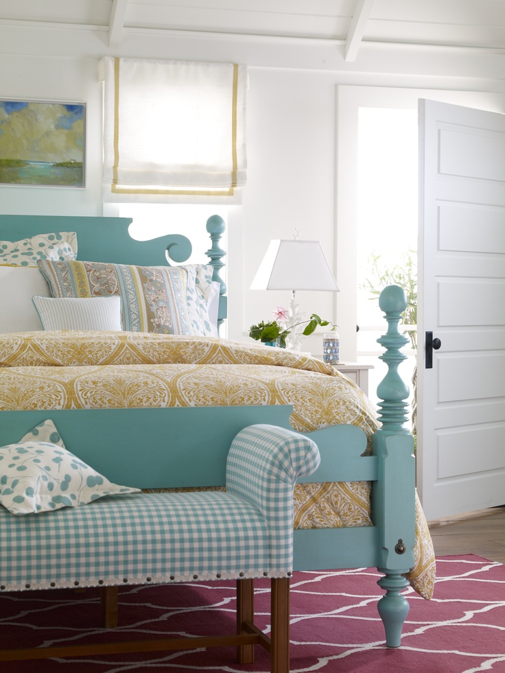
BUT! I do not understand the color of the rug in the bedroom with the turquoise blue painted bed. What am I missing???
I love your blog!