


Elizabeth and I spent Saturday together Christmas Shopping on Robson Street in downtown Vancouver. Then at 6:00 pm, we decided to have dinner so we went to Cin Cin, one of our favourite restaurants.

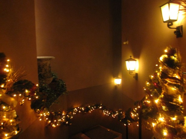
These are the stairs going up to the restaurant. You immediately feel like you’re arriving somewhere special, beautiful and european.
Since I have been sourcing beautiful images for this blog for over five years now, I have to be honest, it takes a lot to impress me. Years ago I remember being so intimidated and awestruck with Christmas decor in big, fancy, downtown hotels and restaurants and now I find myself thinking ‘I could have done that better’.

Anyway, here’s why I suddenly decided to take the Christmas decorations at Cin Cin and turn it into a blog post.

I loved the way all the decor was coppery, orange and gold to relate to the mediterranean feel of this Italian restaurant and of course the terra cotta tiled floors.
No candy apple red and bright green, anywhere in sight.
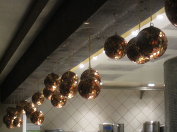
Even the kitchen was lined with sparkly, hanging ornaments.

And the accent lighting on the bar did not escape a coppery decoration.

Here’s Elizabeth and I having at the bar, displaying our new infinity scarves from J. Crew. Elizabeth told me they were all the rage and she was obsessed with finding one all day.
I had to hold her back from buying them all, haha. We both happened to be wearing cream sweaters so although this looks staged, it wasn’t.

Maria & Elizabeth
So here’s the lesson of the day.
I recently received an email asking me if there was such a thing as a totally neutral beige. I said, if your finishes match the beige or gray on the walls, it will look neutral. And if you did that by accident, you’ll think beige is neutral. If they don’t coordinate, you’ll probably say “I think I hate beige [or gray]’.
Homeowners move into a house with bossy finishes they inherit and instead of embracing what they have if there’s no budget to change it, they totally ignore it, which makes it even more of a feature than it would have been. If you simply took that tile, sofa, kitchen or bathroom you hate and worked with it, instead of pretending it’s not there. . .
You never know, it might even end up beautiful.
Related posts:
How to Choose the Right Beige
Learn to be Bossy Yet Charming
Holiday Dinner Party at Colour Me Happy
If you would like your home to fill you with happiness every time you walk up to the front door, become a client. On-line or In-person.
Download my eBook, How to Choose Paint Colours – It’s All in the Undertones to get my complete step-by-step system on how to get colour to do what you want and to make sure the undertones in your home are right, get some large samples!
If you would like to learn how to choose colour with confidence, become a True Colour Expert.

totally have to work with the finishes that are not leaving, I hate to say it out loud to clients but I will if they are bossy…..
with oak everywhere I will do black tables, clients have a “oh my look at the mention of black” until they are delivered and everything looks so wonderfully pulled together…
again with the dropping Christmas balls, so loving the look (like your mantel) x
Yes! We have burgundy carpeting in our bedroom and obviously our old sunlit blue/aqua/white palette was not going to work in there. Bought all new bedding and embraced the dark northern facing window too… now it is shades of pumpkin, brown, purpley wine reds, and cream. You don’t even notice the bossy carpet anymore.
That sounds beautiful, Julie.
yup! got teak parquet! which is a rich burnt sienna …. so playing nice with it with saturated colors ( that i love anyway!) …lots of white and saturated blue turquoise, touches of orange, in summer a little chartreuse in winter some pomegranate . a tone on tone of creamy colors would never look right in there…
I think it also depends on how long they are not going to have the budget to change something. Right now we have carpet in our living room that is brown with a pink undertone. When I first moved in with Jim, I chose colors that coordinated with the carpet. It looked good, when we had the black leather sofa (yes, it had been Jim’s bachelor sofa), but I didn’t want the new sofa’s color to be dictated by the carpet. I know we will be getting rid of it very soon, so if I had chosen a sofa based on the carpet color, I’d be stuck with that instead of my green sofa that I love.
Hi Maria,
It was so fun to see you on Robson Street yesterday. I’m the one who stopped you because I recognized you from your blog. Can’t wait as my girlfriend and I are going to take your colour class in February. You two look better than the holiday decor in your coordinating clothes! No clashing there!
A big fan,
Kim
I redecorated a bathroom I had in a house back in the seventies five times ignoring the pinky-beige tub and sink and toilet features. You’re right. It wasn’t until I decorated in those colours that I had a bathroom I could live with.
You look wonderful wearing those infinity scarves! I love them. After years of wondering why the wall colors I loved in magazines and in friends’ homes did not look good at all in my own home, I finally learned from you that they were totally clashing with the pink undertones of my beige carpet ( chosen by the builder of course ). No more pink-beige for me.
Your blog made me laugh, Maria. I fell in love with my little house the minute I walked through the front door and saw across the wide open LR/DR to the 8′-wide window featuring a gorgeous greenbelt and the screened in “catio” to the left. The clencher (in addition to the right price) was “it’s not what I want in flooring ultimately, but I can ‘live’ with the mix of ‘neutral’ carpet and tile and walls until I can change it. Had learned a lot from your blogs and much better than aqua carpet and linoleum/tile look or rust carpet and faux slate tile + deep gold walls in every room + Southwestern border top and bottom on every wall + every wall plate. Of course, the beige is not ‘neutral’ – the walls are yellow beige, the carpet is grey beige (in comparison) with teeny flecks of tan and brown, and the tile in the foyer and kitchen is definitely pink. Luckily I can still live with it, but I’m busy creating my plan for the future and amassing the small fortune I’ll need to activate it.
Love your infinity scarves – I wish the weather down here would get a little cooler so I could pull out my scarves and wear them comfortably! 🙂
When we bought our current house everything was dark and/or wood. We hired a painter to cover everything in Cloud White, except for the two dormer bedrooms which were perfectly fine – one grey and one a muted, robin’s egg blue. I put crisp, white linens with black accents in both and it’s working for now. Great post, very helpful AND I have a feeling that J Crew will sell a lot of ‘infinity’ scarves today…
Thank you for sharing incredibly beautiful holiday decor with us! and thank you for giving reminding us that we can all turn our “ugly ducklings” into swans!
Totally agree! and love the scarves!
CinCin is one of my favorite places to dine, wine, and just enjoy! It doesn’t surprise me at all that they did it ‘right’ for the holidays.
I haven’t been there for a few years – thanks for sharing the photos and allowing me to dream of their delicious food and ambiance vicariously.
PS – I agree…let your house do the ‘talking’ while you do the listening … great advice as always!
I am doing just that with my downstairs furniture. I have inherited two deep red walls and they just so happen to go with a rug (that I was gifted as a cast off from an aunt), which also goes with my brown rocker (gift from a family member) and brown leather sofa (we actually purchased this), and to try it all in matches remarkable with our side/coffee tables (handed down from my mother)! It all works rather well together and none of it is my style but some how my land of misfit furniture has turned into a nicely styled living room until I can change it all out!
I’m crazy about that metallic look (copper, bronze, etc.)! franki
You & your sister are a cute pair.
I agree with the notion of working with what you have. I think that also applies to the amount of natural light a room gets.
If it’s a dark room, play that up & make it cozy.
If it’s filled with light, make it bright & airy.
Great post, Maria.
Loved the decorations at the restaurant. You and Elizabeth had the same color sweaters and it wasn’t planned…it’s because your sisters. My sis and I do it all the time. One day she came into my work and I said, hey your wearing my turtleneck, forgetting I was also wearing it.lol then I looked and her shoes were the same color hot pink as my top that was over the turtleneck. lol not planned…but sisters we are. lol It’s pretty cool actually.
I lived with my colors for years before I finally got to change it all. it was a great moment when I got to do that. lol