I recently read Down to Earth by Lauren Liess. Her relatable and easy decorating style is so good, I’m sharing my favorite go-to design tips from the book.
What I really love about Lauren Liess’ new book are the many simple, easy ideas you can immediately transfer to your own home to make it more beautiful right now.
My friend Lauren and I started blogging around the same time back in 2008! She is a highly talented, so sweet person and Mom of five kids!
Easy Vase Filler
Starting with the easiest one of all.
A branch from a tree, or wildflowers, or anything green will do.
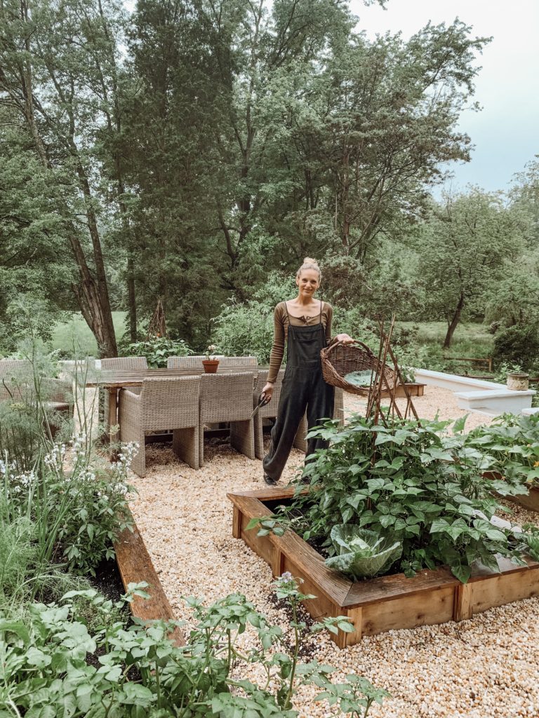
Lauren Liess
Lauren doesn’t arrive at a photoshoot for one of her projects with her car full of cut flowers from the market. She just walks outside with her clippers.
Decorating with Neutrals
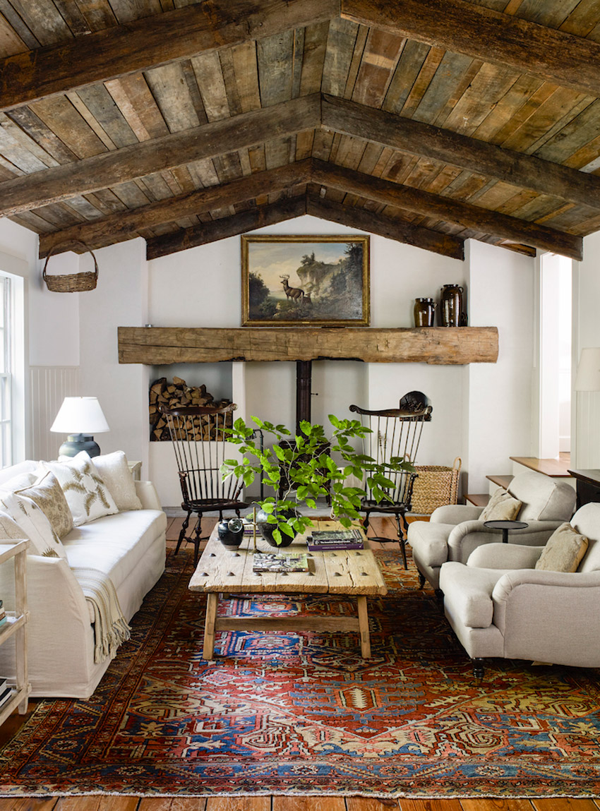
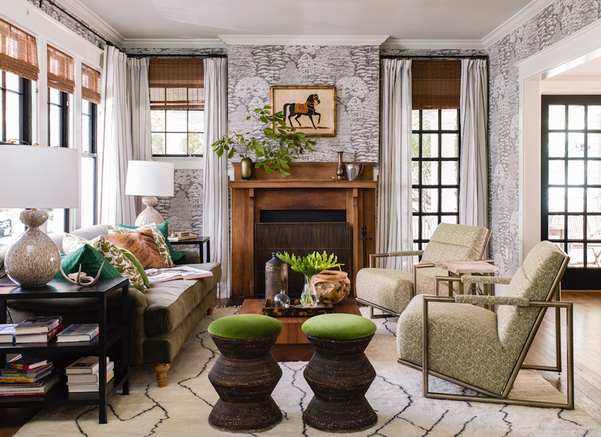
This room brings me to my next point. What do you notice about the colours?
Before I really did a lot of decorating from scratch in my design career, I was literally in 1000 homes in a four year period choosing paint colours (working as a colour consultant out of a paint store). I got really good at being able to tell my clients what was bothering them about the room in question. Or what really had to go because it was holding the room hostage, etc.
For example, a lot of people have expensive antique area rugs that they aren’t willing to part with, and I have often heard comments from my clients like “This rug is from my Grandma, and it’s not going anywhere, but I don’t like red.”
However, most of the time, if you don’t repeat the red in the room again, it just looks like you’re ignoring the rug and that doesn’t work either.
Well, if you keep the rest of the furnishings neutral like this one (above) it won’t look odd if you don’t repeat it again. She does this a lot in her decorating and I think it’s brilliant.
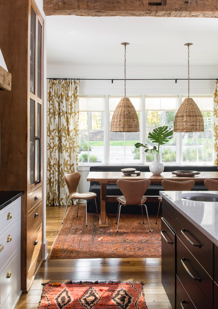
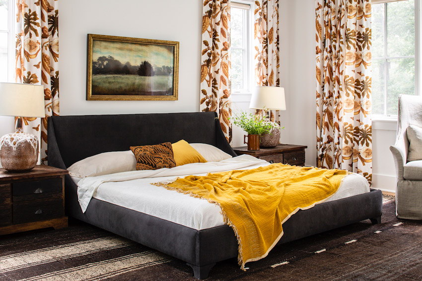
In this dining room, the orange rug is not overtly repeated in fabric or even a vase, but with cognac leather dining chairs which Lauren calls “Glowy browns” that she loves to specify!
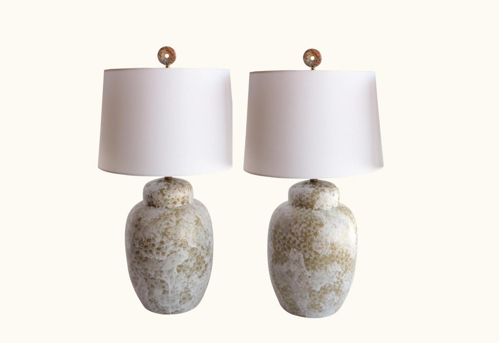
Styling with Vintage Ceramic Lamps
Lauren loves the way vintage ceramic lamps add depth and patina to a newer-feeling space.
Lauren has a chapter where she talks about her philosophy on ‘timelessness’ which (of course) I loved:
“It’s possible to find unattractive and out-of-date examples of anything, but that doesn’t mean that the category itself is bad.
Every other year we hear declarations that wallpaper is “in” or “out”, but the reality is that it’s always “in” for those who truly love it, it’s always “out” for those who hate it, and it doesn’t go in or out; it just gets overused in the wrong places, causing people to tire of it.
There is nothing wrong with any authentic metal finish, be it polished brass, oil-rubbed bronze, iron, nickel, copper, or chrome, they can only be used in the wrong places, yet we will all be hearing about what metals are “in”or “out” until the end of our days.”
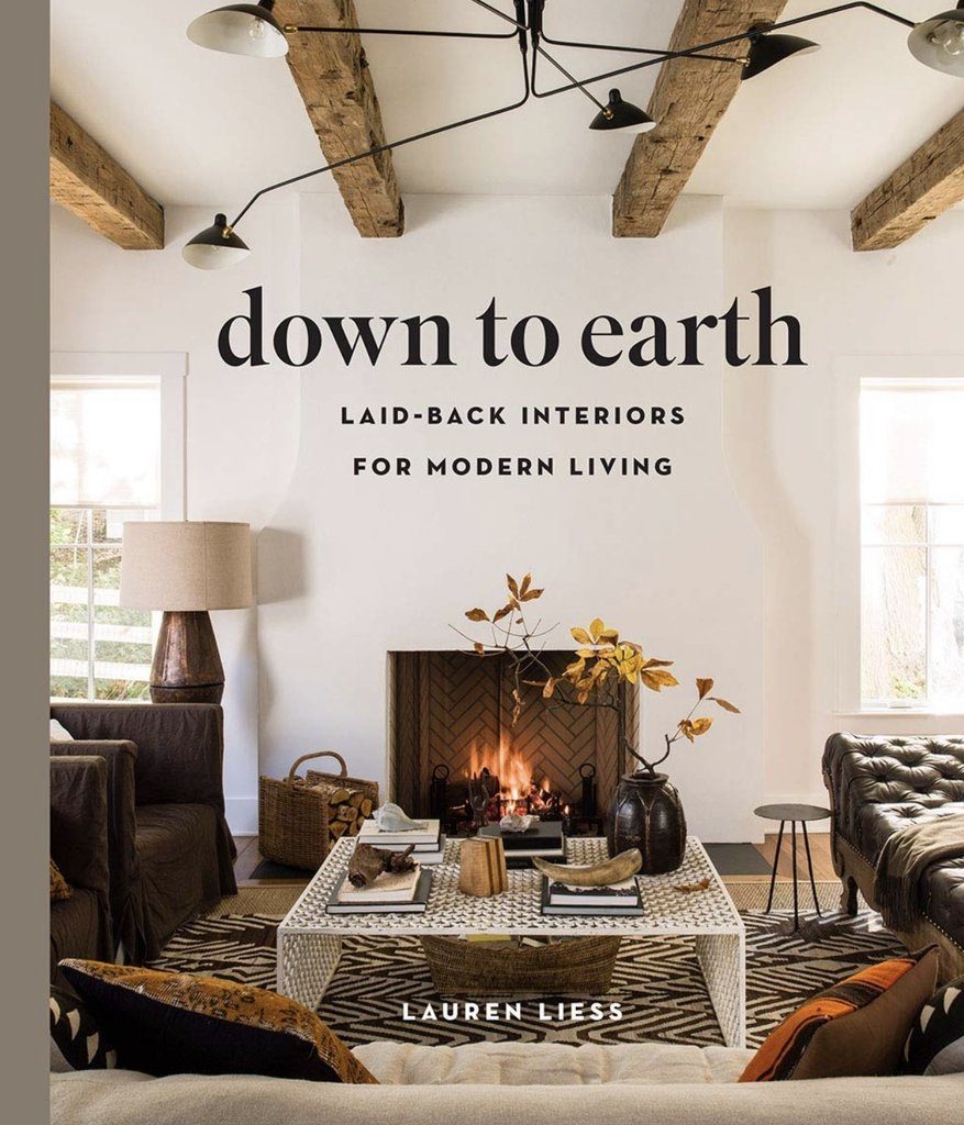
You can get Lauren’s new book here.
This book is the perfect Christmas gift for the design obsessed and I promise it will inspire you to make your home more beautiful.
Related posts:
Do you Have an Odd Chair in your Habitat? (Well You Should) Lauren’s first book!


Lauren is my faaaaavorite. I don’t tend to hyperbole – she really is 🙂 I study and try to imitate her style in my own home (apart from the white upholstery which is impossible for my family). I can’t wait to get my hands on this book – your pictures here really make me excited! I remember in her first book she talked in a certain photo about mixing clean and dirty on purpose sometimes to create an effect and I wondered what her friend Maria Killam thought about that!
I LOVED what Lauren had to say about classic and timeless vs. trends.
This idea that satin nickel is the “in” metal or now it’s brass feeds people’s discontent and insecurity.
When you create what you love, it doesn’t matter. I think that’s joy! I think that’s confidence. I think that’s beautiful!
I’m currently working on a downsizing job and the new townhouse has black everywhere! We’re talking black kitchen faucet, bathroom fixtures, the whole nine yards! The homeowner likes it but it is going to look so dated in no time flat!
Going classic with your hard finishes is like rockin the Little Black Dress!!
Absolutely, and choosing black for everything becomes flat, predictable and boring really fast! Mixing is always better, thanks for your comment! Maria
I agree with everything Lauren says, wholeheartedly. I really do.
The only thing I slightly disagree with is that you can ALWAYS pair a strongly-colored inherited rug with neutrals. I think the living room shown works because the strong brown wood ceiling balances the rug. Plus, the rug doesn’t contrast a lot with the wood floor underneath and the rug is an earthy orange instead of a strong clear red.
But I’ve seen people try to decorate with white walls and ceilings, beige upholstery, and no color anywhere except an inherited rug in strong reds and blues. It ends up looking like they just didn’t bother to find the right rug and the room looks off balance.
Something, somewhere, has to balance the rug if you are keeping everything else neutral.
Thanks for the post Maria! I will check out her book. I definitely sounds interesting!
Having grown up and become a young adult in the late 70‘s, Lauren‘s style is very much the style of my youth. Almost 100%.
The 70s often get a bad rap, but in reality, in many places like where I grew up, it was filled with these cozy natural textures, glowy natural browns, Cognac leathers and all things connected to nature like branches, rocks and shells…along with eclectically collected items from round the world, antiques and the modern designer piece mixed in. Just very real and livable.
Not everything was harvest gold and avocado green back then.
I liked it all, but was a bit puzzled by the kitchen–white base cabinet with black top, black base cabinet with white top (OK so far…) and a stained wood tall cabinet. Hmmm. Well, OK. But the cabinet hardware and finishes of the hardware on these three pieces was all different! That was the real puzzle for me.
That’s what you get when every detail is considered. This is a look that would be hard to pull off unless you have years of experience like Lauren does designing kitchens! Good question! Maria
June, I was wondering about that hardware too! I found her write up of this kitchen on her blog and this is what she said about it “I love to mix metals and use them as the “color” in a space and we must have used at least six or seven different metal finishes in there.” So she clearly did it with intention.
Just ordered the book!! Can’t wait! Merry Christmas to me????
Lovely mix of “real” materials (like unpainted wood!) in a world where so much is plastic or looks plastic these days. I’d forgotten that warm neutrals could be so cozy, and I adore the rugs, all of ’em.
After living through the horror of avocado green and harvest gold, I thought I’d keep a cool palette forever. Green-wise, I’ve always loved lots of living houseplants, but still don’t want to see any kind of gold ANYWHERE. But now I’m ok with tan or brown again, first time in decades.