I decided, this year, to turn this post into an overview of all the other paint companies ‘colours of the year’ along with a discussion about Pantone’s colour of the year.
Frankly, I have been a little disillusioned by their predictions of late, especially last years ‘circus purple’ shade which I talked about here.
I think Michelle Ogundehin said it best in this article in de zeen:
“I’m always amused to read the inevitable crop of articles that immediately appear after such a pronouncement, championing its validity with an array of random products plucked from assorted image banks and quoting breathlessly from the press release, phrases such as “sociable and spirited, the engaging nature of Living Coral welcomes and encourages lighthearted activity”.
Anyway, I’ll get to what I think about their 2019 colour of the year, but let’s just begin with earlier announcements starting with Benjamin Moore’s colour of the year shall we?
Benjamin Moore Metropolitan AF 690
This is a trendy mid tone greyed blue that leans towards green. This is a good thing because the most popular blue greys are usually warmer than just a straight blue grey.
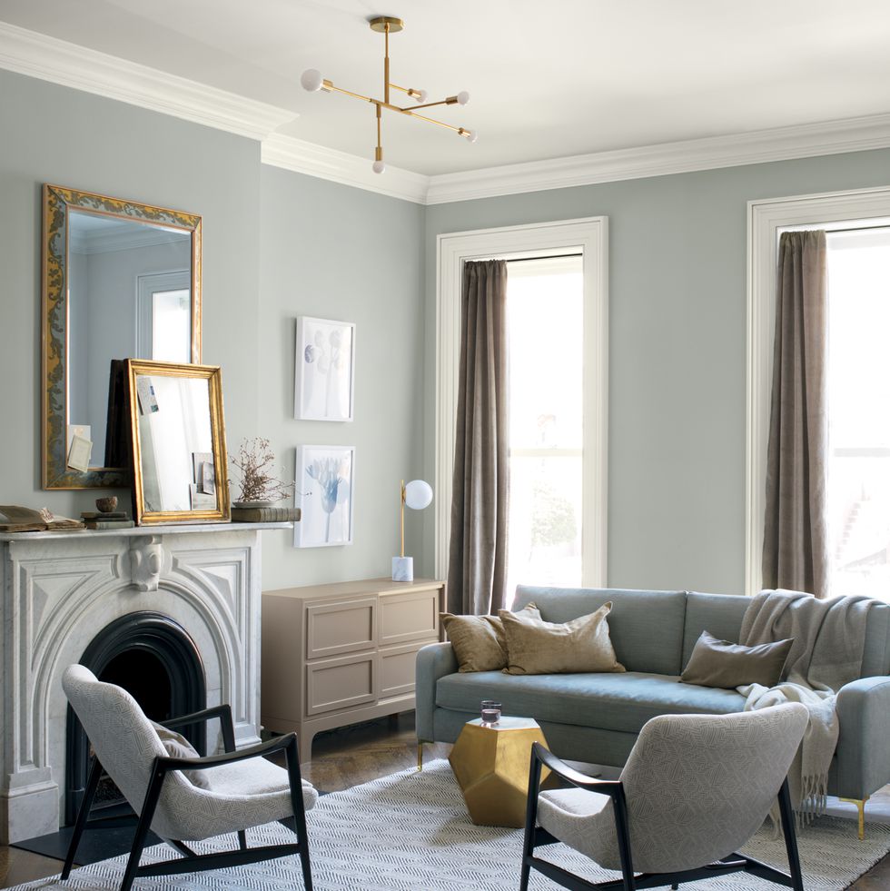
While most of the population is still excited about installing a new grey kitchen or grey hardwood floors, anyone in the know about colour, knows that grey is at the end of it’s 10 year trend cycle. Which is why I was surprised to see this announced as a ‘colour of the year for 2019’.
A colour of the year should have anyone in the business of colour nodding their heads in agreement.
Because, if colour is your industry, that means you’re on the pulse of what is current and especially what’s coming down the pike.
The definition of news is NEW.
Just like a soft shade of pink was on everyone’s radar when it first came on the scene a few years ago, announcing it now would have people in the colour industry thinking, “What? That’s not news, it’s already here”.
Well, that’s basically my opinion about this trendy grey shade.
It’s yesterday, not today.
In my last two Specify Colour with Confidence workshops this Spring, the hottest colour boards that my students kept reaching for were the palest of creamy greiges bordering on beige.
Which is exactly what we have been specifying for the last few years in our eDesign department as well.
Next up:
This is what Behr said about their colour of the year:
Behr Blueprint
“An honest, approachable color that conjures up the blueprints builders rely on to bring architectural designs to life, Blueprint creates a space where you can build your own reimagined life—where awareness of what we want to build for ourselves can transform into action.”
Hmmm. . . not sure what that means, but it sounds like a good goal for 2019.
Strong and dramatic shades of blue are definitely still trending. If forced to choose a blue that I would take to the bank, I’m not sure I would have chosen this one, but, while I think punchier shades such as rich cobalt are more exciting, dustier “safer” blues like this one, are certainly cropping up everywhere.
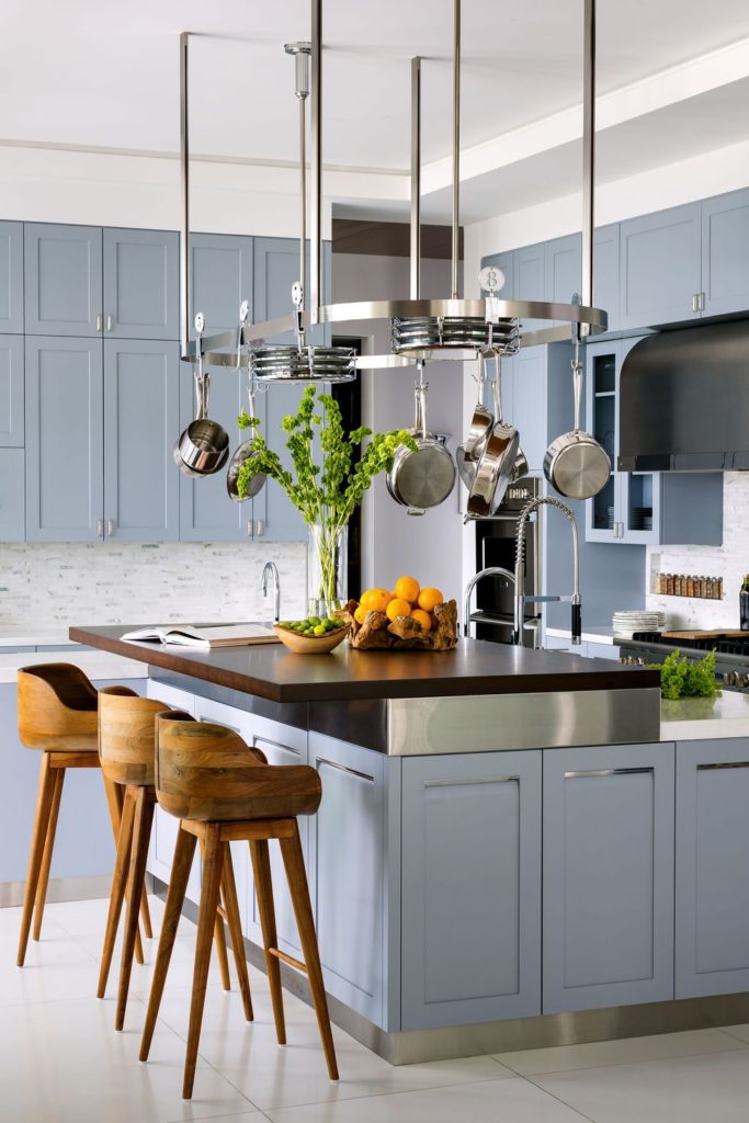
Valspar Seattle Haze
Valspar puts out a trend palette, not just one colour. For 2019, they have a blush, a clean blue lavender, an pale orange squash colour and a more coral orange among others.
This dusty light blue like their Seattle Haze (above) is a colour I’ve been seeing a lot of, especially on millwork and cabinets. Like in this pretty room (below) by Paloma Contreras.
An easy going blue like this is a nice alternative to white or neutrals for cabinetry. And it pairs so well with trending brass fixture and pale creamy greiges that verge on beige. This colour is really more of a trending classic.
BM Water’s Edge by Paloma Contreras
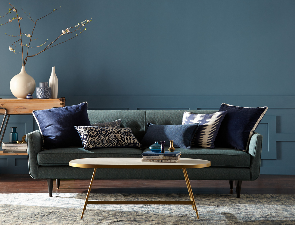
Dulux Night Watch
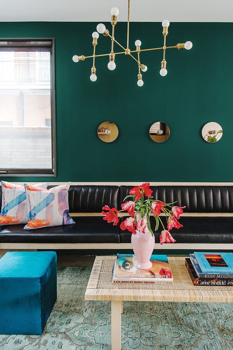
This one I was expecting, even if it’s not totally “new”. A deep forest green. It’s a jewel toned hue that looks luxurious but grounded.
It takes us back to the 80s and 90s. All things from both those decades seem to be popping up everywhere in fashion and interiors lately.
I’m happy to say though, that while everything then aimed for a conspicuous dumpiness, (in rebellion to campy 80s glamour I guess,) the current versions are showing up a bit more polished and refined.
This room from Dulux’s marketing campaign (above) shows forest green elevated with brass and clean blush pink and teal. Rather than the frumpy burgundy plaids and yellow knotty pine it was typically paired with circa 1993.
Here’s a glam hutch in high gloss forest green by Eddie Ross (below).
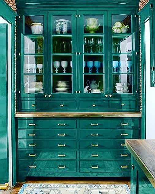
I think it’s much prettier this time around, don’t you?
And speaking of the 90s, remember how there was a big “world traveller” look back then? Well it’s back. Elephant prints and exotic items are everywhere in the high end mags, and this is part of what’s driving the spicier colours we’re seeing in the trend forcasts.
Check out this amazing elephant wallpaper in this Palm Beach home by Ellen Kavanaugh that appeared in House Beautiful this fall (below).
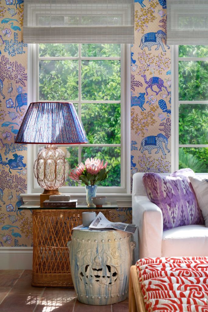
Whimsical wold traveler look by Ellen Kavanaugh in House Beautiful
Dulux Spiced Honey
It’s interesting to note that Dulux UK’s colour of the year is different than what they put out for this side of the Atlantic. I’ve been saying for awhile now that beige is back, but this looks like a deep pink beige (I’d like to get my hands on a chip to verify this for sure) verging on gold.
Yikes! The walls of the world have just barely caught their breath from being smothered in this type of earthy colour (below).
Europe still tends to be ahead of our trend curve, so I’m watching with interest. I really can’t see that we are ready for this again so soon?
I do think camel and cognac are pretty and classic, and sometimes camel can be a bit on the pink side. But as you can see from their campaign image below, the wood brings that element already. Painting the walls a similar colour than the floors is the first mistake I made as a colour consultant many years ago.
“A versatile shade filled with warm and inviting tones of amber and rich caramel signalling positivity, purpose and transformation.”
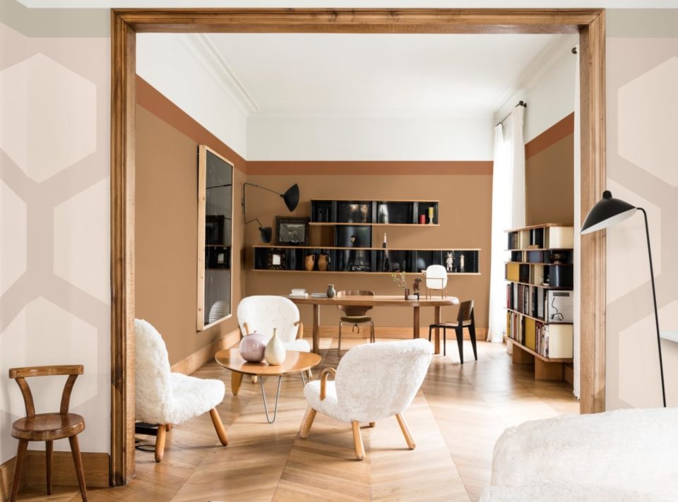
In any case, it does fit nicely into the trend narrative that colour is getting warmer and earthier again although I still think it’s a little too close to the gold beige walls we are still dealing with from the Tuscan brown trend.
Next up, Sherwin Williams Cavern Clay, which I’ve already talked about here, plays into the warmer and earthier thing too (below).
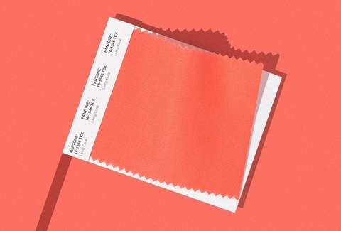
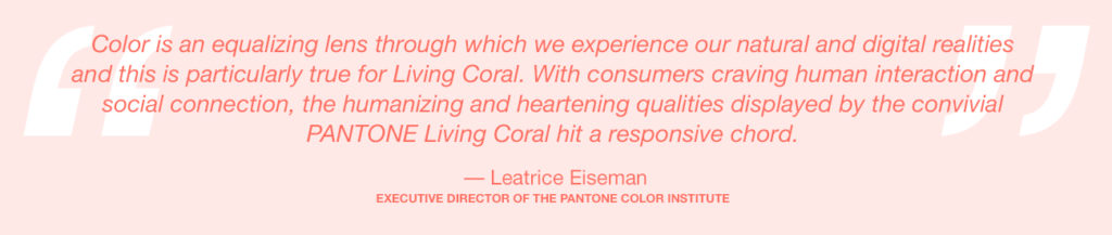
Pantone Living Coral
Now if you scroll through this page, you’ll notice that one of these things is not like the others. Pantone Living Coral is a curious choice for 2019.
When colour is generally getting richer and moving towards jewel and earth tones overall, Pantone bucks the trend and picks yet another super bright colour that is a bit too clean to be quite spot on.
Just like last year’s purple was right out of the crayola box, I’m not sure where this is going to be useful except maybe in Spring fashion and decor when colour inevitably gets fresher for a couple of short months each year.
Don’t get me wrong, I love fresh colour and always will. And going bold with colour in interiors will always make them more beautiful and interesting. I just don’t see how this particular hue captures the colour trend zeitgeist in any way.
Pantone
It’s fairly cliched colour pop psychology that orange is a social colour. I just don’t see how this is THE relevant colour of the coming year. It’s about the softer side of Social Media? Or real in person social contact? Really?
Thibault, home of the most gorgeous and colourful fabrics, put out some images on Instagram of the corals in their collection in response to Pantone’s announcement. Coral is a perennial colourway in their line which is always fresh and playful.
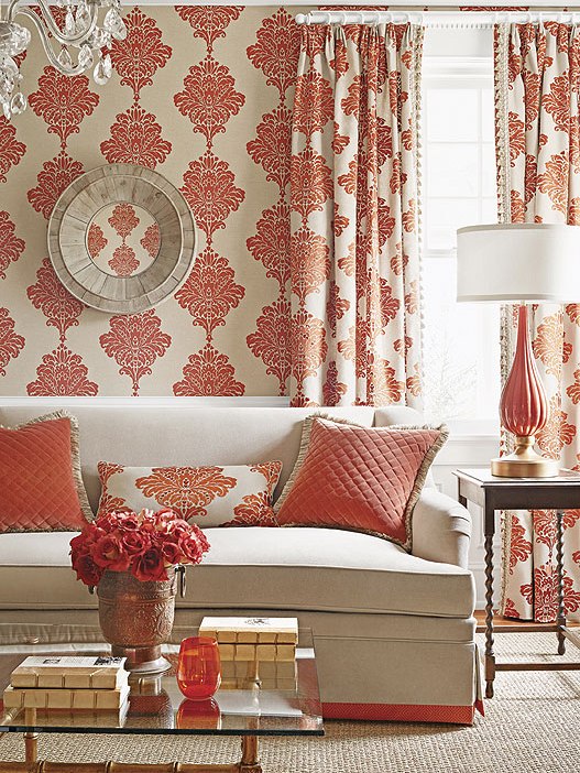
You can see that the coral is significantly more muted than Pantone’s colour. But I guess it is meant to be very loosely interpreted? Surely Pantone is not as concerned with distinguishing clean versus dirty colours as I am, haha. Maybe this trend colour is meant to be anything from neon orange to terracotta.
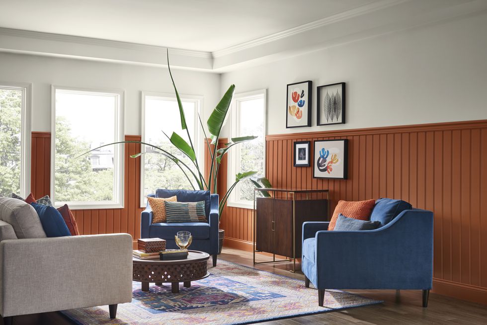
I love the way this dramatic cobalt room is accented in rusty and coral oranges by Jared Hughes design (below).
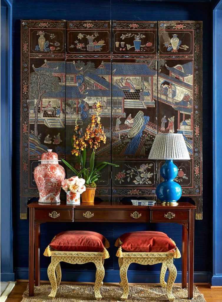
It’s a bit more muted and paired with current jewel tones here. So while I remain unconvinced that it is THE colour for 2019, coral and its variants really are pretty. And I guess I’m happy they didn’t pick dark pink beige, haha.
The colour I would have picked would be peach or apricot. This is the colour that looks “new” to me and I first noticed it appearing in fashion last Fall.
Here’s a deep peach in a classic foyer by Gil Schafer (below).
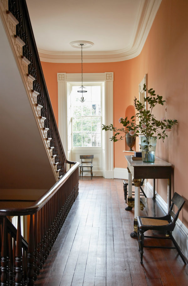
Gil Schafer via Elements of Style
By the way, peach, just like blush pinks, is a great colour to use to warm up interiors with lots of trendy gray and taupe finishes and make them look warmer and more current. Peach also works very well with the trending forest and leafy greens.
I guess you could consider it a variation of coral, but maybe that’s a stretch.
Well over to you my lovelies. I’d love to hear your take on any of these colour predictions as we head into the New Year.
Related posts:
My Take on Pantone’s Colour of the Year: Ultra Violet


Maria,
This is such a thoughtful take on the colors for the year. I have to agree that the Benjamin Moore color definitely has me scratching my head, though it is a lovely version of gray. Thank you!
Michelle
I will always prefer a white or a light neutral for walls, cabinetry, furniture, etc., with pops of whatever trendy colour is in vogue. I find that much easier to live with and to update.
Me too, Carol. I’d rather change pillows, etc than paint. I’m not a fan of colored walls. I think of walls as a neutral canvas that lets my furniture, art and accessories stand out. And I’m waaaay out of sync with trends. I like what I like when I like it and stick with it for a long time. 🙂
Most people paint their main rooms a neutral for this very reason. Colourful walls work best in dens, bedrooms, bathrooms and dining rooms in general. Thanks for your comment! Maria
Maria, this is a very useful post. Would you mind sharing some examples of “pale creamy griege that borders on beige” paint colors?
Your color sense is always spot on and I am in the mood to repaint for 2019.
Yes, it would be helpful to hear specific examples of creamy greige. For example, I’ve heard others describe BM’s Edgecomb Grey as such. Yes? No?
Good question I would like to hear the answer too!
Yes! Please give us a list of BM colours that fall in to this category.
Ballet white! OC-9–a winner every time. Or a grayer version Olympic Mountains 971 ( also called fog mist OC 31) Or the most beautiful creamy beige I’ve seen in years is from Benjamin Moore‘s full spectrum Collection called Dulce de Leche. CSP-250. also discovered a beautiful creamy off white from the same collection
Cake Batter CSP 215. It Can blush just a little bit given the right lighting and when paired with brighter white trim or it May mute just a smidge when Paired with creamy white trim or fabrics. Sensationa! Like Navajo white dressed up for prom.
Great suggestions thanks Lisa! Maria
Yes …. would love to know as well. (Thank you!)
Count me in! I would love to know a few paint examples of this pale creamy griege borders on beige!
Wow I actually liked that foyer. But the name grates on me because I am a diver and I’ve seen living coral and it is never that color. I would call it Carmela Soprano Coral because she was so pretty in it the many times that character was dressed in it with gold jewelry. I agree with your choice of peach or apricot.
I was 19 in 1980 and 29 in 1990 and if you specify that PPG emerald green for anyone my age I’ll be shocked. And the head achey wall papers! I can only hope the walls have been appropriately primed and sized as someone who has pulled much of it off myself.
Excuse my crankiness, I love your work! This time of year I love revisiting Christmas movie homes like the one in Home Alone, The Family Stone and National Lampoon Christmas Vacation. For me they are as important as the plot and action! Plenty of PPG Deluxe Night Watch there.
So funny, I just watched Home Alone and I was going to say to Maria that you can do a test of what is classic by what in that beautiful house still works — I picked hard wood, the forest green on the walls looked ok but not with all the chintz, the outside of the house, of course, black door with brick, the little white twinkle lights, and there were a couple other things that escape me now. I think there was subway tile or classic tile in a bathroom. But yes — I love love Christmas movies and checking out the decorations too. Kitchen was definitely dated!
What goes around comes around. We purchased our first house in 1978 and my great room (a new concept!) was done in peach and green. I made custom drapes that were a greige color with border detailing of peach and green. At my age it is amusing to hear excitement about “new” trends that are old to me! Wallpaper falls into that category for me. After removing ugly wallpapers applied with no thought of correct application in homes we purchased over the years, I swore it off forever.
But it is still fun to read your blog, Maria! I’ve learned a lot from it. Thanks!
I agree with the comment or on the last list. I know you always do the paint chip trendy, but telling us what’s out and in gives me too much anxiety now, especially when in my consult a year ago you told me to paint that color that is now out. We can’t keep up and it’s becomming depressing. I mean, I had beige five years ago in my consult with you and last year my consult says Classic Gray and don’t go with the beiges which I very well could have to done in my kitchen. Now gray is out and I should have done beige like on my older consult??
Ive loves the blog for years, but I felt better reading this when it was more correcting color problems so that what people have works
Hey, I have not specified a trendy grey for a client in years. Classic grey is not a mid-toned trendy grey (refer back to the Metropolitan colour in this post, THAT in your entire house would technically be considered dated, sorry Benjamin Moore). Classic Grey is a GREIGE, which is the perfect backdrop for a lot of my clients NOT to be confused with trendy. I posted about greige here: https://mariakillam.com/is-greige-mistake/ If you are still unhappy with your space, it has way more to do with the decorating and styling than a simple paint colour. Paint, unfortunately CANNOT do all the heavy lifting, as I mentioned in this post: https://mariakillam.com/heavyliftingpaint/ and this one: https://mariakillam.com/browntowhite/ We would love to help you in our eDesign department with our ‘Get me started’ package, buying the right furniture, carpet, pillows and lamps will go a lot further in filling you with happiness when you walk in the door than just changing the paint colour EVEN IF it did happen to be trendy: https://mariakillam.com/product/get-me-started/ I feel your pain, it’s so important that our home make us happy when we walk in the door!
Hope this helps, Maria
I appreciate how you put everything in perspective.–lots of common sense! Probably my most hated color is orange and all its variants, so I gasped when I first saw Pantone’s color of the year. I’m reluctant to admit that the dark coral velvet cushions are lovely with the jewel toned blue backdrop! Not a fan of peach, but things come and things go. I am interested to learn more of your take on creamy grieges. My bonus room is needing a new coat of paint!
I love a post about paint that has me cracking up. Pantone — one of these things is not like the others. Lol. They seem irrelevant to me, why does Pantone even get covered. Also, a couple questions if you could answer any:
–What criteria do paint companies use? For example, while Metropolitan Gray isn’t really new, or makes you go, oh yeah, I should have seen that coming, most of my friends are JUST painting gray walls and “want to” paint everything gray.
–Related — when you say the trend is ending, how long does it take “the ordinary person” to catch up? And — let’s say beige is coming back. When does someone who uses beige (again — ordinary people :)) not look like they are way behind, but instead, right on the cusp or right on trend? I can convince friend’s to pick warmer grays/greiges/or taupe-y grays/more mushroom-y colors, but not beige!
–When you say you would have picked peach, did you mean as the color of the year, or just as compared to Pantone’s coral? If the latter and you wouldn’t necessarily pick it as the color of the year yourself, then what would you pick as the color of the year.
Thanks!
Tanya, this is a great question. Here’s why it takes so long for people to ‘catch up’. If someone is planning and dreaming about renovating their kitchen or bathroom, for many it takes years to save and plan and then by the time they install the kitchen they’ve been dreaming about, it’s technically either already dated or almost out and they don’t even realize it because their mind has been firmly stuck on a brown or grey kitchen (for example).
And when I say beige, it’s the creamy, greige/yellow beige’s that were mentioned above that people were looking for. It’s definitely too soon for the planet to be embracing the darker, mid-toned beige’s that were in even during the brown trend just a few short years ago.
And yes, I would have picked peach as the colour of the year. It’s newer than anything else and I’m seeing it everywhere.
I have no idea what criteria a paint company uses to determine what their colour of the year is, but I have learned enough about them to know that there is NO ONE and I mean NO ONE who works in the executive offices that is out there in the REAL WORLD choosing colour for THEIR CUSTOMERS which means that it’s much harder for them to know what’s really CURRENT. Attending European trade shows (which is usually what their trend reports are based on) is definitely not the only way to know where colour is going.
The consumer chooses where colour is going next, as much as everyone likes to blame it on the crystal balls of trend setters, it’s the customer who chooses by spending their money, OR NOT spending their money.
I talk about the colours MY CLIENTS are asking me for, I’m not plucking them out of my crystal ball.
Just my opinion, doesn’t mean it’s right.
Thanks for your question, it helps everyone.
Maria
Thanks Maria, so helpful!! I wish the designer at our new build read your blog bf she convinved me that a taupy gray cabinet worked with a green gray. I went for it bc she was supposed to be the expert, and now I am stuck trying to decide whether to risk painting a bathroom laminate cabinet a more appropriate color, or getting rid of the green gray I love. You’ve ruined me…I bristle everytime I look at the mismatch even though no one else really even notices!! This mismatxh would be a good one for “ask maria” probably…except I KNOW the answer!!
Great post Maria!!
Dear Maria,
I am a long time reader of your blog and I enjoy reading your thoughts on the color of the year. I would find it helpful if you could mention a few specific shades when you say things like…
“The palest Of creamy grieges bordering on beige”
My version of pale Greige may be very different from what you have in mind. It would be helpful to have a color name to reference. Your shade descriptions are always so lovely and I want to make sure to envision them correctly.
Yes I will write a post about it in the new year! Maria
I am a florist and Coral to blush has been THE color for brides and their bridesmaids for more than three years until the pink blush and wine burgundy trend in weddings stole the show.
I was shocked at Benjamin Moore’s color choice as well, my first thought was they should have consulted Maria Killam before announcing! I do like the color, but like you it isn’t new. I’m not ready for the 80’s or 90’s colors to make a comeback. Everyone I knew had a pink/mauve and blue house or forest green and burgundy house. I want something new.
Oh my goodness thank you! For talking about peach. About five years ago I started gravitating towards The citrus-ey yellow Fleshtones. It was fresh, a departure from all the gray that was shadowing interiors and just Felt right. I wasn’t calling it blush or citrus fizz I was calling it peach! And told clients if they couldn’t say the word it was not the right color for them. But I tell you tho when I made a large color board, and showed them how to execute in the space it was like wellcoming a faraway favorite aunt from Arizona ( or some other sun drenched locale) you hadn’t seen for 20 years. Oh! I remember you, peach…you’ve done nothing but given us beautiful complexions and happy spaces. Wonder why you ever got such a bad name. I’m glad you’re back. Welcome home ?
Great post Maria! I love colors that feel like a welcoming embrace. Unfortunately, for me, the Pantone Coral color is shouting, and I just want to walk the other way. On the other hand, the peachy walls in Gil Schafer’s Elements of Style feel inviting and warm against the wood floors and creamy white trim. Any idea what the exact color is?
This is such a good post. I always enjoy reading your crtiques on color.
I’m quite pleased with the recent color trends showing up (which you did a far better job of identifying in this post than the odd choices from some of these companies). Those sage and peach shades from the 90’s that have returned are some of my best colors as a brown eyed auburn haired soul. Palest creamy beige and forest green are a million times better to surround myself with than grays or horrid dusty blue for my walls and accents. Trends definitely influence me, but more strongly in overall style/look than color palette – I’m thrilled when it gets so easy to find “my” colors at the store!
I would like to see about hiring you with a new build in the mountains of Prescott Az. Most homes are log would blend in to the natural settings. I’m more contemporary with a rustic edge. We have an amazing view south facing. Lots of windows but a 6’ overhang and 12’ deck covered for energy efficiency. I don’t want to get trendy and be sick of it in 2 years. So I love grey but
Know it’s going out but want to keep some. Just ordered a new grey leather sofa and chair but that I planned some greige tones. For kitchen it is open concept to living and my husband insists on white cabinets. The kitchen is small (second home) but 10’ ceilings. I don’t want busy so far I have considered satin black granite with some white and beige lines. A glossy subway tile light capachino color stainless appliances and thinking of black handles on cabinets. The non contemporary design item is a free standing gas fireplace. I picked the most Contemporary looking one but it’s for practically purposes. So what
Would you suggest to help me put this all together. Not too late to change anything. Also medium colored hardwood floors. No grey or orange colored. Just a neutral. I could send most pictures of everything. Thanks Terry
Hi Teresa,
Look for an email from a member of my team, I would be delighted to help you with your new build! Maria
Our retirement home is in Prescott (Hidden Valley), although we currently live in Texas. We plan to either move there next year or create a vacation rental property so we can use it as well. It would be fun to meet up with you someday!
Loving apricot and soft greens. I tend to veer towards warm colors though I’ll never let go of my blue and white chinoiserie.
Thank you! I remodeled last year. I really wanted White or Griege walls but I really preferred the warmth of color. I even have wall paper. Blueprint is beautiful, might be time for me to repaint.
Spot on comments, Maria! I so appreciate your honest evaluations. Yours is one of the few blogs I actually read every word of (versus skimming). Thank you for telling it like it is! Will be keeping me eye out for apricot tones now. 😉
Thank you Maria. Love to hear your forecasts. I go back to your basic advice about basing paint color choices on hard finishes, which simplifies things a lot, and I am happy with the creamy griege OC-9 you specified for my home, which flows with my kitchen stone.
I am also looking for pillows to tie in my red brick fireplace, and am thinking about that gorgeous Thiebault coral as a softer option than rust.
Who knows why paint companies choose the COY the way they do. It’s 100% marketing, and the 2019 colors were chosen over a year ago so they have time to produce all the marketing materials to go along with the colors. The incentive to create new trends is strong, as that’s the best way for retailers to increase revenue. They do have a good idea about what is popular, based on what customers are buying and generally publish that information. Benjamin Moore’s top colors are all gray or whitish, only one beige — think it’s Manchester Tan. The company I watch for trends is WGSN. The put a lot of effort into tracking trends and work with so many top companies (fashion), that they know very well what the trends are, and are credited with setting them. Fashion usually sees it first.
I’ve been waiting to see your post Maria, because …..coral. I’m a happy chappy because those extra accessories I want for my home will appear in the shops. Really what this post says is choose the colour you love, use it wisely, and be happy every day you walk through your door. The paint companies bring some focus to colours we might not otherwise consider, but they could learn a thing or two from you in writing about them. I’m guessing they pay someone a good wage to come up with their babble. Merry Christmas to you and your family.
As always Maria spot on. I wonder how many people living in the midwest are reading your blogs. I am still amazed at how many builders/clients are painting their homes blue gray and thinking it’s “new and in” especially when they have orangey oak trim! I love when I can reach them BEFORE they make that mistake, but often times I’m called in to fix what doesn’t work.
My take on Metropolitan is that it is a twist onthe grey trend which has been veering into “greige” for awhile now – I see more warmth to this color than the past cool greys. Makes sense as this trend will continue with tweaks (in my opinion).
My fave is creamy white – never goes out of style – currently that is BM Elephant Tusk – Classic! Absolutely do not care for any of the new colors…
Fabulous analysis. I totally agree. Especially that the Pantone color, often showing in print media, can be muted for our decorating purposes. Phew!
Great post, Maria. I think the foundation point I’ve learned over the years since I’ve been following you is that my basic palette is cream rather than white and that allows me to put color in perspective. I see a lot of beautiful rooms that I can appreciate but they’re not in my color palette and so I move on. The most reassuring comment you made about beige was “it’s the creamy, greige/yellow beige that people are looking for”. When I moved into my home at the end of 2012, a portion (the open foyer/living room/dining room, the hallway to the bedrooms, the kitchen and laundry room) had been recently painted in what appeared to me at the time and still does as a very, very soft yellow that I figured was meant to be a yellow beige. Turns out it is Dunn-Edwards Jakarta which is a yellow beige “with a small hint of red” which makes it look very drab on a paint chip but, after 6 years, I still love it on my walls. Interestingly, since you mentioned peach which I love (as well as apricot), the only time I’ve ever seen a “hint of red” is on the due-east-facing foyer wall at a certain time in the morning at a certain time of the year when the sun is pouring in and a portion of the wall appear very delicately peach. My 1980s east/west exposure home with very large windows (plus a south-facing window in the kitchen) is always shaded due to the eaves but the key words for me is that my home feels light and airy, and “creamy” neutral walls are the way to go everywhere they used it. I’m glad they didn’t use it in the bedrooms or bathrooms, however, as that would have limited me. These rooms are still the original creamy white and that may change later but for now I’m okay with it, particularly in the west-facing master bedroom, but then that’s another story about the effect of directional natural light on interior color.
I love that gold, copper and chrome are coming back since I always thought is a nice touch when it comes to design.
I’m late reading this post because Christmas was getting in the way. I like all of these rooms but I must say I’m crushing over that high gloss forest green hutch! It looks like a beautiful jewel. I have alway loved forest green. Nice post and enjoyed your input Maria! You are always spot on!
In the NYC area, we are seeing more and more green accents, similar to Eddie Ross’ butler pantry C2paint color.
I love corals, peaches and apricots if they are soft and muted. (The Thibault room is lovely.) I’m not a fan of Pantone’s color of the year…too bright and garish for me. Great post, as always! Happy holidays, Maria!
I find Pantone choice very interesting since almost 2 years ago I decorate my guess room with such a similar coral. I thought it was a pass trend but I so like the pillow that was my inspiration piece that I pulled the color from I went with it anyway.
This was so helpful Maria. Thanks :). Looking forward to the New Years post. X
Great article! My (very novice) take on BM’s COY? I wonder if they’re playing to those of us in the middle income range, people who are not sophisticated, often rushed, and have no idea how to coordinate colors/undertones etc well, and don’t have the time to research it. We’re the same people who have no idea what’s trending, or what’s on its way out. Perhaps here in middle America we’re the last ones to catch up? Anyway, BM’s trend collection, for me, spares me the never-ending anxiety & time needed to pick just the right white or just the right accent color. Metropolitan AF, paired with a trim color and an accent color or two from their collection, and you’re done. That sort of haphazard approach must make you as an expert just cringe (sorry Maria!), but it removes the agony of picking your own main color, is neutral enough that you won’t hate it, and your husband probably won’t complain. The guy at BM says they’re selling tons of the COY right now. Bottom line, I feel if perhaps they’re appealing more to the masses than to color experts?
Makes a lot of sense, I appreciate your comment Sherri!