The colour for 2019 is peach.
Last year at the end of my trends forecast for 2018, I talked about peach appearing on the horizon.
And it’s here.
I’m starting to see it in accessories and even more in interior design.
Does this mean that PINK or other colours of the year (announced in the last few years) are out? No. It just means it’s not new anymore.
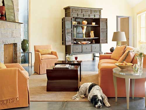
Interior Design by Melinda Douglas
And if peach is back, then we will also start seeing more beige with an orange undertone including warmer orange wood stained furniture. I hope it’s too soon to introduce it in a kitchen.
Interior Design by Charles & Co.
Just like the variations of pink. This past December I walked into a drugstore and saw a collection of pink beige Christmas decorations. I was looking for pink for my sisters new library room. NOT pink beige.
That is a first in a very long time. Believe me, I notice this neutral that should mostly be banished from interior design because it is so rarely done well.
However, obviously if blush pink is back from the 80s, so are the more muted variations of this colour.
If someone wants pink but doesn’t want it to be an obvious pink, they naturally gravitate toward selecting a pink beige. However, tread lightly with this colour. It looks dirty if you accidentally pair it with yellow or orange beige, which we are also seeing more of lately.
In any case, peach is looking fresh and new because we haven’t seen if for a long time. And it’s a sign that things are warming up in interiors. Also, and I’ve mentioned this before, peach is a great antidote if you’ve gone overboard with gray or taupe. Pull in some peach for contrast and warmth.
Curved Sofas
It’s nice to have an off-the-shelf solution for an awkward space. Here is a more streamlined alternative to a standard L shaped sectional or sofa-with-chaise.
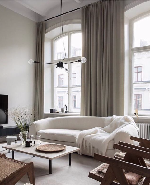
A curved sofa is all elegance. It demands to fill a space rather than being shoved up against a wall. It also brings instant personality to any room.
I have an Aunt who still has a similar sofa in her living room in 80s black and purple. See the theme here? All things 80s are here again.
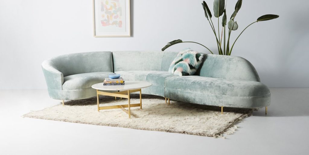
Anthropologie
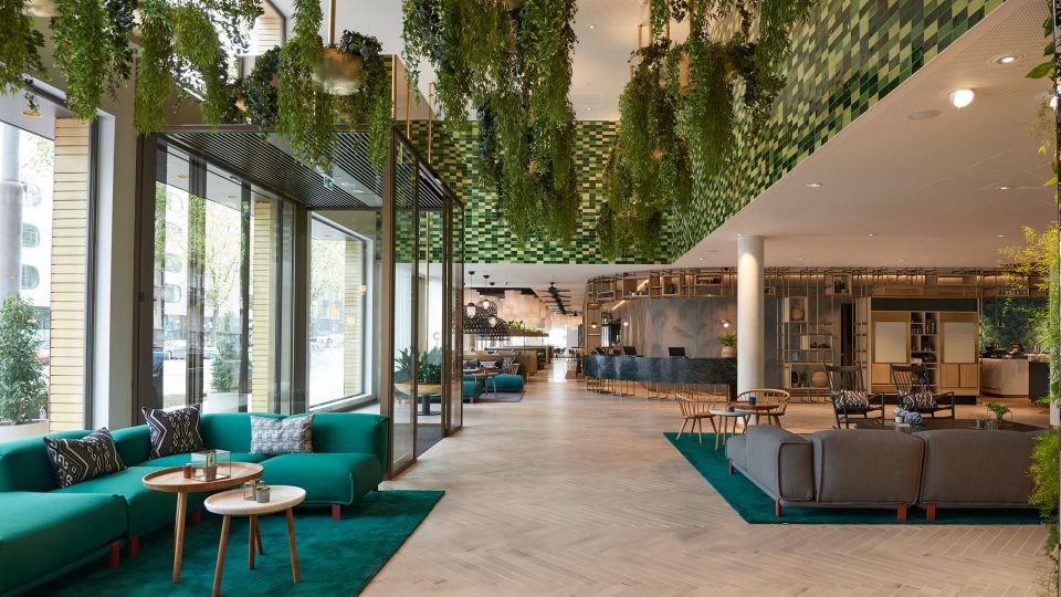
Hanging Plants and Vines in Boxes
Remember those 70s boxes with vines that were built into homes? Well they are back. Here they are at the Hyatt in Amsterdam with this brand new retro inspired renovation. Along with low, sleek sofas similar to the ones I just mentioned.
Interior designers are forever saying they are inspired by nature and this sure brings it inside. A bit of maintenance, but good for air quality apparently.
The New Trendy Sofa (Couch) is Forest Green
Since grey is now considered a neutral that is on it’s way out. Those in the know are choosing a new trendy sofa colour and it is forest green. I talked about that in this post last June.
Hmm. . . is this example more emerald (below)? Maybe so, but all shades of dark, dramatic greens are also trending.
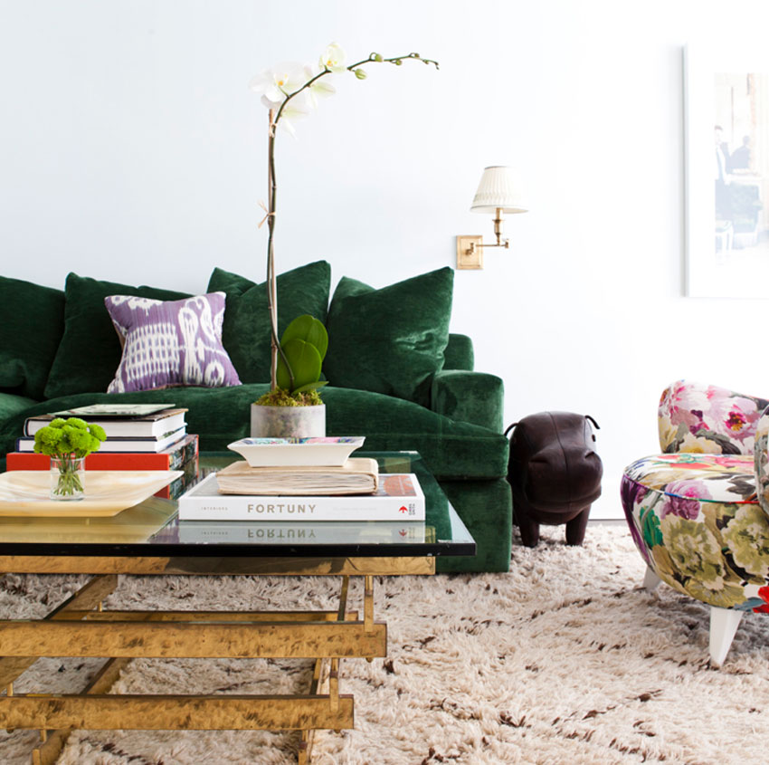
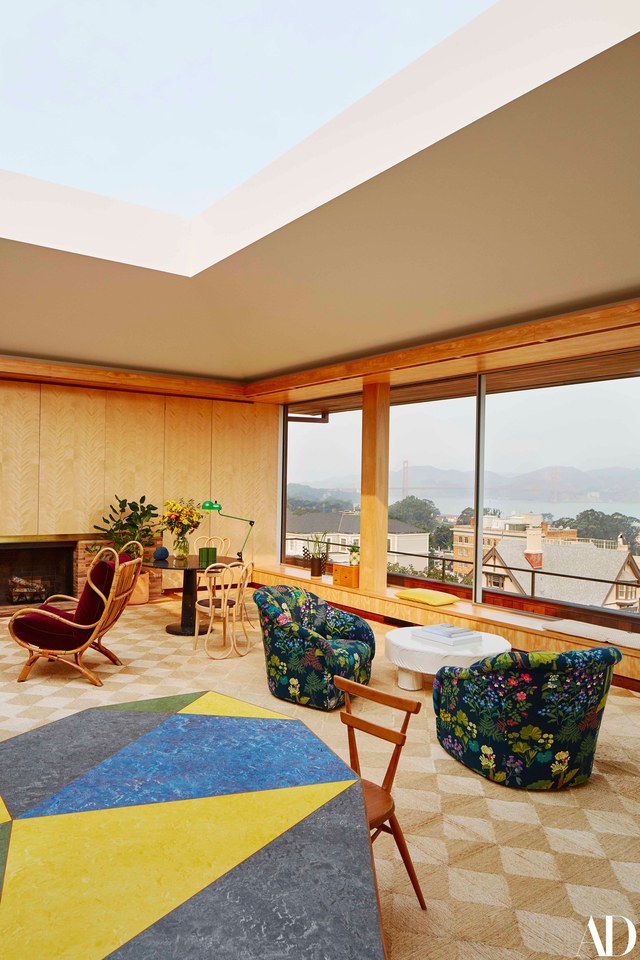
Interior Design by Lilly Bunn
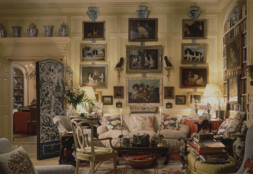
Big Fabulous Florals and Botanicals
It seems like each image I choose for this post includes other elements of trends that are worth mentioning.
The flowered chair in the above photo is a perfect example. Lush florals have been big for a couple of years in fabrics and wall coverings. But lately they have become a “must have”.
The combination of rich colours and dynamic shapes makes floral patterns so useful. Every room needs that multi-coloured pattern that sets the palette. This is why they are a perennial favorite (wink wink).
The trending florals are quite bold, often over sized, with jewel tones, a range of botanical greens, and pops of warm corals, reds and pinks.
And they are not stuck up. They get along great with other patterns like checks, stripes, trellises, ikats and almost everything else.
Chintz
This trend is closely related to florals, but in the context of a specific decorating style.
A sad event in the design world last fall was the passing of Mario Buatta, affectionately known as the Prince of Chintz.
He is known for popularizing layers of patterned chintz and pretty details like fringe and ruffles in the 80s. He did it so amazingly well.
Maria Buatta via Architectural Digest
He was well admired and loved and for good reason. It takes a special talent and spirit to canonize a look in interior design.
It’s lovely that he was around to see the rise of this style again. And it has been popping up everywhere.
Part New Traditional and part of the recent infatuation with all the flouncy details and colour palettes of the 80s. It’s a look that is the essence of homey. Even if in recent years many of us would have judged it to be somewhat homely since it was out of favor for a few decades at least.
Maybe designers are interested in playing with rich details and mixing patterns. And working with reams and reams of charming high end fabrics again. Whatever the reason, this look is all over the magazines and my Instagram feed.
And it’s fascinating how they are finding ways to make it look fresh again.
Via Sarah Bartholomew Instagram
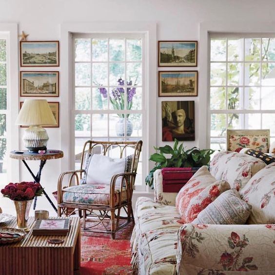
This room above posted on Instagram by designer Sarah Bartholomew looks totally current and fresh. It hits on all the 80s influenced trends. Layers of florals mixed with other patterns. A skirted traditional sofa (with a ruffle even). Rattan. An empire shade lamp. A real plant. Heirloom vintage art. Yet, the room manages to look layered but not stuffy.
Below we have peach and chintz in fashion influencer Alice Naylor Leyland’s country home.
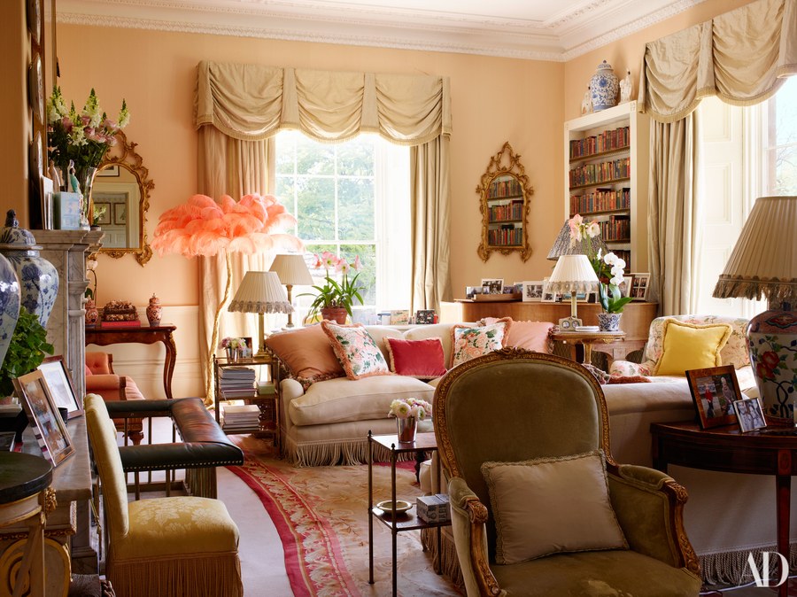
This house has a historical feel, but it exists now in 2019. Are those flamingo feathers? The fresh palette keeps it feeling current.
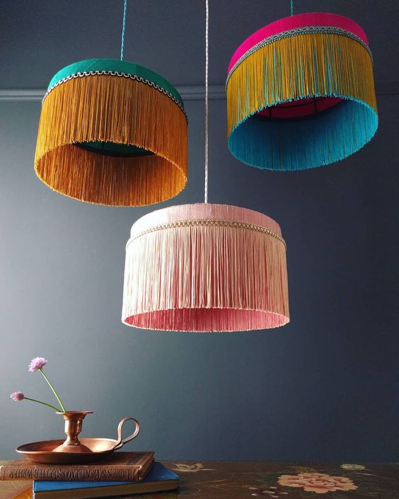
Fringe and Tassels
Notice the fringe on the sofa above. And the modern interpretation of swag drapes. Details like these reflects a romantic return to detail. I’ve been seeing an awful lot of fringed light fixtures like these pretty colourful ones below.
Most of us are not going all out with layers of chintz, ruffles and fringe any time soon. It’s a very high end expensive look that requires a designer for one thing (all those draperies and details!). But I do think elements of this look will creep into many of our hearts and homes over the next few years.
It is fair if you think it is too close for comfort to 80s kitsch 😉 Unless it’s always been close to your heart, it can be hard to love a trend you’ve lived through once already.
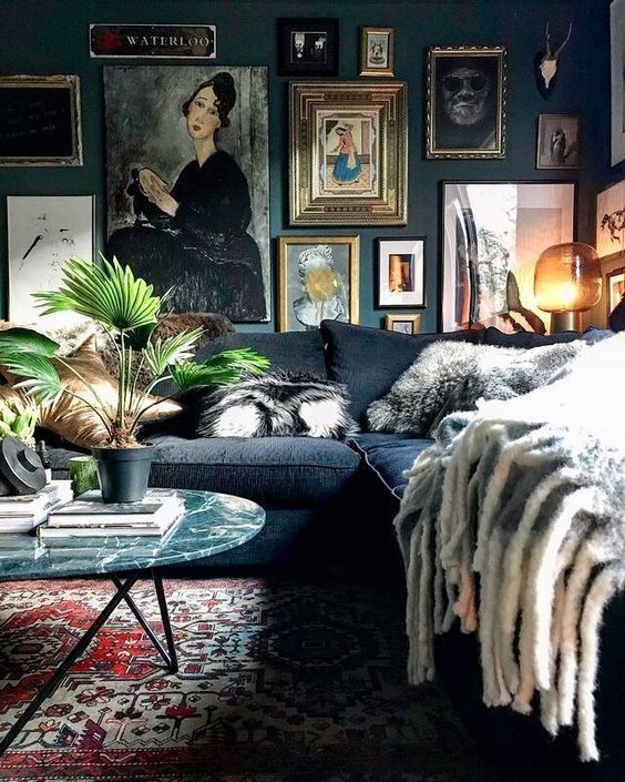
Deep, Dramatic Colours
With black and saturated jewel tones still going strong, more dramatic rooms with deep walls and furnishings are going to be big in 2019.
Love it or hate it, I’m always interested to see what Ikea puts out in their annual catalogue. I find it to be a good gauge of the pulse of what is hitting the main stream or coming soon.
They do employ hundreds of talented designers who certainly make it their business to anticipate what will be hot.
Anyway, this year’s catalogue does feature a decent amount of warm peachy tones.
They also have a big retro floral print slip cover for the iconic Ektorp sofa available. Not sure about this one, but it’s certainly in line with the trends I’m noticing.
And, many of the rooms feature moody deep greens, blues and blacks all layered together like this vignette below.
 Ikea Catalogue 2019
And here’s another example of an artsy dark and dramatic room below. Complete with dark green marble (another trend), vintage art and a large plant. If this room had a curved sofa, it would be a mic drop haha.
Although I think the broadly appealing fresh white farmhouse look will continue to be the dominant look people will go for in their own homes, warmer, richer and more dramatic looks are definitely trending in 2019.
Over to you my lovelies, which is your favourite? Did I miss anything that you feel should have been mentioned? Feel free to let me know what you think!
Related posts:
Beige is Back (You Heard it Here First) Trends Report from HPMKT for 2019


I’m excited that all this orangey oak trim in our house (that my hubby will NOT let me paint!) will be somewhat back in style. I do love the dark green items and that bold floral wallpaper is great! I love jewel tones and so peach will never happen in my house.
Kim, I’ve refinished enough furniture to know that if you REALLY don’t like the orangey trim enough to do some work, you can change it. That trim was stained. Strip/sand the trim down to raw wood (oak isn’t orange) and then either stain it a different shade or just seal the wood (like water based clear poly). You can test this somewhere sorta hidden. It’s still wood for hubby and perhaps a more neutral for you. And maybe a project for hubby, too!
Kim, you should look at the amazing transformation that a light paint/mineral spirits wash made on the orange wood beams in this blogger cabin: https://www.chrislovesjulia.com/painting-and-toning-wood-walls/
Hi Maria,
I love your article. And the fringes!! It looks as if maximalism is in too. I’ve also been seeing alot of botanicals, especially in wallpaper. Thanks for putting this together; it definitely paints the picture.
Michelle
I don’t know if this is a geographic trend or not ( I’m in north Texas) but I have been noticing an uptick in the amount of brick being used in both exteriors and interiors such as fireplaces and floors. Maybe this is related to the farmhouse trend, but also seems to be another nod to the “warmer” color trends, even the the use of more wood in kitchen cabinets etc. I grew up in a home with brick floors and love them, but have rarely seen them in new construction/remodels. But they seem to be trending, at least here, where there are still more brick exteriors than anything else.
I lived in Baton Rouge, Louisiana until recently. Brick exteriors prevail there, and I saw lots of new construction with brick floors, particularly in kitchens.
Too funny. My Mom is looking to do a brick floor in her kitchen – she has a large used brick three-sided fireplace in the center of the house. We went floor shopping today and most of the floors were gray, muted wood look.
So basically everything we were told was out is in.
I’m so over hearing what’s “in” every month that seems to contradict the last one.
I like seeing the makeovers better.
I couldn’t agree more!! Who really cares what is “in”? Are we that insecure???
Good. My old stuff kind of looks new again. The classic English style has never gone out. And I bid a happy farewell to gray and minimalism.
But just say “no” to peach..Sickly non-color that it is.?
I think that curved sofa is also very sixties, and could be considered a modern classic.
At heart, I’ve always been “New Traditional” with a smattering of “Mid Century” thrown in. I mean the Mid Century that’s based on classics; not kitsch.
Although the word “trend” turns me off in any context and makes me want to run, I have to say pink blush has been on the forefront of fashion for a few years. Kate Middleton wore head-to-toe pink blush to her sister’s wedding in May, 2017.
It certainly has, that’s why I’m talking about peach and not pink 🙂 Maria
I have the forest green velvet sofa and deep grey/green walls…and am finally “trending“. As I love these colors, that is a good thing. Never a good thing to use colors simply because they are on trend if one dislikes them. Thank you for the informative post, as always! Peach will remain banned from this house, however.
It’s hard to believe the 80’s have come full circle already, but I think you’re spot on because I’m definitely seeing these trends too. Sigh… I just can’t bring myself to love them. {insert dramatic designer tantrum}
Your posts are always so inspiring and love the pics to enhance what you are saying. I wondered if your Magic Color Wheel is available yet to purchase online.
Thank goodness I don’t have to follow trends .
In the last two years I’ve seen more in and out. Then ever .
Some will take off some will be out before they are ever really in .
Maybe tastefully done and decorated might be the way to go …
But fun to read and see
Thank you
As you may remember, Maria, I just finished (almost) renovating a small rancher I inherited from a couple who built it in the 90’s. They were at the end of the pink/green trend so naturally they jumped on and rode that train! Pinky/peach tubs, toilets, vertical blinds, etc. I can’t imagine what hubs would say if I bought any new peach accessories! Love the post! PS – You know what is hard to find right now? Yellow! And I love yellow accents.
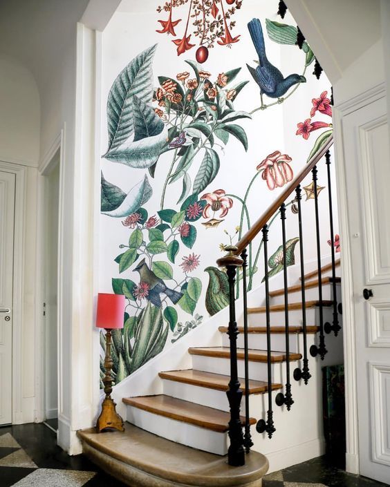
Out of all this what I love most is that wall covering (wall paper?) going up the stairs. I really love that plus I love the white curved sofa. Beautiful. The green velvet sofa is also very beautiful. I could not afford to change to the peach and the dark greens etc. I’m sticking with my farmhouse white and incorporating colors thru white walls and furnishings. As always this was very interesting. The fringe light fixtures are quite pretty and so decorative that I believe could go with several decors. I do love big floral as in chairs and wall coverings.
Thank you again for all the information. It gives us a heads up for the next year/s design and colors. If I were rich I would change out my décor every year because I do like some change and rearranging of furniture, etc! But it is fun to dream also.
I am laughing almost hysterically at all these new trends. Basically, everything that was “in” when I was married in 1980 is back; fern and oak bars, forest greens with peach accents and “orange” wood. You have made my day, Maria, especially since I associate gray with the warmth of a penal colony and welcome a move away from it. Thank you!
This post reminds me of why I am saving my good china that no 30-something wants right now and why I am SO reluctant to paint my cherry furniture with chalk paint. ?
Oh no, no, no…. I really thought the world had learned their lesson from the 80s, but alas it did not. I shuddered when brass (yes, even unlacquered brass) reared it’s head and now seems to be the “in” metal right now. I’m having flashbacks of my teenage home with peach walls and minty blue accents. Then the forest/burgundy combo with ruffles and swags. Atrocious abomination worse than 70s butterfly collars (yep, I wore that too as a kid (grins and shrugs). I really hope that designers using all of this truly are using it in a way that make it appear fresh. I can’t say that I loved any of the examples, but I did like the photo of the room with white walls and original oil paintings. But…I automatically swapped out the floral fabrics for a solid, LOL! Maria, I do appreciate you trying to keep us abreast of emerging trends even if this is one I don’t particularly care for. I love that you seem to keep an open mind and have a way of pointing out the aspects within a trend that are fresh as well as classic. I’m very comfortable in letting a trend pass me by and sticking to what I love. Like you taught us, keep your hard finishes neutral and classic in order to easily update other furnishings. I also like to switch up my accessories every so often and I’m a little concerned that in the coming years, most things will be peach etc. Ugh, feeds full of 80s-esque style. It will be interesting to see how this evolves over time. I’m sure it is a reaction to the gray, white, simple farmhouse and minimalism trend. I’ve really loved quite a bit of that trend as it has lent itself well to “clean and fresh” color. The good news is that design isn’t static, trends evolve and there is always something to learn. Maria, you just keep on doing what you do. Keep educating us about color with great examples. I’ll be here reading.
Yay!! I am over the “farmhouse” furniture and so glad the beach look is far behind us (I think it works well – well if you live near the sea which we do not). Chintz is a look that I thought always had a home in traditional spaces and that new Ikea ektorp cover seems appropriate with its colors.
I like color and have to replace our red sofa. We have gray walls and I am fine with keeping those. We are considering the dark green slip covered vimle sofa (a 2017 released sofa style from Ikea last year) and a high end used contemporary Italian sectional in a color that is like a dusty peach (not sure what this color would be called as I have never considered orange or pink furnishings before). In my perfect world I would love to explore a contemporary style sofa in a demin. We will see!
I wish farmhouse would go. I like it, but so bored looking at it. Love the dark walls and vignettes from Ikea and the whole room with the curved sofa. Now way ever to chintz and ruffles!! Never me. Do you remember Patrick Nagel prints from the 80s? I had/still have several from my 80s college apartment, influenced by the coolest girl I knew then…she had them first and I had to have them! Any chance I can hang them in public yet? Lol
I’m with you, Tanya. +1 for bored by farmhouse!
I was born in the 80s so I had to look up Patrick Nagel. Cool! I’d totally hang one of those in my home! Just one though.
We are obviously on the same page, haha! I was a kid in the 80s so a bit ahead of you. These prints were just fun.
As always, you are on point Maria.
I love the green trend. To me it’s a neutral as in nature everything goes with green. I passed my forrest green sofa that I bought 20 odd years ago onto my mum and it’s still going strong. As you say, buy a sofa in the colour you love and you will always love it. I replaced it with an Ektorp, now with a charcoal marle cover that I will not be replacing with the floral. Navy or green maybe but not floral.
I would love s post on how to bring in the large florals into rooms without them overpowering. I have a bolt of gorgeous fabric that I dont know what to do with. It’s too much patrern for my 2 x 3.5m windows.
I am also loving Sarah Batholomew’s room. It takes me back to my decorating dreams of 25 years ago, with influences of colonialism and Laura Ashley.
I am part of a Modern farmhouse Facebook group and so many are still saying ‘I want to paint this wall grey…’ so I have been sending them all to your page!
Yuck, yuck, and more yuck! Who really cares what is trendy? Decorate with the colors you like in your home, I cannot stress it enough. I hate peach and dark green. I would turn down free furnishings in these colors!! If you like gray as a neutral, who cares if it is on its way out?
I could probably live with a few true peach accents, but apricot would be easier to take. The peach in all the photos seems too yellow for me.
I love rich colors and am a fan of florals. Even the extravagant, dramatic ones are easy on the eyes (mine, anyway).
Natural brick worked its way into the comments here, I guess because of the reference to farmhouse style. I live in the Southwest, the land of stucco. While I like the hominess of brick in home exteriors found in the Midwest, South, and back East, I can’t wait to paint our brick fireplace.
It’s all ugly. :/
We popped into IKEA last week and the floral sofa and chairs sent me screaming back to the 80’s… ? I just can’t go there. Thanks for the ever enlightened view of trends and classics, Maria. You never disappoint!
Maria, I saw the caption “peach” and said “no no no no” in a panicky way. I hated the peach and forest business back in the day and I despise it now. Ugh, to think that the internet will be full of peach or forest green / burgundy combo plus orangey oak makes me queasy. Hopefully, it won’t take over. Surely not. I’m going to go hold some of my blue and white China and take deep breaths. Hahaha it’s my “security chinoissoire”. Regardless, I know that you are delivering the news and I truly appreciate you showing us how those colors and styles are being used in a new way. So, I may not be loving what I’m seeing, but I will keep an open mind. I do appreciate that you have an open mind and show us the possibilities. It looks like lots of people are excited by this trend and ready for change. It will be really interesting to see how this evolves as design isn’t static. Maria, keep doing what you do best: educating us about color so we can make smart decisions even inside a trend. I Love Your Blog!
Haha loved your comment Julie it made me laugh 🙂 xo
You are spot-on: It CAN be hard to love a trend that you’ve lived through already. I saw a pillow at Pottery Barn recently and thought how the colors were the exact same that I had in my kitchen (with “country blue” cabinets) in 1987! It was a beautiful pillow though, and in small doses, done the right way, (definitely NOT on my country blue 1980s couch – that I really loved!) it would probably be lovely. Will be interesting to see these trends play out.
I have recently been drawn to art deco accents and I wonder if something like that is going to come back as an antidote to farmhouse style fatigue.
This!! I’ve always been drawn to Art Deco but especially like the repetitive geometric patterns as a more elegant alternative to all of the ikats, chevrons, and Buffalo checks. Moving in the same direction as the deep jewel tones, marble, lush velvet, etc.
Agreed…it’s the geometric style for me and I am seeing a lot, especially in lighting.
I wanted to chime in here… Art Deco was big in the 80s. Used furniture in the style commanded good prices then. The colors of green peach / pink black were a 30s thing too.
I think people want authenticity in design, layers of meaningful things, old and patina’d things, the warmer metals could be considered a nod to the peachy parade that doesn’t have to degenerate into our 80s nightmares. It feels like depth is what we seek in our trends; history and a story of ourselves in our homes.
Maria it is amazing how fast trends seem to appear and then disappear. I use to love chintz and all of the bright colors! It really did seem homey and so many beautiful homes on the east coast would be filled with them. I don’t care for chintz any more but still appreciate the way this new/old trend is using it. Maybe it is because it relates to a safer happier world that we lived in then.. It has such an elegance! I still have a black floral fabric that I used 30 years ago and it would be right on trend now. What I like to do is make pillows out of it to change up my look and then add accessories. I just donated a floral print chair that I guess would still be in style right now, Who knew? I do however dislike fringed lamp shades so they would never be in any of my designs or my home! I want to comment on the picture with the large floral wallpaper which is lovely but I love the staircase with the iron newel post and the way the stair rails are attached! Love them.
Thanks for this inspiring post! You always knock it out of the park!
Great! My living room is officially back in style! Mine looks suspiciously similar to Alice Neylor Leylands’. Peach, antique satin drapes, mahogany, floral accessories, Chinese lamps. The moral is, decorate in a style and color that YOU like and don’t worry about what is trending. Once you have a good colorist and designer, you can never go wrong.
This post makes me very happy. The warm colour tones are what I am comfortable with in my home, and I do love a bit of floral –on a pillow, an ottoman, or an odd chair, or in a bedroom or powder room wallpaper. (I have all of them.) Now I am wondering if I can put wallpaper up my stairs! I also love houseplants and am glad there are so many to buy these days.
By the way, in the mid 80’s, my parents bought two matching curved sofas in a chintz pattern and had their old tub chairs recovered in pink. They were beautiful and I have pictures of myself sitting on them in my wedding dress and holding babies on baptism day, etc. (I still have the tub chairs ready to recover and wish those sofas were still around. Great on either side of a big round coffee table.)
The pendulum always swings when it goes too far and there has been too much white, white, white lately. I do like the mix above, of white with floral.
Hello My Dear Friend:
As professionals in the design business, it is our job to know what is in and out so a big “thank you” Maria for the update! I love a nice warm toned peach, gorgeous English chintz patterns, richly textured fringe to compliment and some of the big floral wallpapers. Rooms with dark bold colours can be absolutely stunning when paired well. The curved sofa evolving from the 50’s can have a fabulous look, great for a conversation area and engaging a group, Vlaidimr Kagan comes to mind with fab curved sofas. One thing for certain, gray/white monotone rooms are trending down. Can you see me smiling now? Save me some grapefruit! lol
You have done your job well Maria. For I read about these trends and think Oh, trends, here we go again. Nothing tempts me to rush out and buy green, peach and teal, or paint my walls in moody dark colours. I would feel claustrophobic. I know my style and I don’t have the interest to chase trends. I do have an unrelated comment though. I am an art lover and have my pieces framed according to each work. The frames vary, the mat boards vary, the subjects vary and don’t necessarily tie into the colours in my furnishings. I must admit though, I am attracted to paintings in my preferred warm colour spectrum. How do others manage this, are there other followers with this quirk? A piece of art to me is a piece of art – I don’t buy it to fit into my decorating is what I’m trying to say. Do I need to stand in the naughty corner? LOL.
Enjoy your holiday (presuming it’s partly a working holiday) in Palm Springs, and HNY!
I do the same thing with my art. My taste is traditional and realistic, so for me there is no issue of wildly colored abstract art clashing with my decor. I mix oils with watercolors and prints, every one framed (and matted, except for the big oils) to suit the painting. Then I place them in ways that make sense. For example, I have a blownup photograph of my father’s birthplace, which is mostly green and resembles a painting, in my green dining room because it looks good there. It’s framed like a painting too. On another wall I hung an unframed oil painted by my sister-in-law who died 40 years ago. And I’ve treated my long hallway like an art gallery; it contains several oils, some water colors, and a signed and numbered print. Different sizes, different frames, and different subjects.
I’ve inherited quite a few paintings and have bought more. Most young people lack the resources to acquire real art, and when you’re choosing a print to put on a wall, it makes sense to choose one with colors that complement the room. The “frame to suit the painting and don’t worry about whether it goes” attitude is more suited to those who have inherited or can afford to acquire works of art and who aren’t afraid to mix them.
I thought the Pantone colour for 2019 was ‘Coral’, and I love that colour. Viewed an open house today, and the coral bed pillows, and throws were against a neutral background…very striking:) Am I wrong about the Pantone colour being Coral for 2019?
Indeed it is Angela. But every other paint company has their colour of the year too, so there’s a wide spectrum to choose from. I quote from Maria’s Color Trends 2016:
“Here’s how I want you to read this forecast. Trend reports are generally about what’s NEW. It doesn’t mean that the trends I talked about in 2015 or 2014 are OLD. After all, trends in interior design cannot be in one year and out the next. No one could keep up and we’d all be broke trying to do that.”
So my two bobs worth is that if you walk into your home and it makes you happy – a good measuring stick from Maria – you’re right on trend for you.
PS My bespoke coral sofa was made earlier in the year before Pantone announced coral as the 2019 colour of the year. It makes me blissfully happy and will continue to do so for many years to come. Am I trendy? No. Just always loved the color.
Thanks for quoting me Adelaide, that is exactly right! xo Maria
I am wondering about lights: exposed bulbs with a yellow/gold hue. I have also noticed lots of clear glass or smoked glass lamps and fixtures with relatively rounded shapes. I see a few interspersed in the pics above. Any thought on what is going out and coming in? or what will stay? Thanks!
Yes those lights have been in for quite a while with the industrial and farmhouse trends. . . I would say lighting can be trendy because it’s easier to change out than flooring and tile and countertops! Maria
Thanks for your comments Adelaide. I totally agree that we have to decorate with colours we love, and not get sucked into trends. I do like to change things up though, and usually do this with accessories as it is far less costly than a new sofa etc. Smiles:)
I might look for a small chintz cushion in my coral colours, they’ll come onto the market if it’s trendy, and that will be my take on the 2019 trends. It will also satisfy my overwhelming closet love of floral chintz. I am still looking around for accessories, having moved here 10 months ago, so the coral trend augers well for me with as I search for bits and pieces.
What do I think?
I’m NOT going to be “on trend” with any of this!
Agreed! There is a reason the 80’s look went away. Some of this is tolerable and the Buatta look is timeless in my opinion. But many of these rooms look like a hot mess to me ( Bartholomew). Maybe interior design is like fashion – if you did the look the first time around don’t attempt it again.
I’m with Cheryl! I had cabbage rose and lilac chintz bridesmaid dresses with pouty short sleeves in my wedding. I look back and think, “Ugh!” It wasn’t peach, but pink, mauve, and sage green tones. Regardless of this “new” peach and green trend, I’m going to let it pass on by.
Loved your comment about the empire lamp shade. As much as I love drum shades, I find a room with nothing but that shape a little uninteresting. Lamps without drum shades appear to be as extinct as fabulous shade stores.
Where I live in Central New York there is a store called Robins Rarities that sells antique and new lamps, ceiling lights, chandeliers, and shades, both fabric and glass. If they don’t have what you’re looking for, they’ll order it. I’ve been going there for 25 years but didn’t know how lucky we are to have a store like that until I read your comment.
I think regardless of trends, when decorating our personal spaces most of us are going to choose the colors we like to wear and flatter us (Color Me Beautiful circa 1980s, lol). I would never use peach because it looks horrible on me—it pulls the yellow in my skin to the forefront and makes me look like I’ve got hepatitis.
Right on, Maria. Now I love small doses of the rusts and peaches we’ve begun to see as they bring a lot of life to my warm white/ wood/ natural greens and blues color palette. You’re right that the farmhouse inspired whites will be what most of us lean toward, but I love the new moody rooms that are popping up too- wonderful inspiration for those awkwardly low light rooms out of the common living zones. I’ve been taking cues as I work on my daughters’ room, with a deep green accent wall balanced with a heavy dark dresser on the opposite wall and a huge floral painting over it.
PS- I kind of love the English country house vibe that is showing up in fresh ways with the chintz, fringe, moody tones, etc. I loved the minimalist farmhouse look when we moved last year as the intense stress of that year made me crave utter simplicity for a long time, but now we are settled I find a desire for more cozy warmth and comfort which these trends are meeting.
Whoa; with the exception of forest green (as my go to in its place was navy blue) the rest for myself is a feeling of déjà vu!
With that said; regardless that I consider myself a fabric junkie who loves chintz and lavish trims I think I shall be passing this time around, however the larger scale Botanical wallpaper is very tempting. Also; perhaps it is just me but as I do lean towards traditional decor I personally have found it difficult in recent years to find suitable lighting so am definitely hoping that the manufacturers in said industry will be keeping in pace with this revival and offer more in selection with a lower price tag than vintage or antique.
-Brenda-
P.S.: A tidbit about ‘peach’, I even had prescription eye glasses whose frames were peach. Mind you I think they suited my colouring as I received a lot of compliments on them. The lenses if I recall correctly, were tinted a light blue. As they say ‘what is old is new again’ now if it were only the same with age ….. 😉 -Brenda-
I guess I shouldn’t be surprised that my forest green sofa that I got rid of 20 years ago is popular again. When I bought it, there was no internet. So I had no idea of what was trending.
I just thought of green as a neutral. And thought it would work with anything I put with it.
I’m kind of bored with the Farmhouse look. The market has been over saturated with it.
I’ve learned over the years to just buy what you love & you’ll never get bored with it. Also, then your home is a reflection of you. Which is the most comfortable home to have.
Ugg, the swag valences, I just can’t, lol!!
I appreciate any trend that includes colour, pattern, curves, botanicals and live greenery…it all depends on the execution and the edit. Hope to soon see less and less white, grey, greige and would love to see modern farmhouse disappear altogether.
No peach for me—so unflattering to my sallow skin. But I like the other trends, however familiar some of them are. I agree with other commenters that if you buy what you really love (not what you think you love because it’s trendy), you will be able to put together rooms and a whole house that makes you happy. My house doesn’t look like any other house I’ve ever seen because it expresses who I am. We’re all different—and isn’t that wonderful?
Hi again,
Has everyone seen Crazy Rich Asians? The grandmother’s house in Singapore has emerald green moulding and dark green and blue floral wallpaper everywhere. While I can’t imagine this working in my pedestrian home it is an absolutely gorgeous and classic look in the movie. Imagine the home Maria decorated in Canadian Living with the green stair railing. It was like that only the green was darker and there was wallpaper everywhere. Definitely expensive looking and very au courant.
Susan The production designer for Crazy Rich Asians was Nelson Coates. While he was working on this movie he was also working on Fifty Shades. He did Fifty Shades Darker and Fifty Shades Freed.
This guy can do anything. I had the pleasure of working with him many years ago and there was no question he would end up in Hollywood. He goes way out of the box.
I really enjoyed the pictures. I agree the rooms look fresh and pretty. Fresh-ness is an enduring trend! I really liked some of the rooms but trending or a fad? When is there really a trend? Too little too soon to convince me we’ll see fringe or peach last long. That’s why it is your job to try to figure it out I suppose. What about the “color of the year”? It’s meaningless. How about all the brass fixtures and accessories? This is marketing magic. Trends endure through a decade and eventually reach down to Bob’s Discount Furniture. (Then you know it’s probably close to over!)
Maria, it boggles my mind the way designers(I still like you) manage to mesmerize people in the use of a colour, peach(I have more than 200+ tones of it) as your Trend forecast for 2019. You ride the wagon of “social beauty design” and it is all about decoration of a space, and not about the effect of the colour on the human body, but the affect on the space on the human being.
You unfortunately ignore the following: the scientific use of colour’s social qualities, the health influences over time, preventing of self expression, ignore the impact of the visual space on the psychological and spiritual WELL-BEING, and some more. You cant ignore your 5 senses, you cant change it and you cant explain it as a general influence on the human being. No two people in the world can ever experience colour the same. The PNI(psycho-neuro-immunology)effect, refers to the role emotions play in the origin of physical diseases associated with immunological dysfunctions caused by stress. How do you control or advise your customers on the health influences of colour?
Perhaps what I should have said in my post (yet again) is that I’m simply reporting on the trends. On what is ALREADY out there. I’m not getting paid by a bunch of retailers to try and inject peach into the marketplace.
And the rest of what you’re saying about colour and how it makes us feel is totally valid. It’s just not my area of expertise, AND having said that, I think far too much emphasis is placed on ‘Choosing colours based on how you feel’ in residential spaces, which is what paint companies emphasize ALL DAY AND ALL NIGHT. You can be madly in love with peach, for example, but if you suddenly paint it in your living room, where it clashes badly with everything else, you will not love it anymore.
I think the psychological impact of colour is way more important in commercial spaces like a hospital or a spa for example, where you would not choose red and black because they are not calming and soothing colours.
That’s just my opinion, doesn’t mean it’s right. Thanks for your comment. Maria
I’m not a fan of big florals or chintz, but I do love corals and peaches and am glad to see warmer colors coming back. Happy New Year, Maria and Terreeia!
That much Chintz? No. Just no, no, no. I had a 3 piece chintz skirt/vest/jacket combo in 1989. I wore it to job interviews. I wore it to weddings. I wore it to funerals. It was horrendous. I looked like a walking rose garden, but I felt positively beautiful wearing it at the time. I was like a 26 year old “Red Hat Lady”. Flowers were represented on nearly every item I owned, be it purses to underwear. Never, ever again. It was complete overkill, just like Burberry plaid became ubiquitous in Britain and eventually associated with working class youth, thus tarnishing the Burberry high-end fashion houses reputation. In the early 2000’s, “football hooligans” started wearing imitation Burberry plaid. There’s an entire Wikipedia post on it. Who knew? Apparently Burberry. Fashion, design and culture have a fascinating intertwined history together. I often wonder how I would decorate my body and my home if I wasn’t influenced by the social constructs of the day? I mean, I know what I like, but do I like it because someone ELSE likes it too? Seeing chintz in Maria’s blog made me cringe. Almost gave me a little PTSD, lol! I was so young and so influenced by what was the “norm”. You can’t pay me to WEAR anything with flowers on it now. But I still really LOVE flowers & botanicals in vases. My kids look at photos of how I dressed them in the 1990’s and beg to know “MOM, what were you thinking!?” I tell them we all live and learn. We’ve all jumped on the fashion TREND band wagon at some point.
Even further ‘Back in the Day’, when I met my husband in 1982, he had his mother’s 1970’s crushed velvet gold couch and her mint green 1950’s Formica kitchen table as hand-me-downs in his sparse apartment. He also had a water bed outfitted in a crushed cobalt blue velvet bedspread. I clashed miserably with his decor. When we finally bought our first home, he acquiesced to letting me decorate our home in peach and cornflower blue calico, but there could be no florals. I snuck florals in by pasting those wall paper runners a foot from the ceiling. The crushed velvet blue bedspread became the studio backdrop to many amateur Christmas photo cards through the years. It’s a running joke in our family.
How do I decorate now? Neutrals. Everywhere. If I want a pop of fun color, I can get that fix on a whim, with pillows, a funky end table or some stunning art. Accessories are my friend. No expensive tear-out. Maria, YOU taught me this, in the short time I’ve been reading your blog, you pulled it all together for me and helped me make sense of the design world. Your posts are always wise, entertaining, spot-on and sometimes good for a very healthy dose of “please remind me why this is happening again??”
How do you pull together the peach (current) with the gray (on its way out, but not so much in the suburbs). My house still has hard finishes in peach that would be very expensive to change (tile and granite for example). But my furniture, bought before we moved, has lots of gray that before the move I combined with blue. So now what? I know you talk about how to make old designs look “fresh”, how do you make peach/orange and gray look fresh and not like tuscan leftovers?
That would be impossible to say without photos, if you want, send me some pics to [email protected] with Ask Maria in the subject line. Nothing brings grey to life faster than peach or another bright colour really, but if it’s old peach, it would probably still look old, but I would be happy to see if I could turn it into an Ask Maria post! Thanks for your comment Paula! Maria
Would love to hear your thoughts on which you consider the most neutral (cool brown, warm brown, greige, beige, yellow) in flooring when hardwoods or engineered are NOT an option? For many of us that live in hot, humid, hurricane prone areas tile and waterproof luxury vinyl plank are the best options. I would love to see examples of how to make it look as timeless as possible.
Hi Robin, my advice for colour is the same. LVT is what everyone is installing now, even in high end homes. Here’s the post I wrote about colour: https://mariakillam.com/the-new-timeless-hardwood-floor/
Hope that helps, Maria
I didn’t like this fussy, cluttered, over the top look in the 80’s and I don’t like it now. lol.
Here are 2 more trends, I think…built in cabinets seem to be big on instagram…designers and bloggers…and duck egg blue, I swear it’s coming back!! Or was it not out for 15 minutes?
Love the colors in the hotel, with that teal/green. Very modern but refreshing.
I hate all of this retro 80’s look, colors, style. Guess the trendsetters are all created out. Sad.
So delighted to see these timeless traditions in design making a refreshing return! Loving the photo of the Print Room and the Return of Chintz!
I agree that the “coral” shown above is too… meh… but those sophisticated, related, tones of terra cotta, apricot and salmon are looking fresh and sassy. Like you, when Metropolitan was chosen by BM, I thought it was pretty but also wondered if it wasn’t yet another riff on P&L Sea Salt, which has been super popular in the mainstream for years. Thank you for sharing your insights and theories.