Can you layer lamps in front of your artwork? The answer is YES! Let me show you some examples and tell you why layering happens all the time in the world of interior design.
Last week when I showcased the new botanical artwork in my dining room, many of you were bothered that my lamps covered up part of the artwork.
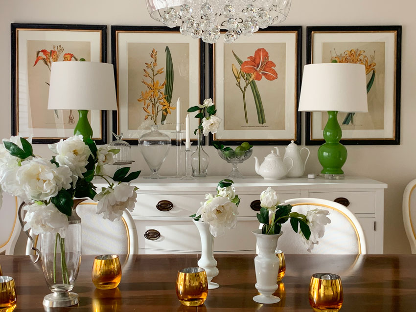
I also received a few comments suggesting that I stack the art instead, so that the lamps weren’t in the way. And I realized, one of the reasons for the suggestions was because I had changed the wall. Prior to this row of botanicals, I had a simple, glam mirror there instead.
Since I wanted to do a little tutorial about the undertone of the neutral background of this artwork anyway, I thought I’d dedicate an entire post to show you that, in fact, layering accessories or lamps in front of art happens regularly in the design world.
Since I’m obviously obsessed with flowers, and this room is filled with them, it doesn’t bother me in the least that part of them are covered.
Here are some good examples of lamps layered in front of artwork:
In this one, imagine how small the lamp would have to be in order to NOT cover the art in any way. And since this is a narrow wall behind the sofa, we would have needed a few pieces of much smaller artwork if we were trying to decorate AROUND the table lamp.
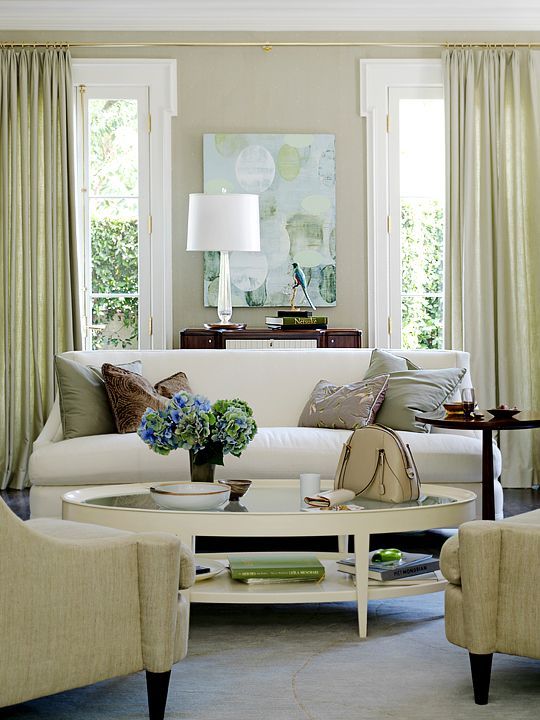
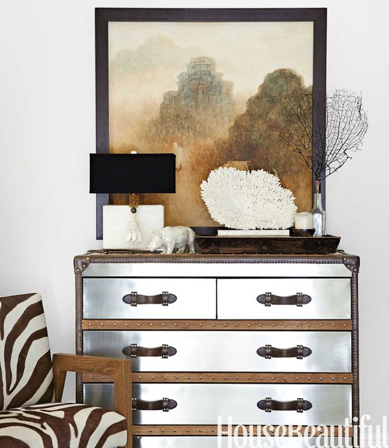
The wall behind this sofa is obviously a huge focal point of this room and the art positioned behind the crystal lamp is perfection.
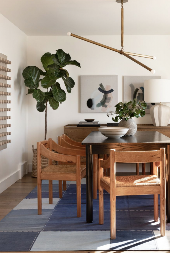
In this dining room, the lines of the base of the lamp are subtly repeated in the abstract artwork which is partly hidden by the oversize lamp (below):
Layering feels luxurious
This art-filled wall with the lampshade on the left completely hiding the piece behind it again gives the room a sense of luxury.
If you only have once piece of art plunked above your sofa, of course it would seem wrong to have one placed behind a lamp.
This artwork not only has a lamp in front of it but coral as well. And it’s beautiful.
Anyway back to my botanicals. I did a little poll on Instagram asking my followers which undertone they were and almost everyone guessed correctly!
But I thought it was a good opportunity to talk about it and give you some insight on how I use my large painted colour samples!
Check out my large painted colour board collections here in Benjamin Moore and Sherwin Williams.
The early bird discount for my Specify Colour with Confidence Spring workshops ends March 6, 2020. Register here.
Let me know what you think! And if you have any questions!
Related posts:
Get Confidence Immediately, With the SW Foundation Collection


Great video, Maria! Looking so cute and perky on this cold January day! I think you can totally layer your lamps against the artwork, as you have done. It is all part of that layered collected look that gives a room personality!
Quick question! A customer can take a Benjamin Moore paint chip into a Sherwin Williams store (or any paint store, really) and get them to mix up the colour that is on the chip, can they not? So if I were to get your samples using the Ben Moore colours, but I happened to like the Sherwin Williams paint, they can just use the colour formula on the chip. Or do they match the colour that I take in to the closest colour they have in their line-up…?
Good news, I sell the same collection in SW Foundations so you don’t have to do that, you can get them here:
https://mariakillam.com/product/the-foundation-collection/
Hope that helps,
Maria
PS. And yes SW and BM match each others colours all day long so as long as you trust the guy that’s mixing the paint, you’re good!
I love the look of lamps and accessories layered in front of artwork. All of your examples are stunning!
And I love your video!! It’s nice to see your bubbly personality coming through in the video, which doesn’t always happen in typed blog post. Thanks!!
Perhaps it depends on the goal. Putting lamps or other objects and knick knacks in front of art demeans the art to mere decoration. It becomes part of a staged vignette, something that is currently in style. If the artwork isn’t all that great maybe it should be removed. I can’t imagine placing objects or a lamp in front of a Vermeer.
I agree with you on the Vermeer (but I had to look it up first to see what you were talking about, haha) and that’s what makes a room well-decorated, because all of those things have been considered. In the Jeffrey room where the art on the left side totally covers up the art, one might argue that maybe the homeowner had it in another room for years and was tired of looking at it, but in this room with all the other gold framed artwork it adds to the layered feeling of the entire room! Thanks for your comment, Maria
I’m curious why you didn’t choose Manchester Tan? It looks like it matched perfectly. Why did you choose the lighter shade? Thanks!
A green beige as dark as Manchester Tan would die in my room with bright colours. That’s why the room is greige to begin with, because it provides a good, crisp backdrop to the brighter colours in there! And it’s why if I tweaked it, I would still be in the same value as what it is now! Great question! Maria
I guessed green beige undertones in the art, but I also see a good amount of yellow undertone as well. I know that trend wise, yellow undertones are a no-no since people tend to perceive them as harking back to the Tuscan trend. What do you think?
There’s nothing wrong with yellow beige in a very pale shade which is what everyone wants anyway 🙂 That is the world of a complex cream which is something else I will be introducing in my Spring workshops and on the blog soon! Thanks for your comment! Maria
The lamps in front of the abstract art examples look good to me–as if the lamps and the artwork merge into one another.
I love layered objects. I need to do more of it. It gives depth and adds interest. I noticed your lamps in front of your prints immediately. I’d push the lamps outward some, so they were more in the center of the outer pics and close to the edge of the furniture. They feel a tad squished as they are now (that’s probably just me though!).
LOL, Jo! And I was just wondering how they would look closer in positioned between the outer paintings! : )) Regarding the beautiful vignette with the sofa, it appears that the swing-arm lamps can be positions so they don’t necessarily obstruct the artwork.
I have done a couple of narrow lamps in front of artwork in a bedroom before. I have stacked objects on a mantel partially in front of a painting before. So, I’ve been aware it’s “a thing” for a long time. 😉
Maria, in your case, I keep seeing something like tall narrow buffet lamps on your buffet. What say you?
Well I like my fat green lamps and the way they relate to the artwork itself and distract the eye from noticing the difference in undertone of the walls and the art 🙂 Good idea though! Maria
So the undertone is green!? My color vision is horrendous. I never get the correct undertone. Frustrating.☹️
Do you have a MAC or a PC? Colour is always more accurate on a MAC so that might be the reason! Maria
I love to layer my decor and use the technique frequently. To me, objects lined up next to each other or to the side of each other looks less inviting and finished. I also love to lean art and mirrors when possible. I’ve even layered leaning mirrors together.
Don’t change a thing Maria!
Can you Layer Lamps in front of your Artwork?
I would say yes. I like a layered look of accessories and pictures if the entire picture is not blocked. If they were thin lamps overlapping a the picture a bit and you could still see more of the botanicals, I think that is more interesting.
Or I would stack the botanicals 2 bottom and 2 top, lamps as shown. Then you get the pleasure of enjoying both the lamps and the botanicals and it makes a grand statement wall.
I’m giving you a “like” on this suggestion just as another option. Maria, did you try many positions before deciding on this one. I like it as is, btw. : )
For me, with no design experience just an opinion, I don’t object to lamps or statues placed in front of contemporary/abstract art work. I have a hard time with lamps in front of a traditional print or painting.
Layering your vignette is perfect – like a well composed still life!
Thank you for being patient and examining the process of layering in an arrangement!! I love it!! Also your lesson of “how to create a vignette” was an eye-opener to me as well!! You make the process of making a home intriguing and fun!!
Bless you Maria, for all the people you help, and all the houses made more beautiful because of your blog!
I totally agree with what Mary said in the comments:
“For me, with no design experience just an opinion, I don’t object to lamps or statues placed in front of contemporary/abstract art work. I have a hard time with lamps in front of a traditional print or painting.”
Nearly all the art is abstract. The one that probably isn’t (that even you mentioned the owner may be tired of) is the only one that would bother me. I think this is why the layering may strike some of us as not being quite right in your dining room. We want to see the flowers without obstruction.
I just read your response regarding layering and while I agree that layering should be used I don’t agree that yours is used properly. When I look at scale, weight and colors, yours doesn’t feel right to me. To me it looks as if you’ve placed everything there while you decide what will stay and what you’ll take away. Plus I don’t like the height of the lamps against the pictures. They almost completely cover two of the pictures which makes me wonder why you even bothered to include them in the grouping. I understand layering but frankly this isn’t appealing to my eye.
I believe vignettes look more interesting when they overlap. Your bright green lamps are refreshing and the perfect compliment to both your buffet and botanical prints. I love it!
PS You’re video was well done. I loved seeing your cheerful self while you explained your thought process.
As a graduated Fine Art Major I also concur with your design recommendations re art work and lamps. We are always looking for a fine balance when we are using art objects whether they be pictures, lamps or decorative items. Lamps today have become design items more than just functional pieces to shed light.
For some reason when I look at your photo, I want to push the lamps centered in the space between the photos. Is there a reason you don’t do that? It seems like it would be layered but cover up less of the prints. Maybe not. Love everything you do and love those shoes!!!
Because they are already at the edge of the sideboard. . . . thanks Sandra! x Maria
Totally YES to layering… and not just lamps. Layering of any accessory adds texture and transforms a space from perfect and contrived to lived in and luxurious. Love the examples used!
Maria I love the layered look and have for years. The art then becomes an integral part of the vignette. In a way it gives it intrigue. If you are a purist and purchase fine art then possibly you would hang the art on a separate wall where you wouldn’t have any layering. Love this post because you make it so exciting and comprehensive!
Keep this up because it is fun and you are so bubbly!
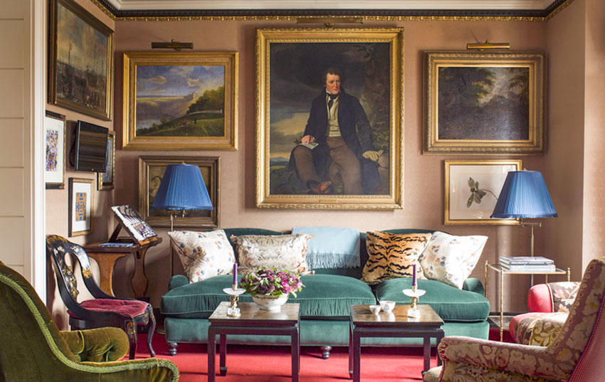
PS Look at Jeffery Bilhuber’s room. I am sure that some his art is fine art but the way he layered it doesn’t disrupt the look. Instead it enhances it! IMHO
Brenda, I bought a rental property, new build, and picked my colour package from the offerings with Benjamin Moore paints/colours. When I took possession I thought the main floor colour was awful, turned out the builder had gone to a different paint company. While the colour was similar, something was off in the undertone and I hated it. The other colours were fine. So, you do need to be careful.
Hi Maria,
The layering concept is new for me, to be honest. And now you gave me a new idea of how to make my room more fasionable. Of course, I use layers, but that’s because I have too many thigns haha..
I find it very amuzing to decorate the room with lamps or vases that will complete the vignettes !! Especially because the design of accessories and lamps is progressing with huge steps .. I do not want to miss any good looking piece.
I am very greatful to you, Maria, for opening new things in design for me!! And I agree, your videos are so informative and contagious, can’t thank you enough for these sparkles of humor and good mood!! ????????????????
Excellent post, Maria!
It would be interesting to see: if instead of 4 prints across, there were 3 floral prints across the buffet.
Odd number, artwork not appearing larger than piece of furniture beneath it, lamps overlapping but not obscuring…
I think it works because my sideboard is white so when I simply had the glam round mirror above it, that side of the room (which truly is the focal point of the entire living/dining room) seemed to be floating in comparison to now. The black framed art defines the room and makes it feel more grounded in my opinion. Maria
Love the video. Thank you!
In your system would the wall in Jeffrey Bilhuber’s room be pink-beige?
Wow would it EVER BE, yes. Hard to look at truly because it doesn’t relate to a single thing in that room but the art layering was too good not to post 🙂 Maria
Thanks for this article Maria. I also like the look of televisions placed on gallery walls with the television partially covering some of the art.
As a former art gallery director and student of art history, I was forewarned about the “designer” approach to art. Real art should always be placed at eye height, and never obstructed. Decorative art is related to a different category. I will readily change my pillows and my decorative objects, but real artwork last longer than a custom sofa.
Some artwork is the focal point – not just the fireplace or the view. When you mentioned looking up Vermeer I recognized that art and design aren’t always on the same team, but we are always friends. ????
Yes, of course one can layer lamps, plants or other accessories to overlap art in a vignette. Your example is perhaps more overlapped than most, but it iis hard for me to imagine why someone would object.
It seems off-balance/wonky to me to have the art extending beyond the console? I think would work in a super eclectic room or gallery wall, but it sticks out to me in this instance, hmm….
Are there guidelines for how high above the consoles the art should hang (or from the floor or ceiling) in these types of vignettes? I think all of these are lovely but in a few of these examples, I have the urge to scootch the art a bit higher so less is covered.
Not really, it depends on how much art you have and where and what is around it. Maria
I, personally, still do not care for the lamps in front of the art work. I realize that a lot of decorating is subjective. Opinions differ, and if you are happy with the look that is wonderful. I only posted to point out my first reaction to the new arrangement..
In the best of the examples, you posted, the art work is not almost complacently covered up by the lamp. And they seem to be more in harmony with the art.
It is always a treat when you post about color and how you feel it should be used and chosen.
I’d much rather see the lamps cover the artwork than to see the artwork higher than the eyeline.
Covering up some of the art is almost inevitable, but I would agree with those saying there is a limit and there is too much. It’s not a huge deal if you cover 1/4 of a larger piece of art but covering almost 50% still looks like too much to me. I agree, stacked would look better with a bit more distance between them so the lamps still overlapped a bit. To each their own though, if you like it that is all that matters. You can’t please everyone.
I think the answer (at least for all artists and lifetime art students out here) is that if it is mass-produced, an illustration, or a frivolous piece acquired for decoration only, then layering is fine, but if it is really art, why would we put something in front of it.