
First, before we go any further, in my last post when I talked about white and cream wall colours being such a huge incoming trend, one of my fabulous readers posted this comment:
“Hey, you didn’t tell us whether you were FOR or AGAINST this trend?”
So first, I’m not FOR or AGAINST, any trend. I know it sounds like I am, because I’m always warning you about the overuse of them, however I specify trend colours anytime it’s the right thing to do.
Here’s what this means. If the right colour to pull your space together is beige, for example, then that’s the right colour for you.
What I’m always striving to do, is warn you against blindly choosing ANY TREND COLOUR, over and over and over again.
There’s nothing wrong with brown, grey, black, white, or cream or any other trendy neutral.
My mission in life is to teach you how to choose the right colour at any given point so that you’re happy with the result.
So just because white or cream has suddenly hit the world of trends big-time, doesn’t mean that your house is suddenly WRONG.
That the BEIGE your house is painted is WRONG.
Just because your house is painted a shade of grey it’s WRONG.
There’s NOTHING WRONG.
Well, if it really is wrong, you’ll either hire me to help you fix it, or you’ll read my blog long and hard to try and figure it out yourself, buy an ebook or two, or attend one of my live workshops so you can become much more confident with all the constant colour decisions you make as a homeowner or designer.
What everyone wants is a look and a feel
However, I would like to stress AGAIN, that what will make you happy in your home is spending your time, money and effort creating a look and a feel.
Painting your house white or cream (or any trend colour) will not suddenly give it a look and a feel if that’s what’s missing. In fact, it might make it worse, if it doesn’t relate to anything.
A look and a feel is achieved with the finishing touches.
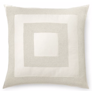
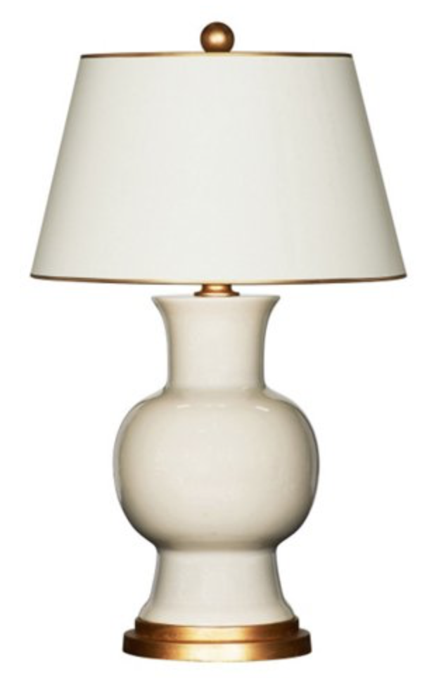
Area rugs, artwork, accessories, throw pillows, and most important of all, table lamps not recessed lighting or the matching set of 3 from a big box store, or the most common light of all, the torch light. You can incorporate all the lighting I just mentioned into an overall lighting plan, however I’m just saying that you need MORE.
Okay so back to this post about MORE cream and white 🙂
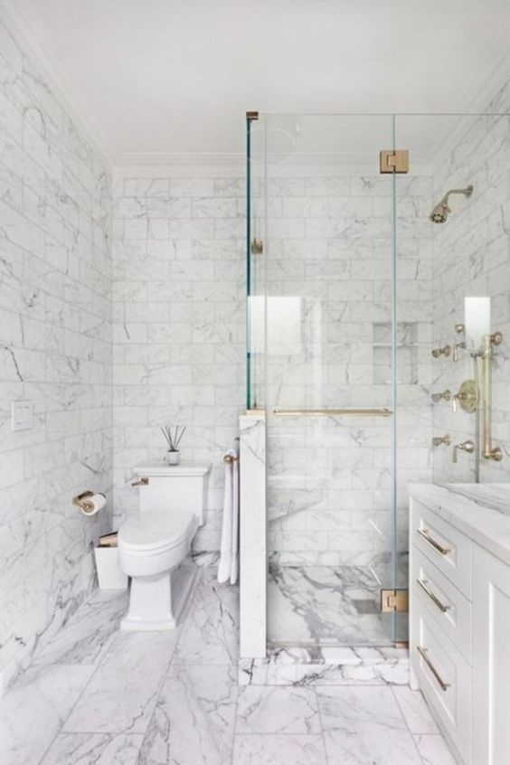
I received this photo from a reader with this question:
This is a picture I pulled from the internet and I’m thinking of doing my master bathroom in the same marble/tile. I love the creamy/yellowish cabinet and ceiling with the white and grey marble. However, after finding your website/blog last year, and becoming a believer, as well as purchasing both of your e-books and large paint samples of whites & neutrals, I thought you could not mix true white and creams together. Looking at the shower wall in this picture gives the impression that the tiles have a true white background and the cabinet is a definite cream. I love this bathroom, it looks so soft and I love the hint of cream. What do you think?
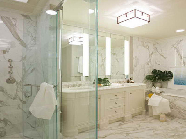
Link bait image, please post the source in the comments if you can find it
This is a great question,
It’s not that you can’t combine them, it’s that if the only thing in this bathroom that was cream was the vanity, it would look odd if everything else was a true white. Then it would look like you chose the wrong white.
This is Calacutta marble which is off-white (vs. Carrara marble which is blue-white) and in addition to all that, the cream is repeated on the ceiling.
Also, let’s break down why this bathroom is so attractive, because it’s more than just the colour.
The millwork is high end and beautifully designed.
The marble is not overly busy and evenly installed.
It’s all the same, adding to the feeling of continuity.
No busy, conflicting patterns or strips of unnecessary accent tile.
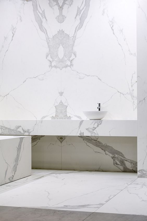
Here’s another bathroom with a similar look and feel but the marble is much busier and blotchy looking.
Here’s a bathroom with book-matched marble which immediately creates a cleaner, less busy, serene feeling!
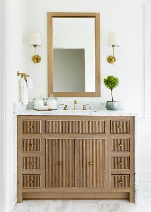
Here’s another gorgeous vanity with a lovely matching mirror and gold hardware and lighting.
As I’ve said in my White is Complicated eBook, you don’t have to worry about repeating true white if paired with off-white. Because they are very close.
Don’t forget the other fixed element in a cream bathroom is often white plumbing fixtures. If you have a cream bathroom, you could still choose a true white vanity because it will relate to your true white tub and sinks, for example.
Hope that makes sense! I thought it would be valuable to identity the key elements that made her inspiration bathroom so inviting because it’s harder to copy a room if you don’t know exactly WHY you love it! This way, you know you need to search longer and probably pay more for marble that looks like the one in your photo!
If you have a question for my Ask Maria post, send me photos here.
I’ve just finished Day 1 of my TOTALLY FULL–at the VERY LAST MINUTE–Specify Colour with Confidence workshop here in Corte Madera!
Joanna Chrobak from the UK wrote a fabulous post about her experience in Toronto earlier this month, check it out here.
Love this excerpt from her post:
How do you see colour like an expert?
I suggest training your eye to see colour in the way that Maria teaches. Her system for specifying colour uses 9 useful neutral undertones that help you categorise the basis of a colour, which then helps you to predict how the colour will work in a space. When you see colour in this way, you’ll be able to categorise every element of a property, including furniture, fabrics, paint colours and natural materials such as stone and timbers into an undertone category.
Training your eye to see the pink beige in the Karndean flooring that your client has just installed (and are referring to as “light grey”), which you now can’t ignore in your design scheme, gives you that expert edge that your clients are paying you for. Training your eye to see the difference in porcelain tiles that have blue-grey, rather than violet-grey undertones will help you make the right decisions for your clients, every single time! That is how you see colour like an expert, with confidence.

Register here for Houston or New Jersey in May.
Related posts:
When to Break the Rules around Choosing White or Cream


One of the key principles I learned from Maria is things have to relate and repeat. When I remolded my bathrooms 5 years ago I made them both while and cream … repeating both colors several times.
I knew (thanks to Maria) that the Gray trend would be over when we would want to sell our home so I kept it the hard finish’s white and cream so there wouldn’t be a ‘time stamp’ by having a color who’s time had passed.
In the many years I have been reading your blog, I never came away with the idea that white and cream should not be mixed… It taught me that indeed they can, as long as they are repeated in the room. In fact, in my living room, I have a white ceiling, white (and grey) drapery, a white (and grey) marble fireplace, white trim, etc.. I also have a cream (and grey) area rug, a cream chair, cream lampshades, and a grey sofa. My walls are pale grey (BM Grey Owl). I combine it with lots of texture, and throw pillows in kelly green and blue. It all works because the white and cream are repeated. I learned from you Maria, and I am pretty darn happy with the result.
Great post that reiterates why you can mix white and cream. I am glad that you addressed the subject of the white bathroom fixtures, ie, the toilet and sink. If you include those two elements in your design then you already have one neutral to consider. I love your no nonsense approach to everything color and design!
The earliest instance (2016) of the cream bathroom pic sent in seems to be from Fuda Tile Stores. Here is the url to their bathroom gallery page: http://www.fudatile.com/bathroom-tile-series.php. It is towards the bottom. A few other sites used the same Fuda Tile tagged photo so thinking that may be the original source. BTW – thought I would mention – it is Calacatta marble (in this case, Calacatta Gold) not Calcutta :).
Thanks for pointing out “why” this beautiful bathroom works, Maria. It’s impossible to replicate a look without knowing that.
Our new open plan rented apartment is a good example of mixing white and cream. The kitchen is white, thankfully! The walls of the adjoining living/dining area are a warm peachy cream, as is the whole apartment. The crown molding, fireplace surround and built-ins are white, which looks fresh and creates a flow with the kitchen. I’m grateful that whoever chose the paint had a good eye. Otherwise I’d be going nuts! 🙂
I’m friends with a woman who owns rental homes for a living, and her current go-to color is Swiss Coffee. It cleans up ANY lived-in space. I’ve seen it work miracles. Yes, it CAN be boring all on it’s own, but you can stage just about any style of furniture with it and add any accent color under the sun, add any metal element. It works with any color wood kitchen, floors, interior doors. Working with client’s trendy gray couch, a fabulous trio of non-matching end tables and a navy blue accent chair? Swiss Coffee becomes your new BFF. Throw some cream, navy and white pillows on that grey couch, add an interesting area rug with a navy, grey, cream and white pattern, toss an inviting soft crochet throw over that navy chair, and voila, you have an inexpensive yet pulled together living space for an open house in a tight timeline. For those internet photos, cream or white is a neutral most any home-hunter can appreciate because it’s a move-in-ready backdrop to their own design esthetic. A picture paints a thousand words.
I don’t remember in which blog post Maria stated something like “I’m not here to suggest you throw out ALL of your furniture, I’m here to help you freshen up your living space”, or words to that effect. That’s powerful incentive to get creative and learn good techniques when you’re on a budget and/or a timeline, whether freshening up your current living space, staging your own home for a sale, staging your rental for photos, or helping a client pull together a look with his or her existing furniture. Whether someone is looking for a place close to work, or a certain neighborhood or school district, with all things being equal, what is that ‘special something’ to tip a potential client to consider YOUR property? My friend swears by elbow grease and Swiss Coffee paint!
Hi! Which paint brand of Swiss Coffee? Thanks!
Hi Rachel, my friend uses Kelly Moore. She has a contractor’s account with the local store. This brand is mostly in the West. We’re in California, so Swiss Coffee is popular here because it goes so well with the architecture and sunny days. Spanish-Mediterranean, Craftsman, Victorian, Ranch, Desert Modern…it goes well on interiors and exteriors, adding a neutral backdrop to most any decor.
I have a consumer account @ KM, so I show the store employee the Costco paint deal for KM paint and they automatically give me 30% off. (You can get a $100 paint e-gift card at Costco for $69.99, so I just show them the deal on my phone and they always honor it by saving me the hassle of buying the e-gift card.)
Sherwin Williams has a Swiss Coffee color that is nearly identical. Sherwin Williams owns Valspar paint, which is sold at Lowe’s, so that’s good quality paint for a builder’s store. If you watch the ads, you can get SW paint at Lowe’s for 30% off. Sherwin Williams also has their own stores. I’ve found there’s always a coupon online for 30-40% at their stores. I use their Extra White Flat for my ceilings. At $29 for a gallon of quality paint with the coupon, you can’t beat the price.
Benjamin Moore also has a beautiful Swiss Coffee in their collection, but it’s a bit more expensive.
Behr brand is sold at Home Depot and they have a nice Swiss Coffee.
I’ve spent a lot of time researching the different paint companies and the quality between the brands. I also taught myself to read the small print on the can, like LRV (Light Reflective Value) and the amount of titanium in the paint. It’s a whole science, and can get complicated very quickly. And we think COLOR is tricky! The base paints all the brands use are a bit different, so when it comes to MATCHING a color BETWEEN brands, OH, that’s where it becomes an art. I’ve seen people crying because they can’t figure out why nobody can match their existing walls perfectly..
Just stick to the higher rated paints out there, pick ONE brand for multiple paint cans of the same color, use the same STORE to mix multiple cans (each store’s paint mixing computer is often calibrated a little differently, even among the same brand) and shop the sales. You’ll get better quality and coverage.
Benjamin Moore and Sherwin Williams are consistently at the top of most lists for quality. Kelly Moore is a close runner up in the West, but often doesn’t make the nationwide list. Do a Google search for best paint brands and you’ll see the winners.
This is a great post! I just redid our kitchen in cream and white, and I LOVE it!
You can find the cream & white bathroom at willeydesign.com.
Thanks, Diana! I looked it up. Click on the picture for 15 Central Park West.
Hope this doesn’t post twice. 🙂 Here’s the link to the 15 CPW remodel. The Calcutta Gold bathroom is at the bottom.
https://www.willeydesign.com/projects/15-central-park-west
Great post about mixing white and cream. But now what about mixing Metals silver gold brass Etc. What are the rules to mixing etals in one room for instance of living room when the stainless steel appliances are visible from the space?
I have that exact situation in our new apartment that I mentioned earlier. The appliances and range hood are stainless and visible from the living area. However, the dining room chandelier is dark bronze, as is the ceiling fan and light in the living room section. The wood floor is espresso. So it kind of gives me “permission” to ignore the stainless, I think. My furniture is dark wood, orange and purple with red accents, so is very colorful and warm. I’ve also accented the kitchen with those colors, so it sort of shows up more than the stainless. My living room metals are brushed brass and dark bronze…no stainless. I’m sure Maria could tweak everything I’ve done and make it fabulous (wishful thinking)! But as friends visit we get lots of oooohs and aaaahs…and I haven’t even hung pictures yet! So I say, ignore and overpower the stainless with color, unless having brushed silver metals in your living room is your thing. I hope Maria weighs in on this question, so you get the professional answer. 🙂
I wanted to comment on the “busy-ness” of the first picture — to my eye, all that marble is way too busy and distracting, even with the quality of the stone and millwork. I cannot even see white vs cream for all the lines and movement. My sense is that marble should be used sparingly.
That is a great question and I’d like to see Maria’s take on metals. I bet she’s very tasteful and fun with them!
Below is a design website that I thought covered the subject very well…
https://www.invaluable.com/blog/mixing-metals/
Here’s their summary: “Tips for Mixing Metals. Choose one dominant metal type. Mix 2-3 different metals at most. Balance cool- and warm-hued metals. Use mirrors to match the reflective feel of metallics. Match metals to your color palette. Use trinkets and accent pieces for a subtle touch. Space out your metals. Mix up the metal finishes.”
My home looks a lot like the last photo in that series, with only one wall painted that dramatic dark color.
I have stainless steel appliances and I do have a modest amount of cool satin silver metals elsewhere in my home, such as picture frames and faucets. My dominant metal is neutral black on all door hinges, door handles and ceiling fans. I warm a space up with a touch of satin brass on decorative mirror frames or a small vase. I have a brass piano lamp and a fair amount of refinished wood furniture.
I change my look with throw pillow COVERS instead of buying and storing a bunch of pillows between seasons. You can even sew your own with custom fabrics, and you don’t even need to know how to put in a zipper!
My white and cream “story” comes from way back in the ‘80s when we decided to wallpaper the living room in our cabin at the lake. (In Saskatchewan, we use the term cabin rather than cottage as we think the term cottage is too uppity! Haha.). I found enough rolls to do the job as well as to have some left over for repairs. The pattern was white and cream. The ground colour was the white (more off-white rather than true white) and the pattern was cream fern fronds. It was gorgeous. And it was dirt cheap. That wallpaper lasted until we sold the cabin in 2014! It was timeless and classic. We filled the room with wicker furniture and the carpet was a speckled light browny beige. I LOVE using white and cream together. It is timeless and fresh and classic and will never get old.
Congrats on the shout – out….you’re worldwide!
Maria,
I love your explanation for choosing the correct white (or color for that matter) for your own home even though it may not be the trending shade! Beige vs grey and feeling WRONG! Color is very personal…you hit the ball out of the park by acknowledging that we all have our own tastes and may not want to completely change everything about our home. In the same vein, you continually steer your readers into understanding HOW to freshen their spaces with the techniques you use to select color. I loved your class, I am a designer, and I have only increased my knowledge of color because of yours!
Love the sconces in your pictures. Can you provide a source?
https://www.shadesoflight.com/products/soho-sconce
Maria, Great quick read! My advice is to alway look at white as a color that allows for other colors to happen! Color is such a difficult subject for people and I think think this article will help many!
“No busy, conflicting patterns or strips of unnecessary accent tile.” Out of everything I’ve learned from you over the years, this is number one!!! I can’t believe how bad most bathrooms with these strips look (to me.) They’re dated within a year. And when I see reader’s posts to Houzz, I see over and over that they have way too many conflicting patterns. Even professionals do that though.
Maria, you are amazing and thank you for this timely post! I generally love white and cream together and choose BM Swiss Coffee walls and BM Seashell trim (ceilings are Silver Marlin). I love the combo in my west and north-facing rooms but in my south facing room, it looks like a hospital! It sounds weird, but the walls are too fluorescent, too light, and too white. If I painted the walls another color, what is a light neutral that would go well with Seashell trim and Silver Marlin ceilings? I like neutral and warm soft colors in both fashion and decorating. Thank you!
Hi Sarah,
Which neutral would work highly depends on photos. There are 9 undertones of neutrals so to pick the right one, I need to see the room. I’d love to help, you can buy colour help through my edesign packages here: https://mariakillam.com/shop-landing-page/#interior-solutions