Crystal called me to help her pull together her new house. This was her request:
“I used to have a colourful condo. Oranges and yellows have always been a favourite of mine, and in the last 5 years, I’ve loved pinks. I hired a designer about 6 years ago, and I guess she was successful at convincing me that colour was kids’ stuff and neutrals were sophisticated.
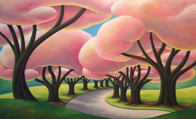
So out with all my stuff and in with the new. Cream, chocolate browns, and greens. I found it bland and lifeless, although yes, very nice and sophisticated. So I started adding pink with Designers Guild bedding, decorative pillows, etc. I also bought some whimsical paintings with colour punches (I’ve attached photos of them).”
I was very impressed by your colourful portfolio and would love your help.”

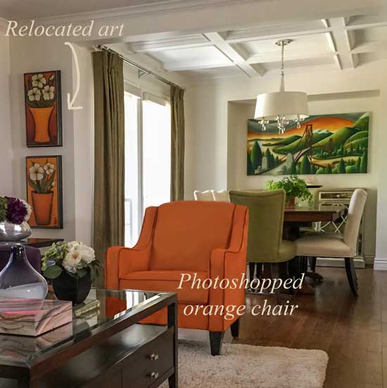
When I arrived in Crystal’s home, I didn’t see her beautiful paintings anywhere. She had only one hanging in her main living area, but it wasn’t immediately visible. The other two were hanging in her adjoining office and down the hallway.
Here are seven steps to using what you already have to transform your home:
1. Your most gorgeous pieces should be seen immediately.
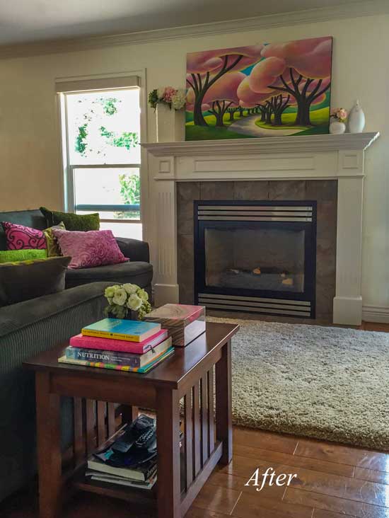
Since those paintings were the pieces she loved, I immediately brought them out, turning them into the focal point of her main living area.
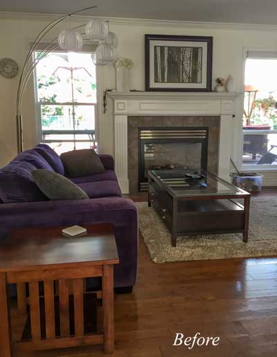
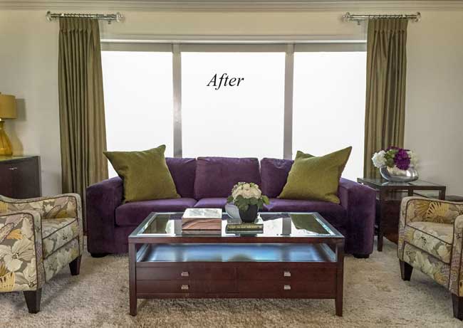
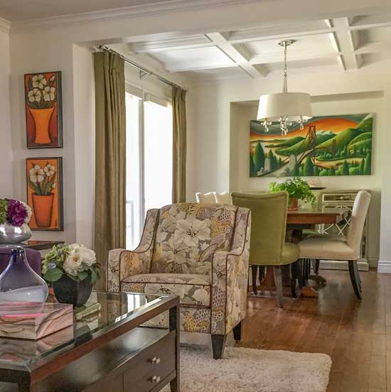
Crystal’s living and family room were located side by side because the previous homeowner had taken out the wall in between them. She had bought a charcoal sectional for this room that currently had the purple sofa (above), but she ended up splitting it in half and installing it in her living room instead (below).
2. Don’t split a sectional. It rarely looks right.
It rarely works to split a sofa that should be together. It looks like you’ve moved into a new space, where your old furniture doesn’t work.
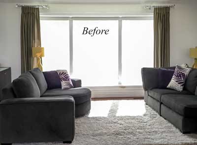
Crystal hadn’t bought new rugs yet because she didn’t know which colour to buy, so she had these shag rugs from Costco as placeholders.
We moved the sectional back together to her family room side, and we were able to bring it to life using her existing Designers Guild pillows to coordinate with her fabulous pink artwork.
Notice how the tree trunks in the art pick up the earthy, brown tile surround and make it fit right in.
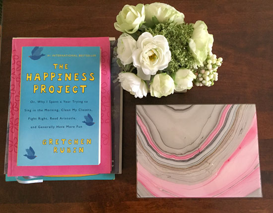
3. A decorative box, some colourful books, and flowers always look good.
I immediately whipped up a vignette on her end table using an existing decorative box, some coordinating books, and some faux flowers:
4. Muted colours die with charcoal.
The sage green curtains came from Crystal’s last condo, but they died when hanging next to her charcoal sectional.
That’s the reason why grey is here, it goes with clean, bright and strong colours.
They were much better with her purple sofa in front, along with some coordinating sage pillows:
5. Low upholstered chairs designed for a living room don’t usually work in the dining room.
The flowered upholstered chairs you see above were moved here from her dining room (below), where they were too low to be used as dining chairs.
She knew they were not right with her existing colour scheme and confessed that they had been an impulse purchase.
6. Use the leaves in your dining room table only for large parties. . .
. . . unless your table is too small for your dining room in the first place.
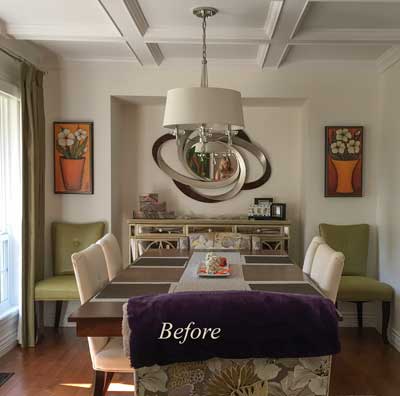
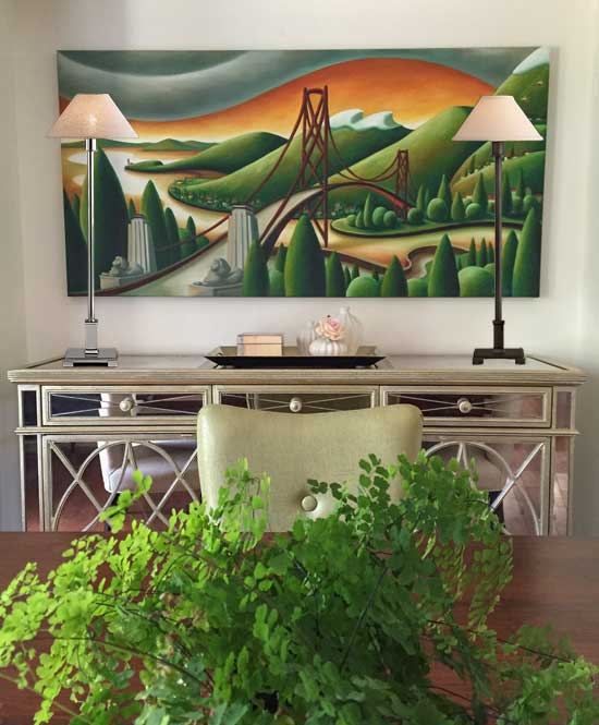
I immediately removed the modern silver and brown mirror from the focal point wall in the dining room and relocated it to the entry. The trellis pattern in the silvery/gold mirrored sideboard clashed with it, making it look too busy. I also removed the orange artwork on either side.
Plus, Crystal’s gorgeous artwork needed to be way more visual.
I also removed two leaves in her dining table. The existing arrangement made the room look like it needed two more chairs on each side and extended past where the dining room technically ended.
7. Repeat clean and dirty colours so your colour scheme looks intentional.
After we installed her colourful artwork in the dining room, the greens in the drapery and the two end chairs looked dull in comparison.
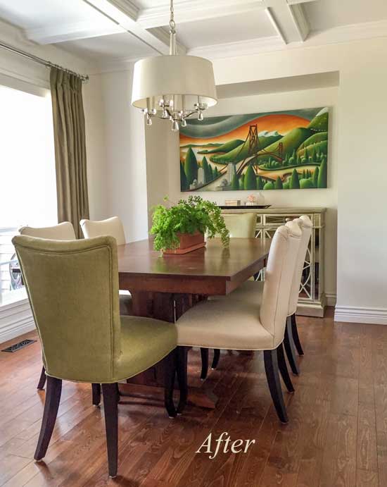
Luckily, Crystal had some potted maiden hair ferns in her kitchen window, which I relocated as a centerpiece (above). Just by repeating the brighter green once, everything looked just right.
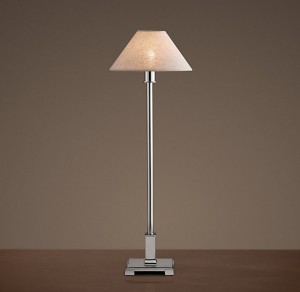
I also suggested two candlestick lamps to go on her sideboard. These are skinny enough to work layered in front of the artwork.
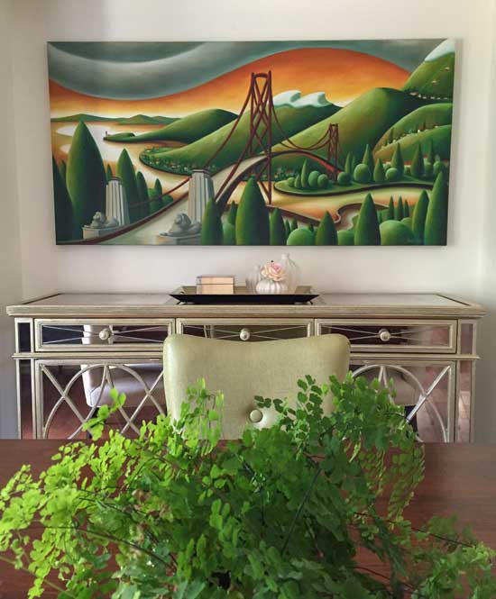
Crystal taught me something about maiden hair ferns that day because I can’t keep them alive longer than one month. She said they dry out too fast if you keep them in the 4″ pots they come in, and that if you transplant them into the decorative pot they are displayed in, they will last longer.
Here’s the grey, yellow, and white flowered chair that needs to be replaced:
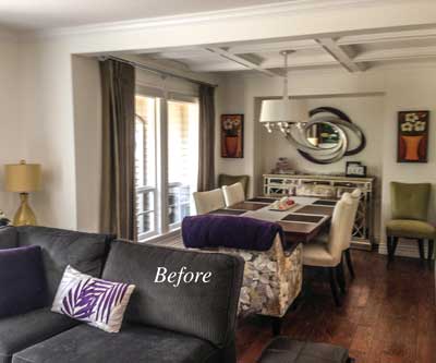
Here’s the before picture again.
I asked Ted (my photography instructor) to Photoshop the chair so we could see how it looked in orange:
I would actually suggest a new pattern to pick up the cream, orange, and purple. Perhaps a stripe! When you have too many solid upholstered items, it starts looking too much like you’re shopping off the shelf at big box stores. There are some items that simply need to be custom in order to have a space that looks properly pulled together.
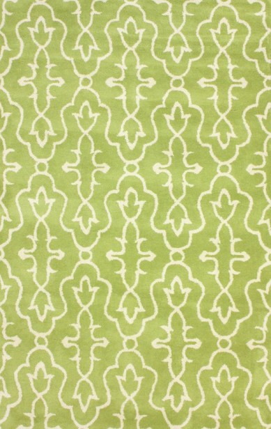
A green and cream area rug in both rooms would help them look unified because they are located side by side:
Then I would recommend the charcoal sectional in the family room be replaced with a cream sofa, or the same purple sofa that’s in the living room. Crystal has pets, so a cream sofa is not an option for her.
So let’s recap, shall we?
If you find the right designer to help you make all your colour choices, you stop buying mistakes that you’ll regret later or worse, permanent mistakes that you might have to live with FOREVER.
If we add up ONLY the sectional and two chairs (not to mention, placeholder rugs, incorrect lighting, etc), I’m guessing they were around $3,500 – $5,000. That more than pays for a designer’s fee. Many times over, in actual fact.
Plus, not only do you save yourself the pain of buying mistakes you’ll regret, but you’ll actually have a plan to get a home that fills you with happiness when you walk in the door!
This proves that the right colour designer is not just a luxury, but an absolute necessity!
PS. I photoshopped both the silver lamp (which repeats the silver in the chandelier, shown above) and the brown one because it relates to the brown in the photo.
Which one would you choose?
Before & After pics taken with my iPhone 6.
Have a great week everyone!
Related posts:
Is Hiring a Designer a Luxury or a Necessity?


Bravo – well done, what a difference!
PS I’d definitely go with the silver candlestick lamps! Light and Bright wins everytime!
I pick the silver lamp- it relates best to the sideboard! Great post and advice Maria! I love that pink art.
Silver would be my choice
Love the new look !
Looks awesome !
I like the silver ,
Wow, what a difference! I love her artwork, and your arrangements really show it off! I choose the silver lamp.
Exceptional use of existing pieces to create an amazing after! Great ideas and great lessons.
My vote goes to the silver lamps. I like how they connect to the mirrored sideboard below.
These are my favorite jobs to do… When you can give them a whole new better look using what they have. Challenging sometimes, but always interesting.
That was such fun to read. Thank you, Maria!
PS I’d choose the brown lamp..it has enough bling with a mirrored chest and a chandelier above, so I’d go with a color that keeps it a bit down, and correlates with a picture and a table.
The silver one also seems to be chrome finish, and I’m not a fan..either real silver, or “antique silver”, or nickel for me…
I guess we’re in the minority here, but my vote is also for the brown. The silver competes with the mirrored chest while the brown brings that colour to the table, down to the floor and around the room. The silver also seems to cheapen the chest somehow.
Add me to the minority…and happily so! The brown is my favorite…goes so well with the art and there’s enough shiny there already… all in all, I <3 your work done here Maria…and the artist! Now I need a walk around my home to make sure my favorite things are front and center! Thank you!
brown for me, too! I like the way the brown stem of the light is a repeat from the art (bridge) and seems to blend instead of the silver, which seems to look like it’s competing in the space with the art and distracts. What a great post, Maria. You continue to teach and inspire us all. Your touches were like turning on a light in a dark room!! xo
I like the brown. Enough silver. Brown in the picture, and table. Love the pictures, add a nice punch. Nice job.
Great article! I too would pick the brown lamp, it looks as if it were taken from the painting, enough bling in room already.
Love the orange chair! I’m in the minority here – I prefer the brown lamp, because it allows the painting to take center stage and the silver seems to compete with it.
Thanks for sharing your work!
Wonderful results! I love that you explain the ‘whys’ behind your changes. I prefer the brown lamp. It compliments the brown tabletop and the brown bridge in the picture; creating the holy trinity ‘triangle’ of decorating.
This amazes me
When I picture hiring a stylist I think of mega bucks and lots of shopping. To see someone actually using what you’ve got- and such good imediate results….I wish you were in Australia!
This was a fun read and you did a great job. I would definitely pick the brown lamp. Just as StagerLinda says, it complements the painting and the tabletop.
Wow! Love it. I also like the silver lamps. Great job Maria!
My vote is silver! Love the art work! Great job Maria!
Great post. Love how you used pieces she already had and rearranged them in order to create a more cohesive look. Love the tip about making sure you see your favorite pieces right away. Will have to use that. I would choose silver. I think they relate to the pillars at the beginning on the bridge anyways and this allows the bridge to shine on its own. Thanks for a wonderful post!
This was great! Wonderful work, and loved how this was written. Your client must be enjoying a breath of fresh (happy) air to finally be surrounded by the color she was missing! That is the best part!
I too go with the silver lamp.
Mary in Ohio
Wow those paintings! Dreamy.
Silver lamps for me too, there’s already enough brown going on. If she ends up doing a stripe as you suggested on the arm chairs, I would love to see a follow-up. What a lovely home she has!
Thanks Maria for showing what can be done with existing decor.
Would a cream leather sofa work for cats?
Not sure but cream leather is a great idea 🙂
Not if they have claws! Learned that the hard way. No leather, faux leather, vinyl, Naugahyde, etc. What a disaster.
Yep, that’s exactly it. If you have cats, these are all out.
Beautiful work! I have to say the brown lamps because they relate to the table and do not compete with the artwork.
Wow! What a transformation! I love neutrals and a feeling of serenity in my home, and even I thought those first photos looked dull. I vote for the brown lamps because they show up better and looks great in front of that artwork. Nice job!
Maria! I bet Crystal gave you a huge hug when you were done. You did an amazing job!
You’re like The Color Whisperer. Ha!!
And I prefer the brown lamp. I like how it relates to the art. Your photoshopping is paying off.
Have a great day!
Super post. Silver lamps get my vote. So glad you mentioned taking the photos with your phone. That’s remarkable.
Hi Deb, The images are also photoshopped to take out the shadows and tone down the light from the window they don’t look this good without a little photoshopping. Still, my iPhone takes way better photos than the little instant Canon camera I used to carry in my purse!
Thanks Maria for being a great teacher with real world examples!
I like the brown lamp because it looks good with the brown in the painting and the wood table. There is enough shine already from the buffet.
I would select the silver lamp. The writing style of this article was excellent. It helped me really understand why you were doing certain rearranging. I think I must be a sister to Crystal because I make the same kind of mistakes! If possible Maria I would love a few more applied examples like this one.
Wonderful changes- can I just suggest that the homeowner spring for a new full length curtain rod for the living room? Those two truncated rods are just a puzzlement..
Those rods are a fashion I’ve yet to understand. Even if one never closes the drapes, they should at least look like one could. However, the colour looks great in the newly arranged room!
I think I like the brown lamp, but if the lamps were switched from right to left, would we all change our minds? Look at the white/silvery buildings on the left near the silvery lamp and imagine it to be brown and vice versa (silvery lamp closer to the bridge iron and the trees).
I love the photo shop of the orange chair – great for us who need more visual reality to make decisions.
Love your work, Maria!
You’re right it does look more silver on the right and brown on the left, I didn’t notice that until you pointed it out!
I prefer the brown lamps. The chrome tone of the silver seems to me to clash with the more muted silver on the wood of the sideboard. As far as recovering the chairs goes – I would make that a low priority. They already pick up the cream, green, and purple in the room. While they might be a little better in another fabric, they’re not bad at present. Priority would have to go to replacing the charcoal sectional.
I get the point about not having all the leaves in the table all the time. But what if you have a drop leaf table as I do? I could leave both leaves down, but then I have a forest of dining chairs sitting around the room (in front of windows and such). One leaf up and one down looks sort of odd in the middle of the room. In that case, isn’t it best to just leave both leaves up? Yes, it makes the table rather large, but it fits in the room fine for dining.
Great information!!!
As mentioned, the artwork is the focal point. I tried to picture myself standing across the room, looking at the art, and I’m drawn to the brown lamps that relate to it.
Loved this post Maria. What a transformation! I’d go with the silver lamp as the brown one almost looks like tree trunks (to me) which takes away from the artwork.
I vote for the brown lamp. The console is bling enough and the brown lamp brings out the dark bridge in the painting. Brown, for sure.
Lovely colors! I go for the brown lamp. More contrast from both the chest and the artwork, and grounds the whole vignette.
the brown lamp pulls your eye into the lines of the artwork – which I prefer
Brown lamp, the silver clashes with the painting. Love the art work. Would like to know where she bought it, and who the artist is?
Dana Irving
Ian tan gallery
The Silver is perfect!
The bronze lamp competes with the lines of the bridge while the silvery lamps allow the bridge and artwork to pop out, as it should. This is really beautiful decorating. Well done
Loved the post and how you created an inviting and cohesive look. Great use of existing pieces.
Would love to see more of these posts on re-purposing existing furniture and accessories. Well done!
I much prefer the brown lamp; it adds warmth and looks more grounded. To me, the silver lamp looks cheap.
Wow, Maria, this is wonderful! I’m always amazed at your work and how you are able to make everything look better.
I love this Maria! I know exactly how Crystal felt because I went through the same thing. When the first designer relegated her beloved artwork to a corner, the red flags should have been going up. Unfortunately, because the advice is coming from a designer you trust what they say. I’ve learned that you really have to shop around. You have turned Crystal’s home into a space that reflects and celebrates HER! That is what a designer should do.
I love this what a difference! This is similar to what I do when staging a home to sell, starting with what the owners have and love and rearrange to create function and style, then adding a few new things to make it all come together.
Neither candlestick lamp. Too tall for the artwork. That painting is so fun and faboulous covering up with those tall candle sticks detracts from it. I understand layering to add texture, but not here.
Maybe shorter candlesticks or silver pot belly lamps.
Nice work, Maria, I would choose the brown lamp, more grounded. The silver is lost on top of the glittering buffet.
I can’t get over the difference made by the addition of the orange chair — both the burst of color and the division of space without visually foreshortening the room(s). Looking around my own combined family/dining room for a way to produce a similar effect.
I’m just going to echo what everyone else is saying, love this post and thank you, Maria! Also, the client’s artwork is gorgeous as are the pillows.
Impressive. I prefer the brown lamp.
Every detail adds charm to this beautiful home.
Please advise the requirements for scheduling an appt.
Thanks Sandy, email [email protected] for more information! Maria
I like the brown lamp. The silver is a bit much with the shiny sideboard. Great job!
What a difference! I’ll just bet she’s doing a happy dance every time she walks into those rooms! Wow, Maria!
Wow, Maria, what a great transformation! Love the artwork, you’re right, they need to be front and center. I like the brown lamp best. Thanks for sharing!
Fun to see the transformation…..I would say the brown lamp….adds a little “depth” and seems to tie in with the table….silver pretty….I just think it blends in with the sideboard.
I like the brown lamp, but I think it looks fine without any.
I do like the Photoshopped orange chair, but the floral ones probably look better with the purple couch, and are OK with the dining room.
How about moving a green pillow to the floral chair and putting some with s bit of orange and Kelly green with olive/chartreuse green on the purple couch, and putting the little purple and cream pillow on the other chair? Might take some doing to find just the right pattern(s)–perhaps something similar to the Dorothy Draper banana leaves print you have in your office could work.
Or add more bright green plants. That always works!
how much fun and what a great job! thanks for the post!
I prefer the brown lamp. It flows better with the painting. My eye relaxes when looking at it.
Brown lamp — it emphasizes the bridge in the artwork and seems to be a good companion with it. It just goes! 🙂 Plus the silver lamp with the sideboard is too much silver; the brown is a good contrast.
Add me to the list of readers who thought this post was informative and educational. Thank you. Would love to see more posts like this.
I immediately voted brown lamps, then started reading comments and started wondering why everyone else was voting silver, wondering why I was seeing things so differently. I mean, silver would be okay, but the brown is clearly the winner. To my eyes. Luckily other brown voters started piping in. Phew!
I’m glad you asked the lamp question; reading the comments has been fascinating. I am curious which lamps you chose.
I immediately thought silver (okay chrome) to relate to the drum shade chandelier but after I photoshopped it into the image I thought the brown might work to which is why I added it. I’m torn. They both work so the client has to choose 🙂
Fantastic, Maria! Love everything! What about using an art light OVER the painting in the dining room? It is so easy for a good electrician to “fish” the electrical wire behind the sheetrock to provide a clock plug, whereby the cord is hidden completely.
Super fun and helpful post, Maria! And what a delightful transformation. Love Crystal’s artwork. She must be smiling from ear to ear. Thanks again and again for the inspiration.
I love the orange chair with the 2 small paintings on the wall and the large one in the dining room. I get what you say about too many solid colors, however; I think a stripe with prominent orange could work as well.
I prefer the dark lamp. The painting is the first thing to catch your eye and the brown lamp draws your eye right in. There’s tons of bling in the sideboard which you don’t see immediately anyway and enough of the bling repeated in the chandelier so I think the silver lamp is a bit of a waste.
Szovinka mentioned that the lamps were too tall and when I look at the picture again, maybe so. The height of the silver one definitely bugs me; the dark one not as much. However, looking again, the height of the lamps is basically the same as the height of the bridge and that looks off – takes away from the bridge. So I think shorter brown lamps (not necessarily short, short) might be better.
I prefer the brown lamp, because it just grounds the picture. Great post, and a great job.
Love it Maria, What a transformation! The pictures are so much fun. They alone would make you smile every time you walk into the room. I think this a good lesson in starting a room design with a focal point like the pictures or even a rug. It is so hard to get this through to a client. They always want to do it backwards. You were able to pull your color flow from the artwork. This is why you are such a good designer and a teacher!
Not sure about the lamps. On one hand I like the silver lamp because it doesn’t take away from the picture. The brown lamp adds a stripe no matter which side of the picture. I guess the silver one would be my choice. Also you could use candle sticks instead of lamps?
This is a very inspiring post and look at all of your responses. Now that’s what I’m talking about! Love you Maria.
I love the transformation! What a difference! Maria, you are so talented…thanks for sharing. I would choose the brown lamp.
Great post. Loved the before & after shots. Fantastic artwork. do you know the artist or where they can be purchased?
Dana Irving
Ian tan gallary
I really enjoyed this makeover! You have me staring at my spaces, thinking about what I could move to gain more impact.
As for the lamp, I prefer the brown, for th contrast with the super-silver-already sudeboard and because it grounds the painting.
Maria, this is a perfect example of why you are so good. What a transformation. And to think, you can even help clients who do not live a distance away by computer and telephone.
who live a distance away. 🙂
Correction: “who live a distance away”. 🙂
I love the art. Can you please, please tell us who the artist is?!
Dana Irving a Vancouver artist.
Love the details in this post! Thank you for such an instructive look at your project.
I choose the brown lamp. To me, the silver competes with the painting.
Great transformation Maria!
The brown lamps looks best to me and I agree with a previous post, a single rod is needed for the living room drapes.
This art is right up my alley; may I ask who the artist is?
I like the brown lamp
Beautiful transition, Maria! Regarding the lamps; my preference is the brown one namely because it introduces a new metal into the scheme of things and breaks the monotony of silver finishes. i.e: The silver leaf and mirrored sideboard, drapery rods, ceiling fixture, trim on the f/place screen etc. Thanks for the lesson. -Brenda-
so either works — guess preference for the homeowner — so what did you pick Maria?
I browsed Dana Irving’s site.
Fantastic artist. Is it me or do others see Dr. Seuss?
I would not use either… They’re too tall. The artwork can stand alone perfectly.
This is my favorite type of transformation. It’s so easy to get caught up in the idea of needing all new everything in a room instead of just fixing what you already have. She could try painting the fabric of her flowered side chairs orange as an easy fix; there’s lots of tutorials online. And definitely the chrome lamp; it ties in better with the dining room chandelier from a distance.
http://tinypic.com/r/331k4f8/8
Well done, Maria!
I’m impressed Maria. The difference you can make with just moving items is amazing. When I look at all the before pics a way to make it work just doesn’t occur to me. I’m crossing my fingers you make your way to the San Francisco area because I will certainly be sitting in your class.
So very lovely …..you did a great job as always Maria !
I love the paintings and how you used them to transform the rooms!
Love what you did, some great lessons/ideas. But on #6 did you mean to say the artwork should be more “visible”?
No this was #6: USE THE LEAVES IN YOUR DINING ROOM TABLE ONLY FOR LARGE PARTIES. . .
What a great before and after post! I like both but think I prefer the silver. Depends on your mood. It all just makes my head spin sometimes! Just when I think I’ve got it, I realize I don’t lol. I’m going to be changing out my kitchen paint color and I believe I need help. So….help!! Lol. I’m a Connecticut girl. You’re so far away!
I loved this article!!! Everything you suggested is exactly what I would have wanted. In my own home I went through the same trouble of trying to have a more sophisticated color palette but then found it too plain and. It really what I love. So I bought new artwork that I love and found ways to make it related with my rooms. Anyway.. I am continually inspired and encouraged by your advice!
I would go with the brown lamps because I think more silver is a bit redundant. With the curtain bar, light above the table and mirror/silver sideboard there is plenty of silver. The brown lamp brings in a little warmth while relating to the painting as well as the brown coffee table and end table in the adjoining living room. I like the view better from the living room where you see all of the brown furnishings along with the brown lamp.
Great job making changes that truly reflect the homeowner and her fun taste in art. I personally would choose the brown lamp as Iike the way it relate to the artwork and sometimes a spot for the eye to rest is a good idea but for this homeowner I would probably suggest the shinier option that also works well with the sideboard and the chandelier.
Would leave only one lamp, the symmetry makes this room too predictable and impersonal. My choice is brown, it less interferes with the artwork.
Good job on the changes!
Personally I will choose the silver lamp because I love bling.
I am wondering if it is possible to remove the green curtains in the living room, move back the charcoal sectional and leaving one of the floral chairs there. Then frame the space with the standing lamp and possibly a ceiling light. The silver mirror can be placed on the wall facing the dining area. That way, the purple sofa can go back to the family space.
Prefer the dark lamp, it blends in better so you can see the artwork.
I loved this post! The changes weren’t super complicated to do, and they made such a HUGE difference! I’m betting she just loves her new space. 🙂 Thanks for sharing.
Great job Maria – especially considering that you didn’t buy a single new thing to do it! I agree about the orange chairs needing a pattern; also because two orange chairs can be too overwhelming to look at all the time (maybe that’s just me though, haha).
About the lamps, I would choose the brown. I feel they will ty in better with everything else. The silver ones would add too much bling, which I think is already a bit much with the mirrored sideboard in relation to the more earthy & traditional feel of the two rooms. The brown lamps would town that down a bit. That’s my view anyway. 🙂
Brown lamps. Amazing transformation. Love the colorful, whimsical art. I would relocate the two small paintings. The ’70’s called and wants them back. Now…Back to my dreary surroundings..;(
One of my all-time favorite posts, Maria. The client must be thrilled to see her favorite art works every day.
After much deliberation, I vote for the brown lamps in the dining area. Please let us know what the client went for.
The transformation is beautiful-and the art is charming. I am fond of whimsical art as well and love how you have utilized the owners furnishings and artwork. The brown lamp works best in my opinion and complements the brown in the painting. I would only use one tall lamp on the right side as a lamp on the left detracts from the art and seems formal against the scene.
Superb job. The slightly more colorful new version is far more lively, sophisticated, unique, and wonderful. First rate work!
I love this redesign! The reason why many designers start from scratch is that they can bring their vision to life not necessarily the homeowner’s vision. Redesign may be a bit more complicated but is more fun and more challenging. It is a back to basics lesson in design…choose your one thing (pillow, art, rug, fabric) that you love and use that as your starting point for color and style. This is a very informative post. Would love to see more of these.
Love the transformation! Her artwork is gorgeous!! I am going to check her out right now. Just beautiful.
Great work! Sometimes it just takes the eye of a designer to take what’s already there and make it look beautiful. Amazing seeing the difference it makes!
I love those paintings. Do you know the artist?
Yes the name is posted in the comments already, Maria
This is my favorite kind of post. So much information that is really useful.
All I can say is, wow! What a difference! You really know how to make it all work when it’s in the right color and coordinated just right. I’ve gotta go back to work full time so I can hire you myself!
Lovely:)
The brown lamp wins my vote. The silver lamp interrupts the artwork whereas the brown lamp blends into the artwork perfectly.;)
choose the silver one because it also relates to the painting;;;in the buildings on the left
my thought too!
First off, what a beautiful transformation with just a few simple changes. And it still looks sophisticated. I love the pops color in the space…I’d be very happy in this home!
How do you know who the “right” designer is? I’m curious what questions to ask to better determine who is right for you and your tastes?
Omgosh! What a visually beautiful
Difference , much crisper and brighter!!! Really like your touches and advice !
Just a wonderful transformation, I’m impressed. As to the DR lamps, I like the brown, sort of fades into the background of the painting and relates to the wooden bridge. Love the paintings too, they’re whimsical and bright.
This my favorite house so far!! The decor is so original and so personal. I LOVE the
colors and how personalized it is,….did i say that already?
I would choose the brown one, because it’s stronger and seems to anchor the look.
Ok, so this is not one of the two options given; but I prefer to not have either of the two color of lamps. I like the photo better with no lamps at all. It’s cleaner and allows the beautiful artwork to really stand out. Thanks for a great and informative article! You worked wonders with these rooms.