
I recently received a collection of photos from a reader who said
“I am not certain if I will retire here or move so I don’t want to do too many drastic investments, yet I would like to update my living room”
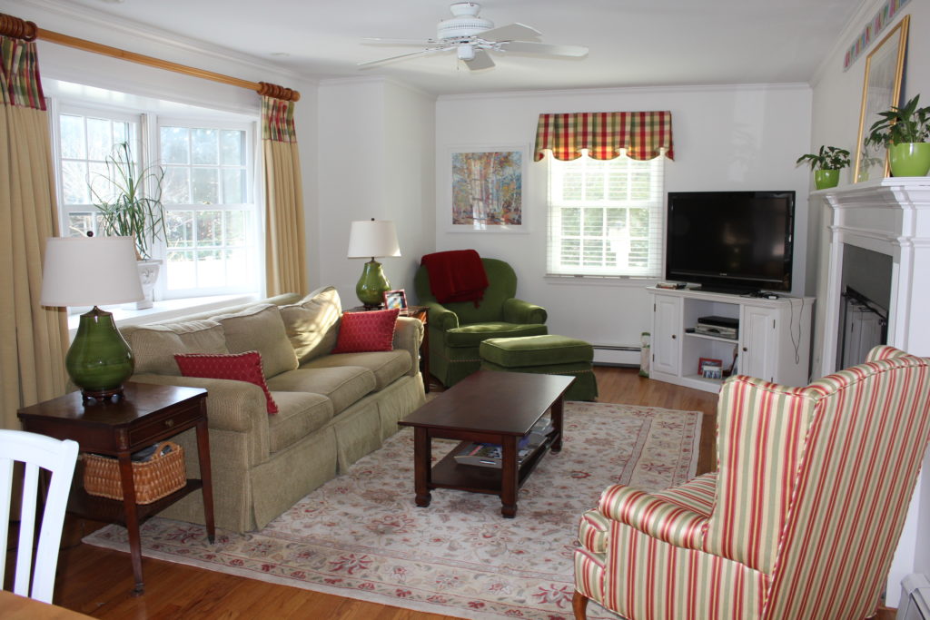
First, before we proceed, notice that her room is pristine and the photo has been taken without flash and in good natural light.
If you want me to consider using YOUR interior in my ‘ask maria’ column, make it easier for me to help you! I will not be inclined to show a messy, badly taken photo on the blog.
So help me, help you!! Clean up your room before you take photos.
Please note, I will ONLY post questions that have NOT been addressed on the blog before. In this case, we are talking about a 90s sofa. So if you are stumped on wall colours (covered that) or you simply need to re-decorate, we will send you a link to our eDesign services if it doesn’t qualify to be in a blog post.
Isn’t it better to have a plan, rather than spin around and wonder what colour sofa to buy? Which pillows are right? Which area rug will make your living room joyful? Buy the right items the first time, that’s what I recommend!
Okay, so the easiest way to start a room refresh when you’re on a budget is with a throw pillow. Rugs are endless and it’s hard to know when you have hit the correct rug. You might end up spending a lot of unnecessary time searching for a rug only to change your mind when you find the cushions to coordinate.
I personally, find it easier to source a throw pillow first. Especially on Etsy where there are lots of trendy pillows in great colours for a great deal! It’s no accident my workroom calls me ‘The pillow lady’.
Here is my readers living room (below). First the white walls are too stark for this palette so we need a new paint colour. And also you can see that her sofa was the ‘trendy neutral’ in the 90s.
The easiest change to make without spending a lot of money in this interior will be to re-cover the wing chair or buy a new chair because the price will be very similar, new drapes and a new area rug.
These are obviously custom window coverings but they don’t have to be. I would also hang drapes on the smaller window instead of a valance.
Make sure you measure the rod approximately 10 – 15 inches past the window and install it the same height as the other rod.
Related post: How to Measure for a Curtain Rod
Lately, I’m into pink. I recently painted my Mom’s sitting room this very shade of peony pink (below). I think pink is coming back in a big way and I hope yellow is not far behind it.
In case you worry that your husband will never accept pink into your home, consider this: there were teams of builders painting exteriors and interiors pink during the 80s and I’m guessing they were mostly men, so don’t worry! As soon as it becomes as common to see as grey, your spouse will accept it too.
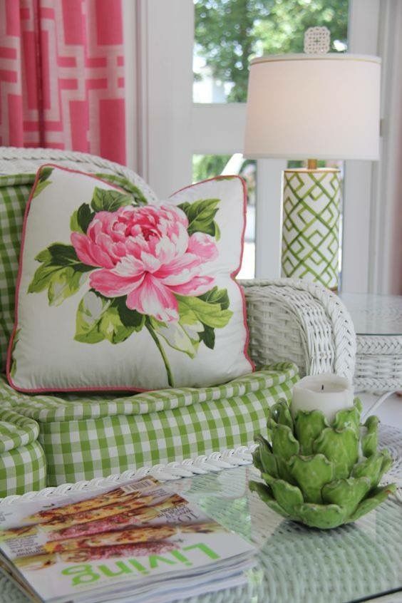
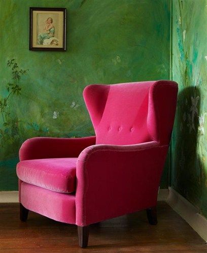
I found this pink and green chair along with some peony pink cushions and a more muted area rug to relate to the existing sofa. Since most greens go together, it’s okay that the sofa is much more muted.
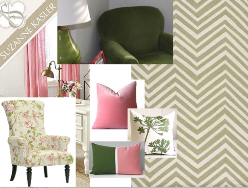
Peony Drapes | Chair | Pink & Green Pillow | Green and White | Pink Pillow | Chevron Rug
My reader could potentially keep her existing area rug because it has the same shades of pink in it, depending on her budget.
Since we’re doing pink accents, we could paint the room pink too, this is BM Pink Bliss:
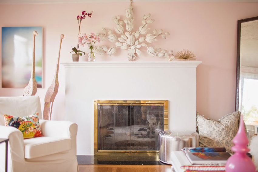
This blogger loves pink, see her full home tour here.
My reader could use a “hint of pink” blush colour like this:
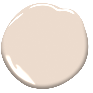
BM Bashful 1171
Or, she could go with a slightly deeper blush if she’s feeling bold like this:
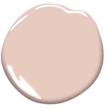
BM Rosetone 1186
Or again, she could go with a neutral ivory greige and keep her options open for changing up the accent colours frequently, like this:

BM Ballet White OC 9
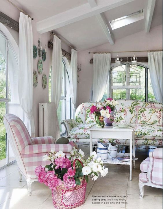
Here are some more pink and green interiors for inspiration:

via Pinterest
via pinterest
I’m at High Point this weekend and so the next email you see from me will be my 2018 trends report! Follow along on Instagram for all the photos and updates this market.
I have one space left in my San Francisco Specify Colour with Confidence course. We were sold out yesterday but we had a someone that couldn’t make it so we still have one seat left. Register here.
We still have a few seats left in our second Chicago course, the first one sold out almost immediately, go here to register.
If you have a question for my Ask Maria column, email me here.
If you would like a room refresh, purchase our ‘Get me Started’ package here.
Related posts:
Ask Maria: Is my Fireplace too Earthy for a White Kitchen?
Ask Maria: About Carpets, Oak Furniture and Dining Chairs
Ask Maria: I’m Worried My Area Rug is Wrong? (It was $10,000)


Just a note about wing chairs. A fit-like-a-glove custom slipcover will cost 350.00 plus fabric, which can be anywhere from 80.00 for the chair and up. Slipcovering in this method makes the cover look like upholstery, not like Grannies slipcovers at the cottage, and not the loose Shabby Chic — unless you want that look.
I’ve got lots of examples on my website Designsewlutions.ca. If you want to talk to a slipcovering pro, email me and I’ll pass it along to one of my colleagues in your area.
Maria , I would get a cover for that sofa in a nice fresh color where it would work with the white walls . The couch is so tired looking
Chair gone .New one
Bring in fresher drapes .
Even though the room is clean it looks tired .
She could paint those end tables .
It screams to me to freshen me up .
I loved your suggestions but not keeping the couch as is .
Maybe making it more airy with a lighter weight window treatment .
Thanks enjoy your Blogs .
Just wondering about sofas. You say to buy one in “color” but then it seems you think most colors to be dated. I am actually considering a new sage green sofa in my house as I feel green is coming back- even sage. What is the perfect neutral sofa color in your opinion. I can’t do a pink or yellow- would prefer all color like that to be in accessories. It seems beige and charcoal are also out.
Hi AJ, well in general all colours are eventually considered ‘dated’ at some point, however a ‘colour’ rather than a neutral, will usually last longer than the ‘trendy neutral’ of the moment. Sage green is coming back in and it’s early stages so you’re good on that shade! Maria
thanks Maria! and after reading your report from Highpoint I am even more excited as I already picked all the trending colors for my palette. Doin sage-y blueish green, terra cotta/orange/coral-ish and some gold. Yay! that usually never happens for me. I decorated my old house in all the Tuscan colors just as they were actually going OUT of style but there was no internet for research.
This is wonderful! Almost makes me wish I still had my ’90’s green sofa! The plan looks so fresh (there’s that word again!) What a great post!
Love pink with green… and the suggestion for a new chair. That raspberry one is so fantastic! Thanks for sharing a real home with us 😉
You should provide her with an alternate palette, something not pink. If she is married, her husband would never allow the pink. And something less flowery.
Luckily lots of men are secure enough in their masculinity not to be troubled by such things as a wall colour! ?
true! my 13 year old very sporty boy loves pink. When given the choice he always goes for the hot pink option. However I do think maybe a less feminine choice would probably be helpful because its not so much the colors as the vibe-its very female. Its gorgeous to be sure though.
I really appreciate your styling and room refresh tips. Another of your recent post, “Tablescapes for Dummies; The Beginners Guide,” was also extremely helpful, and made me think you have a great topic for another e-book, one that I would certainly buy. I might not renovate every year, but I certainly would refresh my styling more often if I knew what to do with all those great accessories that come out every year. Thank you.
Maria, Nice combination of colors! I guess my first question would be to her “are you going to keep you green gold sofa”? and what would her budget be. I personally do not love pink for walls although it is kinda the trend now. To me it is trendy and reminds me of my aunt’s house many years ago with doilies everywhere! I know trends come and go but I guess I have the stigma of “old lady”. Lol. I like the idea of adding pillows to bring up the colors in her rug. She could also layer her rug, buy a new glass top coffee table and add a different end table. Recovering her wing chair is a good idea but maybe in an animal print piped in a rose. (There are many animal print in different colors). She needs a throw on her sofa along with the pillows you suggested. Or even the throw could go on her green chair. I would do floral drapes or even a two tone color block which would lol m allow her to change sofa pillows somewhere down the road. The accessories can certainly be shades of pink or green and add greenery to keep it from looking to sweet! I like ballet white for the walls and the color in the accessories.
I love pink and green together! It’s a classic. My husband would never go for this but my daughter loves pink and green. This post can offer inspiration for a beautiful, feminine girls room. She wants the wildest color of pink and green walls and it’s been a struggle for me to find a balance. I will show her these pictures. Thanks for the beautiful pictures.
Oh my,. My tablet was acting up and I could hardly see what I was writing so pardon the letters I should have deleted and I spelled too with only one o. Sorry. Loved your post and hope you have a good time at market!
Hi Maria,
What color is the green on the walls in the photo of the green walls with white built ins, and pink furniture. That really appeals to me.
Rebecca Linehan
PS. I loved taking you class in Tampa, FL
Maria has it going on. Maria helped me last year to color coordinate my walls with my furnishings in my dining room, kitchen cabinets, and covered porch. The results were absolutely perfect. The key is that you do have to like what you already have. I think that the green couch is nice and will look really nice with her suggestions. The striped chair will also look great just the way that it is with the new rug and new wall color. I have ballet white in my dining room and to me, it doesn’t look pink at all, but that is the undertone that works well with a lot of dark red in my room. Once you start changing things out and slip covering it no longer is a refresh but a partial re-do that you will never be happy with (in my experienced), Better to do the refresh like this in my opinion.
Actually, the chair that Maria picked out would be great. Sorry about that.
Love your suggestions for her room! If she does it, it will be gorgeous for not spending a ton of money. Pink Bliss walls too 🙂
Hi Maria
I love the room with the fireplace and your reader’s lovely room would look even nicer with your suggestions.
I’m wondering what makes a colour like Bashful different from pink beige? Or are they sort of the same, it’s just that in this case you are intentionally choosing the pink?
Thank you!
I think you may have inspired me to paint my living room pink! I’ve been wondering what to do since it needs repainting desperately but I can’t afford a new chesterfield (which is limiting my options). Pink might just be the bridge I need until I can make bigger changes. Love the inspiration photos. There’s something about green and pink together that seems so happy.
Loved the article and your suggestions. I do find it odd that some leaving comments are critical about your choices and provide their own as if they’re better. After all the reader contacted you for advice! AND, what husband dictates the color of the living room, or any room for that matter in this day and age. Perhaps that is where the change is needed!
I have to agree with Bill on this one. Flower prints and pink aren’t for everyone and just because pinks look lovely with green I wouldn’t spend all that money on changing a good quality sofa or arm chair (good quality furniture is expensive!) I would leave the furniture and update the window treatments to feel lighter and more in line with the wall so that they aren’t “matchy matchy” then updated the coffee tables and rug with something lighter and in subtle or more complex greens which they already seem to like. Then add the pinks and whites and patterns just in the throws and pillows so that they cheapest investment is the most trendiest one that is easily changed…
Love your blog Maria!
There seems to be a universal lack of understanding by many bloggers, designers and decorators that when there is a heat run that runs along a wall below a window, it must never have fabric (curtains) touching the cover. The safety info for this type of heating system states that fabric should be a minimum of 10″ from the top or sides of the run, and should never drape over it. In some areas of the country, home insurance rates, and/or fire coverage can be adversely impacted by drapes coming into contact with these runs. A quick google will show many examples of home fires that began with drapes or furniture fabric coming into contact with a heat run. This homeowner has opted for blinds and a valance, which is both safe and wise. It should also be noted that the heat will rise up behind long drapes and not out into the room. Drapes are fine in the warm months, but would need to be removed or swagged up out of the way when the heat is running.
I’ve never had a problem with registers under drapes. . . I have drapes against mine. . . but I have hot water heat. Maria
That is true of electric baseboard heaters. But hydronic baseboards run at a cooler temperature and it’s fine to have drapes near them.
Floor vent deflectors move the heat to the front and prevent it from going up against the window. Google ‘floor vent deflectors’ to see some.
HI Maria,
Great Post as always…
When working with my clients, especially male clients, I find when I use the word “ROSE” instead of Pink it garners a little more acceptance….
Happy Spring!
Denise
I would never use pink and green in a living room. Only in a bedroom.
I had a similar problem and I went with earth tones and greens, but it looked blah, and then I added teal, chartreuse, aqua and gold in some ethnic type throw pillows and accessories and that did the ticket. Looked way fresher and alive. My grandmother had a similar color scheme for 40 years with real wood paneling and tons of windows in a custom ranch and it always looked classic through the years, so that inspired me and allowed me to use some of her things I inherited.
Lucky for me, those colors were “in” when I needed them about 5 years ago, and they still seem quite popular.
As pretty as your suggestions are, that could be a way to freshen the room without going too obviously spring-like or feminine.
Not that I dislike a subtle pink blush paint, but it can be a challenge to work with if you don’t want to go the authentic Victorian or Art Deco route (not the 80s version). If you watch BBC shows, you quite frequently see it in period interiors, used in hallways, utility rooms, baths and parlors, even paired with heavy wood paneling in manly smoking rooms. The old Sherlock Holmes series had his whole apartment painted in that color, and it didn’t look frilly or feminine at all. It tended to be a bit dirtier and more peachy though. Part of its appeal is that it reflects light and photographs beautifully with skin tones.
Would love to see what she does. I hope she sends pictures and you post them!