
It’s 5:00 AM and my phone pings with a text from my Mom:
“Come for coffee now! I’m up but I’ll nap later”. (Except she writes it in Finnish, I can read it but do not ask me to have a conversation in Finnish, that’s where my dual language ability ends).
“Ok” I text back, and jump out of bed, slip on my Ugh boots and a jacket and drive over.
Two minutes later, we’re having coffee in her small sitting room adjoining her kitchen.
A little while later Mom mentions that the colour in this room is too cool. We painted it turquoise three years ago when her house was built because it matched the area rug we bought at the time, but she much prefers the hot pink colour upstairs in the living room.
We started talking about what colour we should paint it and she laughed and said “It’s funny how quickly we get tired of what we have and want a change”.
Did you know that People magazine is the most read magazine in America? It is read by 43 million people, one in every 5 americans?
I’m doing a media course with Rachel Hanfling who has been a producer for the Oprah Winfrey Show, etc. and she said one of our pieces of homework every week is to read that magazine because it represents what people are interested in and talking about and they could be used as touch points when writing articles, etc.
I decided I didn’t want to have a million people magazines floating around the house so I subscribed to NEXT.
Could someone tell me how to work it properly? I go to bed at night and start flipping and all it does is spin and tell me it’s downloading and most of the pages are blurry and I have to wait. This drives me crazy.
Anyway, now that I’m flipping through magazines that I don’t normally subscribe to because I’m so home decor obsessed, I’m looking at all the colour blocking happening as well as unusual colour combinations.
It’s so great how fashion introduces us to new combinations, we get used to them and suddenly want them in our homes.
Rust and lavender?
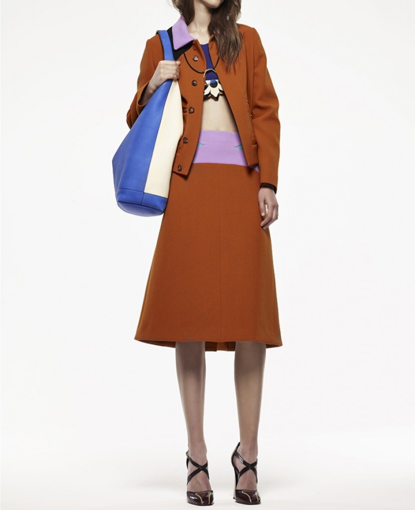
{source}
{via pinterest}
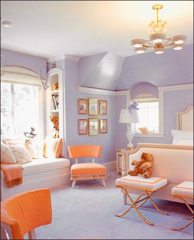
If it’s to be found in home decor, the orange is usually cleaner and brighter, like this image (above).
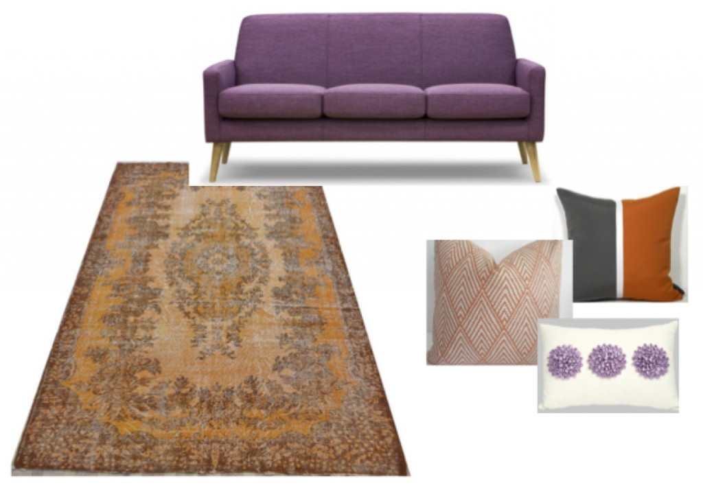
But what if you had a rusty sofa or area rug from the brown trend and wanted to bring in something new and more fun?
Then you either get a custom colour blocking pillow made (like the charcoal and orange one below), or find a perfect fabric that brings in the colour you want.
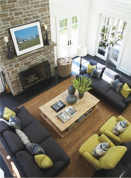
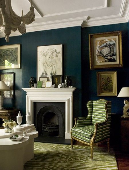
Charcal and muted green?
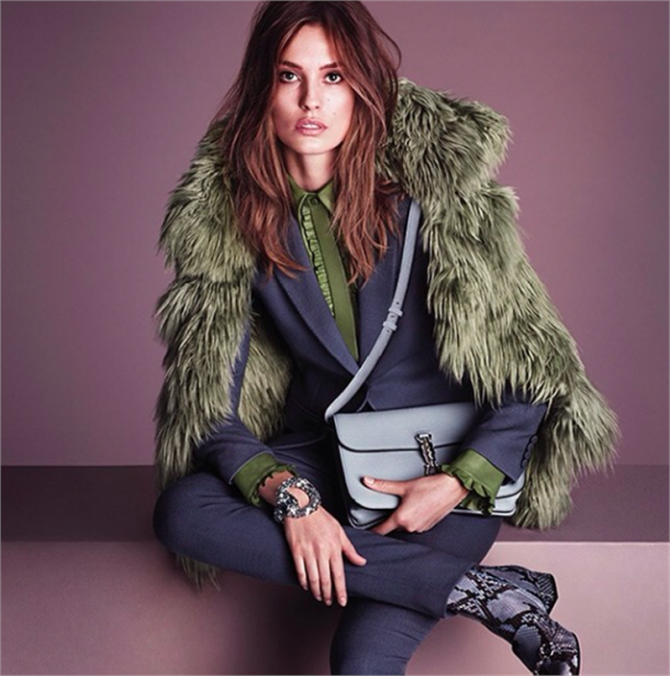
I was also struck by this combination of charcoal and muted green (above) so I thought I’d see if I could also find a room with these same colours.
{via pinterest}
Again, the green was brighter in most of the photos.
{via pinterest}
 {via pinterest}
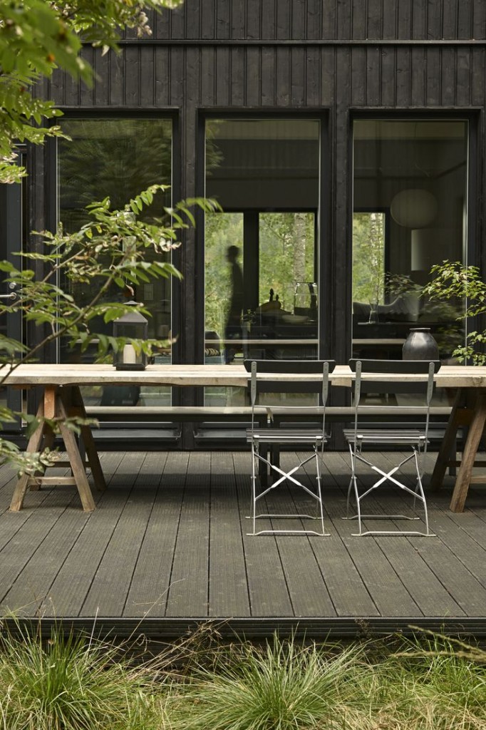
Here’s the combination outside with green plants. But this doesn’t really count unless you fill your living room with them.
What if you have a earthy pink beige stone fireplace (below) that you’re not going to paint anytime soon and you want to bring in some clean colours?
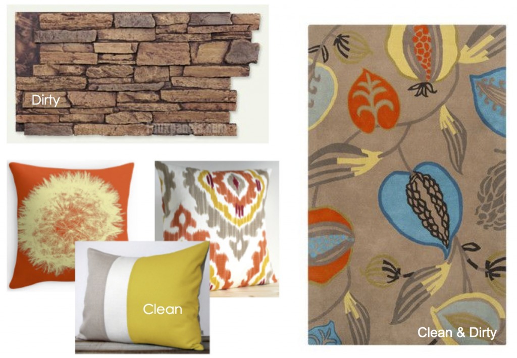
Then you have to find either an area rug or fabric that pulls in your fireplace stone so that it doesn’t look like your completely ignoring whatever your bossy fixed element happens to be.
Clean and dirty is the trickiest combination to work with. When you have decorated a difficult room into a corner where you’re stuck, it’s usually because the colours you have are not current, or there’s one or two that’s throwing everything off.
I have been in many homes where one colour (like the sofa or area rug) is dated, while the rest is more current and it becomes very difficult to pull the room together because everything is being held hostage by that one item.
Something to think about, if you are having trouble with your living room. After all, this is the room we want to look and feel the best because we spend so much time in it, looking at it, and entertaining our friends.
Do you have an unusual combination that you love?
Related posts:
Take Risks with Your Decor Rather Than your Clients
The Difference Between an Experienced Colourist Rather Than a Novice
If you would like help creating a palette for your home, become a client. Online or In-person.
To get your exterior colours right, download my How to Choose Exterior Colours with Confidence webinar and get my go-to list of colours.
Download my eBook, How to Choose Paint Colours – It’s All in the Undertones to get my complete step-by-step system on how to get colour to do what you want.
To make sure the undertones in your home are right, get some large samples!
And, if you would like to learn how to choose colour with confidence, become a True Colour Expert


Cool thoughts and examples, Maria. This post reminds me of an assignment we did in my Interior Design Fundamentals class called the Bridging project. Two random, completely different/clashing fabrics were chosen for us, and we had to “bridge” them using a maximum of 3 other fabrics. It was amazing how successfully it can be done! Everyone’s boards looked great. 🙂 Have a great Sunday! xoxo, Jill
What a great post, Maria! Thank you! We are in the critical phase now with the huge renovation of the 1850’s farmhouse we purchased last fall! We’re renting to my son (I went a bit overboard $$$) for now, who has such a great eye for color and design! (He just had his first post-college interview with a design firm close to home. He’s a Landscape Architect.) We did all grays. It’s turning out beautiful and I can’t wait to post some pics on our Facebook site for critique! Ryan actually picked the shade of green shown above, his favorite color, for the powder room, which transitions from the Fairview Taupe (large color board!) walls in the dining room….yes, the powder room is off of the dining room! ??? I’ll show him the photo of the gray and green together in the living room you used as the example. He will love it!
Like the LR w the toned teal walls and fresh green rug/wing chair….that one works cuz the 2 colors share green. Not too crazy about the dirty pink beige w bright clean colors or lavender w orange. It’s personal taste. Oh, I like light blues or aqua blues w scarlet RED! Somewhat unusual…….
I am on an orange kick just now…coffee cups..blouses..accent chairs. I wonder how long before I’d get tired of that marvelous combination of the light purple walls and bright orange chairs.
I can’t get passed 5 AM!
Me either!
Hi Maria !! Great post I’m new to your post but your thoughts & vision is great. after reading your blog I believe Its just the start tips & suggestion are worth reading.
I’ve got an unrelated question – is that a real person seen through the second set of windows in that last photo or a mirage of some sort??
Yeah, i noticed that, too.
So have you decided on a color to paint your mother’s kitchen?
Interesting post. I’ve been a quilter for decades and my most challenging and successful pieces have been with combinations of clean and dirty colours.
I bought a DVF duvet colour because it had those features.
People magazine, really? To some of us Americans, it’s just a more sophisticated version of a tabloid with the full intention of celebrity promoting, not based on their merits but on the concept of jamming (otherwise known as cramming it in your face), in order to trick susceptible individuals into thinking these people are of upmost importance and should be followed.
I read your blog based on your keen ability (merits) to use color. Keep up the good work!
HI Stacy, I was just as surprised as you to hear that! I’m not a media expert though! Maria
Yes, People magazine is all that you say it is, but to some of us Americans it’s still fun to read at the beauty salon or doctor’s office. I will now tell myself that I’m looking for new color combos! 🙂
I purchased a small purple rug recently for my guest room. I took it to Calico Corners to find fabrics that worked with it. All of their purple fabrics were the wrong shade of purple. I ended taking the rug back & exchanged it for one that had colors that were easier to work with.
It’s frustrating trying to put a room together when you only have what the marketplace has available.
Make sure you get back to us with the color you pick for your mom’s place.
Mary, purple is the hardest colour to decorate with because if you get the shade wrong (too red or too blue) one way or another it looks wrong right away. And there are more purples than any other colour, and one more thing, purple is not the most popular colour in the world so there is less available to begin with.
Maria
Boy…you got that right!
My decorating inspiration in recent years has been the beautiful colors of Antelope Canyon near Page, Arizona…reds, oranges, purples, yellows, with a touch of torquoise for accent. Maria’s blog has helped me to use these colors boldly and sparingly so they flow through our house. Color me happy!
Maria,
Isn’t it possible to decorate with colors you love without worrying about trends? For instance, I love turquoise, always have, and have incorporated it where it works because it’s been available for the last few years. But I plan to keep using it, regardless of trends, because I love it. My dining room and hallway are painted a soft clear gold, and after five years I have no inclination to change it because everything else looks so great with it. I don’t like the color combinations you show here because I don’t like the colors used (the lavenders and oranges). The carpet in my dining room (a good Persian) has a sage green background, the curtains are a hunter green check, the old velvet sofa (it’s a large room) is hunter green (the dark green also showing up in the carpet), and the dining room chairs are a more modern light greeny-gray subtle stripe. My description sounds strange, but the room looks peaceful and harmonious. In the summer I scatter notes of turquoise around the room, and in winter notes of burgundy (also in the carpet). I don’t really care that hunter green and sage green are not on trend, because the room looks classic. I understand that decorators need to keep up with trends and, when decorating for someone, need to choose colors that are available. But can’t a beautiful room stay beautiful throughout all the trends?
Kay,
Your rooms sound wonderful. Can you post a picture?
Martha
Martha,
I’m ashamed to admit that I don’t know how to post a picture. I have one in an email to myself, but short of emailing directly to you, don’t know what to do. Sorry!
HI Kay, The answer to your question (that you know already : ) is of course! Sounds very pretty! Maria
Maria, Wonderful post and timely for me. I just started with an old client who wants to redo her living room, however, she does not want to do anything to her old sofas. They are older people and just wants to update her look – ugh! The sofas are basically teal and salmon with touches of pink. The pattern is a brushstroke. She has some Italian seaside pictures with a lot of grey blues (water) and bright flowers (red, pink, purple etc.) Oh, she also wants a new 8×8 rug. This is not easy. I told her that I would like to bring in the blues on both pillows and area rug and try to disguise the sofa with lots of pillows and a throw.
In past posts you say not to work with anymore than two undertones. In the pictures above, it seems like there are several undertones going on. Am I right? I told my client that I would like to bring in a small amount of yellow but she immediately says she “hates” yellow but she loves pink. (The same combination she has now) Besides having dirty and clean colors, this room is going to be quite a challenge!
Sorry for being so wordy but I just met with her and am blowing off steam!
Just recently I’ve been ‘pinning’ a lot of Eggplant (rich purple) & Olive (green) combinations, in both fashion and decor. It’s really grabbed my attention. Here’s one example: http://www.pinterest.com/pin/228346643581887377/
A question regarding clean vs dirty, new vs old. This is the rug we currently have…pottery barn eva. The pictures on the screen are a little brighter than what it is in person. For example, there isn’t any red in it-but it has burgundy and rust. So we picking out fixtures to go in the room with it-lighting, door hardware, etc. I prefer the look of the brushed nickel, but wonder if this would create a clean/dirty problem and look like new hardware, old rug; and maybe if oil rubbed bronze would look better. Love your blog!
I have the same rug in my living room. I would love to hear what your color combinations are. Mine is more of a warm rug, not the bright jewel tones Pottery Barn says it is. I have a tan sofa (red undertones) and have used navy print pillows for accent. I like the Navy with the sofa and the rug, but was looking for something besides Navy for the chairs. You’re right, it’s orange and not red in the rug. I have both oil rubbed bronze and patina brass for fixtures.
Diane, our sofas are a darker warm brown leather-“hamilton” from bassett. Our armchairs and ottomans are a toffee color-“brooklyn” from pottery barn. I change my pillows/accent colors with the season; my two favorites though are also from pb-the Riley pillow repeats the colors and design of the rug. And the “Roz” crewel embroidered pillow picks up the blue on the edge of the rug. Hope that helps! Curious to know what wall/trim colors you have with it. Maria, any suggestions for this grouping-wall/trim colors and orb vs satin nickel? Your blog is amazing! I drive around the neighborhood and say-they mixed pink beige and yellow beige, and dirty with clean. Seeking things I never noticed before!
Roz pillow in “indigo”
Thanks for the ideas Mary – both of those pillows go great with the rug. I’m still struggling with a wall color – had Devine Dust, later Devine Cashew, but it has too much pink in it.
Diane, we have sw basket beige with it and it looks pretty. I think sw believable buff or whole wheat could also look nice.
The link to the rug…
http://www.potterybarn.com/products/eva-rug
Loved them all, but don’t think I would ever use any of them as they are not in my houses color scheme. However the last grouping “Dirty vs. Clean” was so timely as I have a beige rug that goes with nothing in my room (and can’t afford to replace it), but it is sisal so I can paint it. And I found a pillow with beige and the colors in my room. So its good to know I am on the right track.
You can paint a sisal rug?
I have many bolts of fabric, and recently I happened to stack two unlikely colours together that gave me pause thinking “Wow! why haven’t I seen this pairing before?” It was turquoise with dark eucalyptus green -similar to the dark green room above. So now I would love to do a room in these two colours- well at least I have the fabrics for it already!
I laughed at that outfit in the first picture-it looks exactly like my early 1970’s HomeEc project except my 2 pce. outfit was lime green ;-), note the wide collars coming back. Turtlenecks must be next!
Turtlenecks are in this year according to some of my fashion blogs. Plus, I’m seeing them in all the stores. What goes around, comes around.
Hey, what am I missing? I buy turtlenecks every year! I’m a cold girl. . . Maria
lol Maria! I was only going by my friends’ 20-something daughters who received turtlenecks at Christmas last year..the response was- “Mom- No One wears turtlenecks anymore”…but I do see them in stores more, the difference being the necks are looser and not so high as the 70’s. We have to wear Something for our Canadian winters!
I followed the link to the Mom’s Funny Texts. Laughed so hard I was choking….
Our new area rug has some rust and a pinky lavendar, and a few other colors on a teal background. We have a navy couch and a brown leather chair in that room. I guess you could say the colors are all dirty, except the wall color is bm gray owl, which might be a clean color. Either way, it goes together. But I havent replaced the pillows that came with the couch yet. They are navy and bright white. The bright white doesnt match at all, even though the baseboards are pretty white. Its always a work in progress, I guess.
Hello Maria,
I’m sipping on some pumpkin spice coffee early this morning on a rainy fall day, and enjoying your ideas and color themes. You are a very talented designer, and I appreciate your constant ideas and enthusiasm for the arts in the home. I will continue to look forward to your writings and the dynamic world of color – which is my passion.
Thank you for all the inspiration!
Best, Karen
http://karenjlee.fineartstudioonline.com
Any suggestions for Diane and I? Thank you!
HI Mary, It’s really impossible to give accurate advice without pictures, regarding the hardware question, it sounds like either option would work. Hardware doesn’t really fall into the realm of clean and dirty.
Hope this helps, Maria
Thank you. I guess I was just wondering if since brushed nickel is gray it would lend to a clean pallette vs the orb being a brown would lend to a dirty pallette. I was shying from the nickel jut because our colors are mostly muted. Still trying to understand it all. Love your blog.
Not sure what happened to my post?
Nothing could convince me that lavender and rust look good together :). But, I wear turtlenecks with the wool sweaters that I’ve knitted myself. Love silk ones in pretty colors. Don ‘t get cold nor have an itchy neck.
Just checked the pink link: I used to have a bedroom that was fuchsia, and I loved it!!! I actually miss it. We moved into an older house a few months ago, I want to paint my new bedroom a paler pink, but have to have the painted wallpaper removed first. Ach! What a mess.
Great blog! I love the current fashion trend of piecing together unusual colors. My walls and terrazzo tile are firmly rooted in the burnt yellow and pumpkin and brown world. Last year I found a wall map of the ancient world at Winners and fell in love with the (dirty) raspberry pops mixed in with the usual rusts and yellows. One beautiful raspberry and cream giant flower rug and similarly colored throw later and voila – a really unusual color combo but welcoming and warm.
Great blog….Thanks for sharing…
Maria, love the website and blogs. Please write about how to tone down pink tile and fixtures in a 1950’s bathroom! It’s one room that will have to wait for remodeling. Thanks for everything! I, too, am a color fanatic.
I love the challenge of unusual colour combinations. Nobody combines colours like textile designers. That’s why textiles make excellent starting points for interesting colour schemes or vehicles for solving unusual combinations. Interestingly, purple in one of its iterations often provides a linking colour in unusual schemes. That’s not surprising when you consider what goes into its mix and the ways it can be toned.