via Cote de Texas
Calling all colour scientists, I really need your help!
First in order to find out how much of a scientist you are, I’m going to talk about a behavioural profile test called the DISC Assessment, and my observations from the people who attend my classes and comments that I receive.
I’m talking about DISC because Terreeia is trained in analyzing this assessment. When she consults with her clients, she always has them complete a DISC assessment (below). You can take a free test here.
We also have everyone we hire complete one as well. This assessment is truly enlightening. Of course, no one lands in entirely one box. We can all function in all 4 quadrants. However, we will be strongest in one quadrant.
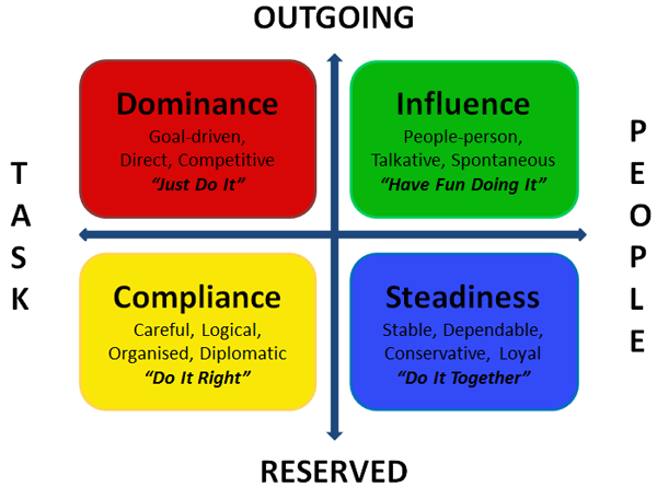
In every one of my Specify Colour with Confidence workshops, usually, all four personality types are represented with everyone who attends.
So in my courses, there are always the D – Drivers, like me who just want the coles notes for everything. “Give me the information, entertain me and let’s get it done and bottom line, don’t bore me.”
Then there’s the I profile- the people who sit in the room and just smile at me. They love everything, they are very social, and every time I look over at them, they’re smiling. They are people-people.
The S profile – Team player, inclusive, always wants us to compile a class list of everyone’s emails to distribute to everyone.
Then there’s the C profile – (This is also my wife Terreeia by the way) Organized, diplomatic, analytical, the scientist. It took Terreeia 6 months to buy a blender because she had to read about each one to figure out which one would be best.
This is also the colour scientist personality. This profile asks the probing questions that make me think?
Questions like “Maria, when does a colour become a neutral?”
It’s the scientist/analytical personality who will call the office and say “I have some issues with Maria’s theories?” to which Terreeia once replied “Maria doesn’t have a theory, she has a system”.
Please note, I’m ONLY looking for SPECIFIC feedback on the functionality of my colour wheel based on your advanced understanding of undertones. You will have this if you are long time reader OR you have read my eBook White is Complicated, A Decorators Guide to Choosing the Right White, OR you have attended my colour workshop.
If you are new to my system, it will not make a lot of sense to you unless you have spent the last week reading my blog from top to bottom.
Today, I’m not looking to clarify random questions about white in the comments. If you need help choosing a white, you’ll want to download my white eBook or check out our eDesign packages.
What I teach is NOT colour theory, it is a SYSTEM for choosing colour and neutrals, not only for paint, but for fabrics, exteriors, hard finishes, ANYWHERE you need to choose a colour. If you understand my 9 Undertones system, it will transform your world.
If you’re still not sure, go read the almost 900 comments on this post.
Okay, so my colour wheel (below), is almost ready for the prototype stage. I need it to be almost perfect at this stage.
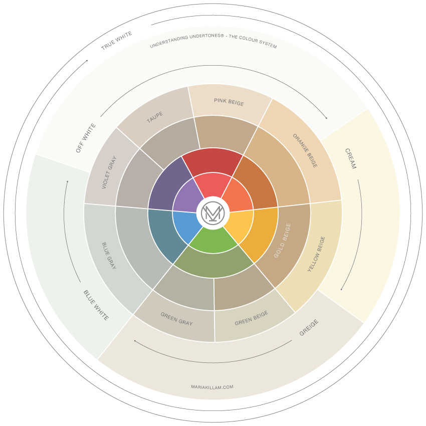
Maria Killam, Founder of the Understanding Undertones System
We have whittled statements about each undertone including the whites, down to less than 35 words or 150 characters, which is how much room I have to describe each undertone on the finished wheel. It’s taken me an entire week to do this along with additional edits and input from my team.
So, before I send it back to my artist, I need you, the colour scientist, to weigh in on each statement. Now is the time to poke holes in what I’ve said so that I can make it even clearer, if that’s possible. NOT after I’ve printed 3000 copies of this wheel.
Okay and here’s the other thing, I don’t want you to get stuck on the images I’ve posted to go along with each statement.
Each statement is designed to stand alone, so pretend there is no image when you read them. The images are only here to add clarity.
PINK BEIGE
Often described as mocha, latte or tan, this is the most overused and limiting neutral undertone. Do not use as a default neutral.
ORANGE BEIGE
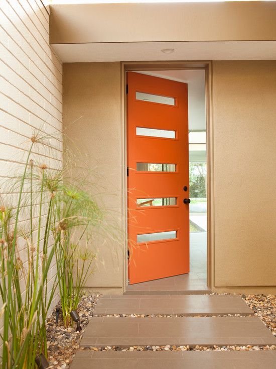
Image via Pinterest (with Pink beige slabs in this image)
While Orange Beige is not as often used as other beige neutrals, it can still be the necessary and correct choice, when its already established in a colour scheme
YELLOW BEIGE
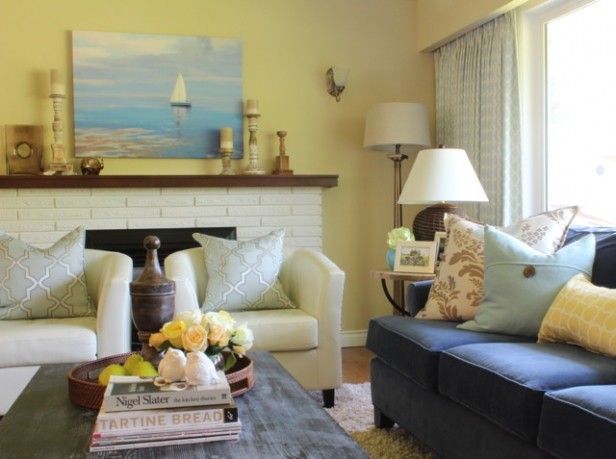
Interior by Maria Killam
Yellow Beige will show an obvious yellow undertone, making it relatively easy to diagnose.
GOLD BEIGE
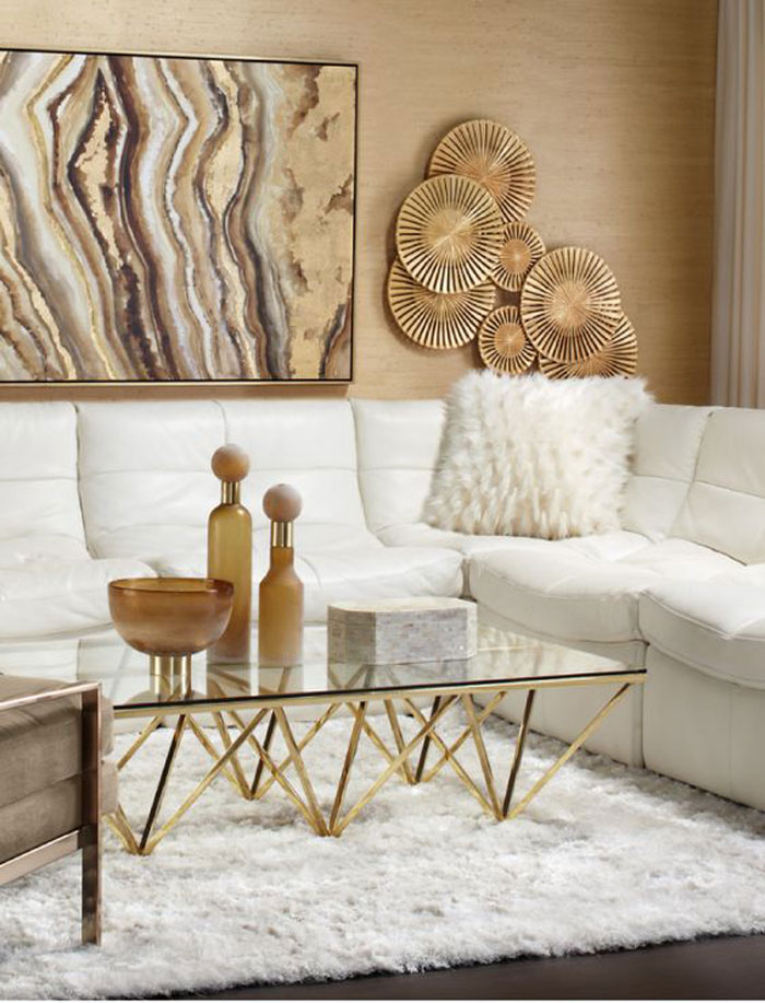
Via Pinterest (Pink beige is in the artwork)
When Gold Beige and Pink Beige have the same value, they can look similar and can sometimes be used together in a colour scheme.
GREEN BEIGE
Image via Behr (this house is NOT an example of earth tones appearing fresher)
One of the most versatile neutrals, Green Beige can be useful in helping earth tones appear fresher.
GREEN GREY
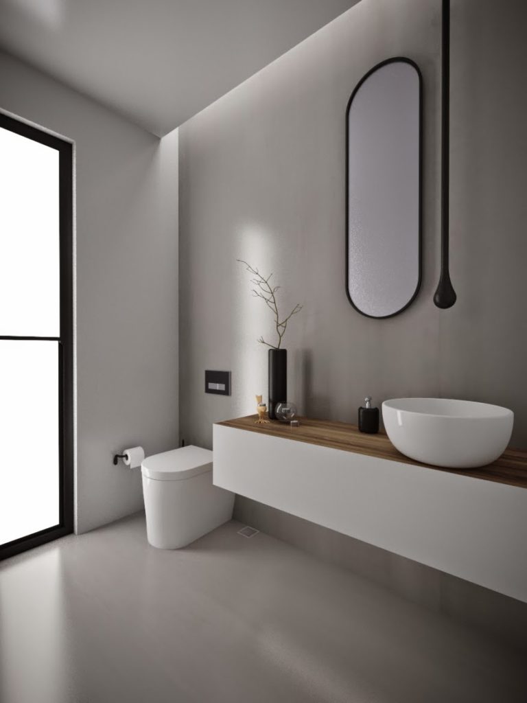
image source (The floor in this bathroom is concrete)
Green Gray is the most neutral of the grays and is the colour of natural stone. It is not as useful in rooms decorated entirely in earth tones.
BLUE GREY
Interior design by Kathy Kunz Interiors (NOT an example of an earth toned room)
Blue Grey will show an obvious blue undertone. It is not as useful in rooms decorated entirely in earth tones because they are usually devoid of blue.
VIOLET GREY
Image source
Violet Gray is most used when these undertones are already established in a colour scheme. It can be useful when paired with Pink Beige or Taupe in moving towards a fresher look.
TAUPE
Taupe is cooler than beige and warmer than grey with a pink to violet undertone.
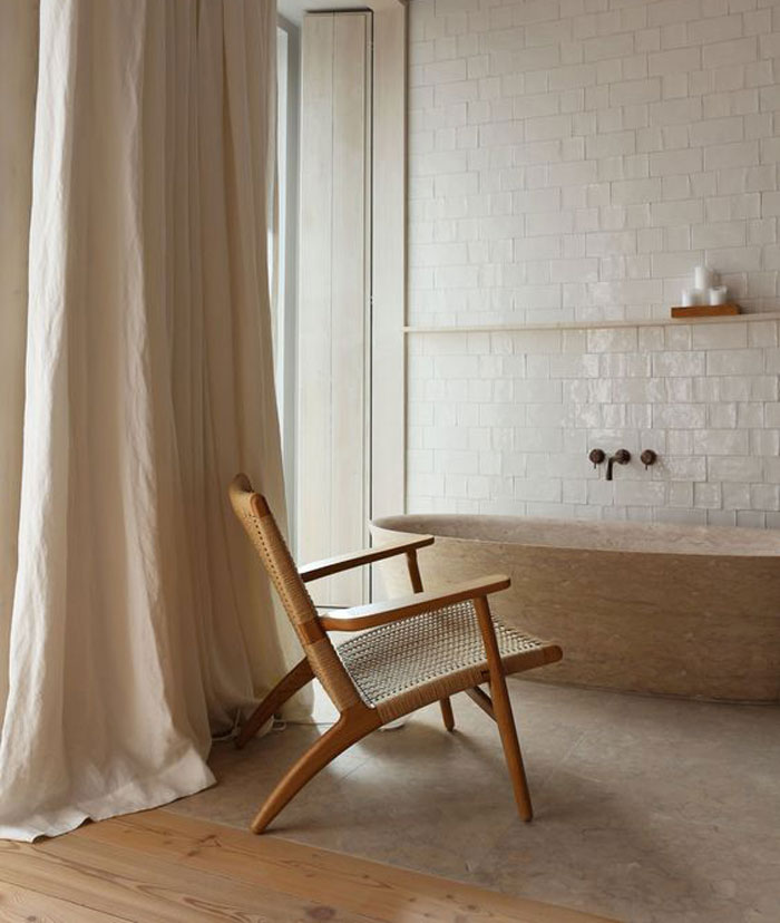
BLUE WHITE
Image via House & Home
Blue White is useful in creating necessary contrast when paired with the whitest of decor and hard finishes.
TRUE WHITE
via pinterest (see the white euroshams?)
True White is the control white against which to compare all other whites.
OFF-WHITE
![]()
Interior Design by Maria Killam
Off White is a versatile white, and can be combined with light earthy colours as well as clean colours, greys and blacks.
CREAM
BHG (Earthy, pink beige walls)
Cream works best with earthy colours, and can also, given sufficient contrast, work with greys and soft blacks.
GREIGE
via Style at Home
Greige is a useful wall colour for interiors decorated in greys or clean colours. To fully appreciate this colour, you need natural light. It is rarely a useful trim colour.
AGAIN, I don’t want you to get stuck on the images I’ve posted to go along with each statement.
If it’s easier, here they all are again without the images:
PINK BEIGE
Often described as mocha, latte or tan, this is the most overused and limiting neutral undertone. Do not use as a default neutral.
ORANGE BEIGE
While Orange Beige is not as often used as other beige neutrals, it can still be the necessary and correct choice, when its already established in a colour scheme
YELLOW BEIGE
Yellow Beige will show an obvious yellow undertone, making it relatively easy to diagnose.
GOLD BEIGE
When Gold Beige and Pink Beige have the same value, they can look similar and can sometimes be used together in a colour scheme.
GREEN BEIGE
One of the most versatile neutrals, Green Beige can be useful in helping earth tones appear fresher.
GREEN GREY
Green Gray is the most neutral of the grays and is the colour of natural stone. It is not as useful in rooms decorated entirely in earth tones.
BLUE GREY
Blue Grey will show an obvious blue undertone. It is not as useful in rooms decorated entirely in earth tones because they are usually devoid of blue.
VIOLET GREY
Violet Gray is most used when these undertones are already established in a colour scheme. It can be useful when paired with Pink Beige or Taupe in moving towards a fresher look.
TAUPE
Taupe is cooler than beige and warmer than gray with a pink to violet undertone.
BLUE WHITE
Blue White is useful in creating necessary contrast when paired with the whitest of decor and hard finishes.
TRUE WHITE
True White is the control white against which to compare all other whites.
OFF-WHITE
Off White is a versatile white, and can be combined with light earthy colours as well as clean colours, greys and blacks.
CREAM
Cream works best with earthy colours, and can also, given sufficient contrast, work with greys and soft blacks.
GREIGE
Greige is a useful wall colour for interiors decorated in greys or clean colours. To fully appreciate this colour, you need natural light. It is rarely a useful trim colour.
One more thing, I think we should all start spelling grey with an e instead of with an a. Grey wins hands down over gray in hash tags so it’s a no brainer. #grey not #gray it means most of the world spells it with an e that’s all.
If you are a colour scientist, you’ll have read this whole post and not just scanned the pictures and raced to the bottom to post a comment!
So here’s the answer to “When does a colour become a neutral”. The closest answer to this question that is USEFUL, is this: “When it’s not obvious anymore that it’s RED, ORANGE, YELLOW, GREEN, BLUE, or PURPLE. In other words, undertones in COLOURS are much more obvious than undertones in NEUTRALS, which is why neutrals are the biggest focus in my colour workshops.
For example, if you see a green and blue duvet cover. You could probably say “That’s kelly green and turquoise”. If the same duvet was green, blue and beige, you might have a harder time trying to determine ‘which beige’ was in that duvet. Is it pink beige? Green beige? Yellow beige? Maybe it’s grey? Which one? Blue, green or violet?
But if you understand the 9 undertones in my system, you could systematically figure it out and end up with the correct beige or grey on your walls if that’s what you wanted to paint them.
Thanks in advance for your feedback, I’m looking forward to reading your comments! Thanks always for being there and for your great support!
Related posts:
When Colour Theory is Literally Dangerous
There are 9 Useful Neutral Undertones in This World (See them Here)
How NOT to Use the Understanding Undertones Colour Wheel


But, what about darker colors like blacks?
They have undertones too for sure but black doesn’t cause the confusion that beige or grey does which is why I don’t focus on identifying the undertones in black and brown. Thanks for your comment! Maria
Cream works best with earthy colors, and given sufficient contrast, can also work with greys and soft black.
+1
concise, professional – easy to understand and work with
great job, Maria…
Happy to hear you are underway with the colour wheel, I know it’s going to be a huge success!
At first look, the descriptions seem a little ‘wordy’ to me. Can we shorten them?
ie. Instead of “Green Gray is the most neutral of the grays and is the colour of natural stone. It is not as useful in rooms decorated entirely in earth tones.” Can we shorten it to : “Most Neutral grey, colour of natural stone, not useful in rooms decorated entirely in earth tones.”
Might be easier to read and remember?
I love the answer to “When does colour become a neutral?” Perfect!
Regardless, this is going to be amazing!
Yes! Maria’s descriptions are clear. Shortening them makes them even better.
Why is the ping-beige the only neutral that has “described as” (in this case mocha, latte or tan)? You don’t have that for all the other colors. And I can hard;y wait for a MK color wheel!
While Orange Beige is not used as often as other beige neutrals, it can still be the correct choice when it’s already established in a colour scheme.
note grammar and punctuation changes. I took the DISC in 1984, very informative. I have the D -C hook.
Agree
HI Maria,
Interesting that you are using DiSC to assess your classes. As an instructor of DiSC in my workplace, I have taken it and am what’s called an I (Influencer) leaning toward a D (direct/dominance.)
Love all your posts. Have purchased several ebooks.
Thanks for all the insight.
Green gray and violet gray, “grey” is in the title, but it’s spelled “gray” is in the description.
Yellow Beige will show an obvious yellow undertone, making it relatively easy to identify.
I agree with Robin, this was my reaction too.
Agree!
Maria
Can’t poke holes in perfection .
Easy to understand love it !
An “I” person! 🙂
Maria, I am smiling. I am a “I”, a people person and I love everything you say (said). In order to even try and change one single word, anyone MUST have attended your course, because indeed: you are teaching a SYSTEM, NOT a theory!! I literally never saw the world the same way again after 3 days with you. I don’t see “tan” or “beige” anymore. I see red, orange, yellow, gold. I don’t see “gray” either, I see everything differently and NOW, I’m able to put together rooms, vignettes, entire homes (!!) that belong in Architectural Digest. I believe YOUR COURSE makes the difference between being a good decorator and a magical Decorator unicorn that everyone wants. There is no greater feeling that confidently whipping out one of your colour boards, gliding through the room, lightly tossing it onto the table and saying “There is your color” (with giant smile of course!) The look on the face of the exhausted / exasperated client who is practically spitting up color chips is priceless. Your system is perfect. I wouldn’t change a thing about anything you said (say). Still smiling! Jenny 🙂
I like that you defined “taupe”. May I suggest that you do the same for “greige”. Also, point out the continuum of whites from blue-white to cream (yellowish white). For instance, what color in pure white turns it to off white.
I’m a D/C. And a high C at that. Lol. In the pink beige description you said it’s like mocha or latte. I immediately can picture that color and move on. In the others the description isn’t as clear and I would ponder more and spend time trying to find a color that I think you mean to use as a comparison.
I’ve read your books, taken the class and have the large color samples. Comparison is where you teach us to use (at least that’s what I remember).
“Yellow Beige will show an obvious yellow undertone, making it relatively easy to diagnose.”
Diagnose is almost exclusively a medical term, a better word might be recognized or identify.
I can’t wait to see the finished product!
GREEN GREY
Green Gray is the most neutral of the grays and is the colour of natural stone. It is not as useful in rooms decorated entirely in earth tones.
Also just noticed there are two spellings of grey/gray here…oops. This is the sort of thing you can’t even see after editing for days.
Also “Violet Gray” 🙂
Found a couple of more grays, you may want to run a “replace all” on your document.
Hey Maria,
I think your color system is amazing and the wheel will be of great value. I would try to phrase the comments more positively rather than saying “this should not….” For example, “Blue Grey is used more in contemporary settings rather than with earth colors which rarely contain blue undertones.” Not keen on the comment on Pink Beige – it contains no useful information on the tone other than you don’t like it!
Agree! I noticed that as well, but you explained it better than I could come up with. Pink beige is gorgeous with blues and blue greens, imo. It’s just limited as to what it can work well with.
I disagree. Sometimes it’s just as useful (or more useful) to know what *not* to do. You really need both types of information (both the do’s and the don’t’s) in order to get a feel for a system of thought and work with it effectively.
Maria,
This is going to be SO helpful and I’m thrilled that you’re putting your system into a visual format. Bravo on this!
My only comment is this: For some of these captions you’re describing how to identify the neutral, and in others, you’re describing how to use them.
I’m not asking you to rework them altogether, but I’m definitely a C (Eek!?) and the wheel is shouting to me that it would be more clear to readers with consistent captions.
Maybe a possible solution is to shorten them (as Jil recommended) to include a brief comment on both identification and use…?
(Btw, do Cs do well as designers? I would also take months to research and buy an item.)
I must be a scientist because I have lots of quibbles.
First, I would like to see some consistency in the way you describe each undertone. If the same kind of thing is said about each, it will be easier for people to differentiate. When the color of the undertone is in the name (e.g., green beige), it is unnecessary to repeat the color in the description. I found your description of pink beige helpful because you named neutral colors that are pink beige, and you said how (not) to use it. Suppose you did the same thing for every undertone?
Some of my issues with the descriptions:
The only thing I learn about orange beige is that it’s not frequently used.
For yellow beige, all I learn is that it’s obviously yellow.
For gold beige, I learn only that it can sometimes work with pink beige, but no “why”at all.
For green beige I learn that it’s useful.
For green grey and blue grey, I just learn that they don’t (usually) work with earth tones. (How are they used?)
Do you see what I’m getting at? People need some tags that will help them remember and recognize. You do that best in your description of pink beige. What would help me are three elements: two or three names of colors corresponding with each undertone; how the undertone is best used, such as specific colors that harmonize with it; and what to watch out for or how it might trip you up. All of these elements appear here and there throughout, but there is no consistency in how they’re used.
Sorry to be so long winded. I could say more, but it’s very late. I simply love doing this kind of thing!!
Great feedback! I agree with making the descriptions more consistent.
I’d also like to see a description of what is different between cream vs off white since I think a lot of people use the terms interchangeably.
Agree with Kay more consistency and the “tags” to remember things by. Great start for descriptions…but need consistency.
I agree with Kay’s comments. Since I’m a C I’d prefer to have more information not less, especially regarding how to use the neutral. Maybe consider two photos side by side: one where the particular neutral color choice looks bad, and one where it looks good.
And as another said, I think the orange-beige section would read more smoothly as:
While Orange Beige is not used as often as other beige neutrals, it can still be the necessary and correct choice, when it’s already established in a colour scheme. Note the apostrophe in it’s, the grammar change, and the period at the end of the sentence.
I so admire how you get things done!
I agree with kay. More consistency in the descriptions is necessary. But I love this!!
Also, with the pink beige, I recall you’ve said not to combine it with yellow beige or one will look dirty (I’ve forgotten which one) and that ought to be included in the description too.
Maria,
Thanks so much for putting this together. I will help me be even more successful using your fabulous system. I love all of Kay’s suggestions and those who posted to her suggestions.
It would be so helpful to have a more specific listing of what “plays well” with the given neutral. Example: What goes with green grey? Giving a Benjamin Moore paint chip range would further define your description. It will further clarify what you mean.
Love Kathleen’s suggestions, too!
I’m a C-S!
“When Gold Beige and Pink Beige have the same value, they can look similar and can sometimes be used together in a colour scheme.”
The description for Gold Beige, while a true and perhaps useful statement, doesn’t actually seem to say much about the particular color. How is it different from yellow beige? How can you differentiate it from Pink Beige in the case of, say, floor tile that you swear is golden undertoned in the store until you put it next to your cream counters and it turns pink? I would find that sort of thing to be a better use of your color wheel blurb.
In your book, you also mentioned that grey can have a blue-green undertone. I’ve been wondering why you don’t have it in your color wheel. This seems like a good time to ask.
Because then I’d have to do the same for the rest of the colours, it’s a tertiary colour! Good question, thanks! Maria
Hi Maria! Good for you for being vulnerable and opening it up for “peer review” proof-reading and editing! With all the free help and advice you have given us on this wonderful blog, I would be happy to return the favor if I can. One thing that immediately struck me was the bit of inconsistency in the type of information provided in each of the comments. I wasn’t sure exactly what the overall purpose of the comments was supposed to be. For example, though most stated something about how or when to use the neutral, not all did. Also, Pink Beige was the ONLY neutral for which you gave alternative names, ie, “mocha”, “latte,” “tan”. (By the way, those alternative color names might be only adding to the confusion within a short explanation like that, as we all have different cultural references for those alternative color names, such as “tan”, which I think of as a golden beige, like tanned (white) skin, and the dictionary definition of tan is “a yellowish brown color” (I just looked it up to double-check!) HTH!
Hello Maria,
As a writer/editor with over 30 years’ experience, I offer the following revisions that eliminate the use of passive voice (when possible), redundancy, wordiness, or lack of specificity. I am a huge fan. Thanks for teaching me so much about color. It has completely changed my world!
PINK BEIGE
Often described as mocha, latte or tan, Pink Beige is the most overused and limiting neutral undertone. Do not use as a default neutral.
ORANGE BEIGE
While used less often than other beige neutrals, Orange Beige may be the necessary and correct choice when it’s already established in a colour scheme.
YELLOW BEIGE
Yellow Beige is relatively easy to identify because it shows an obvious yellow undertone.
GOLD BEIGE
When Gold Beige and Pink Beige have the same value, they can look similar and sometimes be used together.
GREEN BEIGE
One of the most versatile neutrals, Green Beige can help earth tones appear fresher.
GREEN GREY
Though not as useful in rooms decorated entirely in earth tones, Green Grey is the most neutral of the greys and is the colour of natural stone.
BLUE GREY
Blue Grey shows an obvious blue undertone. It is not as useful in rooms decorated entirely in earth tones because they are usually devoid of blue.
VIOLET GREY
Use Violet Grey when its undertones are already established in a colour scheme. Pair it with Pink Beige or Taupe to move towards a fresher look.
TAUPE
A few degrees earthier, warmer and dirtier than grey, Taupe is a combination of beige and gray with a pink to violet undertone.
BLUE WHITE
Blue White creates necessary contrast when paired with the whitest of decor and hard finishes.
TRUE WHITE
True White is the control white against which to compare all other whites.
OFF-WHITE
Off White is a versatile white that can be combined with light earthy colours as well as clean colours, greys, and blacks.
CREAM
Cream works best with earthy colours and, given sufficient contrast, can also work with greys and soft blacks.
GREIGE
Greige is a useful wall colour for interiors decorated in greys or clean colours. To fully appreciate this colour, you need natural light. It is rarely a useful trim colour.
Thanks Anne, I so appreciate your thoughtful response. I need you again when I rework the description for more consistency! Maria
Maria, I love your request for feedback and how gracious you are with all of the input. I decided to connect my comment after Anne Wilbur’s excellent response. What a gift to have an editor as a fan!
My comment concerns consistency in the comments. There seem to be two categories of information for each color–1. a description of the color and 2. an explanation of the use. Some, like pink-beige, yellow-beige and green-grey, have both. Other colors have only the use and I find myself wondering how you would describe them. Having a description for each might help someone differentiate between yellow-beige and gold-beige, for example, or between taupe and greige. I can appreciate that some are obvious and in fact, all are obvious to you and those who’ve benefited from your training already. I’ve been following you for 6 months and wow! what a difference it has made. I hope to take your course in the near future.
I think the words “useful” and “used” are overused. I’m having a hard time figuring out the focus or point of these blurbs because some of the statements describe the color, some lean towards figuring out the undertone, and others are about specifying. I think they need to be more consistent.
I love the direction you’re going, & you have some great comments here. Gold beige does need its to become it’s.
Can you succinctly explain what greige actually is?
Agree w. others , this needs more consistency in statements .Some are only how to identify , some are about how to use, others are only how/ when not to use .. so you wonder what is the overall goal of the statements ..and some leave you wondering ” okay , so then ……. ? ” What an undertaking , will be fantastic !
I’m a “C” all the way – about as far as you can get in the bottom left corner. The thing that strikes me about your statements is that I don’t see consistency across your comments about the neutrals. Are you trying to describe the neutral? Are you trying to say when to use the neutral? Are you sharing trivia about a the neutral? Each statement in it’s own right is valid and informative, but I’m not sure what you are trying to achieve with the sound bites. If I wanted to know if I could use Yellow Beige in my application I don’t get any guidance from you like I do with many of the other neutrals. If I had to deal with Pink Beige I don’t get any guidance. I know from taking your course, reading your books, etc. that one of the problems with Pink Beige is that it clashes with other neutrals and is hard to pair with colors and look good. You only have one word in there that tells me that (“limiting”) and people will skim over that and not necessarily internalize why Pink Beige is evil (it is the only place you use bold font). But if I go to Taupe is see that it is very close to Pink Beige on the color wheel but doesn’t have any negative comments so it must be perfect? I read Tricia’s recent post so I know you also have to tread lightly with Taupe, especially if it is closer to Pink Beige than Violet Gray (as it is spelled on your color wheel, shouldn’t it be Grey?). Other examples – your comment about Greige being fully appreciated in natural light may lead some not to use it if they don’t have a lot of natural light. Is True White useful anywhere or is it just a control color? When is Blue Grey useful? You get the idea.
Personally, I like the descriptions where you say where the neutral is useful. And it might be helpful to say when it doesn’t work. But if you do that you should do it for every neutral – a plusses and minuses approach. Otherwise I would be disappointed if I really wanted to know that about one and it wasn’t there. If you want to stay out of the advice realm then you should just describe the neutrals. In any case you should decide what is your objective with the statements and stick to achieving that objective for every neutral.
Your new color wheel was a huge improvement for us scientist types. Placing a particular sample on one edge or the other of the neutral helps me choose the correct variation of the neutral. I know you teach a system not a theory, but it really helped my logical brain to have some scientific guidance when it comes to color and you have provided that for me. But I still know it isn’t a formula!
Here’s another Kim completely agreeing with the above statements.
@ Kim: …. to Pink Beige than Violet Gray (as it is spelled on your color wheel, shouldn’t it be GREY?) FYI not necessarily as Canadians have been spelling it with an ‘a’ for the past 150 years just like they spell ‘colOUR’ differently which in turn is part of ‘their’ Historical Identity …. °Û°. -Brenda-
@ Kim: I totally apologize Kim as that should have read’; spelling it with an ‘e’ and was not intended to confuse. -Brenda-
P.S.: Must admit though as Canadian myself, I have a tendency to switch back and forth.
Similar to Kim I’m all “C”. I don’t lean towards either of the neighbouring quadrants and sit right on the edge of the circle. I also agree with what Kim is saying. The descriptions should be consistent and have the same objective.
Since the info is being printed on the wheel where you can see the colour I don’t think describing the colour is necessary. For example “Taupe is a combination of beige and grey with a pink to violet undertone.” I can figure that out for myself by looking at where taupe is located on the colour wheel. Putting it into words doesn’t add anything and with only 150 characters you don’t want to waste them.
What I’d find useful is information about where the neutral does and doesn’t work and why.
Hi. Long time reader, since 2010. There is one thing I do not understand about your color wheel. I have lots of different colors in my house. So if you pair say purple and green, or have a house that flows, one purple and one blue, the whites and grays you would change would be different. So, I find the color wheel very confusing that way. I understand this white goes with this blue, but as a system, you can have more than just that blue. When you have a mixture of colors, how does that work with the neutrals?
Hi Liz, just like you would not use a regular colour wheel to choose colours for your house, my colour wheel will not be directly useful either. It simply validates my system and helps people to see where they all fit. Thanks for your comment, Maria
I got really excited when the first category PINK BEIGE started out with “Often described as…”. I was expecting/hoping to have descriptions like that for all of the sections! It didn’t help that ORANGE BEIGE was next, and I’m not sure what that color would be described as at all…peachy, fleshy?
Also the last sentence of PINK BEIGE had the disclaimer “Do not use as a default neutral” where 4 of the 7 words were in a bold typeface. Why not boldface (or italicize) the entire statement, OR only boldface the word ‘default’ if that is key here.
I read all of the other comments, and agree that more consistency is needed. One thing that has not been mentioned that I think needs to be changed, is listing tan as a descriptive name for pink beige. I’ve never thought of tan as leaning pink. I have some colors with tan in the name on my walls, and the pigments used to make these paint colors all include gold in the formulation (and no red of any kind). I even checked my paint chip samples, and wouldn’t call any color on the cards pink beige.
Hi Vicki, I agree that Tan is used also with green beige for sure, but in my 20 years of doing this, it’s most often pink beige that people are referring to, however I see now that I need to go back to the drawing board with being consistent for sure! Thanks for your comment, Maria
I don’t think of the word “tan” when I think pink beige. Tan seems like yellow beige to me. But I could be totally wrong about that. It’s just my old perception perhaps. Before learning your system. Love your color wheel!
Wonderful start, Maria. Agree with others’ comments. One other thought – it sounds like “Off White” is so versatile, works well with earth colors, clean colors, greys and blacks. But what makes an “off white” off white? If it’s so versatile, shouldn’t your arrow for Off White go all the way around your color wheel to reflect it’s easy coordination with other colors?
Correction to previous post – “its easy coordination with other colors.”
Great post on your color wheel. . I am also a bit confused about the 9ff white band. I understand the blue whites with violets and blues and grey. Depending on the off white undertone though I would expect it to look fine with at least the green beiges, but I interpret the wheel to mean only griege works there.
Thank you!
The whites are positioned on the wheel as the lightest version of the colour. For example, cream with yellow, blue white with blue. This wheel is not designed to help you choose a colour for a room. Just like the regular colour wheel will not help you either.
Maybe I need to include that as a disclaimer on the colour wheel because it doesn’t seem to matter how many times I say it, everyone still look at the wheel for a clue. It simply shows you where my 9 undertone system lands in the world of colour. There are so many other factors that go into why any particular shade of white, neutral or a colour should be chosen. For example, if you have dark and blotchy earthy tile in a bathroom for example but your tub, sink and toilet are screaming white, you might still choose a true white like SW Extra White because at least the trim will relate to that white instead of a random cream trim which you would specify if you weren’t dealing with the fixed white of the plumbing fixtures. Hope that helps, Maria
As I was reading, I got lost on the purpose of why I was reading these statements. Are you looking for feedback on just how the statements are worded? My hopefully constructive criticism is beyond getting the wording concise. I don’t want you to think I’m asking you to start over, but consider the inconsistencies in descriptions. For some colors, you describe it more fully, or offer a coordinating undertone, or suggest it to be more or less useful than others, or offer advice on how to identify its undertone. It made me wonder for what purpose these statements will be printed: To help ID undertones, or create a new palette, or introduce the undertone system to novices? Why are the descriptions inconsistent across the colors? Who is it written for? Feel free to reach out to me if you’d like to bounce ideas or discuss my question(s) further. Happy to help.
Agree with other comments about consistency and purpose. I’d add that you need to describe Greige as a beige-grey with green undertones – similar to how you described Taupe. And the Blue-White – i would add something about it being the coldest, harshest white. If a client wants white or off-white walls I specify the same white for the trim, only using the cooler white for the ceiling as per your system.
Maria, I like your color discussions, but being a colour scientist, I don’t agree with everything you say. So my comments are how colour should be approach to realy experience the power of colour. I’m going to mention some points, there’s no space or time to discuss everyone, but you are welcome to enquire about more detail.
* Colour does not exist physical, and is the response of one of our 5 senses, that of vision, and we know that every single sense is a personal experience that can not be explained by anyone else.
* No two people(not even your two eyes) can experience colour the same.
* You don’t SEE colour you experience it
* You talk about your 9 tones, but there are more. According to Shigenobu Kobayashi you can devide tones into 12 hues(120 chromatic colors and 10 achromatic colours): Vivid tone/strong tone/bright tone/pale tone/ very pale tone/Light grayish tone/Light tone/grayish tone/dull tone/deep tone/ dark tone/ dark grayish tone. They are place in 4 categories, namely Vivid/Bright/subdued and dark
* Colour do not exist as single entities.
* Why not consentrate on a colour image scale, more practical and visually easier to follow.
* Neutral colours are colours that are associated with a hue. I know colour consultants consider Black, gray, White and some Browns as the role players in neutral colours.(when you mix a hue with them) A bit confusing because using the NCS(Natural colour system/the most scientific colour systemfrom Sweden)you have 40 hues that can be mixed into neutral colours using any one , or everyone of Black/white/Gray/brown.
* There are no rules in colours, because we are dealing with the 3 Dimensions, Light/Observer/Surface and every dimension will influence the eventual colour perceiving.
* Even if you have decided on a colour(inherent) in the application process 14 factors influence the eventual perceived colour.
* Colour theory is handy, but you work with a complex human being, who’s experience of a colour can never ever be determined by any one else. We accept that all human beings “SEE” the same colour, but we actually don’t know what they see.
* Why not approach colour from a humane design approach. You don’t adjust to colour, but colour must serve you, the complex human who’s brain is influenced by LRV, Ergenomics, etc,etc,etc
* No colour is constant, and neither is the observer.
* Why do you get tired of a colour?
* Why not consider PSYCHODECOR?
* Continuous viewing of a colour.
* Healthy colours/stress.
* Where does colour experience originate?
Love your comments thank you. Yes there are more than 9 but the original colour wheel is also just as limiting because it only shows the primary colours. My system is about USEFUL AND OVERUSED colours. If anyone were to take my Core Collection of 50 samples and go into 10 homes to choose colour, you would find that most of the colours you ended up specifying would come from those 50 colours. That’s why it works so well. Maria
LOL at PYSCHODECOR! Sometimes, remodeling can make a person psycho! Then choosing the furniture that doesn’t make you want to kill your spouse….! I spent Saturday with repeat clients who moved into a brand new house and the spouses couldn’t agree on the 4 sofas they’ll need for the 4 living areas, so we left the husband at home to look at furniture…
The description of true white is stated as the one all other whites are compared to. This set me up to expect that all other whites would first be described/defined relative to true white before their use is described. Scientists are taught that a term must be defined before it is used…
Another thought. As someone who has read your blog, and a few ebooks, from top to bottom (and more than once) I find the description for greige initially contradictory to what is said in the bonus book of whites that instructs us to go for greige if sunlight is low: “If you don’t have enough sunlight in your home you will have a very di cult me crea ng this look.
And that’s when you need to pull out a lovely greige or some of the palest of neutrals. A greige or light neutral isn’t as eli st as white and can help you create a look and
feel that is current and embraces all the bright and happy colours you are seeing everywhere you look.”
Orange Beige is not used as often as…
“necessary” is redundant
it’s
stick with correct
Yellow Beige… to define
Gold Beige… can look the same and can sometimes…
Green Beige will help earth tones…
Green Grey … Do not use it in…
Blue Grey — undertone and does not enhance … earth tones which are usually…
Violet Grey is only used when …It can be… which will make a room look fresher.
I love the descriptors that concisely state where to use the undertone! So helpful.
I agree with Kay that what is said for each undertone should be consistent:
When to use it
When not to use it
and no need to repeat the colour in the descriptor if it is already in the name.
Can’t wait to see the final product!
I’m a S. I would just say make it simple. Do’s or Don’ts. I have several of your courses and E books. I love your system and new color wheel. Do most people use colour??? I’m in the US.
“Colour” vs “Color”?? Not sure which word is most used.
Oh, haha, color is definitely more used than colour. . .sigh, but my entire blog is written with an ou so I’m a little less inclined to give up the european way of spelling it! Maria
Definitely Color but I don’t understand why since it’s the american spelling along with Gray but yet grey is definitely the winner in hash tags.
Maria, I am an SI, indeed! I find that your system clairifies and classifies very well, but I have a few questions: 1) Gold Beige, introduced at an earlier layer of the wheel, all alone, cannot have a few mates, such as Grey Green, and Grey Blue? Or is it that they are more obvious? 2)Since Gold Beige is much like Pinky Beige when possessing a similar tonal value, doesn’t Orange Beige become similar to Gold Beige when in the same tone? ( I have had trouble distinguishing between it and the former at times.) 3) Each colour has either a description or is self explanatory in its name, save for Off White, Cream and Greige. I think a few words would help some people who are not as familiar with your blog, particularily Off White. It can sound so vague, though you show it well on your wheel. What a tremendous accomplishment, Maria!!!
I agree with some of the others – concise and consistent. Also, a reference to examples of commonly used paint colors in each category would be very helpful.
This colour wheel is NOT sponsored by ANY paint company so there will not be paint colours to reference. they will be found in my eBooks (which are NOT sponsored either, haha). Maria
IMHO, I must agree with the many comments that the ‘statements’ lack consistency but at the same time question why use ‘statements’ at all? In other words, is it possible to condense the information in a ‘chart format’ and perhaps target only three categories? (For example: Identity/Use/Result)
Short yet precise and to the point! Just a thought. °Û° -Brenda-
You make a good point, that there is not enough room to perhaps cause nothing but confusion. I’ll have to think about that! Maria
Thanks for the free DISC test- I will use it at my next article club meeting with the ladies- It turns out I am an I/S – I am inspiring and supportive!! I like this combination!
You mention “earthy colors” several times and I don’t know what colors they are. It seems to be an important point that you are making but I’m left wondering what you mean.
not a long-time reader, here 😉
If I said dirty or earthy, would that help clarify it? What I didn’t post here is that the colour wheel does list which undertone goes with which? However, those will NOT change which is why I did not ask for feedback. Thanks, Maria
I would like to add a sincere thank you for reaching out to this particular group. We don’t often get people truly willing to hear our thoughts, and we always mean them to be helpful, not hurtful. It is lovely to be invited to share. Also, putting the descriptions in without the photos was very helpful (I, at least, found the photos distracting).
As for commenting on the descriptions, the common concern seen above is true for me as well – the descriptions offer different levels of information which necessarily means some are less “useful” than others. Gold beige and off white were the least specified to me, but of course we are also taking these descriptions out of context, where they will be paired with colour ranges visually. Given that eventual context, I personally find your more experience based comments more useful than sometimes -referred-to colour names. For example, your experience is better refined in the blue grey and green grey descriptions because you are clearly stating what these neutrals do or work with. This kind of direction is why I read your blog and books, so I believe this information would be more useful on the wheel and more consistent with your other work (blog, books, and I assume course).
Hope this helps, and again, thank you for asking for our feedback!
Ditto Danielle’s thanks. We might not be warm and fuzzy (without effort or deep sincerity) but we will show up with DATA! ?
Concerning “grey” vs. “gray”: I’m a professional science copy editor (20+ years) and therefore well versed in spelling, usage, etc. “Grey” is the standard British (and, hence, Canadian) spelling, whereas “gray” is the standard American spelling (see Merriam-Webster and all other American dictionaries). These standards are not changing anytime soon. So, if you want to be sure to reach the millions of Americans, I recommend that you use both hashtags. Same goes for “color” and “colour.”
Love love your color wheel, what a brilliant way to illustrate your system.
The only thing that confused me was why gold beige is placed in a spot that makes it appear as if it’s a more yellow form of yellow beige. To my understanding it falls between yellow beige and green beige in the same way orange beige falls between yellow beige and pink beige. Yet, orange beige has a piece of “pie” on the color wheel, and gold beige doesn’t.
Perhaps the orange beige slice could me made narrower, and gold beige given an equal sized slice between yellow and green beige? Or would that be a correct representation…
HI Cathy,
Gold beige is like red. You can’t really ask for a light red, you end up with pink. That’s why it’s the ONLY undertone that is categorized one shade darker. And it’s also a useful undertone that is found in lots of finishes and fabrics. Thanks for your comment, Maria
Really like the color wheel, very useful for visual learners.
110% agree with previous posters to work on making the purpose of each descriptor more uniform in purpose. For me, most useful would mean a comment on it’s color essence plus how best to use it (and / or when to avoid using).
Two specific feedbacks: 1. Pink Beige – reader of your blog for a while but not quite use what mean by do not use as a default neutral. Imagine most people find themselves with Pink Beige fixed elements (tile, countertops?) that may not be compatible for immediate replacing…and therefore may reluctantly become someone’s default color need to work with. Would be helpful if descriptor had suggestion on how to make most of pink beige. 2. Yellow Beige – just a description that doesn’t provide any useful insight on how to use the color.
Good luck!
Maria, you should know there is a programming error on your site regarding the comments loading. It shows the first 20 or so, then when I click the “Older Comments” button at the bottom it simply takes me back to the top of the first few comments without loading the older ones. I had this issue last night too on an older post of yours where I could only see the first of 40 comments and couldn’t get the other ones to show up. FYI if you weren’t already aware! I would really like to see the whole comment string.
I agree with the comments that these color range descriptions seem to have different purposes (e.g., to describe the color more concretely, or to advise regarding compatible colors), and a single consistent purpose would be better.
Color-specific comments are:
PINK-BEIGE – “Tan” doesn’t fit. Tan is a less complex color, and has more orange. Try Khaki if you need three descriptors. Also, rather than saying “do not use as a default neutral”, provide the reason not to use in a more constructive tone: “Pink Beige is the most limiting of the neutrals when selecting accent colors.”
GREEN GREY – Comparing this color to “natural stone” only works in parts of the world where natural stone is gray granite. In Texas, natural stone is limestone, a rich cream color, and in Arizona and New Mexico, natural stone is a rich bright terracotta color. Instead, maybe you can describe green grey as the color of concrete, or the color of Spanish moss or dry sage (but most of your customers won’t have ever seen Spanish Moss and will be thinking vivid green like moss on the ground under trees). So maybe dry sage is the way to go.
TAUPE – I’ve always struggled with your use of the word “dirty” when describing color. It makes conversations with family very difficult: “Honey, I want to paint the room a dirty grey.” I know this word is firmly embedded in your blog and training… but it makes me cringe every time. The words muddled or muted would be better, and muddled is actually the most accurate (from a watercolor painting point of view).
GREIGE – Remove the word “wall”, since it is absent from all the other descriptions; showing it only here raises the question of why/whether the other colors are NOT for walls.
Great fun, thanks for the invitation to comment!
I agree with the color of natural stone on green gray. There are so many natural stone colors if you go into a slab yard that it becomes very evident why you need gold beige or pink beige, and sometimes the green beige. Maybe it should be compared to natural colored cement and not stone. I’m at a client’s house overseeing the marble install and it is a blue gray. Nonetheless, I love your color wheel and the photos to help visual learners. (D/I person)
Orange Beige is not used as often as other beige neutrals, however, when its already established in a colour scheme it can still be the necessary and correct choice.
I 100% agree with the many who are wishing for more consist descriptions overall! It is tricky though, because some colors like gold beige, taupe, and greige need more definition than colors like yellow beige or orange beige whose names say it all. Still, I would strive to include the most useful information for each color and organize them as consistently as possible. As others have suggested, it would be easier to read as short phrases instead of sentences. Other comments:
Pink Beige – Mocha and Latte make sense, but personally “tan” really throws me off.
Gold Beige – This is a trickier color that especially needs definition to distinguish it from yellow beige and orange beige.
Green Grey – To say “it is not as useful in rooms decorated entirely in earth tones” leaves me wondering… as useful as what? Other greys? (Surely not.) As Green Beige? The point is not clear. Also, I really like your description of green grey in Bonus Book of Whites… “reads like a neutral, putty shade.” Wish it was included here.
Greige – This color also needs more definition. “A combination of beige and grey with a green undertone” would differentiate it from taupe. I have also heard you describe it as grey-white.
Good luck!
This color wheel will be awesome…I just know it! I agree with the previous commenters regarding providing more clarity and consistency with the descriptions. As a longtime reader (and a CS!), the descriptions individually make sense, however put together the message gets lost. Also, and I may have missed this, have you defined your target audience for the color wheel? If it’s for the masses, then simplifying how to identify the undertones and its usefulness is key. If it’s for your workshop participants, then while I still believe the descriptions should be clear and consistent, they’ll get the gist of it more easily and be able to fill in the blanks. For example: True White – The control white… I understand what you mean, but how would someone know if they are looking at a “true white” or not? Just by the color name? In one of your e-books you list Chantilly Lace as the true white for BM, but some might think BM’s Pure White” is a true white (maybe it works, too!). Again, for the average homeowner, this statement might be confusing especially if they don’t know your mantra: Compare, compare, compare! Your readers/workshop participants would know to do that. 🙂
I too think a more systematic description for each Undertone would be helpful. The Wheel can have a concise description for those of us who know your system. Creating a “cheat-sheet” with further explanations would help those who have not taken your course. If you were to ever get the opportunity to sell your Wheel in paint stores, a brief explanation of your Undertone System would be a terrific selling factor!
Hello Maria – Question relative to the chart – there are colors that do not work in a Northern exposure. That part I get, from the class, the books, the comments, sadly from experience. Are there colors that ‘shine’ in a Northern exposure? I love the idea of adding tips to each undertone – to help anchor learning and use.
Say more about ‘which colours don’t work in a northern exposure?’ I haven’t found that. For example many people say that blue is too cold but my bedroom is blue, however it is highly decorated and styled making the colour irrelevant. In my experience, when people are focused too much on the COLOUR of the walls, it’s because the room does not have a LOOK and a FEEL. You need LAMPS, ART, END TABLES, PILLOWS, BEDDING THAT COORDINATES. Hope that helps, Thanks for your comment! Maria
I know you hate pink beige but here is a suggestion. Instead of “Often described as mocha, latte or tan, this is the most overused and limiting neutral undertone. Do not use as a default neutral” could you say:
“Often described as mocha, latte, or tan. Looks less fresh and doesn’t coordinate easily with other colors besides pink and blue.”
I think the true white explanation doesn’t go far enough. How can someone figure out what is a true white. I also don’t understand why you say Greige needs a lot of light. White needs the light and greige needs less. Also greige itself has undertones….I am the scientist type.
Your breakdown of the colors above and the color wheel make it so easy to see how these colors can be used. Knowing this alone is priceless. Would love to take one of your classes someday, right not cost is a factor for me. I have learned so much from the years of following your blog and your booklets. Thank you! I too am curious about the off white, what colors make it off white that it goes with everything?
Hi, Maria-
I haven’t read through every single comment to see if this has been said, but I would love to see the info in bullet points, so that I can see the info at a glance. For example:
Green Grey:
-most neutral of the grays/ is the colour of natural stone
-do not use in rooms decorated entirely in earth tones
Also, I would like to see more info on some of the colors. Maybe for each color you could put “recommended” and “not recommended.” And I want more info on gold beige, other than it can sometimes be put with pink beige.
And I’ll use a bit of space to highly recommend your color workshop! I mean COLOUR workshop! ;-D Loved all of the info, and have been using my large paint samples. You gave language to what I could see and not describe adequately, as well as fine tuning what my eye now sees. You and Terreeia are a dynamic team. I have so much love for you both!
Take care!
Kimberli
I tested as an L–about equal in each. I am a painter and photographer with an interest in historic architecture and design, so I consider my color sense to be quite good, although I do have problems distinguishing between the beiges at times. I have enjoyed your blog for years and have learned a lot from it.
Anyway, I agree with the comments that the format and content of each description should be more consistent. I think true white can be described as “White without any overtones, used as a control to compare other whites and neutrals.” A chart (or several charts) with more explicit information would definitely be useful as well.
I’m sure you have your reasons for choosing the center colors, but I find them a bit confusing. All of them on the center ring are what I would consider strong pastels (saturated colors with a bit of white) and all are on the warm side, except violet. The ones I find most “off” from what I would expect is the orange, which has a lot of red in it and is not that much different from the red/pink, and both look rather salmon to me. The blue is also very warm–close to process blue/cyan (for printing in CMYK)– I would expect a more true blue to mix to grey. And I would expect the red/pink to be less orange, perhaps a bit more to magenta, the yellow/gold to be a touch less orange, and the green to be a little less yellow.
In the next ring, the gold beige looks a bit orange to me, as does the cream. The green grey is not quite as green as I would expect (more like blue green grey). My screen is color calibrated, but subtle tones are difficult to capture–perhaps it looks different in person.
Seems like there are tons of variations in whites and light greys in real life. Perhaps the outer ring could shade a bit from very pale to slightly darker, and in tint (cooler to warmer). Or maybe that would be too confusing to figure out where these very subtle colors lie? It has been awhile since I read your e-book (for the life of me I can’t find it on my computer), White is Complicated. What exactly is the definition of off-white? The description above doesn’t specify.
My go-to white for historic trim and interiors is antique white, which is white with just a touch of burnt umber (a cool brown), mixed sometimes with a tiny fleck of yellow or some other color, but not so much that it goes to cream or beige, I find it goes well with just about any color and most whites, dirty or clean, although it is not contrasty enough for true yellow and light pastels. I’m not sure where that would fall on your chart–would that be on the continuum of off white (which looks to be white with a touch of greige, grey or taupe) or cream?
Kathy you totally called it, the colours have been given a complete overhaul on their way to the printer, thanks so much! Maria
Hi Maria,
The statements you assign to each undertone need to align with your objective for the Colour Wheel. Do you envision the Colour Wheel being used to identify a pink beige? Or to explain how a pink beige might be used? Or both?
For me, the most useful statements are those which guide me in discerning undertones. For example, “Taupe is a combination of beige and gray [grey] with a pink to violet undertone. It reads a few degrees earthier, warmer and dirtier than gray.” This description gives me some useful clues in evaluating whether a neutral is in the taupe family, or not.
The statements I find less helpful are those which diverge from the purpose of defining or describing undertones. For example, ”Orange Beige is not as often used as other beige neutrals.” While this may be perfectly true, the statement doesn’t help me assess whether the sofa in my living room has orange undertones. You have a lot of insight and advice regarding colour; don’t feel you have to summarize all of it into these few statements on your Colour Wheel 🙂
Toward the end of your post, you said, “. . . if you understand the 9 undertones in my system, you could systematically figure it out and end up with the correct beige or grey on your walls.” For me, the sorting/elimination process can be frustrating. I often second guess myself and even question what I am seeing. This is why I find these verbal descriptions, which accompany your Colour Wheel, so useful. Thank you for including the statements with your Colour Wheel.
Overall seems great. I agree with Ann’s comments. I was pretty much following along but got hung up on the Greige blurb. It doesn’t really explain what greige is. I was also wondering how is greige different from taupe (which you probably explain elsewhere).
What I do in a situation like this is choose my favorite or most comprehensive blurb and use it to create a template so I can measure the other blurbs against it.
I’m a C/D which is consistent with how I see myself. 🙂 Another personality profile tool that I have gotten really into and highly recommend is Gretchen Rubin’s Four Tendencies. It’s satisfying to know what one’s own tendency is and that of one’s loved ones and close colleagues. Gretchen has a book on the tendencies coming out in the fall, and an entertaining and informative weekly podcast. http://gretchenrubin.com/happiness_project/2015/01/ta-da-the-launch-of-my-quiz-on-the-four-tendencies-learn-about-yourself/
Picking up on Ann’s comment- I think each colour definition is clearest and most relevant when it opens with a description of what the colour is then is followed by a second sentence of how it is/is not used best. You’ve used this formula on Blue Grey:
“Blue Grey will show an obvious blue undertone. It is not as useful in rooms decorated entirely in earth tones because they are usually devoid of blue.” To be even clearer, the first sentence could read, “Blue Grey is a (cool?) grey with an obvious blue undertone”.
I think the other colours here could benefit with this formula. For example, what exactly IS Greige? What makes greige, greige?! Is it an equal mix of grey and beige? Does it usually read as a warm colour? True white might be a control white but what exactly is it? Is it a pure, stark white? This is probably second nature to you (and feel a bit obvious) but I think if you could come up with a clear, concise single sentence to describe the colour then go on to a second (and maybe third!) sentence that addresses its use, you’d not only have consistency across your definitions but they would all be very clear.
Wow! So many diverse comments. IMHO everyone should read “How NOT to Use the Understanding Undertones Colour Wheel”. It is clearly stated how it is to be used! I do agree with many of the comments however that the descriptors of each color should be consistent. Some should be more clarified, ie “off white” and even “taupe”.
Good luck with this. You have put in so much time and effort to simplify the way we see color. I know that your wheel will be a great success!
Thanks for the interesting test! I’m a C/SD. Are you trying to squeeze the wording to fit in the arc-like areas? I’m only asking because, just as your artist is limiting the number of characters to use, a trimmed circle is what I envision as your final product. Since this tool is guide, like a map, is it possible to put a “legend” on the backside where each colour that comes with a description can be a bit larger, thereby not taking away from the aesthetic of the front of the wheel by crowding it with too much wording?
I think it would be really useful to a novice user like me to list a color that is an example with
the color your describing. For example….. the color BM oc– is an example of off white or
SW—- is a pink beige. I’d have a better idea of what your describing……a picture is worth a
1000 words…..to me anyway.
This would be a good blog post? I’m sure the color wheel will outlast the paint names and numbers?
ps. I like comments such as “orange beige is not as often used as other beige neutrals”cause
it tells me to steer clear of investing money in a color I may mot use as much. Another
example is “pink beige overused and limiting neutral”…well that’s a very helpful tip if say
your going to buy carpeting and the sales peron steers you toward pink beige and after its
installed and you spent all that money on it and then you find out how frustrating it is
to work with!!!!
Just as a FYI in case you didn’t know this and in case it needs fixing….. this post shows it has 103 comments. I can only see four. When I click on “older comments” the screen blinks but nothing happens. I can still see the same four comments.
I haven’t read any comments yet. I don’t know if I will offer anything helpful or that isn’t redundant.
1) Under the headings for GREEN GREY, VIOLET GREY, and TAUPE, you are still spelling “Gray” with an “a” in the text underneath.
2) Under the heading TAUPE, I think it should say, “It reads a few degrees earthier, warmer, and dirtier than any of the greys” instead of “than grey”.
3) Under the heading TRUE WHITE, when is it best to use true white? Consistency requires it to be spelled out.
4) Under the heading OFF-WHITE, is off-white a universal color? Does it go with everything?
5) Under the heading CREAM, can’t it also work with blues? Especially the warmer turquoise and teal?
6) Under the heading GREIGE, why do you especially need natural light to fully appreciate this color? You have also said this about whites in the blog, but only mentioned it here under greige. Seems inconsistent.
If I’m only repeating what others have said, then I apologize in advance. 😉
Under ORANGE BEIGE, “when its already established” should be “when it’s already established”
🙂
Took the DISC test and I’m a C/I. No surprise.
Hi Maria,
I found that your descriptions really pinpointed a specific message about each undertone and offered additional, and needed, clarity. After all was said and done, however, I found myself still wanting further clarification.
What would help me would be two things: (1) a two-inch square of sample paint color demonstrating the undertone in the paint, as well as (2) a grouping of the undertones into “families.”
For example, my first thought was to group the various undertones by seasons of the year: “Spring, Summer, Fall, Winter”.
Then I thought you could create your own headings, such as “The Good Guys, The Problem Children, The Handmaidens, and The Gremlins”.
In essence, I am thinking that there are similarities between/among the undertones, making them logical “family” members, in either how they are found or how they behave. I am not certain this is even true, only you would know. So, if there is a theme among some of the undertones, it might be interesting and helpful to portray it.
Thanks for the invitation to comment. Good luck to you. You are creating a masterpiece!
Since Pink Beige is so prevalent, can you list it’s best and worst complements?
Here are some of my edits for sentences that I tripped up on :
Often described as mocha, latte or tan, this overused neutral undertone is very design limiting. Do not use as a default neutral.
While Orange Beige is not used as often as other beige neutrals, it can still be the necessary and correct choice, when it is already established as part of a colour scheme.
One of the most versatile neutrals, Green Beige can be used to help earth tones appear fresher.
Green Gray is the most neutral of the all the grays and it is the colour of natural stone. However, it is not as useful in rooms decorated entirely in earth tones.
Blue Grey will show an obvious blue undertone. It is not as useful in rooms decorated entirely in earth tones because these tones are usually devoid of blue.
Stating that orange beige is not as often used as other beiges doesn’t tell us much about how to identify it or where it best used.
Yellow beige may be easy to diagnose but what other colours would it be good with?
Also I think that phrasing “it is not as useful…” is not helpful. Perhaps say “not recommended for use with earth tones.” Then indicate where to use that colour.
I agree with the orange beige comment. Although the fact that it is not used as often as other beiges could help eliminate it if in doubt it didn’t provide much information specific to that neutral.
I don’t envy you this job. Must be frustrating to try to cram so much knowledge into a few words.
Hello Maria, Great work! I am looking forward to getting that wheel.
I note that your wheel shows a true white to be used to compare and classify all other whites, including blue-whites, off-whites and creams. You call it the ”control white”. I am wondering why you haven’t included in your system a true black (with its possible undertones) and a true gray (overarching the gray undertones)?
As for the five undertones of beige, greige and taupe, I suppose there cannot be a true colour representing each of them as they are the result of a mix of different colours. Am I right to assume however that the representation of these complex undertones on your wheel is generic enough to allow their use for control and comparison purposes?
Thanks for this very useful tool.
I don’t focus on the undertones of dark colours because people are rarely as confused as they are with just beige and grey. . . Maria
Oh Dear, I really should take your class. For me, looking at the color wheel, any color wheel, is a little like looking into a candy box. I’ll take one of those and one of those. And not one of those; didn’t like it last time. My choices are all over the wheel. Confident your class would help me pull it all together.
Seriously though, the wheel does help me visualize how colors relate Liked the suggestion that the descriptions are separate rather than on the chart. A flip up portion? Instead of on the back where I’d have to keep turning the wheel over.
Masterful job of transforming your color system into a visual tool
DISC = almost even blend of traits. How strange. Does that make me a chameleon? Hmmm…can see possibilities there.
Hi Maria,
Ok, I read your whole post. I’ve come to the conclusion that all of your descriptions of each undertone makes sense. But since I’m not a designer selecting finishes/colors I will never remember all of this. I’m not using your system everyday like a designer would.
When I read each description it kind of overwhelms me. Because there is so much to learn or remember.
If I was doing it all the time it would become easier, like anything else. And taking your courses would help too.
The only thing I’ve always thought would be helpful to me (a homeowner) would be having the names of paint colors that have the specific undertone you are referring to. But maybe that is something that’s provided at one of your seminars or in one of your e-books. I know it was in the White Is Complicated book.
I also realize that could be difficult because there will many colors that have the same undertone.
Since it’s so involved, I’m just glad I have your number. Because I can just hire you if I ever need color advice.
This is very exciting for you Maria! I’m certainly not an expert but I have read all of your books. One thing I’m wondering is where more “complex” neutrals, such as BM Feather Down would fit into this wheel?
You asked that we give it to you straight . . .i know you can take it, so here goes, the descriptions are mostly fluff. The Orange Beige sentence could have been written with many other words substituted for Orange Beige. If you strongly believe something should be written, then refer each colour to the page # & e-book that provides useable info. We all love you & your blog & courses since you don’t provide any BS, you write/say your opinion plainly, directly and we get it! Don’t give us fluff. Re-think what you’re trying to achieve/relay with the wording. Oh, and don’t use ‘diagnose’ change it to ‘discern.’
A Color Scientist here!–
I agree with the greige comments. You need to define what greige IS; oftentimes, contrasting two things makes the difference clearer–in colors and in writing! Tell us please how greige is different than taupe in terms of what colors comprise them.
Also, re: your paragraph about “kelly green and turquoise”.–It’s not clear the point you are trying to make. WHY would it be more difficult to determine what kind of beige is in the duvet with beige.
Any other questions, just let me know! God bless you!
PS–I would LOVE to attend your workshops!!! I LOVE COLOR!!! 🙂
Wow, you asked for it and you got it:) I have followed you for years and have all you’re books. I can’t wait to see the final result . I think being consistent with each discripton is the common issue for most of us.
Congratulations on your upcoming wheel. I’m not necessarily a color scientist; but, hope my comments are helpful.
The descriptions are sometimes descriptive of the color and use or one of the other. I suggest you be as consistent as possible given your length limitations. The clearest descriptions describe the color and it’s best use.
For example:
Can gold beige be described without its relationship to pink beige? The description doesn’t stand on its own.
Green beige- does it have an obvious green undertone like yellow beige?
Hi Maria-I am totally a C and knew right away what feedback to give.
First, I think you should say why pink-beige is limiting instead of saying not to use it. I’ve been following you a long time and still don’t know exactly why you don’t recommend it except that it doesn’t work with what’s on trend.
In the Blue Gray description you say why it’s not useful in rooms decorated in earth tones, but you don’t explain why for green grey.
Greige is not defined-what colors and undertones are in it? How are these colors different from taupe?
OK. I hope that’s helpful! Good luck!
Lisa
Maria – I think this is a good first attempt at descriptions and requesting feedback. I, too, am struggling to figure out if your 150 character descriptions are written with the same context — is it to describe the colour, or what it works with?
For this one: Yellow Beige will show an obvious yellow undertone, making it relatively easy to diagnose. — I agree, except I would use “identify” instead of diagnose.
And then right below, for Gold Beige, you didn’t really give a description, so I am not sure I could identify it (even though I have purchased your ebooks and read your blog forever). All I know is that it is often confused with (and used with) Pink Beige.
So, for the descriptions, are you describing the colour, or a general rule, or the context of when it can be used? You decide!! 🙂
You’ll know from my approach that I’m that analytical type 🙂 Some thoughts:
Maria, What is your goal for these statements? How do you want them to function? If the answer is, “if you remember nothing else” then you’re in good shape. If it’s to assist in IDing color, like a field guide, you’re not there yet. You talk about different kinds of qualities of each color. it’s like talking about the feet of one bird and the beak of another… ok slight exaggeration but you get what I mean…
You would need to describe what orange beige looks like.
Ditto gold beige. It’s a bit greener than a yellow beige.
Green gray is the color of most natural stone… stone that looks like “stone” rather than having some other distinct color.
Many of your points are “what not to do”.
Blue white is the coolest white. Important point. In the right context it works and in the wrong context it is stark and cold.
Love your photo for true white.
Talk about off white as an option to get a fresher look?
What is the difference between greige and taupe? I would know when looking at the wheel. Is it important for a person to know the difference without looking at the wheel? (I think of both as gray/beige crosses but with different undertones…)
I just discovered your website. Wonderful!
My feedback on the wheel:
1) My eye craves a version of the wheel without the distraction of
the vibrant colors in the center (circle 1 and 2.) I understand their importance-
but since I want to learn about the subtleties of undertones,
I need to see the the undertones in relation to themselves, perhaps
they could have their own, mini-wheel?
2) To my eye, and on my computer, the red in the center of the wheel reads
as a dirty, dark coral, not at all like a primary red.
Warm regards, Alicia
Orange beige – “its” should be “it is” or “it’s”
Violet grey – should “these undertones” be “this undertone”
Yellow beige – term “identify” easier to understand than term “diagnose”
Maria, I really appreciate that you are trying to be as specific and informative as possible in your statements. I did find the wording for ‘Orange Beige’ a bit awkward. Perhaps it could be tweaked a little to: “While not as often used as other beige neutrals, Orange Beige can still be a (instead of the) necessary and correct choice when it’s (contraction – ‘it is’) already established in a colour scheme.” Just a thought 🙂