


When I tour the showrooms at High Point Market, one of my first questions is always:
“What’s your hottest selling colour?”
Besides grey, the answer is still blue and then green, but this time coral was a close third.
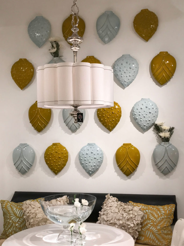
When I stopped into Global Views, one of the reps told me that this combination of pale blue and gold (below) was their 2018 colour prediction.
Black and white
Black is still going strong but not nearly as ‘overwhelming and everywhere’ as it was at Maison & Objet last September. If Europe is usually ahead of us a year or two, then this is no surprise.
Black is the new grey (in case you missed that post). Hot Tip: Don’t overuse any trendy neutral and your house will be way more timeless than your next door neighbours.
Related post: Grey is OUT! (Maybe); The Colour Trend is IN
Love these faux bois chairs (above). And check out the fun cocktail tables in the middle, Bernhardt introduced around 50 new styles this season.
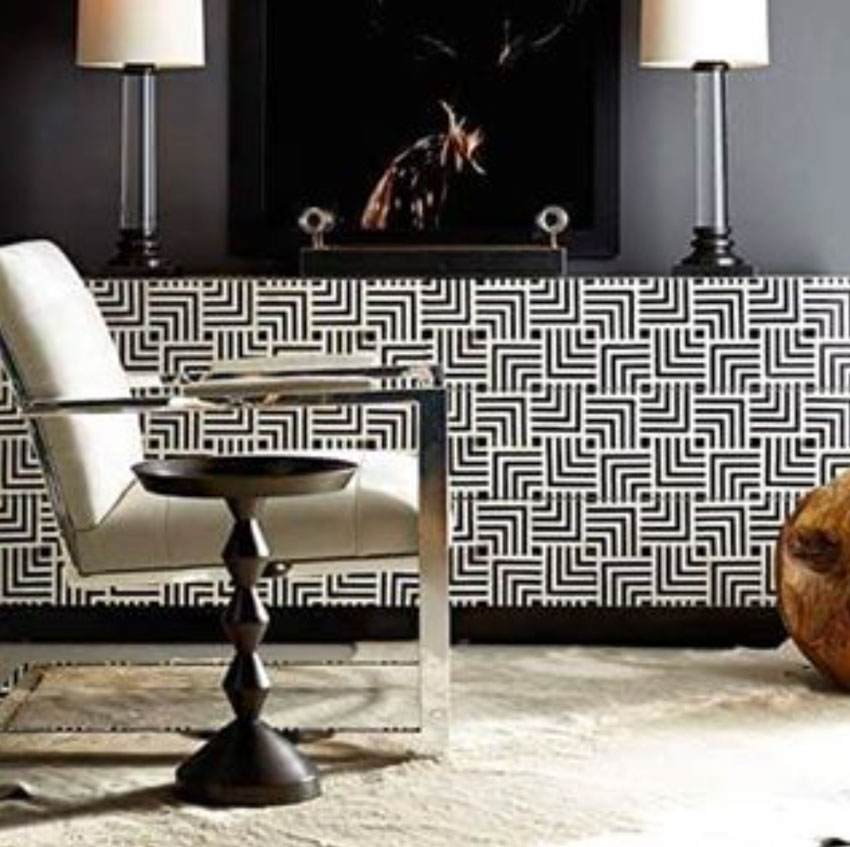
Bernhardt graphic black & white cabinet (image source)
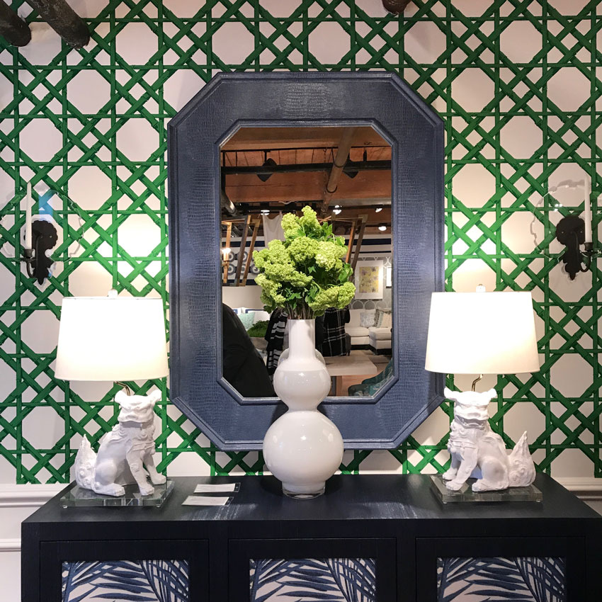
Thibaut Emerald and Blue.
Love this shade of green, can’t wait until it’s more mainstream! There was lots of this green everywhere.
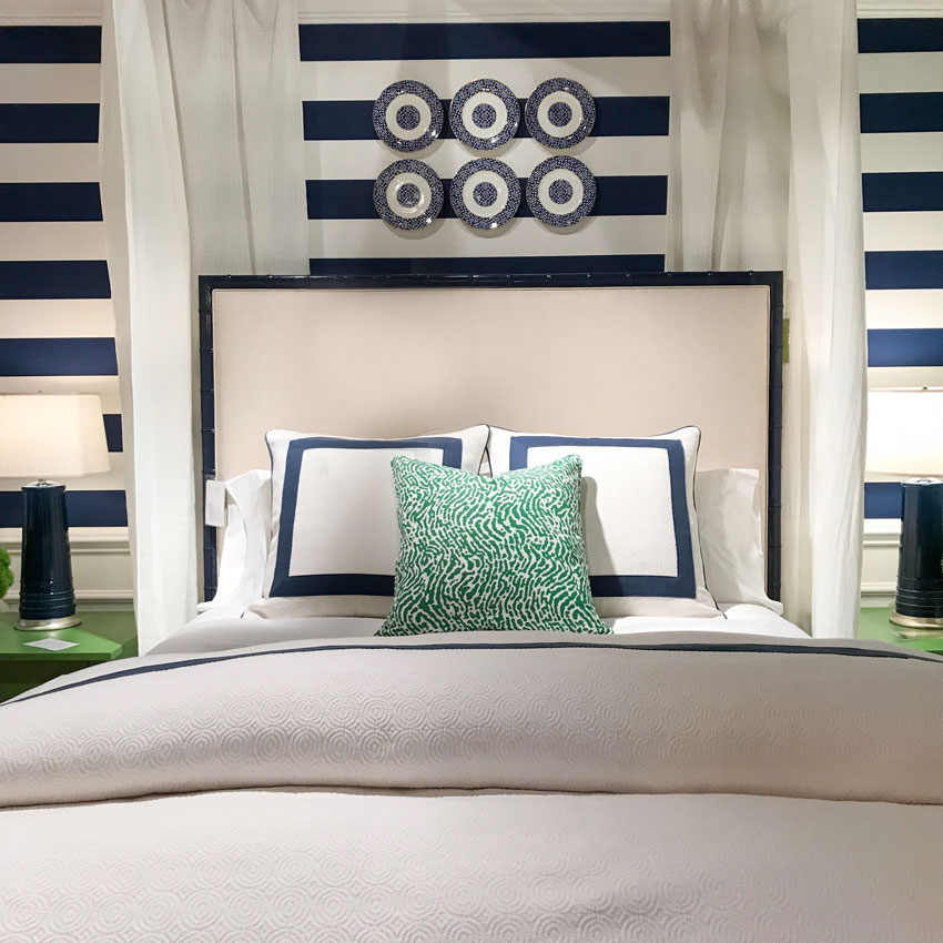
Thibaut Classic navy combined with greens.
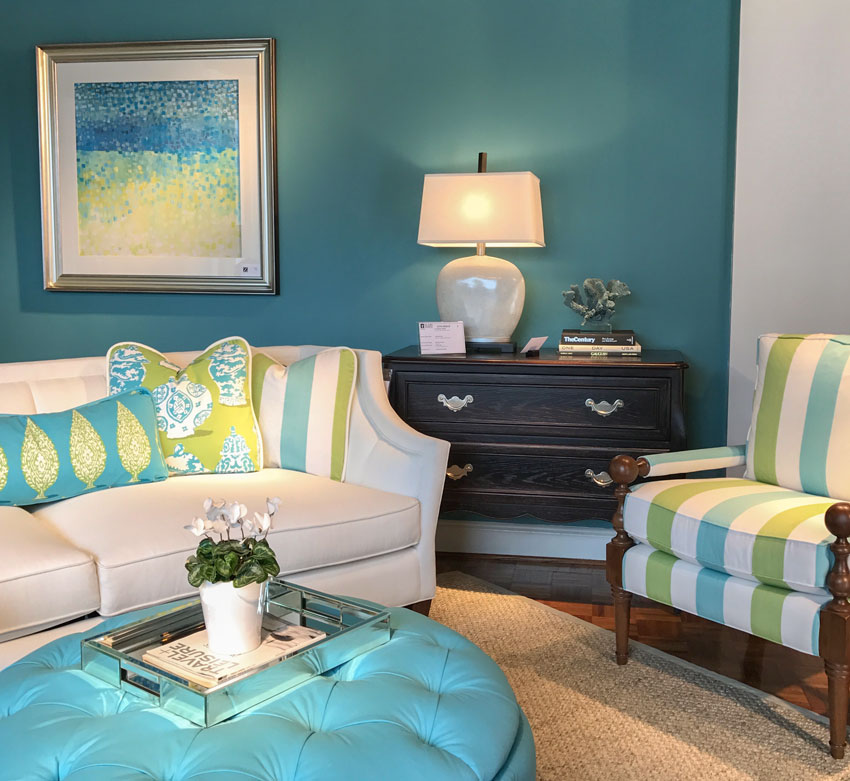
Turquoise is still going strong, but it’s slightly brighter than it was when we combined it with chocolate brown back in 2002 when brown was became the trendy neutral of the moment.
See the yellow green it’s combined with? For almost 20 years, we’ve been decorating with this shade of green and it shows no signs of fading. If you have a sofa in this colour, you are GOLDEN, in the timeless department.
Colour is way more timeless than a trendy neutral, as I mentioned in my last post.
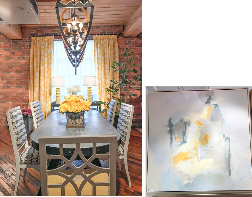
Yellow. I’m still waiting for this colour to become mainstream. It’ll happen, and when it does, my sofa will seem even more current than it does right now. Loved this yellow and grey room at Thibaut and I snapped a photo of this piece of art at Wendover when I toured their showroom.
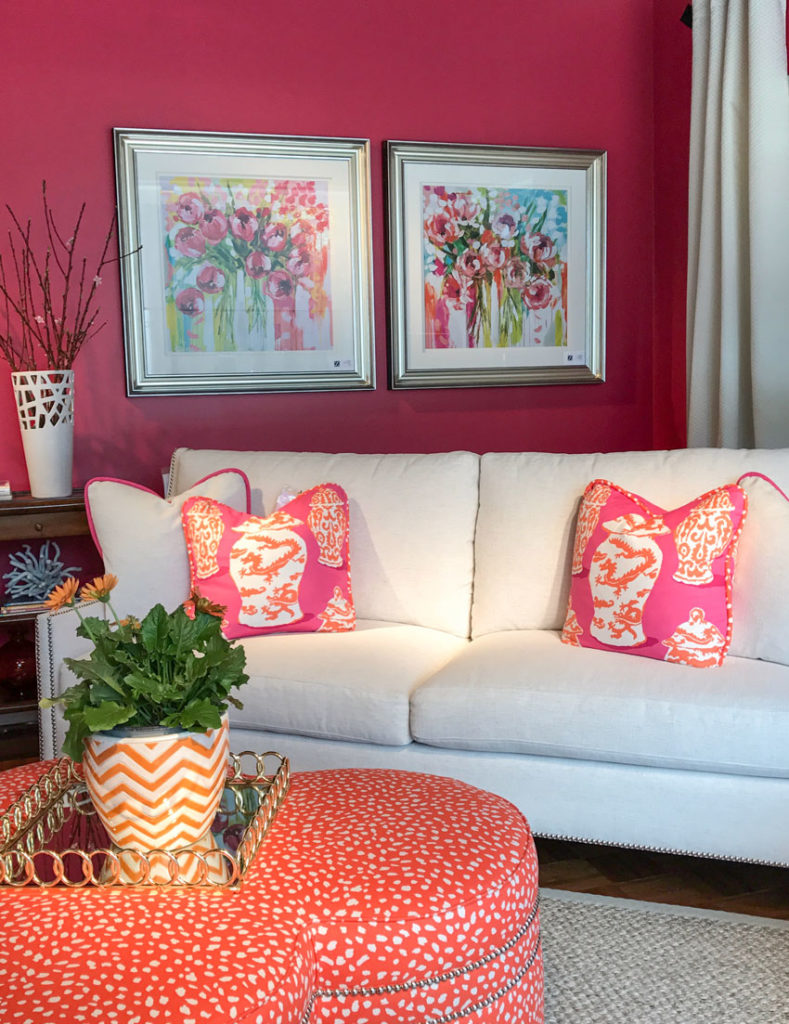
Paladin Industries Inc. Corals and mandarin orange. Fun combination.
But none of these colours are really NEW are they? New to you perhaps, if you haven’t introduced brighter colours into your home yet (and some of you might never go brighter, AND there is nothing wrong with that).
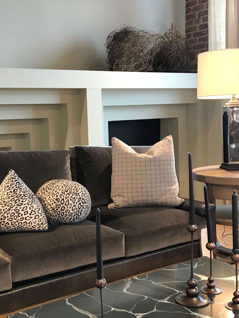
What was new, was that there were many showrooms that displayed brown and a more muted orange and they added animal prints to keep the look fresh and current.
Does this mean BROWN is coming back in? Well no, but there’s nothing wrong with a little brown, or a little charcoal or a little black.
It’s the overuse of these colours where I’m saying “buy with caution”.
Nancy, my Maxwell rep in Vancouver came by a few weeks ago and she was sporting a new ‘brown fabric book’. This book had fabrics with patterns that combined browns and greys. Perfect for someone who wants to introduce grey into their home but they still have an espresso brown sofa that’s not being replaced anytime soon.
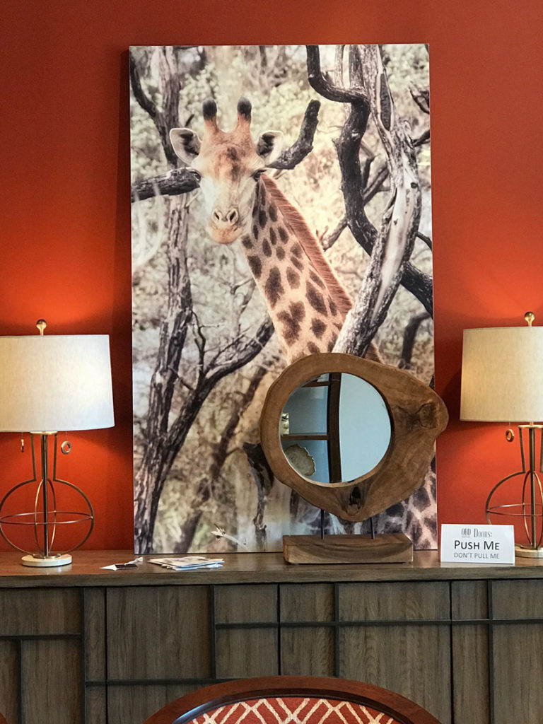
Of course I would love this photo with the sweet giraffe in it. Looks fabulous with the rustic mirror layered in front of it. And notice the rusty orange shade?
Brown is back but only in small doses

When Stephanie toured me around Bernhardt she was showing me this collection of ‘medium brown’ furniture that has become popular again.
Yes, because it’s timeless.
The grey washed, reclaimed and weathered woods will eventually find their way to the ‘shabby chic’ paint room. I’m just sayin’. A little goes a long way. Again, just don’t fill your entire house with the same grey wood.
It’s like entire homes that were filled with espresso furniture, now those will seem more dated than the current weathered grey finishes.
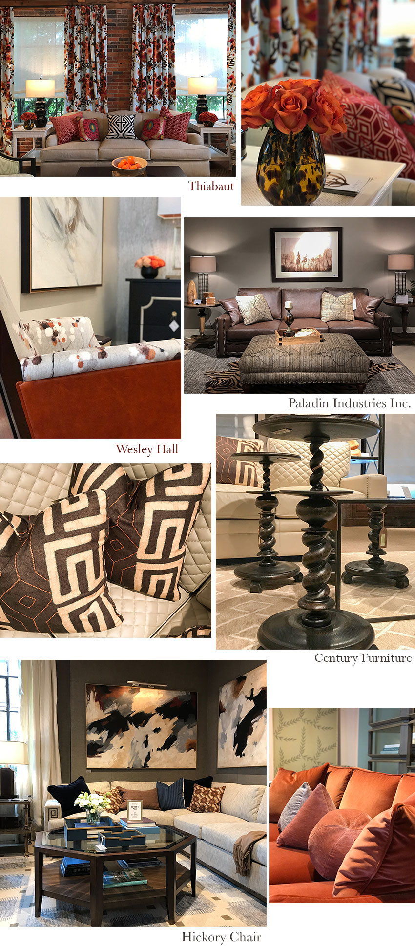
Thibaut | Wesley Hall | Paladin Industries Inc. | Century Furniture | Hickory Chair
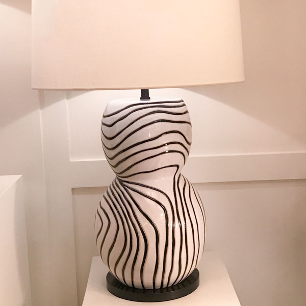
This table lamp was new for Kelly Wearstler at Visual Comfort. Fits right into the animal print trend doesn’t it?
Texture
There was lots of fabulous texture but that is the world of designer fabrics.
When I arrive at a clients home and she’s showing me three painfully thin microsuede (or something similar) fabrics as options for her new sofa from the ‘sofas are us’ big box store in the neighbourhood, I know we’re dealing with mass produced fabrics that are inexpensive and produce an equally inexpensive sofa that is not designed to last.
Frames are generally easy to build so that they have a ‘lifetime warranty’, it’s the fabric that makes a sofa expensive. So think about that the next time you are considering a variety of fabrics for a new sofa.
Should you Buy a Sofa in Microsuede? Yay or Nay
Taupe
When I walked into the Toronto airport, it had brand new tile in varying shades of taupe (sofa below). This in-between shade of grey and beige has also been a big colour inside the grey trend even though I consider it to be earthy, not fresh. So if you don’t choose the correct shade of taupe, it might look dirty with your cleaner colours.
However, shades of taupe (check out my neutral colour wheel below) appear warmer AND more neutral than blue greys and green greys, so that’s why people gravitate towards them.
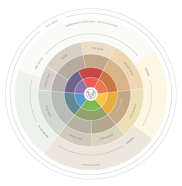 How to NOT to use the Understanding Undertones Colour Wheel
And, many people make colour decisions strictly by asking themselves questions like “Is it cool or warm?” But as my True Colour Experts know, warm and cool are relative, just like clean and dirty. You can always find a warmer colour and you can always find a cooler one, it depends on what you’re comparing the colour to, in any given moment.
Many WRONG choices are made based on asking this question.
I recently received a flurry of questions about taupe so I’ll write a post dedicated to this undertone very soon.
Related post: 3 Ways to Use Fresh to Sell Design
All photos by Maria Killam
So there it is, my trends report from High Point! I’m excited to hear your thoughts!
Which colour are you loving lately?
Related posts:
Is Black the New Grey? Trends for 2018 from Maison & Objet

Hi, Maria….I was so glad to hear you mention taupe, today! I couldn’t sleep last night, all I wanted to do was read your books and look at paint colors. Then I read the part, that said pick a lane, and I laughed and thought that’s what I need to do! So I picked taupe! You must of sent me good vibes! Thank you. 🙂 Loved all the trend setting info! Hope you had a great time at High Point! Love ya!
P.S. Loved the pics, especially the turquoise room, and the coral and mandarin!! Loved ’em!
Wow Maria, I love all of the color! There sure is a lot of clean vs dirty going on. The first picture at Bernhardt reminds me of the “Hollywood” glam look that was so popular eons ago. The play of gray and white is so predictable but still looks fresh. I love love love the emerald green lattice wallpaper! It is the wallpaper that I saw in a beautiful home in Newport Beach years ago with black and white tiled floors in the entry. I was so impressed. Putting it with the grayed blue is different but seems to work. The room at Thibaut that you liked with the yellow and gray going on is o.k. but for me maybe a little too much pattern going on with the brick and the floor. So much to comment on in each picture! The room I liked best is the Century showroom with the black and brown accents but most of all I love the artwork! Each showroom has its plus and minuses. Do like the giraffe picture and the rusty orange wall. I will show my son because that is the same color that we painted his feature wall in his condo.
It is so exciting to go to market to see all of the new items and how they are put together! Love this post!
I read somewhere on your blog that all greens go together. I am curious, is that the case with other colors (like all shades of blue)?
I always look forward to your blog and, after following your Highpoint posts on Instagram, was eagerly awaiting your report on the trends. I always love blues and greens, especially together (most of the rooms in my home have some combo of the two). Orange and cream are a great way to freshen up brown. And while I’m still a fan of greige as a backdrop, I’m so happy to see the gray trend giving way to more medium browns for wood furniture and fresh color for furniture, textiles, and accessories.
With regards to your beautiful yellow sofa, I think the color is timeless. I can see that color as easily in a mid-century modern home as I could a Parisian salon (in a rich velvet) or an Italian villa (in colorful ceramics).
Funny, I saw that orange on a new Ikea store display today and thought, “Getting closer to yellow for Maria!”
Thank you for sharing your brilliance. As always, an excellent lesson.
I was out and about today in Oz, and pale pink was the buzz. Not my colour at all, I’ll wait for the corals ansd mandarin. Thanks for the heads up Maria.
My mom’s friend went with a deeper gray with a purple undertone in her bedroom and revamped what had been tapue or brown, warm colors and in that range, any way. My mom told me recently that she said she misses the warmth the room had before. This is probably why tapes, warm whites, Brown’s, etc. will probably be back. We will all start looking at our gray walls and noticing the lack of warmth as designers showcase these other colors. For my bedroom, I wanted gray, but chose sw repose gray due to the tauoe-ish undertone. I even did the sloped ceiling so that I didn’t have any cool white bouncing off the warmer undertone. Still a cool color, but I think now I was craving a bit of warmth.
The blues and greens are gorgeous. Gold, orange, and several of the patterns in other photos remind me of the 70s (hey, some of us are old enough to remember…) I’m especially curious about the blue and gold combos. The golds have the same tones as the old “harvest gold” — dang! I should have kept that 70s gold pressure cooker I donated just last week. And the bathroom tile, I KNEW it would be back if I waited long enough. Can avocado green be far behind? I know color is always relative, but it’s tough to get over the horror of the 70s.
Anyway, seeing harvest gold again makes me doubly glad I replaced that tile with white subway!
The first picture with the light blue and gold reminded me of a new color introduced in one of the cabinet lines I work with. It is SW Interesting Aqua, which surprised me at first, but the last couple times they have introduced a new color, it has been spot on. They other new one is SW North Star. A lot of people in my area (rural Midwest) when looking at the white and gray painted cabinet samples seem to gravitate toward this gray with a violet undertone. I’ve also had two different people request taupe for their cabinet color.
Hmm, mmm good! Love the photos.
Taupe is a thorn in my side. I just don’t get it. For being a neutral, why does it look wrong with so many colors ? Taupe is my pinky beige.
I am liking the brown with gray combo.. but feel it works best with a green gray. Thoughts? I say giraffes must be in as I am seeing them all over the place!
Except for the bright colors everything popular right now looks like a black and white or sepia photograph. Blacks, browns and grays and neutrals, also reads very masculine. For me this just does not work in our cold, bleak winter MN climate. I think if folks do this here in MN they will regret it very soon. I’d much rather walk into your house on long, gray days than any of the new trends!
After all the gray I think we’re ready for some creamy yellow
What a fun post! Love seeing all your pictures. My favorites are the bright colors- I really love the photo with the corals and mandarin orange. The rusty orange that appears in some of the displays is something I wouldn’t have thought I’d see as a trend…but that’s the fun part of these posts that predict trends, I’m always surprised by something! Thanks for sharing!
I am so happy to find you I just started my design business and you are so inspirational!!!!!
[…] the kind of atmosphere and dynamic that you’d like for that room. Do some research on the most popular colour schemes of 2018, and you may soon be wondering why you didn’t get the colour charts out long […]