Trying to find a more current paint colour for your home? These days everyone is opting for fresher and lighter exterior colours. The most important step in the process is testing your exterior colour. Here’s how test exterior paint colour the right way.
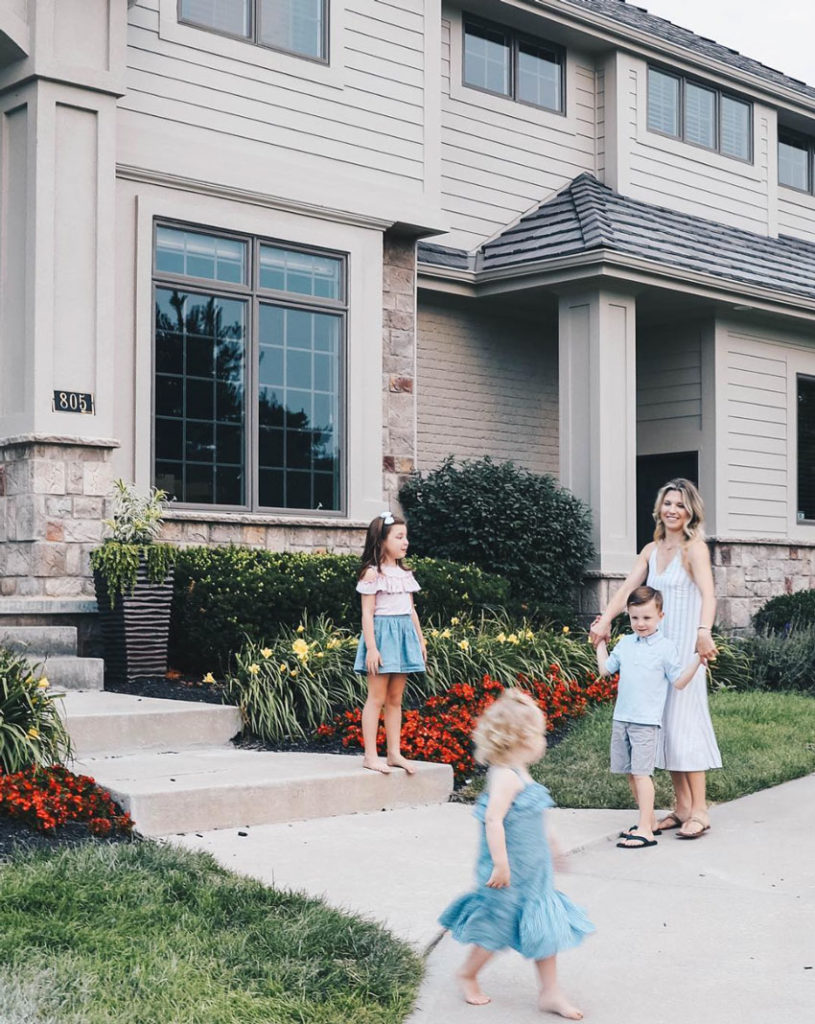
Image via Brooke’s Instagram
Today I’m happy to bring you another before and after of an exterior eDesign transformation, we recently helped a fellow blogger Brooke Wegner (above) create with her house! Tricia Firmaniuk, my virtual assistant wrote this post:
The Shortcut to Testing Exterior Colour; Before & After
Blogger Brooke was in love with her new house for her growing family. But the exterior needed some serious help.
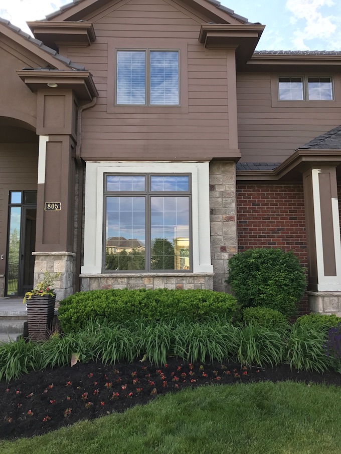
The dark reddish brown (below) was heavy, frumpy and dated — not at all a look that says a savvy mom and young family live here. Brooke admits that at first it was hard to get past the colour and buy the house. She knew that painting the exterior was an absolute must.
She also knew that finding just the right colour to work with the stone was going to be a challenge, so she enlisted Maria’s help with an eDesign consultation.
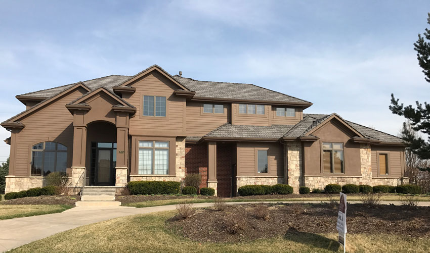
Before: Dated Brown Exterior Colour
Clearly, this house needed a lighter, fresher colour, but it also had a somewhat randomly placed block of red brick right smack dab in the middle of the lower elevation (below).
I suspect this is the reason the previous owners opted for a reddish brown in an attempt to work with it.

Before: Random strip of brick bossing around the entire colour scheme
Which kind of worked, but why would you want to cover your entire house in the most dated colour on the facade? This kind of thing happens all the time with “creative” mix and match claddings that developers are so fond of these days. See how bossy an innocent little, completely unnecessary strip of brick can be?
We wanted to create a fresh and creamy look on this house so the brick had to go. The solution? Just paint it out. See ya brick!
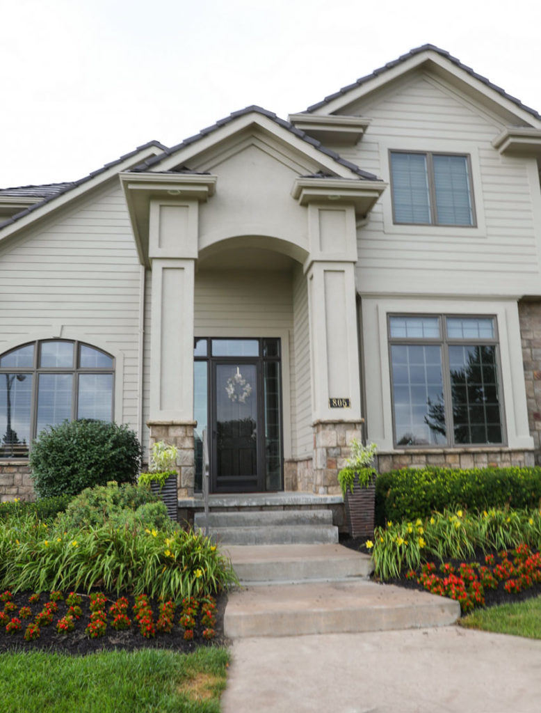
Keep trim painted same as body colour.
The previous homeowners had made the right decision in keeping the trim painted out the same as the body colour.
If you look closely, painting the trim would have made the house look very choppy and busy. See the three windows close to the gutters at the top? It looks like there isn’t any trim along the top of each window.
So we opted to unify it with one soft creamy colour on the body AND trim for a more current look.
Here’s the AFTER.
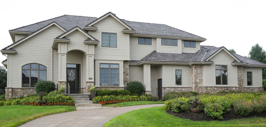
AFTER So fresh and pretty
AFTER
In the before images she sent us, the stone looked so bright and creamy in contrast to the brown that we initially gave her a pale pink beige that would read cream on her exterior. We asked her to test it by painting out an isolated section surrounding a window and meeting the stone so we could see how it was working.
The shortcut to testing exterior colour: isolate the colour in one area!
In case you missed it, here it is again: The EASIEST way to SEE the colours that your testing is to ISOLATE the colour in one area. Here we had our client paint the area FULLY around the window so it was easy to see what to do next.
If you start painting a random patch on your house, you will surely make the WRONG decision. ESPECIALLY when going from such a dark colour to a lighter colour.
That’s the shortcut to making sure you end up with the correct colour or neutral. Painting the exterior of your house can be very expensive and you can’t just close the door if it’s wrong. The entire neighborhood will see it.
First Colour Test
Why testing your exterior colour is so important.
When she sent us the photo of the colour test, it was clear that it was too light, so we offered two more options. The one on the left was more taupe, and the one on the right a pale green gray (below). The original selection can still be seen around the top of the window.
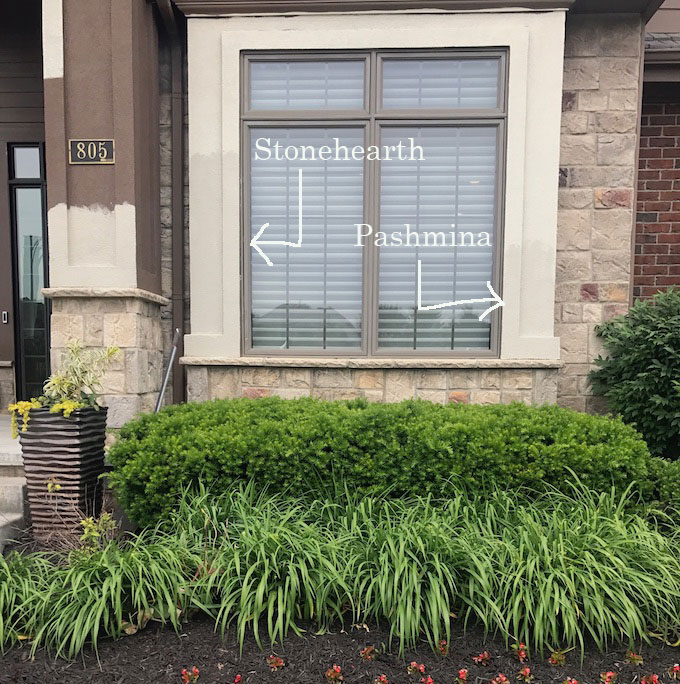
Tweaked Test Colours
Brooke really could have chosen either of the second round options, but she preferred the Benjamin Moore AF-100 Pashmina on the right, which was reading creamier.
Both green grays and pink/violet taupes are present in the stone so either options would have worked. The difference between the taupe option and green grey option are subtle because they are blown out and essentially reading cream in the bright exterior light.
Let’s take a look again at the dramatic before and after exterior – from dated brown to fresh and light.
BEFORE
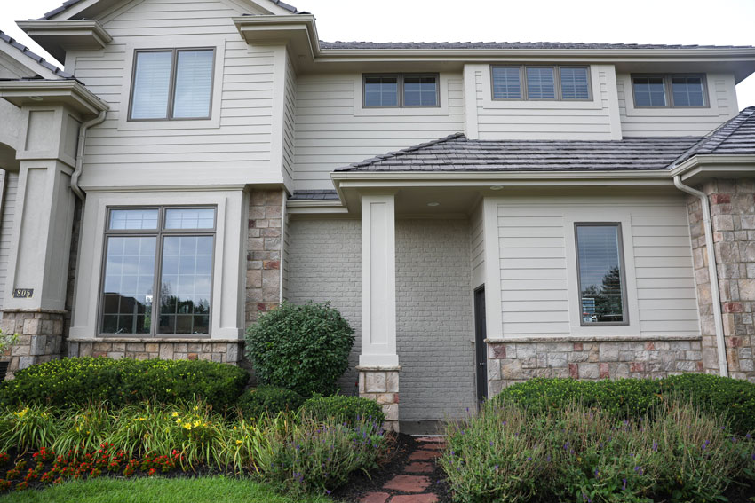
AFTER – painted out brick and siding to match – Benjamin Moore AF-100 Pashimina
Now the existing dark taupe windows look newly painted as well because you can see them. Before they looked totally painted out and blended in with everything else.
BEFORE
AFTER
Brooke and her family are much happier with the look of their house now. Thanks Brooke for the lovely before and after photos!
Brooke is a lifestyle and fashion blogger and she wrote a post here where she included this comment:
“I couldn’t speak more highly of Maria and her team as well as the overall process! I was surprised at how precise they are at picking the exact color using your home’s fixed features. To start the process, we sent Maria pictures of our home – full view and close ups. She also requested we take pictures of the stone and brick with a piece of white paper, as this allows her to better see the undertones.
We were then given a full report of the colors and accent colors to start with. It took about 3 different samples to get our exact shade. Some of the early samples were too light or too cool – things that I couldn’t really tell until Maria pointed them out!
If you are considering painting your exterior (or any area for that matter), I really encourage you to enlist the help of Maria – her knowledge of color and tones is so impressive.”
If you would like help transforming your exterior from a before to an after, treat yourself to a convenient and effective eDesign consultation here.
You can see that my groundbreaking system of Understanding Undertones™ is critical to choosing the right exterior colour. Become the next True Colour Expert here.
Related posts:
Exterior Consultation with Orange Stone and Brick: Before & After
10 Tips to Transform Your Exterior
Can you Combine Brick and Stone on Your Exterior? Before & After


So much better, Maria. Brooke was smart to have you help her.
Mandy & I were walking around her neighborhood last night & critiquing houses. We were commenting on which ones could use your help. It’s cheap entertainment for us. Lol
I do that internal critique on commercial buildings as I drive around and residential areas around my parents house and my neighborhood as I walk around. I taught that to a friend of mine who’s a landscape designer as we walked around in her neighborhood and she said, “OMG, this is so fun!”
Hi Maria,
Would it have looked OK to paint the trim the same darker color as the window muntins?
Thanks,
Kim
No because as I said in the post, the trim was really choppy all over the house and the casings on the 3 windows beside the roofline don’t continue at the top and painting the trim a contrasting colour either light or dark would have made that really obvious. Maria
I don’t know why people hesitate to paint brick. It’s not the end of the world. I have painted brick fireplaces and exteriors more than once. This house here has so much texture going on with the siding and the millwork on the pillars around the door that using another color on the trim would have been a terrible mistake–the trim still shows even though it’s the same color. The only thing I would do differently, if money were not an object, is to remove the vaulted entryway overhang. The house looks mission style, and that entryway looks too dramatic for the rest of the house. I’d lower that entryway roofline, and I’d be tempted to make a porch on the front across the left. But as it is, much improved!
Houses built in the last 30 years or so can be a real challenge because they tend to have so many gables and alcoves and complex rooflines. They also tend to have a number of design elements, such as window frames and stone cladding, that cannot be easily changed, and often somewhat awkward proportions and details.
I didn’t mind the dark color actually, especially if it was paired with more color and variety in the landscaping, and perhaps a lighter entry door. But going lighter on the body color changes the feel of the house and is a big improvement. The lusher and tidy landscaping is also a nice complement.
I would have painted the black service door that shows up in the middle of the building…..that caught my eye immediately
What a great improvement! That bit of orange-red in the plantings gives tribute to the bit of color in the stonework. This house is so immense, the lighter colors you selected bring it alive and back to scale. Nicely done! I love before and after stories!
What a wonderful difference! It went from blah to wow. Painting the trim around the windows the same color as the siding was a good call. Why would anyone slap in brick in the middle of a house with all of the stone work is beyond me. Painting it out was certainly the only solution! The landscaping also made the house look very classy! Good job!
Ahhh – awesome!
Stunning transformation. It’s amazing how much the look of the windows changed. Love the painted brick.
I’ve never seen brick and stone work together, so might as well paint it!
A wonderful transformation and just what it needed. I love the difference it makes. A great before and after.
What an improvement!! Brooke just improved the value of her house by probably 10% by making a smart EDesign investment with Maria. Money and time very well spent!
Hi Tricia. Great post, thanks. I really enjoyed seeing the difference- such a fab improvement. I wonder if you’d mind explaining why you thought the first colour was too light? I found the difference really subtle so I was trying to understand why you made that call (always trying to train my eyes and improve). Thanks so much.
Hi Nicola,
I thought it would look better a little darker because it would coordinate better with the existing stone. Maria
Thanks Maria
Great choice of colour. I would have chosen Pashmina, too. Absolutely gorgeous. 🙂 They must be so proud of their home now.
Love the before and after! I would love to see a picture of the house with the new color taken with a sunny blue sky to see what the sun does to the look of the new paint.
Great post!
The after looks so much better! It’s amazing how the stone color looks so different between the two!
Stunning.
HI Maria,
Awesome Transformation..! I really liked your color combination
Well, that builder was all over the place, couldn’t decide on windows so he chose the kitchen sink and threw in everything, lol. The color transformation is amazing, light and refreshing. Great job to Maria and her team. I would suggest down the line if the client could change out the rounded window to the left of door to match the window on right of door, it would bring even more cohesion to the design. Again, amazing.
Wow! I am just amazed by your skill with color — the absolute transformation of this property is extraordinary. It looks like a different house. Just lovely!
Fabulous transformation!!! Nice job Maria & Tricia.
Great article! Thanks for the insights. Very useful infor for my next home renovation projects.
What about introducing CONTRAST in the trim when painting the body of the house in a neutral? You say here that “painting the trim would have made it look choppy”, but what about having contrast? Neutrals (like taupe) can fall flat if contrast isn’t introduced right?
I recently advised a homeowner to paint the body of her house (1978 ranch with dated brown siding) in SW Taupe Tone and to trim out her windows in SW Neutral Ground. Did I give her wrong advice?
Hi Colleen,
On THIS house it would have looked choppy, not to be confused with another house where contrasting trim would be a good idea. However the trend now is painting everything out the same colour especially when it’s pale.
Hope that helps,
Maria
I realize this post is REALLY old. But do you remember the name of the original, lighter test paint color?
Hi Maria,
I am reading about BM Pashmina 100 for exteriors, being a nice neutral and curious what colour taupe the windows would be, since they didn’t change, but really stand out nicely. A green/grey taupe? I love the transformation! So classy and cheerful now, but still keeping the traditional vibe, just updated 🙂 Thanks