Interior design & styling by Maria Killam
As I lay by the pool on my recent vacation in Kauai, I had already read both of the beach novels that I brought, so I went through my client’s library and pulled out The Alchemist.
 My sister Elizabeth posing for my photo
Three years ago, when my client was building this house in Kauai, I helped her choose hard finishes and select furniture (Something I have done long distance with literally hundreds of my lovely readers).
She generously invited us to stay for 10 days last January and again this year. It was heaven.
 Here’s a better photo of the pool. Notice the two palm trees,
which were strategically planted to accommodate a hammock.
Anyway, I’m reading The Alchemist of all things (which is an inspirational book about finding your purpose) and in this book, it said (and I don’t have it with me anymore so I’m just paraphrasing here) something about beauty and how people react to it and love it.
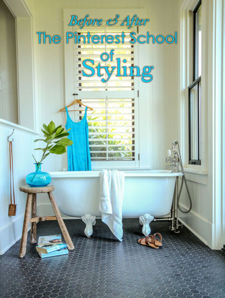
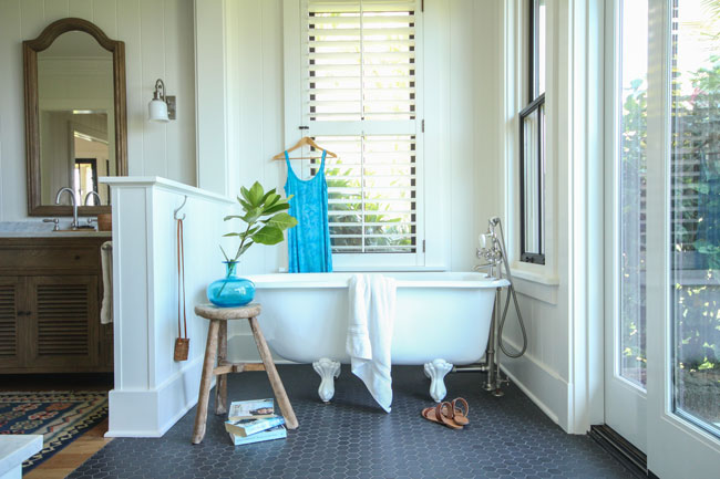
And, I thought, I should take a better photo of the clawfoot bathtub in the master, it’s so pretty.
So, I jumped up, and because I had brought my good camera and tripod, I proceeded to style and photograph the room.
Here’s the photo I took last year with my instant camera:
This year, I first went onto Pinterest to search for some inspiration.
There were lots of images of clawfoot tubs, but the best ones were photographed directly, showcasing the entire bathtub. After all, what’s not to like?
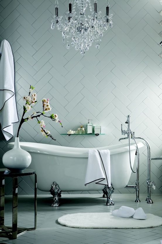
I noticed this picture because of the low, distressed chair, similar to the one in my client’s space. (Also of course, the charcoal hex tile.)

I loved this picture because of the big green, leafy plants. That part was easy because I was in lush Kauai, with no shortage of green.
 Side view of the house
 {via Pinterest}
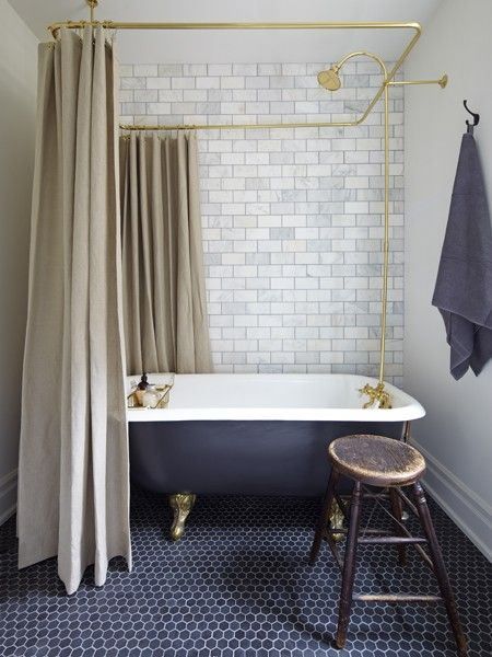
Then I saw this photo (which was already in this post
I wrote about renovations), and I was ready to go.
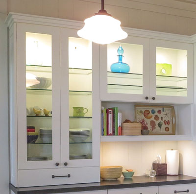
My client had a lovely blown-glass turquoise vessel in the kitchen (above). Similar to the vase in my inspiration picture! I peeked into her closet for a dress in the same colour; luckily, she had one! Then I found some books in the same tones.
 Notice her books are colour coordinated!
Okay, so back to the finished photo. Here’s the first photo I took:
 Interior design & styling by Maria Killam
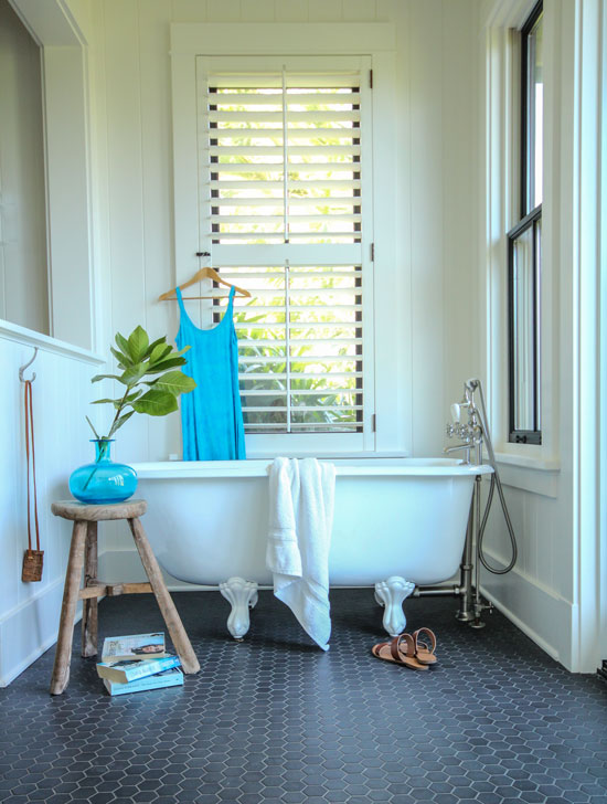 I also took this vertical photo, which I liked best
because the focus is entirely on the bathtub.
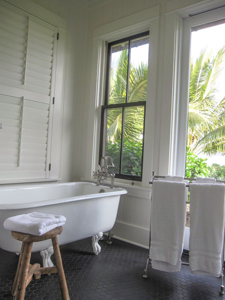
Then I decided to shoot the bathroom in the guest house, too. Here’s the exterior:

This was the picture I snapped last year:
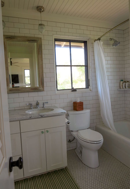
I didn’t post it, even though it’s a lovely, beachy bathroom that follows all my rules. The colours of the hard finishes are perfect, but it’s not styled, and this was just an instant camera. It’s not a good representation of the bathroom.
But here it is after some styling, and with a good camera:
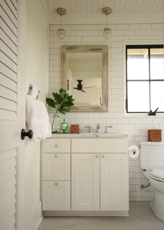 Much better!
I used the same branch, just found a different jar for it. Don’t forget greens or flowers in any photo shoot. They always bring the space to life!
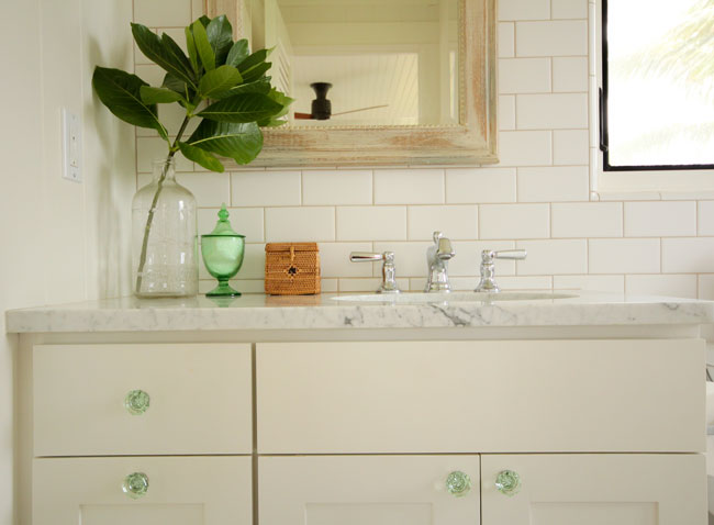 Love the green glass knobs with the coordinating glass vessel with cotton balls
The lesson of the day for design professionals is this: remove any photo from your website that is not styled and photographed professionally.
I used to think I had to show EVERYTHING I had done or could do so that prospective customers could identify with SOMETHING and hire me.
The same rules apply for advertising. I recently opened a shelter magazine and noticed an ad for outdoor furniture. Instead of showing a beautifully styled space, the ad showcased three wildly different, unrelated photos of furniture. It reminded me of the first ad I placed in a local magazine. I showcased three completely different rooms and styles and it simply left the reader confused.
Now, I’m clear that photos on my website need to evoke a look and a feel. If you have only five photos that are beautiful, delete the rest! Those five will represent you better than 50 so-so ones, and they’ll get you the kinds of clients you actually want.
So just in case you thought that styling ideas come from divine inspiration, it’s Pinterest, or before those days, I’d turn to my favourite coffee table books.
Happy Monday everyone! xo Maria
Related posts:
If you need a step-by-step plan for your renovation or new build, download my on-line training here, or become a client.


Such a great job! I find styling the very hardest to do. Probably because I don’t do it very often.
You make it look soooo easy – and perfect!
so so interesting, well well explained…… I read it 3 times… I will be looking more carefully at pictures from now on, need to start a file of design styling so I can work out how to do it to, You always teach me something new, thank you x
Hi Maria,
A lot of bloggers have quit blogging these days & now mostly use Instagram. Too much work they say.
Not you! Even on your vacations you are finding ways to teach us & inform us. Do you ever relax?
I never noticed the green knobs in the second bathroom until you styled it. So thank you for today’s lesson.
You taught me the importance of posting only beautiful photos of my work. This is another example of how important it is to represent yourself! I LOVE staging, I just need to learn to be a better photographer. Which I am working on! Enjoy your gorgeous vacation my friend!
I LOVE this house! Perfect photos, Maria! Surely this house has been featured in a magazine, right? I’ll second Mary from Illinois in saying I, too, hadn’t noticed green knobs until the second photo and had to scroll back to see that it was the same bath. Also, I see what you mean about adding greenery or flowers especially in monochromatic rooms. So happy you were able to enjoy this paradise with some of your clan. The expressions on the boys’ faces (prior post) are priceless!
Worked in advertising and public relations for real estate developers for many years–before digital photography. Learned from some terrific photographers/stylists to always have a plan for the shoot, but to bring along lots of additional items to “play with” to change the mood and add in more than you’d ever actually live with in a room. Take a cue from the shelter magazines when photographing interiors, what you see is a carefully staged vignette that conveys the message.
It’s truly amazing how much you teach us in one short blog, Maria!
The difference styling makes: Last year’s pix which evoked an “Oh, okay” and this year’s pix which evoke a “Wow! Love it!”
The different and instant reaction when looking at one horizontal pic of an area (where the eye has to do a lot of work before the mind knows what to react to) versus one vertical pic where the eye can go directly and the mind can react immediately (your two styling pix of the tub).
The importance of a touch of greenery always. The dark tub/dark floor bathroom with the beige shower curtain leaves me cold and bored. Just a small green plant would have introduced some life, although I think if it were mine, I’d add a bright apple green shower curtain – something to make me really sing in the shower. Even Alex Kennedy’s white shower curtains work because of the bold green plants.
The clever trick of showing the full piece and a close-up of details as you did with the guest bathroom vanity. My favorite catalogues do a lot of this and it really makes a difference. The gingko leaves triptych in the Grandin Roads catalogue (which could be hung vertically or horizontally) would have only mildly interested me except that they showed it hung horizontally with a great green chair beneath it and I immediately saw it on a wall in my D’office and had to have it.
I love being in your “classes”.
You’ve mastered your camera, Maria!
I’m out your way next week… I need to pick up that juju hat! 🙂
Love your styling, Maria!
Great styling tips Maria! You’re photography is fabulous!
Fabulous instruction. I found this also to be true with photos of people. They look much better “styled”; engaged in something they like (like your sister reading) or with an object of something they like or relating to other people in the photo.
Hi Maria, beautiful pictures! You have inspired to learn how to operate my camera! Oh, and the plants do add life!
Can you tell me what color of paint you used on the bathroom vanity?
Thanks!
It was a Pittsburgh paint colour, closest probably to SW Snowbound.
The last photo is particularly nice. The glass vessel brings out the green in the glass knobs. My real estate company’s “photography bible” states “no pictures of toilets.”
Wonderful, Maria! I loved your explanations on styling and it looks like you had a picturesque vacation!!
xo. Leslie
Segreto Finishes
I never mind seeing a toilet..lit is after all…an important feature in a bathroom. Love the green knobs/green vase!
If the toilet much show, please, please, please had the seat down. Also, please no dead animals on the wall. Beautiful styling, Maria. Love the timeless and classic bathrooms you encourage.
Sorry, can’t spell today… also meant to mention how much more interesting the reflection in the mirrors were in the second set of pictures, loved that and never really thought of it before.
So pretty Maria! Love love love that charcoal hex tile. I want it for my very own. Your styling is awesome and the” before and after” photography amazing!!
Great post. I would also say, take “old” pictures off your website/portfolio. You don’t need to show what you did 10 or 20 years ago! Chances are it’s not relevant and could be scaring people away!
Tell me what is the thing on the hook in the bathroom?
Haha, when I was out shopping in the touristy stores I bought it because I thought it would look cute hanging on a hook in my house somewhere. Then Terreeia told me it was a cigarette holder!! Oops.
Oh I am the world’s worst photographer but do admire those who have the talent for it. Re the claw foot bath tub; hope you don’t mind me sharing a cute story with you. Years ago when my Mother was renovating her bathroom the old but beautiful iron claw-foot bath tub was removed and was put in the back yard to be disposed of however by the next morning it had disappeared. Fast forward, someone had helped themselves to it during the middle of the night BUT …. the story doesn’t end there as about a week later the person who stole it rang the door bell inquiring if my Mother had repossessed it. Can you believe that? As she had not, she a good laugh about it as ‘karma’ in its own way had worked. -Brenda-
Huge difference in guest bath with better lighting/photography. It looked rather dreary, colorless and more industrial/ NYC than beachy. But, I woul definitely have mint green towels in that bathroom to add more of the green color! In the master bath I have to say I prefer last years photo angle looking out windows to tropical plants. Again, needs colored towels. Re the styling, I would’ve left out the dress….IMHO.
Maria, I couldn’t agree more about professional photographs being a must for our portfolios. Investing in this service is always money well spent. It never fails to amaze me when designers get frustrated with homeowners who try to save money by taking design advice from contractors or friends. Yet when it comes to photographing their work, they essentially do the same because they don’t want to pay for this service. Please don’t do this people! In my experience, fabulous photographs equate to fabulous clients. 🙂
Hello Maria
I have taken your advice of photographing my work by a professional as opposed to taking them myself because that’s the marketing of my work that people who have a similar taste to mine or would like to have that style in their home would look at the perfectly photographed rooms and would want to hire me. I have a new client because I followed your advice.
Thanks A Million
P.S. I do intend to take a course in professional photography and do my own photoshoots. You’re a real inspiration.
Great pics, and beautiful rooms!
And your book choice is one of my all time favorites!