When I was a brand new designer, it scared me to choose tiles. There were so many of them. Thousands of clients and years later, I realized that 80% of tiles, shouldn’t even be in the store. Most of them are bad and ugly, it’s the pretty tile that I want to teach you to see.
It’s such a permanent decision! It’s an even bigger decision to suddenly rip out your tiles if you’ve decided you made a mistake, even if you’re still in the middle of the tiling process.
Which happens a lot.
And I have two cautionary tales to tell you today that will illustrate my point perfectly.
By now you know that I believe all bathrooms should be mostly white or cream.
But even when white or cream is your goal, things can go wrong.
This past winter I started helping my sister Lea choose finishes for her new townhouse being built in the Eco Village just down the street from where I live.
This is Lea’s first (and probably only) brand new kitchen where she has the luxury of choosing exactly what she wants.
So she wants it to be FABULOUS.
Unique to her. Not what everyone else has.
Lea does not regularly read my blog and her aesthetic is very different from mine. She loves everything bohemian which equals colour and lots of it! And, because she is my sister, my advice is free and as you know, free advice is often taken with a grain of salt.
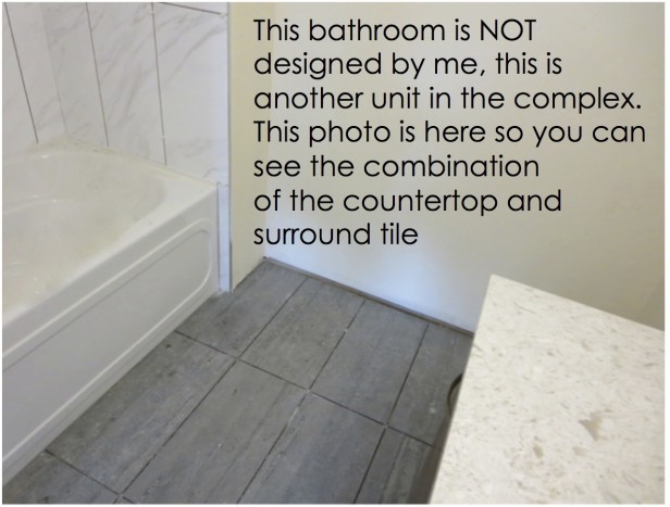
If she had chosen everything on her own, she might very well have ended up with a kitchen that looks like this recent installation that I photographed in another brand-new townhouse in the village (below).
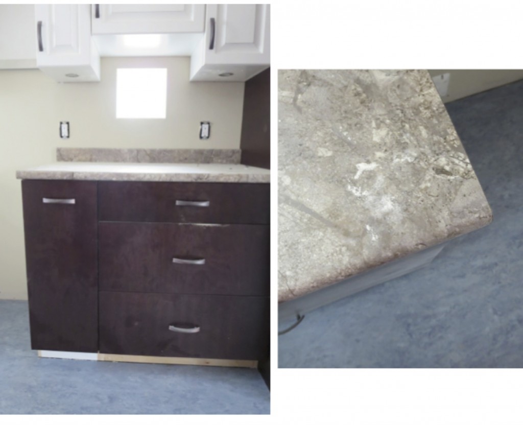
With the blue linoleum floors, busy multicoloured cream and taupy/green-beige countertops, – oh wait, that’s still not ‘different’ enough – let’s make the upper cabinets a too-bright white and the lower cabinets a wood stain.
But I digress. Here’s what happened when we were choosing tile for Lea’s bathroom.

The budget was not big for either the kitchen or the bathroom, so when the salesperson in the showroom said she had negotiated a deep discount on this particular quartz countertop (above) that could be used in both spaces, I approved it. It didn’t look overly busy and made it possible for her to have a stone countertop rather than a laminate one.
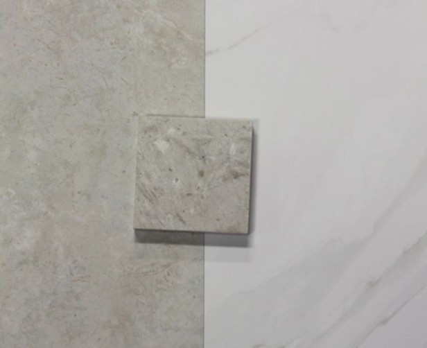
These were the two tiles that we shortlisted to consider (above). Clearly the one on the left is waaaay too ‘matchy’ and would definitely end up looking like we had tried to match her quartz countertop and failed.
So we chose this tile (above). My sister didn’t want a plain, boring solid tile (even though that’s what I would have recommended) and I thought, ‘Hey, it’s benign enough, not overly patterned and you can see it has the warmer, green-gray colour that relates to the countertop.’
A ‘safe choice,’ don’t you think?
NOT.
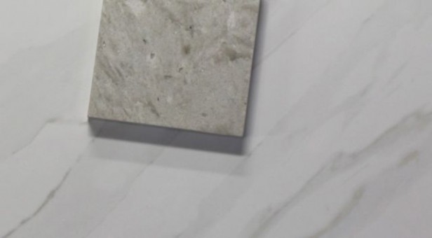
Another homeowner had chosen the same countertop and tile; however, instead of installing the tile on the floor with a nice white subway tile in the shower, she had installed the same tile we chose for the floor as the shower surround along with a more solid-looking gray tile for her floor instead.
My sister brought me by to take a look.
And I said, ‘Wow, look at how the wall tile reads way more blue along with the even bluer floor tile which in no way relates to the greener tones in the countertop. Can we still change your floor tile?’
Luckily the answer was yes, as their suite is one of the last ones to be built and the tile order was was still sitting in an office to-do box.
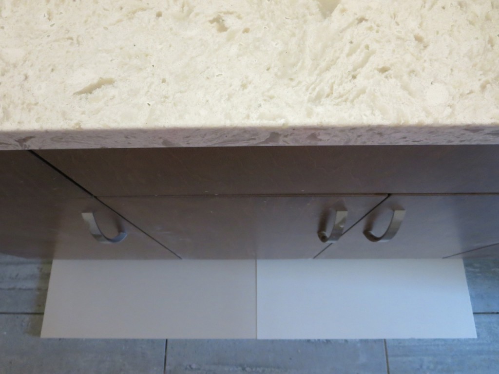
So we came back and placed our two SOLID choices in the bathroom and chose the one on the left, which is a perfect match (even though it doesn’t photograph perfectly here) while the one on the right was too white.
Whew! Crisis averted!
And this proves yet again that matching is imperative. Close enough rarely is, when it comes to hard finishes.
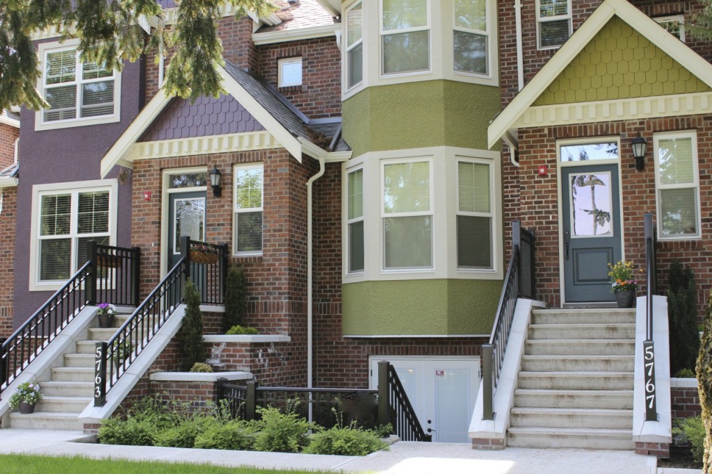
My second cautionary tale is one that happened just a few weeks ago. I drove by a show home in one of these new brownstones (above), so I thought I’d pop in to take a look:
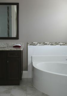
Here’s the builder’s perfectly nice, uninspired, master bathroom. With the token strips of pencil tile (you can see the rest of it reflected in the mirror). It’s fine, in this case, it all actually works even though the floor is patterned and so is the granite, but are you running to pin it on your boards?
Should we even mention that the wall colour is wrong? A pinky taupe while everything else is green? But that, at least, can be changed.
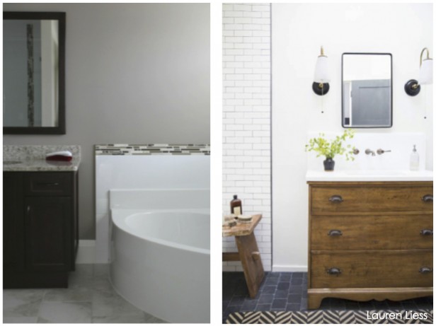
Which bathroom do you prefer?
I’m sharing both of these projects with you because if you are about to renovate or start choosing finishes for a new build, these are mistakes I don’t want you to make.

I’ve received so many emails like this one over the past couple of years:
“Maria, when are you going to offer a workshop for us homeowners?! I’ve read everything you write about color on your blog and try to incorporate what you say in my home but I still need more help! I wish I could understand better how to understand undertones (I’ve already read your book) and get some hands-on practice in developing my eye to see color and know how to incorporate what I know in my own project.”
So, just for you homeowners, home renters, design enthusiasts (and anyone who wants to understand colour better) from the comfort of your own home, I’ve created a 3 week training that will take you on a journey of transformation and change how you see and choose colour for your new build or your renovation.
Forever.
It’s called Renovate with Confidence – Focus on Finishes:
I’ve worked with hundreds of homeowners over the years and this is the first time I’m revealing the step-by-step order I use to choose finishes for a new build. It’s brand-new content!
And for renovators, my new Colour Confidence Method™ will give you the tools to look at any house through the eyes of a designer and make sure you spend your precious renovations dollars correctly.
This training is for you if:
- You are planning a renovation but you’re paralzyed by all the choices you need to make and you don’t know where to start.
- You are building a new house and would love to learn a step-by-step process on what to source first. When do you choose the countertops, flooring, walls, trim colour and everything else?
- You look at paint colours, countertops and tiles and ask yourself any of these questions: Is it beige or gray? Is it the right gray? Will I love this countertop when it’s installed? Will this white look too dingy or too cold? Will I love this turquoise shade when it goes up or will it turn into another colour all together?
- You look at endless colour chips and feel your eyes roll into the back of your head with overload.
- You wish there was a ‘system’ that would help you organize colour in your mind. (There is.)
- You rely on your best guess and cross your fingers in hopes you’ve chosen the right colour and the right finishes.
Do this video training with me and you’ll learn the answers to all these questions and more.

BONUS: To help you get the best hands-on training, you’ll receive a download in advance of the course with instructions on the Benjamin Moore paint chips you’ll need to collect and a pre-course exercise for you to complete.
Similar to the exercise Diane Golin is working on in one of my Specify Colour with Confidence™ training courses (above).
During the training, I’ll walk you through more exercises so it’ll feel like I’m almost in the same room with you.
You’ll also receive additional downloads with fill-in-the-blank worksheets that will help you identify and create a custom plan for your renovation or new build.
Session 1:
Renovate with Confidence week 1, will introduce you to the most important ways to see colour:
- Why understanding contrast is critical to achieving a look you’ll love.
- The most important information you’ll ever need to know about neutrals, whites and colour with regards to choosing finishes and paint colours.
- How to compare colour so you never again make the same mistakes you’ve made in the past.
- Four categories of white (which are the only ones you really need).
- Hands-on exercises that will have you see colour in a whole new way (it’s always the biggest ‘aha’ moment in my live courses)
Session Two:
We’ll focus on how to develop a master plan for your renovation:
- Learn how to best allocate your precious renovation budget.
- Complete an easy exercise that will reveal the right starting point for all the rest of your decisions.
- How to choose the right finishes to coordinate with a wood-stained kitchen (not just a white or cream one).
- Learn how to incorporate new finishes in combination with your existing fixed elements that are not changing.
- Get the step-by-step on how to choose colours for every room in your house.
Renovate with Confidence, week 3, we’ll focus on the step-by-step of choosing finishes for a new build:
- Learn the two “big picture” ways to view your new build – before you start to make choices and decisions that will make you sad/frustrated/crazy.
- How to choose your foundation palette, which will make all the rest of your decisions much easier.
- Get a complete list of which colours and finishes must be chosen first to achieve a look and a feel that flows throughout your entire home.
- Learn exactly when your wall colours should be chosen. Hint: It’s not at the beginning and definitely not at the very end!
- How to design your new build so that it’s classic and stands the test of time.
Many homeowners already attend my three-day seminars because they are ready to begin a renovation or build their own home and they don’t want to make the same mistakes they’ve made in the past.
So now I’ve created this training for you to experience your own colour transformation in the comfort of your home.
Here’s a testimonial from a homeowner who participated in my live training:
“As a Jungian Psychoanalyst, I certainly had no training in color! So I approached the class with some trepidation. I own a small office building, and a home, and have had some disappointing experiences with the selection of paint and rugs over years.
I was intrigued by your description of undertones, which seemed to explain some of my successes and well as most of the failures. So often, I would see so many tiny paint chips, and feel overwhelmed. I would select some, hold them up against the color I already didn’t like, and just not know how to begin.
So I ventured up to Vancouver, where I met a delightful group of people, learned about colour…and had a lot of fun. Then you showed us how to see undertones, how to distinguish – IN CONTEXT – dirty and clean colors, and my whole relationship to color changed.
Your course took the world of thousands of colors and brought it into perspective. Now when I’m making color decisions for my home, or my wardrobe, I have a framework and I know the first steps and where to start.
I emerged from your Colour Course feeling empowered in my choice making process. Such a great outcome, thank you!”
Marla Herbig, MSW, ACSW
You’ll have access to it as long as you need it!
PS. If you’ve never participated in my trainings before, this is one not to miss! One mistake will pay for this course and if you’re on a budget, you have no budget to waste on mistakes!


What a great opportunity for homeowners! Let’s rid the world of ugly oysters, hahaha!!
Great idea for homeowners. Love the picture of Diane! And you can even see my left shoulder in the background so can I officially say I was “featured” here LOL? That was such a great exercise. I have to say the undertones had been more intuitive to me than the clean/dirty difference, so that was such a new revelation to me that people need to know!
“With the blue linoleum floors, busy multicoloured cream and taupy/green-beige countertops, – oh wait, that’s still not ‘different’ enough – let’s make the upper cabinets a too-bright white and the lower cabinets a wood stain.”
LOL! I do kitchens and baths for a living and thought, “What is that?” when I saw the photo. Plus the weird white thing in the middle of the wall….OY! as they say in New York.
I look forward to taking this course to learn some more from you.
So much ‘new’ is ‘dated’ before the grout has dried. In the real world this means over a decade living with the wrong choices.
Love when I get a client ‘before’ they’ve chosen colors, tiles, etc… Especially if there’s a daylight basement level leading to the garden.
At least you don’t have to worry about mosquitoes inside. My last several designs have included posts with exterior ceiling fans at the dining terrace/harvest table.
Exciting times, you’ve got a new course !! Congrats.
Garden & Be Well, XO T
Perfect timing, Maria. Have put my relatively little kitchen reno (painting the oak cabinets white and working toward a French country kitchen look) on hold for the time being because ditching the “#10 envelope with extra postage stamps” flooring (pink beige tile to 30-year-old nicely neutral but filthy carpet to pink beige tile to carpet against yellow beige walls) has got to go. My 1986-built open floorplan house here in Arizona, as were so many everywhere, is a shrine to the idea of a different floor covering in every area (I remember when you said that practice was so OVER, but developers are still doing too much of it today.) I decided that any effort in the kitchen would be wasted if it were done to work with the current flooring and, in the end, it’s the look and feel I want throughout my house that’s the most important thing to me; of course it’s also the biggest and costliest thing too but it needs to be done first. This is a wonderful opportunity and the perfect motivation to get me going. Count me in. I’m collecting my bucks and making notes on my calendar.
I wish the people who had our house before us had taken your class. Someday, when we have the resources, we will be fixing all the “mistakes”, like the green beige floor tiles (also used as the countertops) with the pink beige backsplash in our master bathroom, along with orange beige 80’s ceramic tile surrounding the tub. How do I know what all the beiges are now? Because of you Maria! Thanks for teaching us so we understand why it looks so ugly…even if we can’t fix it yet….
Hi Maria,
This is a wonderful opportunity! Could have used your course 15 years ago when our townhouse was being built. My husband & I were in sales office picking finishes. The choices were very limited & I was trying to just stick with solid white tiles for the bathrooms. With white grout. All of a sudden my husband became an expert in picking colors & was adamant that the grout should match the color of the carpet in the adjoining hallway.
I was a newlywed & let him have his way.
I have learned so much from you over the years & have shared it with family & friends that now my husband let’s me makes all color related decisions.
I love the ‘which bathroom do you prefer’. Putting these images side by side is brilliant. The old adage ‘a picture speaks a thousand words’ couldn’t be more true.
This will be awesome. Maria you are the best instructor and the things I have learned from you so far have changed my life and elevated my career! I am running not walking to sign up and any of you reading this should too!
Thank you so much for offering this webinar to all of us. I just registered and can’t wait to get started!
I am soooooooooooo excited to be able to participate in “summer school ” We’ve lived in our dated condo three years and I have saved my money for a redo this fall. This is PERFECT timing.
Thanks for the upcoming webinar.
Toni
Oh boy…I guess I need this course since I preferred the bathroom on the left:)
I actually think a fair comparison to your builder bath would be another builder grade bath; not a bath done by a designer, styled and professionally photographed bath. The bath on the left although could be much better will never be the bath on the right if you are having to choose from a limited number of choices from a builder.
Fair comment, however this is a course to help homeowners NOT end up with that bathroom. Just by choosing the RIGHT floor tile, countertop and getting rid of the obligatory strip of accent tile would have gone a long way to making the example bathroom NOT look like a builder bathroom.
I agree with you; that is why it would be really effective to compare the poorly done builder bath with a well done builder bath. This would help homeowners see what they can end up with given their limited choices. It won’t be the bath on the right either.
I do love your blog and all the color advice. It’s been very helpful to me.
I think the problem is there are no well done builder bath photos to choose from. Where would one go to to pin a nice builder bath? Why do builders offer a granite to people and then force them to search on their own for coordinating finishes? When they offer that counter top they should have a matching floor tile chosen to go with it already.
Hi Maria. Someday could you please do a post about selecting the right grout color to go with the tile? I would love to learn more about “color theory” and how colors play off one another as it applies to tile and grout.
I recently found out how tricky selecting the right grout color can be as I ended up trying 15 different grouts (yes, 15-(blush)-on different sample boards! ) trying to find the right color grout to complement my ivory-colored subway tiles on my kitchen backsplash. The tiles have a yellowish or goldish (and maybe slightly greenish?) undertone and have subtle variations in glazing (emulating handmade tiles.) I wanted a white grout, but all the white grouts I originally tried either looked too bluish, pinkish (from the sand?), or grayish, or too “clean” (too bright white) or too “dirty” next to my tiles! In desperation, I even tried 4 other colors that I didn’t really think would work–but didn’t know what else to try. Nothing was looking right. I wasted so much money and time! I googled, but couldn’t find much info out there to help someone specifically select the right color grout for their tile. (That is how I stumbled upon your site, however, and I am so glad I did! I’ve learned so much about color and design. You also relieved my anxiety about NOT installing accent tile! Thanks so much! )
Anyway- I finally did find a brand-new type of grout that DOES have a beautiful warm white grout that looks fabulous with my tiles and makes my tiles look gorgeous, too) (ok, I know it sounds funny to get so excited over grout, but after seeing all the other grouts that looked horrible next to my tiles, or made my tiles look dirty, you would understand!) Anyway, in case anyone ever needs a warm white grout, the one I found is made by Mapei, in their new “Flexcolor CQ” line of grouts. It is an acrylic (not cement-based) “single component” grout (ready-mixed in a bucket- gotta love that!) Instead of sand, they use coated quartz crystals (I think so it is less prone to scratch delicate tiles and stones), so I guess that is why they can achieve such a nice, clean, warm white color that regular sanded, cement grouts don’t seem to be able to achieve. It is a premium grout (it is a bit more expensive than regular grout, unfortunately, but not too bad), and it is very stain resistant and never needs sealing. My kitchen backsplash has already tested that claim–spills and splatters clean up beautifully. (No- they aren’t paying me to say this!) I found it very easy to apply and easy to clean up, too. Hope this helps someone.
Maria I’d love to hear your “take” on selecting grouts and grout colors! Thanks.
Anyway—any tips you can give for future grouting projects (to help narrow down the selection before having to test so many grout colors!) would be greatly appreciated, Maria!
Thanks so much.
Maria, I love what I’m learning from you but still have so far to go. One of your first posts I ever saw, you commented on someone else’s kitchen that was so lovely. Saltillo floors, soapstone countertops and cream subway tile. My heart skipped a beat and I knew this was the kitchen I had looked for for so long! I’m still scared to death. My designer (without saying so openly) doesn’t agree with my choices…but I’m sticking to my guns..thanks to you! I start my reno in June, and I hope to have it all fine-tuned CORRECTLY before then! Fingers crossed, and studying your work every day! Thank you so much!