We’re going back to the 80s with all the colours of the year that have been announced this year and Pantone’s Ultra Violet is no exception. Benjamin Moore’s Caliente (blue based red) and Sherwin Williams Oceanside (strong teal) were all big statement colours in the flamboyant fashion of the 80’s.
Will black be the next grey too, just like in the 80s? Don’t forget, I said it here first. And it is PPG’s colour of the year, Black Flame!
I might be ready to break up with Pantone.
The ‘Colour of the Year’ prediction should have most colourists in the industry nodding their heads in unison.
I used to be a member of the Colour Marketing Group. Every year at the annual conference, we would all be required to show up with our ‘next’ colour predictions.
We’d pin them up on a board (example below) and you would be amazed how many of the colours in each section would be identical. And it didn’t take a crystal ball to figure out what they were. If you’re in the colour industry, you are on the pulse of what’s happening in colour it’s easy to see.
Look at the greens and the blues that you can see on this board I’m working on here:
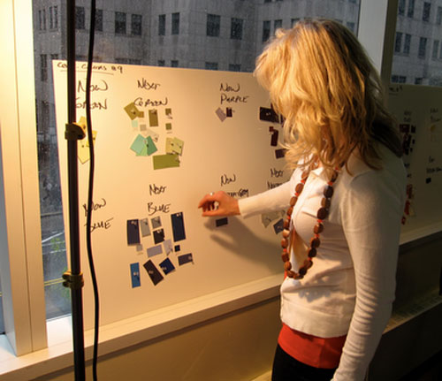
Maria Killam | Colour Marketing Group
The idea was to predict which colours were going to be trending in the coming year for the completely practical reason of knowing which colours people will be asking for in products and design.
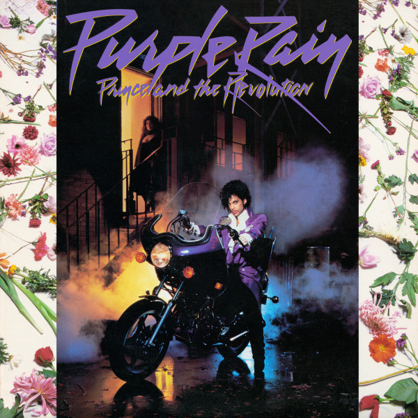
I think very few people saw a “Purple Rain” kind of colour on the horizon for 2018. Apartment Therapy rounded up their predictions here and purple was not on it.
So here’s what I think Pantone has morphed into as a colour company. It’s no longer about ‘Here’s the hot trend colour that will show up in fashion and home decor in 2018’. The intent seems to be reaching beyond that to express where we are culturally right now.
So as an industry standard, it’s possible that it’s over reaching it’s purpose and relevance.
Instead it’s become a kind of colour horoscope.
It’s no wonder reporters keep asking me the same questions about ‘the mood that colour evokes’ over and over again, and as I said in this post, is not that important of a question in residential design.
I learned in their webinar this morning they see this colour ‘Crossing all areas of design”.
It’s about experimentation and creative expression.
Be original, explore, express, invent. (see the quote in the box at the beginning of this post)
Pantone feels that Ultra Violet reflects what people are looking for, it’s a colour that fulfills a broad psychological or spiritual NEED at this moment in our culture.
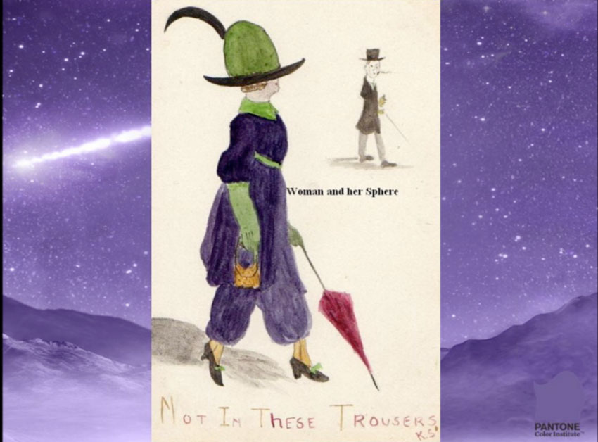
Oh I see, so it covers everything, including embracing the eccentricity of the “When I am an Old Woman I Shall Wear Purple” mantra that I’ve seen so often (above).
So since I’m the no-nonsense, here’s the real scoop, colour designer, what I would appreciate is if Pantone would just say that straight up. Instead of leaving so much to the interpretation of the masses.
Everyone runs out and starts pinning purple sofas and purple high heeled shoes, but as we’ve seen in past predictions like here and here. These colours did not appear in the upcoming year, and they were impossible to find in home decor. And then people stopped talking about them as they jumped on the next bandwagon all over again the following year.
The best sound byte from the Pantone webinar was this:
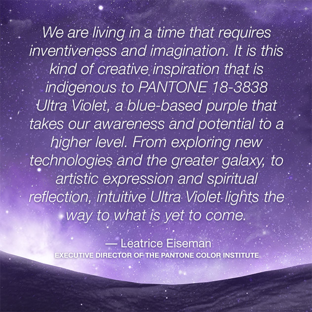
“We are living in a time that requires inventiveness and imagination. It’s about putting your own stamp on something.”
That’s what I’ve done in my business for the last nine years since I’ve been writing this blog and with the access we all have to social media, there’s no better time to start your own thing! Be a rule breaker and a wave maker! When you have more time than money, it’s easier than ever to create a niche that you’re known for in the world.
Over to you my lovelies? Did you see this shade of purple coming?
Related posts:
How I Reply to Media Requests about Colour and It’s Effect on Mood
My Take on Pantone’s Colour of the Year Greenery
My Take on Pantone’s Colour of the Year Marsala


no
Wish I’d said it like that.. ditto
I think you have figured Pantone out! I gasped when I read earlier that purple was the color of the year. Now, I love purple flowers in my garden, a purple accent in my wardrobe–scarf or handbag, and a lovely piece of lavender toile. But, that’s about it.
Not this shade! It is certainly going to be a passing phase, and not well received in the “Middle Earth” of Interior Design. Those that are color forward and want to buy into it might have a little fun with it, but it is not worthy of a big investment in my opinion, definitely not for my or my client base. It sort of like picking something random for random’s sake and for some “water cooler” talk to bring attention to the Brand. Perhaps they are looking for a younger base….
Sorry for typos
Go ahead and break up with them! I think you are spot on!!! NO ONE I know has expressed an interest in decorating with purple!!
Seriously?
Oh, back to the 80’s ? My Grandma told me in the late 90’s when bell bottoms were resurfacing that everything comes back in 20 years, keep the thing you like most and it’ll eventually be back in style. I guess she was right.
Maria I do agree with you .
Back to the 80’s
Don’t see it going there .
Thanks for your insite .
Nancy
Your post reminded me of a fabulous purple sofa I had for years. It was quite dark and worked well in several homes with different colors.
Did I see this shade of purple coming? Um, no.
I totally agree. Did not see this one coming at all and I’m trying to leave myself an open mind. I don’t have a singe client (past and present) that have shown an interest in using purple and I’m thinking this will not sway their opinion either.
Isn’t that the color teenage girls want to paint their bedrooms that drives their mothers mad?
Bingo!
Sweet.
If you’re a Barney fan.
’nuff said.
LOL!
I totally agree with your cultural statement. It started with the Rose Quartz and Serenity, and then the Greenery. I’ll admit, I was excited about Greenery; not that particular shade of green, but was hoping for more green choices in general, like depression glass, or a dark bottle green. Rose Quartz has seemed to roar onto the scene, and even a brighter shade of “Marsala”, in the form of burgundy and as you mentioned, Caliente. Maybe they ran out of ideas. I mean, brassy yellow is already here, and yellow is getting popular. Green, pink, blue and burgundy they already chose too recently. Turquoise has been done to death. What does that leave? Purple, orange, and teal. I think they scratched out teal when SW made their announcement, and then tossed a coin.
I will confess, I wasn’t one to pay attention to color trends until I started to read your blog. So my insight is probably behind. Also I’m a midwest gal. I would’ve bet on a bronzy yellow or earthy orange. I saved some pictures from Fashion Week runways of some gorgeous yellow dresses. I don’t even like yellow, but all of a sudden I love it. I even knit a golden yellow cardigan. Now that’s commitment.
By the way, I hope your next post is your own Colour of the Year.
YESSS!!!
I think you summed it up perfectly. The 80’s all the way. I am not a fan of this color at all!
Totally agree, Maria. It no longer feels like Pantone is reflecting on how color will be used in the upcoming year, but more about what color theoretically reflects our culture at that time. Devoid of any practical use…. Certainly won’t be using this color (other than perhaps in a mixed bouquet of fresh flowers in my kitchen).
I miss the days when the paint companies followed Pantone and there was one color of the year! Now, they each have a different color of the year of their own which confuses my clients. I can ignore it all, but it’s still irritating!
I agree with you 100% about Pantone. They predict a color and then everyone thinks that is the “in” color to use. So far I have not seen orchid or purple back as a major color in the clothing world. Be inventive and yes do your own thing! The client dictates the colors anyway.
Kravet has introduced Ultra Violet. I guess they are on ‘the band wagon’. OK in clothing, but I’m not so sure with interior design.
Ive hated pantones colors of the year for about every year they’re garish to me . Even the pink and Blue awhile back …it’s all based in fantasy outre trends …most of us
Have to be real…. for those who don’t well enjoy!
Oh my goodness….Pantone, with their reasoning behind the color of the year sounds like they are the new “color resistance”! That color will go nowhere fast!
I think it’s a marketing gimmick. They supposedly research color trends for several months beginning in the spring. Colors have to change so consumer brands can develop new products to sell us. I was aware of that today when I was trying to find a throw for the living room: I had my choice of any color, as long as it was gray. As much as I try to decorate timelessly, there are only so many colors that are sold at retail.
I’m getting tired of the grey options too. I’ve had my fill, I think i’m gonna try to hold out till gray is gone.
This, exactly!
I was expecting a derp sapphire blue. Jewel tones are still out there for next year, though perhaps tamped down a tad. But I don’t follow trends.
Four years ago, I used a deep purple on the walls of a dining room, with antique gold on the chair rail. Clients had a black table, black sideboard, and a black wall mirror with a gold color inset in the frame. Placed end chairs with a paisley matching the rug, and brighter green for the side chairs. Clients had two pieces of colorful art. It’s a magical room.
LOL! Just say the word Maria my black leather sectional can’t wait to be trendy again!
THAT shade of purple? Not really. Though I have noticed a darker, richer shade in pillows and accent pieces in jewel toned rooms. Check out Jeffrey Bilhuber’s Instagram. Am I a big fan? I don’t see purple walls in my future, but some accents are great. Love the jewel tones with very light walls.
Ditto on your next post being on your personal pick of Color of the year!!
I don’t know about this color for home decor. but back in the 80s I had a beautiful printed flowy skirt and fitted cotton top in this exact color, and I loved it. so I would be a purchaser of this color if it shows up in clothing.
In my guest room the wall behind the bed is painted BM California Lilac. I don’t know if they even still make this color, it’s a deep vibrant purple. I love it but it’s in another room that I don’t use so that may be why, lol. It’s the only purple in my house. I am an old woman and would never ever wear purple.
No, I did not see it coming, but a color like Lilac would have been cooler.
This colour, not so much. Unless you combine it with, black, White, grey and maybe a clear yellow of similar intensity, what would you do with it? It’s not one of those colours people embrace in their environments. Too strong an undertone for a blue eyed blond to wear, thats for sure. I can only see it in a tiny accent piece or an accent wall for Mary Kay lobby.
Ewwwwwwww. Really, Pantone?
I’m with you Maria… I rarely agree with Pantone but this one is so off the mark, I’m done. As far as I’m concerned it’s dark blue this year – moody. Dark navy like BM ‘Hale Navy’ and a ‘near’ black with blue undertone, like F&B ‘Off Black.’
I remember when the (insert name) colour of the year first came into my consciousness via your blog Maria. I looked out for it each year, probably because you wrote about it. The other colours of the year surfaced from other paint companies, so I dismissed the whole concept as marketing. Floating around the internet this year was the supposed favourite colour of all time, all people – deep teal. The only enthusiasm I’ve been able to feel for any of the colours were the yellow and green. I like my colours fresh (clean), bright and happy-making. If I take only one lesson from your blog, it is express yourself and your loves. So, I like the Violet, but not for my home. Do I think it will permeate fashion – will we have to wait for Anna’s approval? Who knows? I just get on with feeling happy in my space Bit I do look forward to your next post, be it about violet or any other decorating info you give.
Ha! I guess I’m on point without even trying! I’ve been wearing purple for 40 years and I’m finally an old lady. 🙂 But I’ve never decorated with purple until I bought two eggplant armchairs to go with two orange barrel chairs and red accents in our new condo living room. Art ties it all together. It’s rather smashing, if I do say so myself. They are a much darker version of Pantone’s ultraviolet. But I would never paint a wall purple for some unknown reason. I prefer white or cream walls. However, I won’t be at all unhappy to see shades of purple in clothing. Bring it on!
Once again you are speaking what’s in my heart and head. There are no true colour specialists at the helm of these paint companies. They may as well use a giant dart board.
The training I received from you enables me to help my clients choose timeless colour and design that transcends the latest trends. I am incredibly grateful.
I’m in the process of painting my bedroom a very very pale version of this colour. Quite romantic with lots of off white and a bit of dusty blue. This full blown colour is too commercial for interiors. More likely seen on chocolate wrapping or kids toys!
Pantone has gone political and I don’t like it!
I so do not like that colour. I think it is a depressing and moody colour. But I can see people going for it in London.
Thanks for your saying what alot of people are thinking in secret! My disillusionment with most of the COTY (colours of the year) started a few years after you and I trained together in Colour Forecasting in the summer of 2008. My stint with Color Marketing Group was short & sweet. I’ve come to view COTY as fashion & cosmetic colour trends, not interior design colour trends because the colours are rarely practical for my interior design and staging business. It’s been extremely disappointing that we can’t rely on paint companies or global colour experts to give us practical colours to create classy interiors.
We need some very classy colours for interiors (which usually means muted paint colours to create understated elegance), not loud boisterous colours that you’d only pick for kids rooms, gyms, playground equipment, or flower bouquets. So I think we need to separate the Runway Fashion COTY from the Interior Design COTY. Yes, I think the time has come for you and other colour & interior designers to start announcing our own Interior Design COTY.
Seems a company has turned aggressive/arrogant against much of its consumer base. How? Follow the money. Huge swaths of their customer base cannot afford to use a color with the lifespan of a young aphid just knocked to the ground from its perch on soft new foliage.
My first thought was political. Hillary/Bill wearing purple for concession speech. Though it wasn’t supposed to be a concession speech. A statement color choice aligned with an anticipated win. Odd thing to remember, yes?
Today, learning what Purple means on the California fire warning chart. Worst case scenario is the Purple warning. Purple, now, is a terrible reminder of seeing 29 horses burned to death in their closed paddocks.
Sad things I’ve written, above. Color matters.
You never waiver Maria. Your color knowledge is a gift. You share in grace & integrity. Making people’s lives better, and our world prettier.
Garden & Be Well, XO Tara
You nailed it Maria! Instead of forecasting color it appears they are pushing their choice of color. Bleck!
And yes to your question I think black and white will replace gray but it will be slowly. I still have many clients calling who want gray in my region of the country. I give the spill the bray wave should be ending soon. But here is the rub I remember so many people saying I would never use gray in my home at the beginning of this color trend. Once they started to see it every where not just in decor mags but in friends homes that’s when they decide to get onboard. Yeah when it’s over???
I give you credit for at least taking Pantone’s color choice seriously enough to try to analyze it. I gave up on them after Marsala. In fact, after that one, they lost any/all credibility with me. I have a more cynical view about some of these choices. I think they are zagging where everyone is zigging to try to get to a new trend when what will happen…we will all buy more paint to paint our walls! The gray trend is so steeped and so many people have it, paint demand may not be as high! The best colors I have seen so far for this year…Behr’s In the Moment. As a paint brand, Behr isn’t as highly touted or talked about as Benjamin Moore and Sherwin Williams, but this color beats both of theirs and most of what I have seen! SW is fine and I like PPGs, and I think Glidden, Deep Onyx, is really nice and on trend. Pantone is staid, I think, and so are their color choices! As my daughter would say, Next, please!! Lol!! 🙂
A couple more good ones:
Olympic — Black Magic
Dunn Edwards — The Green Hour; I like it better than Sherwin Williams’ color, actually, though both have the green blue mix.
Hope you don’t mind links to other blogs. Here is another great blog from another great lady, Cyndy at Creativity Exchange, who has a roundup of the colors of the year (no Pantone though): https://www.thecreativityexchange.com/2017/08/2018-colors-of-the-year.html
I wore a purple top to the gym this morning & got 2 compliments in the first 5 minutes I was there.
So I will be looking for more purple to wear. But I won’t be putting it on my walls.
When was the last time their color passed to retail? I loved it when it had that power … it made it easy. As for this color. I recall the later 80’s as having gray carpet and walls and then this shade of purple in clothes and contemporary home deco style but that was it. As for Ben Moore – Caliente was marketed years back as the pottery barn red when they had a relationship. This is my go to red for the last 6 years for painted red furniture pieces. How I know what non neutral color family is a current trend? Go to a busy thrift that organizes their home deco in colors and see where everyone is.
Is there any analysis that shows how color of the year translates to short-term or long-term trends? I see the brass, navy, grey, charcoal shows up everywhere, but do we see the colors of the year? I’m not a professional but don’t recall any of the colors of the year have any staying power apart from classic applications. Why should we pay any attention to this?
I completely agree. It’s hard to imagine Pantone really believes that specific color is going to be all over this year. The thing is it’s an awful shade of purple, in my opinion of course. There are other deeper shades and this just looks like “grape” or “Barney.” It seems like they could have gotten their point across with a much lovelier shade.
I think that Pantone is pretty useless in general. Though not the point of your blog, it’s impossible to use their books to get any accurate colour in print, whether it’s being reproduced on paper, vinyl or acrylics. I don’t know how many times I’ve had to get graphics redone!
Hi Maria!
I suffered through wearing that color as a bridesmaid in my cousin’s wedding in 1995.
I have never gotten over it! And the dress even had huge shoulder pads!
I am so glad you don’t even TRY to make this color work as a trend, but you give your honest (fact-based) opinion.
Thanks for keepin’ it real.
I think it’s time for the “Killam Kolor” of the year! Maria, you’ve emerged as the true color expert and your brand following has grown so much that it might just take off!
I love John Saladino’s periwinkle blue. Been looking for it for my own home. So, I guess , kinda? I am also feeling a soft yellow,golden blonde color too.
I’m just a layperson but I would never have guessed this color for COTY. I absolutely love purple (I had actually painted a bathroom a more muted, kind of creamier version of this color, and I have amethysts all over my apartment) but I can’t see people decorating with this. It doesn’t really go with any other trends right now except maybe in a throw pillow or something I guess.
This shade of purple is impractical to decorate with. It’s garish cleanness would make everything else in your house look dirty, So, no thank you, but I do like a more wine colored shade of purple, and prefer to call it eggplant.
Honestly, though I am not a designer, I do sort of have an instinct for color trends (I wanted lavender bridesmaids dresses in ’97, two years before they were in stores)… and I figured purple would be the next hot thing, though green will stay much longer. Mainly because it’s been out for so long — my husband wants a plum bedroom, and I went to the bedding store last week to see what might be available, and… nothing. So somebody better get on it if that’s going to work! Lol. Mostly I think they choose a new color that hasn’t been readily available just to sell more pillows and accessories at Target to people who like to be trendy. 😉
Love BM FRENCH VIOLET
LOVE BM VIOLETTA