This post is written by Tricia Firmaniuk, my design assistant who handles my eDesign:
So often people find Maria’s blog AFTER they have already made some costly mistakes in their renovations; when they realize it’s not coming together the way they had hoped, and they go looking for answers on Google.
DIY design has some common pitfalls. One of the biggest ones is making decisions without the context of the entire “big picture” of how things will relate. Good design is the result of a well reasoned plan.The trouble is that when you don’t make design and decorating decisions all day long, and you are faced with the opportunity to finally redecorate or renovate your kitchen, it is too easy to get overwhelmed by the possibilities. It is tough even to decide where to begin and it is far too easy to make costly mistakes. And then what?
Well in swoops Maria with our “Save Me from Myself” eDesign consultation 🙂
One of our lovely eDesign clients and her husband had spent 3 years on a drawn out kitchen renovation. After all of that, they were still unhappy.
She admitted they had neglected to be sure that their plan for the new kitchen related to the rest of the house that wasn’t going to be changing much. They had installed a bright white kitchen without changing their earthy porcelain tile. They chose hardware and backsplash tile that were far too contemporary to relate to the existing finishes. They had worked very hard but in the end, they knew it was just not right.
Here is their new kitchen.
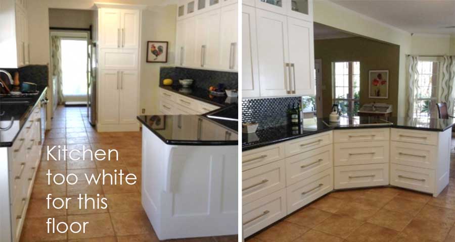
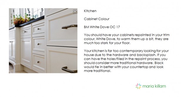
You can see how the floor was completely ignored, the new true white cabinets are too stark.
Fortunately, for some reason, the cabinets needed to be repainted anyway so we recommended that they go with a creamier off white which was already their trim colour everywhere, BM White Dove.

The shiny black graphic backsplash they installed was not helping it relate to the rustic floor tile either. It was way too dark and modern.
via Pinterest
The stark white island countertop and hood fan in this kitchen are also very white but the white has been repeated and the styling is gorgeous.
Sometimes, if you make a mistake, just repeating the colour again can make it look right again.
If you were going to introduce accent tile with floors this colour, you could consider this:
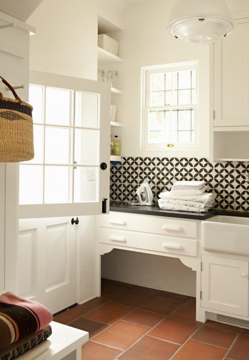
This much graphic black and white works for this laundry room with a small area to tile but might be too much for a kitchen with a lot of backsplash tile.
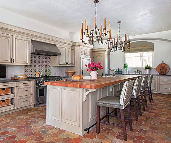
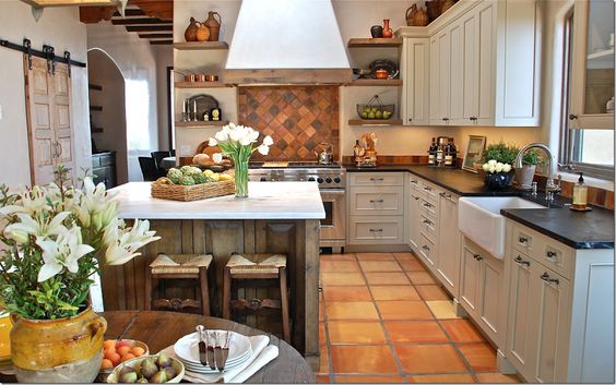
The cabinets in this kitchen are pink beige but they do work with the floor. And if you have an orange, terra cotta, or Saltillo tile here is where repeating the colour in a butcher block countertop looks great!
via Pinterest
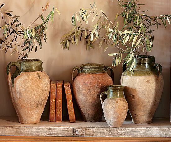
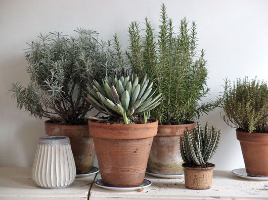
Adding terra cotta pots with rosemary and cactus is also a great way to style a kitchen with orange tile floors.
Here is our advice to tweak the details of this kitchen to make it feel more classic and traditional.
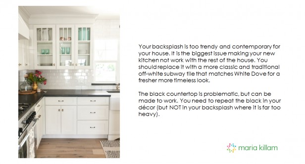
With these few relatively minor tweaks, (a subway tile backsplash in the right white simply never fails 😉 their kitchen will relate better to the rest of their house.
We didn’t stop there. It is still a brand new black and white kitchen in an earthy house, so we gave them some decorating tips to pull everything together 🙂
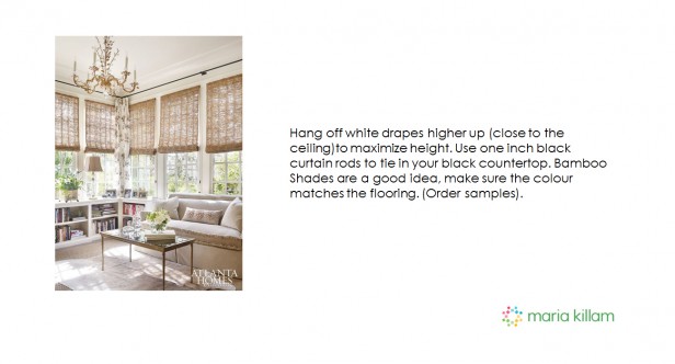
Here is a photo they sent us of the living room.

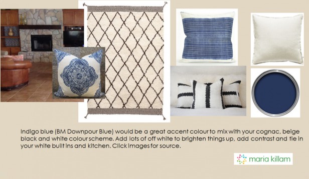
The main thing needed here is contrast and colour. We recommended that they paint their built ins the trim and cabinet colour, White Dove, to better relate to their new off white kitchen, slipcover their beige chairs off white, and add a black and cream rug and some bright accent pillows. And we gave them the perfect neutral paint colour to tie it all together.
We gave them some toss cushions and a rug as a spring off point for a brighter more current colour scheme that repeated the high contrast black and creamy white of their new kitchen in the living room along with a punchy indigo blue accent colour. The cushions and rug images were all hyperlinked in the presentation so they can source them easily.
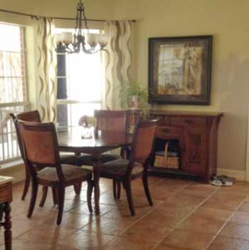
The dining room in particular needs updating to relate to their shiny new kitchen. The current set up has not a stitch of black, white or colour (aside from the green walls that aren’t really relating to anything).
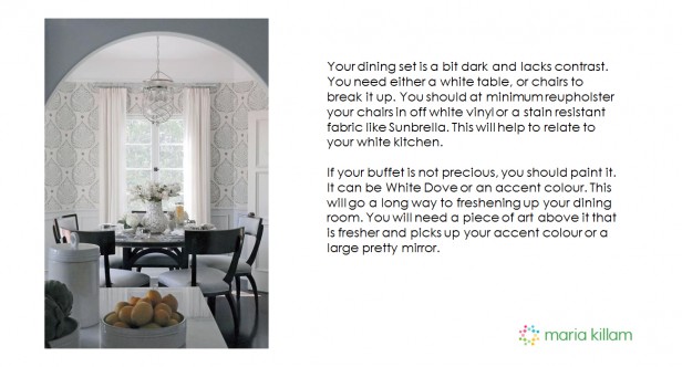
We recommended that they update their dining set by swapping out either the table or chairs for something white or reupholstering their chairs in a bright off white wipe-able fabric.
Furniture arrangements look best when they have a collected and coordinated look rather than looking like they were bought as a set. Here again, contrast, in this case black and white, is key to creating a fresher look in their dining room and making it relate to the new kitchen.
They already had a great idea for their window treatments which we affirmed for them.
So there you have it, some tweaking of details and savvy decorating can go a long way towards correcting even relatively major design issues. We created our “Save Me from Myself” package with this in mind. This way we can help you with the tweaks that will make the most impact on top of the perfect paint colour.
She sent this note later:
I got my new Dash and Albert black and white rug, I love it!!!! I am currently reupholstering my dining chairs as instructed.
My friend bought the exact handmade African fabric(bulk/whi) and is making my pillows for me.
The consultation has relieved me of a lot of stress and was worth every penny.
Whether you have some ideas and you would like to run them by us, or you are just not sure what your room needs to come together, there is enough flexibility built into this package to tailor our advice to you and your house specifically. Because most often, getting the right paint colour is not quite enough to turn your room into an “after” picture, usually there are some simple but effective tweaks that will make all the difference in the look and feel of your room.
Click here if you would like us to help you solve your colour puzzles too.
Thanks Tricia!
__________________________________________________________
I’m in Charlotte about to hop into a car to drive to High Point Market with my good friend Lisa Mende (below) who was in my Specify Colour with Confidence workshop this week!

This is what Lisa said about my course:
I highly recommend Maria’s course, Specifying Colour with Confidence, to new designers or color specialist just starting their practice as well as the seasoned designer.
Her knowledge about color is unparalleled. I already owned her custom paint color boards which I use with clients all the time but taking the class gave me a new perspective on how to use them to the fullest potential with my clients.
The course was well organized. I came away with lots of tips on working with clients in ways that will save me time and money.
When you have a master color expert like Maria explaining the theory of color in the way she has devised which is simple to understand, you then feel better equipped at explaining color to your clients.
Another amazing group of design professionals and colour enthusiasts below:

Charlotte True Colour Experts

Photos by Melissa Bolinger
I’m wearing a current cold shoulder top from Bloomingdales! I have been looking for one but this is the first one that looks good!

Traci Zeller and Maria Killam
Traci was the first True Colour Expert she was in my very first course 6 1/2 years ago when I launched this training and we held the event at her Country Club (we are at Country Clubs a lot because they have windows) she was my guest speaker talking about her Designer for a Day service and how it works!
Every designer charges a little differently so it’s always valuable to learn another way of adding to your income.
Register here if you’d like to transform the way you see colour.
I’ll be at High Point Market this weekend, follow me on Instagram to see all the latest trends.
Related posts:
The Problem with your Orange/Yellow Floors
The Best Way to Work with Saltillo Flagstone (because it’s pink)


What I would like to see on these consultation posts are the “Afters”. All the ideas make sense. The homeowner is on board. Let’s do a follow-up with photos?
Red
Easier said than done long distance unfortunately!
I’d love them as well!
Maria
I have a question about pinky beigh. It seems to be a villian but is used in so many homes. Why is it bad? Isn’t pink flattering? Many blogs talk about banishing it from rooms like it is unbearable. It is mentioned above as a solution for terra cotta tile floors. Can it be a solution instead of a problem?
Hi Donna,
Pink beige has it’s place and certainly exists in many homes. If you’ve got it, it is best to work with it but Maria usually recommends not installing it knowingly (if you have the choice) as it is the most limiting undertone to work with, it tends not to be as versatile as some of the other neutral undertones 🙂
Great post! I can see how helpful this service is when you are stuck!!
Hope to see more posts like this!
This was really well done and helpful. I can relate to the average homeowner with an older house doing a few renos at a time. Old and new together don’t have to be a bad thing. I love the older elements of my house, won’t be painting my original wood trim or maple shaker cabinets, and don’t believe in ripping out finishes that are still in good shape. However certain elements such as the black laminate counter do need to be replaced. So the ideas about continuity and the pinterest examples, combined with real life photos and practical suggestions, are very helpful. It also gives me a much better idea how your online consulting services work.
I can only imagine how their hearts sunk when they saw their new modern kitchen and knew that something wasn’t right. You did a great job pulling it together with their house.
I know terra cotta can be considered pretty neutral, and I know muslin is only a very subtle pink beige, but I would not think to put the two of them together. I hope we get more pictures later!
Can Traci write a guest blog about her Designer for a Day service? She sure does beautiful work.
Your posts are so informative and helpful. I “hate” terra cotta floors! They are so bossy that it is hard to put most anything with them that will make them blend in. Actually you are then stuck with the pink undertones. Your suggestions however sure make sense and makes a “silk purse out of a sows ear”. I like the blue accents and the use of the dove white to pull it all together. Good job!
Love your new cold shoulder blouse but didn’t they have it in yellow? Also what a nice looking group you had. I know that they are so glad that they spent the time and money to take your course. It is so worthwhile.
P.S. Also love your new shoes!
Very informative post, would love to see their “after” pictures.
Great article
Great post to show what you get when you order a package. Thanks.
You are a life saver. How stressful to have done a big reno like a kitchen & still be unhappy with your home. What did folks do before you came along? Probably the same thing I would have done & continue to throw money at it. Geez!
Yes, DONNA!
From reading Maria’s books, I thought pink beige was the laughing stock of any decor and to be avoided at all costs. Yet that is exactly what was recommended to me when I purchased a color package for my NEW BUILD!
So I gave up and painted everything the same white including moulding.
Hi Heidi, we gave you a pale current neutral with a pink undertone because the fabrics you chose to decorate with had pink undertones. There is nothing at all wrong with pink beige if that is the right colour to relate to your decor.
This was a fantastic post, as always. Should bamboo or woven shades always match the floor color — or can they be darker if they relate to something else in the room?
Perfect solutions. Would love to see the ‘after’ photos of this kitchen, living room and dining room. Have fun at High Point!
How come that Terra Cotta floors can’t be treated the same way as wooden floors ( = ignored), when they can actually be the same colours?
Great post!
Love your ideas for this homeowner! My issue is walls… my builder only allows you to choose from a few colors! ugh! I chose “Accessible Gray” for walls and “Extra white” for cabinets and trim. But I plan to use blue and white w a very light taupe sofa. Will it look cold? did I mess up? (PS AND builder is charging me $3K! said I “switched” colors – they should be vice versa (Gray trim and white walls!) Grrr!
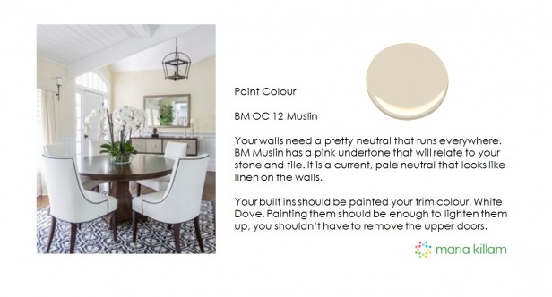
Did you recommend that the dining room be repainted? If so, what color? Muslin?
You had mentioned the black countertop was problematic. I was wondering what you would recommend with the cream cabinets and white subway tile.
Imagine mining Maria’s blog posts in 2023 and finding one from 2016 that pretty much sums up what’s going on with your own house currently! I’ve known for a long time it’s a hot mess, but am still stuck on whether to paint the fireplace brick and whether to put up with the dated peach and grey tile or put LVP over it. The only real difference in my kitchen is I went with white subway tile for the backsplash – but like this eDesign client, I’ve got the too-white cabinets, peach floor and black countertops! My dishwasher happens to be black and other appliances are SS. Let’s call it un-intentional repeating of the black. Verrry tempting to start paining and pull out some terracotta pots!