Well, it’s been a long time coming but it’s finally here! The feedback I received from the first agency I hired to design my new site was “You don’t have a colour wheel that shows your colour system, that’s the first thing you need”.
It’s taken a village to get this far let me tell you!
In the meantime, you can catch a glimpse of my new logo in the middle of this colour wheel.
![]()
Understanding Undertones® – The Colour System
Here’s how it works, the inner wheel represents the primary colour wheel, the next circle is slightly more muted (clean vs. dirty) then there is the darker circle of neutral undertones which includes gold beige, and the lighter circle of neutrals for a total of 9 neutral undertones.
The outer circles represent the most useful whites from blue white to greige with true white, the white you would use to compare to all the others, on the outside ring.
I’ve also uncovered another way of explaining the difference between regular colour theory and my Understanding Undertones™ system, this is courtesy of Irene Hill (my amazing freelance writer):
Do you remember studying the Periodic Table in your high school chemistry class?
In 1869 Dmitri Mendeleev organized and published the first widely recognized periodic table. He developed this table to show trends in the properties of chemical elements.
He didn’t invent these chemical elements. What he did was study them so thoroughly that he noticed patterns in how they were configured and how they behaved.
Ever since he published this table, scientists have been using it to understand and predict how chemical elements behave.
My system is the periodic table of understanding undertones: it gives you clear sense of how colours behave in every space.
This last section about Isaac Newton was added to this explanation by Tricia Firmaniuk my fabulous virtual design assistant:
Colour Theory isn’t enough anymore
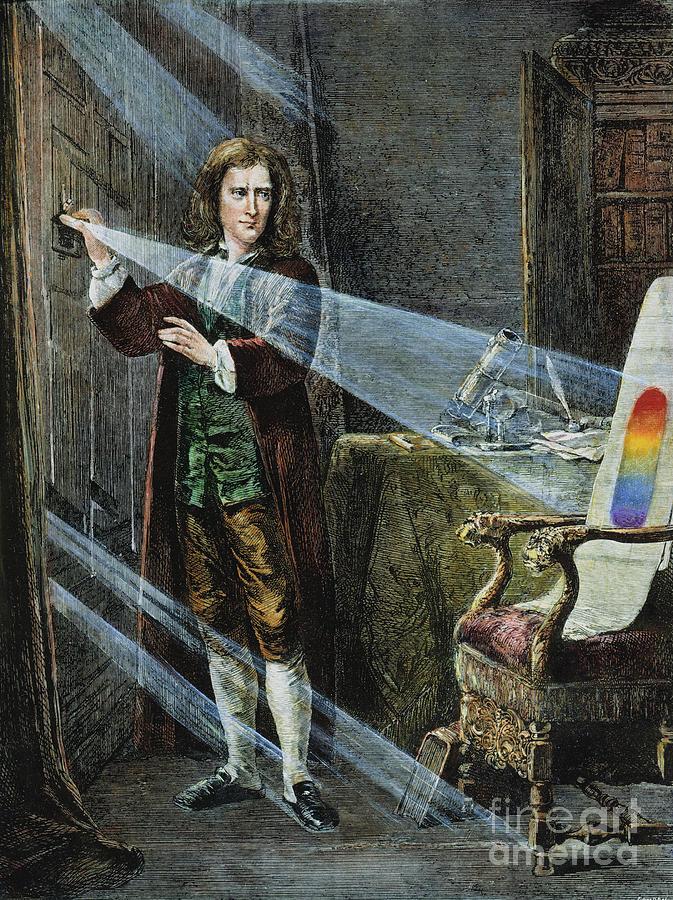
Sir Isaac Newton gave us the colour wheel, and many of us get basic colour theory – primaries, secondaries, complimentraries, etc. based on his concept. But he was trying to understand the spectrum, not how to coordinate fabrics, tiles and other finishes.
The colour wheel has very little to tell us about working with complex neutrals and whites in interiors.
Working at a paint store years ago, every time I spoke to an interior design student who walked in looking for help with their complementary or analogous colour wheel homework assignments, I would think to myself, “That exercise seems so useless”, because never once did I walk into a client’s home and say “Today I’m going to give you a split complimentary colour palette”.
And that is why my system works, because it’s fundamentally useful, and it takes the world of thousands of colours and turns it into a manageable and simple way to choose colour for paint to fabrics to tiles and everything in between.
Over to you my lovelies, I’d love to hear what you think?
PS. I keep getting emails asking me when I’ll be in this city or that city with my workshop. So just to be clear, I’m NOT doing a full American tour every year.
So do not cross your fingers and wait for me to show up in the distant future. If I’m close to a city near you this Fall and all you need to do is book a hotel room, or take a short flight, now is the time. So much better than in the past where you had to come all the way to Canada.
This is the system for working with colour in interiors and exteriors and you won’t learn it anywhere else but in a live class with me.
So look, if you are a decorator, interior designer, stager, architect or colour enthusiast, you should join me this year!
Here’s a Video Testimonial from Karen Gray Plaisted and Samantha Ring from Design Solutions KGP who attended my Toronto Specify Colour with Confidence workshop this past Spring. Karen sent along this note to go along with her video with Sam:
[youtube_sc url=”https://youtu.be/HasrMiXgJqA” rel=”0″]“It was great and worth every penny. I gained a lot from it, and now I do not second guess my color choice because a client is telling me “but I really love this color” I WILL NOT BACK DOWN on what the undertones are telling me! And now I have the reasons WHY they should not settle either!”
Mobile users go here to view the video.
Related posts:
There are 9 Neutral Undertones in the World; See them Here
What Everyone Should Know About Beige
What Everyone Should Know About Grey


This is way beyond fabulous!! Wow…This really helps me in having a clearer picture of how and why it all works.
I’m a visual learner so this is perfect!
Your new website is looking great and I you have taken it to a whole new level…
This is so wonderful Maria! Such a great idea my creative, superstar friend!
Woo hoo!!! LOVE this and the parallels with the periodic table are genius! No US classes for 5 years?? I’m so grateful I got in when I did 🙂
Hi Kendal,
Oops is that what it sounds like? I meant I’m not doing a full city tour every year with the projects that I’ll be working on, I did NOT mean to say I’m not coming to the US ever again.
Just thought I’d clarify that even though this doesn’t apply to you 🙂
Maria
It was probably my hurry-up-quick-read-and-treat-myself-to-a-Maria-post while I’m at my NON-design job that caused my confusion 🙂 Happy to hear your classes will continue and I hope someday to be a class helper! All my best to you and Terreeia!
Want color wheel! {opening wallet}
“…never once did I walk into a client’s home and say “Today I’m going to give you a split complimentary colour palette”.”
Haha!
I have to admit I had a hard time understanding all the different undertones of the whites/off whites, but your color wheel is fantastic and helps me see it clearly! love!
Your color wheel is brilliant. It will be incredibly helpful. Will you be selling it individually? Because this is something I, as a homeowner with an interest in color but no designer aspirations, want to have in my hand.
Maria, this is beyond genius. And as I said on your FB post, it would be wonderful if this was printed out professionally (on cardboard stock with proper colouration) and each concentric circle printed individually so that it spins on the centre axis. Then not only would it be a visual aid of what to do, but also what not to do. (you could make a fortune…this is your system in a colour wheel). Brilliant!
Yes, Susan, I completely agree, having the ability to spin the wheel to show why this and that don’t work, would be crucial!
Can’t wait to see this Maria!
This is perfect and what I’ve dreamed of for quite sometime. We are definitely on the same page.
Maria, Brilliant just brilliant! You certainly are THE color diva. Yes, you certainly are a rising star. I can’t wait to hear what else you are up to.
You deserve the best of luck in all that you do.
LOVE the new color wheel!!! Holy moly, this is the most helpful visual ever. A picture is worth a thousand words!
Will you be selling these? Would love to carry one around with me to consultations.
Love all that you’re doing to grow and expand…
Jill 🙂
Remarkably well thought out. You are spreading happiness with colour and with understanding!!!
I’m ready to buy it.
I love this Maria! Will you put this in ebook format? I am not a professional, but I have found your books to be extremely useful. So even though I probably won’t be able to attend your course, I would love to buy another book and a colour wheel! I have gotten SO MUCH out of your blog and books! You’re the best!
Copyright copyright copyright. Schools and designers everywhere are going to be using this. I hope you intend to sell it as suggested. And comprehensively train color professionals who do in home design in regions.(through your business.)
True, copyright. All you have to do for protection is put a “c” in a circle followed by your name. Learned this from graduate students whose professors were using their work without attribution.
I do have Understanding Undertones copyrighted but forgot to have my designer put it on the colour wheel. And I will print them but because I want it to be as clear as possible, I wanted to show it to y’all first in case I get questions that make me want to tweak it again!
Thanks so much for your comments everyone!
x
Maria
Get that copyright on there because any picture on the net is basically free for the taking.
Big breath, not a designer, I think orange-beige undertone on the original question about the room above.
I hope your undertone color wheel will be available to purchase. It is fabulous and clears up some of the color questions I still had after reading your ebook on It’s All in the Undertones. By the way, your assistant selected a color for my bedroom walls that pulls everything else together! My friends have all commented about that “perfect wall color.”
This is brilliant!
I’m so proud of you. I’m sending you a virtual hug!
And I agree with Connie…get a copyright.
Maria … I adore your color wheel and everyday I am grateful for the concepts that I learned from your course
LOVE! Genius! Love Susan Silverman’s idea! Can’t wait to get one to use someday…? Also can’t wait to see your new website 🙂 You remain an inspiration; for not only understanding colour, design,but for your business savvy!
As a fan, Colour Expert graduate, and a new friend, I am bursting with pride over your color wheel. Not only is it going to change the way the world understands color, but it also exemplifies how much a person can achieve if they stay true to their gifts and passions. I can’t wait to see what’s next!
xo
When will the color wheel be available? It will be so handy.
The color wheel is amazing! It is going to make it soooo much easier to explain your color system to other people.
I will be the first in line to buy a large version of this. How cool if you could create a laminated foldable version. This is the most brilliant design tool ever!
I LOVE this Maria – Brilliant. This colour wheel is going to be so useful. Where can I buy it? I so need this when I’m visiting my clients! Please make this available soon!
i want to buy this color wheel. i was just at a department store shopping for clothes and thought about your color system, because of the mismatched undertones of the clothes.
Brilliant! Yes Maria be sure to copyright and trademark the heck out of this and all of your other materials, as you are sure to be copied. I love how the wheel makes it so easy to visualize your system. I am just a homeowner and a very happy client of your e-colour consultations. You and Tricia did a great job on my interior — just purchased the exterior bundle and I can’t wait to see what you recommend to go with my Old Chicago Brick!
Genius! Thank you!
Wow Maria, brilliant concept.
Based on the colour wheel, does it mean for example that only green works for greige walls?
Great question, and the reason that the greige section is also a little into beige is because greige changes a lot in the light, sometimes it looks green, sometimes it looks beige and sometimes it looks like a neutral grey. If you want a blue grey, you choose blue. I don’t have greige in the category of blue grey.
Maria
I have a Donald Kaufman full spectrum taupe in an area that changes hugely. You would swear it’s cool taupe beige/gray, but the undertone changes throughout the day, more yellow sometimes, and when the sun is setting, the orangy western light mixes with it so it looks like it has pink undertones for a short time.
Sort of a similar question, but I’m trying to grasp the basic concept with a specific example. Does the color wheel suggest that gray-green walls would not be a good match for an orange-beige carpet? Rather a greige carpet would be the better choice?
No it doesn’t suggest that, I’m curious how you would come to that conclusion?
So I’m sure I’m simply misinterpreting the wheel. I was looking at the fact that greige on the outer ring overlapped green-gray on the inner ring next to it. So I concluded that these colors would mesh well because they “live” in the same zone of the wheel. On the other hand, I was reading your posts about pink beige (I have a bit of this in my home) and you indicate that blues, red and creams go well. None of those live in the same zone as pink beige in the wheel, so clearly I’m not quite following the concept being illustrated by the wheel.
Perhaps the wheel isn’t meant to indicate “good” or “bad” color pairings. Rather, does the wheel illustrate how colors can be broken down into various undertones, therefore making it easier to determine how many undertones a color palette would involve? From reading elsewhere on your site, I think I’ve picked up the notion that you don’t want too many undertones in one space, so the wheel would assist in determining how many undertones you’re dealing with when looking at various paints and fabrics.
Please forgive my ignorance. I’ve never thought much about color concepts, but I’m very interested to learn.
OMG such smart questions. . . I will have to ponder this one 🙂 I need my scientist readers to ask them so I can figure out how best to use it since for me it’s the air I breathe! Thanks so much for posting it!! Maria
BRILLIANT!
I like your colour wheel and it would be even more helpful in my opinion if you put paint color names or numbers on the corresponding colors. For example benjamin moores color —- is true white the one you compare other whites to or whatever color is benjamin moores or sherwin williams orange beige etc. THat would really make it usefull for not only decorating but knowing which paint color is what undertone. IMHO.
this colour wheel can be used with all paint fan decks, it is NOT Benjamin Moore specific at all which is why there are no paint colours on this deck. Also there isn’t only one pink beige or green beige or whatever, there will be several inside each section of course. Undertones are universal and I don’t want this wheel to look limited to only one paint companies fan deck.
Thanks for your comment! Maria
ps. You might even be able to sell your wheel to paint stores then…..just a thought!!!
Great concept – put’s the undertone of its related colour into perspective. Brilliant:-) I’d definitely use this for my consults!
Coming to Oz anytime soon?
I really like how the outside relates to the saturated color in the center. Is taupe right? I thought it can also flash pink. Thanks for sharing!
You’re right, in actual fact it starts pink and goes pinker and more purple. . . I will adjust that! Good eye thanks so much! Someone else mentioned that the undertones should be larger and the whites smaller so I will be adjusting that as well!
Thanks so much for your sharp eye!
x
Maria
Fantastic concept Maria and congrats! Hope you sell a zillion of them … ☺. That said; do agree with having the Neutral Undertone section a tad larger also will add on my monitor the orange appears to be more of a Tertiary colour (yellow orange, rather than a secondary one) and perhaps the script for the gold beige should also be in black. Also, if you were to add the feature that it spun do you feel ‘a’ proper alignment indicator should be included on its corresponding wheel? (You would only have to do it for one and the rest would fall into place.) Just a few thoughts.
-Brenda-
The inner circle of color, the base, is not showing as true color on my monitor if that helps. Thanks!
You are pretty darned amazing. Paris, Palm Springs, high six figure income, adoring fans. You’ve obviously earned this life you’ve created. Now, show the rest of us how to create a life we love, on any level. We don’t all ‘need’ to have your life, as wonderful as that would be, but to just realize we can turn our passions into something we love to do every day, with a monetary reward at the end of that.. well. Thanks for all you do and share with us, Maria!!
This is genius and I can’t believe nobody else has ever came up with it. Your system makes sense. I’ve read some color theory/ideas from consultants online that sound so in depth but doesn’t make any sense and isn’t at all useful. Almost as if the point is to confuse the reader.
I love the color wheel! It would be awesome to see one with BM paints, as an example, and then use it to explain which ones go together and don’t and why. And once you get this completely sorted out, please write addendums for those of us who bought your books, explaining how it works!
Absolutely love this!! I’m just returning to the field of interior design after taking a hiatus to stay home with my kids. I have been reading your book to freshen up on color theory and have found it tremendously informative!! This color wheel would be an incredibly useful tool to take on color and decorating consultations!! It will help give the client a better visual of what we are trying to explain as far as undertones go. Can’t wait to buy one!! Thank you!!
Hi Maria, I am currently studying your color ebook. I will confess right now that I don’t yet have those undertones down, but I haven’t given up! My question is about the value of the paint color. I have a habit, and I suspect a bad one, of painting my walls the same value as the flooring. In fine art the quickest way to get a boring painting is to paint all the same value. Does this matter with walls/floors? Maybe not and the furnishing/wall hangings make up for it?