I recently received this question from Shelley, asking how useful it would be to custom mix a paint colour to get it right with the light in her home.

“I’ve recently used BM Manchester Tan in a pantry that has a large fluorescent light fixture, and it looks lovely — right at the happy intersection of warm and cool. But in our front entry and hallway (which are criminally devoid of any shred of natural light), Manchester Tan is looking yellow and muddy (as in actual, physical mud). It feels like being inside a brown cardboard box. And it still feels that way after we put brighter LED lights into the small overhead light fixture. (FYI, this a basic 80’s house with standard low ceilings.)So I’m trying to figure out if using a diluted version of Manchester Tan would be the solution: preserving the coordination of tones in the adjoining spaces, while feeling a tad fresher/cleaner.My key question is whether this can be done with neutrals — such as your recommended green-beiges and green-grays — and what kind of color effect you might end up with.
Is trying [a] lightening technique splitting hairs [and] too much in the effort to find the perfect wall color?I’m presuming that the undertones would remain the same, but are there ways in which such a technique could go wrong?” Shelley F.
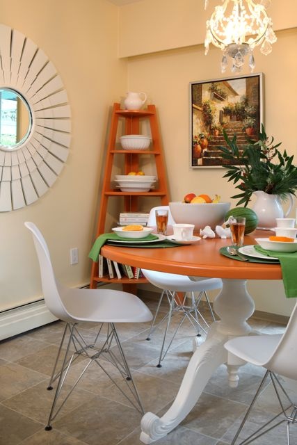
This is a great question, and it reminds me of a similar situation that happened to me in my last house. I painted my kitchen and breakfast room (below) BM Montgomery White, a creamy, yellow-beige with a slight orange undertone. I chose this colour because it coordinated with the existing linoleum flooring and I liked the idea of a yellow kitchen instead of a gray one.
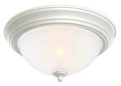
I had the tiny pass-through hallway to the kitchen painted the same colour. It had four doorways including a set of double closet doors to the laundry room and a door to the powder room, so there wasn’t much wall space. This small hall area had a standard flush mount ceiling light fixture, like this one:
Montgomery White turned a sickly fluorescent-looking yellow in this space and since it wasn’t a long hallway leading into the kitchen, I decided not to worry about trying to make it look the same. Instead I painted it with black chalkboard paint for a little hit of drama and to provide a space for me to write inspirational quotes or whatever moved me.
Could I have tried experimenting with different light bulbs too? Sure, but it was more fun to experiment with chalkboard paint, so that’s what I did.
Anyway, my reader’s dilemma and mine are really the ONLY times you should start fooling around trying to create a custom colour. And even then, I would say you should only try this fix as a last resort.
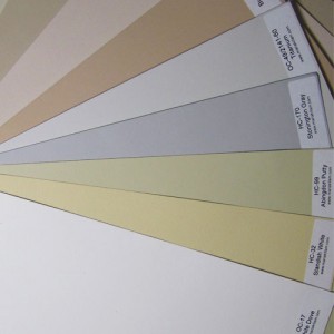
I would start by looking for the lighter shade of the colour in question (Manchester Tan in our example) since it’s not always on the same strip of colours. If I couldn’t find it on my own, I would ask the paint store which one was lighter. And Shelley, 953 Feather Down is the lighter version of Manchester Tan, so I would try this before trying to get a custom colour!
In another example, if you painted your family room a creamy yellow that turns green because you have a forest of trees outside your window, could you add more orange to the colour to eliminate the green? Well, sure you could try that option, but then you’d have a peach room the rest of the time. It would be better to go with a slightly darker colour. Because of all the trees, you won’t have enough natural light to pull off a pale colour and keep it from looking dingy or keep it from picking up the reflecting greens from outside.
During my paint store consulting days, I watched designer after designer walk into the store asking for their paint colours to be tweaked. Even back then I knew it was because they just didn’t understand how to find the right colour in the first place.
Right around this same time was when I started painting large colour boards to use when choosing colour for clients. Using the large colour boards made it easy for me and my client to see when the colour we were looking at was the right one.
There is no formula in the world that anyone can create (in advance, before you test or paint the walls) that will solve lighting problems and have a home owner or a professional be able to predict what any given colour will do 100% of the time.
Imagine, for a moment, what this formula could potentially look like:
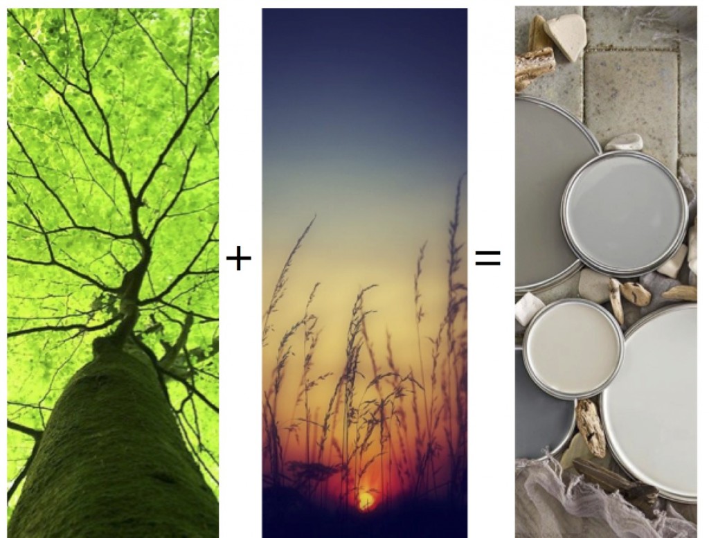
Three trees + an east-facing exposure = the right magical colour/s.
Can you see how this could never work?
In the first colour training that I ever attended, the colourist, a woman with 30+ years of experience told the class a story of how she once chose an orange wall colour for a guest room situated on the water and overlooking a lake. Well, when the sun started to set, the light bounced off the water and into this room, turning it into a blazing inferno.
Did she realize that would happen prior to the room being painted?
No.
So back to the paint store, she went, to change the colour of the room.
The ONLY way to remotely even begin to be able to predict, IN ADVANCE, what a paint colour will do in your interior is to use large colour boards. This will instantly give you and your client confidence. This tool, along with your knowledge of undertones from my How to Choose Paint Colours eBook will immediately increase the number of times your advice will be correct instead of just your best guess, based on tiny little paint chips. These experts say the same thing.
As designers, we automatically think we should be born with the ability to predict what the light or the trees or light bulbs will do to a paint colour. But unless you’ve been in a very similar predicament in a previous house, there’s just no way to know in advance without using the right tools in the first place.
I asked my True Colour Experts,™ who all use my large colour samples, how often they need to start experimenting with custom colours in order to get the right colour, and here is what they said:
“I did it once (before my True Colour Expert™ Training) only because the sample on the wall was “too bright” and in my ignorance thought that half strength would fix the problem. Of course it didn’t, I just didn’t understand how paint color worked.”“I did this only twice before the True Colour Expert™ course, but not since. I easily find the right colour now, never second guess or feel the colour I choose needs to be altered.”“Never. Actually I refuse to do this for customers because it is a total crap shoot.”“I have done it occasionally, but the outcome is unpredictable. Definitely not an ideal solution.”“I used to, [sometimes] ordering 1/2 or even 3/4 [strength] formula! It was mostly because the color was too clean and I thought lightening it would be the solution. I also just didn’t know the colors or what they looked like up, so if I wanted say a light cream I would order 1/2 strength of something like Pale Almond instead of just getting Ivory White. The big samples help immensely! I haven’t asked for anything custom like that in a long time.”“I own a Benjamin Moore store and whenever someone asks for 50% lighter or whatever, I always try to talk them out of it. While the ratio of colourant going in is the same you really don’t know what you’re going to get.”
“I tried to do it recently but it didn’t work out. I needed a lighter version of Coventry Gray for part of a Victorian exterior so we tried a half tint of it — didn’t work. It was still too dark and the undertone shifted so I abandoned the idea. Will likely try to stay away from customizing colors as much as possible.”
Does this sound like a big commercial for my colour boards? It surely does, but that’s not the reason I’m writing this post. Really. It doesn’t matter if you paint them up for yourselves or buy them from me — just do whatever it takes to get to get yourself large painted samples.
What I’m really trying to do in this post is to dispel the myth that ANYONE can accurately predict what a colour will do in any given space when you add in a set of particulars like water, Eastern light, Southern light, four trees, the overhang from a deck, etc, etc.
And don’t miss this part — your large colour samples must be painted, not printed. It’s paint, after all, that’s going on your wall. To use a large printed sample would be similar to expecting the colour of a vinyl siding sample to look identical to a paint sample. These are two different surfaces and they will show the same colour differently. Printer’s ink will never look the same as actual paint.
If you have decided that buying my large colour samples is cheaper (because it is) than painting them up yourself, get the Core Collection first, which give you all the neutrals you’ll use 80% of the time.
If you already have my first collection of samples, you might want to invest in my VIP Collection of 50 samples which includes more greiges as well as darks so you can show your client, using a black large sample, what her fireplace surround would look like if, for example, she painted it or changed it to black granite. Then there’s a pile of the best greens and blues because those are the colours you’ll specify first before the others.
If you’re not a design professional but you just need to choose a white or a greige, my 25 Sherwin-Williams samples are designed specifically for you. You can get them here.
So stop worrying that you need to be a magician or a chemist in order to get colour right. What you need is the right tools to help you get there 99 times out of 100.
And then, you’ll be well on your way to gaining the confidence you need ASAP!


this story reminds me of a client who loved the paint colour in her daughters home. There was no need to pick colour because she was going to use that beautiful colour. I got a desperate call from her after the painter got the ensuite bath painted and had started on the Master Bedroom. (it was a condo & she was determined it would be perfect for the whole suite). Well it was pink, really pink. Not the neutral “beige” at her daughters home. I went to the condo & sure enough it was very rosy. A trip to the paint store & we looked up the formula. Sure enough it had copious pulls of red. Fortunately I had much experience in paint mixing. We neutralized the red with yellow-green. Thus toned, and further tinted with a gallon of white for the remaining batch we got the perfect “Cafe au Lait”. Not pink, not beige, but a hearty warm, neutral background colour. All that red undertone was the “colour for free” that we don’t expect. I wish I’d insisted at looking at her chips earlier on because it was a huge sample in the paint store & definitely stood out as a warm, rosy glow even in the store under the florescent lights there. She was very puzzled as to where all that red came from. As Maria always comments: look at the undertones & the families of colour will be apparent.
I know this isn’t about light bulbs, but I recently moved into a house with a million light fixtures. I’m serious. I’ve never seen so many light fixtures in my whole life.
Since there were so many, and some were 20+ feet in the air, I decided to opt for LED bulbs that won’t need to be changed for many years. They are expensive, but pay for themselves in a year or so.
I went to Home Depot and got some regular LEDs (Cree brand) and started installing them. Then I found out that Cree makes a full-spectrum Soft White LED that brings out colors more accurately.
I got some of the full-spectrum LED bulbs and switched them out, and lo and behold, it was a noticeable change. We are in a log house and the ceilings are wood. The full-spectrum bulbs made the ceiling wood tones much warmer, whereas the regular bulbs turned them a washed-out yellow.
Outside light exposure surely affects color in ways that are hard to predict, but so do light bulbs. So if you choose the perfect color, don’t forget the light bulbs – otherwise, you are undermining all that hard word. Full-spectrum does wonders.
Absolutely no guarantees to predict color due to artificial and natural light, and the necessity for sample boards at least in some areas. (For colors with no boards I always have larger paper chips – 6×9″, 5×7″ – never just fan decks.)
Lighting is almost part of the conversation, since sometimes it just takes changing an off-white ceiling light cover to a clear or white one, or swapping a beige lamp shade to white, to “adjust” a wall color.
Changing Kelvin (color temperature) of bulbs and making sure the CRI is in the 90s, not builder grade 80s can unmuddy light. And sometimes you just need to add lighting.
Ugh, brain glitch. Color is “always” part of the conversation, not “almost.”
This is the PERFECT post, Maria! I am going to use it to assist all of my color consultations. You are the best teacher.
I would like to say a big “AMEN” to this post. This completely breaks down your system, Maria! THANK YOU! I own your color boards and have used them to repaint 2 homes. They are PRICELESS! Thank you for this KNOWLEDGE! Worth every penny! And now I KNOW that “half-formula” is bunk, I will never do THAT again!!
Very good info. My single office window features my neighbor’s painted red wall – turns my BM Bleeker Beige into pinky beige. Drives me nuts.
Thank you for answering such a great question. I have the Sherwin Williams collection love how easy it is to look at several options in different room. Those cards are worth the investment for sure! I was wondering though how different paint brands affect the color. For example if I chose Benjamin Moore’s Poolside Blue and the painter says he gets his paint from Lowe’s (who has the same formula but different paint brands), will the color be exactly the same?
I know Maria will be able to answer this more definitively, but, NO the color is and cannot be the same when you use a different brand’s base. Different brands use different bases. Have tried this. Don’t.
Agree wholeheartedly. Different bases – multiple bases for each manufacturer – plus different pigments, makes it difficult to color match. A computer will get you just close enough to look off. A good color matcher needs to understand color theory, and check the color in multiple light sources. Almost never happens.
i work at a benjamin moore paint store as a color consultant. true story: i took the job because of you! i absolutely love the job and love the colors i work with. but i encounter exactly the same problems — custom mix, half strength, add a little red…it boggles the mind. i always, always try to steer them away from making up their own colors. unless you’re a veteran, bunny williams-type, mixing color on-site (and even then….), the customer does not have the eye to do it themselves. besides, with all the beautiful colors available, why do it at all? learn the colors. learn the undertones. learn the science behind the colors developed by the experts.
the kelvin comment above is absolutely spot on. full spectrum and identical bulbs and wattages throughout for true, even color. and watch out for colored lamp shades — they can destroy all the hard work. sorry to go on here, but this is the best post you’ve ever written. thank you for validating what i (we) as consultants struggle with every day.
Wow, thanks for such a quick response to my cry for help, Maria! I’m definitely off to the paint store tomorrow to check out Feather Down — I’m sure you’ve saved me from a whole pile of sample pots. 🙂 Additional thanks for offering a specific solution to my particular scenario, that’s very generous! I wasn’t at all confident in my own ability to detect matching undertones in separate paint chips, which is why I thought the safest route would be to just dilute Manchester Tan. It was also helpful to see other readers’ comments about their lack of success with customizing colors.
Shelley I have Feather Down in 2 rooms and here is what it looks and feels like: a cream, without any yellow. Pretty against wood trim. In the north facing room, it is possible to detect the SLIGHTEST amount of green undertone, but not anywhere else.
That being said- anything cream might just look dingy in your low-light space. As Maria says, “a light color won’t come to life in a dark room!”
I have actually never tweaked colors before, but I was thinking about doing it for an upcoming job. I specified a palette of BM colors, all from your e-book, for a large town home. The colors are all on the lighter side – grays and beiges with green undertones. I never paint ceilings white, unless the walls are white or off-white, and so I was planning to reduce the strength of the wall color by 50% for the ceilings, particularly in the living room which has very high vaulted ceilings. Do you think this is a bad move? Any suggestions on ceiling colors to coordinate with the lighter green-grays?
If the colours you are using are light to mid-toned, it usually works to specify 1/2 strength for the ceilings since you want them to look the same (I’ve done it many times). And you need to be prepared to paint it again if the undertone shifts as it can happen. Maria
I don’t think that we get Benjamin Mooe paints here in South Africa.
What board would you recommend that one paint on to create a large colour sample e.g.: white board, matt, size of board, thickness of board to carry the paint etc.
Thanks.
Good quality poster board is all you need, anything heavier and it’s hard to carry around a bunch. Maria
I used those full spectrum lights when they first came out with them in the bedside lamps and couldn’t figure out why i wasn’t sleepy until 3-4 am after reading in bed. It was like the sun was shining and waking me back up. That changed when I switched to soft white.
When I redid my mom’s house, her range hood came with a cool white fluorescent tube, but I got my electrical store guy to help me out by buying a warm white bulb in the same size. Now that it has burned out, the only way I can get a replacement is to buy a case of them since they are so rare.
In one of my recent kitchen/baths/laundry room jobs, the cheap fluorescent bulbs the contractor put in made the paint color look weird. I told the homeowner to switch out the bulbs to see if that helped bring it back to make the whole room look better and it did. It was more than the paint on the walls: the counter, cabinets and floors looked warm instead of washed out.
Well that explains everything! Brilliant post. Thanks Maria.
I have one of the problems you mention with trees/light changing the tone of paint. Our living room faces north (cool blue light) and has a large pine tree outside the window. So the pale creamy yellow color I chose goes green quite often. I brought home paint samples of various yellow-beiges and did up some poster boards with them and found a darker shade that stands up to the lighting much better. Now to get around to repainting!
I love this post about “tweaking” paint color because I have ” been there done that” so many times–sometimes with good results, sometimes with bad (much money and time wasted!)–as you say it is impossible to predict! I thought it would be similar to mixing acrylic craft paint which I am familiar with–NOT! Wall paint tints must be whole different animals!
My house DOES back up to trees so I totally can corroborate what you say about the greenish cast those leaves can give your wall color! I purposely choose a yellow-gold paint that had red undertones, hoping to counteract the inevitable greenish tinge from the leave’ colors reflecting in. It evidently wasn’t enough to overcome it, though–from what I just read here I now wonder if it also was too light of a shade for the situation (the room is also pretty dark most of the year, despite lots of windows, because of all those trees!) Next go-around I will use a darker shade–and large samples!
Thanks for a great post.
Maria, I am hoping and waiting for you to introduce a set if color boards for Exterior applications! I hv taken 2 exterior webinars w you and have set up a color consulting program for a Exteriors!
Maria, What a wonderful post!! I will put this into my archives so I can refer back. Everyone has brought up such good points. I really liked the tip about light bulbs.
I agree that your large color boards are worth their weight in gold.
I am going to e-mail you about another subject which is explain the difference between aqua, teal and turquoise. I get so many different opinions. I have had discussions with other designers.
Love this post as always!
I had my whole house inside trim painted with the same creamy trim color. When I went to repaint the east facing sun room/breakfast nook the color looked awful in there. It looked muddy yellow, especially since the tongue and groove ceiling was the same color. I had to paint that one room with a brighter white. That did the trick and it wasn’t noticeable from the rest of the house, but it sure made that room look a lot better.
Wow what a great post!! I really like your formula
example that would never work but still intriguing.
I have been wondering tho if you were going to start
a house from scratch which would be the most versatile
neutral color to work with? Besides white? Are warm
or cool colors easier to work with?
Carol
PS I went to hair styling school several years ago and
the guy who owned the school used to say……….color is
light and light is color………..and I think your explaining that
theory very well!!
Carol
Fantastic post about color. Now every time I have a client who asks me to “cut the color”, I can lead them to this post.
Would love to hear about chalkboard paint. I have heard it is VERY finicky and I want to do a large wall of it. What brand did you find works the best?
Thanks so much for this post, Maria. I’ve been hoping you would address the issue of having a house surrounded by trees (deciduous mostly, at my house). I also get lots of bright afternoon sun in a west exposure dining room in summer. so have to stay away from golds and tans. I fear that a palladian blue color that I’d like to try to go with my mahogany dining set and multicolored rug, and orange oak floors might turn out a dingy grey. It’s a boring navajo white right now……
In addition, I’ve always wanted a dramatic peacock blue dining room like I’ve seen in magazines, but not sure if it would work with the rug which is multicolored – with a garnet red border and navy being the most prominent colors at first glance. Again, there are two very different but prominent woods, orange oak and mahogany, Is this room beyond help? 😉
I was just about to paint a wall in my family room a 50% Chelsea Gray since Chelsea Gray is the perfect color but too dark. You saved me! Thank you!!! How do you figure out what color is lighter but same tone family? Guessing just putting swatches next to each other until you figure it out…
Just reread the post. I ask the paint store if I can’t figure it out!!
Hi Maria,
I Know that Edgecomb Grey is the lighter version of Revere Pewter, but what is the darker version?
Thank you!
BM Thunder from their Affinity Collection.
Maria, you are so correct about the 1/2, 3/4 strength being a waste of time, you truly never know what you will get and the undertones can really change. I learned this the hard way. You just end up with a different color, and not the one you necessarily want.
After trying this and getting unsatisfactory results, I never ask for 1/2 strength. I look for a different color. Your large color boards are the only way to go in choosing colors.
What happens when you test sample boards in different lights in the room you’re painting and you can’t find one that you like in all different lights? (at all the different times of the day)
I tested over 25 different shades of green on large sample boards and the ones I loved in the artificial light of evening turned into pea soup in the natural light of day. And it’s a room that we spend lots of time in. Very frustrating!
The color I eventually chose looks just lovely in the warm artificial light of my soft white light bulbs. But I don’t like it during the day. 🙁
We actually had great results using a 3/4 tint BM Thunder.
I wanted my family room and kitchen to be one color – there wasn’t a logical place to switch colors between the rooms. We wanted a lighter version of Thunder. We tried every similar gray we could find from four different collections and the lighting in the two rooms was just too different and we’d have a green in one room and a pink in the other – we’re not even sure why – there are a ton of windows and the rooms are completely open to each other. The colors looked very different whether we had only natural lighting during the day or artificial lighting at night. People had a hard time believing the samples on the walls were really the same colors because they looked so different.
After weeks of frustration, we tried 3/4 tint Thunder and had great results. We ended up using the same ‘custom’ color in a different sheen in the adjoining entryway and it looks great there too.
We are replacing old flood or incandescent pot lights with LED pots. I can’t say I am loving the LED lights – seem so much cooler even though they are “warm” LED’s. Not very flattering light. Rooms are still torn apart so no task lighting yet to balance things out but I am thinking I will stay with the old pot lights if they haven’t been “updated”. Am i just imagining this? Any advice?
PS: these are basement rooms with little natural light.
I totally agree, in my kitchen reno, I went out of my way to find normal light bulbs for my recessed lighting. Maria