Hi, my name is Laurel Colins, and it is my pleasure to guest post for Maria today. I am The Beautiful Living Coach, and I live in Nelson B.C. I specialize in transformation through decoration. I use Feng Shui, colour, styling, and coaching to create environments that support the life you want to be living.
What is your favourite colour and why?
Pink! I have always loved most shades of pink.
I grew up in a heritage house built by my great grandparents in Nelson B.C., and my mother liked to create environments reminiscent of the magical musical movies she adored as a child.
This meant my bedroom (with its large, floor-to-ceiling bay windows) was draped in pink ruffled curtain panels, and the vintage-style wallpaper had a creamy background with trailing pretty pink floral patterns. There was a chandelier over my head that I would gaze at every night as I crawled under my white chenille bedspread with all the pretty pink cushions.
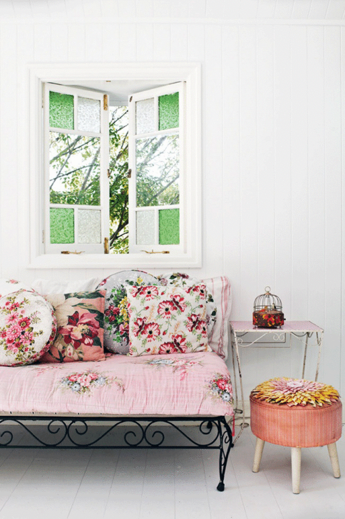
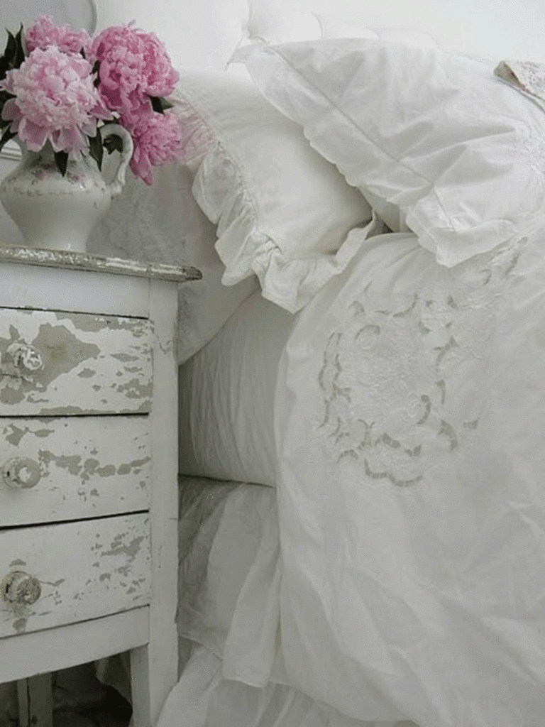 reminiscent of my childhood bedroom, soft and pretty with a touch of pink. source
Although not extravagant, that bedroom certainly gave me a love for crystals and romantic pretty pinks. I still love and use pink because it is pretty and fresh.
I’m a Shabby Chic kind of gal (and that’s no wonder based on what I grew up surrounded by), so it works perfectly with most of my furnishings.
In my line of work, pink is a great colour for giving people a sense of trust and comfort. It’s also good for receptivity, which is why I have painted my office door 2009-40 Peach Pink from Benjamin Moore.
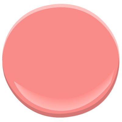
Benjamin Moore Pink Peach 2009-40 source
I want my clients to know there is a safe space behind that door, whether they’re coming in for life coaching, feng shui, or to source a vintage treasure for a design project.
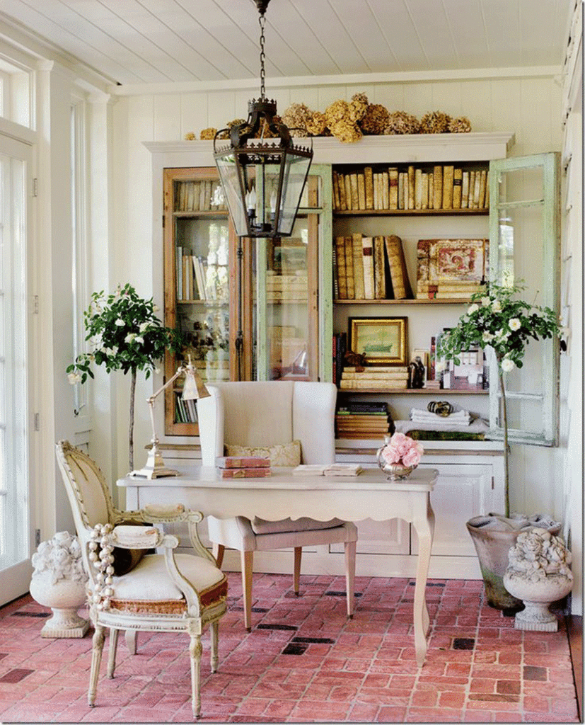
Gorgeous office with a great use of vintage style and pink. source
When it comes to colour, what’s hot?
Well, over the last several years and going forward at least into 2017, I have found pink to be very hot. Surprise!!!
I am not the only pink lover out there, and so I see shades of pink are very popular now. Picture the fuschia of an eco-friendly garden, the soft pink of a vintage floral, and the twilight tints found in a sunset. These colours are fresh, frosty, or soothing, and they can add just the right mood to most palettes.

You could find some pretty fabulous shades of pink in this sunset! source
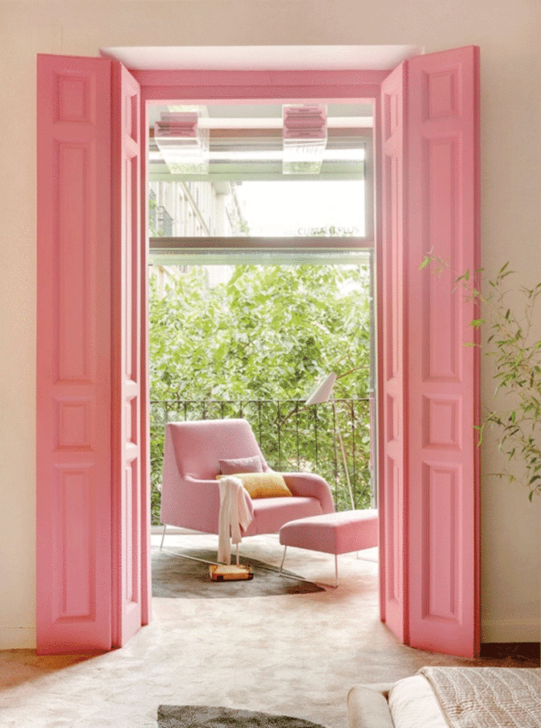
I can’t resist a pink door! source
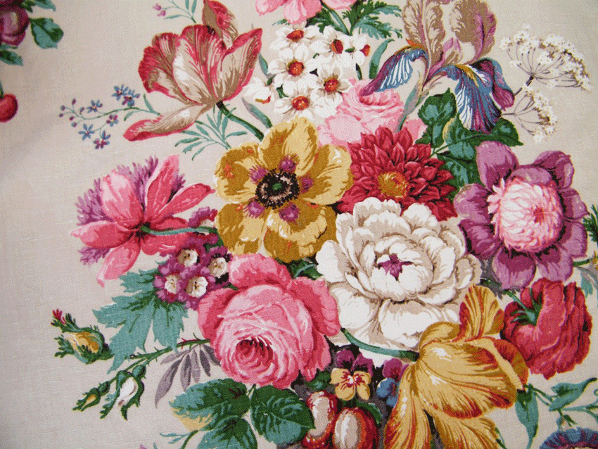
Vintage bark cloth floral print as inspiration. source
Pink florals and white walls source
Which colour do you think is timeless?
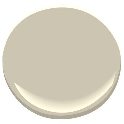
For me, creams and whites are timeless, and I still choose the whites I decorated with over a decade ago. My current home has Benjamin Moore Delaware Putty CC-230 throughout, and it works beautifully with my abundance of natural light, all the all the creamy shades of my accent pieces, and the crisp whites of my trim (Benjamin Moore Decorator’s White CC-20). I like to throw in some putty colours, like Benjamin Moore Florentine Plaster CC-530, for a touch of warm grey as well.
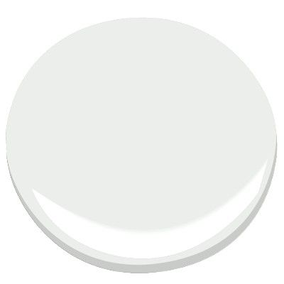 Benjamin Moore Decorator’s White CC-20 source
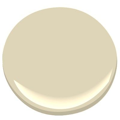 Benjamin Moore Delaware Putty CC-230 source
 Benjamin Moore Florentine Plaster CC-520 source
What do you think is the biggest mistake homeowners make and why?
The biggest mistake I know people make is not testing their colours before painting.
I was speaking with a friend of my mom’s the other day, and she said she hates the colour of her whole living area. I asked why she didn’t repaint, but she said, “No way! I paid $5000 to have it painted, so I am living with it.” Imagine if she had first hired a colour consultant to help her choose a great shade, and if she’d bought a sample pot to test that shade before painting everything.
Colour is SOOO important, and it can evoke all kinds of emotions. It can make you feel wonderful, relaxed, peaceful, creative, and happy … or it can make you angry that you hate it and it cost you $5000.
You deserve to feel good in your home, your haven. The impact of living with colour(s) you hate is much deeper that you realize, but you can avoid this massive mistake very easily.
Even (ESPECIALLY) if you are choosing a white, and you think it will be a simple selection, you risk choosing the wrong undertone, which will create dingy shadows, not work with your ceiling colour or trim, and either clash or not have enough contrast.
Stop the insanity. Test your colours.
What is the best colour to use for a bedroom using Feng Shui principles?
Feng Shui tells us that bedrooms should be painted in flesh tones, but I don’t mean just that peachy cream colour. Flesh tones reflect all the races of world, giving us a broad range of shades.
Consider that this is the room you retreat to and rejuvenate in, so colours that seem to envelope you like loving arms feel right.
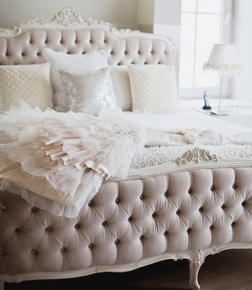
Flesh tones can be stunning as here with the beautiful textures and tufting. source
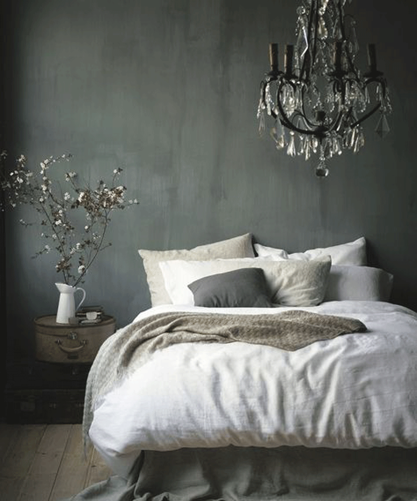
This grey would be considered flesh tone. So romantic and inviting. source
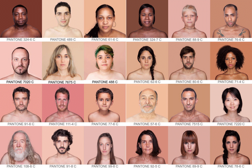
Imagine being an artist, and think of all the true colours it takes to create natural skin tones.
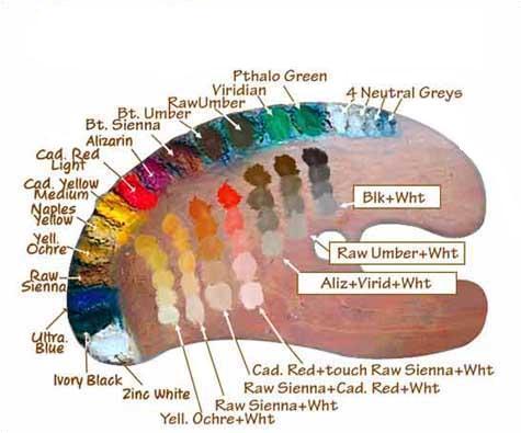 These are all the shades that make are found in true flesh tones. source
Flesh tones range in colour from creamy whites to yellow to shades of red and purple, and up to rich coffee browns. Check out this awesome comparison of skin tones to pantone. When you really think about it, there are a multitude of shades.
Another great example of the varied flesh tones. source
The main point here is to think in terms of colours that feel warm and organic, very much like the original, all-natural paint colours.
Also in Feng Shui, we recommend you avoid pure white or black for a bedroom. There is no nurturing warmth found in these colours. Bedrooms decorated in pure white or black will not feel relaxing and inviting. Although it may be striking to look at, it is not restful, which is the primary function for this room.
Which part of participating in Specify Colour with Confidence™ created the biggest breakthrough/aha moment/insight for your business, and how did it help you move forward?
Aside from learning how to identify undertones and to confidently make selections for myself and my clients, I learned how to get my business started.
Maria’s training was integral in my decision to create my own blog/website. I may have waited to implement that for myself, but she helped me realize the importance of having a place to send people, and that we didn’t need to spend a fortune on branding like she did. She took the fear and mystery out of it, and so I jumped in and did it.
Starting my blog/website before I even knew I was ready was the catalyst to have a business. It gave me a place to direct people and made me feel confident as a professional just by simply having my domain name and a landing page. It started simply, but it started, and all it takes is a first step. Maria gave me that nudge to make the step.
People have enjoyed my blog posts and have found them informative and often transformational. My website really shows my love for flowers and rustic paint finishes, and it seems there are lots of people just like me.
Since then, I have taken other awesome trainings with Maria that have demystified a lot of things or issues that we decorators come up against. She gives us tools to use for success that go beyond colour.
Thanks for having me, Maria! This has been fun to share some of my decorating philosophy with you all. I believe colour and great design are an essential part of what creates Beautiful Living and making the most out of every moment of every day. I would love to invite all of you to come to my website and grab my free gift: Find out the 10 Incredibly Simple Ways to Change Your Life in 10 Minutes or Less
Thanks Laurel for this beautiful post!
What do you think? Is it time to repaint your bedroom?
If you’d like to become the next True Colour Expert™ in your area register here.
Related posts:
5 Ways to Balance Bold Colours
Do you Follow the 10 Year Rule?
10 Things I learned So Far by my Designer: By a Happy Client


Fun guest post! I am a wife and mom to 2 growing boys so there is not much (if any) pink in our house. I would love to have the pink double doors that are in the above picture. They would look amazing with my walk in closet!!!
Darlene
http://www.BundleMeBaby.etsy.com
Hi Darlene, I am happy you enjoyed the post! Thank you and btw I do have a couple boys living in my house and I know they secretly like a little pink a lot more than they let on. A little feminine touch is cozy. I know what you mean about those pink doors. Love them too 🙂
Thank you for the great post! Love creams and shades of soft blush pinks especially in bathrooms and guest rooms. Nothing prettier!. Love learning more about Feng Shui.
Hi Mariann, Thank you, I am so glad you enjoyed the post. I find Feng Shui so fascinating, and it really works. It is amazing how having the right balance and colours and placement of your things can transform your life.
Aaaaack, wait a minute, this post is advocating for——PINKY BEIGE???!?
No Way CrewMom, almost any shade but that hideous pinky beige. There are so many gorgoeus shades in the pink family and pinky beige doesn’t make the cut.
I don’t know – some of those flesh tones look pinky beige to me. Though if you treat it as a pink instead of a beige, it can work beautifully.
But grey as a flesh tone? Huh?! Am I the only one that strikes as Addams Family-esque? I could NEVER have a grey bedroom. It’s hard enough waking up in the morning without waking up to grey. Give me warmth and cheer and sunlight in my bedroom!! Use the greys elsewhere.
Hi Valerie, I know what you mean. I have been thinking about it quite a bit, and just like any colour, it is a trick to get the correct undertones and avoid having pinky beige. That’s why we love our training with Maria! I know a grey bedroom seems gloomy to you and odd as a flesh tone, but it is truly found in actual flesh tones, therefore some find it is cozy. It’s not for everyone, I love a creamy white bedroom myself. And hey!!! The Addams Family need to sleep somewhere 🙂 thank you for reading my post and I appreciate your comment! Laurel
Laurel, yes, different things work for different people. My bedroom faces north and is currently painted (the builder’s) greyish beige. Ugh. Not good in the morning. My intent is to go with a very soft yellow (really, almost a buttery beige). I’ve got large samples in use as we speak. One of the challenges of a bedroom, of course, is to find a color that’s lovely and restful at night in lamplight, but cheerful and refreshing in the morning light.
Well you are smart Valerie to be using the large samples. What colours are you considering? I also have a north bedroom. Back when I made my choices I didn’t know about the large samples and so I love my colour except at night when the overhead light is on. I don’t dislike it, but that is when i notice that it doesn’t totally match the undertone in the fabric of my roman shades.So many variables and when you make rush decisions during a Reno this is what happens. I think that is where builders beige was born!!
I love this guest post! It has given me a new way of thinking about bedroom color, all color for that matter. I abandoned pinks in my home decades ago and I think maybe now I miss it a little!
Trudie, You melt my heart! I think a little pink would be so great to add back into your life 🙂 thank you for reading and being inspired.
What a fabulous post, Laurel!!! Your images are just stunning and so intriguing. So refreshing to see colour in decor and in other contexts. Well done! I once had a bedroom in BM ‘s Winthrop Peach and it was lovely. Making me rethink my office accents!!!
Thank you Susan, your comment means a lot! I loved your post too. Hmmm yes freshen up the office accents and add a little Feng Shui, maybe super power up your desk.
Lovely post! I really felt relaxed reading it! You have definitely challenged me to add more pink to my house. Despite having 3 girls none of them likes pink as much as I do!
Thank you Jennifer, what a great comment, that you felt relaxed reading it! Pink is so wonderful because there are so many shades to work with. I have 2 girls and they turned out to be real pink lovers, but in their own way, Blush pink is a fave for them.
As Jennifer above mentions, I too feel I should add a little more pink into my decor!
Bravo!
Well Thank you, Mission Accomplished, let’s all add a little more pink into our lives. I appreciate your comment 🙂
I really enjoyed this post. Am wondering which shades would work in the “black family”. Can you recommend specific BM colors?
Hi Susan, when you say which shades would work with the black family, did you mean blacks? Or pinks that work with blacks? Most shades of pink look stunning with the right shades of black. Let me know if there was a specific colour you were thinking of. Thanks for reading and commenting here.
I loved the flesh tone photo coordinated with the paint color!
I agree that is a very clever photo. It really shows how diverse actual flesh tones are. Thank you for your comment.
I have three boys, so I am surrounded by sword fighting, wrestling and testosterone. My bedroom is the one room in the house that is girly – the walls are a soft pink, and the bedding is white with pink monograms. Fortunately, my husband doesn’t mind the pink!
Hi! Your Bedroom sounds lovely and totally my cup of tea 🙂 I am happy to hear you have a bedroom that nurtures you and is a retreat from all that sword fighting. You need a good restful space for yourself to recharge all the energy you need for those boys. I know the men like a little feminine touch too, even if they don’t always admit it. Thanks for your comment.
Wanting to break up the gray, I am finally working up the courage to do a white on white room (lovely, but hard to get right). I do love white with a touch of pink in the accent pieces. But, yikes, what whites go together for that layered, tonal look? Yes, stark white with off white; creamy whites together. Yet, I have crisp decorator white trim, and thought off-white bm classic gray would work but I think classic gray (a very very light, earthy gray) looks dirty next to crisp white.
Question: how close/similar should the whites be that you choose to go together?
I am in love with that grey! Can you please tell me where I can buy it?