Every time I hold one of my 3 day colour workshops we take some time in the afternoon on Day 1 and analyze the paint colours in the meeting room we are in and discuss whether the existing colours work or not (they rarely do).
We do this so that my new True Colour Experts can see how to work with my large paint samples. The other very important reason we walk through this process, is to prove that the right colour is always magically in my collection of large paint samples.
How can that be?
Because 80% of the time you are choosing colour for anything, you’re inevitably choosing a neutral.
And if you have a collection that includes all 9 neutral undertones in the world from light to dark, as you would if you had my Core Collection, well, you’ll find it there.
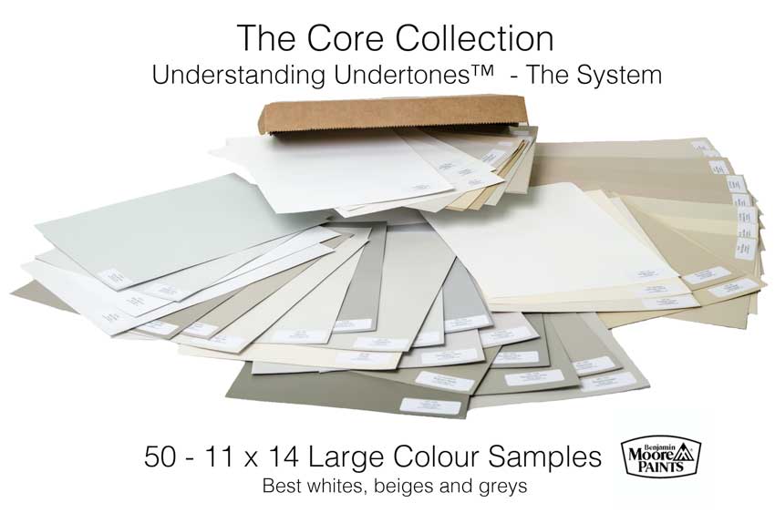
I worked with many large colour samples for years, during the time that I was developing my Understanding Undertones™ system and I started to notice a pattern in which colours I ended up specifying over and over and over again.
That is how my Core Collection of paint samples was born.
In the meeting room below, you can see that the existing green beige colour below the chair rail does not relate at all to the carpet.
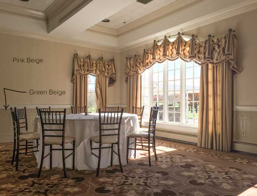
The correct paint colour for this room is taupe because the carpet is primarily brown, taupe and pink beige with a little yellow beige (below).
You wouldn’t introduce brown because that would feel dated. For example, if you painted the exterior of your house brown right now, it would instantly date your house 15 years because that’s how long the brown trend has been around.
This is also why understanding where your city is in the trend cycle is very important!
Here I have pulled a pale taupe out of my Core Collection of samples which is essentially what you need every time you need to choose a paint colour to coordinate with furniture or hard finishes.
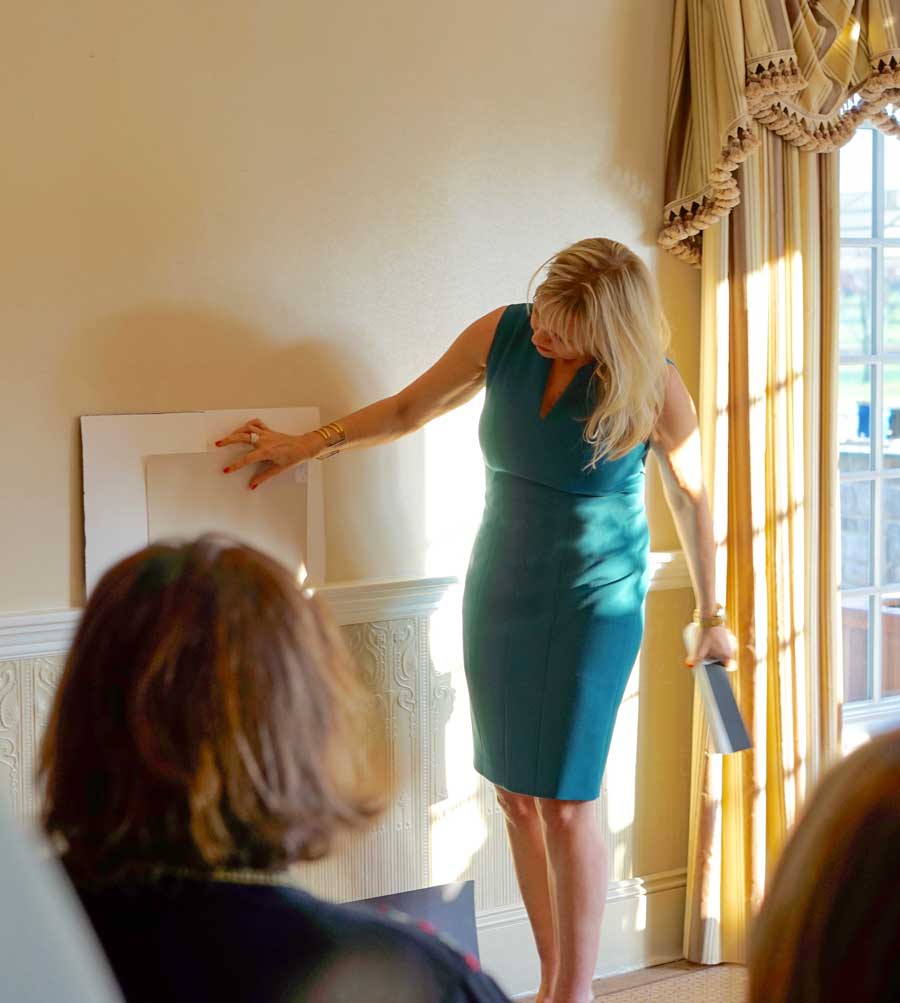
In this image (above) I have moved the colour sample up to sit on the chair rail but to finalize the correct colour, we had them all sitting on the carpet, propped up against the wall.
What I’m teaching is not a formula that will suddenly become unworkable if the situation you’re in changes. What I teach is a system. A system with a core collection of colours that work 95% of the time that you need a neutral.
Analyzing the minutia of neutrals is way harder than choosing chromatic colours like blue or green. That’s why it’s important to have the most useful ones in your toolkit anytime you need a to choose one.
Neutral vs. Chromatic Colour tip: How you know you’re looking at a neutral over a colour is if you start wondering in your head what the undertone is? It’s easy to look at a blue and call it periwinkle or a green and call it an apple green. You can’t do that with neutrals quite the same way.
If you need a colour and not a neutral for a bedroom for example, first, you decide which duvet you will decorate around and then, you simply match the colour.
It’s easier to see if the colour you are choosing to match the duvet is right or wrong when it is not a neutral. When you are trying to choose a neutral you need to be able to discern whether it is a green gray or blue grey? Purple grey or taupe? Because these complexities are subtle, they are impossible to see without large colour samples.
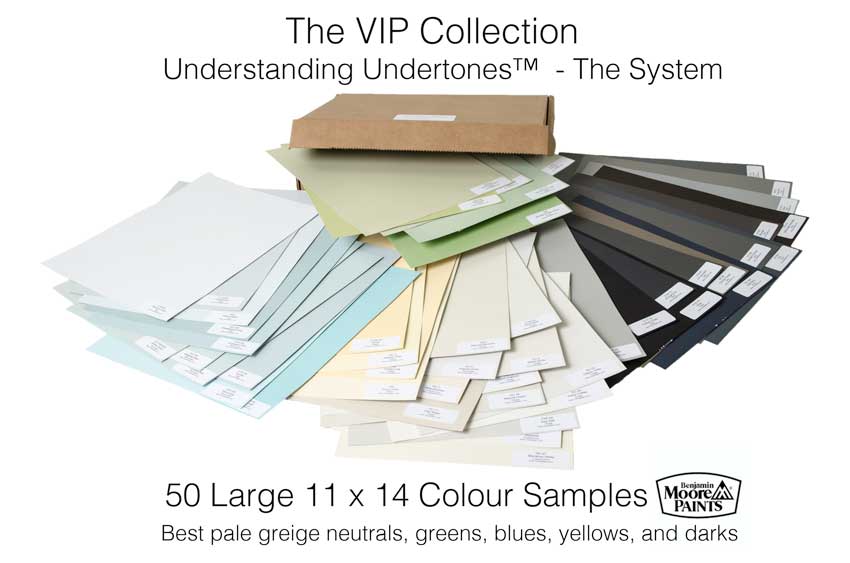
My VIP Collection (above) has more colours. Greige was trending big time when I introduced this second collection of colours so this set includes the best ones. Plus, blues and greens, a few yellows and 10 dark colours which include the perfect taupe, the perfect black, the perfect brown, etc.
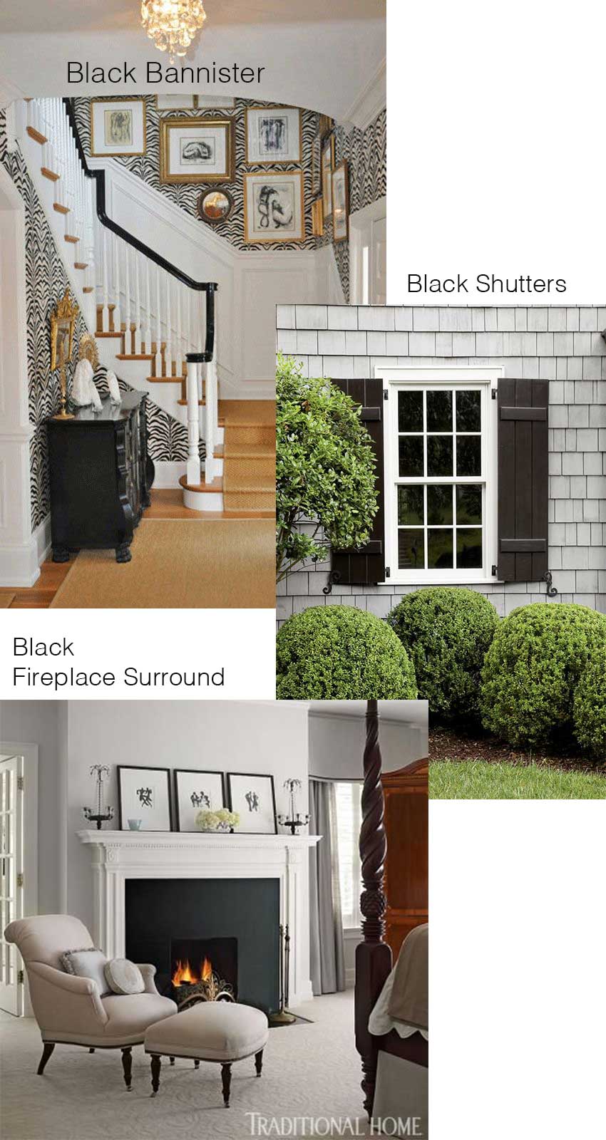
These addtional colours are perfect for when you need to show your client what their bannister will look like painted black, or brown, or their fireplace surround if it needs to be changed. Or if you need a front door or shutter colour, it will most likely be here. There are also more greige and cream shades since they are trending right now.
Get my large colour samples right here.
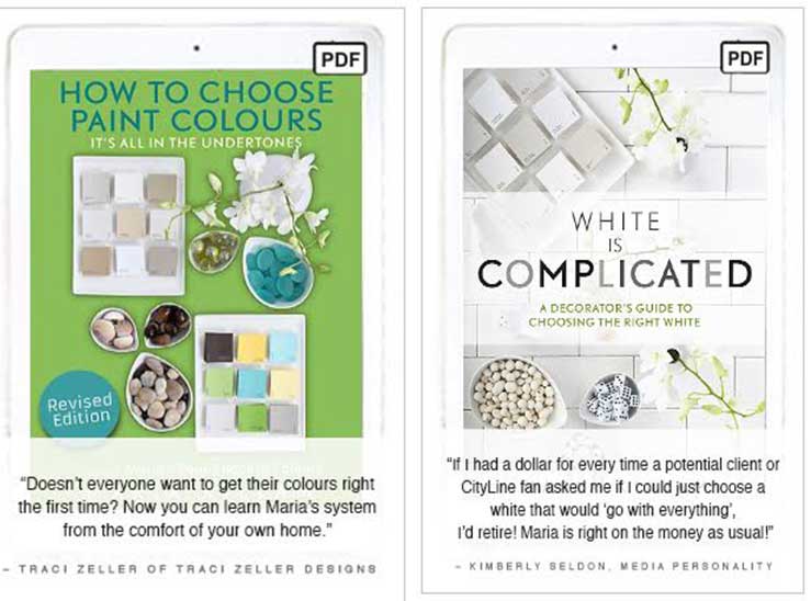
Get my eBooks here.
Here’s what two of my True Colour Experts said about the boards:
“Ever since I took your training in the Chicago my interior design business hasn’t been the same…thanks to your 11 x 14 exclusive colour boards. My clients take one look at the large colour boards and how I use your system to enlighten them about undertones. They are always in awe and are amazed on quickly we can select the correct color for their space. They feel empowerment in being part of the process as well because they actually can see what the colour looks like in a large format versus a tiny little chip. I have gained new client’s trust much more quickly than in the past.“ Julie Kay Design, True Colour Expert
“I received my set of color boards just a few days after I completed Marie’s Specify Colour With Confidence training. Because I had the boards I could immediately apply the concepts I had learned in the course during my color consultation sessions with clients.
Armed with the boards and the knowledge and confidence I gained at the training, I’ve been able to communicate with my clients in a language they understand…visually. The large samples help my clients truly see the color in context and help me reinforce why the color I’ve chosen for a client’s space is the right one.” Arianna Bellizaire, True Colour Expert
My colour boards are individually painted boards. When you think about what it would cost to make them yourself (around $10 each), you’ll snap them up ASAP.
Here’s the thing, you don’t need to buy my paint samples in order to get your chromatic colours right, but you do need to use large samples to find the right neutral 95% of the time.
Get the colour boards here.
Get the ebooks here.
Who has the boards? Love to hear what you have to say about them in the comments!


Maria, I too have been using your color boards ever since I ordered them a few years ago. They are simply priceless! I don’t know how I ever got along without them. When I show my client(s) the color that will make their rooms look perfect they are amazed. Your system is one that I recommend to everyone I talk to. Also taking your class reinforced the whole concept! Thank you so much for ALL that you do!!
Hi Maria, I’ve been using your boards for a number of years. What a great tool. As with all good office “samples” (although these are much more than samples), some of the favourites have gone off on their own never to be seen again. I have been meaning to order some more to replace what’s missing, but I’m also pleased to see that there are some new colours in the VIP section. So your promo was most welcome and very timely! Thank you so much.
Do you have the larger set in Sherwin Williams. If not please consider doing them. I have the smaller set ini SW
Because I have been pretty much backordered for one year on my boards, I don’t have them right now but I will get the set of 20 whites and grays made again. They will be available in the new year.
Any chance of making the SW with the additional colors (with black, etc.)?
BTW I’m a designer and want you to know your color sense you share is very helpful. If you ever come to Chicago area I would be ready to sign up for a course.
Hi Kristin,
My Sherwin Williams boards are the least popular and when I get them made, they last for months, so I don’t have any plans to make them in other colours.
I will be in Chicago in May, you can register here: https://mariakillam.com/live-colour-workshops/
Maria
Hi Maria! Do the color sets include white paints and is the VIP set the same as the core set, but included more colors?
The Core Collection includes the 10 whites in my system as well as the beige & gray colours you need when you choose neutrals.
The VIP set does NOT duplicate the Core Collection at all. It’s greens, blues, more greige colours, some yellows and 10 of the best dark shades.
Maria
Does it still make sense to get the set of large color samples even if I don’t necesssarily plan to use whatever brand of paint (likely Sherman Williiam’s) that the set is based on? I plan to choose my brand of paint based on things like VOC and other health related concerns, which I have not fully researched yet. I understand that most brands now offer low or no VOC options, which is very nice to see but I expect that some brands will likely still be better than others when it comes to health related/off gassing/chemical exposure issues
Hi Jill,
They are painted using Benjamin Moore paint and yes my Understanding Undertones system is totally transferrable to any paint line anywhere. So just find a colour in the deck you are using that is close and then you’ll be getting the correct undertone that will relate to whatever you are doing. Or you can get them to match it. Great question! Thanks for posting it! Maria
I just ordered my second VIP set. My current set has been around the block so many times they are looking too tired and worn to be presentable in front of clients. Bless you for creating these! Along with a new set of color boards I’m hoping to assist in a training session next year. I’ll look at the class schedule and my calendar to find a good fit.
I’m not sure which ebook I should get – I am about to paint our kitchen/living (open concept) white. I (believe) I have off-white trim/cabinets and similar carpet in LR with dark wood-look laminate floors in the kitchen. I like to decorate with brighter colors and this whole open concept home has me thrown off. Would the How to Choose Paint Colors be better for me? Or the Whites are Complicated? I am leaning towards the first since I’ll still be using lots of color, but wanted to make sure it would still help me select a white!
Hi Amanda,
They are two distinct books. The first one is about understanding neutrals and colour and the second one gives you step by step instructions on choosing whites it sounds like you need both of them. Still cheaper than one gallon of paint that is wrong 🙂
Maria
Really like the green looks great in your house Maria
And the green with the black looks fantastic .
Makes me want to redo .