
I’ve been receiving questions on two-toned cabinets lately and I can’t believe I’ve never addressed them on the blog. Here is my lovely readers question:
I’m about to refinish my 90’s oak cathedral raised panel kitchen cabinets, and am considering a two toned paint scheme. I’m thinking Fieldstone lowers and Gray Cashmere uppers. Do you think this is a trend or is this a classic look? I hesitate to do this until I get the Maria Killam stamp of approval. Can you tell us when or if this is ever a good idea?
Often when we’re looking for inspiration photos to help us plan a renovation or new build, we’re looking at photos like this (below).
If you cherry pick a high end look, it won’t look as amazing
Gorgeous kitchens in high-end homes that most of us don’t live in. This is another reason why I talk so much about classic and timeless finishes that seem boring to some people.
Most of the time, a new trend is incorporated the wrong way if you’re doing an update, on your own, without a designer. For example, you fall in love with a large scale encaustic tile for a space that is way too small to handle it, or you take another interesting patterned tile and decide to install it on your backsplash along with a patterned granite countertop.
Here’s the thing. . . as I’ve said many times before, if you think my advice to install subway tile for your backsplash must mean I have zero creativity, you can keep clicking. There’s lots of people who could live with this backsplash (below) for a long time and are very happy they found my advice BEFORE they installed the trendy backsplash tile they were originally considering.
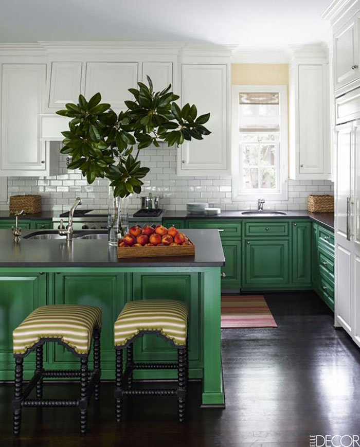
Image source
Back to inspiration images. The problem with them is that the average house doesn’t look like this kelly green kitchen (above).
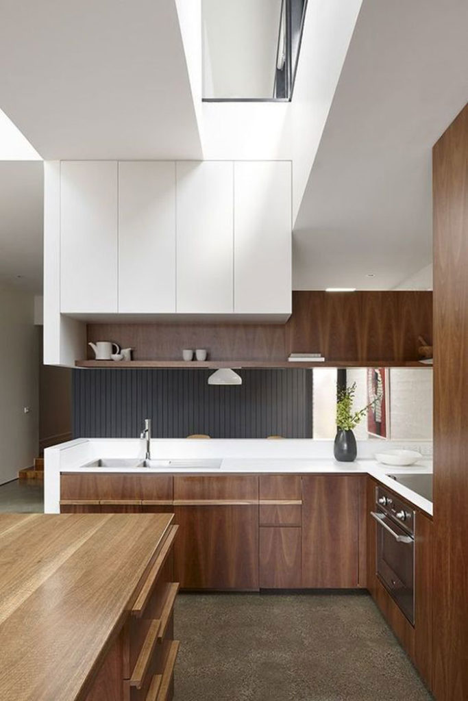
In this kitchen, the kelly green lowers and white uppers look right as rain. To my eye anyway. And here’s why it works.
The white subway tile relates to the white uppers. Kelly green looks amazing with black and white.
Here’s an entire kitchen in kelly green.
Which one do you prefer?
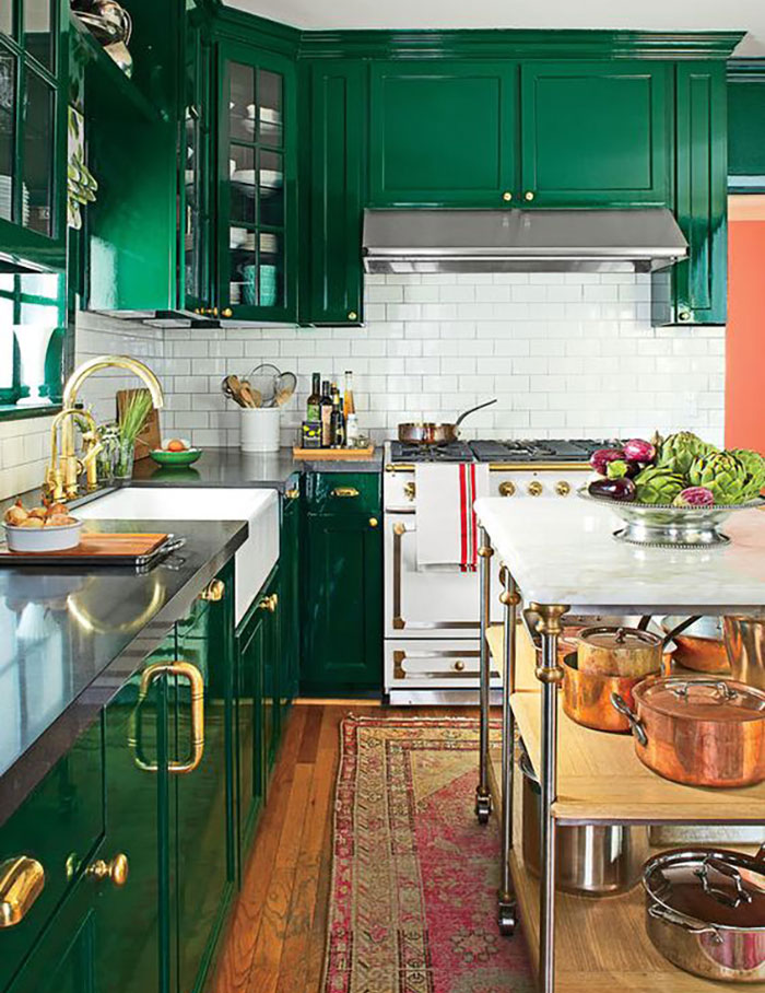
Interior Design by Bailey McCarthy
What else are you installing?
It’s very important that you choose everything before you simply choose different colours for your uppers and lowers.
Most people make random colour choices without thinking through what the rest of their finishes will be or how the colours in their kitchen will flow with the rest of their house.
I can’t tell you how many times people would walk into the paint store with their countertop or tile sample and were SURPRISED when I chose a colour that RELATED to said tile or countertop.
So let’s explore some more of them shall we?
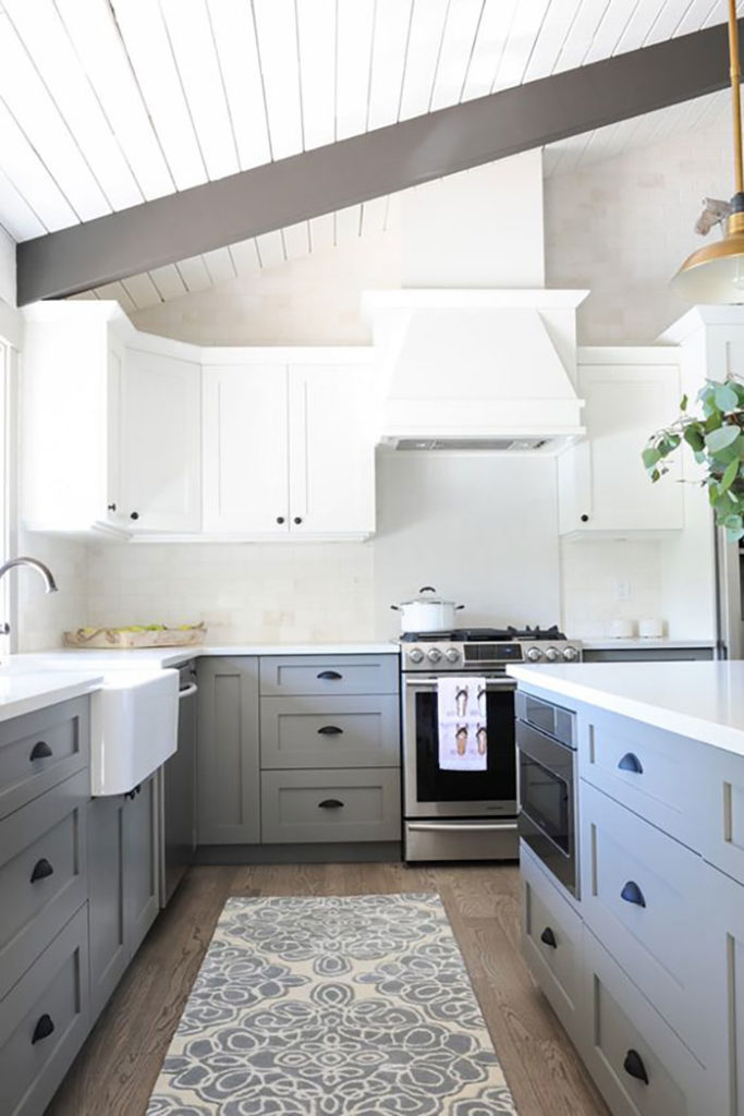
Here’s a trendy grey on the lowers:
via pinterest
And notice that it needs the carpet that relates to the lowers, otherwise the grey is all by itself–especially because the beams in this kitchen appear to be taupe–don’t relate to the cabinets.
Why this works
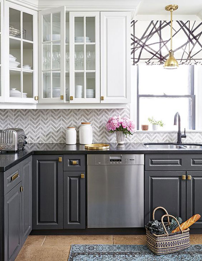
The backsplash tile here relates to the uppers and the lowers making this kitchen look well thought out.
via HomeBunch
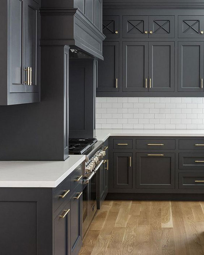
Here the ALL CHARCOAL kitchen looks a little heavy (above). If you are going to choose a trendy colour like charcoal grey for your cabinets, better to keep them on the lowers like the first image.
At least the hardwood floors here are perfect.
 via
via The darkest colour should usually go on the bottom. There’s nothing wrong with this kitchen (above) but to my eye the charcoal should have been on the lowers.
via Pinterest
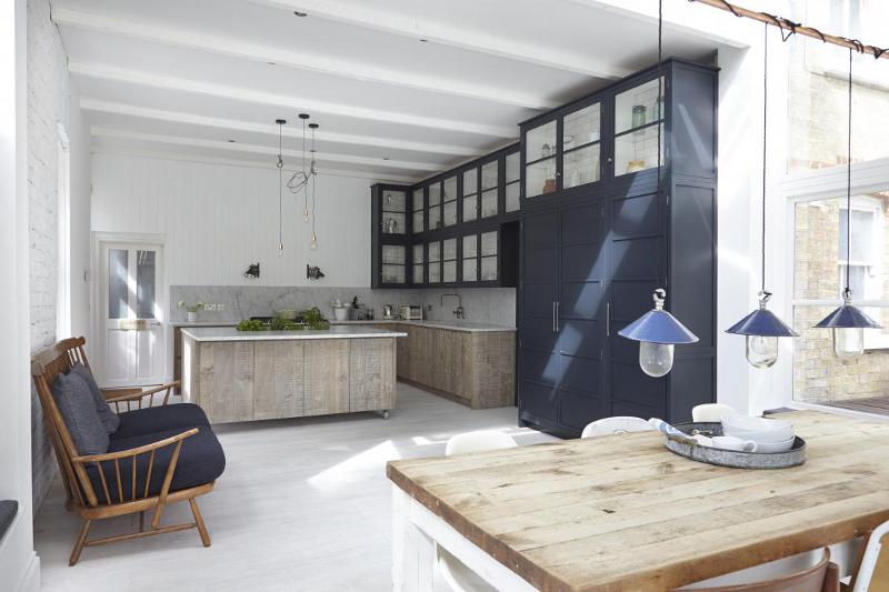
However, most kitchens have pantry walls now so then you have to choose which colour goes on the pantry wall if you’re going to have dual coloured kitchen cabinets.
via Pinterest
I would consider leaving the pantry wall in white if you have to choose (above).
via Pinterest
I prefer a little wood in a completely modern kitchen with white slab doors (above). Here the upper shelving relates to the lowers which makes sense visually.
via BHG
If I had to choose two colours for my kitchen, I would probably choose stained cabinets on the lowers to relate to the hardwood floors and then white for the uppers. It still feels light and fresh but the lowers (which take most of the beating with wear and tear) feel like furniture here instead of kitchen cabinets.
Also, note that again, this is a higher end kitchen with high ceilings. Take an off-the-shelf builder kitchen without the furniture look of this kitchen and it would not look nearly as amazing!
Bottom line, if you are in love with grey and want to incorporate it into your kitchen, trendy or not, perhaps keep it on the lowers. Easier to change down the road when you fall out of love with grey. Which, by-the-way, will happen. Just like you’re probably not considering espresso brown right now, but you might have been a short 5 or 7 years ago when brown was on trend.
Colour vs. a neutral
If you are considering a colour and not a neutral, make sure it relates to something. When you paint both uppers and lowers the same colour, they relate. But if you simply have navy blue lowers for example, it doesn’t look like a designer has been there if you don’t repeat that navy elsewhere in the kitchen.
Don’t forget about Contrast. If you’re going to install contrasting colours, which usually means darker on the bottom, keep your countertop a solid white or cream. In all the images I viewed when writing this post, the kitchens I liked the least where ones with granite countertops. It just starts looking too busy when you add granite to a two-toned kitchen.
One more thing, you might be considering two colours because you want your kitchen to look ‘interesting’. Interesting comes from styling which is way easier to switch out than a trendy colour that will date your kitchen faster than anything else.
That’s my classic and timeless advice for the week!
Which kitchen is your favourite?
If you have a question for my Ask Maria posts, please post it in the comments below!
If you would like your kitchen to fill you with happiness when you walk in the door, check out my eDesign packages.
Related posts:
When Should You Rip Out Brand New Tile?


Hi Maria, love your post. Here is my Ask Maria question. Due to water damage I have to replace my laundry room floor. I have grey carpet adjoining and white washer/dryer. Since it is a VERY small room, I thought to buy basically white tile or vinyl (more likely) and paint the room a happy color. Simple, right? No. Tile and vinyl are….brown. Brown, brown, BUSY brown. Drowning in brown or beige. Even their “white” is really beige-y that looks yellow and dirty next to the washer. I have walked into show room after show room and told the sales person I do NOT want brown or beige and they look crestfallen. It’s not an option. The only thing that relates is a dark grey that goes with the adjoining carpet but feels to heavy for the space. I keep running into this problem, everywhere I look is brown and beige and it is difficult in reality to BUY things in the color I desire. What do you do?
Hi Liz, Well today is your lucky day because I’m going to tell you the ONLY two vinyls out there that are even REMOTELY an option, this one https://www.pinterest.com/pin/29203097560213427/ or this one https://www.pinterest.com/pin/33354853462810617/ You’ll probably have to order it.
Sad that salespeople don’t know about them.
Maria
Oh bless you! I think my family does too because they are tired of going to every store within a 100 mile radius. Having gray (with a hit of purple I think) carpet has been lovely but a challenge.
I get stuck on projects often because everything out there is brown or beige. Sometimes, due to your lovely website, I have an idea of what works. Or, at least I definitely know what DOESN’T work. And I simply can not live with what doesn’t work because it will bug me forevermore. But stores doesn’t carry this. I always wonder what you and other designers do because variety in color is a huge problem. In general, how do YOU find the colors you want?
PS My mom really loved this post. We have talked several times about whether to paint different colors in the kitchen cabinets.
PPS I like the third kitchen. Beautiful colours but it retains that real-world homey feel.
I’ve seen both hex pattern vinyls that you linked in person. The grey one looks nice on the screen but in person it has a faux aged stone look that I don’t care for.
The white one is great and I’ve used it before. There is only one store that carries it which is Linoleum City in Hollywood. They have it custom made by one of the big manufacturers and they primarily sell it to set designers who use it on movie sets. Unfortunately it isn’t very durable so it shouldn’t go anywhere that will get much traffic.
I used this one recently and really liked it:
http://www.mannington.com/Residential/LuxuryVinylSheet/Decorative/Penny-Lane/130332
Hi Jessica,
Thanks for your comment, nice to know that about the second link. I have seen the first one installed and although it’s not AMAZING. It’s a lot better than all the other faux tile laminates in earth tones out there! Thanks for posting the link to the 3rd option!
Maria
Hi Maria!
What would you say is a “classic” floor tile for the main areas of a home? Also, if you have a white kitchen, then does the tile need to be white as well? This question has me stumped!
Thank you!!!
Hi Kristin, Here’s a post I wrote about that! https://mariakillam.com/which-tile-is-best-for-multiple-rooms/
Hope it helps!
x
Maria
I located a store with the first sample and it is definitely an option, thank you. I found a second option and I am decided between yours and this one. Just FYI, it is Congoleum Contempo Ballet White
http://www.congoleum.com/ap600/
Hello! I took home this Mannington sample. The rep at the store told me everyone was checking it out. I thought it might work for our kitchen. I wished the grooves were deeper and note it had gray.
Oh, thank you so much for that vinyl recommendation. I recently threw a sheet of loose lay vinyl over a laundry room floor I hate. I went with a grey faux-stone, knowing it is part of the “grey trend.” I wanted a more permanent solution for my bathroom. I’m in a second floor condo so the sub floor is uneven meaning the risk of cracked tile and grout, and the downstairs neighbors may not tolerate tile. (Plus its the only bathroom, and vinyl is a one day install.)
I love that though you are a high end designer who would surely prefer everyone have “the best” and use a designer you still help us “vinyl budget” people do the best we can!
Hi Liz,
I used “Shades of Gray” tile by Crossville. Color: Haze
Love Love it. It joins up to a wood floor. Haze has brown and Gray with very little movement. Reminds you of slate. It looks great with white washer/dryer and Palladian blue walls. It looked brown in the store, but took home sample to look in my lighting. They also have other colors in same line.
Took me 6 stores to find this contemporary tile that wasnt too dark or too flat of a color.
The second kitchen with all green cabinets is my favorite.
I love individualistic kitchens, but I don’t love two-toned cabinets usually . . . even when they’re well done! They irritate me visually. 😉
I think I would need to know how many times it would be possible to repaint one set of cabinets in its lifetime before I decided to do something as bold as different colors for uppers and lowers or a really bright or unusual color for everything! I assume that once wood is painted there is no going back to regular wood, which I think would be fine with me, since I tend to prefer painted (painting real wood might affect property values but probably not a lot). I would also like to know about the cleaning and maintenance of painted vs wood finish before I decided.
I like the kelly green in both kitchens but it’s a lot of green. I think green is currently on trend but it might seem dated at some point in the future (I’m afraid that the green trend might be kind of a mini trend that will be short lived . .. but it sure is pretty!)
I;ve also wonder about doing all the uppers and lower the same expect for doing the cabinet for the island in a different color (maybe something fun and colorful).
Hi Jill,
Paint can usually be stripped, it’s just a longer process if there are more coats. I love the look of white kitchens, but have found stained wood is easier to maintain than painted wood. The paint almost always chips, so if you go that route make sure you have touch-up paint on hand.
In my last home we started with white cabinets, but they chipped so badly I refinished them with a medium stain (they were maple and they looked great stained). If they were oak, I would not have stained them…I just don’t like the look of golden oak. I do like a a cerused oak finish, which is something you may like. You can see the grain, but the grain is “filled” with white lime or a paint.
Susie
It was nice to view all the different ways to do a kitchen with two tones. I really did not like any of them. I wanted to change the floor color or backsplash and countertop color in each one. I am sold on an all white kitchen cabinets with white subway tile. So if I had to choose it would be the herringbone grey subway kitchen. I like how it pulled the colors together. Another great post!
Typically, I’m not big on different colors for upper and lower cabinets. But in the examples you show, they look fine. Like you said, that’s because these are magazine-level homes to begin with. Honestly, it would be hard to make these kitchens look bad, no matter what colors you put on the cabinets – especially given that the counters are black or white.
Homeowners should realize that this type of space is like a gorgeous, skinny model: you can put almost anything on it, and it will look fabulous. Might not look as great on you… or on your own kitchen. I like your advice to try the trendy color just on the lowers, if you want to have a little fun. I do love bright greens and used them extensively in my own home remodel a year and a half ago, so nice to hear it will be a trend.
Hi Juli,
Did you read the post or just scan the images? There were a few in there that I WOULD NOT INSTALL. And that was my point.
I don’t read everything either, haha, so for anyone else reading this comment, make sure you READ this post.
Thanks for your comment!
Maria
I agree with you Juli. I was even going to add when Maria says that they aren’t homes most people live in, these aren’t even homes the owners probably live in, at least full time!
I am of two minds about this idea. Generally, I am not a big fan of different color/wood upper cabinets and lower cabinets. I like my background to be really cohesive b/c I have enough clutter in my life and this would ultimately drive my eyes crazy, I think. Yes…it would have to be really carefully done so the colors blended or balanced each other out. And, I suspect that if I wanted some kelly green cupboards I would really take this idea seriously b/c it looks terrible with all kelly green in the picture of above, and pretty darn nice in the first picture.
On the flip side…if you are really drawn to the idea, I am not sure I see too much wrong with it simply because you could just paint the uppers the bottom color (or vice versa) if you decide you don’t like it. (I agree…make sure that would be an option a year or two down the line.)
Looking back at that second green picture, maybe the overall look is just too hard here with lacquered cabinets, dark counter, and the hardware on the cabinets, among other things. Maybe the mixed color look is best on cabinets when the overall look is classic (as Maria suggests), or softer colors. I don’t know, this reminds me of feature walls, which I’m not really into either. Hmmmm…
I LOVE “interesting comes from
Styling,” which is so much less expensive and changeable.
My subway tile is carrera marble. I know I spelled the wrong. This post is really useful to me because my cabinets match my floor in my open floor plan home. And the fireplace surround is the same oak (and marble surround). I think I’m going to paint the mantle. See how that goes. The m thinking chalk paint. But I’m not confident. So I’m waiting.
Hi Maria,
I like the very first kitchen the best. Love those stools at the counter. Kelly green sure is fun.
I like the Patina Farm kitchen. Does that one count?
Well notice she technically doesn’t have uppers. And their house is most definitely nothing close to anything ‘builder’. Kitchens THAT well thought are amazing!
Thanks for your comment!
Maria
I am in the home stretch of my studies at NYIAD (New York Institute of Art and Design). Several months ago my coursework covered recommended blogs to follow. I checked all of them out and yours was the only one I thought would be beneficial to me as a new designer. It seemed relatable and livable. Fast forward to now and my choice has been confirmed time and time again as I read your posts. Another educational and applicable lesson is laid out above- thank you! Molly
Thanks Molly, that made my day! It seems like every course I do now, there’s always SOMEONE registered who found me through their recommended blog list!
So awesome, thanks for posting this comment!
x
Maria
Fantastic blog. From my merchandising background, Light is always above Dark, and although this next part doesn’t relate to your blog, (Colours are Left to Right from lightest to Darkest…and warmest on the left to coolest on the right.) I feel we have the most success when we think about how the earth relates. Sky above, darker ground below. We are at ease with this relationship.
Brilliant advice. I never knew why, now I do! Thanks!
I chose a two-tone color scheme when redoing my kitchen in 2015, and so far I’m very happy with my decision. Our house was built in 1923 and the kitchen is in the northwest corner, making it a darker room most of the time. The cabinets were custom quarter sawn red oak, mission style, put in about 20 years ago. My first impulse was to paint everything white, but I realized that it would probably make the room feel bigger but not brighter. Instead, I settled on black lowers, white uppers, and kept it simple with the whitest marble counters I could find locally (Vermont Danby Mountain White) and a sparkling glossy white subway backsplash to help reflect light. And, I installed better lighting to help brighten everything up when natural light is at a minimum. I’m hoping that since I went relatively basic with the colors and finishes, it will hold up over time. We shall see!
My favorite would be the kitchen with the taupe beam. Looks light and airy.
The House & Home kitchen with the gray chevron backsplash tile is definitely my favorite. It is crisp, airy and would work well in a typically sized, not quite magazine-ready house.
I can appreciate the advice to stick to a classic kitchen. I would love to rip out my 90’s oak cabinets with the soffit above them. And replace them with white shakers that go up to the ceiling. But that’s not happening. But some white paint & white counters can go a long way.
During my painting project I decided to paint the lowers a shade of blue that’s a little darker than my blue walls. When you say your lower color choice needs to relate to something, does that count?
I also think it’s important for folks to enjoy their home & not worry about trends. If you want to paint your cabinets a color you love than do it! It’s just paint.
Hi Mary, It certainly does count, and your blue continues into your living room. You have a lovely house!
Thanks for your comment!
Maria
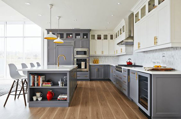
I suppose my fave above is the kitchen with the chevron backsplash, grey base cabinets, white uppers and brass hardware. If it were mine, I’d replace the oil rubbed bronze faucet for an unlacquered brass faucet; hang a different window shade; install a panel ready dishwasher (it’d still be a Miele), so that it would disappear into the cabinets; and I’d choose medium toned wood floors to flow with the rest of the house. With all of that said, green is my favorite color, so I would accessorize with green!
I’m seeing quite a few kitchens with intense green or blue cabinets on Pinterest and Houzz. They are beautiful, but I couldn’t live with them. And, I’m not a fan of different coloured uppers and lowers. Although, I do like it when the island is painted a contrasting colour. Otherwise, it just blends in with the cabinets behind. When renovating a kitchen (unless we’re wealthy), we need to keep it fairly neutral and timeless.
I don’t find your recommendation of white cabinets and subway tile boring at all, Maria. It’s great advice for a kitchen that will withstand the test of time.
Thank you for this timely post. I am considering navy lowers with white upper cabinets in a large high ceiling room where navy and gray are dominant themes in my house. Your first pic with green cabinets looks nice, but only if you really like green. I am wondering do you think the counter tops should have been white considering your end of blog statements? I have 3 different counter tops to work with and have been pouring over pictures and have seen about every combination out there.
Yes with navy, I recommend white. Maria
In addition, I agree with Heddy! It’s similar to the reason we are attracted to balance and symmetry. When we look at each other, we usually see two eyes, two ears, two arms, two breasts, when something is unbalanced, we notice and have a hard time feeling at ease.
Frankly, I have no favorite in this category because my focus is my small kitchen and the worst thing I could do would be to add visual clutter by doing two-tone cabinets. In fact, the one image I saved was that of the charcoal kitchen and the reason I saved it was that you said the hardwood floors were perfect. So there you go again, reviewing/reinforcing what you’ve already taught me. This is an interesting and important post, nonetheless, because so many of us don’t click on the fact that the images we’re viewing, as you mentioned, almost never match the reality of the rooms we’re working on. Your questioner was very smart to ask you for your opinion. She didn’t get a “yes” or “no” answer but I think her smarts will enable her to think on your words and study the images thoughtfully and come to a satisfactory conclusion.
The green one is my favorite! We did an all antique white kitchen in our old home and while I loved the look of it, our 6 children had the lower enamel nicked and looking worn in just a few months. When we moved and started all over, we did darker stained on the bottom with hardwood floors and the same antique uppers. I like it, but it’s looking very Tuscan beige to me now 4 years later. I’m thinking to paint the uppers a truer white and go navy on the bottom, but now wondering how I can make the navy relate. We have a thick crown molding around the top that is the same stained wood color as the bottoms and floors. My first thought was to paint it white to visually extend the height of the room, but now am wondering if it should be navy to relate to the lowers. Or if there’s a better way to repeat the navy—like in curtains or tablecloth. It’s a giant eat in kitchen (18×30) but has 8 foot ceilings.
Hi Angela, my eDesign packages might work here for you too if you just need a paint colour but certainly window coverings are a great way to repeat the navy. Maria
Great post Maria! I really like quite a few of them but really loved the one with the chevron backsplash. Neutral and pretty. I also thought the green cabinets with the white uppers did look great. I am not a bold color lover but I agree that it just works. Also like the stained with the white. And the…. lol. See? I told you I liked a few. I followed your advice when doing my laundryroom over. I had existing cherry cabinets and wanted a timeless look. Added white cabinets to the mix and marble look quartz counters and wa-la. Perfection. Great ideas to be had from this.
I have maple cabinets in my kitchen with the lower cabinets stained and the uppers are cream colored. When I told the kitchen people that’s what I wanted, they thought I was a wee bit nuts but they were surprised that it looked so good. I did this about 6 years ago and I still love the look. I haven’t put up a backsplash but if and when I do, it will be cream-colored subway tile.
I love your blog and have been reading it for years! I have an Ask Maria question regarding a paint color for ceilings in our main living space which includes a large entry, great room, kitchen/dining space, plus front and back hallway. We have very open concept rooms and a wall of floor to ceiling windows that extends across the back of the house which faces South. Our ceilings are very high and angular. Also have 2 deep dormer windows. We are planning to paint the walls in this entire main area in Stonington Gray, but need suggestions for a ceiling color that will work with Stonington. Current ceiling color is pure white and makes the room feel cold. We have lots of white trim, including windows, fireplace surround, bookcase and cabinets. Thanks Maria!
Hi Gwenda,
Thanks for your comment. Questions about which paint colour goes with what are not really eligible for my Ask Maria posts because they are very specific to your situation. You can purchase a single paint colour solution in my eDesign section on the shop page!
Thanks for following me!
Maria
I love two-toned cabinets. My favorites here is the very first kitchen(a question btw..emerald and Kelly Green..how you would describe the difference? is emerald deeper/darker?), and a wood kitchen with slab doors, which to me seems walnut, and white. I always admired mixed look of wood and color, first time I did it(with ready made furniture) was in 2000..that was cherry and very light cream, and it still looks good many years after. It’s modular so it could work in different spaces and settings, and literally followed us around the world. Now my ex has it. in 2010 I repeated the look by custom ordering shelving made from teak but incorporating two colorful veneers-light cream once again, and my beloved purple. I knew I had to make these movable in case we moved-and right I was. I don’t get tired of the colors I truly love; rather I fall in love with new colors in addition to the older favorites..so that is tough:)
I dreamed of going two toned in the new kitchen..couldn’t make it wood because of the wood floors and small space..it would be wood overload. Was thinking of mixing two pretty bold colors that I really like, but alas the look would be too chopped in my kitchen that has much more lowers than uppers, and is fairly small..I also, as you pointed out, thought that the pantry should be darker, lower part color, and I wasn’t sure that would benefit the kitchen too.
In the end I choose just one color, different altogether, which I’m kinda sure I’m not going get tired of for a very long time since I loved it all my life. That’s my first kitchen with painted cabinets and I do feel I need to baby it much more. Good thing about it-you take care of the things like spills etc. immediately. In the old kitchen, with its busy granite and more forgiving cabinets, you usually saw dust and dirt with your fingers rather than eyes..:) I’d touch it-and then I knew lol
(never liked espresso or oak..always liked maple and cherry in the light range of woods, and walnut and teak in the darker range
which doesn’t mean I’d redo a kitchen not exactly to my liking, if it makes sense within the general concept of the house, color wise, style wise and function wise.
I did redid our new one since I had a unique opportunity to do that(walls were coming down anyway) and because it was totally out of context, probably installed for resale. Now it lives in the garage:) And is very useful there-true we don’t have a big kitchen but we have two small ones..:) ok, one and a half:)
Thank you for the beautiful post.
Very interesting read as I am doing a kitchen redesign. Planned on white shaker perimeter cabinets with a darker island in wood expresso stain color. I didn’t realize that was out of trend already. Wanting the same white quartz – Torquay( or similar over both. The wood floors are medium oak color. Haven’t committed on the island cabinets and countertops yet. Any other suggestions? I really like the two tone to blend with the open design of living area. Thanks in advance.
An entire kitchen in espresso is considered dated but I think you could install an island in espresso as long as it looks like furniture. And obviously it would be good if you had other espresso pieces in the adjoining great room.
Maria
Thank you! That is what I was planning.
The all green kitchen, uppers and lowers, should be properly attributed to Bailey McCarthy. Blog “peppermint Bliss”, store Biscuit in Houston, features in several magazines , including February 2017 HOUSE BEAUTIFUL.
Very informative post and great ideas! One question that has been stopping me from my kitchen remodel is that I have a contemporary style early 80’s home with oak cabinets in the kitchen. All of the molding and doors throughout the house are clear mahogany. I don’t feel white cabinets will work in my kitchen with the mahogany molding I will not paint over. The floors will be replaced with oak. I would appreciate seeing some kitchens that have a modern look, but not with white doors and moldings. I love my mahogany doors and moldings and I don’t know what I should do to replace the 80’s oak cabinets. Thank you, Maria, for your inspiring posts!
Can you comment on solid surface counter tops? Ive searched your blog many times and I can’t find your opinion on them anywhere. In white, off white of course! Thank you!
Hi Brenda, yes that post is right here: https://mariakillam.com/is-quartz-sexier-than-granite/
Maria
I have never liked the different uppers and lowers look. I do like an island with a bolder treatment in some cases. I’ve always been partial to a green or blue island.
Its easy to look at the high end photos and think you can recreate the look, but you’re so right: in an average home, it will fall flat.
In 2008, we updated our kitchen and painted uppers off-white and lowers, green (BM Weekend Getaway.) The kitchen was the ‘show stopper’ when we sold it (depths of housing crisis!) It recently went on the market & same kitchen was described as “recently updated”, haha.
Kitchen with chevron backsplash and lots of gray has a brown floor? I thought this a great example of updating Tuscan/brown-trend.
Your new website design is fabulous! As someone previously mentioned, I’d also prefer a larger font. Me enlarging the font, enlarges images just enough to make navigation a bit awkward.
Thanks Maria. I really enjoyed and appreciated your comments and the photos you chose to help distinguish the different concepts. I am planning a new kitchen and thought I wanted a dark colour on my island until I read this post. You have me rethinking that however I am thinking of going with a walnut butcher block top on the island to bring in the warmth of wood. We have real beech hardwood (vs. engineered hardwood) flooring throughout an open concept design (kitchen, dining room and living room/family room). I love your “not boring to me” white kitchen with white quartz countertop and white subway tile backsplash however, I think our cabinets should be in the off-white (Simply White) range because of the wall paint colour I am thinking of using after having bought your e-books. So my question is: how would the white quartz countertop and a white apron-front farmhouse sink look against Simply White cabinets? Thanks for your very welcome input.
Great post, Maria, and I love your comments on the various kitchens. I didn’t notice the taupe beam until you mentioned it, then “Ugh!” Could never live with that. I can admire several of the kitchens– the first green and the gray with chevron tile, in particular–without thinking that I would want them in my house. The funny thing about all the gray cabs is that I would never want any of them, despite the fact that I love the color gray and always have. In 2005 we gutted our main bathroom. I found a picture in a magazine of a bathroom with gray and white ceramic tile and ended up basing the renovation on that picture, but finding gray tile back then was extremely difficult. So I wanted gray in the bathroom, with lots of white, but never wanted it in our kitchen. Does that have anything to do with living in snow country? Perhaps. The gray in my Carrara marble countertops in a white kitchen is enough for me.
My favorite eye candy kitchen in this post is the first with the green lowers.
I love your advice in this post. Thank you for the good info and examples.
One of my favorite real life kitchens was in a small house where the cabinets were all painted a very pretty blue. In a real life house without high ceilings and tons of natural light my friends choice of using a color for all the cabinets was better than all white probably would have been. Since I know so much more from Maria now I could probably analyze it better, but at the time I know it just looked right and felt happy!
Beautiful kitchens!
We are looking to redo our 1991 kitchen and I want off white cabinets to replace the orangey oak ones. Does anyone know if off white cabinets work when the trim around the windows and baseboards are stained wood? Could I leave the trim (not cabinet trim, but windows and baseboards trim) wood stained and have off white cabinets without looking out of place? I just can’t picture this all in my head. We have two (horizontal support) beams that are in the kitchen area ceiling that are orangey wood that might be able to be painted to blend with the ceiling. The flooring is stained wood that blends with the trim, beams, and doors. Ideas anyone??
I like the second picture of the green lacquered cabinets the best which got me wondering if a “lacquered” finish would give a classier finish if you were going to paint over builders oak
cabinets? I’ve seen several houses in my neighborhood that have painted over the builders gold oak cabinets that were installed with the houses and some of them look quite nice especially the ones done in darker colors like gunmetal grey or black. But the ones in white not
so good. But the finishes were a flat paint and Im wondering if something with more sheen like the lacquered green ones would look better? In short….how much difference does sheen make in the final result when repainting oak cabinets?
Maria, First of all I LOVE your new website! Every post is so instructive and valuable! Reading all of the comments is so much fun and also informative. You have done such a great job! None of this would you get from design courses.
I agree that the “wow” kitchens that you have posted do not fit in with most average homes. I think that it takes an open concept design. I have always loved all white kitchens with different accessories that pulls colors together. That being said, if you have enough room in a remodel to put in a center island, I still would want the uppers and lowers to be white with subway tile in a pattern that you like. If you want to then get “trendy” you could paint the island a color that goes with the rest of your pallet throughout the house. Making the island look like a piece of furniture as you suggested is what makes the space look updated.
I love the dramatic emerald green kitchen in the first picture and like you, I also like the last one for something simple and relative.
Hi Maria,
Great post! I’ve always wondered what you thought about this trend. I guess I should have asked! A quick clarifying question for you–do your thoughts on two toned cabinets also apply to kitchen islands? For example, if the perimeter upper and lowers are the same color (stain or painted) and the island were a different color, is that considered a trendy no-no in the average kitchen? Or, would that be okay as long as the color relates to something else in the room/adjoining room? Thanks!
Hi Ashley, I wrote a post about kitchen islands and it’s right here: https://mariakillam.com/what-not-to-do-with-your-kitchen-island-design/
Hope that helps,
Maria
Thank you! I had forgotten about that post.
Great post. I just remodeled my kitchen and as much as I love the idea of using a dark lower and a light upper, I couldn’t make it work in my u shaped layout. I don’t regret going classic white either. I am brining in color and originality through art and décor instead. You were completely on target when you pointed out that most of us don’t live in those photographed homes.
Thank you, Maria, for a great post. I think you’re spot on with the pantry units being in the lighter colour if you go for a two-toned kitchen, unless they are superbly unique and you want to draw attention to them.
On another note, I’ve never been fond of subway tile – sorry, I realise I might be the odd one out, but I just cant help or defend it. What would be your second go-to wall tile/ finish for a timeless look? Thanks for putting so much effort into your posts. Mia
Something plain and white or cream, whatever goes with your kitchen. Doesn’t matter what the shape is. Hope that helps! Maria
Maria, I just want to thank you because we are in the process of building a house with a large builder, meaning that my choices are kind of limited. However, because of your blog, I was NOT to be talked out of my simple vision– white subway backsplash, black granite countertops (I agree with you about granite, but again, my choice is somewhat limited), white cabinets. Light, wide plank floors. Bathrooms are all white with NO accent tiles. A few years ago we redid our master bath and I walked in to the tile store knowing I wanted white, but somehow allowed myself to be talked into early tile with that rectangular, mixed stone accent band! How did I let that happen?? The guy who sold it to me had just told me he painted his bathroom “Tigger Orange”. What in the world made me listen to him??? Understanding WHY I like something gives me much more confidence to stick to it. I will definitely be purchasing your White is Complicated before we paint! Thank you so much for your advice!!
Is it ever ok to have bathroom tiles painted? We moved into a house and two of the bathrooms have brown tile. The quality is good but style? Not so much. So. Can I get I painted? Or is ripping it out the only option? Thanks Maria!
If they are flat and on the wall I would probably keep painting until the end of time rather than have a brown bathroom! Go for it. Get some good instructions from the paint store. . . Maria
Wow – Re the green lower cabinets and white uppers: The darker bottom really “grounds” the lower cabinets and the white uppers make them almost disappear, making the kitchen look fresh and brand new! I love how you hardly notice the uppers yet you still have all that storage! And that gorgeous green! A terrific post! Thanks, Maria!
Your advice to me was to paint the cabinets Chantilly lace which looks really good.my sister convinced me to consider painting the bottom set of cupboards a dark colour to reduce the cleaning . I found the paint colour chocolate sparkle and love it. My updated oak cabinets look great ! Thanks
I’m not a fan of dual-colored kitchen cabinets. I’d much rather see an island painted in a different color. Otherwise, it’s just too busy and disconnected for my taste. Of course, if someone is going to go with two colors, it’s much better to keep the lower cabinets the darker color.
IMO all are lovely kitchens in their own right; however my personal preference is all upper and lower cabinets the same. That said; re Bailey McCarthy’s green lacquer ones I believe are those of her former kitchen which theoretically proves she was well ahead of the time in her ‘ salute to the Irish’ … ºÛº …. and the usage of Kelly Green projected for this year. -Brenda-
A little late to the discussion- but not for lack of thinking about this topic.
First, I need to ask- Does the yellow above the window in the first picture bother anyone else? There’s yellow on the barstools, but gosh I just want to tile up that section.
I actually love the full-on green, but would never consider for myself.
After looking thru the pictures, I think the two-tone can be striking, but also “demanding.” They require your attention.
Ah Maria, I have been a white kitchen gal for a long time. I can have occassional pangs of natural wood envy, but I never grow tired of my white kitchen.
Hi Joanne,
Yes that area should have been white or tiled, I agree!
Thanks for your comment!
Maria
Dual colors would be a no in my book (trendy). I like it when I walk into a room and my eye settles on things that are about chair rail to picture rail height. In the all green space my eye rests on the counter area which is fine. I appreciate all the gold there. Green lower with the white… my eye cannot help but to fix on the green. In the mixed gray- white this is a little harder. I am drawn to the backsplash but the valance with the gold light is fighting for my attention. I would have gone with a more boring fabric. The all gray feels too dark.. I would have gone with a medium shade of green gray. As a side note I have never seen a kitchen with gray cabinets until this recent gray trend. I have seen gray cabs in spaces like a dr office or lab (70-90s), retro gray furniture, gray toilets, older gray brick a brack but nope to the kitchen.. Did they not do them or did we tire of it that quickly?
I have an Ask Maria question. Why is brown not considered a complex neutral? There are orange browns, red browns, purply browns, beige browns, grey browns, black browns, etc. Even if you are not decorating in the Tuscan brown trend, sometimes you still use brown! Selecting hardwood floors can be tricky because they have a great variation of undertones even if they are medium brown. If you have some medium brown wood furniture or existing stained pieces in your home, can you make an obvious wrong choice with browns like mixing pink beige with yellow beige? Since taking your online course and reading your blog I have become so hyper-sensitive to competing undertones that I see them everywhere, even in brown – am I the only one? Is no one else bothered by this? 🙂 I would like to learn more about what to look for when ‘mixing’ browns together, similar to the education on beiges and greys.
Hi Meegan,
Just like Black, brown has undertones for sure. I wouldn’t call brown or black ‘primary undertones’ but yes they do. People don’t make such huge, irreversible mistakes with brown and black which is why I haven’t focused on those colours like I have the lighter and mid-tone undertones.
When choosing a medium brown hardwood floor, should you coordinate the shade of brown with your existing wood furniture? Yes, absolutely. And wood photographs really bad, makes it hard to show different shades of brown like that accurately in a blog post in a really useful way.
Hope that helps,
Maria
My kitchen was all white and I just re-did it in all sapele magogany, natural, which is a medium toned, gorgeous wood. I was thinking about doing the uppers in white because I was worried it would seem too top heavy, but I actually have very few uppers. So instead I did some glass doors for the first time. I don’t like seeing things through the glass so I used a fairly opaque “bamboo” glass since it was a tropical house.
In general I do like the look of multi-colors of cabinets, but it has to be done very well. I feel it works better when it’s not just uppers and lowers, but also tall cabinets, islands, etc. Like the modern one above with the wood lowers and white uppers, it only works because of the balance of the wood shelf, and also that the countertop is white like the uppers.
Hi Maria. I have purchased both of your books and think your work is great! I have an ask maria question for you and I am not sure where to send it… Basically our living room was very weighed down by the dated orange fireplace when everything else in the room was clean and crisp. I tried to whitewash the brick, but next to the white build-ins, the undertone is too purple. I can’t even handle being in the room and looking at it! I don’t know if I should paint the whole thing white or try to reface it with stone or tile. Help! I would be happy to send a picture if you are interested in addressing dated fireplaces. Thank you!!!
HI Kerri, send me a photo at [email protected], that sounds like a good one 🙂
I forgot to mention, I’m really like your blog these days. I like how you are explaining why something works for you or doesn’t. And I’m glad you’re mentioning things like how regular houses don’t look like show houses. The first reference I’d seen to that was in a kitchen design book where the author said most kitchens that you see places like Houzz have 9 foot+ ceilings, and if you do your hood and pendants the same with an 8 foot ceiling they will look odd.
I have an Ask Maria question! I’d love to see a blog post on this one day if you haven’t addressed it (I searched, maybe I missed it?). What advice would you give on choosing a ceiling fan for a room? What should its colors/finishes relate to? How do you factor in style and proportion so it doesn’t look dinky or bloated, or dated soon after installing it? Thank you!
That’s a good one Megan! Thanks, Maria
Hi Beautiful Maria,
Your house is incredible. I love every single thing about it. I was wondering if you have laminate or hardwood? If it is laminate, it is perfect. I am trying to decide what to use in my condo. Your help would be greatly appreciated.
You are the best designer/color expert, EXTRAORDINARY
What a lovely comment thanks! It’s a high end laminate from Pravada floors, they are available in the Westcoast of Canada and the US (not sure if they still make this particular style but it’s worth looking into. thanks for your comment! Maria
Two toned cabinets in the kitchen: Yes, I think it is a trend that she will eventually decide is done.
Given that I was about to do the same thing with my kitchen you have to consider me one of the converted, Maria. My 108 year old house got a half dose of renovation a number of years ago with white raised panel cabinets. Next came the black stove…it was on sale, and ours had just failed. My husband surprised me with some hand-me-down Blue Pearl Norwegian black granite counter tops after I admired them, which he has yet to install. I thought about painting the bottom cabinets a blue undertone grey to relate to the colour flashes in the granite and decrease the contrast of the black stove in the white kitchen, but I think I will give that a miss. Those counter tops are busy enough. I have large (4×16) subway tile in glossy white and a cherry wood colour laminate floor that continues the colour of the original fir floor from the living room. It is not your perfect colour wood floor, but the kitchen entrance can be seen from the front door and living room so some visual continuity is what I am going for with that choice. I am also using that laminate for the central hallway that is connected to both the living room and kitchen so it will have some flow. The laminate was another of my husband’s spontaneous purchases and it is to cover the century old battleship coulored lino in those rooms. I fight the notion that I could add more colour and hold tight to the mantra…colour can come with the styling. Perhaps the next thing will be to seek out lowers that relate to the floor colour instead. For wall colour I will continue the flow of yellow tones from the living room into the kitchen and hallway. The hard finishes in the hallway are an original to the house faux red mahogany paint job on the doors with half height red mahogany panelling, so the red toned wood will further relate. I want to paint the hallway upper walls a distinct yellow based pumpkin or Chinese yellow. It is hard to work around my husband’s spontaneous purchases and freebies he brings home, but with a little bit of coaching from you it is coming together. Thanks for your opinions.
Maria, I’m a new reader of your site and love it! I finding trouble justifying paint my kitchen cabinets as our home is only 7 years old but if I do go ahead is it best to hire a professional or do it yourself? Also what is the “best” kind of paint and what is the best method to apply it. I don’t want to see brush marks! Also can you go with off-white instead of white or does it clash with the white subway tiles or would it help tie together with the brown fleck granite counter top!?
I make sure I think a lot before making any moves on décor changes!
Thanks Charlene
Hi Charlene,
For durability, I’d probably hire someone to do it, as for what is the best way, talk to your paint store. There is enough information on-line about painting cabinets that I haven’t written that post.
My white eBook will help you choose the right white, without photos it’s impossible for me to give accurate advice. https://mariakillam.com/product/white-is-complicated/
Hope that helps,
Maria
Hello Ms. Killam,
Your post from last January just verified many of the design choices my husband and I made last winter that are in the midst of implementation right now. We’re in week #9 of our kitchen renovation. (Replacement of our original 1984, 7’x9′ tiled floor space, galley kitchen opened up into a first floor ‘flow’ design.)
My inspiration in creating a timeless and classic kitchen was the Nantucket Lightship Basket. This basket was handmade hundreds of years ago and has withstood the test of time. My husband and I do not own Nantucket property but we greatly respect the courage, craftsmanship, and ingenuity of the men who manned the Lightships. Our stained lower cabinets made sense because the lower cabinets take a beating. The ivory/schrimshaw accents of the Lightship basket is reflected in the ivory uppers and pantry. I was so excited to find leather finished Hanstone called Aramis which coordinates with straps on the Lightship basket. I was happy and relieved to read that you think qranite countertops can be a little busy looking with two-toned cabinetry. Currently we’re shopping for an ivory/beige glass, possibly herringbone design (easy to clean and woven looking) for the backsplash. If you’d like to blog about our kitchen as it’s under construction, that would be fun because I too am “in repair,” recovering from hand surgery. Discovery your January blog post was a very welcome surprise! I can hardly wait to show my husband!
I am remodeling my kitchen with white & dove gray U.S. Cabinet Depot kitchen cabinets. My designer is trying to talk me into
using the dove gray shaker cabinets for uppers & using white for the lowers. I cannot find any pictures of this & it is always shown in reverse. I am using glass gray subway tiled back splash with mostly white & gray veining quartz countertops & grayish brown wood floor. Is this a complete no-no or or what? I sure could use some advice!
Yes, lowers ground a space, so in general dark goes on the bottom, I can’t see your kitchen so it’s hard for me to give accurate advice but that would be my general opinion.It sounds like there’s a lot of grey in your kitchen which is already dated. . .I would at least make all your cabinets white. People fuss too much about all the ‘options’ because the sky is the limit but in the end, boring equals timeless. Maria
Hey all, Off-topic question for the designers reading and commenting~ in the post above where Maria comments about a pantry wall, there is a picture of a kitchen and an oven/micro next to each other on the same wall. Just wondering if this is a common placement, if there are drawbacks/special considerations to having them next to each other, etc. I am considering a kitchen remodel/rearranging layout in a year or two and would like more input on this idea.
I agreed with everything you said! I personally still prefer all white!
Unfortunately I lost my lower maple kitchen cabinets to hurricane Florence. I cannot afford to replace the upper maple so they must stay in place. What color should I get for the bottom cabinets white or black? Any suggestions would be much appreciated. Now I cannot have them painted I cannot afford it and I cannot do the job myself. I’m looking to put in real cheap lower cabinets for my home improvement store. I’m just not sure what color
Great question! Take out some uppers and put it some upper shelving or leave it more open that will feel more current and paint the lowers a dark colour and make sure it works with your countertop!
Hope that helps! Sorry about the hurricane!! Brutal. Maria
Hi if you paint upper cabinets white and lower one blueberry blue and you have a tall one piece cabinet what colour do you paint it
That’s why it likely won’t work in your kitchen to do a two-toned kitchen, doesn’t matter what you paint the pantry closet it won’t look right. If you want a custom opinion, you can purchase our kitchen cabinet package in my eDesign department! Hope that helps, Maria
I have dark wood veneer cabinets on top. Can I paint lowers a light color and leave tops dark?
Without seeing a photo I would say no. Dark colours usually look best on the lowers because they ground the space, otherwise your dark cabinets will appear to float. Hope that helps, Maria
Maria,
My husband and I are building the 4 gables house. Well my husband doesn’t want to go with the traditional white and black house. I was ok with that. He wanted the old yellow and white farmhouse look. So I agreed to that however, when we were ordering our windows we ordered black Jeld Wen windows with just the line down the middle. They are really nice but where we made the mistake was when the dealer asked if we wanted the 4 in trim with the windows. We said sure. Well when we got the windows in I realized that this was a big problem if we wanted a yellow and white farmhouse. I feel even if we put white trim around it to soften it it would be so much trim and it’s just too much black. I guess the question is Is there any color combination other than white (which is what I really like on this house) that is a color that would work with a 4 in trim black on all the windows.I want to work with my husband and I love the soft yellow or a blue but I feel we are running out of options Can you please offer some help on the matter. We have to make a decision this week. Thank you for your time and expertise.
Maria, we are remodeling our kitchen with white upper cabinets, light grey lowers and thinking about a darker grey on the peninsula. What do you think about doing that, three colors? Our floor is dark brown bamboo. Thanks.
I have a question, I have golden oak farm style cabinets with a golden oak floor. The cabinets are plank ed so I don’t want to paint them as it will fall into the cracks. How should I update these? I have uba tuba granite countertops. (Black)
I have had this visual in my head if what I wanted for my kitchen since I first bought my home two years ago and have been scouring the internet for someone else who has done it so I could know if my vision was cohesive or ugly! Finally your post was suggested to me on pinterest and the very first picture of your blog is my vision! My kitchen isn’t this large. My ceilings are tall (sort of. My kitchen living area is peaked, ikd the correct terminology) my kitchen is half “open” to the rest of the living space (wish I could just post a pic lol) and the peak is between the two rooms. I do habe the curtains all the way to the ceiling to help give it a bit more height visually. any way the only thing that differs from this picture and my vision is I planned to do a blackish hex tile on the floor and walnut counters. The tile I think I like has small sections of brown tones (again tough to explain without a picture). My question is does this sound cohesive to you or should I scrap the counters and go with white or black like suggested in your blog or should I scrap the hex tile and just run the darknwood flooring all the way through the entire living/kitchen space)
P.s. I’m happy to pay for your advice and even checked out your epackages. I simply didn’t see an option other than wall color so I figured I’d reach out here first!
I bought a house that needs a complete overhaul. It was owned by a single guy with two huge dogs. The kitchen consisted of a counter, a stove and a fridge. We are adding on an addition. The addition will be the new kitchen from scratch. And as my mother of blessed memory told me, I have an eye like a dead fish. I know what I like but I have no sense of how to put things together. My taste is classic. But I prefer cream as opposed to white. Also, the new kitchen space is pretty large and although I love granite counters, which I have now, my husband is balking at the cost. Granite is preferable since I keep a kosher kitchen. But maybe I can get away with some other less costly material. Also, in my current kitchen I have wood-looking tile floors. I love them because the dirt doesn’t show up. I’m partial to tile as opposed to wood floors in the kitchen because invariably when I cook the floor gets VERY wet.
any advice on all my queries?