Today’s guest post is from Kelly Bernier, interior decorator in beautiful Rhode Island. Welcome, Kelly!
As a designer and True Color Expert, I get asked about color a LOT, including by other design professionals. I was pretty happy to answer Maria’s questions while she’s out of the country, and (unsurprisingly for anyone who knows me) the blues are going to come up a lot. I just love the blues!
Don’t worry, though. If you have a different favorite color than me (and most of the world!), I’ve still got some advice further down about how you can choose the very best one for your space, and to coordinate with your maple or oak cabinetry.
1. What’s your favourite colour? Why?
My favorite color has always been blue. I adore dark navy blues, and that is evident in my home! Blue is such a great neutral, and it works so well with other colors (even pinky beige!).
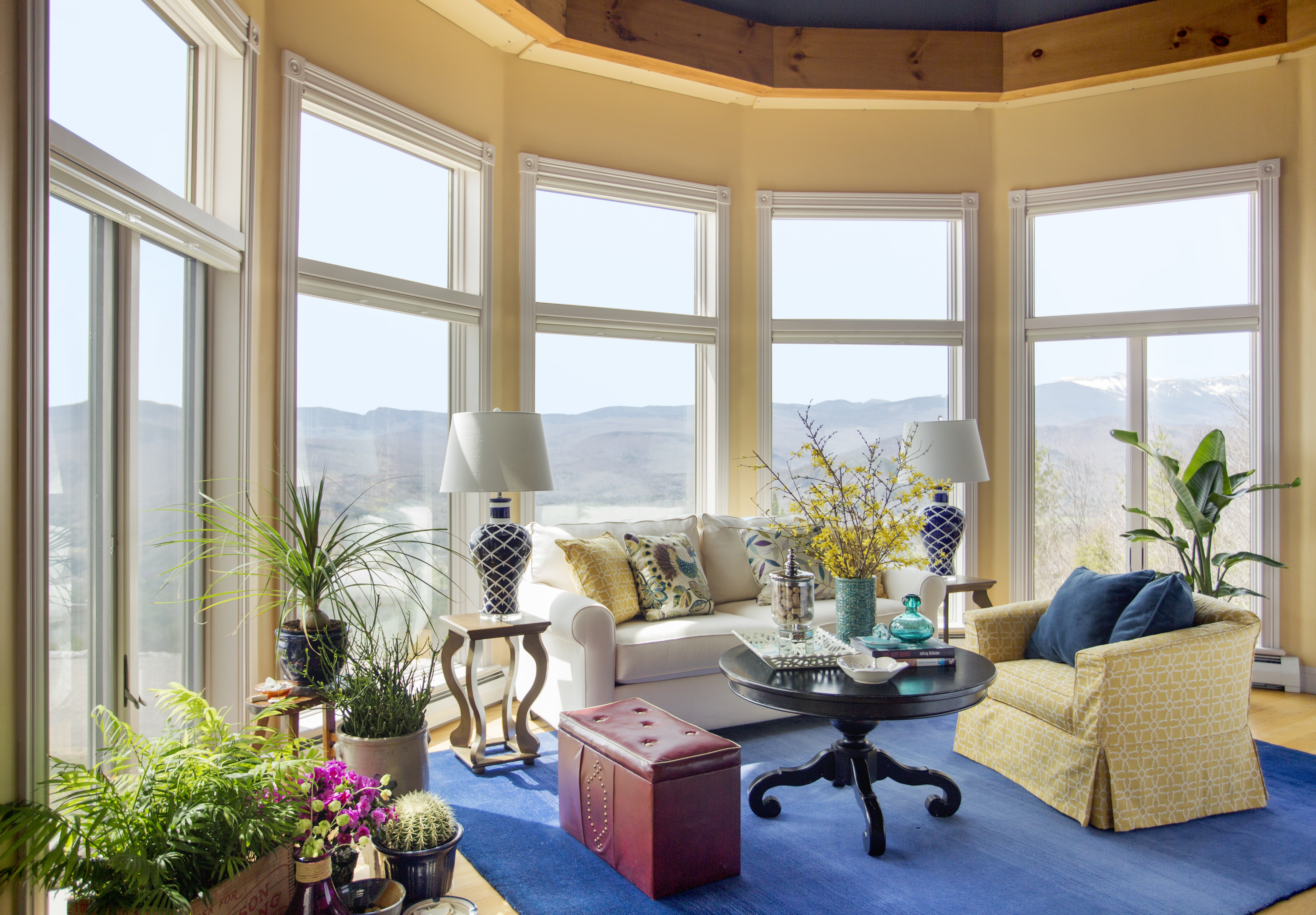
When designing this room (below), I focused on the stunning view, which we maximized by foregoing drapery and using made-in-nature colors. My favourite item in this room is the blue area rug!
2. What was your biggest colour/design mistake?
My biggest design mistake was early on. I had a client purchase a sofa online without trying it first. The client hated it because it had a wide seat and was very uncomfortable to sit on. I learned a very expensive lesson when I had to pay for shipping to have the sofa returned!
Thank goodness it was not a custom piece.
3. What is the most important colour lesson you’ve learned?
My most important color lesson was learning the undertones with Maria. Beiges, whites, and grays are easy to work with now that I know what color lies underneath them.
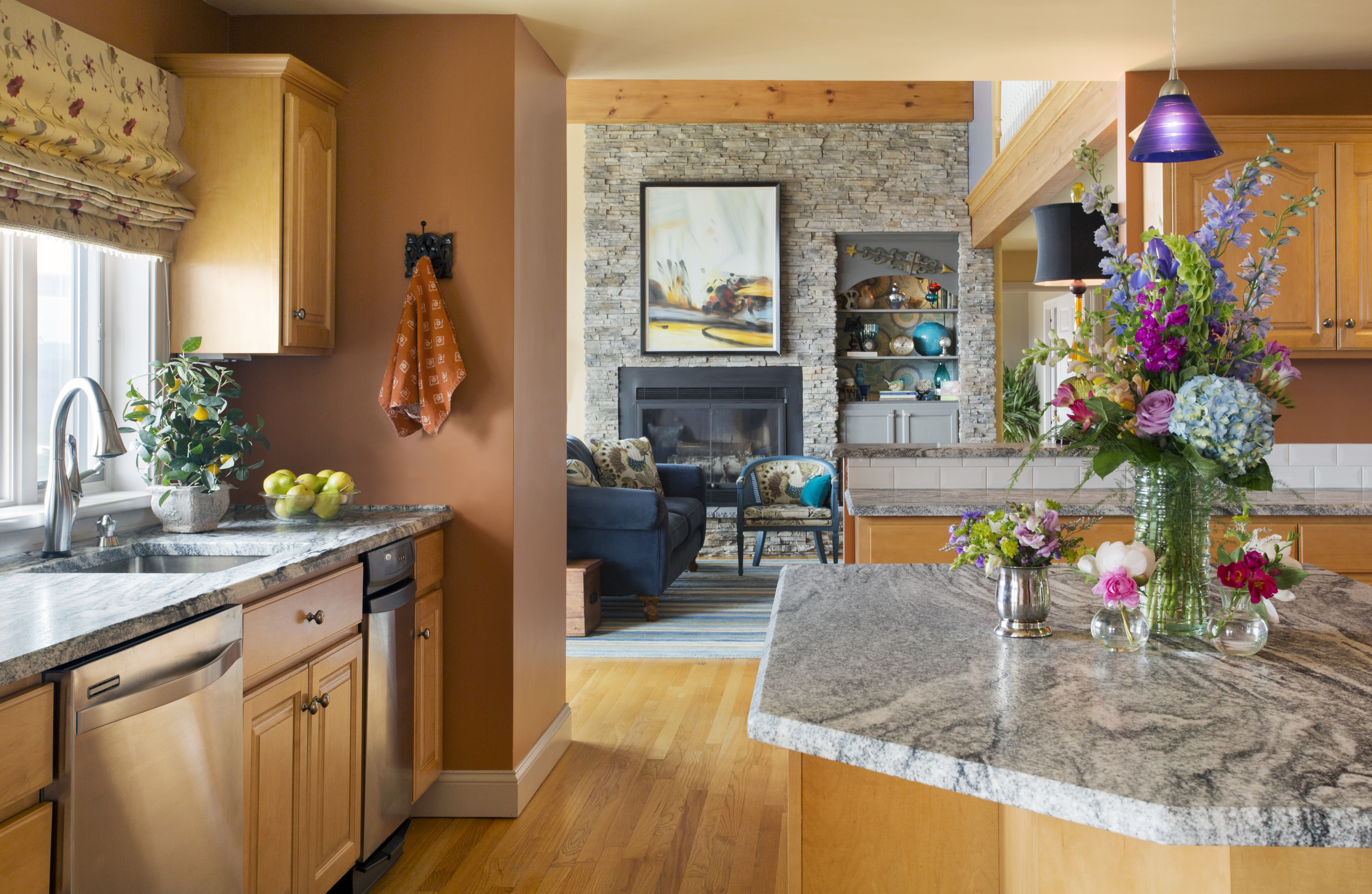
Another lesson that was invaluable was which colors work best with maple or oak kitchen cabinets. So many homeowners have them, and replacing or painting them isn’t always an option (or even desirable). For this client (below), the cabinets were staying, so we had to find a way to work with them. I’m not sure what I would have chosen before taking Maria’s class, but luckily, I didn’t have to worry about that. I used what I had learned to incorporate a terra cotta wall color that coordinates really nicely with the cabinets:
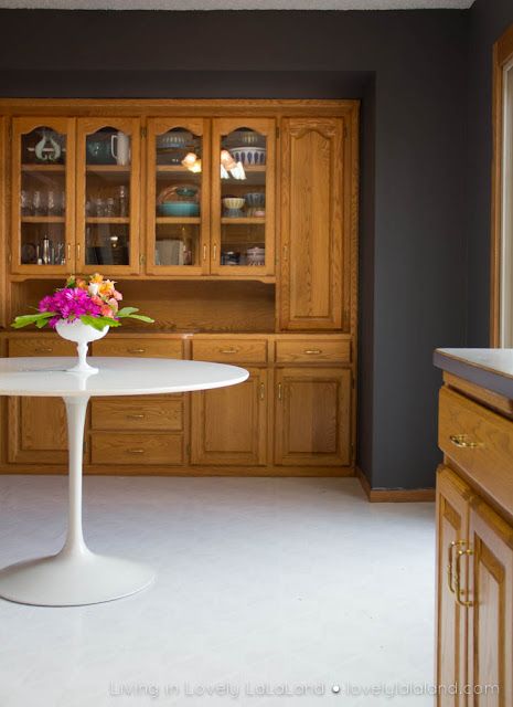
If you have oak, go for drama! Any charcoal shade will do:
 {via Pinterest}
Go with colour instead of a neutral; the latter might start looking like you tried to match the oak and failed.
 {via Pinterest}
4. When it comes to colour, what’s hot? Which colour do you think is timeless, and which colour trend would you love to see disappear?
I think navy blue is hot!! Has been and will continue to be because it is classic and works well with so many other colors. Maybe I’m biased because I love blue so much, but I’d love to know if you all agree!
I do hope Marsala dies a quick death, and my clients seem to agree since I haven’t been asked to specify this color for even a single design projects. My vote for the next color of the year is … wait for it … blue! I think it is time for a beautiful, deep blue to take center stage. These two navy blues are my favourite!
 {SW Naval via Pinterest}
 {Benjamin Moore Gentleman’s Gray 2062-20 via Pinterest}
5. What do you think is one of the biggest mistakes homeowners make with colour?
The biggest mistake is being in a hurry and not taking the time to sample the paint colors at home first! Please, please, take an extra 24 hours before painting to do the following:
1) After you have narrowed the paint color selections down to two or three, buy sample jars to bring home.
2) Paint your colors on poster board, and move the boards around the room you want to paint: day and night, up and down, in natural light and shadow. This will make it crystal clear which color you love the best in your home. Color really changes as the day goes on, and you don’t want to end up with a color that looks awesome at 9am and depressing at 3pm.
6. Which part of participating in Specify Colour with Confidence™ created the biggest breakthrough for your business, and how did it help you move forward?
That would be two breakthroughs: learning the color undertones, and using the big 11 x 7 color samples with clients.
I now have the confidence and the tools to help others select the best paint colors for their spaces. During my very first appointment after Maria’s class, I was confident that I could help my client choose the perfect color, and I did! I felt like a real professional using my large sample boards, and to this day, I impress my clients when I walk in the door with my large boards.
Thanks for having me, Maria! I look forward to chatting with all of you in the comments, and I’d love to see you back over at my blog, too.
—
Thanks, Kelly, for all your great tips and advice! I’m beginning to see a theme with all these guests posts and it is that BLUE IS BACK.
How much blue is in your house?
If you’d like to become the next True Colour Expert™ in your area register here.
Related posts:
Ask Maria: Which Colours Don’t Work with Honey Oak Trim


Great post Kelly! I have to agree…blue is my favorite color too. Loving those navies and indigos, they are so pretty with a combination of off whites and stained woods!
Great post!
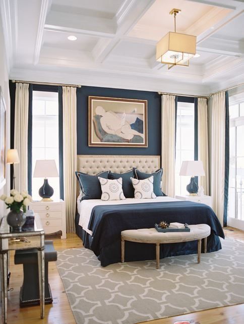
Looks awesome Kelly! I love the blue rug! and if I may ask- In the neutral bedroom palate with the light maple floors and dark 4 poster bed what are the wall colours chosen as it flows so nicely and with the hint of blue on the shades. Thanks 🙂
The bedroom wall color is Ben Moore Alexandria Beige Tracy. Thank you!
Great post. Since I have oak cabinets the charcoal paint choice is perfect. Thank you!
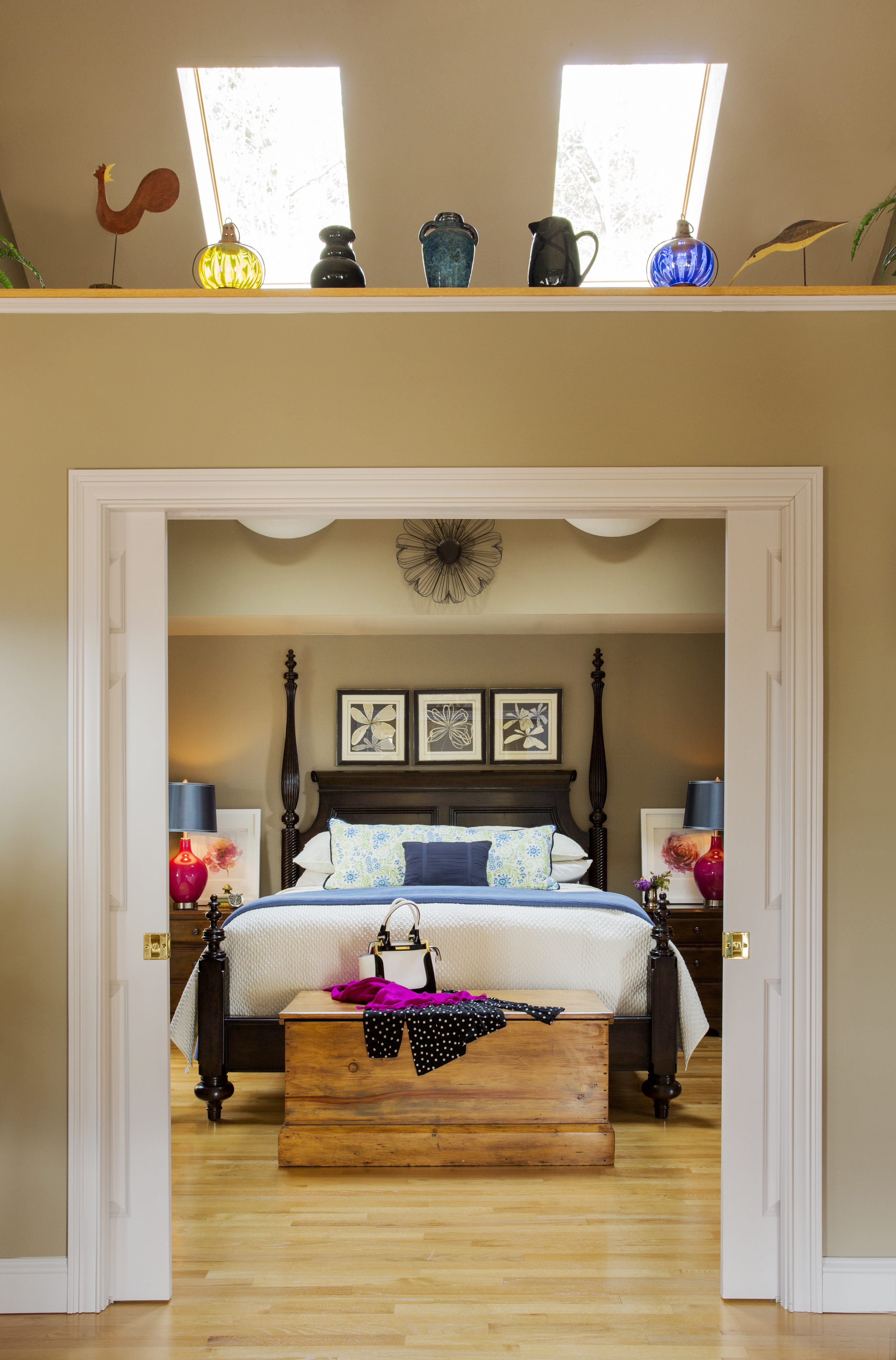
Beautiful work, Kelly! I love the way you staged the chest at the foot of the bed. Well done.
Kelly, I couldn’t agree more on navy blue. My dining room is BM Hale Navy and I’m so in love! It’s puts a smile on my face every time I go on it.
Love the terra cotta color with the cabinets. Can you share the wall color? Loving the charcoal as well.
Hi Debbie,
The kitchen wall color is Ben Moore Firenze AF-225. Beautiful color!
I like your examples of using the right paint colors to freshen up wood cabinets. When trying to do the same thing, homeowners often choose the most ghastly colors, and the whole kitchen looks horrid and wrong. In the third kitchen pic, changing the backsplash to that pretty blue and matching the paint to it simply transforms the room.
And I share your love of blue! I use turquoise accents in my mostly green dining room, cobalt accents (including the stove) in my white kitchen, and different blues, in paintings, ceramics, pillows, and even books, against the ivory and natural linen colors in my living room. Blue makes me happy.
Blue makes me happy too!
Hello Maria and Kelly
My new favorite color is blue as well. I have varying shades of blue throught my house all tied to gether with Wickham Gray
I absolutely love SW Refuge – which is in my Dining room and is continued as a accent color in my family room on the wall with fireplace. I absolutely love it. It plays well with the Wickham Gray which has a blue green undertone. I have accents of orange, creams turquoise.
Thanks to Maria – I was able to step out of my comfort zone and go with a blue.
Though I have not attended Marias Specify Color with confidence but hope to do so one day. Her color boards are amazing and I am confident that when I am doing my color consults – the results will be awesome because I have read her e-books multiple times and train my eye to see the differences that sometimes are very subtle but make huge difference.
Thanks
Farha
Great post, Kelly! I’ve always enjoyed following your color adventures 🙂
Beautiful and inspiring post Kelly! Blue, Yellow and White is one of the happiest combinations I know…What is the wall color in the living room with the amazing view? It is a lovely room. Thanks for sharing it!
Brenda
Hi Brenda,
The wall color is Ben Moore Honeymoon AF-345.
wow, thank you Maria for bringing us this series of excellent posts from your colleagues. Kelly, your color choices are fantastic! You me me want oak with your examples 🙂 I am a blue lover, too. Navy blue is the best neutral I could ask for – too bad my husband disagreed. Oh well! With Maria’s help, the colors in my home make me happy because they are so well cooridnated (even though I didn’t get my blue :()
There are always bathrooms for those ‘special’ colors we love Robin!
Great post Kelly! I’m seeing a lot of blue (navy specifically) in my neck of the woods. You provided such great examples of various shades of blue that all look fantastic!
I’m going to recommend navy blue for a boy’s room with orange accents, but right now there is only one small sconce for lighting. I’m trying to figure out how to get as much lighting in there as he needs for studying & playing.
If you can not put in overhead lighting Beth, two lamps with a three way switch for different levels of light, will work well in the room.
Couldn’t agree with you more about blue! I even painted my own media room Gentleman’s gray by Benjamin Moore. Works great with the pinky beige sectional (purchased before taking Maria’s course!).
Great article Kelly.
Agree with you Kelly on the longevity of blue. Bright navy has been a popular trend for a while now. Marsala was a puzzling choice IMO. I see colors moving toward more cheerful and energetic, as a counterpoint to all the grays.
Navy, I agree! I just bought a navy sofa. I love to put navy in a room, a little or a lot. It’s my “black.” And it goes with any other blue or green you want to put with it, so it’s very versatile. And it’s a color both men and women can agree on.
So true! I bet your navy sofa is gorgeous!
I have always loved blues!
Kelly, Great work! I am so glad that blue is back. I can remember years ago that you could not find blue anywhere. I live in California and a lot of my clients wanted the “beachy” look but could not find blue. I always wondered why it disappeared. Now I see it everywhere and just love it! I especially like putting bright reds, yellows, greens and actually any bright color with it to make it pop. Hope it doesn’t ever disappear again.
Love all of your rooms. You really understand undertones. What would we have done without Maria?
Great post Kelly! I love your clients living room with the blue accents, so fresh and pretty. I also love your advice of painting a wall dark if you have oak cabinets that you are working with, the dramatic look is gorgeous!!
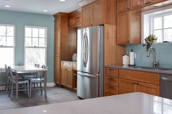
I love your kitchen with blues and grays with oak cabinets! We are remodeling a kitchen which could use a similar design! 🙂 Can you tell me the manufacturer of the tile and tile description? If we can get it, we probably will use i our kitchen! 🙂
Thanks!
Rick
Strange – I came back to this post after a couple of years (4/2018) and several of the pictures seem to be missing. There are only four showing.