The residents of St. John’s, NFLD (Canada) must be used to tourists taking photos of their colourful homes, happily, the second day we were there, the sun came out.
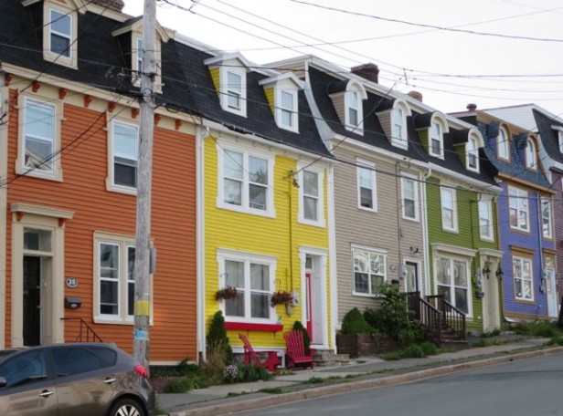
The reason their homes are so colourful is because most of the downtown core was burned in a fire in 1892 and the quickest way to rebuild the homes was to build row houses.
In order to distinguish one row house from another, the residents started painting them their own individual colours to identify their house on the street.
According to our tour guide, many times the furniture inside would also be painted similar colours.
When I snapped this photo (above), the owner of the blue house on the right walked over to me and reported that she completely re-built the yellow house. Created a pulley system in the basement to pull the dirt out through the lower window to dig it out further and built a wine room down there.
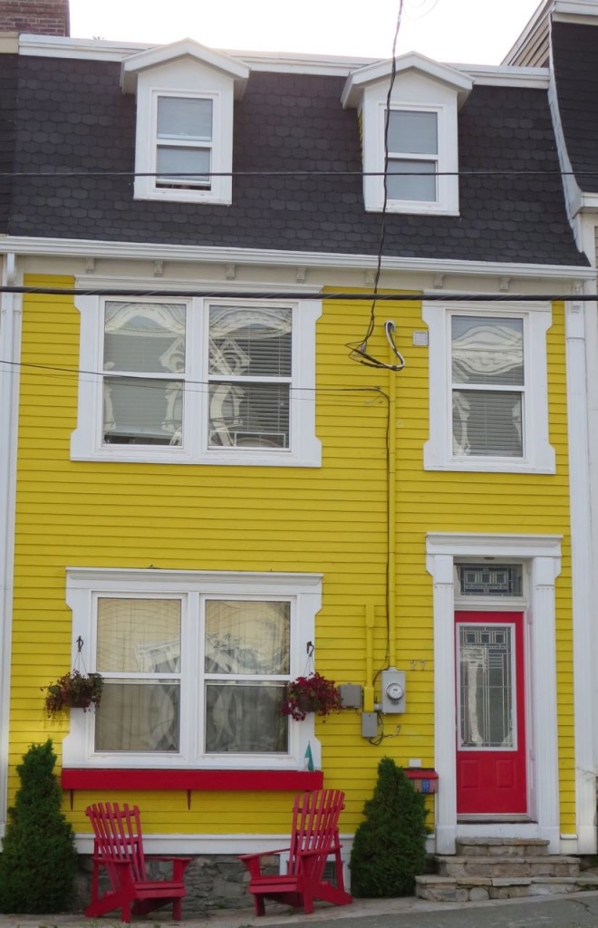

She said the house used to be blue but two days after they painted it BM Sun Kissed Yellow (above), someone knocked on their door asking if they could buy it.
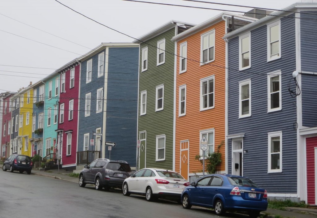
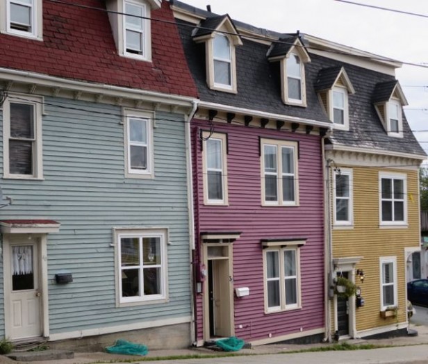
It was hard to get a photo of a row of houses without either a bad trim and body combination or a clean and dirty in addition to a value/intensity problem, so I thought I’d see how good y’all are at seeing which colours on the above photos should be tweaked and to which new shade? Post your answers below and I’ll post my answer in a few days.
This is in no way meant to be a big critique of this town, the homes are charming just as they are. This is just a fun way to test your eye!
Here one of these colours also needs an adjustment. Which one and why?
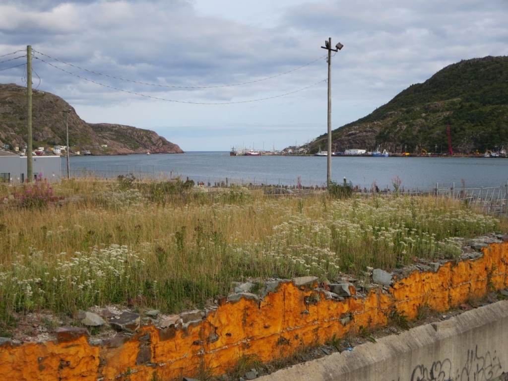
I don’t know why this old foundation is orange but thought this was a cool shot! That’s where our boat tour took us to see the the furthest tip of the East coast of Canada.
Today I’m flying all the way down to Durango, Colorado for a mastermind day on Thursday and then back home Friday!
Apparently the weather back home in Vancouver has been a lot warmer then where we’ve been travelling in the last 10 days!
I’m looking forward to being home!
** Okay so here’s my assessment of the colours.
The first photo, the neutral technically doesn’t belong on the strip of colourful homes. If it was lighter or greyer it wouldn’t look dirty in comparison to the yellow and green on either side. It’s close but not exactly right.
In the second photo, the turquoise is too clean and would look better if it was more muted.
The third photo, the muted turquoise is too pale and would really sing if it was the same value as the purple and yellow row homes on the right. And obviously the red roof is slightly out of place here too.
Related posts:
The Happy Colours of Lunenburg
Happy Turquoise & Purple Exterior in Christina Lake
If you would like help creating a palette for your home, become a client. Online or In-person.
To get your exterior colours right, download my How to Choose Exterior Colours with Confidence webinar and get my go-to list of colours.
Download my eBook, How to Choose Paint Colours – It’s All in the Undertones to get my complete step-by-step system on how to get colour to do what you want.
To make sure the undertones in your home are right, get some large samples!
And, if you would like to learn how to choose colour with confidence, become a True Colour Expert.


Of the three in a row – I’d say the first one – the blue one looks wrong because of the roof colour.
I looked at the roof color but for some reason it didn’t register. It’s such an important component too. Good eye.
I agree….the two colours of the first house look wrong together….not sure why…..just is!
Wow, wow, wow. I LOVE that yellow. I am a clean color fan but I’m guessing that pink between the blue and gold should be toned down to bring harmony BUT by my way of thinking, the blue and the gold should be re-painted and brought in line with pink! 😀
That foundation…is that the remnants of sprayed in insulation? It tends to get that color when old.
I was just in Nfld for the past 5 weeks visiting family. I spent a couple of days in St. John’s and the scenery is second to none, especially looking out over Signal Hill. Glad you got to visit my part of the world, Maria. I knew you would have something to say about those colorful row houses as soon as i knew you were going to St. John’s. …lol.
To my eye in the 2nd to last photo, the middle house looks wrong. The purple is warm and the black roof conflicts. On the other hand, I love the pale blue house with a dark red roof:).But I’m new to all this.
BTW, I think I’m calling it purple and others might see it as pink?
The clean colored pink house has dirty colored window frame trim??
At least on my screen the first two houses look clean (blue and purple) while the yellow looks dirty.
the turquoise and yellow houses should be dirtied down.
Oh, that’s funny. I loved the turquoise and yellow and thought All the others should be cleaned up.
I think the pale blue needs to be painted a darker,richer blue to match the tone of the other two houses.Looks like you had a wonderful vacation.
I agree, I think the blue house needs a deeper blue to match the colour intensity of the other houses.
This is fun!
I am torn but my first instinct was that the blue is too pale. Actually, I would paint all three bright clean colors. Cobalt, sunny yellow and raspberry. yum
Thanks, fun post!
Love your color choices…cobalt, sunny yellow, and raspberry. Yum is right.
I’m not going to read anyone else’s opinions, other than the first three that did not pick the gold house on the right. It’s a warm color, compared to the two others. I think it should be a brighter yellow. Though the roof isn’t dark like the other two, I think the blue/gray house is fine. I hope it’s a cool/warm conflict going on here!
In the first photo with the string of row houses the neon yellow and the pale aqua seem out of place with the other paint colours. The hue and the intensity feel wrong. On the second photo of the three houses the trim on the middle plum house looks like a dirty pinky beige to me that needs fresh color to look it’s best between the other two colours.
Um, I believe it’s the blue house because of the red roof? I just returned home today from a five-day trip to Denver, CO!
In the first example, the aqua and pinky-burgundy houses are painted in colors that are too clear and bright compared to the dusty colors of the other houses.
In the first of the two photos, the turquoise house looks out of place – too clean for the others on the block, particularly the red and blue it sits between. In the next, the pale blue house looks bad with the beige trim. I don’t like the red roof on that pale blue either. Perhaps the roof color should remain constant. It is interesting that there are no white houses in any of the photos!
I confess, I read all the preceding comments before replying. My first thought, though, on the row of three is that the light blue was too washed out and needed to be richer. (I didn’t even notice the red roof!). After looking back, I agree that the trim color on the middle house is too “dirty”.
The long row of houses… I love the yellow, raspberry and aqua… I think the rest of the row houses need to be brightened up.
I started looking at them, and thinking, yes, that one should be changed because it’s off from the one next to it, and the trim on that one is dirty when it should be clean.
But then I looked again.
I’m going to go against the grain here and say none of them needs to be changed. The mish-mash of colors is all part of the charm. If they started coordinating the colors, making sure they were all harmonious, it would start to look corporate and planned.
Although they are row houses, they need to be looked at like individuals, not as part of a whole.
For sure the houses don’t coordinate perfectly, but these are real, lived in residences. I may be biased (I live in St. John’s) but part of the charm of our city is that it isn’t matchy matchy – it’s a real working/living downtown core with grit and sophistication, whimsy and utilitarian, side by side. Sometimes the colour of a house is dictated by the colour of the paint that was on sale at the local Paint Shop.
Just to be clear, this is NOT intended to be a big critique, simply an exercise for all of you for fun. It’s a totally charming town. Maria
I immediately didn’t like the blue red roof combo but then thought, hey, it’s their home and it doesn’t look like a cookie cutter HOA dictating colors, so they get to express their individuality.
My parents’ neighbors just painted their home a deep blue with white trim and a yellow door after months of waiting for their second baby. It looks lovely, even though there are no deep blue homes in the area. It makes me smile every time I visit my family. I live in an HOA and sometimes it’s just boring to see everything in 2 trim colors.
I;m thinking it’s the purple one – but then my eye is directed to the roof of the blue house. It’s wrong. Needs to be black to blend in more with the others. But the purple is too dirty looking for the other two colours. It needs to be cleaner and would look better with the blue and yellow.
The blue house should be painted a deeper, grayer, blue with its dirty trim color. The other houses look “dirty” and the current blue shade looks pale and clean in comparison. Also, the red roof needs to go!
Re the first pic, I feel the colours blend well yet love there individuality. As for the second one; by holding a piece of white paper over ‘my’ computer screen ☺ and regardless that the blue house has a red roof, I feel the middle home could be toned down. -Brenda-
P.S: I would actually like to see the center house painted a proper shade of green which I feel would tie them all together. -Brenda-
I find it really hard to tell from a computer monitor. I think all three houses look dirty, but that blue house with the red roof looks wrong. The red roof is a warm color and the blue siding is cool. Also I think all the window trim on the blue and raspberry house need to be all the same color. The gray trim on the blue house with the white window and the pink trim on the raspberry house don’t have enough contrast to the house color or the white window. To me it looks like they tried to match something and missed on all sides. I can’t tell about the windows on the mustard house.
In the first picture of row houses, I’d say the yellow and turquoise ones don’t look like they fit in with the other colors. The yellow’s too bright, and the turquoise is too light against the other more saturated dirty colors of the surrounding homes.
In the second picture of three homes, I don’t have a problem with the raspberry and gold toned homes (reds and yellows are analogous on the color wheel), plus they’re both of medium color intensity.
My opinion is that the dirty red roof is the most glaring error. And, secondly, I’d ramp up the soft blue siding to be more in line with the intensity of the other two colors.
Thanks for sharing your trip with us!
thinking the pinky purple house in the middle… trim is a yellow base, should be a pink base… ?
In the first picture the pink-beige would have to be replaced; the trim on the orange painted white and even a cleaner orange with it. Replace tan trim on the blue with white.
Just for clarification, are you referring to the very first picture? I think most of the posts are calling the “first picture” the 3rd one down, because it is the first one that Maria asked opinions about.
Oops, I hit send before I was finished…anyway..
The yellow house is perfect; picture # 4- the blue and the green next to it need to be cleaner as well-they look dreary next to their counterparts.
The last picture-white trim on the cranberry house and a clean yellow on the yellow-beige house. New roof colour for the robin-egg blue house.
Come back east again soon Maria! There is lots more to see.
I would change the red roofing to charcoal. It seems to be the one element that would unify all three houses. I like that the trim on all three houses are similar. I think it works even on the raspberry painted house, which appears a little muddy on my computer screen. I would also consider painting the foundation of the red-roofed house to be similar to the charcoal color of it’s neighbors.
Here are my guesses: the first photo, the yellow house is so clean and vibrant compared to the others, as well as waaaay too intense. A more muted yellow would be better. (In the pic of the yellow home by itself, the red trim makes it look like it’s based on a Lego creation – complete with Lego green pine trees snapped in by the front door)
2nd row of houses pic,- I like it all as is- but the turquoise one is clean, where all the rest are dirty. In the row of 3, middle (plum) house needs clean white trim, and the blue could be a tad brighter.
??? Tell us, Maria!! 😉
This is really interesting and cute. I have vicariously enjoyed your trip! One thing that really bugs me about these historic areas? All those blooming electrical wires strung everywhere! It would be nice if they could figure out a way to do underground utilities so you could see the pretty houses without all the wires.
The blue house needs adjustment – the door and trim should be white not cream with the “key” detail above the windows in a red to tie in the roof. The dormers are currently painted cream which makes them too prominent if they were also a red they would blend in with the roof.
I think the blue needs to be a more complex color like the other two. It looks too washed out.
Paint them all ‘Cloud White’ :)) I have no idea except maybe re-paint the blue one a more ‘teal’ shad to compliment the red roof and brighten the trim on the pink house, next to it?
* shade
Given that you said “adjustment” regarding the last three houses, I’d say the blue house, at least on my monitor, looks a bit rough and faded as though it’s in need of a fresh paint job. And the trim on the purple house looks as though it could use a dose of white to match its neighbors. Don’t like the red roof on the blue house but that’s not an “adjustment” – that’s rather a major investment. Which might be why the roof on the yellow house looks pretty rough. On the whole, it’s a charming street and, if I lived there, I would hope the neighbors on either side of me chose a color I felt coordinated with my house, I’d be happy no one dictated what the colors HAD to be, and I’d try to keep in mind that my neighbors might be hoping the same about the color I chose. Sounds as though you’re having a ball and still teaching us.
Some of the roof colors are out of line with the siding colors one blur roof looks like the paint color is a blue with a lavender undertone ( on my screen ) then the dirty color red roof with the clean color of the blue green
I like the red roof because it’s unique and would cost more to replace than just repainting. Something about the blue I don’t like. Maybe it just looks sad compared to the rest of the homes.
I suggest“”adjusting””the first house on the left with the red-based roof. Ideally, change the red roof to a new roof similar to the charcoal color on the adjacent houses, especially since it seems not to be in great shape. Whether keep the red roof or not, but still want to keep a blue façade, go with a deeper, more dark gray blue, such as the far right blue in the first photo. That would balance the intensity of the red roof. (The blue house in the middle of the first photo is interesting too, but the color doesn’t seem as rich to me.) Also the house trim, window trim and gables’ colors are different. Make them all a white, no beige. This was fun. Thanks!
I think the yellow and turquoise homes need to be redone. The red roof on the turquoise home is a nice touch though, I haven’t really seen that before.
This exercise put us all to work. I was just thinking if all the residents took your color course, they probably would never be happy with their homes again, and that is sad. Ignorance is bliss!!
So glad that you had such a wonderful trip and it was so much fun to see all your pictures.
I confess, I don’t think the colors look that bad at all. Yes the pinky beige house is not like the others in picture one. The screaming swimming pool aqua and yellow houses stand out in pic. 2 because the colors are so saturated and don’t contrast as much with the white trim, but hey it is pretty cool that they all agreed on white trim. The houses in pic. 3 all look a bit weatherbeaten, especially the mauve body color of the middle one, and its pinky beige trim doesn’t match the neighbors, but in all, not horrible. I do like the picking out of the cornice brackets in a darker color, not like the neighbors, but subtle enough to not be a glaring difference.
I think a fresh coat of paint on the trim of all three would help, along with some roof repairs or cleaning of mustard house, and a darker door color on the blue house. This picture clearly shows what happens to saturated colors over time–they tend to get chalky and uneven in tone, esp. blue and purple colors, Usually takes more coats to cover evenly as well.
The different roof color on the blue house isn’t too bad,especially if the blue was a bit deeper and greyer, but the shingle is large and doesn’t follow the slope of the roof as well, and it looks like there are several layers and the whole thing will need to be replaced at some point, preferably with black. It also bothers me that the windows are a little random on this house, especially that the right window is a bit smaller than the left on top, and I would add a decorative window box underneath to make them balance better.
I think that the blue house should be painted a cool toned blue to make it look more clean and then it will match better with the cool toned mauve house in the middle and the cooler toned gold house on the end.
In the long row of houses the aqua blue next to the red and slate blue houses looks out of place. I think it is too clean for that row?
In the second example the house with the red roof looks out of place.
On the first photo that Maria asked about, wow, I really don’t like the yellow and aqua colored homes! I think the aqua is too clean & bright.
And the yellow is, well, too something… ugly! I think it would look so much nicer to have a softer yellow, maybe a butter yellow rather than saturated, dirty yellow. I wouldn’t call it mustard — it’s more like NEON mustard. Just imagine that yellow house right next to the orange house. The orange is nice and soft while the yellow is harsh and yucky. (That’s a technical term, I’m pretty sure 😉
On the 2nd picture that Maria asked about, the Mauve/Plum house in the middle is perfect. The mustard yellow next to it isn’t horrible, because gold and purple do complement each other, but the yellow does need to be a little cleaner (or softer is the term that I would use).
I don’t mind the beige trim on the Mauve house, but I agree that it has a slightly yellow undertone that might be improved with a more pinky undertone.
The faded aqua colored house with the red roof is so horrible to me! That red roof just doesn’t go with any of the colors. It is such a harsh color, plus it doesn’t match the other roofs. And the aqua is too washed out compared to the rest of the palette. It looks sad and dumpy to me. That red roof just makes the aqua look even more sickly.
I can’t wait to hear what Maria has to say!
Oh Maria. Are you ever missing the point on the row houses in St. John’s ! They are what they are. Rest assured the nuances of colour rarely enter into the decision and you have no control over your neighbour. It’s totally about individuality and what makes you happy. But, I get your exercise. Hope you enjoyed your trip to our most colorful city.
It’s a little hard to tell from my monitor, but here goes:
First photo (row of five houses):
-orange house has a pink-beige trim
-blue house has a “clean” field color with a “dirty” trim color
Second photo (row of ten houses):
-second blue house has a yellowy cream trim which should be white
Third Photo (row of three houses)
-the raspberry house has a yellow-beige trim
I didn’t take the time to read what others wrote..the first photo, the aqua and yellow houses are too clean/bright, and the second photo, the blue house has a different saturation level than the other two. The violet and yellow houses look nice together because they are complimentary.
Trim colour on middle house.
In the next to last house picture with the three houses I think the red roof color needs to be changed as it doesn’t seem to go with the rest of the colors or the plumy/red
house color in the middle needs to be changed as the
2 reds clash……….not sure exactly why tho.
I like these kinds of exercises…….its a fun way to learn!
In the photo of the 3 three houses, I think the blue house needs to have a deeper hue of blue and a stronger intensity of blue than it currently does. All three houses could use a coat or two of white trim and the red roof would look better in a dark gray.
The photo of the long line of houses, the turquoise house is the one, I think, doesn’t fit with the rest. It should be a moodier blue. The yellow house is charming! I started school in St. Johns, so these photos take me down memory lane! Thanks for this!
Too bad the utilities on the yellow house are front and center, would be nice if they could be moved to side of house
There is no side of the house- these are row houses!
I skipped reading the ‘answer’. The only house I noticed anything about was the pale blue one in the last photo. It looks like it needs a fresh coat of paint and maybe a gray. But that is my taste. Did anyone get the ‘right’ answer? Charming neighborhood and stunned how soo many homes could look so great together.
Was there an answer? I didn’t see one. Come on Maria…what needs adjusting? 🙂
@ Julie: The answer is right below Maria’s original post, but I’ve copied it here for you:
** Okay so here’s my assessment of the colours.
The first photo, the neutral technically doesn’t belong on the strip of colourful homes. If it was lighter or greyer it wouldn’t look dirty in comparison to the yellow and green on either side. It’s close but not exactly right.
In the second photo, the turquoise is too clean and would look better if it was more muted.
The third photo, the muted turquoise is too pale and would really sing if it was the same value as the purple and yellow row homes on the right. And obviously the red roof is slightly out of place here too.:
Doh! Thanks (and to Maria who emailed me) I didn’t look back up there! Cheers! 🙂