
Happy Thanksgiving to all my American readers!!
Here’s a new video where I’m sharing about my boards, I’m a newbie with these vidoes, so don’t judge me too harshly, but you certainly can if you want to, haha.
When I was brand new at colour consulting, it took me a looooong time to specify just a single paint colour.
In two hours, you basically received a palette of paint colours for your home. That’s it. And not much advice about anything else.
And I made all the clichéd mistakes that a newbie would make.
For example, I specified a different colour for almost every room. I figured, “This is my job, I’m choosing colour for you”.
Neutrals were not on my radar at all. You got COLOUR. Cause after all, I’m a colour consultant right?!?!
When I started though, it was the 90s, so even without knowing it, I was still specifying colours that everyone else was choosing. Like gold, sage green and rusty oranges.
I also did not sleep well at night.
I worried so much that the colour would be wrong and my client would call me and tell me I should be fired.
One of the biggest takeaways designers report from attending my Specify Colour with Confidence workshop is that they get so much faster at choosing colours.
And not just paint colours, fabrics and hard finishes are all included.
Whenever someone who has not attended my workshop buys my boards they say things like “Well she’ doesn’t have ALL the colours, but they are very helpful”.
So here’s the thing.
What you are buying with my large painted colour samples is a SYSTEM. What this means is that because I’ve conducted literally thousands of colour consultations in the last 20 years, I paid attention to which neutrals and colours I used OVER and OVER again.
What this means is that they have all been curated for you.
What that means is that 95% of the time you need a neutral, you’ll find it in my large sample boards.
But you need to understand how ‘The System’ works so that you even know which colour to pull out of the stack.
So I’m going to give you my best tip right now:
If you don’t have any of my colour samples, you’ll want the CORE Collection. This is the core of my understanding undertones system.
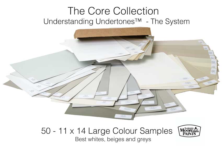
You’ll notice when you receive them that not only are the greys (and whites) there, but also the more unpopular beiges. For those of you who love beige, don’t worry, it’ll come back eventually.
I had a young designer in my Vancouver workshop this season exclaim “Beige? I don’t get beige!?” And that is strictly because we’ve been specifying grey since approximately 2009. If you started in design inside the last 8 years, beige won’t be on your radar at all.
However, homes everywhere are still full of beige.
Let’s be clear, there’s nothing wrong with beige, it’s just not ‘trendy’ at the moment.
This means, if you are a designer, your client is most likely looking to update their warmer, tuscan, beige house.
In order for you to choose the right updated colour, you need to be able to identify which beiges are currently in the house.
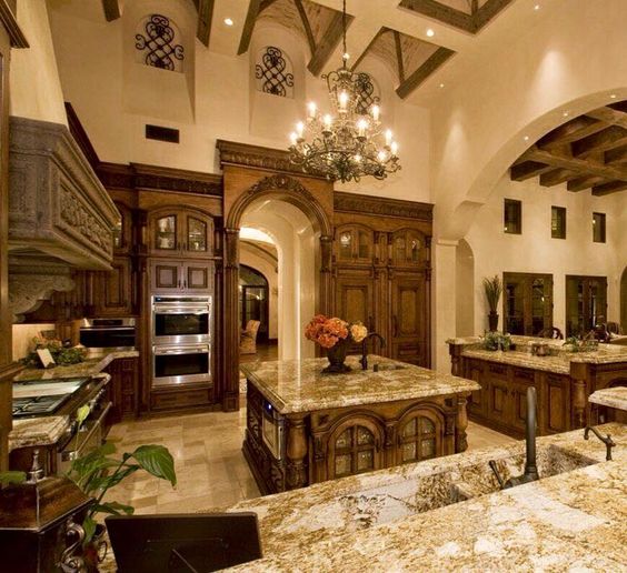
Does your client have pink beige (above), yellow beige (above) or green beige? If so, you’ll need to identify which beige they have so you can then work backward from there to give them the most updated colour because they probably don’t want a different beige.
If you have this house (above) you cannot introduce any shade of grey, blue grey, green grey or violet grey, because those undertones don’t exist in this kitchen (above).
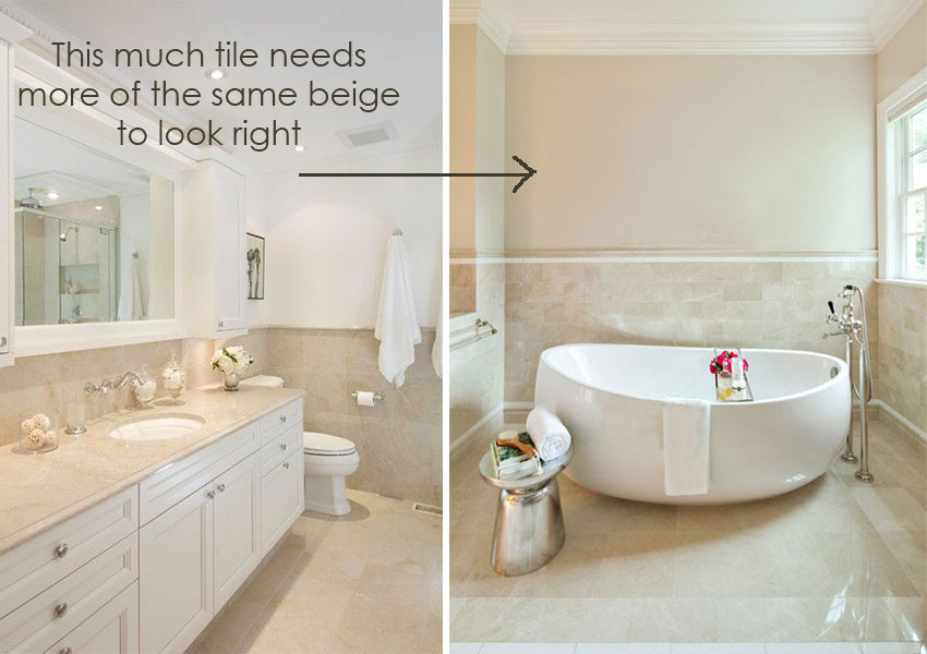
Say you’ve established that choosing a colour will not work for the room you are in. Perhaps you are in a bathroom with lots of beige tile where introducing colour is not an option. And, since there are only 9 undertones in my system, once you’ve examined all nine of those neutrals, you’re done. There’s nowhere else to go.
That’s the big tip on how to use my boards.
Did you get that? I’ll say it again.
Once you’ve identified the right neutral, using my large colour samples. If you are in a more dated interior and the correct colour does not make your client totally happy, in order to prove that you’ve still chosen the right colour, you go through the rest of the undertones so that she can see that you are in fact, correct.
Let me know if this makes sense in the comments below.
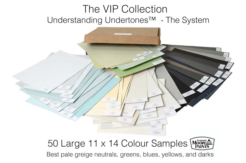
Okay so my VIP Colour boards include the best blues and greens, the best greige’s and the best darks, so you can show your client how their fireplace surround will look like painted, or which shutter colour they should have on their exterior, etc.
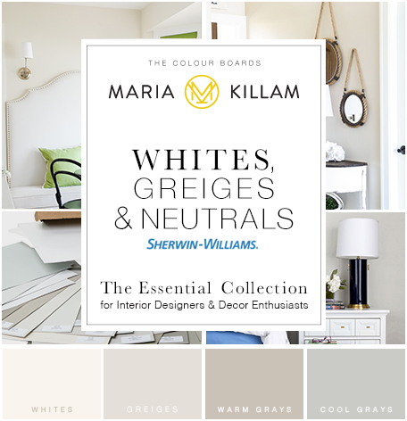
The Essential Collection are 25 Sherwin Williams large sample boards of the best greys and whites if you just need to make sure you have them right.
Here’s what two of my True Colour Experts said about the boards:
“Ever since I took your training in Chicago my interior design business hasn’t been the same…thanks to your 11 x 14 exclusive colour boards. My clients take one look at the large colour boards and how I use your system to enlighten them about undertones.
They are always in awe and are amazed on quickly we can select the correct color for their space. They feel empowerment in being part of the process as well because they actually can see what the colour looks like in a large format versus a tiny little chip. I have gained new client’s trust much more quickly than in the past.“ Julie Kay Design, True Colour Expert
“I received my set of color boards just a few days after I completed Maria’s Specify Colour With Confidence training. Because I had the boards I could immediately apply the concepts I had learned in the course during my color consultation sessions with clients.
Armed with the boards and the knowledge and confidence I gained at the training, I’ve been able to communicate with my clients in a language they understand…visually. The large samples help my clients truly see the color in context and help me reinforce why the color I’ve chosen for a client’s space is the right one.” Arianne Bellizaire, True Colour Expert
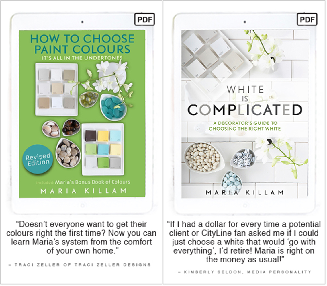
These are both my eBooks:
And my online training courses which are the next best thing to being in my live workshops!

Get the Benjamin Moore colour boards here. (free shipping)
Get BOTH Core and VIP sets here. (free shipping)
Get the SW Essential Collection here. (free shipping)
Happy thanksgiving to my lovely American followers! I am so grateful for your continued love and support on my blog and on this space over the years! I am so thankful for all of you! I love you all and hope you have a fabulous thanksgiving!
Thanks so much for stopping by!


I love the video! It’s so you 🙂 XXXOOO
Great video Maria. You’ve got the marketing piece down so well. The colors that you’re wearing, your makeup, and hair look perfect for you and speak volumes about selling color consulting. Your presentation was fabulous. I am in awe of how you’ve ramped up your business.
Loved the video Maria— I felt like I just took a little refresher course on your True Colour Consulting system!
Maria,
Wonderful video! You did a great job in explaining your colour boards.
I have all 3 collections and I don’t leave my office without them. Ever since I took your training in 2014 my business has continued to grow and I owe that all to gaining the confidence from taking your class.
Great video Maria!! I have two of your collections and eagerly awaiting your Sherwin Williams boards as we speak. I can’t say enough about these tools, they are one of the BEST investments I’ve ever made in my business. Thanks for all that you have taught me!! xo
Great job on the video! ???
Amazing video! Love the bloopers at the end..too funny.
I’m curious about SW Worldly Grey.
R: 206 G: 198 B: 187
Hex Value: #cec6bb
LRV: 57
Does that mean it’s more of a taupe?
Although I am not a decorator this website was very helpful in preventing me choosing conflicting neutrals in our new home. What you think would all flow together really doesn’t always. I admire those who can do pops of color on walls but have always been a fan of neutral wall colors that align with flooring and counters and cabinets that then allow me to mix up decor with pillows and rugs and things that make me happy.
We are building a new home and are meeting with the decorator in a few weeks and I feel thanks to reading your blog I am much wiser so will be sure to look at the clean vs dirty or however anyone wants to call that…. Thanks!