Bored with the beige in your home? While we may not be able to replace all our travertine floors and beige sofas or carpet at once, there are ways to make it look fresh and more tolerable. Here are 5 ways to update earth tones in your home to make them look more fresh.
I’m in Austin, preparing for my Specify Colour with Confidence workshop that starts tomorrow (Wednesday) at the Norris Center. I’m finally getting the hang of doing insta-stories so you’ll be seeing a lot more of them on my Instagram, especially in my workshops so you’ll get a sense of what it looks like to be in one.
It’s sundress weather here and I’m loving it (not that I brought one)! Usually by now, Vancouver’s spring green is out, but not this year, it’s still cold with lots of rain and the cherry blossoms have barely started to bloom. Terreeia and I are happy to get out of the rain for a little while.
Tricia Firmaniuk, my Design Assistant/Artist VA who handles all my eDesign wrote this fun guest post about beige.
(green beige sofas, taupe accents) AD
Beige. It’s a polarizing colour. When the fresh trend arrived, beige, which covers the warmest range of neutral categories, fell out of favour.
If you’ve been reading Maria’s blog for a while, you’ll already know that “beige” is a whole category of neutral colour. Green, yellow, orange, pink and gold are the undertones of beige in Maria’s system. And knowing which undertone you are working with is the key to making it work well.
In our eDesign consultations, we see frequent cases of the “beige blahs”, clients who are either on a mission to eradicate any beige from their lives, or those who are unhappy that they just can’t change out all beige from their homes.
Beige (taupe or gray) fixed elements like tile, stone and carpet, can certainly be decorating challenges, and that is why Maria tries to steer you all clear of installing them in the first place. Particularly, the bossiest of the beiges, pink beige.
For many of us, though, banishing beige from our lives is not likely anytime soon. Whether we have travertine floors, a beige sofa or carpet (or all of the above), there’s a good chance it’s just not practical to replace it.
5 Ways to Decorate with Beige (and make it look fresh)
The only rational thing to do is to make the best of it, and I’m here to tell you that beige can be more than tolerable. There are some simple ways of working with beige to keep it looking current and fresh. When you identify the undertone of beige you are working with, and work with it instead of against it, (or worse, try to ignore it), beige rooms can be sophisticated and classic.
We’ve all been exposed to a lot of really drab and uninspired beige rooms. What is the picture that conjures in your head when someone says beige? I’ll bet it involves a frumpy sofa, a lack of contrast and overall has the charm of a bowl of cold oatmeal, right?
I’ll bet it doesn’t look like this room by Celerie Kemble (below).

(Orange beige grasscloth and tile) From Elements of Style
This works so much better than your average beige room because it is by Celerie Kemble, and she’s magic 😉 But let’s unpack the details and figure out what makes it great. First, the expensive floor, but more specifically the bold scale and dramatic contrast of the floor. You can accomplish this with a really great area rug.
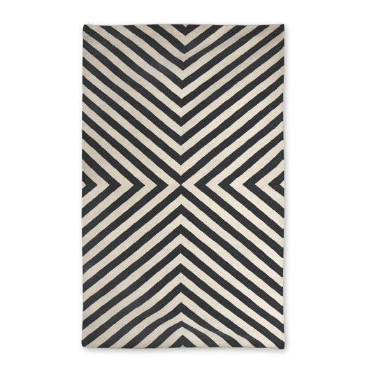
1. Add a bold contrasting area rug
Something like this by Jonathan Adler or if you’re on a budget, this one from IKEA.
2. Add some wainscoting on the walls to break it up
(If it works with YOUR style of home)
And the wainscoting (also expensive looking) is really about having enough white to balance the warmer beige.
3. Add white or cream for contrast
This can also be achieved with a generous use of white toss pillows, lamp shades, throws, white painted furniture and slipcovers.
And check out the oversized white mats on the simple artwork further breaking up the warm beige with white.
Plus she has some hot coral and leafy green to make the palette dynamic. So to recap, she makes orange beige pretty here by adding BOLD CONTRAST, both dark and lots of light, and some shots of pretty colour.
Take a look at any unappealing, dated beige room, and you will notice that it lacks these essential elements.
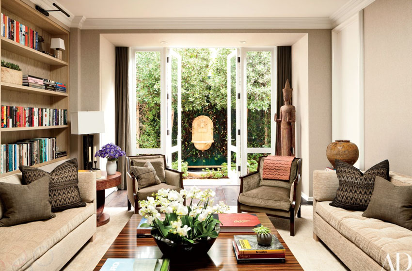
Here’s another room with lots of beige that makes good use of contrast by Sandy Gallin (below).

(yellow beige) From Architectural Digest
The walls here are cream, and that works well to freshen up a space with a lot of beige. But look at all of that dark gray, black and brown keeping this room looking anything but bland. Some really skillful styling doesn’t hurt here either.
And just in case you think that beige only looks good in traditional rooms, here’s another more retro modern arrangement by Sandy Gallin.

(Gold Beige rug, taupe pillows) From Architectural Digest
Ok, so the artwork in this room is worth many times more than the average person’s net worth, but you get the idea. There is lots of light and contrast, and some bold shots of colour.

(Pink beige grasscloth) Kate Jackson Design from the Home Bunch
4. Add some gold accents
(You can mix silver and gold, just make sure both are repeated at least once)
Gold accents work well to update the feel of a beige room. This room has a current lucite coffee table showing off a bold contrast zebra print rug, and LOTS of white.
I love seagrass wallpaper, it’s so preppy and classic.
5. Natural materials are a good way to repeat beige and even gold beige in any interior
Which brings me to another point, we are seeing lots of natural materials warming up even the whitest rooms.
Natural fiber rugs, basket lights and unvarnished woods are all ways of introducing BEIGE into rooms (covertly at least). Because it’s all about creating balance.
It works both ways. A room that has a lot of warm neutral elements, needs lots of cooling white (or cream) to balance it out, and a really fresh, cool room benefits from the warmth of natural materials and warm metals.

From My Domaine
Stained wood is usually brown, orange, or yellow, but natural wood tones are in in the realm of beige.
I just love this breakfast nook with the stylish Saarinen table, delicate chairs and fresh pillows. If I sat down here, I might never get up again.

From La Dolce Vita
Just as the light brown and metallic gold tones warm up a mostly white room as in these last two examples, conversely, adding lots of white (or cream) to a beige room creates a fresh balance and instantly makes it look current.

From Pretty Stuff
The white frames and mats in this lovely gallery wall create a fresh feel for this warm room.
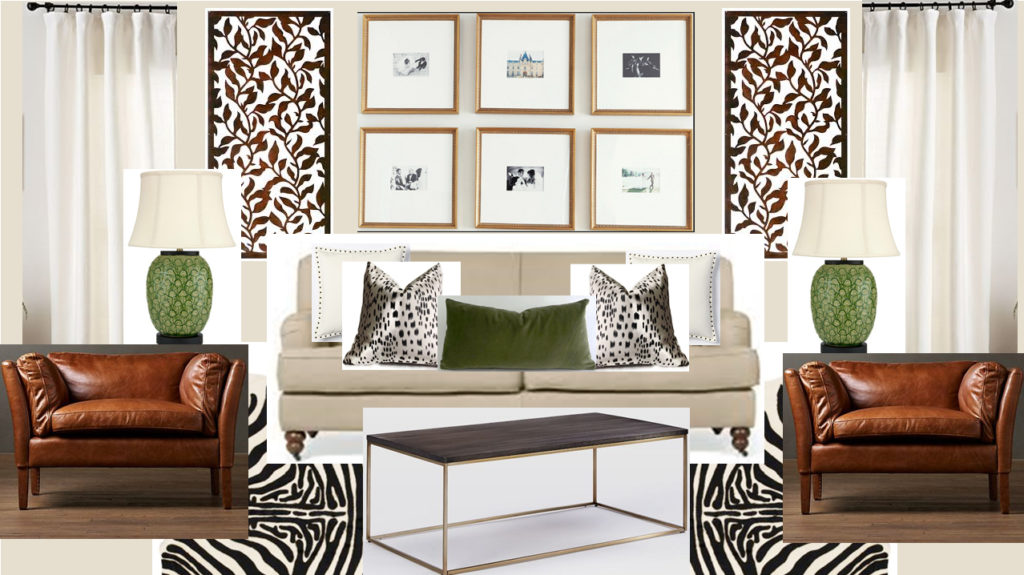
Here’s a mood board I put together starting with a green beige sofa and pale creamy/beige walls (you can imagine travertine floors here too) and applying the principles of adding white, creating contrast, and a pop of colour to make a beige room look current. I’m crushing on traditional rooms with lots of classical symmetry these days 🙂 What do you think?
You may not be convinced that beige is a beautiful thing, but I hope this helps some of you figure out how best to work with it instead of loathing it.
If you would like help updating your room, try one of our eDesign decorating consultations and we will create some mood boards just for you!
Thanks Tricia! Which tip is your favourite?
Related posts:


Welcome to Austin, Maria!
Thanks Martha! xo
With the econsult, do you provide links to products that can be purchased online, or are they for inspiration only?
Yes absolutely, links are provided! Maria
Love the idea of adding lots of white!
Love this kind of post! So much valuable information given. I’m saving it, thanks!
Thanks for this article, as I tend to always go back to calming beige when I decorate. Since I’m locked into this colour I’m looking for ways to keep it fresh. Great pictures!
Loved this article! I see a lot of beige in my clients’ homes and these are great ideas to freshen things up without spending a fortune.
Great post Tricia. I often have to tell clients that “beige is NOT a four letter word”.
I love the green with the cognac on the mood board.
This is one of the most useful articles I’ve read lately. Great advice for anyone seeking to freshen their space. The main problem with beige/dark brown is that so many houses used those colors ONLY. I’ve seen it. Contrast is so important, and the less actual color you have, the more you’ll need contrast of light vs. dark, rough vs. shiny to establish interest.
I agree with you. It’s the ALL beige rooms that revolt me. Because I love color, I have a hard time understanding that lots of people are afraid of color. You would think that once they got their beige shell installed, they’d start adding color here and there. Beige does a good job of warming up color, so let it do it’s job by introducing color!!! 😉
Love this article! I am also stuck with beige. I have travertine floors, beige green sofas etc. I am also updating my family room that is connected to my kitchen. My kitchen has white cabinets and my fireplace surround has base cabinets with bookcases above all done in white. I have added a blue geometric rug and found an old China cabinet at Goodwill which I painted indigo, sprayed the glass with mirror paint, wallpapered the sides and bottom doors in a vinyl grasscloth. I found some cool floral pillows at Home Goods in shades of blue, added some blue accessories to my coffee table inside of a white tray and pops of pinky red and yellow other accessories. It has made my family room look brand new and up to date! This article is so succinct!
Wow! That sounds great. So creative!
Travertine floors only get a bad rap because of all the people that don’t bring in color.
I understand that a beige sofa is not really neutral because of the undertones. Would a white or cream/off-white sofa be considered a neutral?
The most neutral would yes would be a sofa in the realm of white but keep in mind you have to repeat white in the room so that it looks intentional. White is just not practical for most people! Maria
I think beige can be beautiful and classic. Imagine silk dupioni drapes in champagne beige or gold beige grass cloth wallpaper. Of course the same could be said for cool tones, as well. The key is balance. Tricia, you did a nice job spelling it out!
Love all the grasscloth with white in the photos. Very fresh looking.
A little clarification about my question…I’m using “neutral” in the sense of a “true neutral” that goes with just about any other color.
Wow thanks for a great Blog !
love the last picture .
That came close to making me love beige !!
Good design makes such a huge difference!
Oh I wish I could attend one of your seminars! I love your blog and color is my hobby.
I’ve had a house with grey and discovered I really wasn’t much of a “grey” person. Even with lovely bright colors I couldn’t get used to it.
We moved to Florida and have a light filled house that has beige and cream colors. I have always loved creamy walls. I have learned to decorate by what I love and less than following the latest trend. I love grey when done well in everyone else’s home–just not mine! I am happiest in the beiges. I’ve learned to avoid pink beige from your blog. Thanks for the article since we aren’t all lovers of grey or able to afford a complete house overhaul!
I am also an “enthusiast”. I attended Maria’s 3 day seminar last fall in Washington, DC…a gift for myself. It was an excellent experience. I HIGHLY recommend it, even if you’re not a “professional”…I met terrific ladies from Tennessee, Atlanta, Canada…people come from all over for this education!
Thank you for raising beige to its rightful place among neutrals. As you’ve shown, if done well, it’s as beautiful and timeless as so many of the “current” looks. Bravo, my friend! xo
I’ve always decorated with white. I think it makes any color look fresh.
Tricia, did you select the green accents in your mood board because the sofa color was green-beige?
Love (love) that picture from Architectural Digest, but what is beige? The couches? Can one of you consider doing a post on taupe sometime? I have to say, I’ve more or less got the grays figured out due to Maria’s blog and understanding undertones, its pervasiveness on blogs generally, and the 60 samples in my basement (lol), but taupe is a mystery to me for some reason. It’s warm, is it a brown with gray and pink, or something else? I can always see taupe as something else…brown, pink, etc. Thanks for the informative post!
Tanya, good question, I will keep Taupe in mind for a future post! maria
I really enjoyed the informative and helpful post, Tricia. I love your mood board, too–gorgeous! ( Just an FYI: the image from Architectural Digest does not show up in Internet Explorer (at least on my laptop.) It did show up on my phone and in google chrome, however. )
This breakdown is great! So succinct and clear. I like walls that are creamy colors or light beige, and my living room is not too far from that last green and cognac board. I have light yellow-beige walls, orange-beige natural fiber rug and lampshades (burlap shades), a gray-green sofa, and shots of leaf green and cognac/orange around the room. The many bookshelves are off white, as are the curtains and trim. It all looks cottagey but fresh.
Great post on Beige!
I want to second the request for a post on taupe! My porcelain tile, which looked just off-white/greige in the big sample board, is now in, and many of the tiles have a definite purpley-taupe thing going on. I have to say that the sample didn’t include any of those tones, even upon re-inspection. Anyway, it’s in now, and I still like it, it’s just a bit more of a factor than I was hoping for …
Thank you for your clear and beautifully illustrated post. I know from doing photography that the eye loves contrast, so it makes sense for rooms too—great examples. I have always loved bringing the outdoors in—just didn’t think of natural fibers as beige before.
In my experience, Tricia does a fabulous job answering questions, and going between Maria and me during design consultations. And Maria’s design boards nicely link to her product recommendations, making it easy to find and shop for them. I am extremely pleased.
Enjoyed the blog! Now I’m not so nervous about running into lots of beige. I’m drooling over the cognac chairs on your design board. Such a nice shape and alternative to a Chesterfield. Can you share where to find them?
Hi Christina, they are from Restoration Hardware 🙂
Love the ideas presented here today. In my locale their is tons of beige in the homes. Serving over 500 clients each year these images have given me wonderful ways of providing a fresh look in the clients homes. Thank you Maria!
I love my pale yellow beige walls, they read almost cream. I have added metallic gold, lots of cream, and pops of beautiful and bright colour. I couldn’t be happier. It feels fresh fresh fresh, even though there isn’t a stitch of grey! All thanks to Maria’s book of whites and all of her blog posts. This one was great too!
What a great post, Tricia! Well done and very helpful. My area has yet to embrace the gray trend (???), so I’m often working with beiges and tans. Can’t wait for Maria’s post on taupe! Thanks, ladies!
Great post! My living room is greenish beige with green, orange accents.. this post is very helpful!
xo,
Ivy…
This makes sense since many people can’t afford to ditch everything at once. Starting over is great if you can afford it, but this is a sensible approach.
I think the 3 principles of decorating a beige room, are great! I love that idea! Especially the pop of color. 🙂
LOVE every beautiful beige room! No gray for me
Great info!