
View from this house (below)
Some of you may remember when I did 37 days of Undertones in the summer of 2012 on Facebook. Many of you got a lot out of it so I’ve been thinking about a way to do something else, but with a different twist.
So here’s what we’re going to do this time that I think will be even better.
Email us a photo of a room in your home that bothers you. Make sure you take the photo WITHOUT FLASH and preferably with natural light. If the room is dark, it’s okay to have lights on but it’s very important that you don’t use FLASH.
Three times a week, Monday, Wednesday and Friday, I will post one of them on my Facebook Fan page with my best interpretation of why it’s bothering you and what to do about it.
One of the reasons this will be so great is because undertones in neutrals are almost like an illusion. Unless your eye is trained, you can look at a fabric, tile, stone or brick and not be able to distinguish which undertone it is, However, as soon as I tell you what it is, you’ll usually be able to see it immediately.
Sometimes I will give you an exact colour, sometimes I will have you refer to the category of undertones in my eBook because it’s possible that more than just one shade (lighter or darker) will be correct.
You’ll need my How to Choose Paint Colours – It’s All in the Undertones eBook in order to figure it out.
Most of you already have it anyway so this will be a snap!
But for those of you that don’t, you can buy it here.
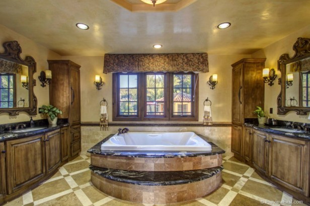
If this was the room that was bothering you, I would say that the tile around the tub is pink-beige, the floor tile is green and the yellow-beige paint colour on the walls doesn’t relate enough to the finishes in the room.
The cabinets appear to be maple which don’t take a stain well and is the reason why the end result of using a dark stain looks blotchy and the overall effect in this bathroom is they look dirty combined with the floor tile and paint colour.
The biggest issue with this bathroom is that everything is patterned. The tile, the cabinets, and even the faux finish on the walls. It’s just too much.
The solution here would be to paint the cabinets cream like SW Dover White or SW Antique White. The wall colour should be a light green-beige to keep it as current as possible. I would not recommend a sage green. And of course the valance should be replaced with a solid fabric in a green-beige to coordinate with the new paint colour.
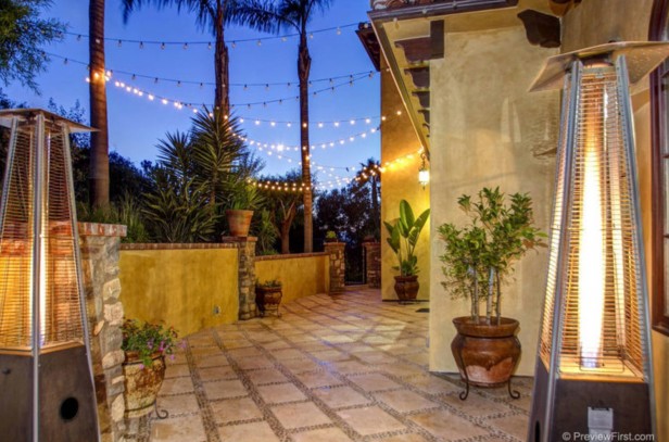
Here you can see a LOT of money was spent on the installation of this deck (this is the same house sent to me by a reader who is letting me use the images). The tiles are again pink-beige while the paint is yellow/gold. Here I would change nothing because the colour on this Mediterranean style home works with the orange tile roof (not shown) and in my opinion the curb appeal factor is more important.
Sometimes the best advice is to leave it exactly the way it is unless there’s a budget for a renovation.
If you want your room to be considered, please remove the clutter, or clear the countertops of unnecessary items in a kitchen or bathroom and make it look as presentable as possible. This way it’s easier to assess the space.
Of course I will NEVER mention names or locations of the images you submit. And, when you send me your images, I understand you’re agreeing to let me use them for training purposes.
Here’s what a happy reader had to say about my book:
“Maria, I am no decorator, but I am a writer and marketer and I think you are an amazing communicator – secondary to your obvious design abilities. I finally feel like someone “taught” me how to problem solve design issues – after reading your book – and while I am a novice, feel so much more confident than I was.” Anna
So get my eBook here. Who knows, this could go on indefinitely as long as I have enough pictures to post.
I’m excited, this will be fun! Don’t forget to click LIKE on my Facebook Page so you can follow along. And send your submissions to this email (Remember NO FLASH).
Related posts:
What Everyone Should Know about Gray


I recently found your blog while researching white kitchens. Can’t wait to participate! Heading to the kitchen to de-clutter! 🙂
Yes, the images shown have too much going on with undertones especially the bathroom. On the other hand, it kinda reminds me of a few places I saw in Europe this past winter. Personally the only thing that seems ‘wrong’ to me is the pink tiles on the tub area. Funny how the Europeans seem to be able to live with diversity we North Americans find ‘too much’ 😉
It’ll be fun to see this new series 🙂
Hi Maria,
Would love to take you up on your 50% off your e-book offer…however, when code is entered, I am receiving “invalid” message.
Thank you for any help you can offer.
Sincerely,
Christine Schombert, BoxwoodLaneInteriors.com
Hi Maria, what a great opportunity! Does your book on undertones also address whites? I noticed you have a new book you are working on that might be dedicated to whites and I was wondering if any are included in the current book offered here. Thanks!
Yes just not as thoroughly as my white eBook will. Maria
Maria, You are a great teacher! I started following you several years ago and your blog is the only one I am still interested in still following today.
I’m looking forward to this series!! I learned so much last year!
MaggieS
I feel so well trained by your site and your e-book. Wish it was on sale when i bought it! I can usually spot the undertones now. And i am always telling my younger sister who is going into interior design to remember to keep things in context. She has lots if fun ideas, but they are all way too extreme to work in my suburban home. I will send in a photo of the house we are about to move into in a month. It has some pink beige issues.
I’m so excited about this, Maria! I already have your ebook and read it OBSESSIVELY, but if I happen to get selected I’ll be ever so happy to have your input on my house. Because EVERY. SINGLE. ROOM. is off, except my office and the adjacent guest bathroom which were tiny enough that I had the budget and vision to fix them all by myself! 🙂
Just to clarify—should we space out our photo emails to you, or do you want one collection of pics that you can choose from at will? I’ll limit it to three rooms, promise. 🙂
I will post one photo of one room each Monday, Wednesday and Friday so make it a good one. Maria
Good morning Maria, Great idea here! Question…similar to Virginia’s above, I already have the ebook, so I don’t need a reward, but I was about to try & choose a paint color for my
master bath, which has conflicting tiles….OK to send photos anyway? I would LOVE to see what you think!
xo,Paula.
Hi Paula, You can send any photo you like, it’ll just be in the cue 🙂 Maria
Maria, I think it is so kind of you to offer this opportunity and learning exercise to your readers, but what about those of us (like myself) who are not on Facebook yet would love to participate. Signed a BLOG FAN! ☺ -Brenda-
Hi Brenda, it will only be on Facebook because that’s just the easiest place for it to be posted three times a week where everyone can participate. Maria
Thanks for offering your book at half off I have downloaded it and am ready!!! How exciting!!!
How fun!
Running to grab camera now.
Exterior is orange (really orange) brick with sage green and ochre bricks here and there as ‘accents’.
Am totally stumped.
🙂 No need to be kind when you see it, just HELP! LOL
Thank you for extending the 1/2 price offer, I purchased your ebook a bit ago and am looking forward to being more knowledgable in choosing colors for our beach cottage which is currently undergoing a lot of changes. It’s been a scary proposition so far to select the right finishes and colors to make it a comfortable and easily maintained space for my husband and I. I’ve lived with the aqua/teal colored carpet that was new when we bought the cottage 15 yrs ago up until now by ignoring it but it’s finally coming out, hurray!! Carpeting in a weekend/vacation cottage 1-1/2 short blocks from the Gulf of Mexico has never seemed practical or attractive to me so it’s the pristine white pine floors under the carpet and a layer of 1940’s, thankfully easy to remove linoleum, that we’ll be having finished and living with from now on. Happy days!!