Styling and photos by Maria Killam
Recently my good friend Jan Romanuk told me she’d finished a renovation in downtown Vancouver and asked if I’d like to photograph it for the blog.
Since I can never get enough white kitchens on the blog, I happily said yes.
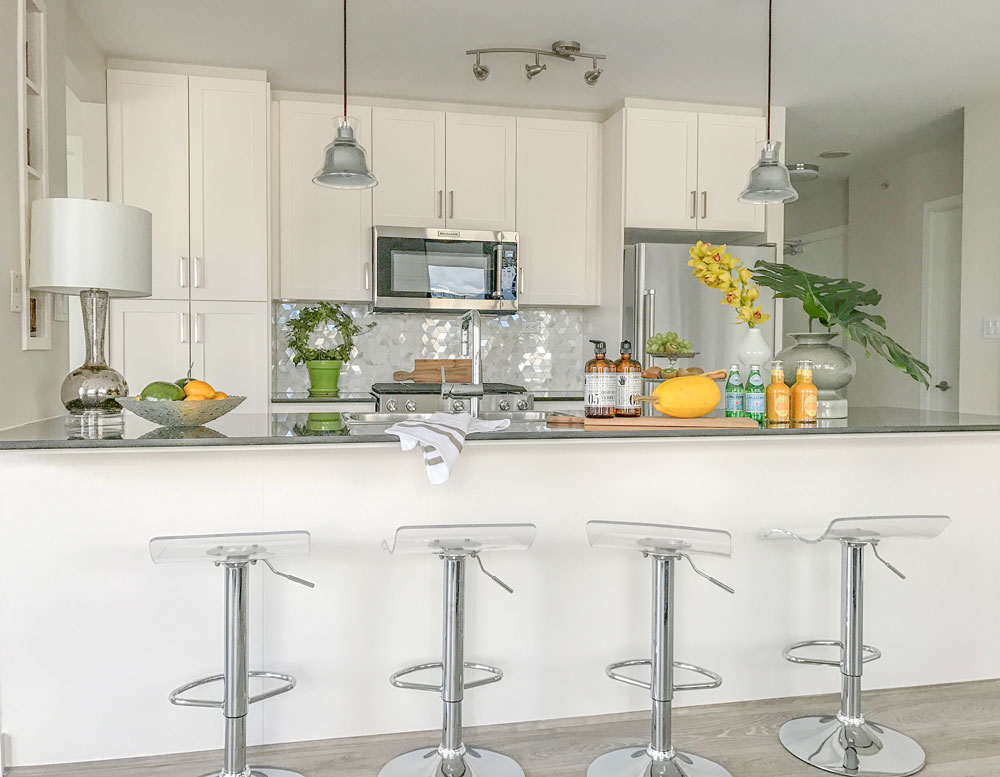
Jan’s client had ordered new white cabinets for her kitchen and was dismayed when they were installed and she saw that the white she had selected actually had a pink undertone (below).
This was when she realized that a professional interior designer was required, one mistake was already made and she did not want to make another.
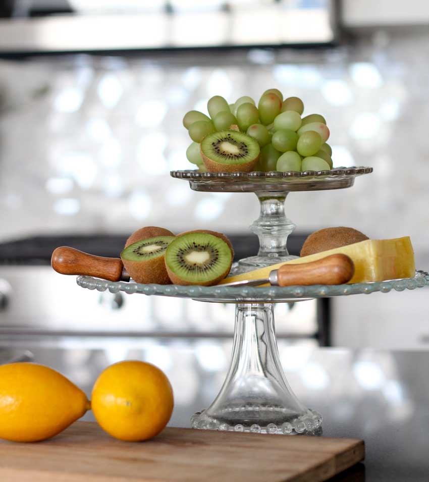
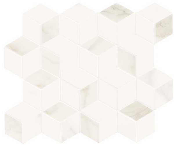
Jan chose this mosaic tile from Ames tile. Jan’s client wanted some bling and since there were no under counter lights, Jan chose this mosaic to add sparkle. In case you’re wondering, the total cost was approximately $1200, including removal of the old tile and installation of this one.
She didn’t have a large area for a backsplash but if Jan had chosen a solid white or cream, you would have noticed the pink more.
Now you have this pearly, sparkly tile that changes colour constantly (below).
Wall colour, BM Silver Satin – Interior Design by Jan Romanuk – After
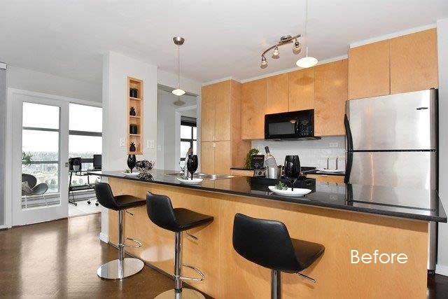
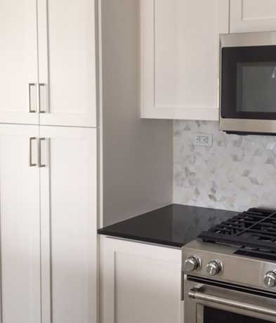
90s cabinets
So if you have made a mistake with your whites, your cabinet white looks different from your trim for example. Unless it’s really in-your-face and glaring, I wouldn’t stress too much over it.
If you find yourself saying “my white kitchen feels cold, my whites don’t match, my white kitchen is boring”, what’s missing is styling.
Here’s what you have to understand about styling if you don’t have that gift. I have spent countless hours looking at styled images and styling myself. Yes I have a gift, but I have also gotten a lot better at it because I do it so often.
You live in your kitchen every. single. day. And you might not be interested in spending a gazillion hours looking at Pinterest images. So follow some tips I wrote about styling a white kitchen in this post instead.
I talk about this a lot in my Specify Colour with Confidence events. How colour mistakes can be hidden with the right styling because you’re distracting the eye.
And if you don’t want to make a mistake choosing whites, download my White is Complicated eBook here. There’s 150 pages of teaching with images to make sure you choose the right white for your walls, millwork, trim or ceilings. Way more than could ever fit into a blog post. Plus that includes a bonus chapter of whites in Benjamin Moore and Sherwin Williams.
And at the end of the day, once you style the kitchen, get a lamp for atmosphere at night, a bowl of fruit and some flowers, you can get over the pink and even forget that it’s there.
Is there such thing as a cordless lamp? Laurel Bern wrote about them here.
Every kitchen needs either sconces with fabric shades or a lamp. Way prettier at night than pendants or recessed lighting.
The wall sconces in my kitchen (above) are always on in the evening.
So listen up, if you have just finished a renovation or new build and are freaking out because you’ve decided that you made a mistake choosing whites, just start decorating and move on.
And forget about your white mistake already. I’m serious.
If you’re renovating and need help choosing finishes, check out our ‘Create a Classic Kitchen’ eDesign package here.
Related posts:
What’s Missing if Your House is Not Trendy (Who Cares?)
Ask Maria: Will my White Kitchen be Cold?
Ask Maria: Help! I Don’t Want the Same Kitchen as Everyone Else


Great Post
I can just imagine how one would feel to discover their had pink undertones .
I ordered some time Back white is complicated
And could never figure out how to get back to the site to use .
Thanks Nancy
Seeing the picture of the tile alone, I wouldn’t have guessed how it would look installed. Lovely, and you don’t notice the pink.
My consult with you about my kitchen saved me countless hours and great angst about the best white for my cabinets, with Carrara marble. Once you said to use Chantilly Lace, I never looked back. Not long ago we were choosing a white for trim in our modest church, and I pulled a number of BM chips of whites that I see used a lot by decorators. I forget which ones they were, but when I put them together, the undertones just leaped out. One was pink, another yellow, another green, and only the Chantilly Lace looked just white. That’s what we used.
About styling, I think people should explore what they already have, and love, to make their kitchen personal (unless they’re selling, of course). I gathered lots of things I already had, including two charming ceramic pieces my daughter made in school, and put them together in my new kitchen in a way that pleases me. So many kitchens I see in magazines lack any personal touch, and as a result they look cold and remote. English Home, however, shows some beautiful kitchens that I’d be happy to cook and hang out in.
I really like the pearly, sparkly tile! Even though solid whites (and creams) have a lot of advantages it seems like the variation in color and shifting color has some advantages too. Is pink undertone the only undertone mistake that the pearly might be good for making look right? Does the pearly work best in slightly unusual geometric shapes, in order to emphasis the way the color changes when light hits it at slightly different angles? I’m assuming that it might be better for a relatively small area rather than having a huge area covered in pearly tiles and I assume that it would usually be better to have all the other fixed elements be pretty simple, if you are going to do the pearly thing. I think I’ve seen pearly, 3-D textured tile on a fireplace that I really did not care for.
I totally agree with you, Jill. My first thought was, “I like that pearly tile!” I think since it has some pinkishness, the cabinets look fine and white. I think the tile looks almost like a pearl. I liked the kitchen!
Love your logo! And love those snazzy shoes in your picture! 🙂
Such a great post, and I’ve got to check out the link to the lamps without a cord – can you imagine how wonderful and useful that would be???
I used a white with pink undertones on my walls and it was a lovely warm white. But, I can see not wanting it on your cabinets. The solution of using those tiles is perfection! It makes her kitchen sing.
I saw those lamps on Laurel’s blog. Is there a distributor in Canada?
My 2 cents -the logo could be bolder, same style just a little bolder on the letter M.
I could have used this post on the pink undertones about three years ago. I made the mistake of ordering white appliances instead of SS because I thought SS was going out of style. However, the appliances have a blue undertone which is so obvious next to the cabs with the pink undertone. Love the shimmery tile…spot on! As to your new logo, I am in agreement with previous comments. Have you considered using black lettering? What’s with the ‘V’?
I love your logo but the white initials inside the yellow circle are very hard to see……
I agree! Your logo needs to be bolder and much bigger. When you asked the question, I had to scroll back up to find it.
Agree with those who say the logo should be bolder. Yellow and white is a hard combination for many to see so you need to over compensate with bolder fonts. This logo is fine and looks professional…but totally honest…I liked your old logo better. In fact, I could have described it to anyone who asked, because it had caught my attention so many times. Why the change?
I thought the new colour wheel was your new logo, I Realy liked that it was innovated, clean and the cognitive message was everything Maria Killam is all about. This new one is nice but I didn’t notice it until it was pointed out. I am a Graphic Designer myself.
On your logo, I see a big V and an M in the background. Kinda like an optical illusion. Not clear on how it represents your brand. An MK or Maria K. would be stickier for me. Hope the feedback helps. Love your blog, always so relevant!
About the logo, realize you didn’t ask, but have to agree with the majority so far…
Love the yellow, but not enough contrast and it’s not memorable. I too don’t see what it has to do with your brand because it looks like the initials MV or VM, or an M with an old fashioned TV antenna. Sorry.
Sorry, Maria- I loved the old logo. It was colorful and simply designed. I think companies try too hard sometimes to be clever. The color wheel was a great statement about who you are- the Color Lady!
Well it’s interesting until I asked not a SINGLE person told me they liked my new colour wheel logo. I wanted something that’s more me and trust me I’ve seen countless MK’s and I’m super happy with this one! Thanks for your comment! Maria
Logo needs work, which I’ve addressed in an e-mail via my husband who is a UX web designer, for helpful comments.
Love the post – as usual you’ve given more tips and tools to take away. The picture of the waterfall island with the lamp is so good. I always have a lamp on the end of an island, but I’ve never seen a cordless one, so I will check that out. As an alternative, I have an electrical outlet installed on the end, positioned high and then shorten the electrical cord, but cordless is soooo good!!
Loved this post as it applies to my personal situation with the pink undertones:) The tile is a perfect solution! Agree with everyone else on your new logo. Have you considered black lettering?
Hi Angela,
Yes I have it that way too but for the site I want yellow. I appreciate everyone’s feedback. We are going to try a darker yellow one next to see if that’s better!!
x
Maria
Maria…this is SO why I tune in to your blog every day…practical advice! Thanks for not being a snobby interior decorator and for giving real advice to people who are trying to up the ante in their homes, but who don’t necessarily have the budget for constant do-overs!! Have a great week!
Love the tile solution.
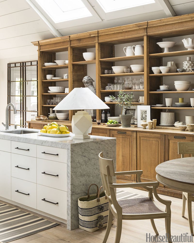
The House Beautiful photo on the other hand… that island looks like it belongs in a completely different kitchen. The cabinet styles have nothing that relate them to each other, and the marble waterfall counter clashes with the wood cabinets. Right?
Hi Maria, Terrific post and I couldn’t agree with you more. I get letters and comments like that too and I understand how they feel because I often feel that way when I get something new. It’s like I need to break it in or something.
But yes, accessories are like the salt in cooking or like hair and makeup on a woman. Without them, I think it’s impossible to have a room really sing!
Oh, and thanks so much for linking to my post about cordless lamps. The kind folks at Modern Lantern sent me one and I have to get it out of the box and try it out!
I would have never picked that tile from the close up pic of it…then it turns magic on the wall.
I love this!
To add in to the convo on the logo, I think it is a M and then a K rotated sideways.
Tell Jan that we all love that tile and kitchen! 🙂
Hi Debra,
It is a sideways K. And if y’all had seen as many MK’s as I have (over 100) you’d love this one as much as I do. the colour wheel is generic and could be anyone’s which is why I’ve always wanted an MK logo.
Thanks for your comment 🙂
Maria
Good I’m glad I was seeing it as it was meant to be.
I like it, good for you.
My son just did a logo contest for his business, and had over 500 submissions.
We were nearly blind from looking at all of them.
Maria, I just love your posts as you already know. The advice about the pink undetone cabinets was spot on. The solution was a very good one. Also thanks for the heads up on the cordless lamps. I can think of a dozen incedinces where they can be used. For one is when a sofa is in the middle of the room with a sofa table behind
it and no floor plug. That has always been my biggest bugaboo! With the cordless lamp it solves that problem.
As to your logo I have to agree with everyone who said to make it bolder. I really liked your color wheel rather than the new yellow one. It identifies who you are. Just make it strong enough so you can see it as a color wheel. What I love about your posts is the feedback that we can give without hurt feelings. It is like being on the private TCE page.
We love you!
There are some designer-y tips I just can’t get behind. Fabric shades in the kitchen, won’t those get covered in greasy kitchen dust? Or maybe splatters from my KitchenAid! A giant lamp on the island? That will get knocked over when I’m trying to use the island as prep space or even entertain – you know, the main functions of my kitchen. In fact that one looks like I might knock it over just walking by. And I’m on the move a lot in my kitchen.
Of course, I use my kitchen to cook. It is styled, but with decorative items on a few open shelves or at the back of the counter, not in the middle of my prep/eating surfaces. Kitchen finishes are chosen to be wipeable (that’s the purpose of a backsplash, actually).
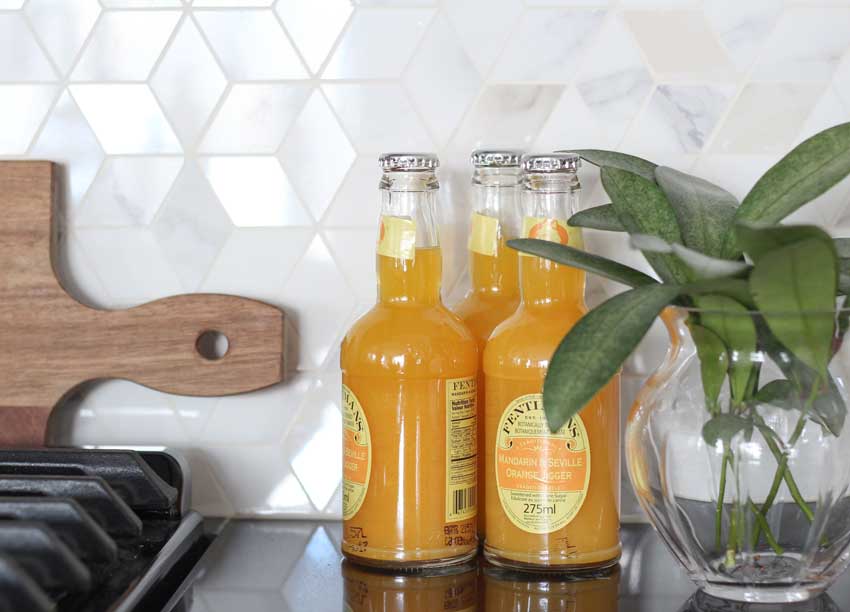
Well then it depends on how much you use your kitchen. . . this client is single and has champagne and oranges in her fridge 🙂
Great example on how to correct a slip-up. When I painted my upper cabinets white, changing the color of light bulbs in my recessed lighting helped the cabinets look better.
As for styling a kitchen….I never liked a lot of things on my counters. But after comparing pictures of my kitchen with styled kitchens, well it’s clear I need to up my game.
#decoratingisneverdone
Haha Mary that’s my motto too #neverstopdecorating
I’m confused about all of the negative comments on the logo. I like it. And I really like the kitchen. Great job! I am picking white paint colours soon and I am going to download the e-book. Thanks Maria!