Okay, this week I’m showing you the after’s of the family room in this months colour issue of Style at Home, it’s really fun to see the transformation!
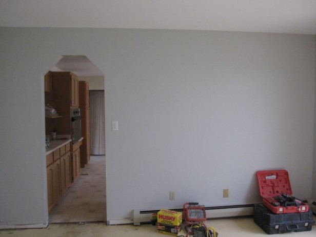
Here is what the drywall return doorways were like! These angled corners, had to go!! The adjoining family room was too narrow to make opening up this entire wall practical but we definitely opened it up twice as much.
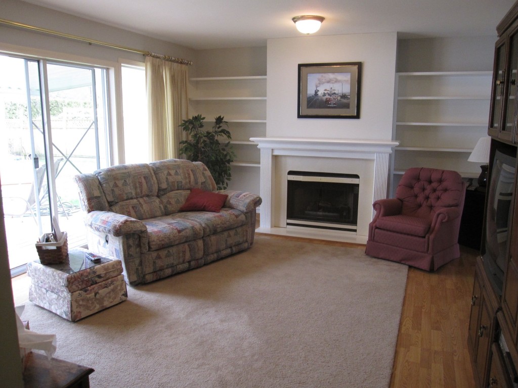
Before
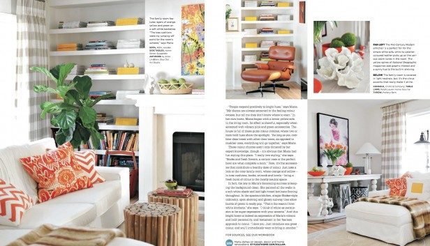
Photography by Tracey Ayton
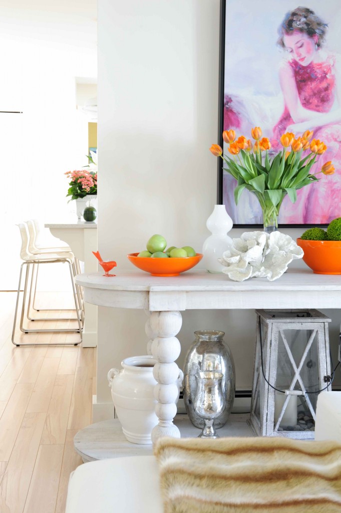
The console table is from Chintz and Co. This throw from the Pottery Barn.
This was the real estate photo – before we took possession.
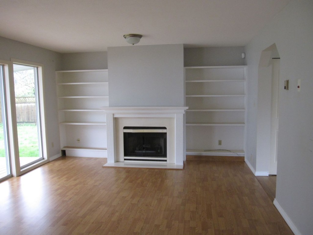
You can see that the colour went from a blue grey to a white/greige. It’s Rice Paper by Cloverdale Paint.
I always specify an eggshell finish because I like a little sheen on the walls.
One of the painters from Pure Painters told me that the eggshell finish from Cloverdale Paint was his favourite.
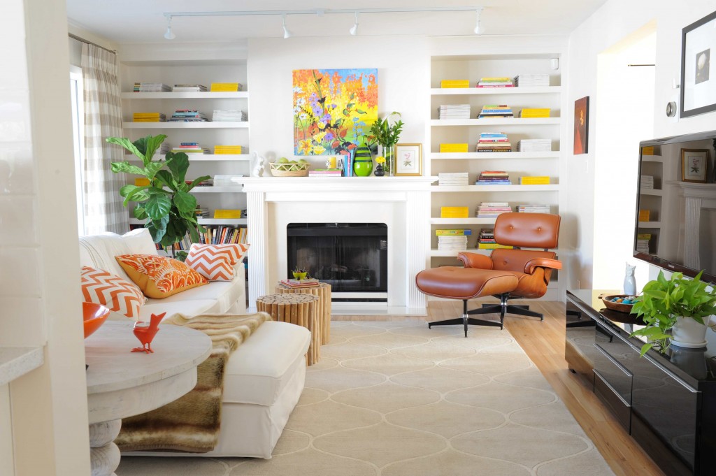
Since this was where the television would be, I decided that the style of sofa I was looking for was very similar to the KIVIK from IKEA so I bought it thinking it was nice not to have to wait to sit on furniture in here since we were without a kitchen when we first moved in.
Well, just in case you’re considering this style, DON’T. It’s like sitting on a board. The EKTORP, like the one my sister has, is very comfortable and perfect for her family room. This one, not so much.
I just ordered a new sofa yesterday to replace it so I’ll show you when it arrives in a couple months.
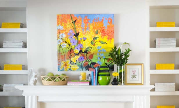
Here’s a close up of my mantle, I love the colourful artwork. More from this artist can be found here.
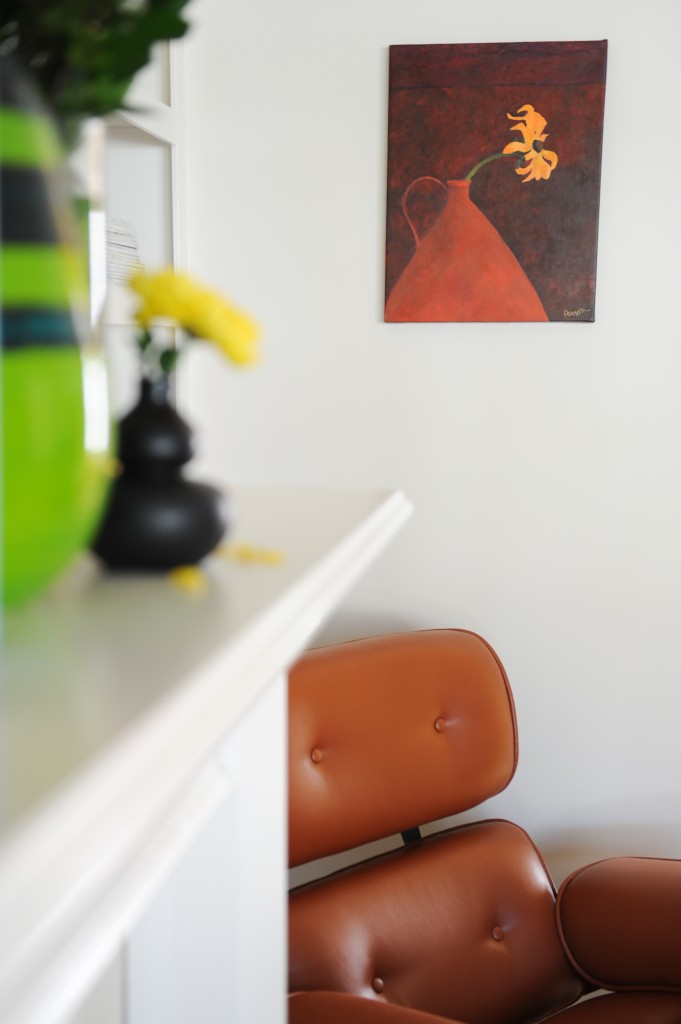
Terreeia and I found this little piece of art a few years ago when we took a day trip to Toronto Centre Island. I love how the single flower looks like it’s forging ahead, no matter what, haha.
 Before
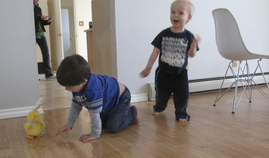
And here are my angel nephews William (left) and Markus (right) doing a happy dance to the musical walking bunny on the day we took possession.
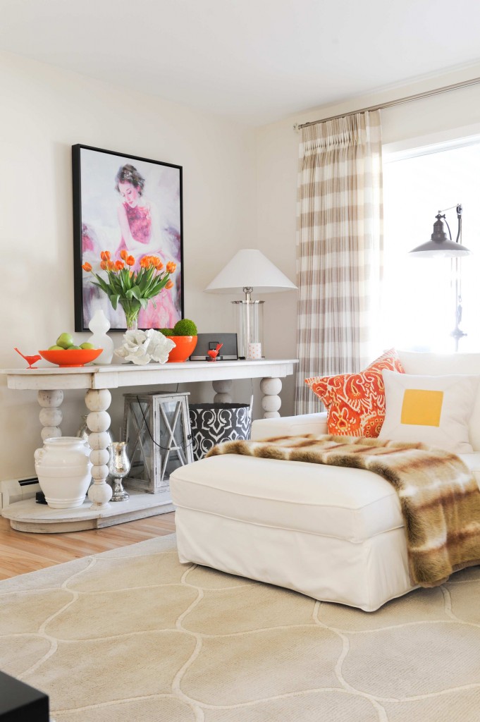
The lamp on the console is Ralph Lauren and the floor lamp is from the Pottery Barn. I have specified it a few times in consultations I love it so much.
Okay, a little test for all you True Colour Experts out there, what’s the undertone of my drapery and area rug?
PS. You’ll see my raspberry drapes in the living room very soon!
Related posts:
My White Kitchen Inside Style at Home (including the before’s)
Cloverdale Paint Party on Elizabeth Avenue
Family Room Bookshelves in Progress
If you would like your home to fill you with happiness every time you walk in the door, become a client. On-line or In-person.
Download my eBook, How to Choose Paint Colours – It’s All in the Undertones to get my complete step-by-step system on how to get colour to do what you want and to make sure the undertones in your home are right, get some large samples!
If you would like to learn how to choose colour with confidence, become a True Colour Expert.


It’s a wonderful transformation. I like the way you beefed up the shelf edges, it really adds style. It looks like you also lowered the ceiling above the shelves to make it look more like the built-in that it is. Great!
The track lighting was an inspired choice too. Love it.
The undertone looks purple to me. Hope I’m right!
Looks terrific, I couldn’t find Cloverdale paints in the states and ended up with BM Ballet White for my bathroom, which looks amazing. Love your whites SO much; it’s such a gift that you have to SEE the color. I do wish I lived in BC still and could come to your class. Thank you for sharing your gift.
Rodda Paint sells Cloverdale in Alaska, Idaho, Oregon, Washington and Montana…
I’m in California but thanks for the info
Maria, Just saw your photos in the April issue of STYLE AT HOME. Congratulations, your home looks fabulous! Nancy
yellow
Beautiful! I especially love the pops of orange and green on the white table. They make it look so well coordinated. I’m not sure about the undertone. I see yellow in the rug but not in the drapes. I see more of a purple undertone in the drapes. Hmmmm…
Where is the rug from. Love the room.
She answered that in the post.
Actually Marie said where the throw, sofa console and lamps were from.
Carol-Ann – I’m old help me out? Where is the rug from? Can’t see the info in this post. Thanks.
That rug was from HomeSense.
Looks beautiful Marie. May I ask, did you just add a face piece to the front of the shelves to make them look thicker? If so, how do the look when you are sitting and can see under them. I am building built in shelving on either side of my bay window and am unsure how to achieve the look you have, and have the shelves look chunky. Thanks, Melanie
Yes this is what we did: https://mariakillam.com/family-room-bookshelves-in-progress/ and I can’t see that it’s just on the face even when I’m sitting down. Maria
So, you’re saying that the 2″ is attached on the front edge of each shelf, with the board flush with the top surface of the shelf, thus hanging down below the shelf? And, you can’t notice it even sitting below looking up? That’s amazing! I want to do that! I just assumed the part hanging below the shelf itself would look funny when people went up to the shelf.
That’s right. Maybe if it had puck lighting you could see it but I don’t notice it.
Absolutely gorgeous. I also noticed that you squared off the doorway – PERFECT!
Fantastic (I did read that post too, just forgot), thanks so much Maria.
Haha, Maria…The undertone is definitely NOT pink 🙂 I love the room, it’s beautiful, as is the entire floor. My favourite item (not in this post) is your yellow sofa.
Wow Maria, you have done an
amazing job, just what I expected but I’m always wowed. Thanks for sharing.
So glad you used the colorful artwork & orange accents to bring to life.
Yes, it sure needed “something”.
So inviting, Maria!
must be yellow undertone, no?
Yellow
Maria,
I see you feature your young nephews often and you have the same kitchen bar stools we are considering. Are the bar stools sturdy enough for the children or do they tip over easily?
No they are great and very sturdy for them. They definitely don’t tip unless you’re trying hard. Maria
Fabulous room! Great job, I love this room!
Ok, on the photograph on a computer, the drapes look a little “pinkish”, however, I know you would probably never put a pink undertone with the oranges in that room. So I’m guessing if I could see the drapes and room in person, it would be an orange or yellow undertone. But I could be wrong, hard to tell from a photo on the internet.
A while back I used the beefed up shelving photo (or one like it) from Maria to talk a client into doing the same for a wall of skimpy shelves in her family room.
I love the room’s styling and color pops, but would like some light color on the walls. I think white walls can show beautifully in photos, especially with professional lighting, but not so much in real life.
As to undertone, I happened to look on my PC and iPad, and one shows yellow and one greenish, but I’m sure it’s yellow, for obvious reasons. (I think there should be at least one yellow called Maria Yellow.
My walls in the photos look quite a bit more washed out than what they are in person.
Hi Maria, I adore those drapes! Of course raspberry is luscious, but I still love what you have 😉 What a transformation on that room. I can’t believe someone could actually live with that original doorway opening — totally claustrophobic. Amazing difference!!
Love LOVE Love the orange! Such a happy color when not draped in Halloween black. I also love that at any time if you decide you are done with yellow and orange in that room you can easily transition to another season, color, mood with all of the white. Beautiful. (Sweet orange bird…it’s the little things, huh?)
I’d say the undertones are yellow and if I’m wrong on that then orange.
So glad you got rid of that creepy Transylvania doorway! As for undertones I say yellow for the carpet and violet for the draperies in the first photo- which then look yellow in the second.
Love the white pillow with the yellow block- a great way to add a little colour . It’s fun to study your photos Maria.
Had to laugh at this comment. I didn’t see “Transylvania” before in regards to that doorway style but I’ll never “unsee” that now! Thanks for the giggle.
green?
As always, looks beautiful. I say yellow undertones. (Or could it be green?) Love how you use colors amidst your neutrals.
Maria… Lovely. Please tell us the undertones so we can tell if we are correct. I see yellow in rug…. Not so obvious in drapes but I think they must be yellow too… You wouldn’t mix undertones.
Gloria
It’s green beige. One way to figure it out is ask yourself, is it pink beige? No. Is it yellow beige? No, then it must be green beige because it’s not greyed enough to be green grey.
Wonderful transformation! I say the undertone is Yellow…..I can see now (after all the comments about the shelving) the shelves are wider and you changed the top at the ceiling …which makes it look custom-built.
Basically framed in….
Hmmmm…a computer screen is NOT the best way to judge color…hmmm. franki
Since the pictures don’t capture your sofa & window fully, is the floor lamp behind the sofa?
I love your choice of large scale accessories. I have a friend that uses items that I consider too small & it makes her space look cluttered.
When you were designing your space, did you pick the rug first & then the fabric for the window treatments?
I haven’t had the pleasure of taking your course, so I don’t know what the undertone is. But they look great together. I really love your choice with the Buffalo Check. I don’t see it used that often & I think it’s stunning.
I have a feeling your space is bright & happy even if it’s dark & gloomy outside.
I feel like the undertone of the carpet and draperies is yellow (mildly and lovely), but undertone of the paint in my version of the picture appears slightly pink (but that just cannot be so?!!)
What a happy room, Maria. That white couch must be as uncomfortable sitting in that room as you are sitting on it. Love your cognac leather chair in the corner. Bought one similar in a creamy white. It is a “recliner”, not that I would ever recline on it, but once in a great while, one needs to sleep in a comfortable near-upright position and the chair works great for that. Love how you tied it into the room with the pillows on the couch, the throw and other orange accessories.
Think the rug has yellow undertones – drapes do look a bit “lavender” in the pix.
Job well done! I’m still eager to order the Style at Home back issue so that I can see and read your entire article. Bring on those hot pink drapes.
Yellow
Thanks for your opinion on the Kivik sofa from Ikea. I too had the Ektorp and loved it, but now I’m looking for the same type of configuration as you have. (I believe it’s slipcovered as well.)
Would you mind sharing where you ordered the new one from???
Maria, your house is just beautiful. So fresh and cheerful and well coordinated, full of complementary details that give it a cohesive look. I like how the color of the vase in the picture above the recliner echoes the cognac color–a really nice touch considering that cognac is not a major color in your house.
I’m no expert, but on my monitor I see yellow in the rug and gray in the curtains.
Love the track lights – they really help modernize the room. Where are they from?
The Lighting Warehouse in Richmond.
What is the leather chair?
It’s an Eames Lounger. They can be found anywhere on-line.
Appealing, but, nothing special.
Definitely green undertone…unless my iPad is messing with me : )
Maria, Where did you find the picture of the woman? I have been looking for a similar picture for my client to put in her bathroom. Do you mind sharing?
I too would say the undertones in the rug are yellow. It is so hard to see on the computer.
Green undertone on the carpet. You even gave us a hint when you said the walls were white/griege. And, it all looks great, Maria!
So fresh and pretty, Maria. Quite a transformation! By the way, that’s not my comment above.
I know who you are, thanks Fran 🙂 xo Maria
Maria, all your spaces make me want to grab a book, curl up and relax. Very pretty. Thank you for sharing…
Hi Maria..It’s all so colorful and pretty!! Is the yellow sofa in another room…? Can’t wait to see the raspberry drapes!! Will they be in this room??
I have some catching up to do…I’m livening up my gray and white living room with yellow and a little raspberry! Loving it!
Roberta
This makes me want a white room again!!
…i’m gonna say a yellow undertone in the rug and drapery…
Glad to know that my greeny beige guess was correct. I think your place looks fantastic! It’s so YOU.
I see yellow in the rug. The drapes are harder to tell in the photo.
Green beige
Love your non symmetrical mantle-scape! Its very nicely done. I remember you once said that if its difficult to tell what the undertone is w gray then its prob green…guess that applies to beige also. I guessed the rug was greenish but the drapery was harder to tell. Daring choice white as much as i love it. I cant do it w a beagle and carpenter boyfriend…have to reupholster my sofa in navy. Even slips would need cleaning every month. Oh well. Design must follow function. Good job overall
This room invites one to relax. Thanks for the comments re the IKEA sofa. In my monitor, the curtains look lavenderish and the carpet greenish. The touches of orange are brilliant!
Maria, Just wondering if the brown leather recliner is an Eames Reproduction from Kardiel? If so, how do you think the quality and comfort compares to an original Eames? I’m looking for one that is comfortable and well built without the price of an original.
Not comfortable at all!!! Keep sitting in the reproductions until you find one that’s comfortable.