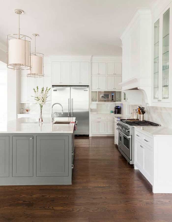
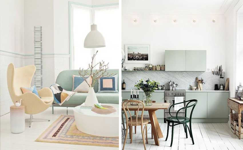
Recently I was consulting with a couple on their new build. They told me they were definitely installing a white kitchen but they wanted a different colour on the island. This is the inspiration picture they showed me:
When I asked what colours they were decorating with in their adjoining great room, they showed me a photo of their existing sofa which was a gold beige colour.
Now if they plan on introducing this green grey colour (above) into their decorating, then it’s a good choice. For example, the new great room could have this kind of colour scheme:
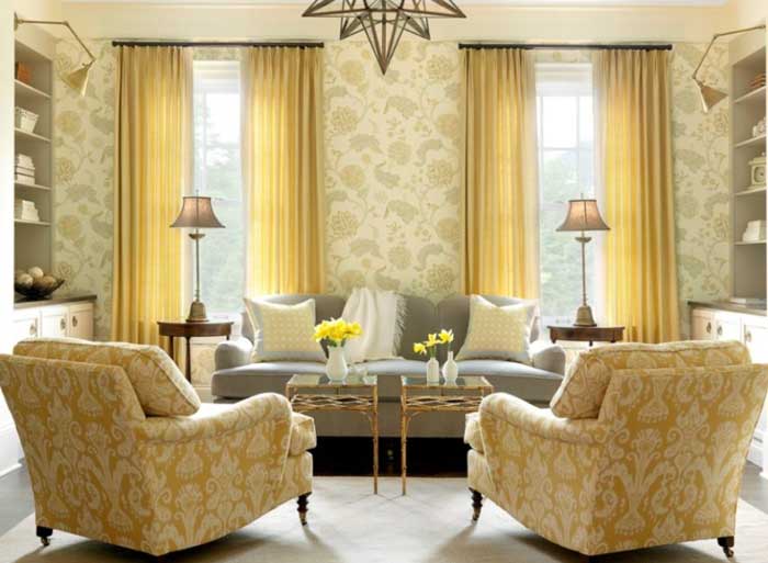
image via Tumish
Here the chairs are gold and the sofa is a green grey, but you get the idea. You can definitely incorporate your gold furniture from the tuscan trend and make it look more current by introducing grey just like the above photo. I like how the wallpaper picks up the gold and the grey, this room feels cozy with a nice balance of warm and cool.
Another client showed me a photo of the dark blue-grey shade she was considering for her kitchen island.
Then when we started talking about the colours she was using to decorate her great room, she sent me a photo of the area rug going in there.
I said “Well, take it out of storage so you can confirm that the colour you’ve chosen for your island works with your area rug, you’ll get cranky if, in the end, it looks like you tried to match it and failed”.
Even if you can’t see your kitchen from your adjoining living room or family room, when you walk through your house and your colours are coordinated, it feels. . . right. This is part of what creating flow looks like.
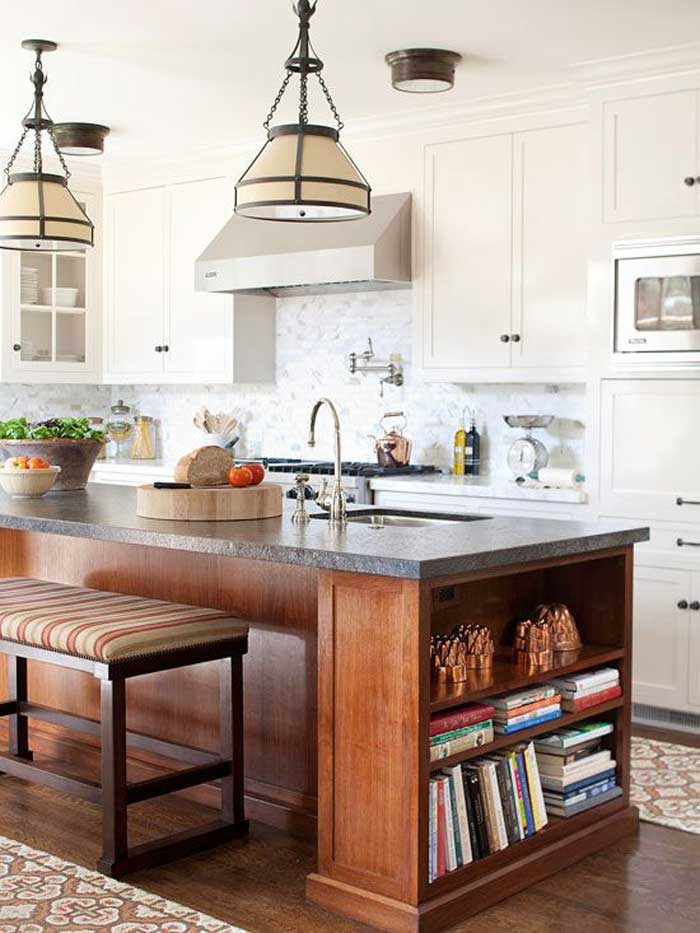
If you want something different but don’t want to be married to a colour, you could go with a wood-stained island that coordinates with your wood floors.
It’s likely that you’ll have a coffee or end table that repeats the colour of your island and then you can just forget about the colour. I would have repeated the white countertop on the island here, but overall this is a pretty kitchen (above).
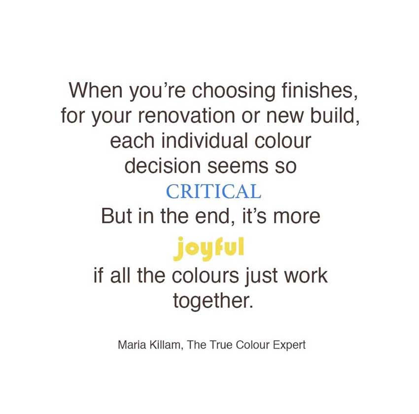
I posted this quote on my Instagram page a couple weeks ago, because I had just spoken to the woman with the blue-green island, so I’m including it here because it reinforces my point.
And that is, it seems sooooo important at the design stage, to choose DIFFERENT colours for everything, but if you just blindly copy an inspiration picture without considering how it will fit with the rest of your furniture then you might just be disappointed with the result.
So before you choose just ANY colour for your kitchen island (or your cabinets for that matter), think about where that colour might be repeated somewhere else in your decorating for the prettiest result.
These two rooms are not from the same house but they could be right? You would expect to see a muted, mint green sofa in the house where this kitchen lived.
One more thing to remember. If you are painting your kitchen to give it an update and you DO NOT have an island that was designed to look like a piece of furniture like all the ones shown in this post, DON’T paint it a contrasting colour. That will simply draw attention to the fact that it’s dated, and old.
It often makes a huge difference to just take the island out and replace it with a more updated design. This way you can also possibly re-design the shape. Most kitchen islands should be square or rectangle.
You won’t see a kitchen in House Beautiful in an odd shape with shaved off or rounded corners.
Okay, hope that makes sense, if you have any questions, post them in the comments below.
I’m crushing on pinks lately how about you?
Related posts:
Should Your Great Room Fireplace RELATE to the Kitchen?


So what about coordinating with a color that’s in the existing kitchen, for example a backsplash? Or does it make sense to make sure it coordinates with the other rooms first?
Yes, I’m glad you asked that question, to have an orange island with nothing else orange in a kitchen, for example, makes no sense either. You’ll want to repeat that colour somewhere if only in your decorating. Maria
So if the kitchen has a travertine floor then it’d be OK design wise to have travertine subway tile as long as the tile reflects the appropriate undertones for the room?
I love the buttery travertine floor under my feet however I have been stumped on how to do white or creme subway tile that matches on the back splash.
Due to budget, my travertine floor is made of cast offs & left overs I squirreled away for years as I found them on Criagslist, clearance centers, garage sales, etc – about 8 different sources and all shades except deep chocolate. Strangely it works although I’m debating on removing 2 of the more pinkish ones.
Thanks for this entire site, for year’s I’ve fought on color schemes based on my gut & had no idea why. Now thanks to you, I can better communicate why I’m not using a certain color & I can make better, more direct decisions.
I am in the designing phase as they dig the whole for my new home. Maria, what about classic colors like white base and upper cabinets and a classic navy island? I am thinking classics like white and navy shall remain timeless?
Hi Kristin,
I’m not saying you shouldn’t paint your island, what I’m suggesting is that you should be decorating with Navy if that’s going to be your island colour.
Don’t pull a colour from the sky or an inspiration picture, make sure it’s part of your decorating plan! That’s how you create flow!
Thanks for your comment,
Maria
Maria, I marvel at the great illustrations you give and find! Another great read! xo
Great post Maria; I totally agree.
Am I the only one who thinks the 2nd example photo looks like 1973 called and wants its color back? (maybe because I’m old enough to remember it — and I still have a gold mixer to prove it) But then, how does the Arne Jacobsen egg chair in the 4th photo manage to look so good? Is it because it’s in a lighter gold and doesn’t evoke the same harvest-gold memory?
I love the 3rd photo with the wood island that coordinates with the floors.
I agree Sandy! I think it is the use of pattern. Both the wallpaper and chairs are in an out-of-date swirly pattern- and the photo of the egg chair is more modern .
Thanks Maria for another interesting (and informative) post!!
Very interesting article. But how does one who has decorated room by room over the last 20 years, create color fluidity room to room when looking to update a kitchen. I had hand painted (by me) wall tiles in my kitchen that I don’t want to remove. They have a white background. The remaining rooms are cream/ warm white trimmed. I’d love to do it all over, but that just isn’t going to happen.
Live your blog. You are so talented.
Rosella
Hi Rosella, you need to treat your kitchen reno (if that’s what you’re planning) like you’re ‘moving forward’. So that means your new kitchen looks more updated than the rest of the house for a while, nothing wrong with that. Thanks for your comment, Maria
And yes, I’m crushing on pink too. It’s been one of my favorite home decor colors for over 20 years. I’m glad to see it’s made a comeback.
I hope this doesn’t post twice but for some reason the original is not showing up so I’m trying again:
Hi Maria,
Thank you for another great post! Someday I’ll have a white kitchen; but for now I’m making do with my honey-colored hickory cabinets and matching island that are in great shape. My kitchen is open to the family room and my fireplace has a white painted mantel. In order to refresh the look of the kitchen and better coordinate with my white mantel, would it make sense to replace the island with a white painted furniture style? Or, would that be an example of “new island” but “dated kitchen?”
No but I would NOT paint your island WHITE. An island should be an accent colour which is usually darker or brighter. If you paint your island white it will look like you started painting your kitchen white but stopped. Just my opinion, doesn’t mean it’s right! Thanks for your comment!
Would it work to paint the island in this situation the same color as the living room and dining room color? We have medium wood oak cabinets and floors. The kitchen pottery in display works well with LR/DR color. Or is it the same problem as painting it white?
That sounds like it would work, creates flow. Maria
Hello Maria,
Could you tell us what you mean by “shaved off” corners on a countertop? Pictures? You refer to this above, “You won’t see a kitchen in House Beautiful in an odd shape shape with shaved off or rounded corners.”
Thanks! ~ K
I was wondering the same thing. I had my island made in an L shape that echoes the L shape of the kitchen. The bottom of the L has only two open shelves, the upper holding a pretty wine rack and the lower holding my enormous cobalt blue ceramic bowl. To me it looks right.
She might be talking about something I have in my 13-year-old kitchen: the corners of the island countertop on the stool side are cut at an angle, presumably to protect people from sharp edges, but it’s SO dated! Luckily, an easy fix, once we replace the ugly laminate counters.
That is EXACTLY what I’m talking about, you said it better than me! Thanks! Maria
Having been the victim of a sharp corner on a countertop, I’m adamant that corners should not be sharp. When I was a child, I fell, hitting my face on the sharp corner edge of a counter. Thankfully, it didn’t poke my eye out, but I have a scar above my eye, below my eyebrow. That’s how close it was. My parents were worried I might have a concussion so they made me stay awake watching Johnny Carson. I was so tired; I just wanted to go to sleep. But, nope, had to watch Johnny Carson.
Please be careful of sharp corners and edges. Bevel them. Round them over. Do something so they don’t poke an eye out when someone falls face first into them.
Maria
My wife has always loved pink. I like it too. Two years ago we added a Woodard Chantilly Rose patio table and six chairs to our deck. The c1957 table is Mamie Pink and the house is a dove grey, purple undertone. The house has white trim, black shutters and roof. The desk is in a shady area full of hosts and ferns. The pink pops.
Rick
Thank you for your timely post! I’ve been painting the cabinets of our house on the shore white dove and was going to go with grey for the island. However, it is an older island and does not look updated so I’m going to stay with white dove for the island as well. It is not a huge kitchen and even though it is open to the rest of the house with blue and white I think you are correct that it is best to leave this older island painted like the cabinets.
I just received my colour consults back from Maria last week – I am re-doing my kitchen and also painting all the other rooms and hallway on the main floor. It was so many choices I was paralyzed. I love your recommendations Maria and will send some pictures when it’s all done! I feel so confident now that it will all turn out amazing.
Maria, this is a good, constructive lesson on pulling a house together. Well researched photos. Though, since your class, I have re- examined my house a million times in terms of wall colors, this
piece of advice clarifies & focuses the rest succinctly! My eyes are opened to all the disparate elements that were bothering me for reasons I could not fathom. Thank you again, friend, for teaching with clarity & sparkle !
?Paula
Agree TOTALLY about islands painted a color that doesn’t speak to decorating choices elsewhere! Has actually become a pet peeve of mine. Kitchens have so much going on, visually, that another big color hit is rarely if ever needed. To inject more “personality” or “fun” into a kitchen, use a plant in a colorful pot, dish towels, a stunning platter, etc.
Maria, I absolutely agree about the continuity of colour throughout to update your decor to a cohesive finish.
Spot-on advice. Since I may need to repaint my blue lower cabinets this summer, I’m going to select a blue that flows with the blues in my living room better. The current blue is nice but not perfect.
I’ve been seeing a lot of pink items for sale in the home decor catalogs that come in the mail. Some dusty pink pillows on my sofa might be nice for Spring & Summer.
I have written a comment twice and it does not post. Maybe it is my computer? I will try it again.
The same thing happened to me. I didn’t want to try a third time and look like a nut if they all eventually published, lol.
Same problem here. Leaving this comment on reply instead of comment button to see if it works??
Let see if this comment will post! lol.
I love your comment about painting your center island a different color unless it looks like a piece of furniture. I had a client who argued with me about painting her ” island cabinet” a different color because she sees it in all of the magazines. I told her that if she added legs and maybe a different trim or hardware, then it would look special otherwise it just looks the rest of her cabinets with a different color. The only way it would work is if you painted your base cabinets a different color and the center island the same. It would then look right.
As usual, a great post! So much good information.
Same thoughts on the curved counter on my island — I love mine! I have a furniture look island as far as the cabinetry, but I installed a counter that was curved on one end of the 8 foot by 40″ expanse to help with traffic, and seating. It works for me and my family! And I think it looks custom, not dated. Oh well. Rules were meant to be broken? I have a cream kitchen (not white), with double stacked cabinets to the ceiling, pale yellow walls and Juperana Gold counters and faux travertine (heated) floors … I live in a very GRAY city (literally some of the least days of sunshine in the country) –so for my mental health, I prefer a war, bright palette in my personal (historic, dark tudor) home …where there is tons of medium dark wainscoating throughout all the non-kitchen spaces, with only a little painted woodwork. (My husband LOVES the wood!) I do flip houses, and I put alot of pale grey into those. And alot of square and rectangular islands, too 🙂
Hi Karen, There are definitely exceptions to this ‘rule’ but most of the time, when I’m looking at a picture of a dated kitchen with a badly shaped island, it simply should have been a square or rectangle, the end. Thanks for your comment, I’m sure your kitchen is beautiful! Maria
Happy St Patricks! When we talk about repeating I think of : rhythm. Correct me if wrong but for those without open concept this advice still applies. What I like to do, when thinking through color, is to open up all the doors and walk through the space. How to tie it all. Ah the blue walls from the living room.. blue in our stained glass foyer window.. how about some in the dining room art or dining seats? Then more in the kitchen counters or rug. And then i pay attention to intensity. In my last home the colors fell to the light side of the paint card. Today we have bold color in two bedrooms and not in the rest of the house.. it can be jarring. I tend to think it is “forgiven” or “allowed” in the more private spaces and maybe the bath. But when I sell this home (this is my fifth and I never think I will stay long) these bold rooms will be painted and staged to share the feel of the public rooms. A video tour might help folks to focus on getting it right. There are great software programs that some use.. think property brothers.
psame problem with a previous post. Comments not posting!
Appears reply button works but when I hit comment to post it doesn’t.
ack, thanks for letting me know! I will get my web guy on it! Maria
Post did not make it… hum. Well I did not comment on pink. Just saw two rugs, returned at a national chain , that were predominantly pink. A medium shade and not orange-y. What I have noticed at the huge furniture charity thrift store I volunteer at.. people have been snatching up the floral upholstered goods that have pink in the flowers. I fell in love with one of these.. it felt very cottage. . No it did not come home. Personally I am on the hunt for a tartan? type plaid chair (not mcm or contemporary) with at least navy and dark green in it and no or little red. I could go for a large Buffalo check in navy but it seems to be paired with yellow beige. Pinterest is not helping when it takes me to UK sites for the plaid 🙁
Marie, what you’re discussing and demonstrating here, I think, explains why I never like designer show houses (those houses where each designer does one room). I like some individual rooms but I’m never happy with how they feel walking through them. Even on the houses where they have a “blue” color scheme or “beach house theme” I don’t think there is ever enough coordination between the designers to get the colors right between the rooms. I couldn’t put my finger on why they always felt “off” until now.
I’m sorry Maria, I typed your name as “Marie”, my fingers must have a mind of their own as it’s my middle name. Sorry!
As usual another great post and now that I have my island dilemma solved….just have to decide on a range hood. I know this is a little off topic and perhaps I’ve missed this subject but it would be interesting to hear a post on range hoods and what is considered classic. There’s no shortage of examples but one can’t help wondering which ones will stand the test of time along side the white kitchens and subway tile.
I have white kitchen cabinets with a white Corian counter and 4″ backsplash. My island base is also white with a beige/gold/black/white granite countertop. My wall color coordinates with the open family room in a light gold Venetian plaster. I want to change the wall color as I’m really tired of it. What would you recommend?
Thank you, Kim
Hi Kim, it’s impossible for me to give you accurate advice without photos. You can buy just one eDesign paint colour here: https://mariakillam.com/product/interior-paint-colour-consultation/
Maria
Maria, I have alot of taupe, dark bronze green, cream and faded, rusty red in my living room and family room. But I love Delft blue or cobalt blue in a kitchen. Is it possible to incorporate blues as an accent or will it ruin flow? If so – which blue? Thanks!
Hi Annie, it is impossible for me to give you accurate advice without seeing photos. If you’d like colour help, you can buy just one colour here: https://mariakillam.com/product/interior-paint-colour-consultation/ Thanks for your comment, Maria
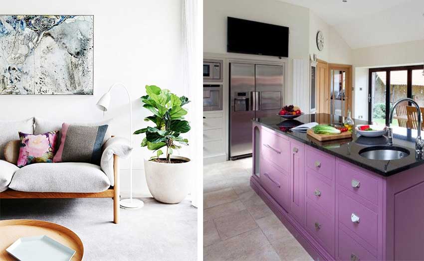
I probably would never use that color in my kitchen, but I am digging the lavender island! As usual, a great post. You’ve given me the language to explain to my daughter why her desire for a navy island will not work if she has nothing else navy in her adjoining spaces!
How do you feel about the second kitchen that has not only different cabinets, but different counters? I feel that if one is different, the other should be the same so there is continuity between them.
Yes I agree! Maria
We are doing an all white kitchen, transitional/parisian bistro. We will have marble or look-like marble counters. Our main problem is deciding on the floor. To try to keep a modern edge, we have chosen concrete looking floors, large format, with little grout lines, mimicking concrete. I am nervous to go with that choice as it is feeling all white and grey, cold and boring. Conversely we are doing a wide, plank door in our open concept living dining in our small toronto semi-detached home. I see in much of the research people just carrying the wood through the kitchen but I am worried about being able to really wash the wood floor. When you have a tile floor you can do a really wet mot and tough scrub. Would love to know your thoughts
thank you!
my kitchen cabinets are dark brown like most of the new homes that i see have in them , what do you think about me changing my kitchen island a linen color ? I need a change from all dark cabinets . thank you
An accent colour is generally darker than the rest of your colours so I would not recommend painting only your island a linen colour, it might look like you’ve started painting your kitchen and haven’t finished yet. Having said that, it’s your house and if you think you might eventually paint your kitchen, start with the island so that your kitchen will feel fresher! Hope that helps, Maria
So thankful for all of your ideas! I’m working on a white kitchen with a timeless hardwood, thanks to you, in my open concept home. The kitchen island is large and designed like a piece of furniture with marble (looking) countertops. I’m considering painting the island a soft black and repeating that color on the cabinets on each side of the fireplace. I’ve hit a roadblock and can’t find any pictures or advice on what I should consider for the kitchen table, which is close to that big island. Any suggestions? Thank you!
I’m doing the same-would love feedback on this?
I was considering tricorn black or a gray color for the island .. then carry the color to my cabinets in Family room.