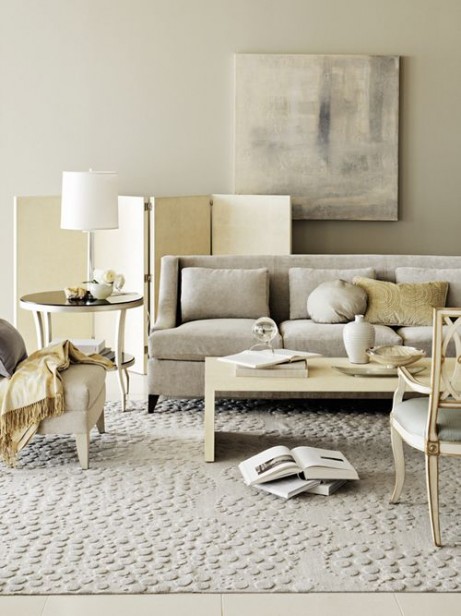
Image via Barbara Barry (A pretty combination of green-grays and yellow-beige)
When Irene and I were working on my White is Complicated eBook. We got to a section and she said “You need to explain that more thoroughly, people are literalists”.
And she’s right.
When we’re learning anything, we’re literal.
That’s why in every profession and especially design and colour you need to know the rules first before you can break them.
I spoke to a designer recently who confessed that prior to attending my Specify Colour with Confidence™ training she chose pink-beige for an exterior. “And, it was not pretty,” she declared.
How did she get to pink-beige? Well, she said, The brick was a green-beige, so she concluded that because red is the complement to green, specifying a pink-beige was the answer.
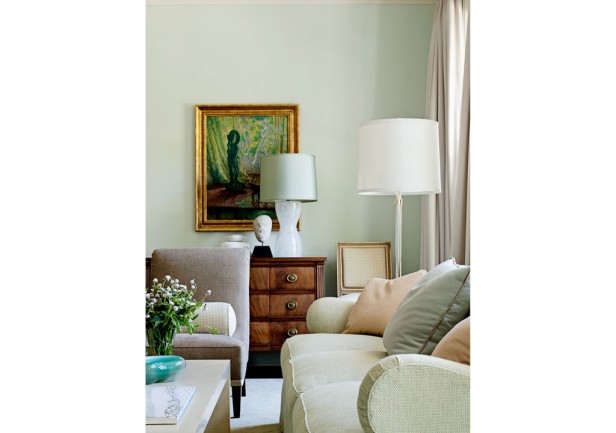
Image via Barbara Barry (Note the soft green walls which relate to the green sofa)
Once I came upon an “after” photo a designer had posted on her website.
The room had a burgundy sofa and love seat, the cushions and coordinating upholstered chairs were gold-beige. And the walls were green. Yet there was no green in the room at all, leaving me to conclude that she had specified green because green was the complement of red.
In my colour training, professionals who learned colour theory from design school, will try to fit my system into theory. This is natural because when we are learning something new, we try to take what we’re learning through the filter of what we already know. We’re literal.

Your walls should literally pull your space together. That’s what makes a colour look fabulous.
Just like you should literally go out of your way to make sure your fixed elements match. If you start selecting tiles, countertops and flooring and you think “That’s close enough,” keep looking. It won’t look “close enough” when it’s installed.
The most beautiful, luminous, full-spectrum (don’t get me started on that) colours in the world will not be fabulous if they relate to nothing.
Your colours should literally be related.
Your wall colour and furniture or fixed elements should literally look they belong together and should never have been apart.
Literally.
If you’ve always wanted to master colour way beyond colour theory, register now for my True Colour Expert training and you’ll only pay 1/2 the total price as a deposit now, with the rest due 3 weeks prior to the course. I’d love to see you there!
Related posts:
Colour Theory Rules are for Breaking
Are you Waiting for your Paint Colour to Propose?
If you would like your home to fill you with happiness every time you walk in the door, become a client. On-line or In-person.
Download my eBook, How to Choose Paint Colours – It’s All in the Undertones to get my complete step-by-step system on how to get colour to do what you want and to make sure the undertones in your home are right, get some large samples!


Sometimes I’ve wondered why they are called “complimentary” colours, when, they are actually in opposition.
They’re not complimentary; they’re complementary. Different meaning.
Thank you Mary, for the correction, but they are still in opposition.
well… those ‘opposite’ colours often ‘complement’ so well together like red roses in green field:)
Because the eye looks for it instinctively because of a well-known effect called after-image. This way its is said that each part compliments, enhances or completes the other one. And yes, Color Theory functions, but you have to know how to apply it correctly, in my humble opinion.
Are we talking about colors that are the “complement” of another as in opposite on the color wheel or are we talking about colors that “compliment” each other as in “flatter, enhance”?? Forgive me for me for being so literal 🙂
An interesting post, Lynn; thank you. After going to m-w.com and looking up “complement” (a word I hadn’t thought of in a long time), my mind is in a tizzy over its connection to the field of color.
Complementary, as in opposite on the color wheel – at least on the one often in use here. There are other color systems.
Actually, can we get you started on full-spectrum paints? I’d love a post with your thoughts on it.
Yes, that would be so interesting. I am a big fan of full-spectrum paints as they add so much dimension and life and interest to a space.
Benjamin Moore has a line of colours called,” Colour Stories”, and they are full spectrum without any gray or black tint used in them.
When something looks out of place, add more of it!
(My favorite mantra).
Love that mantra, I think I’ll use it 🙂
Back in the late 90’s, I helped my stepson & his wife paint their kitchen mint green. (They picked the color).
They had pinkish pickled oak cabinets. I can’t tell you how awful it looked. The next weekend we repainted the space a dark red. Much better!
She hated her cabinets & she thought picking a green would make the cabinets look better. Because the colors were opposites on the color wheel.
Here’s the thing with opposites – they intensify each other. If you want to down play a color the last thing you want to do is put it next to it’s opposite.
Delurking to second the motion for a post about full-spectrum paints. 🙂
Yes, full spectrum paints always look more interesting to my eye. I’ve been mixing full spectrum paint colors for clients since 1998. What do you think Maria?
Yes, a post about full spectrum paint!
Forgive my ignorance (obviously not a design professional!) but what are full spectrum paints? Sounds lovely! Thanks Maria!
I think I understand this: A full spectrum paint uses no black in creating it; only other hues.
If you use ‘Cloud White’ throughout a house (or just one room) as your ‘canvas,’ because it appears to change texture, hue & shade with the light, creating a neutral palette of it’s own; then does it still relate in the way you describe, if your fixed and ‘soft’ pieces are colours or even other neutrals?
Sorry, that was a very, long sentence – hope it made sense :)))
Hi Maria, interesting post. Complimentary colour theory is very useful when mixing colours. The biggest problem when applying it “literally” in decorating is applying it clumsily, ie. not paying attention to tone, intensity or balance. I get the sense you don’t care for full spectrum paints, but I’m here to tell you there is a huge difference. I use them all the time. They use colour theory to create complexity in their colours instead of tossing in umber or black to grey them down. Makes a huge difference.
The danger is when any system is oversimplified and used ineptly.
Full spectrum paint can be beautiful. And you can also experience a colour moving from green to brown (for example) as the light changes.
As long as the colour is chosen correctly to begin with, and if you’re prepared to change it if you don’t like how it changes throughout the day, then you’re good. Maria
Years and years ago I was mesmerized by Donald Kaufman full-spectrum paints (wasn’t he the first FSP person?) I have all his books and was riveted how they looked in the photos, or perhaps how the photographer made the colors sing. I painted a room with DK color and I noticed the shift as Maria revealed, and it was not a pleasant color shift a long with the reflection of my neighbor’s red tile roof in the mix (the gold color became magenta). A very expensive repaint.
I suppose you have to check FSP’s throughout the day, but it would take an enormously large board to really capture and understand the color shifts perhaps.
I’ve always been aware that north, south, east or west and also the grass or desert or whatever is outside influences color if you have large windows. I learned that full-spectrum paints seems to be more sensitive to these natural elements. Am I wrong?
Color can be complicated. Maria really sifts it down to an understandable element. Thank you, M.
Not a designer and I’ll never get to Vancouver for your formal color class, but how neat to be able to sit in front of my computer with a cup of coffee and my mouse and feel as though I am literally in your classroom. And even better, because I’m sitting in my office/living room, I can apply the lesson immediately and experience one of those “Aha” or “OK, I see” or “No wonder” moments right away. Super fun!!!
Had been seeing “full spectrum paints” advertised but just read very briefly about the concept and add my voice to the request for a post on same.
Agree, … agree, …. yep, agree,… agree!! LOL
Hi Maria,
Great post! I’ve been wondering about that exact thing (opposites on the color wheel) in a room, and you answered so many of my questions. Thank you! Also, your post was hilarious with the ‘literally’ theme running through it, I was cracking up!
Haha, that’s right Maria, full spectrum paints are not for control freaks. They have to be done well enough not to be too wonky I guess. I won’t plug my favorites here, but I suspect there are some brands that aren’t as good 🙂
Great blog, Maria. I ‘literally’ loved it!
yes, Maria, I also would love to hear your take on full spectrum!
I too would like a post on full-spectrum paints. I’ve used them in my house, and although the Honeysuckle from Ellen Kennon has been wonderful, the blue (Sky, also EK), has faded horribly, and I’ll have to repaint (with something else).
kay, I painted almost my entire house in EK paint. I used Silt and Mushroom and a blue green, I think it was H2o Ahh.
I also had the most horrible fading/color change. Silt went from warm lavender grey to bad cheap makeup and Mushroom went from soft taupe to washed out beige pink. The blue green became dingy nothing.
The color change was dramatic, you could see the original color clearly behing every painting that hung on the walls; many of the walls received no direct sunlight so that wasn’t a factor.
I spoke to her and she was puzzled and offered to replace with new but I was afraid of it happening again so I went back to BM, tried and true. I threw out (recycled) 3 gallons unopened, didn’t want to be tempted, lol.
A local paint guy, in the business many years, told me he heard that ICI who made her paints, had had some problems with pigments going bad or perhaps using alternative pigments which apparently weren’t stable. this was several years ago, she may have changed suppliers by now, I don’t know.
Are you located in Southern California by any chance? That’s where I am. Perhaps it was a localized problem.
I’m excited to learn that your working on your book!!!!
I can’t wait til its out………..Yippeeeee Maria
Agree!!
I’ve used some full spectrum Donald Kaufman paints (DKC). My experience is in some dark colors it doesn’t make much difference, but in one of his beiges, the undertone can shift remarkably depending on the light. And there is a luminescence or depth in some non-neutral colors since there’s no black which stops light/the eye.
I’ve also used a couple of Ben Moore’s full spectrum Color Stories colors. Same thing.
But it also depends on room light.
I’d like to see a blog entry on the difference between photographs and real life! LOL
Some of my clients call because have been seduced by small shiny photographs in magazines or on computers, and are very disappointed when white and extremely pale everything looks dreary or dingy in reality. I tell them it’s because their walls aren’t backlit or shiny or as small as an iPad or computer screen. : )
In magazines, I love white rooms. I have a pinterest board full of them. In reality, I never like all white rooms. I realized long ago that I am attracted to the brightness, not the whiteness, abut I know that effect is achieved through professional photographer’s lighting. Perhaps you could photograph rooms with and without the stage lighting to show your clients?
I’ve been thinking about this since yesterday. My living and dining room walls are yellow. Nothing else in those rooms is yellow. (Well, at the moment, I have vases of daffodils, but daffodil season is short, and it’s an entirely different yellow anyway.)
Sometimes I want to repaint because the rooms have been yellow for so many years, and I like change, but it’s not because I don’t think the walls relate to the furniture or don’t pull the space together. In fact, I look at my yellow walls and red sofa and think they belong together. I can’t imagine a better wall colour for my sofa. So I don’t repaint.
Am I delusional that my home looks warm and friendly and just right, or do I have the exception to the rule about wall colour being repeated in other elements?
LOVE Yellow wall and red sofa!!! YUM!!
Grab some pillows or other ‘stuff’ to add yellow to the room, perhaps.
Wood can often have a golden yellow tone, depending. And wood floors often (not always) do.
Your colors sound great. Might just need a couple of “this’s and that’s” to make it ‘pop’
Just a thought…. 🙂
Also would love to hear your take on full spectrum paints. Have used EK paints, but haven’t tried Ben M yet. I try something different in my home each time I paint so I can compare.
After going to to art school, I learned all the ins and outs of colour theory and how to use it well. But then I took simple community painting class and finally, truly learned how to make colour sing! What I learned is that colour theory is still just a theory. The truth is that paint colour is just pigment harvested from nature and pigment doesn’t care about theory; it just is what it is. The thing that makes colour “work” is Light. Good paintings “trap” light. There’s more to all this, but what does this mean for wall colour? The light in each space is the most important and uncontrollable factor. Therefore, I echo Maria, test each colour in each space and compare, compare, compare. A colour that works for you in your space may not work in mine.
Which leads us back to Maria’s idea of having enough lamps in a space…without the right amount of light any color can look sad…
Thanks for the posts!
As always, I just love your posts and seem to be written just for my clients I’m working with.
Currently working with a client who was going to compromise on backsplash tile. My reaction: never compromise. Even if it takes a little bit longer to find the perfect combination or you have to wait until the order comes in.
Love this: “Your colours should literally be related.” Thanks again for such great advice and a wonderful way to express your knowledge!
Great points!!!!
To change the subject slightly, in the Barry photo are the chair and drapes pinky-beige? Would this be an example of how to use muddy pinky-beige with a clean green or are the walls considered a light muddy colour?
That Barbara Barry photos is yellow beige and green greys. Totally works.