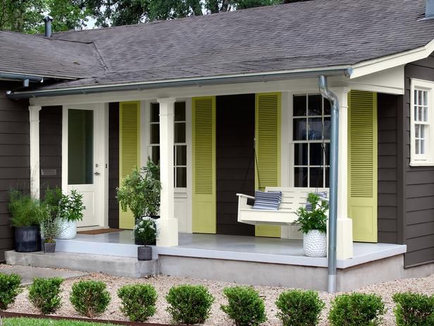
I saw this cottage makeover yesterday (the before pic is so covered with shrubs that it’s not worth posting) and I’ve been swooning over the shutters ever since.
 {via HGTV}
Here’s what I’d like you to notice about the colours. The main body colour is basically a gray/brown (BM Iron Mountain) but the shutters painted in BM Pale Avocado bring it to life and give it a sophisticated cottage feel.
If the shutters were simply the trim colour, it would just look trendy and therefore not the best colour for just any cottage.
 {via pinterest}
Speaking of Iron Mountain, (which happens to be one of the Darks in my VIP Collection of large samples), it’s a really pretty soft gray/brown which makes it a perfect accent colour for doors with espresso floors as you can see by this photo above.
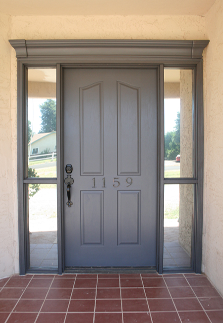
Check out this pretty front door transformation, with the addition of the crown on the top and new hardware, it’s a miracle from what it was before : )
If you would like help creating a palette for your home, become a client. Online or In-person.
To get your exterior colours right, download my How to Choose Exterior Colours with Confidence webinar and get my go-to list of colours.
Download my eBook, How to Choose Paint Colours – It’s All in the Undertones to get my complete step-by-step system on how to get colour to do what you want.
To make sure the undertones in your home are right, get some large samples!
And, if you would like to learn how to choose colour with confidence, become a True Colour Expert.


I have Iron Ore in our bedroom (SW). A very cool and very dark gray that leans toward blue.
When I was sampling colors for our room, I tried a color called Urbane Bronze that I absolutely loved. It didn’t match my curtains and therefore didn’t make the cut, but I saved the sample and am determined to use it somewhere else, maybe in my hallway (zero natural light, a perfect candidate for a cozy color)? It is a great grayish-brown.
I just painted my art studio in Tweed Suit thanks to my VIP Color Board Collection! It’s a not as dark as Iron Mountain but looks rich and contemporary and makes my bright artwork pop! I’m so happy with it! I agree Maria, the green shutters on the house make it great.
I’ve just used Behr “intellectual” PPU18-19 on an exterior door and love it! I think it looks very elegant. Have you tried it, Maria?
Since my parents chose dark grey/blue window frames and shutters I have decided I would go more for white window frames and coloured shutters, a much lighter feel. I look at their house and although it’s much better than it was, it just seems too dark…or just too much. This post confirms my thoughts, thanks.
Love love love Iron Mountain in the exterior photos and on the doors!! Not as much a fan on the interior walls, a little moody for me, but I am going to remember this color!
Maria, thoughts on what that BM trim color this could be in the top photo?
My favorite dark gray is Kendall Charcoal HC-166 by Benjamin Moore. I painted my kitchen this color and with white cabinets and white crown moldings it looks so rich and modern.
I haven’t painted anything gray. So I don’t have a favorite.
The Pale Avocado on the shutter looks yellow to me. I always thought that color was a shade of green. I guess that’s why it’s important to do a large sample.
Thanks Maria for bringing such refreshing new colour schemes to our attention…
My take on the paint name Pale Avocado is that it must reference the inside and innermost part of the avocado – exactly this beautiful colour! Aka, chartreuse..
If you look at the photo on three different computers you might see three different colors. : )
SW keystone gray. I’ve used it both indoors and out. It’s a lovely dark gray inside but turns much lighter outside with a greenish undertone. Love it. Very greishy 🙂
Benjamin Moore’s Amherst Gray. Our dining room is painted this color – the room doesn’t get any direct sunlight and I love the rich color on the walls. White below the chair rail keeps it from being too dark for me. I’m waning on the gray trend — I’ll either add a window and move to a lighter color OR go for navy.
I would never have considered such colors, they just did not exist in my range. This is why a decorator is such a wonderful luxury. It’s beautiful
Don’t have a dark gray favorite. What I do know is that the dark gray color that was used to paint the brick trim on my house is absolutely not it and I’m stuck with it until 2019 when the HOA paints all houses again. There are 5 homes in our HOA with grey composition roofs and the other four were nicely done. My roofmate (and I) got stuck with the 2009 “in cahoots with other owner” vision of the chairman of the Paint Committee who is an “artist”. In 2019 I’m opting for a single exterior cover all over as a couple of homeowners did. Otherwise, I definitely lean toward warm green grays and, if going dark, would certainly look at gray brown. I bet it’s going to weather beautifully on this cottage.
I love BM Bear Creek. It’s a taupy grayish-brown color that works well with challenging beige surfaces.
I also LOVE iron mountain and have used it many times. My favorite is the buffet table now turned desk storage in my dining room.
Kelly @ http://www.yourcolorconsultant.com
Favourite grey is ‘Chelsea Grey” BM OC-168. I use this with ‘Cloud White’ BM CC-40 – interior doors are ‘Off Black’ by Farrow & Ball (dark charcoal with a deep blue undertone). My clients fought me initially but e-mail me almost weekly with their happiness. They did kitchen cabinets – white uppers, charcoal lowers and continued the palette into their Great Room and D/R (open concept). I also did this in my new, powder room – Cloud above the chair rail, Chelsea below with black door – very effective.
I don’t think grey is going anywhere for a very, long time.. it’s the new, classic.
Sorry I just can not get behind the gray colors. No matter how trendy they are. They depress me. I need light and bright pastel colors. Hahah YES I am an old lady. I think when our eyes start to cloud with cataracts we need light to be able to see better. I do love the long shutters though. Certainly would consider doing this for the front porch. Our house is a pale creamy yellow of course because we live on Canary street. Truth.
I’m a BM consultant and spec iron mountain regularly, love it! A gorgeous complex grey that can enhance many different decorating situations. Good call : ) Loathe those flat ‘battleship’ greys people often mistakenly choose.
Haha! I guessed it! I had to do a double take between the large colour board that just happened to be sitting beside me and the picture you posted. I just specified Iron Mountain for a kitchen with brown wood/laminate floors and white cabs. I was just thinking how great its is as a transition colour from the brown trend to the grey. Also, it reads grey yet it’s still earthy. Brilliant.
Here’s the biggest lesson to learn about trends and whether ‘grey is for you or not’.
Use the ‘trend colour’ where it’s appropriate. Doing your whole entire house from top to bottom in charcoal will surely date your house as fast as anything else.
Same thing with brown. Do I still have brown furniture in my house? Yes, but not every stitch of it is brown. The new grey, lime washed furniture which will eventually look just as dated as pickled pink oak from the 80’s, just don’t do your whole house in it.
I have one oversize console table in that look, therefore when that ‘trend’ is over, my whole house won’t instantly look 2014. Painting a cottage charcoal in general is not what I would recommend. It’s a cottage, there should be colour involved which is why I liked this house so much.
Problem with painting the outside of a home a dark color is that it will fade more quickly than a medium or light tone–or at least the fading is more noticeable. Changing colors outside isn’t as easy as doing it inside, and the more paint layers you have, the closer you are to total paint failure and laborious stripping.
At least the solids content of BM paint is more than other brands that should help it last longer.
I also love Iron Mountain and some of the grays others have mentioned. I used Kendall Charcoal on some (not all) 40-50 foot high walls in the massive foyer and the sanctuary of a church I worked on. Contemporary colors, no burgundy and gold. : )
I love the bright shutters, but still don’t care for grays. I find them depressing too.
I already have the “How to Choose Exterior Colors With Confidence”. I will refer to it. Hope I can pull it up , I am not very good on downloads!
Thank you