So Tricia (my Senior Colour Designer) and I just had a super fun weekend at High Point Market checking out all the new and hot decor trends for 2019.
I’ve always been fascinated by the trend cycle, and I look forward to market every year so I can bring the latest news to you in my annual trend report. And there is SO much to report this year!
I started specifying colour in the early 2000’s when we were still in the pink beige/sage green/ginger maple, trend.
After that, the Tuscan Brown trend started in 2002 in the West Coast, with lots more beige, UNTIL the grey trend arrived, around 2009.
I’ll always remember arriving in a clients home (around 2002) who still had existing, untouched, decor from the 80s.
Her living room was decorated in emerald tones, fuchsia, forest greens, and teals (ALL of which we saw a lot of at market by the way). During the consultation, I had my large paint samples, and I held up beige after beige and they all died when paired with her strong colours. Grey was of course, the same. Very bad.
In the end, it was specifically a yellow beige on the green side that looked the best because it read as a colour, a muted yellow green.
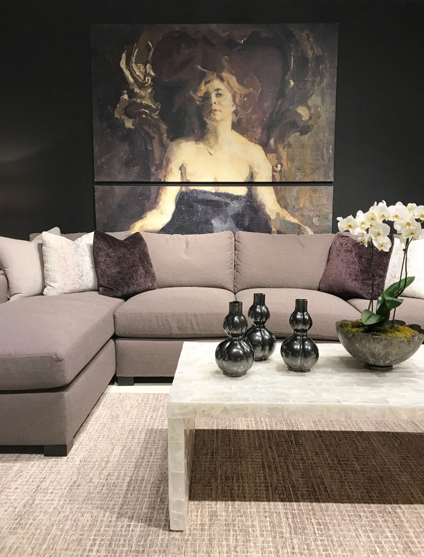
The take away story this year is that the trendy neutral of the last almost ten years, GREY, has hit full saturation point. Many of the showrooms had attractive, colourful storefront rooms, but when you walked though, you would inevitably find yourself surrounded by grey-on-grey vignettes this Spring at High Point Market.
More. than. ever. before.
Which tells me that the all-grey-look is overexposed and poised to look generic and even tacky. As a result, beige is feeling new, warm and sophisticated again.
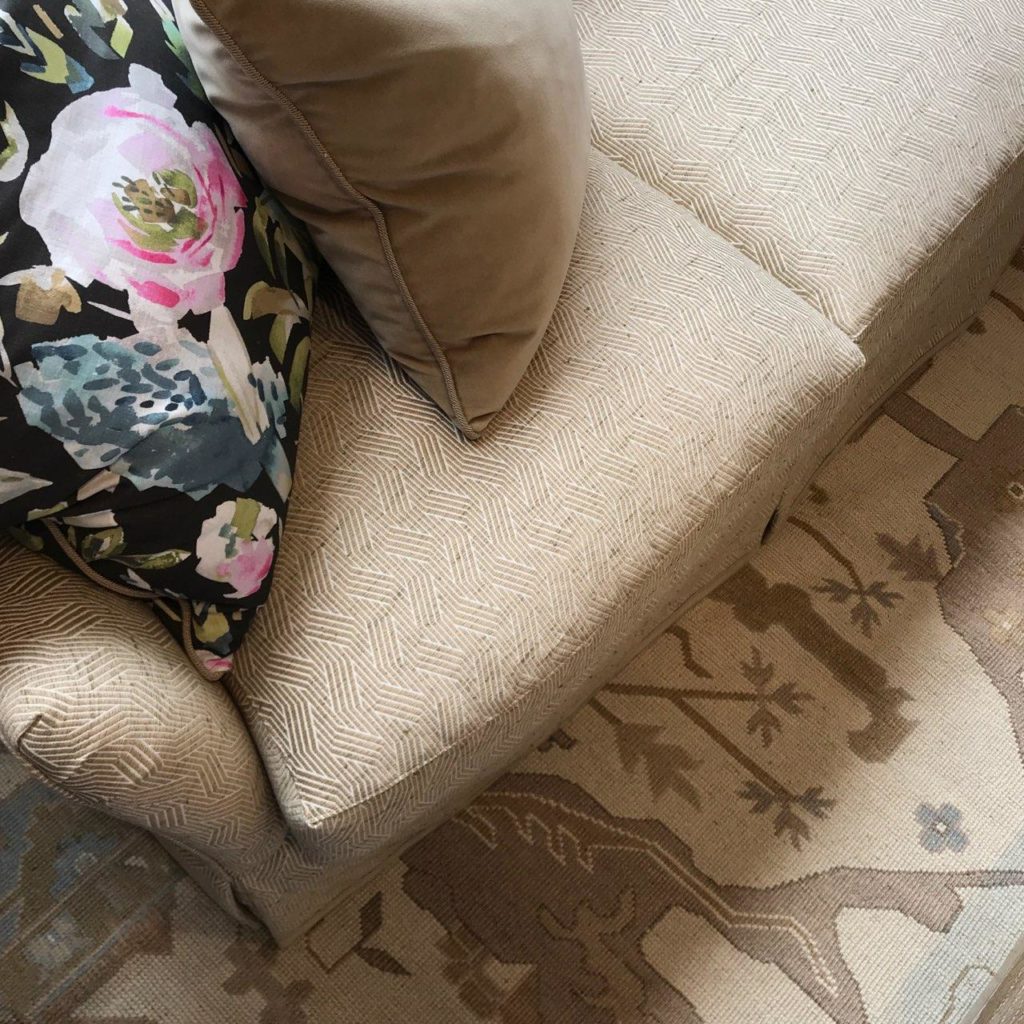
A pretty, small scale Pink Beige print at CR Laine
If fact most showrooms also had some beige rooms, and the high end showrooms had A LOT of serene cream and pale beige.
When I say beige is back, this is not to be confused with brown is back. Yes, we saw browns at Market as well, but no one is running out to buy a brown living room set anytime soon.
Brown will take a back seat now in interior design, just as grey will shortly as well.
Just to be clear, there is nothing wrong with brown, or grey or black. It’s the OVERUSE of these neutrals that screams “I decorated in the brown or grey trend”.
And the beige we saw in showrooms at high point was mostly pale beige, so it was fresh. There was lots of pink beige of course, but it was also interesting to see some yellow beige and orange beige which we have not seen in quite some time.
A combination of yellow beige and green grey at Bernhardt
There was very little black (even though black is the new grey and there was lots of black at Maison et Objet in Paris two years ago).
But aside from lots of gray, there was a whole lot of gorgeous bright colour too. The Thibaut showroom is always a delight and reliable for bold colour and pattern mixing (below).
Thibaut Fabrics and Wallcoverings
And I was happy to see so much fresh, kelly green. This shade of green has been on the fringe of trends for years, hopefully there will be many more products available in this happy green!
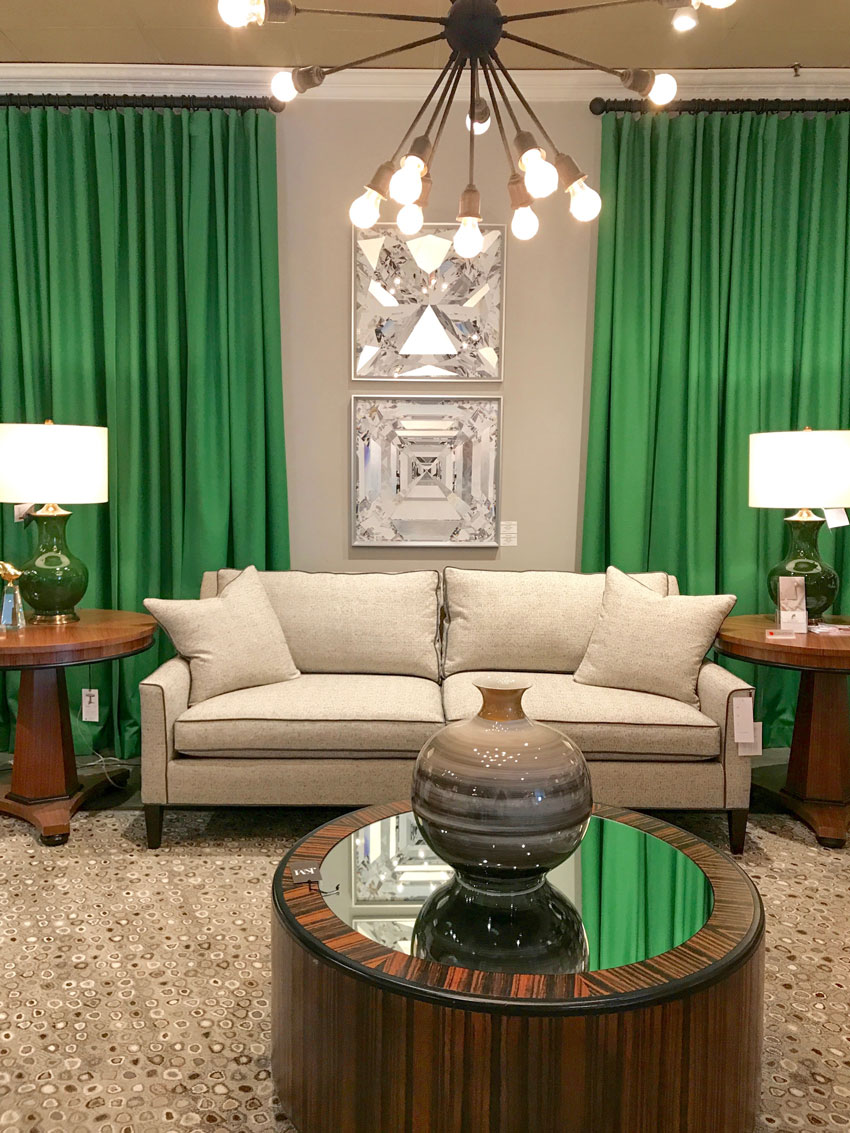
Kelly Green and Green Beige at CR Laine

Kelly Green and Cream by Mark D. Sikes for Henredon
Yellow was also here and introduced in smaller accents, often as a counterpoint to gray and deep dramatic colours. (After all this is how gold, basically rich yellow, is used.)
Hickory White
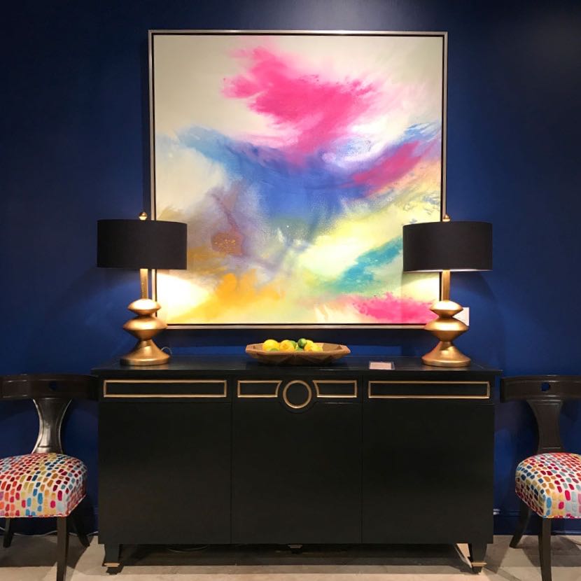
There was a new shade of plum/eggplant which we saw repeated in a few showrooms. In general there were lots of dramatic deep toned walls from saturated blues and forest greens to almost black.
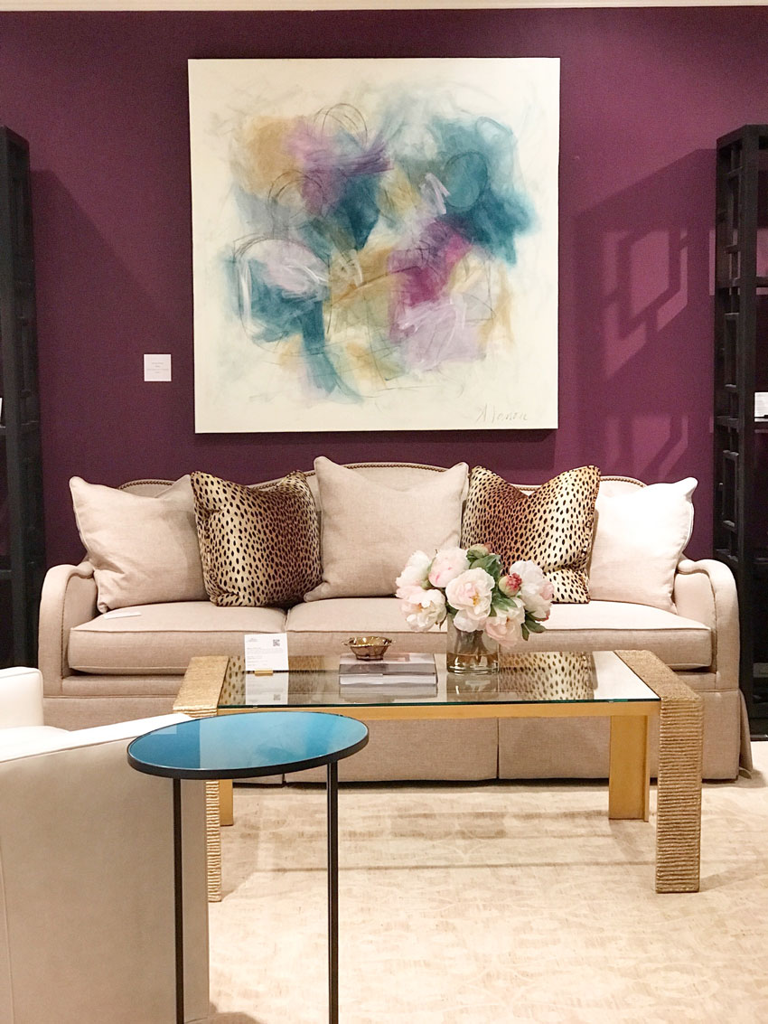
Plum and Pink Beige at Alden Parkes
Violet Gray and near Black Walls at Bernhardt
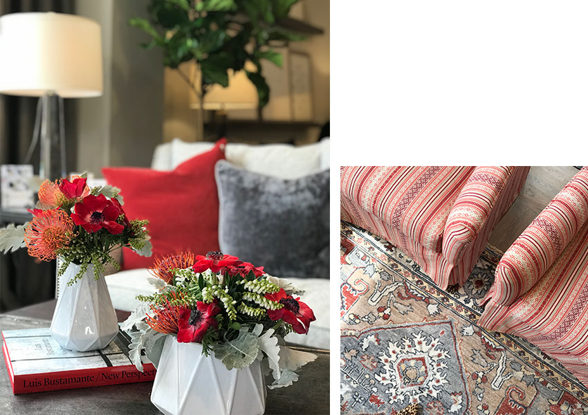
Red is back but it’s a clean and fresh red, very far from the muted, burgundy red of the 80s and 90s. It was paired with lots of white and fresh blues.
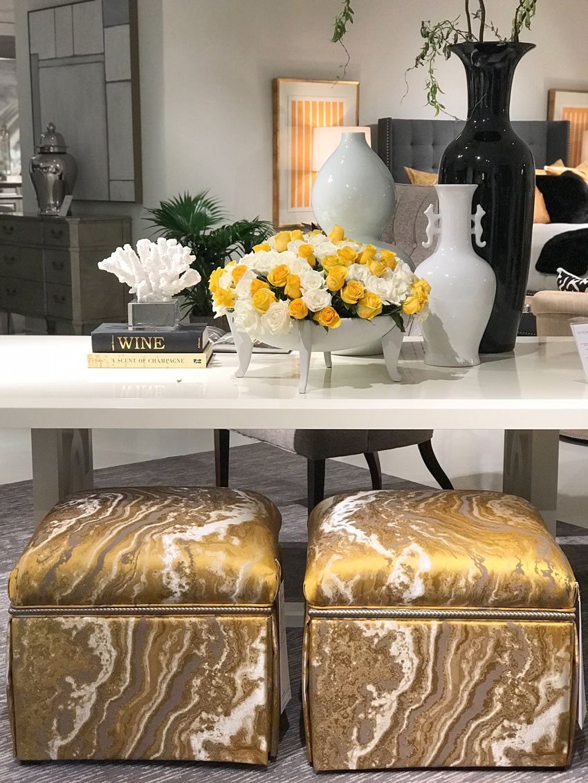
There were lots of luxurious details like decorative boxes, mirrors, coffee tables, you name it, wrapped in textured materials like embossed leather or grass cloth.
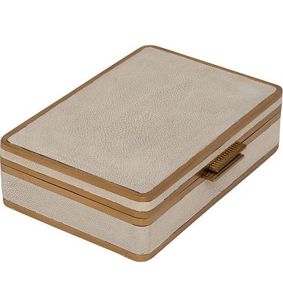
Suzanne Kasler Chagrin Decorative Box
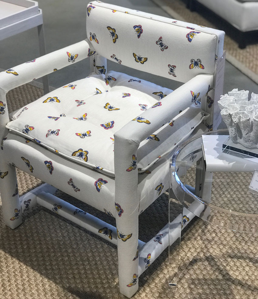
This style of chair entirely wrapped in fabric was also everywhere. I remember a decorator friend had two of these in her living room 20 years ago.
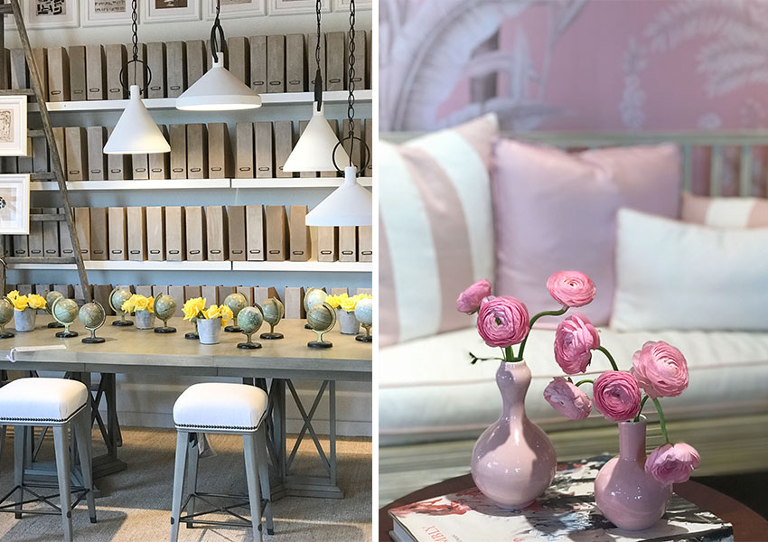
Pink was still a big story at High Point this year. Most memorably in the most breathtaking collection of new furniture, Suzanne Kasler’s Paris Apartment collection for Hickory Chair (below).
I love the white pendants in this library vignette also by Suzanne Kasler below.
Gallery white walls were very well represented at the market this year, but they were paired with endless amounts of white upholstery which is really the only way to make them work.
Related post: 5 Reasons You Cannot Paint your House Art Gallery White
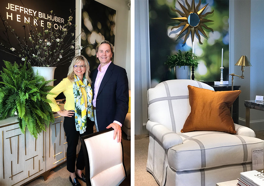
I was really excited to meet my favourite decorator of all time, Jeffrey Bilhuber. He is even more lovely and charming than you might expect. I have written posts or mentioned him, many times over the years, here, here and here. I have all his books and use them as a styling resource anytime I’m styling a room.
Whenever I’m specifying swing arm lamps behind a sofa, I show one of his interiors to my clients.
Related post: 10 Styling Lessons from Jeffrey Bilhuber
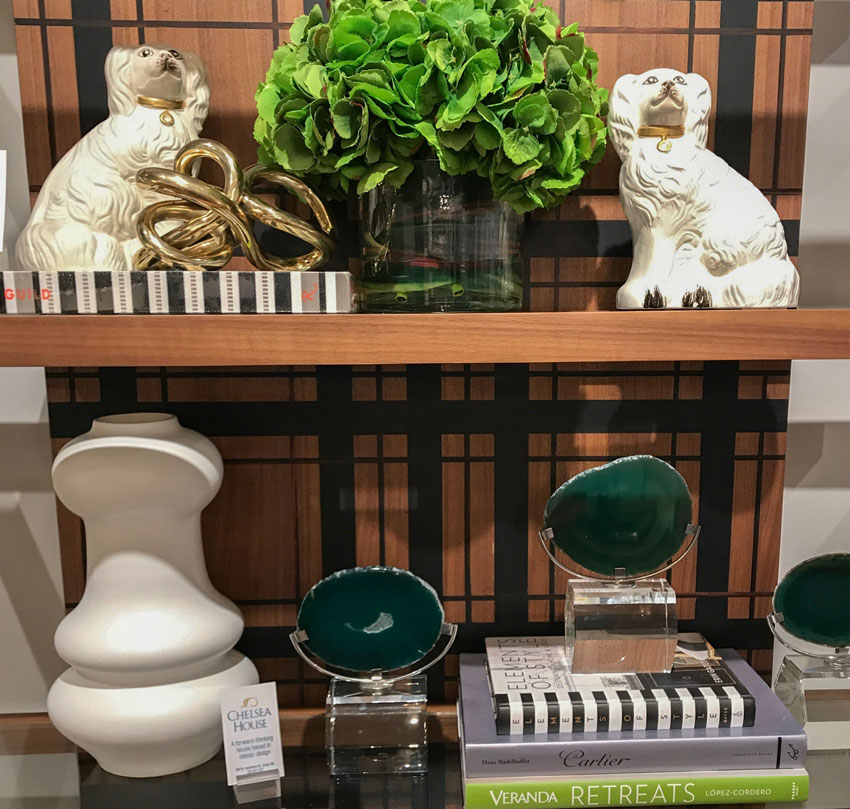
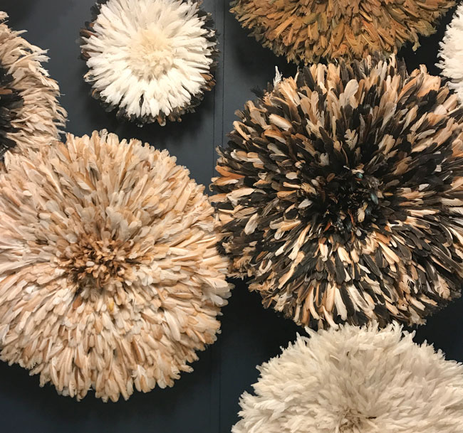
Whimsical reproduction Staffordshire dogs were the primary motif this market! Actually, fanciful beasts were everywhere. Parrots, monkeys and tigers were all over fabrics and wall coverings.
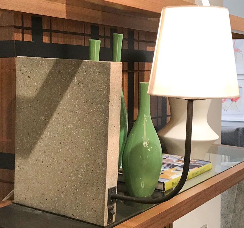
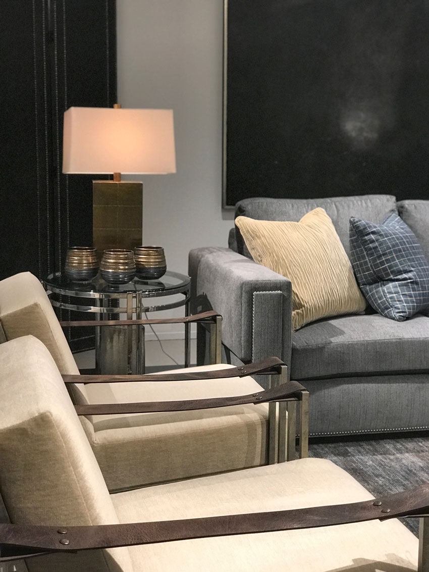
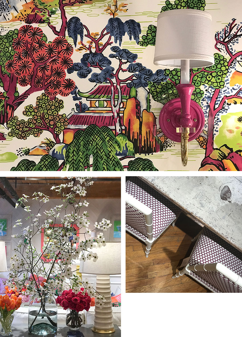
Love this clever freestanding sconce on a weighted concrete base to tuck into a a bookshelf from the same vignette at C.R. Laine.
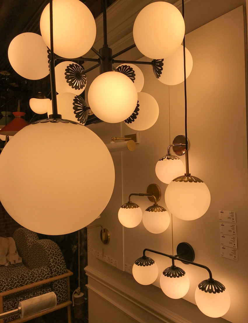
Loved these daisy inspired lights! from Hudson Valley Lighting
My friend Denise McGaha has an amazing collection of classic and timeless stone mantels with Materials Marketing, you can view and buy them here.
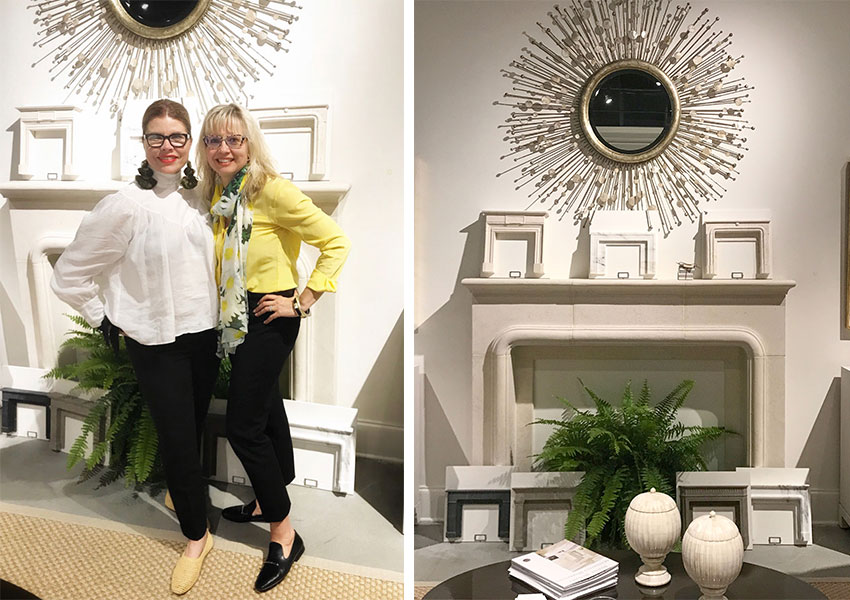

Tricia Firmaniuk and Maria Killam
And here we are zipping around the showrooms at cocktail hour (it’s hard work haha). Visual Comfort was adorning everyone with these Mardi Gras like gold beads. And oh my, they were showing off some gorgeous lighting.
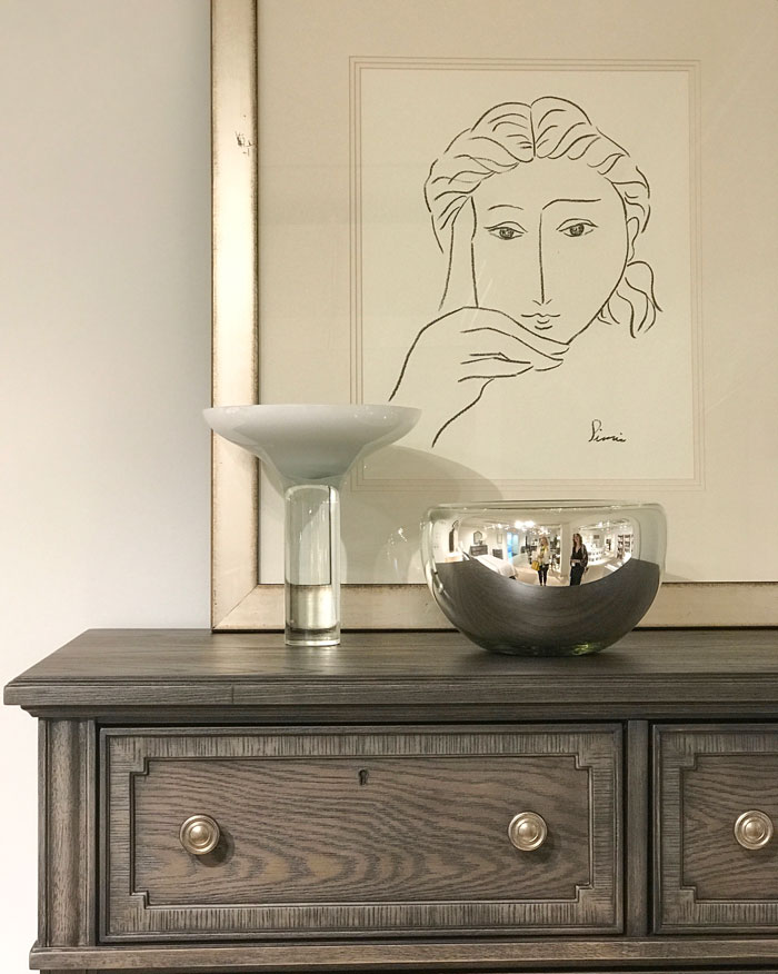
Tricia is an artist, so when SHE actually liked a piece of art, I would sit up and pay attention! Like this simple line drawing by Picasso.
Henredon
So there you have it! Although all the retailers will certainly have lots of gray upholstery available for you this year, it’s at the END of the trend cycle, and NOT the time to buy it. Let’s focus on their fresher offerings full of colour!
What is your favourite trend or colour palette?
Related posts:
What Everyone Should Know About Beige
Maria Killam’s Trend Forecast for 2018; the Colour is Yellow


So glad to see this update. I am so ready to get rid of my gray walls. Everyone loves them. But I am tired of them. I’ve had them for 6+ years already. I do have color in the main part- SW Rainwashed (I live in Fl) that I may keep. I totally agree with you that color is definitely more timeless than the current trendy neutral! The Rainwashed still looks fresh to me after 6 years but the gray looks tired.
So glad to also see the industrial thing fading! I saw just one or two lighting pieces here.
I anticipated this would be happening this year or next. I did the gray thing back in the 80s, and discovered I really don’t like gray. This time around I stuck with my neutral light beiges that go with everything and warm up the house. I knew that they would be back in style soon. Glad I didn’t change it.
Hi Maria,
You must have had a great time. Between seeing your idol & all the great design, how could you not?
I was wondering if you think the life span of trends is shorter now then in previous times. Now we have the internet giving us more exposure. Pinterest, Houzz, blogs, social media. Not to mention all the home decor catalogs that I don’t recall getting years ago. Thoughts?
Oh thank goodness! I’ve been keeping my head down right through the gray trend because it simply held no appeal for me. I love warm, earthy palettes and to that end I’ve held on faithfully to my beige-toned sofa. It will be nice to start getting fresh inspiration on how to work a colour scheme around it at last.
Thanks for the review of Market, Maria. I sent the pic of the Hudson Valley daisy lights to my lighting showroom for pricing. They look perfect for a girls’ bathroom I’m working on!
Hmmmm. I think beige is sophisticated and timeless. I’m not surprised.
I just knew beige would be back. I hate to say it but I have been a basic beige gal for a long time. I change my accessories a lot and it always looks new (to me at least) and fresh. I was so happy when you with great detail told us why pink beige doesn’t work especially paired with yellow beige. It gave me new insight to what I instinctively new but not the why. Beautiful post! I miss going to market so much. It is exhilarating to say the least.
I look forward to reading your blogs weekly. I appreciate your approach regarding timeless design. I recently listened to a podcast via ballad design. You provide such insight regarding color. Thank you for all you do, I so appreciate your expertise.
Maria.
What fun the market place must be !!
Seeing all of the latest !
Im over gray ….. but beige doesnt excite me.
One issue with the neutrals is they become saturated.
Brown trend
Brown walls / brown couch brown on brown.
Same with gray.
Will be the same with beige.
I love your saying neutrals will outdate faster then color.
I now understand why you say that.
Im getting a new couch.’
And im excited cause its not going to be
Gray / brown or. Beige !!!
Im going for Color !!!!
Thanks
I love blue purple, aqua — very light, pale yellow and red with a little orange it. Mainly, I love blending blue/purple/aqua/green. The sky and sea please for me. My study is a red with a touch of orange and it is very soothing, like the womb.
I was finally warming to purplish greys. I’ve seen others say grey is classic, but as you noted, it has reached saturation point.
Looks like having fun. Thanks for sharing all that lovely everything! The Bernhardt- yellow beige pillow with green gray sofa.. nice to see my suggested pairing of beige to gray officially represented 😉 Always have loved cream and light beige. See much high gloss lacquer?
Beige? I hated beige before, and, forward, and, now. Sorry, I will NEVER get on the beige bandwagon, never, ever! It is the color of flesh. Can we not be a little bit more color creative?
Pink beige is the colour of flesh yes, and I’m not a fan of that particular shade of beige either. And you are preaching to the choir, since I am in no way suggesting that everyone should run out and turn everything into any shade of beige. Maria
I’m another one who declined to play the trend during the whole gray phase and kept to pale beiges knowing it would come around again. Seems like there are more of us than I suspected! Actually these days, since our current house has so much California sunlight pouring trough most of it, white walls + wood + black + color is really where my heart is, but beige has a good supporting role.
Thanks for letting us walk through with you. Loved everything you shared. Thank you!
I think you’re right on the mark when you suggest that gray interiors are starting to look generic—like too many houses these days! We have been house hunting, and every seller puts gray paint on the walls of empty houses now, no matter how awful it looks with the cabinet and floor colors. And every house is furnished with the same stuff from the same catalogs. It’s hard to tell one house from the next.
Higher-end houses, we’ve noticed, show much more variety and individuality in decorating, with family pieces and interesting finds from travels. And there’s very little gray to be found! The more sophisticated design world has already moved on, just as Maria suggests.
I am so sick of grey everywhere. I never minded it before in small doses and dashes however it’s showing up in places that don’t make sense.
I never used a ton of it however, I keep finding greys in everything now, even footwear & clothing I had to settle on a grey just to get through the winter. And the strange undertones that are usually in it! I had to get a new table for my tiny entry way and the one that feature/size/shape that made practical sense has this strange grey wash on it, yuck. Tempted to paint but maybe just strip/stain since paint might wear off on the edges being in such a high traffic area. Most of my wood furniture is walnut ranging from 1880to 1940.
I grew up in a historical town. Since my Mom knew how ot hang wall paper, she (with me along for the trip) would be on the fringes of many victorian restoration projects and when i got close to being a teen I would do it when she coulnd’t make it. I’m so glad I was exposed to that because colors were used differently in that era, at least in my opinion and it’s allowed me to make better long lasting decisions. Beige is the best, quietest supporting actor in a scheme that really supports other color’s & textures performance. Happy to hear Kelly green is coming around, I’ll have to stock up since I’ve discovered via this blog that strong colors make me happy.
Lovely post, Maria. It is always fun to get your take on the High Point market. (You might want to correct the top picture caption from “accent ouch” to “accent touch”. )
Oops, with the way their logo is designed I read ‘ouch’ and thought that was odd, I see it now, eeek. Thanks Katherine! Maria
I find it tiresome that “beige is the new thing” and “grey is the new thing” and everybody runs out and decorates their entire house in one color. I am still of the opinion that each room “means” something different and unless the room is truly connected to the next, then decorate each room as an individual.
I have a library in greek architecture decor (black and gold), a living room/dining room in mahogany and satin drapes (peach), a family room in a muted beachy feel (blue and beige), a kitchen in white and bright colors. I have 5 different flooring types visible from my front door. That was the style 30 years ago.
Is it for everyone? NO, my daughter in law shakes her head at my flooring every time she walks in the front door!!! But, it works for me.
Each room evokes a different feeling and every time I go into and use each room I let that feeling wash over me! I love my eclectic house and my decorating. And actually, so does my husband!!
Maria,
In your most recent blog “Beige is Back! (You Heard it Here First) Trends from HPMKT for 2019” the second picture shows a setting by CR Laine with a beautiful rug that is exactly what I am looking for. Is it possible for you to send me the SOURCE for that rug? I would be so very appreciative. Thanks for all that you do…it’s so amazing!
Hi Norene, I don’t know, but I’m sure if you call the CR Laine showroom they would be happy to give it to you. Thanks for your comment! Maria
I think we like to decorate in the colors that look good on us. My color choices are warm. I absolutely can’t do purple/gray, mauve, charcoal, ashy pales — they make me look terrible and they don’t feel good in my house.
Oh, this is music to my ears! I’ve never liked all the gray, and have cringed inside when my clients asked for it. It just feels blah to me. And I too have come across a few houses still in 80’s color mode. So happy you got to meet your idol. I’ve read his books and been inspired. Since we’re both on several of the same Instagram accounts, I find his comments amusing and delightful. And, he’s so handsome!
Loved seeing all these lovely photos from High Point. I NEED that black/blue/pink pillow on the beige couch in the first photo! I didn’t see it when I clicked over to CL Laine. Does anyone know where I might find it? Or even just that fabric?
Just call the showroom, if anyone would know, they would. Maria
When I built my house 5 years ago, I hired a lady to specify colors for the entire house. She choose a light gray for my main living area, halls and entry way and my woodwork in a cream color. I originally disputed the color, but she said it’s the new beige. After a year or so with living with the gray I realized it depressed me. I hated it.. I’m an upbeat person and the gray just looked so dead to me especially with the cream trim.
I went on the search for another color – hired another person to make suggestions, walked in and immediately suggested Summer Suede. OMG, he barely looked at my furnishings, etc. I knew that was his “go to” color. Nope, I wasn’t doing that mistake.
I finally got tons of paint samples, white paper and painted and hung them throught my living space.
I ended up with a beautiful blue green (spa color) similar to Rainwashed and a dark teal as one accent wall, also a teal wallpaper for my dining room. The change immediately changed my mood, I was now in a happy place not a dungeon.
So glad gray is on it’s way out….and I didn’t stick with it.
Maria
This was a good blog and good feed back .
As i read ,it became so clear.
Most of the responses were … Gray is Blah
Gray is blah when we do gray on gray .
I then realized and i speak for my self here .
Its cause im afraid of clolor .
If we take any neutral and layer it over and over in a room it can be blah .
That then made me think of Maria’s home .
With all of her color if she had added some gray in there would it be blah ?
Absolutely not cause
she has enough color to not make her netural color be blah .
I have been guilty of using to many safe colors .
Im not talking hard surface .
Thats why ive always felt that something was missing .
Thanks Maria appreciate all your blogs
Your information is just so helpful and I have learned so much from your blog!
I *cannot* convince my clients and customers that grey is going to be a choice they regret in a couple of years, when it comes to large scale items or those not easily swapped out.
Just curious, what will this shift in neutrals mean for all the marble that people (including myself!) have been installing in their homes over the last few years??? I have to say, I am sad about the change… I feel like my home is a little brighter with the grayer neutrals as opposed to the beige. Extremely happy about the Kelly green insurgence — it is really hard to find home decor accessories in the right shade of Kelly green! However — I feel that Kelly green is at it’s best when paired with gray! Oh, boy!
I was thinking that too! Do I still install my Caesartstone ‘London Grey’ quartz counters???? Holy Crap!
So much information. Thank you Maria. So does this mean I’m going to need to change my newly painted SW ‘Worldly Grey’ throughout the main areas of my house. So sad.
Maria, I really enjoyed many of the photos that you used in this blog post. I don’t think I’ve ever thought of beige as “playful”.
YEAH! very excited to see colors back in our palette.
Thanks Maria for the Market recap.
This post adds weight that the best, most timeless color choice for a sofa or other major upholstery is a color you love.
The husband and I are about to redo our living room including all new upholstery, rugs, and everything. The one color we can always agree on is blue so now it’s abundantly clear blue will be the color of our new sofa.
Blue goes with yellow beige, pink beige, grey, white, black, forest green, and brown. That ought to cover the major neutrals for the last 20 years and the next 10 ?
Never beige-Never the cooler grays but was and still am quite pleased with greige. Benjamin Moore Revere Pewter, White Dove and Sea Salt. On trend or not they make me happy on walls and cabinets. Usually when you post pics there are rooms I adore. Sadly none of these. Love your glasses and have to say you are one of the few people I have ever seen who looks so fabulous in yellow.
When I walked through Pottery Barn recently I noticed that I didn’t see much gray at all–Pottery Barn is not as “high end” as “High Point”, of course, but still probably a good barometer of the way the design wind is blowing for many of us, LOL. Besides lots of blue with white, I did notice another trend there toward more of an earthier, simple “natural” look and feel to things–like cream and beiges, and muted greens, so your proclamation about beige being “back” doesn’t surprise me at all!
Speaking of colors being “back”, Maria, a month ago I got an email advertisement from Birch Lane ( Wayfair’s sister site that caters to the crowd with “Pottery Barn taste”, I think) back in March declaring “Color Crush: Sage This nature- inspired neutral is the new “it” hue. Go with this subtle green.” They had some photos of gorgeous rooms using that hue–though they didn’t resemble the sage green rooms of the 90’s at all. I was going to send you a copy and ask your opinion of that, Maria. Maybe I will be able to start finding accessories to go with my old sage green sectional after all! Maybe I will try forwarding that email to you so you can see–in case you might want to do a post about that–is sage green coming back, or is it just hype??
It’s coming back, it’s just more greyed and not as ‘olive’ as the sage from the 90s 🙂 Maria
For all of you who are stressed about your upcoming choices. . . As long as you are not making every choice ‘grey’ or ‘beige’ your house will be great! Trends should be kept on a shelf and used with caution.
Thanks for your comments! Maria
Hi Maria,
Apologies if you’ve answered this before, but I’m unclear. Can any of the beige undertones be used together?
Thanks!
Pink beige doesn’t generally work with yellow beige, orange beige or gold beige. Great question! Maria
Here in So Cal beige never left!! For a certain segment of the population some kind of beige is the only scheme they would consider. Art and accessories might be refreshed, lamps updated, and window treatments restyled, but the overall scheme is still going to be beige.
IMHO, I feel beige for the novice decorator will be much easier to work with however I do love gray as consider it a classic and is perhaps the reason why as a neutral, I prefer ‘greige’ over either. To conclude; thank you Maria for the High Point Market tours as totally appreciate them but am wondering, did you ever reveal what room had recently been renovated at the Breakers Hotel (W. Palm Beach) or did I miss it? Wishing you a beautiful day! -Brenda-
I never was a fan of all the gray woods especially. Why ruin gorgeous wood with gray? But I’m still not sure what wall color you’d use for a modern house with clean, bright colored art and furniture, if not white/off white.
Wow! All these years of slamming pinky beige, and today it is declared as coming back! I’m tired of “what’s new.” I’m in my early 50’s, and maybe that’s why I’m losing interest in these forecasts. I think that if you choose the colours that you love, and they work with the architecture of your home, you can’t go wrong. I know that not everyone has the gift of seeing what colours work together, and I think that those who don’t would benefit from a colour consult from a professional like Maria. I’m one of her happy customers. If you can’t afford it, Maria’s products or just following her blog can help guide you. In the end, what a person chooses to put in their home, including colour, expresses the beauty of their personality and individuality. It makes them happy in their own home and invites their guests to get to know them better. If you don’t get hung up on trends, you can replace things as needed or when you’re in the mood for something fresh!
Haha, there’s nothing wrong with pink beige if it is chosen correctly. What I try to teach on this blog is how to do that and to choose it with caution.
And yes it’s not my favourite beige because it’s used incorrectly more than correctly since the novice chooses it over all other beige’s thinking it’s ‘SAFE’
Thanks for your comment!
Maria
Love the concrete base lamp in the CR Laine photo. Think I found it here at Lamps Plus.
https://www.lampsplus.com/products/sector-concrete-and-oil-rubbed-bronze-desk-lamp__9t311.html
They’re calling it a desk lamp. 18″ deep Hope that includes the lamp rod. I like the idea of the bookshelf.
Thank you, Pat!
Speaking of beige, why do people still install beige tile floors? My teeth hurt from grinding them looking at beige tile, lol!
What would be a close match for the plum at Alden Parks in the photo you’ve shown?
I just read this one again. Maybe I will stop looking for a cream or off-white to paint over my Standish White, which looks good with everything in my house (green, turquoise, brown wood, cloud-white.)
Reading this again I see C.R. Laine has your dream curtains!
Hi Maria,
I was very intrigued to read your suggestions for the color trends for 2019!
It is a great delight to see pink, violet and even red colors present in the interior.
I must admit, I havn’t seen beige quite for some time and it’s only this year that I’ve met it mixed with pink. Not sure it will continue in 2020…
Oh dear, I share your interest in stones … the sconce and the mantels are such a great find!
I love blck and grey in interior, I think human nature requires the frequencies of natural colors of serenity such as green, blue and grey… And the upholstery with animal print definitely become the central point of the room.
Well, let’s see what the year 2020 brings to our table!
Sincerey yours, ????????