This is a guest post by my Senior Colour Designer Tricia Firmaniuk! Love the look and feel of her new bedroom transformation:
____________________________________________
My house is very cozy and small. And because I like to switch things up, I’ve kept the walls ALL cream. I’ve been craving the drama of deep walls, but my main living spaces are all open onto each other and that is just not the place to do it.
My bathroom is a contender, but it’s got the only South facing window in the place, so I like it light and airy. This leaves the master bedroom which actually is the PERFECT room to add some drama.
Our bedroom walls were also cream, and it was perfectly nice (below). Ok, kinda boring really, I hadn’t put any decorating energy into it because it just didn’t seem like a priority.
Before
I was tired of the slightly boho feel and wanted to challenge myself to make it more grown up and glam, despite my Ikea furniture 😉 Because if I’m getting any new furniture this year, it’s a reupholstered sofa, not a new bed.
The balance before was lots of light including the ivory greige walls (Bone Folder by Martha Stewart), an off white Ikea dresser and pink beige curtains and bedding, with hits of black in the cowhide and lamp shades.
I was curious to see what would happen if I tipped the balance dramatically with BLACK WALLS.
So I thought I’d jump right into the black trend, because my house is my colour lab and paint is the best way to do it!
First some inspiration. I’ve got several versions of William Mclure’s black bedroom pinned to my Pinterest boards below.
I wanted this kind of drama with a bit more of a masculine feel because, after all, it is my husband’s bedroom too. And I liked the warm neutral accents.
You can see that the key here is lots of decor in light colours to balance the heavy black walls. Even the floor is painted white, (he does that in a lot of his spaces it seems, most of which are light and airy).
But painting the floor is not an option at my house, the hardwood is just not that far gone yet.
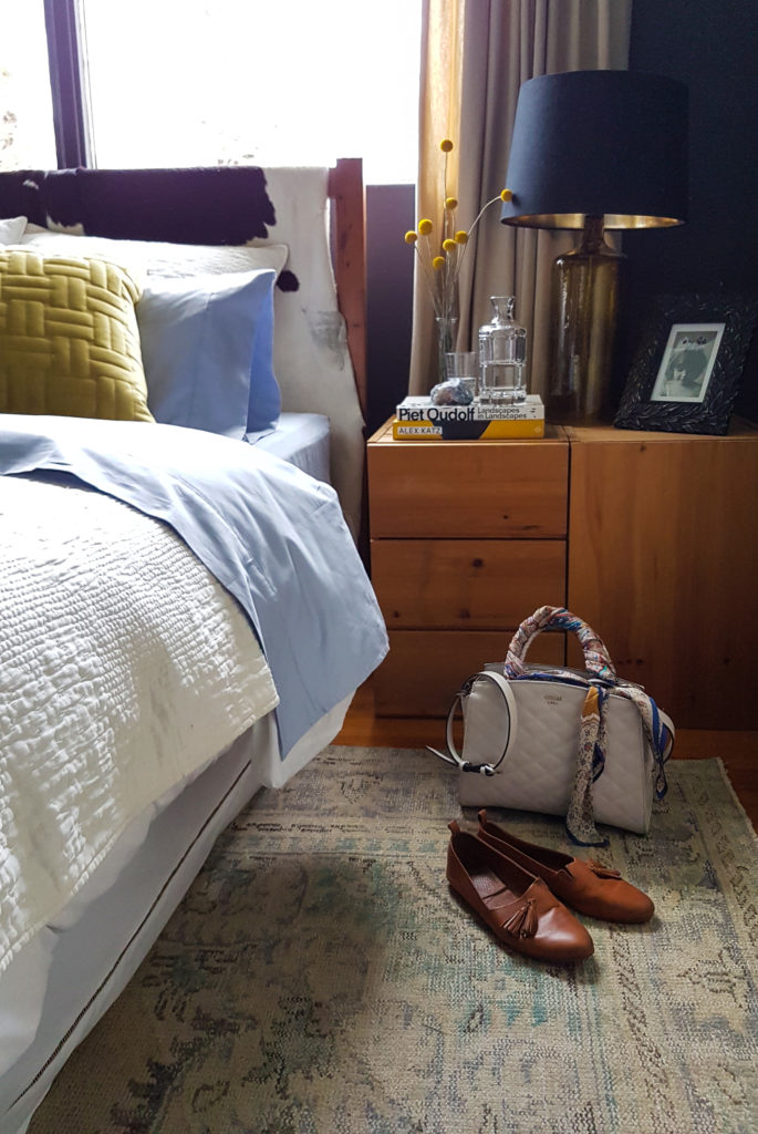
So the answer when you want to cool down a hot orange wood floor? A large rug of course!
I got this gorgeous one of a kind vintage neutral over dyed beauty from the Unique Rug Store. And did it ever elevate the feel of our bedroom! Even without black walls, this rug was an instant upgrade.
Over Dyed Vintage Rugs Available Here
Here is the image of the rug on the shop website below.
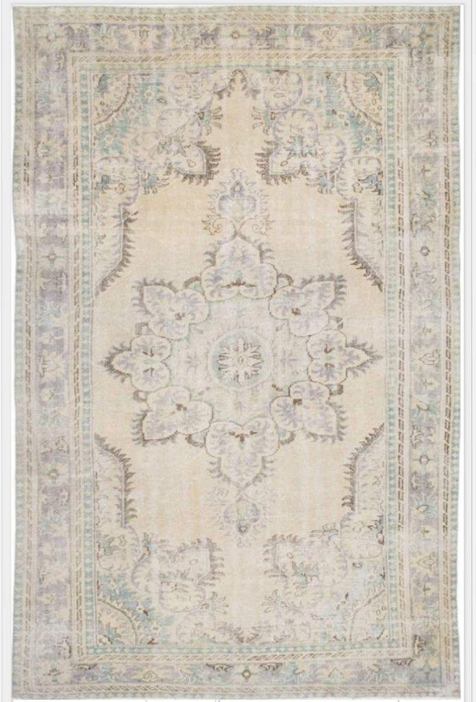
Neutral Over Dyed Vintage Rug (Similar Here)
I was happy to find that the blues in the pattern were more prominent than I expected, so clearly with this beauty, my room was not going to have the neutral tonal restraint of Mr. Mclure’s room (restraint is not really my thing anyway).
So I decided to work with the pretty purple blue in the rug as a jumping off point.
Purple and black can really be very heavy, but purples always look fresh and happy in the context of a garden inspired palette with fresh greens, so I began to get excited about bringing in more colour.
To create a good room, you need something that informs the colour to work from. Here’s what I started with:
- The area rug, which I ordered first. I didn’t make any firm decisions about the rest of the decor before it arrived (which was good, because once I saw it, I knew I wanted to work with periwinkle blue).
- My deep “black” walls concept. Not that it was necessary with this level of contrast (I could have gone straight black), but for fun, I pulled a soft black with a bit of purple to it for the walls, BM Almost Black 2130-30 (see my test board below).
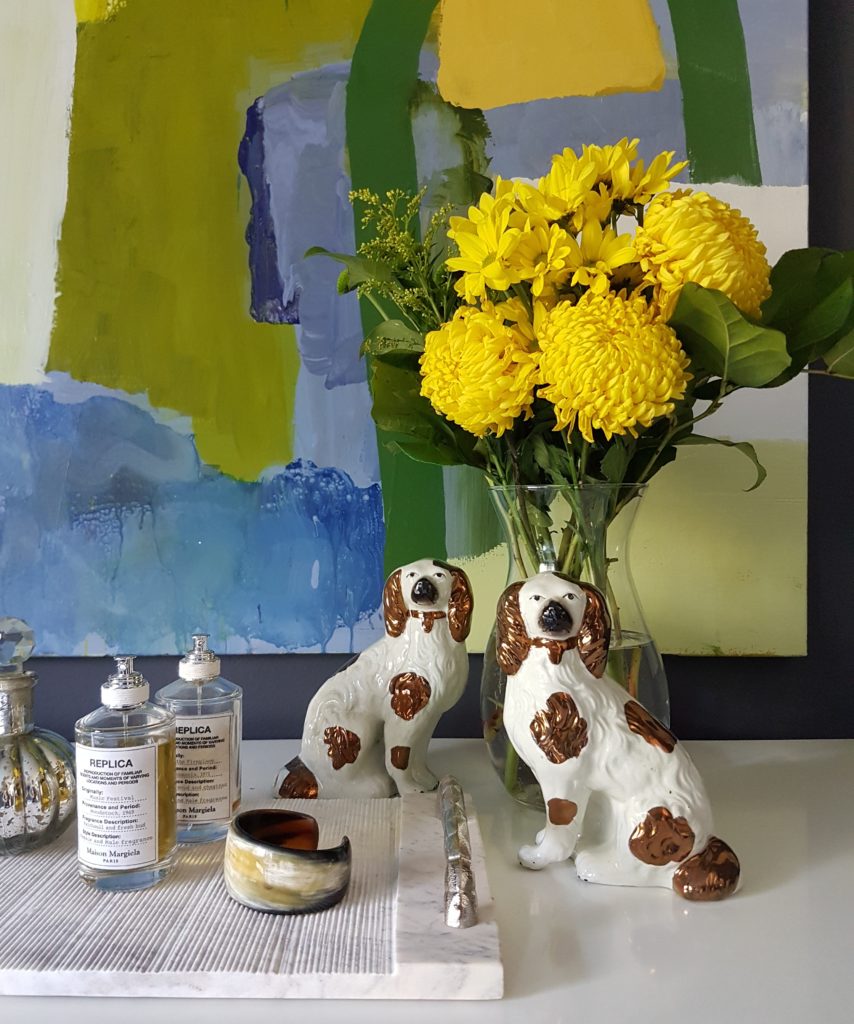
- My citrine glass lamps with black and gold shades. These were the most glam existing element in my room, and the goal was to bring the rest up to match.
- So overall, the main challenge was to create a more sophisticated and dramatic look.
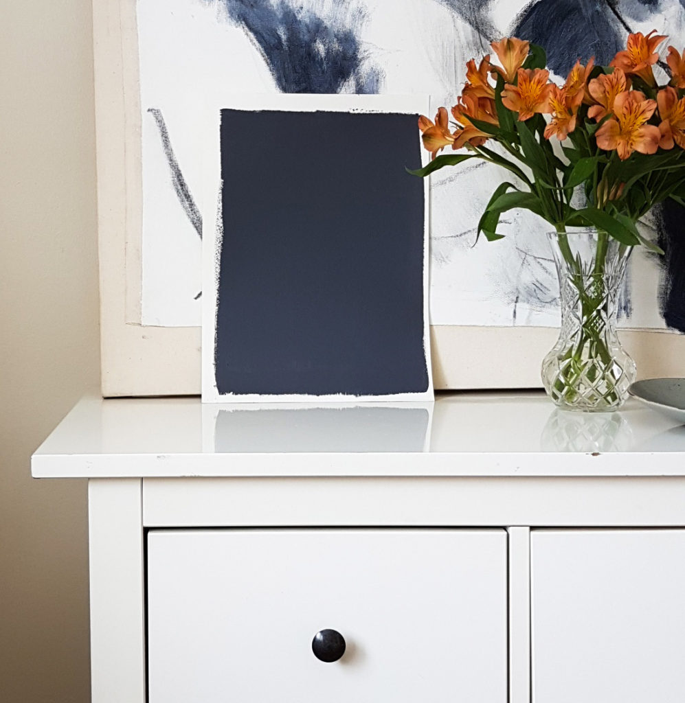
BM Almost Black 2130-30
I liked how the paint colour looked with the huge charcoal drawing, but in the end, I painted a new picture (one of the perks of being an artist, William McLure does it all the time 😉 with blues, purples, yellows and greens, because again, restraint isn’t my thing. If I had only put the citrine and blue on the bed and pillows, I think the colour would have been too bitty.
It’s important to repeat your main accent colours and art is a great way to do it. If you don’t want to try your hand at creating your own, I wrote a post on where to get some good art here.
So my Ikea furniture did not magically transform into gorgeous antiques, but the lovely new rug and dramatic almost black walls went a long way to creating a more sophisticated look I think.
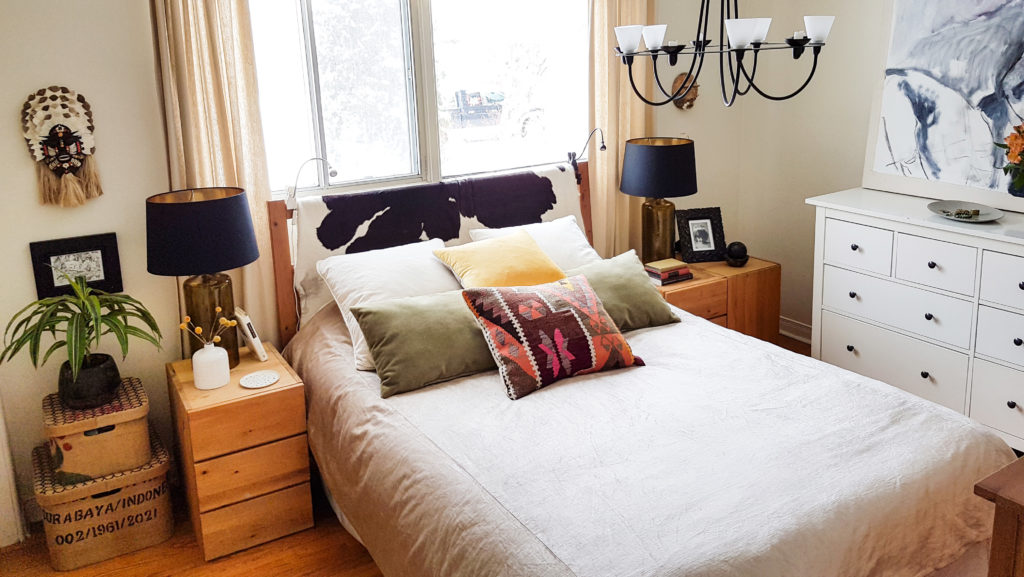
My Master Bedroom After
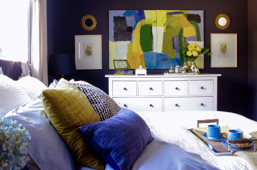
Bedroom After
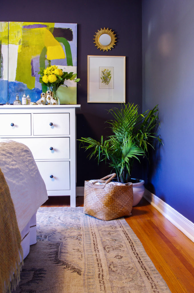
I picked up the two dandelion botanicals at the antiques market at High Point when I was there checking out the trends with Maria in the Spring, and I just think they’re so fun. It’s a good idea to have some old, storied pieces in a room.
Bedroom After
I like how the pale beige of the rug and curtains keep the palette from looking too graphic above.
I saw so many rooms styled with Staffordshire dogs at High Point that I ordered myself a pretty little antique pair from Etsy. Aren’t they cute? I have a busy pair of real spaniels, so these really speak to me 😉
Here’s one of my pet spaniels, Stanley, looking confused and hoping for a treat for this good behavior 😉 (Getting both of them to pose would be utter chaos haha).
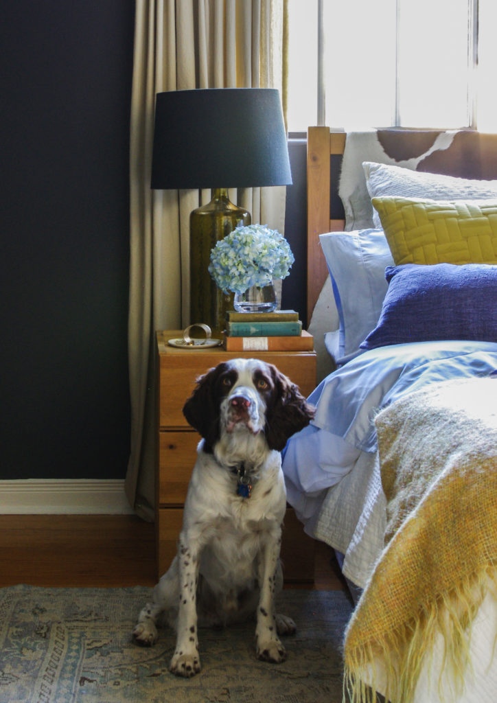
Stanley my English Springer Spaniel
I am very pleased with the way the room turned out. And for those of you who are wondering, the black walls don’t make this room feel cavernous and dark at all.
A common objection when introducing dramatic colours like this is ‘Won’t it make the room feel small?’ but you’ll notice that the corners even seem to disappear! And the light and bright curtains, dresser, bedding, art and rug, the room, which is East facing, feels very cheery and bright, especially early in the day. I kept the ceiling light which makes a difference too.
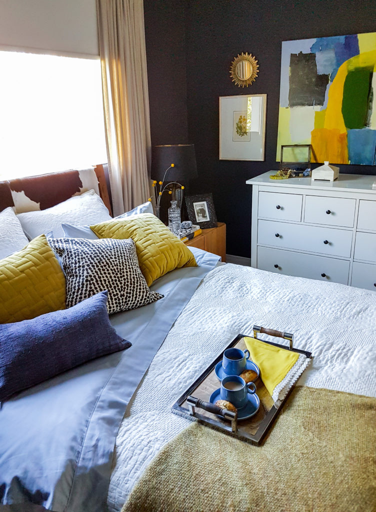
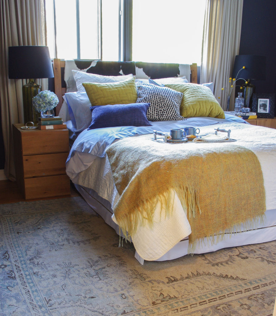
Tray, blue mugs, sheets and yellow pillows from Homesense, hand stitched matelasse from Pottery Barn (no longer available, similar here), black and white dot pillow and starburst mirrors, H&M Home
We now love to hang out in this room. It is so much prettier and the dark walls are really very soothing.
Bedroom After
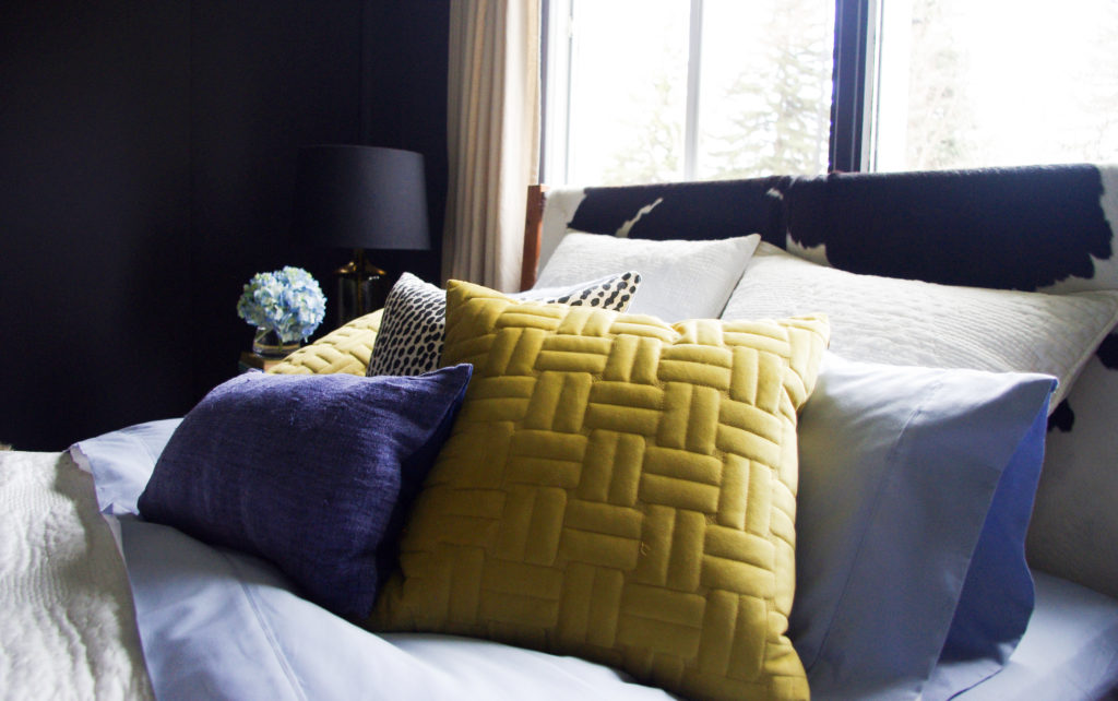
Some serious light and dark drama in this pillow-scape
Here’s the before again:
And here’s the after:
Bedroom After
So what do you all think? Would you be willing to go this dark on your walls?
Thanks Tricia for this fabulous and colourful before and after!
If you would like help creating a new look for your room, check out our eDesign consultations here.
This post is sponsored by Unique Rug Store all opinions are my own.
Related posts:
How to Work with Bedroom Carpet You Don’t Like
How to Specify Colour for a Bedroom and a Closet!


Holy cow! It’s gorgeous, love it!!! (And I appreciate the descriptions you offer for why you chose what you chose, the order in which you chose and how your new art was essential!) Brava!!
I love it!
Our master bath is papered in black with an all-over dogwood pattern which does lighten it up, but I never tire of the black.
Your bedroom is very appealing!
Dogwoods??? Photos please!
Beautiful!!
Absolutely love the dark walls!!! I wish I could be brave enough to go darker than LRV 50!!! You are truly inspirational Tricia!
Also, love the doggie statues and your doggie! I have a German Shepherd and paintings all over my home from art teachers at my schools! Another great way to add color!
Good job Tricia!
That looks sharp! Nice job and loved all the explanation and details.
I painted my small laundry room BM Caponata. The floor is vinyl with white, gray blue, and the deep Caponata color. I have a small cabinet (also white) and wash sink with a formica countertop that is speckled the gray blue and Caponata. Cabinets are white and I did a gallery using black and gold frames, white mats, with black and white family pictures. The room was originally painted a muddy olive brown color that related to nothing. The floor and counter looks so much better and lighter. I now enjoy being in that room and it absolutely feels larger with the dark color. Depending on the time of day, at a glance, the room reads black. The corners do fade away.
You go Tricia! I love that you went bold….especially in the master bedroom. This is an incredible transformation and worthy of a magazine shoot. Thank you for opening your home to all of us and showing what is possible. I love your style.
Great transformation, Tricia. ❤️
Completely delicious! That rug is a sensational game changer and the walls are perfect.
I love this room. I’ve recently painted my dining room and office (different house) very dark navy. The dining room has lots of black in the navy. People are so surprised walking in these rooms but soon love it. Your right when you say lots of white in decor & the warmth of wood tones are needed in with very deep dark wall colors . I’ve also found old gold stands out beautifully.
What an incredible makeover! I LOVE it all! Somehow the room feels fresh and filled with light… and yet soothing and calming at the same time. It also feels more together and flows so beautifully which seems peaceful. I love the way the greens play with it all. Delightful!
Cindy
You are helping me so much! I love your “after” – it certainly has more weight and substance than the light colored before. I’ve got that McClure bedroom pinned too, love its vibe. We recently moved and renovated the main spaces which are gloriously light and bright – renovations stopped at the hallway to private quarters and as I’ve recovered from Renovation Phase 1 I’ve begun to ponder just how I want my bedroom to feel. My pin board is titled Calm Bedrooom which is the main goal (shhh! quiet!) , but I haven’t decided yet about paint… dark or light? My bed is centered on a huge plate glass window that goes wall to wall on one side, and the room also has 2 closets and 2 doors, so I’ve mainly feared that dark will appear too chopped up. All the moody dark bedrooms seem to have large solid walls behind their bed. Yet light walls seem to lack substance – the current 80’s beige wallpaper is of course ugly but also bland as oatmeal even though it has an acceptable yellow undertone that works with what I have in there.
All this to say, thank you for showing me what dark walls with a large window behind the bed looks like in real life!! I’m getting closer to at least wanting to test dark paint.
Love, love, love
That’s it. I’ve been toying with the idea of dark navy walls and this convinced me! Gentlemans Gray it is! Thank you!!
The bedroom looks great. Periwinkle, yellow, and black are ALL longtime favorites of mine, but I’d never thought of putting them together, especially with such dark walls. I’m inspired!
Love it !
This post is so helpful because it includes great process descriptions. Hearing how someone else has thought through the various issues gives us a template for working through the issues in our own rooms. I would never go black, but painting my bedroom walls a darker blue might look really pretty.
Thanks for a great post!
Great job! It looks like the perfect place to curl up and sleep. I love dark rooms that are done appropriately. Dining rooms and powder rooms are other rooms that can be fun in dark colors (if not an open concept floor plan). Why not dress up your IKEA dresser? There are easy hacks (just google IKEA dresser hacks) and check out myoverlays.com.
Lovely transformation and thanks for walking us through each step. You are amazing! I used Ben Moore Wrought Iron in my daughter’s room and its stunning. The only recommendation I would make is to use a satin finish. The matte walls scuff too easily. I’m considering having the room repainted.
What a great transformation! I think the wall color nicely complements the orange tone floors, and the rug is beautiful. The great thing about that ikea furniture, is that you can paint or stain it if you want a more antique look. My daughter has the same bed In her college apartment and we upholstered the whole thing in a dark green/grey. It’s quite sophisticated, and it didn’t cost much at all (half off fabric and some batting and foam that I also used a coupon to buy).
Thanks for experimenting on your house! It’s a great example to show that darks really do recede and make a great backdrop.
Also I love your abstract art. I think you’re very good at restraint in your painting!
Absolutely gorgeous and very inspiring! I LOVE the dark walls.
Yay Tricia! You nailed it.
Absolutely stunning! I have always loved yellow and blue. The warmth of the sun and the cool refreshing water. I can’t believe how much I love the dark walls. Well done as always Tricia ❤️
Tricia what a beautiful room! You really knocked it out of the ballpark! I loved reading all of your thought proceses. I absolutely love your color combinatios and the green gives it life. Your painting was your inspirational starting point and it all came together beautifully. I finally painted and wallpapered my family room fireplace and bookcase wall a colbalt blue with a lot of white accessories and pops of green. My family doubted that it was going to work but now love it! Ya just have to go bold sometimes!
Great inspirational article and love your dog. He adds a special layer to the room!
I especially love very dark walls. One of my bedrooms is painted navy & it’s my favorite room in my house. After it was painted, I wanted to paint the rest of my rooms navy. I live with a very open floor plan also. Even my bedrooms extend off the living areas. But my husband wasn’t on board. ?
Your new bedroom is stunning!
Tricia, I love your posts! Your good eye and good taste go without saying, so what I want to point out at the moment is your (as Dave Ramsey would say) heart of a teacher. You explain things!! And you do it well and clearly, so it makes sense. While reading, I’m like, “Ah, yes. Of course. I see that.” Maria is the same way in her posts. A teacher loves to learn and loves to share what was learned for the benefit of others, and you’re both that way, and I love it! (I have the heart of a teacher, too!) I’ve learned so much from this blog and I’m still learning. Thank you both for sharing beauty with the world. It’s spreading! =D
I would never have considered it until seeing your great results. It may not be worth the energy if planning to replace, but some kind of paint treatment for the side tables?
Such a great article! When I’m pulling a room together I love to start with a rug, or artwork, and pull the colors from that. Nicely done! Love it!
Tricia, it is GORGEOUS!!!
Lovely. Have done black in the past and would do again. Feeling a little more accessible (as in SW Accessible Beige) these days, but would definitely do black again.
Wonderful upgrade as love many of your chosen elements. That stated; you are much braver than I to paint your walls black however one my favourite rooms in my home is a ‘true’ Navy Blue as I had the BM colour tweaked so much to disguise the purple undertone, that I could not tell you what the final formula ended up as … :). -Brenda-
I think this is a stunning transformation ! I really like that you worked with the furniture you had and added new fun accents ( glad staffirdshire dogs are back again always loved them)and that gorgeous rug . The fact that your black has that purple blue is perfect ! Very Nice I live that as you said the corners disappear.
YAY! Looks wonderful. As some of us have said here – dark can work (the woman who had dark blue bedrooms in two different homes). The rug is so lovely too. I am trying to add in a rug to a space which is fun ( the toothfairy still visits right 😉 )You are into mcm if I recall.. maybe a vintage walnut bedroom suite will come available near you 🙂
I think she is a magician of color. It is a stunning bedroom. I like very much that she is also concerned about his husband for “masculine feel”. 🙂 She used dark color very well. Because everyone prefers bright color. I think she has defined a new palette. I love it.
LOVE it! What is the material of the periwinkle pillow – seemed like it was not mentioned in your source lists.
Thanks!
Hi Sarah, if you mean the light periwinkle, that is the sheet set from Homesense. The deep blue pillow is from Thailand via Etsy 🙂
Is there a reason your bed is in front of the windows? The bed should be on the longest unbroken (meaning no windows) wall!
Major design rule for furniture placement in bedrooms.
Love it, especially that you worked with existing IKEA furniture – makes it feel very attainable. Where did you get the yellow billy ball dried flowers? I’ve been trying to find a source for years!
By the way I want the dried flowers for my bathroom, which is painted navy blue 🙂
I like this transformation. I actually went through the same process with my small bedroom 3 years ago. I had cream walls, which were starting to feel boring and drab. So I painted them Moscow Midnight by Sherwin Williams. People always say don’t paint small rooms dark or advise painting just one wall. But I love my tiny dark midnight blue cocoon.
This is a stunning, interesting, and creative transformation! What I couldn’t tell is did you paint the ceiling? Do you recommend it with such a dark and dramatic paint color?