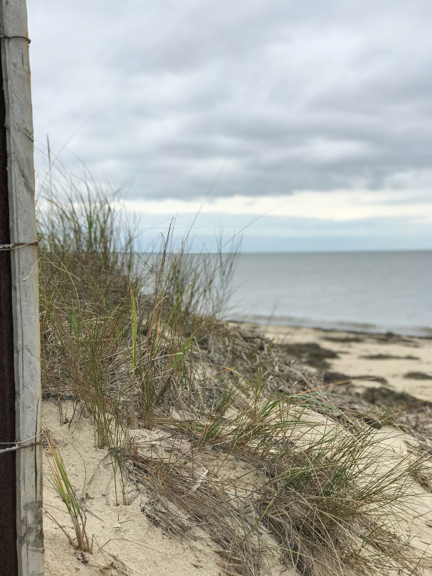
 At the beach just outside of Provincetown
Until you travel somewhere, what people say or the photos you see about any city or place doesn’t really land until you see it for yourself. After our Atlanta course, we flew to Boston for the next one, but we had a four day weekend in between.

Terreeia (pronounced Maria with a T) and Maria
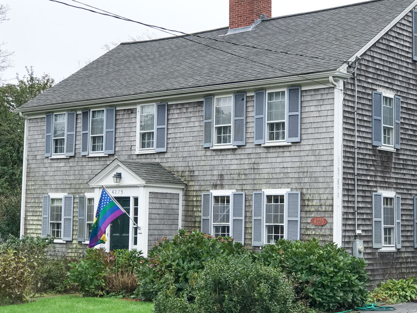
On Sunday, Terreeia and I rented a car and drove up to Cape Cod. I was completely enchanted by the homes and how they all had a similar look and feel.
When I asked my Boston class why the homes are mostly weathered shingles with one side painted, they told me that the paint doesn’t last long in the salt air which is why many of the fronts of the homes are painted but the other three sides are left untreated.
Then one of my followers on Instagram posted this comment on one of the exterior photos:
“I had to choose new natural cedar shingles for my cottage in Maine. It was really difficult to pick a roof shingle before they had weathered. Straight gray had too much blue undertone in it, so I went with a brown/gray -hope it will turn out to be the right choice!”
I always assumed that cedar shakes or shingles weathered the same neutral shade, which in my system is a green grey. I didn’t know you could choose which neutral you wanted and end up with taupe for example, like the comment above.
If anyone has any more information on this, please post a link in the comments, I tried searching online but couldn’t find anything useful.
Here are some lessons I learned about Cape Cod colours and architecture:
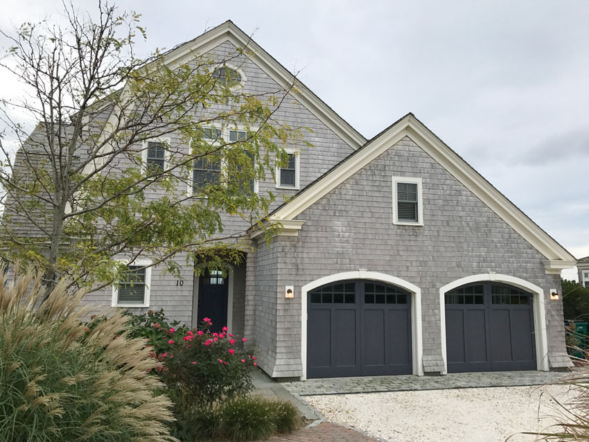
If your trim is white, it looks the best when it relates to the clamshell driveways
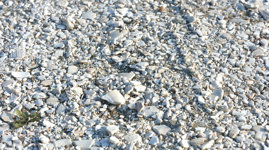
Until I walked up close to look at the creamy driveways that were everywhere, I thought it was some kind of pea gravel. It’s clamshells (below). In the pretty house (above) with the purple door and garage doors, all the trim should have been the cream or yellow beige fascia colour as well, which relates to the driveway.
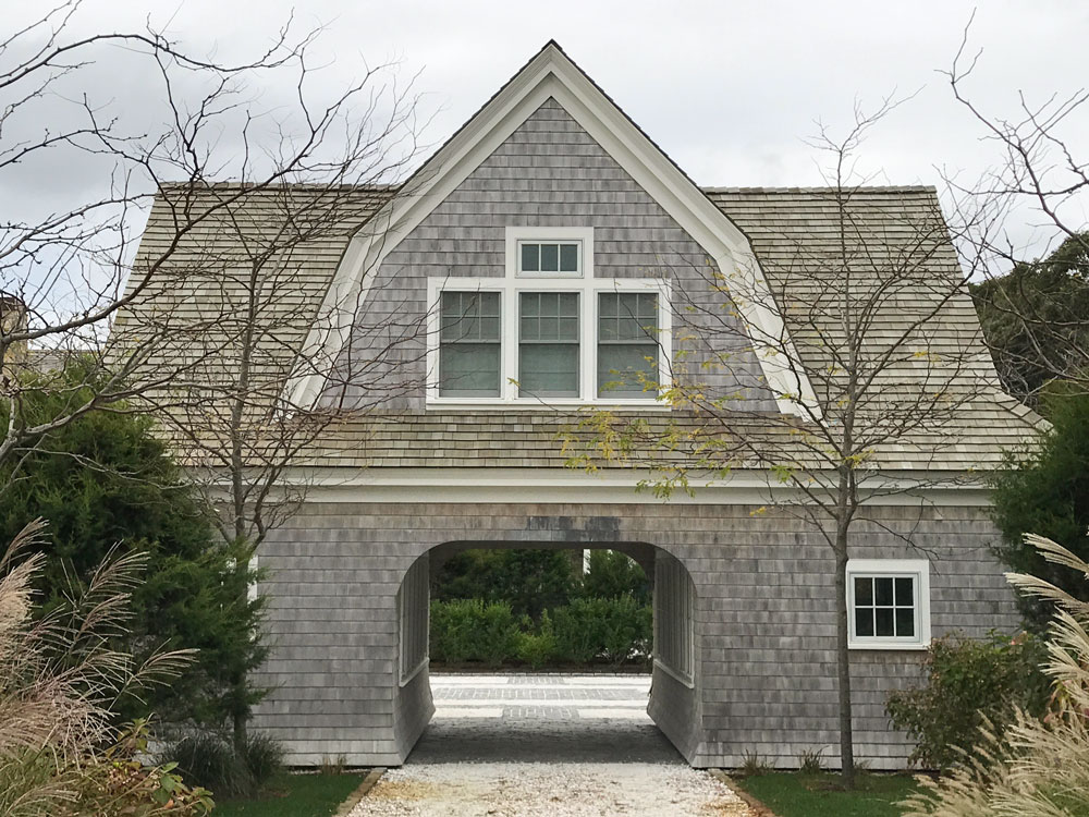
This was the guesthouse (below) which was on the same property as the house above.
Sure enough, the green beige shake roof certainly hasn’t weathered to the same colour as the singles which look more violet grey here.
Paint your door and shutters the same happy colour
I have always thought that a white house with shutters painted any other colour but black looks more like “We couldn’t afford to paint our house so we painted the shutters instead”. However, on this style of home because it looks like a cottage, it’s totally charming.
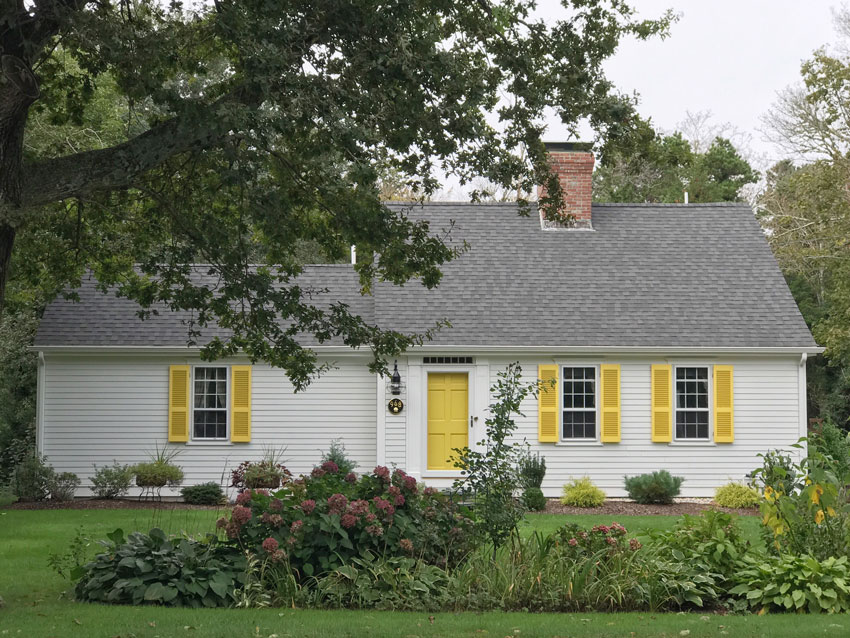
Shutters look the best on narrow, skinny windows
One of the reasons the shutters are so pretty on Cape Cod homes is because they look like they can close over the windows.
If you are looking at your house and something bothers you about it, it could be that your windows are too wide and shutters are completely unnecessary.
In the house above, since there is only one wide window, it would have looked awkward to not repeat the shutters, however, they look way better on the smaller windows.
There are certainly exceptions to this rule, but it’s a case by case, custom situation. Often when Tricia and I send out our exterior eDesign recommendations, one suggestion we will make is to remove the shutters if the windows are just too wide.
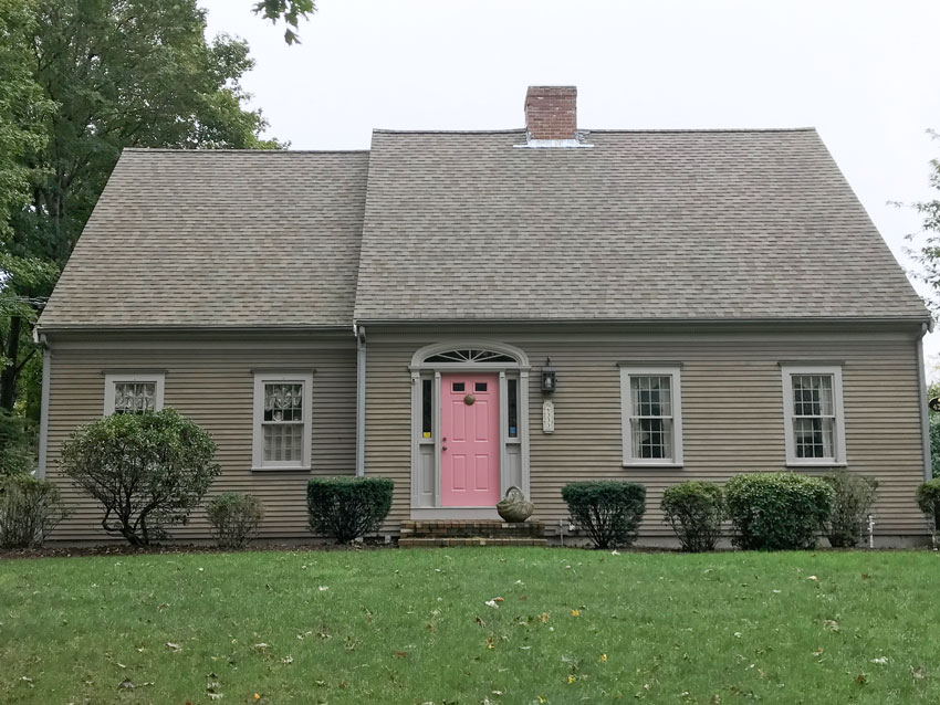
Front Doors can be a cleaner colour than usual and it still works
One of the huge distinctions that my True Colour Experts learn in my colour workshops is to be able to see a clean and dirty colour combination.
Understanding colour is equally as important as understanding neutrals.
The pink door combined with the siding colour in the house above would normally be considered a clean and dirty colour combination but I think here it works.
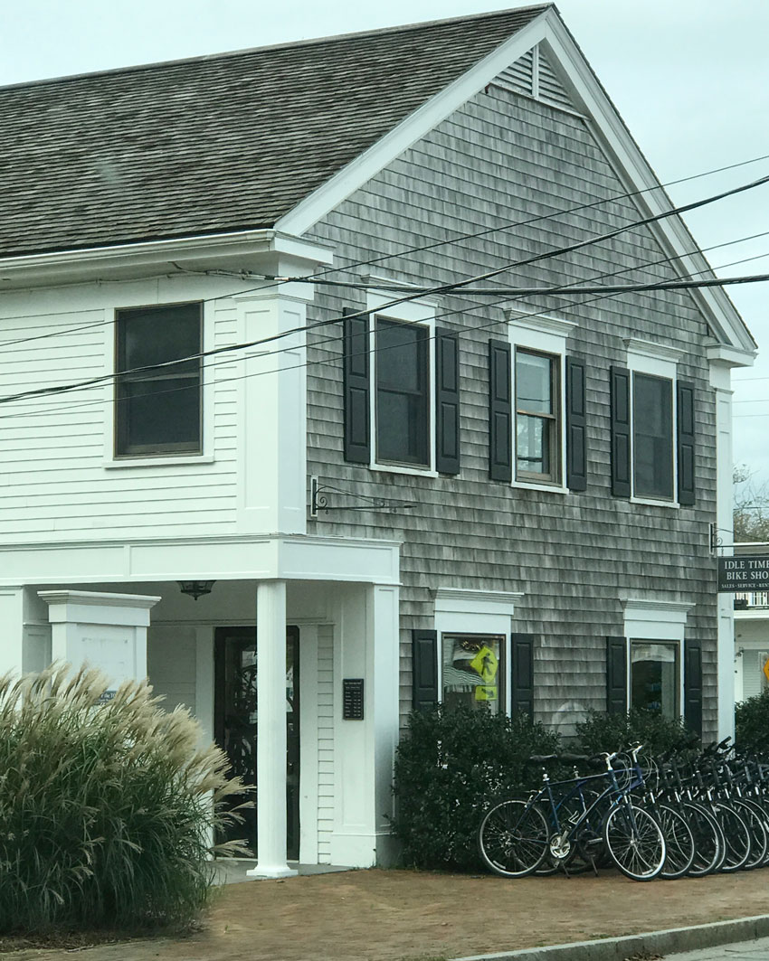
Here’s an example of weathered shingles on one side and painted siding on another side (above).

Don’t be afraid to paint your house a colour
How fabulous is this pink house with the grey roof (above)? Colour is way more classic and timeless than the trendy neutral of the moment.
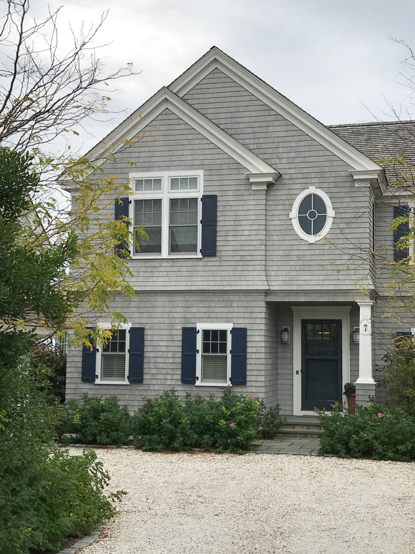
Compare undertones and you’ll see them easier
What are the undertones in the shutters and siding (above)? So much easier to see them when they are together.
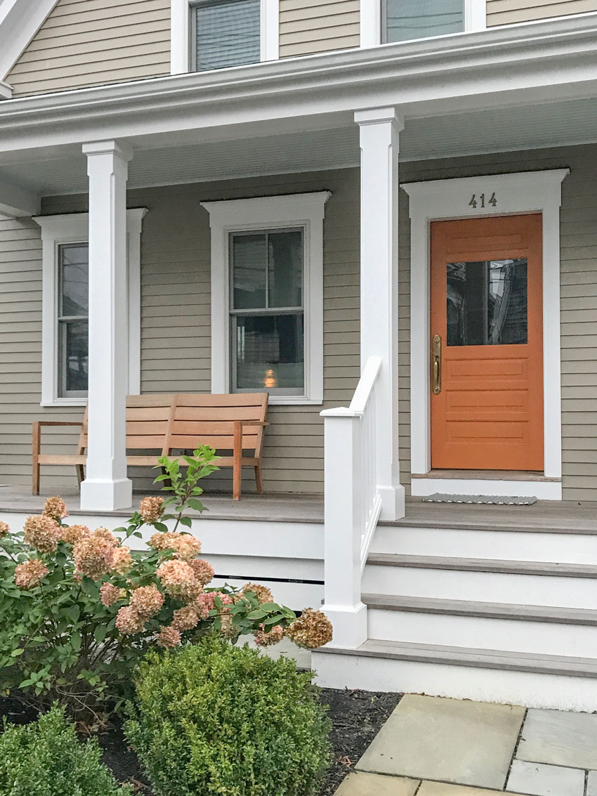
Paint your front door an accent colour
Most people in the cape had a front door painted in a great colour! I love the way this orange door relates to the fading hydrangeas and the bench on the porch.
My front door Pinterest board will give you lots of inspiration or you can simply purchase a front door eDesign consultation here.
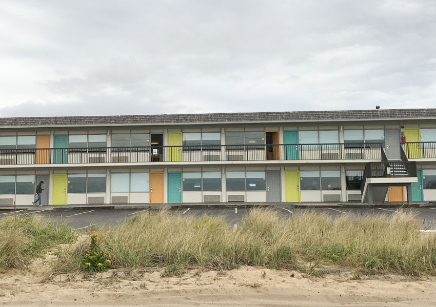
Here’s a motel which has come to life with alternating colours on the doors (below).
Hope you liked my tour of the Cape!
Here are some pictures from my Specify Colour with Confidence event in Boston last week:


Diane Lupo
This is Diane Lupo (above), the grand prize winner of a seat in one of my courses who we flew in from Chicago! This prize was one of my 50 prizes for turning 50 giveaway I had in June.

The Boston Class
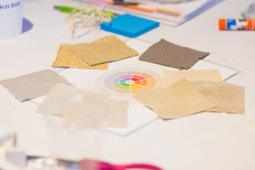
Nine neutral undertones in fabrics!

Class photos by Caroline at KLAAR Photography in Boston
Karen T sent this note after the course:
Just wanted to say ‘’Thank You” for a fun and information packed three days. I learned so much and will start to review everything all over again as there was so much information and lots to absorb.
The seminar was very well run, fast paced and always interesting! Loved the stories and examples that helped me ‘’see’’ the undertones, recognize how many bad decorating choices there are out there that will really help in my upcoming renovation.
There’s one seat left in my second Vancouver course coming up in two weeks and lots of seats in LA. We will not be back in Los Angeles so now is the time to attend if you don’t want to fly to another course.
Have a great week everyone!
Related posts:
1o Best Front Door Colours for your House
The Best Way to Choose a Front Door Colour from Palm Springs
Exterior Consultation with Orange Stone and Brick; Before & After


I am so glad that you enjoyed your long weekend in New England.
My Yankee grandfather always told us that only one side is painted on many of the old houses because paint was expensive. The original owners painted the front facing side to make a good impression. (My 17th century home was white on the front, white cedar shingles elsewhere).
Oh, and no one ever drives “up” to the Cape. Maybe “out” to the Cape, or drives to the Cape.
Hi BillP – A native New Englander myself, I grew up on the North Shore of Boston not too far from Cape Ann. There are homes and cemeteries in my hometown that date back to before the American Revolution. Typically, more expensive and formal clapboards were used on the front facades and were painted. Cheaper and less formal white cedar shingles were used on the other three sides and allowed to weather naturally. It was all about Yankee frugality and keeping costs down. Maria’s 9th photo (the one with all the bicycles in the rack) illustrates this perfectly.
Hi Maria,
I’m a transplanted New Englander now living in southern California–still missing the distinctive architectural styles and clapboard and shingles. Your pictures show some good examples of the local architecture. You even demonstrated how the reveal on the clapboard effects the overall appearance. We were always told the weathering of shingles depended upon several factors–the type of shingle, the treatment applied (if any), and of course, the weather–seaside or inland– shingles on the Cape, Nantucket and Martha’s Vineyard appear to have been painted with the same “brush”. I found this article that may explain. P-town and the Cape is lovely this time of year, happy you enjoyed it.
https://www.thisoldhouse.com/ideas/selecting-cedar-shingle
I’ve read that Western Red Cedar is favoured over Eastern White Cedar for it’s ability to weather the elements – although maybe not so much the second growth cedar that we buy now. I think its most common application is roofs, although you do see the exterior of some homes clad with this cedar. I have seen unstained, Western Red Cedar ‘greyed out’ but I recall it being a bit more of a brownish gray and not as uniform and silvery as the cedar clad homes in the Maritimes of Canada or the eastern United States, which is probably Eastern White Cedar.
The one house with two different shingle colours does look like it has WRC on the roof, but not below – maybe that’s the white cedar.
Firstly thank you for explaining how to pronounce Terreeia! And hello Terreeia!
In Australia we don’t have shutters on many places and they often look out of place. As you pointed out, shutters need to at least look functional and that they will fit over the window. I believe they work on the bigger window as it is made up of two smaller windows and the shutters could be double stacked when open. The proportions work.
I am looking to paint my new front door to draw attention away from my old front door in a new renovation. The contrast of clean and dirty colours works in this situation as it is something you want to draw attention to. If it was an awning or gable end, something you don’t necessarily want to have the full focus on, then it looks odd.
And is ot a purple grey in the shutters and siding picture? How I wish your colours course could be online(understandable that its not due to screen variations) or via mail!
Maria ~ I am so glad you finally made it to New England! The architecture is charming. While I lived there I learned so many terms: Federal Front, Gambrel Cape, Garrison Front, Dutch Colonial, Salt Box, dormer or shed dormer, etc. I did learn that cedar is referred to as shingles for the roof and shakes for the siding. They are actually a different thickness. The cedar roof shingles need to be thicker. They will weather differently depending on how close you are to the salt air. Thanks for all your beautiful photos. They made me homesick!
Come back and spend more time “down the Cape,” so much to see and do with great home decor shops, not to mention the wonderful people!
Maria, have you ever been to Charleston, South Carolina? If not, you must because it’s the ultimate in eye candy as far as both architecture and color! Go in late March or early April. I’d LOVE to see you do a post from there.
I have yet to go there, but I hear that’s true!
Maria you look fab in the picture of the Boston class! Love your color theory- I am always using it.
So glad to learn that your seminar in Boston was a success! Re cedar; from my own experience can vouch there is definitely a difference as to the colour it will age to, whether it be exposed to salt air or not. That said; not sure if the same type is used for shingles/siding but I have had new decking installed more than once and much prefer the (Canadian) ‘eastern white’ cedar (which is best decay resistant BTW) that turns to a beautiful bleached silver gray whereas IMHO that of the western red cedar appears lovely at first but unfortunately doesn’t take long to look shabby and old unless a finish is applied to it. -Brenda-
P.S.: Also, have to agree with the few other comments that if you were travelling from Boston, you would be geographically driving ‘down’ to the Cape. ☺
THanks this is a very helpful comment! Maria
At the beginning of the post, you suggested that the trim colour relate to the driveway.
Our friends from New England can answer this: does the sun and salt air bleach the clamshell driveways over time? (the trim may not match for long)
I find it strange that the trim would be painted the same colour as the driveway. Only on the Cape, I guess.
I don’t think that would be a rule to apply for every house, however, since the clamshells are ivory/cream, I liked that the trim colour was related. It doesn’t need to be yellow beige, but cream is better than stark white in this case. It’s just my opinion, doesn’t mean it’s right.
I saw many homes, and all the driveways were cream certainly not stark white, I’m guessing they weren’t all brand new. Thanks for your comment! Maria
Maria,. First I want to say that I am sorry that you have a lot of seats left in your LA course. I am calling everyone I know to tell them how important it is to take your course. After taking your course it was like the lights finally went on. As you know, I have been a designer for years but there certainly was a big hole in my understanding of color. I wish I coul somehow backup with the knowledge I now have. I would have been so much more confident and further ahead!!
I love all of your examples of Cape Cod houses! I have never been to the Cape so I never gave it a thought about how cedar ages in different undertones. So interesting and educational. I still don’t like that clean vs dirty pink door example LOL! As usual a very informative post!
I was the person who left that comment on your Instagram post about the shingles, so I will explain my dilemma further. I have new white unfinished cedar shingles on our guest cottage. I was picking roofing shingles (NOT natural cedar) and had a hard time because I wanted the roof shingles to go with the siding on the cottage once it had aged. My place is on the ocean in Maine and I spent a lot of time looking in the area at the color of aged cedar shingles and also different roofs people chose. Some shingles aged more silvery gray, some more brown. As others have noted, perhaps some are red cedar and others are white cedar. Also it depends on where the house is located in relation to the water and also sun exposure. (One side of the house can turn a different color from another side..). I have to say, there were a lot of bad roof choices out there…. I sampled a gray shingle (Certainteed Landmark Georgetown Gray) but it read too blue gray to me. I decided to split the difference and went with Certainteed Landmark Driftwood shingles because they contained both grays and browns. I hope the roof will look good with the cedar shingles once they have weathered, especially because I am getting ready to redo the main house, which will also be natural cedar shingles. I am planning on/hoping to use the same roof. It is particularly tricky to pick colors when one of the colors will be changing!
Hi Molly, thanks for clarifying, I appreciate your comment! I thought you were talking about a shingled roof as well! Maria
Hi Molly – Eastern white cedar is the wood species that will weather to a silvery gray. It’s a smaller (both in height and width) shingle and not very dimensionally stable – it will expand and contract and cup with the weather (even if stained or painted). For this reason, it’s installed with a reveal (how much of the shingle surface is exposed) of about no more than 5 inches and a spacing of about 1/8 inch between shingles. A shorter reveal means more product. These are the shingles that give you that coastal look and are found all along the Atlantic coast.
Cabot makes a bleaching oil that you can apply with a slight gray tint and bleaching agents to accelerate the weathering process. One major advantage to using the bleaching oil is a more consistent and uniform color all around the house – it gives you some control over mother nature. It also allows you achieve that weathered look in months not years. It’s not something you have to keep reapplying over the years – unless you want to. I went with eastern white cedar when I resided my home back in 2007. I opted for a factory applied opaque stain (shingles were sealed / stained on all sides at the factory). They are a Canadien brand called Maibec out of Quebec. I considered going all natural but the house is a 1935 Dutch Colonial located in Western NY state, and although I’m located about 10 miles from Lake Ontario, I felt a coastal look would look too contrived. I’m happy with my choice.
Western red cedar shingles are larger and more dimensionally stable. They can be installed with reveals as much as 10 to 12 inches. They can also be installed closer together (although they shouldn’t be butted up tight). In my opinion untreated (i.e., stained or painted or treated with wood preservative) red cedar shingles are not very attractive as they age. They often develop a black streaky appearance and are just plain ugly. Typically homes sided with western red cedar shingles are painted. This is what I ripped off my house when I resided.
Thanks for adding to this post with such a detailed explanation! It really makes the post so much better when my readers leave thoughtful comments like this and I so appreciate it! Maria
I’m still bummed that you didn’t make it to my house. You would have loved my yellow door. I’m glad you and Terreeia had beautiful weather and were able to get a visit to Provincetown. Wasn’t it such a fun town? Anyway, next time you make it out east you’ll have to make a stop at my house.
Maria, This makes me want to go “down” the cape! Love going to different areas and seeing all the different architecture. You’re so lucky that Teereria loves checking out homes and paint with you!
Love New England Shingle houses…that’s why we built one here on the coast in Delaware…We used white cedar shingles that grey out, as opposed to red cedar that turn brownish. We painted the front door Wythe blue-that went with the spa blue green awnings. After 5 years, I just changed out the awnings to sunbrella sky blue. Looking for a complementary color for the front door. Tried a couple of coral-orangey colors–complimentary color to blue……didn’t work–Any other ideas ? Right now it is still Wythe Blue.
Hi Maria,
I had to chuckle when I read your comment regarding colored shutters on white houses. I also had a preconceived notion about them. But when I would see them I thought, “Someone creative & colorful must live in that house.” Lol!
What wonderful pictures!
and thank you for explaining shutters a bit, i’m in a neighborhood of tiny cottage/ranch houses and some of the house shutters just “feel wrong” but i couldn’t pin point why.
I want to put shutters on my house some day however, i have hesitated because of the gut feeling i had as mentioned above. if i got shutters though, I’m pretty sure I’d want them functional for baseballs & tornado launched tree branches.
is there a ratio to shutters looking good? or is it just an eyeball/gut type of thing?
Not sure if someone has answered your question about the person with the Maine cottage. I think what she was saying is that she had re-shingled her cottage exterior walls with new cedar shakes and wondered if the roof tiles, which are synthetic, would be better in a blue-gray or gray-brown. I went through the same thing. I chose the same gray-brown (driftwood) roof color that she probably did. It doesn’t look good now, but I have seen a house where it looks good once the cedar shakes on the walls have silvered.
The yellow shutters are so happy. I had never thought of this combination. Thank you!