Years ago when I was just starting out as a brand new colour designer (back before I knew anything), I was standing in front of a totally white building, wondering which colour would make it look the best.
I vividly remember this moment because this is what I was thinking:
“I can’t wait until all the possible colours/colour combinations just flash inside my head like a movie.”

Twenty years and over 20,000 consultations later, that’s exactly how fast I am. And that’s exactly what happens in my head when I’m looking at any project.
During breaks at my Specify Colour with Confidence workshops, I consult with students, and usually in 5 minutes or often less, I know exactly what colour their exterior or the room in question should be painted. Or what colour the countertop and backsplash should be. Or what colour the floor tile should be.
Back when I was new, I had a conversation with a very wise and experienced colour designer who specialized in commercial exteriors. He flew all around the US because this was his niche.
He said no matter how quickly his team completed the clients colour scheme, he ALWAYS told his clients that it would take two weeks to complete their project.
Sometimes they would call the office, sure that the ONLY project he was working on was THEIRS.
He confided that people equated time with a better and more thorough colour specification. In fact, he advised me NEVER to take on last minute work for this very reason.

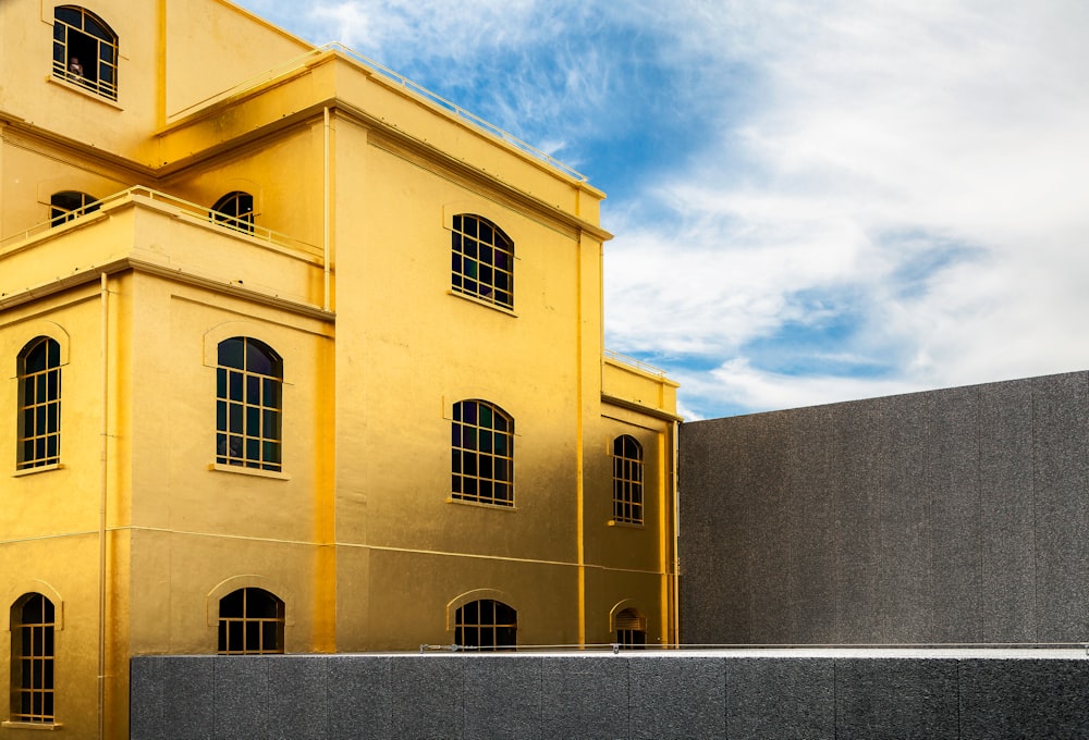
Image via Rakuten
In other words, the consumer seems to feel that a colourist should be paid for the TIME that it takes to complete a creative project.
And I’m here to tell you that is totally backwards.
Expertise is not the same as punching the clock. The faster and more experienced I am, the more expensive my time is.
Would you rather pay for a brand new designer to stumble around in the dark (in their head) for hours, days or weeks as they rack their brain, second guessing themselves, coming up with colour palettes for your house? Or do you want the colourist that has all the best possibilities already in their head and can tell you in 5 minutes flat what to do?
My favourite response is still this one, I mentioned here many years ago:
A designer friend charged $2,000 for a complete kitchen design. When a client asked how long it took, her response was “17 years and as long as it takes me”.
Recently we received this question from a reader:
I’ve been back and forth about purchasing an exterior paint consult because of a tight budget but I do want to get it right. . . so, what are the terms of the consult as far as, if I don’t like the selections that are recommended?
I have a specific color family that I want to use but I don’t understand undertones and it needs to work with the pavers in front and the roof, and give me the “feel” that I’m looking for. How much “back and forth” is incorporated into the consult?
If you’ve ever considered buying one of my eDesign consultations and wondered this very same thing, let me help clear this up right now:
The world is not your oyster when it comes to interior design or exterior colours.
Once you make one selection (for example granite or stone) and in the above example, she has pavers we need to work with, as well as the roof, you don’t have an endless number of options.
Therefore, all the ‘back and forth’ that you think might be necessary, is NOT necessary. Far from it.
Why?
Because based on your fixed elements, there might be one or two options that will be the very best (if you’re lucky you have 3 options but often that’s not the case). Every other choice after that will definitely not be as perfect as the first or second one.
I once had a designer in one of my events who, at the end of the third day, had this to say about my course:
“I choose exterior colour for subdivisions. Often I am working with bad exterior choices because the developer/builder got them on sale. I thought that if I came to your course, I would learn how to make most of those ugly finishes look pretty. What I’ve learned is that I maybe have one or two pretty combinations and ALL THE REST are UGLY.”

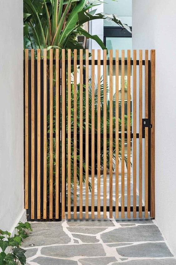
Photo by Maria Killam
Any of you who are required by your HOA to choose a combination of stone AND brick for the exterior of your home already know this to be true.
The home buyers who were first, got the choice of the best and prettiest combinations and you are left with the ‘not so pretty’ combinations because your house has to look different from theirs.
This leads me to the point of this post:
I recently received this email in response after one of my eDesign clients had received their colour specifications:
“I wonder if Maria ever truly laid eyes on my project. From the looks of her instagram stories she was out and about traveling, dining out, and hosting her color conference. It seems a bit odd that she had the time to sit down with my project.”
I really appreciated receiving this email because I’m quite sure there are other people who might have wondered the same thing.
I love my readers. Even when I sometimes choke on an email (above), that’s when I have the best opportunity to learn how to be even more clear on the copy on my shop page AND in my blog posts!
So first, what you don’t know, is that by breakfast (this is the part that doesn’t show up on my stories, and you should follow me my stories are fun :), I have already put in many hours of work which includes Skyping back and forth with my eDesign team (who are both ahead of me in my time zone). This is because I’m an early riser and because I can work anywhere my laptop is. And also, because I LOVE what I do.
I work exactly like this when I’m on vacation too. Like I will on my upcoming trip to Paris, Amsterdam and Finland coming up next month where I’ll be gone for 5 weeks. I don’t stop working. In fact it’s because I have my laptop with me that I am able to go away for that kind of vacation. And I do have a goal to go on a vacation without my laptop, but I’m not quite there yet.
And second, and this is the most important, there is not a single eDesign presentation that goes out without my input and approval.
This is MY REPUTATION on the line and there is NO WAY that I would send out designs that did not have my 100% approval.
My team works on the intake and presentation. THAT is what takes all the time.
Am I cutting and pasting images and writing the copy that goes into each presentation?
No, I am not.
But every colour comes from me.
And as you’ve just discovered, more time does not equal a more magical colour scheme.
And when you are good at something, you make it look so easy that people don’t think you’ve put in any effort.
Are there some projects that need more time from my entire team? Are there projects that I touch 3 or 4 times? Yes of course, however, as you’ll learn if you attended one of my workshops, there are a lot of projects where we are specifying the same colours over and over again so they are completed way faster.
What does that mean?
It means right now, the trend has moved to black and white so there are lots of presentations where we are specifying the same colours or whites OVER and OVER and OVER again. Because they work. Because they really are the best options. Because they are perfectly beautiful.
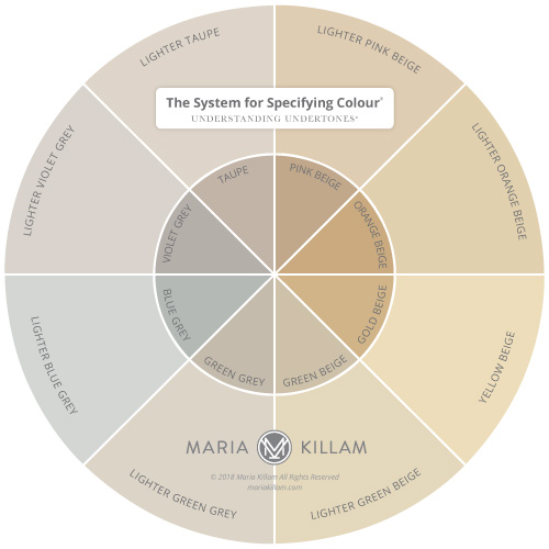
That’s why my System for Specifying colour (below) works so well. Because you only need the best and most useful colours in each undertone. And the list of most useful colours is very small indeed. You’ll find the list in my How to Choose Paint Colours ebook here.
And, if you’ve ever spent some time looking at a fan deck, you’ll see a lot of never-used and useless colours in them. Those are not the colours you’ll find in my system.
If we’re talking about exterior brick for example (I personally think brick looks best painted white or cream NOT a colour) there are probably 4 really good choices of white to cream. That’s it. And do you think we give them out to more than one person? You bet!
Read on, this next piece of my clients email fits into this perfectly:
“I could have spent 5 minutes on Pinterest with the exact same outcome for free.”
Yes of course you could have done that. But the difference between you and me is that you don’t know WHY that exact colour combination is the right choice for YOUR home.
Your intuition can’t tell you where the ‘You are here’, arrow is.
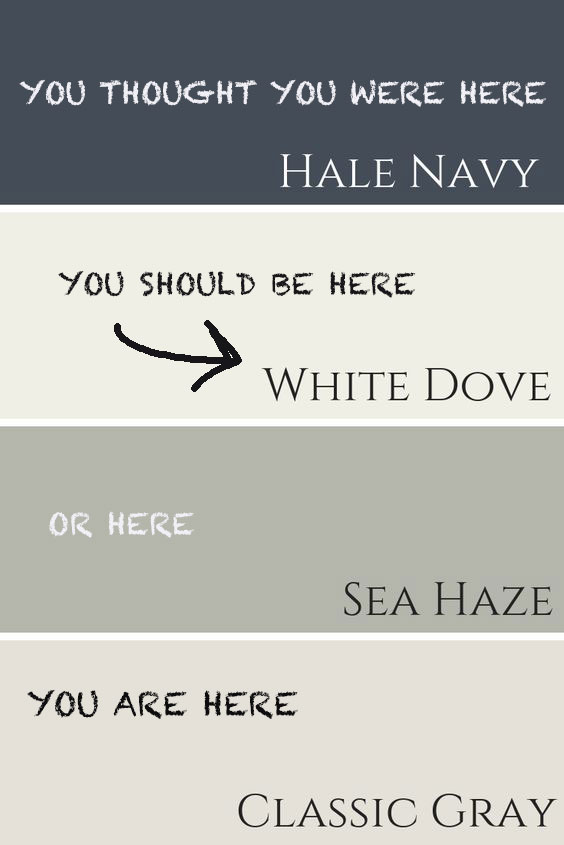
Image via Claire Jefford
If you had the “why” to be certain you had the RIGHT answer, you wouldn’t have hired me.
If you’ve ever consulted with me and I sent you a colour combination that simply validated what you were already thinking (in other words it was virtually the same), you might have thought “Well I could have done that myself!”, but here’s the difference:
I can tell you WHY my colour choice is the right one.
Armed with the answer to the question WHY the colour I’m specifying is the right one for YOUR home, you can confidently hire a painter and spend thousands and thousands of dollars painting the exterior or interior of your home.
That’s the reason why most of my Specify Colour with Confidence workshops are full or almost full (below).

Because designers come to my courses so they can get much faster, not to mention MUCH MORE ACCURATE, than they already are, at nailing the colour. Their intuition is often right (that’s how you know you should be a creative), but what you don’t have and what you need to learn is how to EXPLAIN why.
And here’s the worst part about not being able to explain WHY your colour specifications are right:
If you don’t know WHY your intuition is right, you lack conviction, and your client can take the entire project off the rails with their objections to your colour suggestions.
By the way, this last statement is not intended to offend anyone. If as the client, your ideas were always right, you wouldn’t have needed to hire a designer in the first place.
This is why the faster you learn to be ‘bossy but in a charming way‘ the more accurate you’ll be and the more money you’ll make or save.
One of the reasons homeowners/colour enthusiasts come to my courses is so they can stop making very expensive mistakes on their OWN home.
I have one client who I have worked with many times to help fix colour mistakes she has made on her home. Most recently I helped her with her brand new kitchen that ended up completely wrong. So wrong, that in order to fix it she would have to remove her brand new tile or leave the tile, and paint her cabinets, change the countertops and backsplash in order to make it work.
Had she simply hired me in advance of making the wrong choices or attended my workshop to learn how to do it herself, she would be WAY AHEAD and have saved thousands and thousands of dollars rather than ending up with a kitchen that bothers her every single day.
I consulted with another couple who had received three exterior colour combinations from their designer.
They were horrible. Which is why they hired me to help them.
I threw out all three of them and started again. See how bossy that was? This is exactly how you want to be with your clients. Experienced designers who have been in the business many years can relate to this.
Anyway, when they finally realized that their stone choice was the most important, the husband said “Neither our architect, our builder or our designer told us that we had to choose the stone first’.
Why?
Because they had no idea.
Which was obvious looking at the colour schemes this couple had received.
And in all fairness, colour theory training helps no one choose colour in the real world which is all you get in design school right?
Sometimes a reader or upset customer will send a message that is pure gold to me. I get a lesson on providing better ways to give service, I learn to share and teach with more insight and how to understand that if things are not spelled out, people will just make up things up! It helps me be more clear on my choices and why I make them – and most importantly if I make any mistakes that I own them and make it right.
My fall dates are up! I will be in Vancouver, Chicago, Boston, Denver and Orlando. Register here.
PS. We’re hiring! I’m looking for a Colour Designer and a Social Media Manager, go here to apply.
Related posts:
Learn to be Bossy Yet Charming


Brilliant post today Maria
One of the best posts you have ever written, and the hardest for many people to fully grasp.
The principles apply to all fields of endeavor, too. All.
Hi Maria ,
I am from Ireland .
I am choosing a Quartz for my kitchen work surface .
The only fixed item in the room is a Crema Marfil porcelain floor.
The options I have at the moment are Crema Marfil Quartz , Silestone snowy Ibiza , Silestone Lagoon or Silestone Jasmine .
I haven’t got a kitchen cabinet colour either. My kitchen designer thinks I should go a light green/ blue .
Please help
Thanks
Nicole
Whoot whoot. Keep it real.
I appreciate you.
Excellent post maria and so very true. Needed tobe said
It fills me with so much joy to see my painted house exterior, the colours are so perfect, so happy, and there’s no way I would have had this outcome if it weren’t for you!
Excellent post Maria.
Well that takes care of thattttt!!! lol
One of the better posts I’ve ever read. Confident, and right to the point. Love it. Perception and perspective are tricky words, huh? No better teacher than experience. “You can’t al-ways get what you wannttttt”….? comes to mind lol. Many times our choices are products of what we have to work with. Period. Thank you for yet another great instruction Maria. I’ve learned so much from you.
Absolutely love this post! You are so honest and direct! I wish I could clone you! Color is so important in every aspect of life from what clothes to wear to what color to paint your castle. You have a God given gift to be able to analyze colors and explain the why’s and wherefores. My biggest take away is that when certain colors work together you can use them over and over again without trying to reinvent the wheel. I get so inspired with each and every post that you write. This business is so wonderful because no matter how old you are or how much training you have, there is always something new to learn!
Thank you for taking the time to write this article. I agree with others, probably the best article you have ever written. You answered questions and gave examples that I’m sure many others have wondered about themselves. (Me included).
Thank you!
This is so well stated! It is so true of many professions. How many times have you gone to a doctor, and she/he spends less than 5 minutes looking in your throat and ears, etc, only to be told to go home and rest and drink plenty of fluids and take some ibuprofen? Your intuition, or your mom could have told you that for free, of course, but you are paying the doctor for all her/his years of experience and education to make sure that that advice was correct, and that you didn’t have something needing more serious intervention, etc. Same thing!
I started my color consulting business nine years ago and luckily found your blog around that time. You’ve been an enormous help to me, and a wonderful role model! Thanks a million!!! I have to laugh at this post because I too can find the best colors in five minutes. However, I give my clients a small range of options to use as comparisons because it makes them feel good to be part of the process. My business is only in person, so I do a lot of education, and by the end, they feel confident with the color scheme because I’ve explained why the other options don’t work. They frequently say they would have never chosen those colors, but see how perfect they are. I charge a flat fee, not by the hour, because I don’t mind spending the time to help them feel comfortable. My business is part-time, I’m mostly retired now. But I really enjoy helping people feel happy with their homes.
I cannot express how helpful this post is for me right now!! For 20 years I’ve been managing moves for seniors – helping downsize, move, and recreate a sense of home in smaller spaces. The experience I have brings the right results, and I can quickly size up their needs and wants. Your posts are always GREAT, and this one is particularly inspirational for me to communicate why I charge how I do and the benefit for my customer. Thank you thank you.
This reminds me of when I “matched” the tan grout for my ranch style home, instead of owning the pinkish brick. For years, I had to live in a pink house with yellow trim. ???
I absolutely love this post. The point is articulated so well, Maria. This is such a similar experience in the dental world. My husband, Dr. Dentist, has years and years of experience, knowledge, and expertise in dentistry. He is efficient, yet thorough, in his extractions, root canals and other procedures. When it comes time to pay the bill, a few patients have said “why is it so expensive? It only took him (this many) minutes to perform the treatment.” The team remains calm and professional and explain his years of experience and his thousands of procedures he has done over his 25 years of dentistry. Dr. Dentist and I laugh at home about it afterwards that he could have taken way longer with the needles, the injections, the pliers, the suturing, etc. TIME spent does not always equate to BETTER RESULT. Thanks for this reminder.
Thank you for this article, after years of following you I just purchased your Exterior pkg this April. I had “all” the thoughts and responses you covered here. First I thought I could’ve picked that myself on Pinterest. The truth is I have been looking on Pinterest for over a year and still couldn’t decide, this has delayed painting the house for a long time. You’re color options validated my choices even though you didn’t know them. Sometimes after searching and looking over and over and knowing the cost if you pick the “wrong” color can give you
“ Analysis paralysis.” I still have a few things to do before I paint ( new garage door, electrical for lighting..etc) but I will be sure to post the end results for all. I just want to thank you Maria & the Design team ( Tricia Firmaniuk) for the quick responses to my follow-up ques and for helping me to move forward on my project!
Second guessing is so frustrating and time-consuming. . .and then there are the repainting hours. This post is very direct and clear. Thanks for telling the story that you imagined when the colors would just flow into your head immediately. Practice and many consultations are what make people experts – not a single class or a single successful consult.
I had a color consultation with you that made my living room beautiful and more than that, the color shifts during the day which makes the room more interesting.
Yes, a great post! Explaining everything, the why’s and wherefore’s. You really are the best colour expert out there, no doubt about it. I just love reading your posts and learning from you, keep ‘em coming.
Hi, Maria….That person needs to take your course, then they could really see what a gem, you are! It’s easy to say, I could have picked that, after you tell them what is perfect for them. Well….Why didn’t they? Because they weren’t sure!!!!! You are worth your weight in gold!
Love you and all you do!! ❤❤❤
Awesome article!
Thank you!
Wow! Just a great post!!
Is it just me or do paint companies REALLY struggle with providing good color combos or even a decently “aesthetic” looking sample room photo in their materials? I love these companies… but just received some items in the mail… whew! …like NO WAY did I like one combination or one room! I want to say “What are you thinking?”! (note to big companies: HIRE Maria!)
Spot on post, Maria! Thank you, thank you. Just returned from your NJ workshop and it delivered above and beyond! Only wish I took it sooner in my career haha!! So much valuable information and career guidance from you and Tererria, this investment will pay for itself in no time. Keep up the good work!
Just saw photo with Michelle Obama. Lucky you! Will she use you for colors in their new home(s)
I hope so 🙂 Maria
Marie – I have been following your blog since the beginning and have been so happy for all your successes. I feel like we are friends. In reading this post I can see that not only are you successful and are great at what you do – but I sense that your EQ has evolved. Am I right? I know you’ve indicated before that you can be explosive but in reading this post you genuinely seem to be thankful for a question/comment that seems ‘off’ (to be polite here – I’m Canadian too afterall ;)). I really appreciated reading your take on how to accept these comments and turn them into a teachable moment. In short, you’re amazing Maria and it’s why I keep reading. Thank you.
Oh Maria, well said. Another post that spoke to me was, “Are you waiting for your paint color to propose?” More time, more money, more options, more opinions does not mean better. We have used your e-consults in the past and taken your advice (except backsplash). We recently moved and we are tackling major renovations ourselves. As in, I should have already consulted with you before we put in pavers and reconfigured our kitchen and put in new windows. All super expensive “mistakes.” Guess what? We are now backtracking. We have a problem of trying to save money, forgo our gut instinct on the right contractor and we pay for it. Every. Time. We are putting the breaks on and already trying to undo. How far in are we? About $100K and our kitchen isn’t even started, just the guts. Will we be happy yes…but these delays are due to us trying to manage it ourselves and making dumb mistakes along the way. Is it wise to save money? Yes. But you don’t spend tons of money on materials and labor WITHOUT an expert opinion. Thankfully, I have read every single blog post you have ever written. So our mistakes are not about the finishes, they are about trying to save money and not picking the right professional to do the job and then paying for it twice instead of using the “more expensive” guy in the first place. They are not more expensive when you have to redo the same project twice. Thankfully, we did hire a landscape designer. However, I have NOT consulted with you yet on exterior color which is our next move. I love you Maria!! And this is SO well said. I also think I would nail the 3rd remodel (won’t ever happen) but already in remodel #2 we are making similar mistakes. I will send you photos of our previous home you helped choose interior paint color, cabinet color and countertop color!
Saving this! Will definitely read it again and again for a good boost of confidence!
I have a very different job (pediatrician) and after many many years of experience, i can say the same thing. I know what the problem is usually in less than 5 min of walking into a room. I still get the story and do an exam to confirm I’ve got it right and am not missing anything, but experience counts for a lot even in my job. Being fast doesn’t mean careless or poor quality work, it usually means you know what you are doing;)
This is fascinating…your experience is opening doors for your readers/followers. And, basing color choices on the undertones is brilliant. I’ve been ‘stuck’ on deciding the ‘perfect’ basic color for interior rooms, because I know I it’s impossible to paint interiors my favorite color…PURPLE. When I consider undertones, it is CLEAR that lighter and darker VIOLET GREY will be perfect for my master bedroom. Now, to decide my guest room and living room….??? It won’t be nearly as hard, because they will be GREY with different undertones. THANK YOU. You’re article was amazing. If I were younger, I’d like to learn to work for you.
Great job Maria!