In some homes, warm green grey colours like Benjamin Moore Revere Pewter or Edgecomb Grey start to look a little purple. People want to blame the lighting, but more often it’s because you chose the wrong colour or the wrong neutral undertone. Let me explain.

Help! My Revere Pewter Cabinets Look Purple!
This is a great question that will help anyone who has had a similar issue with this popular green grey:
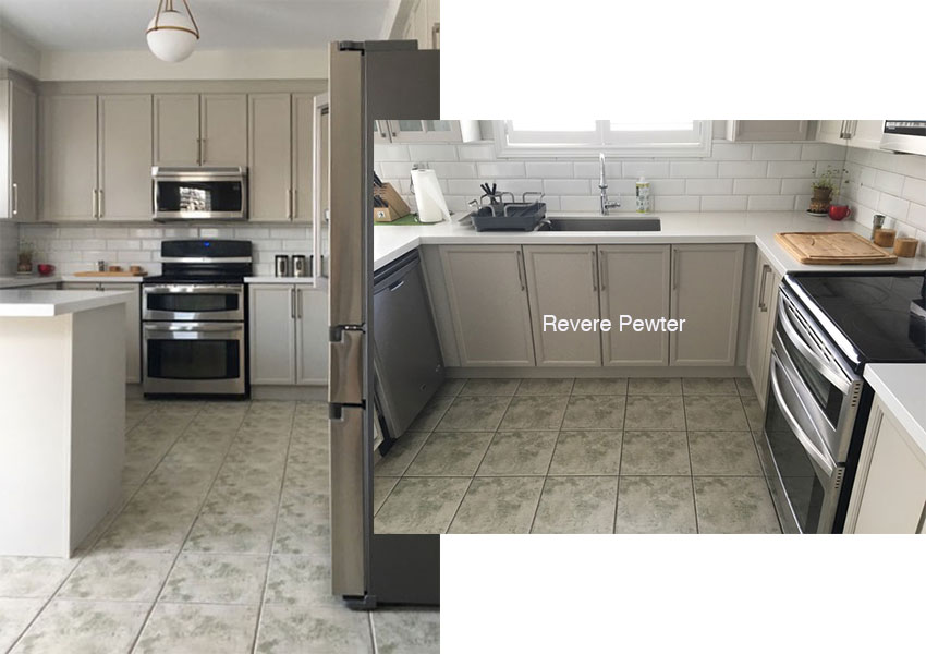
We’ve just had our kitchen cabinets professionally painted Revere Pewter. They colour matched it but I think it is not 100% identical, looks more pink than the BM paint swatch.
We have new Frosty Carrina countertops and white subway tiles. I was so looking forward to this change BUT now my cabinets look PURPLE. I am so disappointed.
The floor tiles are greenish and off white, walls are BM Classic Grey. The light bulb is LED 2700K. Thinking of trying 4000 or even 5000. The kitchen window faces west.
Does my white subway tiles make purple stand out more? Or the western light? Is there anything I can do except trying a cooler or whiter bulb? Please help!
Throughout the grey trend, I heard this a lot. That in some homes, warm green greys like BM Edgecomb Grey or Revere Pewter went purple. However, this is the first time I received the right photos, so I could explain visually, why this was happening
And everyone quickly blamed it on the lighting.
Let me be clear. Yes, of course there are times when the light changes the colour. However, usually the problem is not enough natural light (making a light colour look grey or dingy). Or reflections from outside at times of the day where the light comes in at strong angles. And yes, sometimes a wall colour can look quite different in natural vs. artificial light.
However, people generally give exposure too much credit for affecting paint colour. And, if you don’t understand undertones, there’s nowhere else to go, except to blame it on the lighting.
My System for Specifying Colour
When you learn my System for Specifying Colour, if you choose the correct neutral undertone to begin with, it should look right MOST of the time.
Then, if the light changes the colour for an hour or two, it’s no big deal.
But if you chose the wrong colour or the wrong neutral undertone, well that’s when, of course it will look wrong. ALL. THE. TIME.
Why?
Because you simply picked the wrong colour.
Not to be confused with the lighting.
I go into this in great depth in my Specify Colour with Confidence workshops.
How to compare colours.
Anyway, the reason this particular green grey undertone turns violet in a house with Tuscan finishes is because the neutrals in a Tuscan house were primarily undertones of gold beige, sage greens and pink beige (+ lots of Travertine). Therefore, if you attempt to introduce grey because ‘Dammit, you want to be current’… well, it’s not going to look right.
Here’s why. In the Tuscan trend, we were using a lot of beige. Technically (stay with me here), beiges are all quite yellow or “creamy.” My system was born when I distinguished the subtle undertones of different beiges, or yellow-based neutral paint colours. They are Pink Beige, Yellow Beige and Green Beige. But ALL beiges are more yellow than grey colours.
For example, the difference between a green beige and a green grey is technically how yellow vs. violet it is.
Manchester Tan (green beige) is more yellow than Edgecomb Gray (green grey) below. Are you still with me?
Manchester Tan {Green Beige} and Edgecomb Gray {Green Grey}
Grey paint colours are cooler, more shaded neutrals, and they have more prominent violet and blue undertones as compared to beiges. And they are comparatively less yellow.
Because remember, neutrals are neutral because they have ALL the primary colours mixed together in them, the difference is in the proportions.
I don’t want to get too technical here, so here is the takeaway. If you place a grey next to a beige, the grey will look relatively more blue or violet or too cool to relate.
A LOT of people painted their open floor plan Tuscan houses with the grey paint colours in warm undertones like Benjamin Moore Revere Pewter and Edgecomb Gray in an attempt to update them. And it worked in many cases, however, it was common to hear that these warm greys turned surprisingly purple or blue.
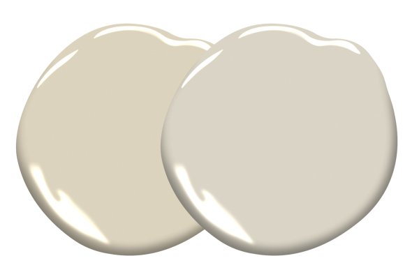
Baffin Island {Green Gold Beige} and Revere Pewter {Green Gray}
This is Benjamin Moore Baffin Island CC 270 (above left), a green gold beige, and Benjamin Moore Revere Pewter, a green grey (above right). See how the strong yellow and green undertones of Baffin Island make Revere look cool and almost lavender?
And below is Benjamin Moore Silver Dollar 1460, a very cool blue grey, and Revere Pewter (below). Here, Revere looks “warm” and even beige by comparison.
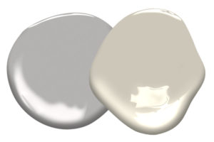
Silver Dollar {Cool Blue Grey} and Revere Pewter {Green Gray}
All this is to say, that in the context of warm beiges, even a warm grey can look too cool or purple (and a lot of people see pink in purple undertones since purple is made of red and blue).
And this is because colour behaves in relationship to the colours surrounding it. It will distinguish itself by its differences COMPARED to other colours.
This is why an expert knows you must always compare and test colour.
So when I saw her sage green floor tile, I was not surprised that Revere Pewter looked more violet than expected. Revere Pewter has a green undertone compared to other greys, but next to sage green it is not nearly as green.
Does all this make your head spin? That’s exactly why my System for Specifying Colour works so well. I have already curated the 50 neutrals you’ll need in all the 9 undertones in my Core Collection of large sample boards which you can purchase here.
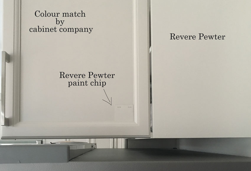
Anyway, first, let’s find out if the paint colour was in fact not perfectly matched.
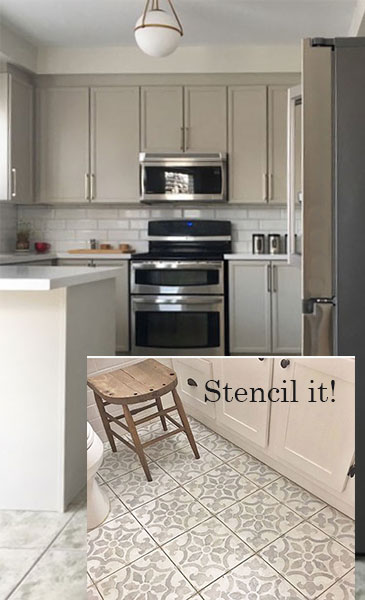
I asked my reader to take a paint chip and place it on the cabinet, but she took it a step further and took this photo which shows the boxes (that were painted DIY with actual Benjamin Moore Paint) and the doors, which were sprayed professionally with a colour match.
You can see that the door is slightly more violet than the actual paint colour. This doesn’t help at all when the colour was bound already to look more violet compared with the sage green floor tile.
Here’s the kitchen (below). You can see that the tile is more of a sage green and upon first glance it looks like it is green and cream.
However, when we photoshopped the cabinets on the right to a colour that matched the floor better, now you could clearly see, that the background of the tile is actually pink beige and not cream at all. So the tile is sage green and pink beige.
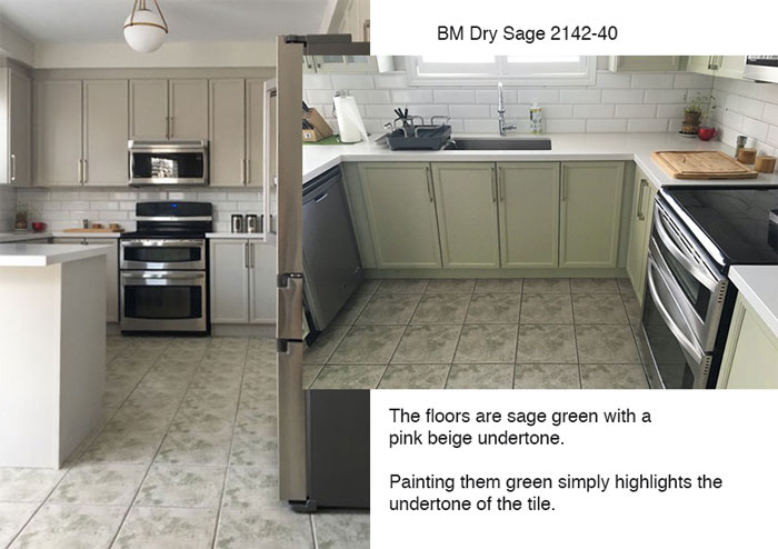
Bad, right? Now the floor looks even more old and dated. And of course the pink beige undertone of the creamy background in the tile stands out even more.
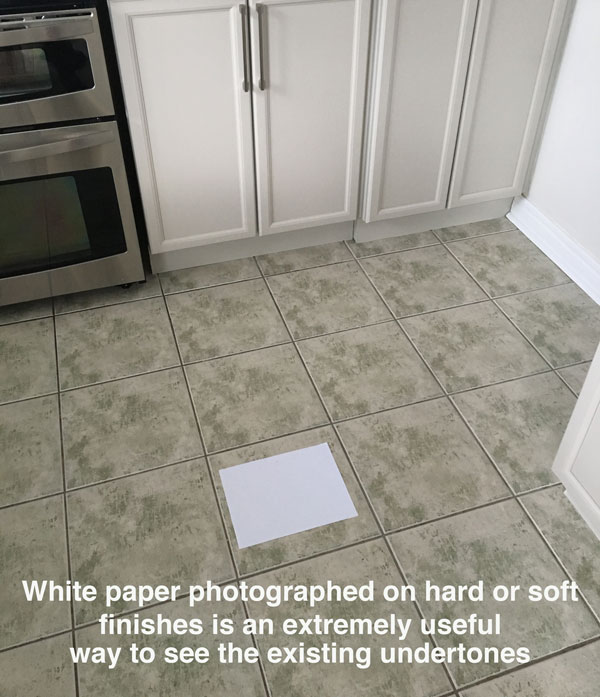
How to see the neutral undertones in a photo.
One more thing. When we ask for photos for our eDesign consultations, this is how we can see the undertone, ONLINE, and not in person.
We ask for a sheet of white paper to be placed on everything so we can see, are we dealing with a true white? Off-white? Cream? Or is it actually beige or grey?
As you can see in this photo below, placing the white paper directly on the tile, enables us to see that the undertone of the tile is clearly pink beige.
This is also part of the Business of Colour that you’ll learn on the third day of my colour workshops.
Okay, so painting the cabinets sage green is definitely not the answer. However, we certainly don’t want to paint them pink beige either. And, painting them off-white would still highlight the pink-beige undertone.
Since my lovely reader had them professionally sprayed (which is expensive), let’s see if there’s another solution.
During December, we had dinner at the Blue Water Cafe in downtown Vancouver and I noticed a couple scratches on the floor where we were sitting and realized they had actually painted the existing terra cotta tile, BLACK (below).
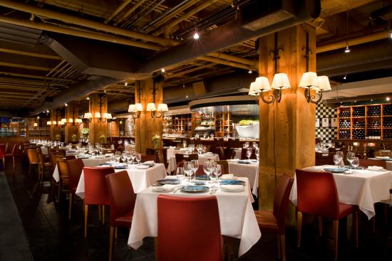
So if a commercial restaurant with lots of traffic can do this, so can you.
We have already established that no matter what colour we paint the cabinets, the tile will still look bad and dated.
Especially because it should also have been installed randomly. However, the tile installer made the decision to install them all in the same direction.

Here it is photoshopped to a colour similar to Benjamin Moore Wrought Iron. Obviously when it gets painted the pattern will disappear, but I wanted you to be able to see the grout lines, so we just photoshopped the floor so you could see how much better it looks painted!
And you could even go further, if you had the time and the energy and stencil this floor!
Cutting edge stencils and how to paint them
There are lots of step-by-step tutorials online where you can learn exactly how and which product to use!
This is definitely the time and place to incorporate the look of trendy, encaustic tile!
How long it will last is certainly another conversation. But adding a pattern with a stencil will downplay any wear and tear and distract from it with its loveliness.
I’m sure paint has come a long way but when I was growing up, my Mom would paint our bad linoleum floors in the kitchen of the little house we rented, every two years.
Regardless, just painting the tile floor that will never be amazing is the smartest way to handle this colour dilemma until you can change out the floor. Eventually, an affordable wood look floor like laminate or LVP would look great in here.
Here is a gorgeous kitchen painted Revere Pewter with wood floors below. Just look at that island painted in a blue grey accent colour making our green grey look so creamy and warm 😉
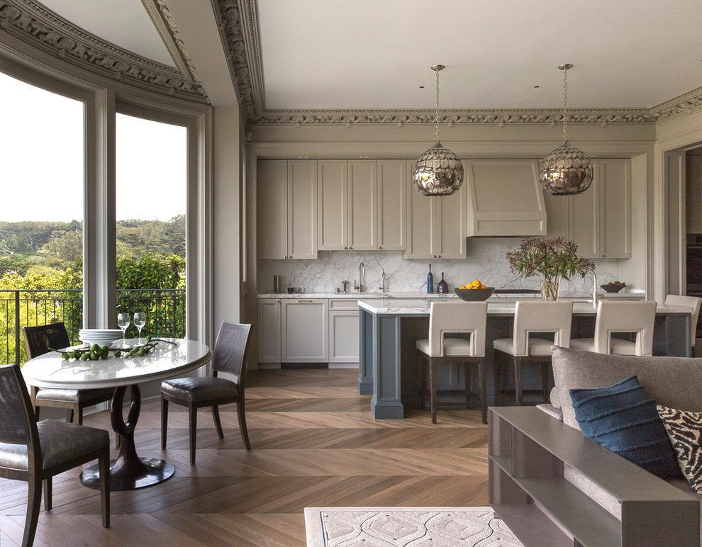
Source: John K Anderson
If you are painting your cabinets this year, you can buy a single eDesign paint colour consultation here.
Or if you’re renovating a kitchen, you can buy our ‘Create a Classic Kitchen’ package here.
If you want to learn how to understand undertones, download my ‘How to Choose Paint Colours’ ebook here.
If you have an Ask Maria question (that hasn’t already been covered) for this column, please email me photos, taken in good natural light, without flash, and email them here.
PS. Here’s an update from my reader!
She said, “This solution was totally unexpected as we never looked into the tiles as a source of the issue, but IT TOTALLY MAKES SENSE NOW!
We are going to paint the tiles as soon as the weather gets warmer and we are excited about it. We have an egg chair nearby in the family room and the colour is identical to BM Wrought Iron :)) Pic attached.Hope it will be ok with the rest of the space.”
Related posts:
5 Reasons Your Paint Colour Looks Wrong. It’s Not the Lighting


Brilliant! There is so much bad tile around here in New England. I love the idea of painting over in a neutral, and then stenciling it! YES!
Great info! As a cabinet painter two different paint products will seldom be the exact same color. Each product has a variation of ingredients and will accept the tints slightly different. I would never spray one product on the doors and use a different product on the frames. They will never match…..ever.
Yes that’s exactly right. Thanks for clarifying that. Cabinet companies will never use BM paint to spray cabinets because it’s a different paint period. Maria
Can you please clarify this?Is there a preference for painting cabinets between BM and SW?
This is a fantastic post!!
No, the point is that cabinet companies don’t use a lacquer paint that is neither so you should always get a test door sample to make sure the colour is what you want. However, as we just learned in this post, the colour match wasn’t the issue as much as that the colour was not right for the floor in the first place. Maria
Listen to Maria – before you sign the contract ask for a test door! I had my kitchen refaced and I used it as I picked out countertops, flooring, etc. I trapsed around with my cabinet door and two color boards from Maria – I am sure I was a sight – but it helped to whittle down possibilities.
Brilliant!
This was an awesome, constructive post!
Maria
Good post !
You amaze me how u come to your color choices.
Totally loved the answer you came up with .
Changing the tile color huge difference !!!
I have a non-color question. I apologize if it’s something generally understood. What did you mean when you said the tile looked bad “Especially because it should also have been installed randomly.” I’m considering changing my backsplash to subway tile, and I don’t understand what you meant. —thanks
I think Maria meant the floor tile. It has a pattern that should have been installed randomly rather than with pattern all going the same direction. Tiles that are mimicking stone need to be installed randomly so it looks more like a natural stone random pattern. The way the tile was installed bothered me in the first picture I saw. Glad Maria mentioned it.
Yes that’s right thanks Ronda! Maria
Thanks!
My guess is that Maria was referring to the tiles on the floor! ?
If you look closely at the original unretouched photos of the FLOOR tile, you’ll see that each tile has been turned the same direction, and the resulting effect is a repeated pattern in the floor instead of a random splash of color here and there, which would have been the preferred effect. It’s not in the subway tile.
I had to look at the photo one more time after I read that part of the post. In my opinion, the comment appears to be in regards to the floor tile as each tile is placed with the pattern in the same direction (which looks odd) whereas typically each tile would be placed in a different rotation. I hope that makes sense.
I believe Maria was referring to the floor tile in this kitchen. Notice how each tile is carefully positioned so that the big green blotch is in lower left corner? Had the tile been installed randomly, the pattern would be more organic and much more eye pleasing. That’s not something you have to worry about with white subway tile because there’s no pattern.
This post reinforces so well how undertones can make or break a project. Your undertones ebook has saved my bacon on several occasions. Most recently, we were redoing a north facing room we use as an office that has only 1 window so the room is quite dark. That works fine for us since we have a bank of computer monitors (5) mounted on the longest wall and there is no glare. Before starting the project the room had beige walls, beige trim and a beige carpet and was pretty dreary (house originally built in 1999). We found Pergo flooring that we liked in a whitewashed oak. There are 5 doors in the room and the trim was in good shape so we really didn’t want to repaint the trim, way too much work. Thinking to lighten up the room I bought a sample of a light green BM paint (don’t recall exactly which color). Immediately the trim in the room looked even dingier and dirtier than before, almost pink. After doing some color matching we determined that the trim was painted BM Navajo White. Aha! Recalling your undertone information, we quickly realized that the green was a “clean” color and the trim was a “dirty” color and they were just not compatible. So we switched gears and ended up painting the room BM Odessa Pink which looks great and made the trim look almost white.
Maria,
That was an amazing post about the Revere Pewter Cabinets.
Thank you!
Happy New Year!
Best, Melissa Ruttle
Great informational post. What pink beige color for the cabinets would make the floor look better?
Well I’m saying no one would want to paint the cabinets pink beige. . . no matter what you do the floor still makes this pretty kitchen look dated. I would start with the pink beige colours in my system if that’s what someone wanted, Muslin, or Shaker Beige or Stonehouse. Hope that helps, Maria
One of your best posts in a long time, Maria. Lots of helpful technical information. Thanks!
I’m confused. In every picture, on my iPad, the color of the upper and lower cabs looks completely different. Are the uppers and lowers painted different colors? If not, why does the color look so different? To my eye, the difference is far from subtle.
Well overall the light hits them differently sure, but the point is that green grey does not work with pink beige and sage green tiles. . . thanks for your comment. Maria
This made so much sense!!! Well written!
Maria, one of your best posts ever! I can sympathize with the owner who must be heartbroken each time she walks into the kitchen. My advice is to save your money for LVP flooring. I was always a purist when it came to flooring, but I am thrilled with my LVP. Easy on the back and feet, easy to clean, less likely to slip on than wet tile, and no grout to maintain. I understand you may have used you kitchen budget – but in the long run I think you will be much happier. I did a lot of research and chose something from Coretec. All of the tradesmen who worked in my home thought I had wood. Best of luck!
Just wondering is there an undertone in a gray that would work with the yellow gold wall to wall carpet? Every gray that I have sampled either goes green or purple. I appreciate any advise
Grey is always either green, purple, or blue, so if you can’t decide, I’m guessing you need more decorating to happen first. The most ‘neutral’ looking grey is usually a green grey like Edgecomb Grey or Revere Pewter but if it looks green to you, it’s probably because there’s nothing grey in your decorating so it’s not the right colour to begin with. I can help you find the right colour with an eDesign consultation. Hope that helps! Maria
I completely agree with the reader who said the upper and lower cabinets look like two completely different colors!
And I think a solid dark floor would be too heavy for this light and bright kitchen, and wouldn’t relate to any other finishes (unless you count the side of the fridge and the glass on the stove and microwave).
I’m seeing what look like hints of greeny-grays in the tiles … so maybe a deeper gray on the lower cabinets would help unify and transition the upper cabinets and fixed elements to the floor, providing some depth and contrast without being too heavy …
From experience, I wouldn’t recommend painting a tiled floor in any high-traffic area like the kitchen. When professionally done, it involves some pretty strong chemicals to prep and finish the surface and is expensive (and most companies won’t guarantee this type of work on a floor — walls are a different story). Appliances will have to be moved out and then, very carefully, moved back into place so as not to scratch the finish. And even with the best cover-up prep, some paint is bound to get somewhere on those beautifully finished cabinets.
great post! Thank-you.
Your explanation as why the color looks violet is spot on! Also the visuals were very helpful. I have found that when color matching by some other paint company the colors really never match. So in this case it looks like the undertones have been tweaked! It is amazing how you have to take in consideration the whole picture in order to choose the right colors to paint a room or cabinetry. Everyone needs your no nonsense course! Love this kind of post!
Great article! Years ago I painted the walls under the chair rail in my dining room a pinkish color. I had a sage green carpet in the room. The wall paper in the room coordinated with both of them. The room looked great during the day, but as night fell the pink turned lavender. To this day I remember how horrified I was! I ripped out the carpet to expose the beautiful wood floors and solved the problem. No more lavender walls! Thanks for ALL your wonderful advice, Maria. I sure do appreciate you!
Maria, you are soooo good at explaining color and undertones…yes it kind of makes my head spin trying to explain sometimes (i refer to “just trust me” sometimes but after taking your class I definitely can see the undertone!
Usually cabinet doors are sprayed with a laquer type paint for a longer lasting, harder wearing surface. Lacquer paint also changes the colour slightly, making the painted surface look different from the paint chip. The colour changes as the surface ages as well.
Before reading the whole article I thought you were going to say the problem with the same colors looking different in different places was the finish of the paint. I’ve used SW Amazing Gray a lot in “flat” but if used in a “sheen” it turns blue. Anyway, great article! I learn so much! I enjoy all your blog posts!!
I agree as have experienced much the same. That said; unfortunately ‘sheen’ is a subject that is seldom discussed and IMHO it should be. -Brenda-
1. Great thought-provoking post!
2. I had very little money, but in my previous house re-did 1990’s pinky-blonde wood floors with an espresso vinyl plank! EVERYONE thought is was wood… and I loved it! I had a pale taupe walled kitchen with french blue and white print drapes and white cabinets and white marble… looked great… cost $1.99/ft.
3. See above “pale taupe” – …that color was TWINE by the old laura ashley line. I LOVED it! I used it on smooth kitchen walls in a semi gloss. A few years later, before selling house, I wanted to also paint the adjoining den same color. a. I had a terrible time tracking down the color (or even a color chip!) b. Lowe’s paint guy said he had found it… I bought it and did the den. It literally looked PINK! yikes. No one really noticed that much except me.. and I still sold my house, but there’s a lesson in there somewhere! Idk why it looked SO different, but coulda been paint mixing (?)
Hi Maria,
My eyes started crossing as I was reading your explanation of this poor reader’s color conundrum.
Obviously, I haven’t taken any of your courses. I’m sure your graduates fully get what you’re saying.
Please don’t ever retire, Maria. You’re the only one I trust when it comes to choosing colors. You could still do edesigns from your nursing home, right?
I had my painter paint out all pink terracotta tile in a very large house, from the front hall thru al the halls and bathrooms to a cream colour. This was for a client with small children.
Three years later it’s still perfect & scratch free!
Thanks for the vote of confidence Debra! This helps everyone! Maria
Debra,
Do you know the details of the job? Prep? Type of paint? Topcoat of protector??
Such a great post!! Color is so complex but with Maria’s course you truly have a new understanding. I have been an interior designer my whole life and went on ‘gut instinct’ on color. Usually it was good but I never knew why! Now I do. Thank you Maria.
I love this idea of painting the floor! When we added on I was stuck on what to use for the new floors and decided to wait until I was ready. I bought some cheap “oriental” carpets and tried to ignore the plywood. One day I couldn’t ignore it anymore, and decided to paint a fake rug. I love bright colors and marbling was big at the time, so I took leftover aqua and sapphire wall paint and marbled that together, painted a wide purple band all around the edges and a narrow yellow border in between. Then I spent years looking at every kind of flooring in the world! When I had enough money to do the whole house, the vinyl slate look I liked was no longer available and everything else was too pink, too yellow, too green, and first and foremost, always too blah. Then we had a pipe under the sink break and because we did most of repairs ourselves we had enough money to do the whole house (included in our insurance money was $635 for the hand painted floors!) and I found a very neutral wood that looks great! Sorry to be so long about it, I guess my point is that our paint lasted 15 years.?
I had yucky press and stick vinyl tile in the kitchen, dining room and down a long hallway. We replaced the the tile in kitchen and dining room with wood type laminate, but couldn’t get enough to do the hallway, so there it sat. One day I decided to paint it. First a coat of Hi Hide primer in white, then simple acrylic paints in a mix of yellows, browns and grey. I brushed them together with a stiff bristle brush as if it was woodgrain, then when dry I put on a 2 coats of water based poly in a gloss finish. Do you know they lasted for nearly 20 years and no one ever suspected they weren’t wood parquet!
I totally agree with painting a floor, has been done in Europe for decades.
Here’s my experience: Telling a painter your specific paint color is not enough. Why? Because they are going to use lacquer and that requires a “paint match.” I wanted my bathroom vanity painted BM “Hale Navy” and while it turned out beautifully, it is not a true match to that specific color. Lesson learned: Tell your painter to give you a sample board painted with your specific color choice so that you may see, and approve!!, the result.
I love these posts!!!
Interesting how paint colors can change depending of your other hard fixtures, i have pinky beige travertine looking tile and tried agreedable beige on the wall ond looked like a light purple, just awful, i currently have behr french pastry on living room and while on the paint chip looked beautiful now that is on my walls most of the time it looks pinky brown… oh well, cant change the floors, i try to incorporate area rugs wherever i can and i want to look for a gray with a green hint, im gonna have to try a bunch of samples
Awesome post, thanks for explaining that so clearly!
This is so good. I have painted tiles in my own homes and in clients’ homes many, many times with great success! If you don’t like some horrible accent tile, paint it! It works. The key is an excellent primer (I like Benjamin Moore Stix), very high quality paint and lots of curing time to guarantee success.
Thanks for a great article. I always stop what I’m doing when I get your emails with a new post- I always learn something and they are always interesting.
?
Great, well written post with perfect pictures to demonstrate the concepts. Thanks, Maria!
This is one of your better posts, Maria. You are a teacher who knows her craft. Thanks for sharing.
I loved this post because as a
rep for Benjamin Moore, I encounter this daily with designers and homeowners. I think one point should also be covered as to why BM colors dont come out right along with the color undertones theory you put forward.
When you match BM colors into other brands, be it wall paint or a lacquer system on cabinets, the colors will not be the same. BM colorants are proprietary. Its a system of 13 colorants made from finely ground pigments with an acrylic resin base. In addition, BM’s base (Chantilly Lace) is much cleaner and whiter than other manufacturers base paint (look at SW Extra White). So When you try to replicate BM colors by using a universal tint system’ (made up of 11 colorants that are glycol based) that the majority of national paint manufacturers use along with a grayer base paint to start, its like baking grandmas snickerdoodles with margarine instead of butter. They just dont taste the same! Kinda techie I know, but if you hold up a chip of Chantilly Lace against Extra White you will immediately understand. You can always make a color grayer when color matching (add black) but you cant make it cleaner.
Thank you, Lisa. A couple of years ago, after ordering Maria’s boards (which are the best!), I chose a color for my kitchen walls. Unbeknownst to me, my painter only used Sherwin Williams paint. I had to be out of town the day they painted and when I walked into my kitchen it was much greener than the board. The painter insisted the paint could be matched exactly between brands, and it was “the lighting.” Fortunately, I had Maria’s large sample to demonstrate that it wasn’t the lighting, since somehow the board wasn’t affected! Lesson learned. I changed painter, but now I try to stick with the brand my painter uses or insist that he use the brand of the color I want.
Great information! I have always believed color matching is a bad idea and you have given the best education as to why.
Lisa,
I recently painted my living room Metropolitan AF-690. It seems like country blue now not sure if that is my older wood floor with rust tones, the lighting or what? Is this a color I can dilute?
That’s because Metropolitan is a blue green. . . and with a blue green, in some lights it looks blue, in some lights it look green. It’s probably the wrong undertone for your interior and diluting it will not be the answer. I would love to help you choose the right one, you can purchase help with just one paint colour here:
https://mariakillam.com/product/interior-paint-colour-consultation/
Hope that helps!
Maria
Great post! Spot on. I was going to repeat what another commenter said — a vinyl plank floating floor could be applied over the existing tile as well. I’ve done it and it looks great and holds up extremely well.
Also, as a kitchen designer, I keep wondering, WHY DOESN’T THIS KITCHEN HAVE ANY DRAWERS? haha.
Stephane, I bet the drawers are in the peninsula.
Kitchen designer ? Ha, ha
another important thing to bring up is that paint chip samples are generally flat or satin sheen… hand painted boxes or trim are likely semi gloss, BUT sprayed cabinet doors are ” lacquer cabinet finish ( a really thin paint that works in a paint sprayer and can be matte or shiny but is a more durable and perfect finish for cabinets)
Every time you adjust the sheen of paint the color adjusts a tiny bit and undertones can become more prominent.. so much so that when i spec paint for cabinets, i usually take a piece of that newly sprayed/painted cabinet and have it color matched for the trim paint rather than go back to the original paint swatch or paint code…
using lacquer cabinet paint is the right thing to do but they should have taped things off and sprayed the boxes as well… then doors and boxes would have matched perfectly..
and just remember when spec’g cabinet paint, it will be spray lacquer and therefor slightly different color than the flat swatch appears
One of my all-time favorite MK posts! You know how you were asking us in IG stories what we want more of? THIS! It’s so educational. And, small thing, but I love your caption about the click bait sites. <3
The kitchen image from the “click bait” sites is by https://www.instagram.com/jkadesign/. It was pretty easy to find on images.google.com with the “time” function used to find the first occurrence of the photo.
Thanks for this, I will have to figure out how to use that search function! Maria
Oh, and I found more info on his Houzz page about that kitchen, if anyone is interested in the specific colors used. “JKA Design answered: The cabinetry color is Benjamin Moore Revere Pewter in a Satin finish. The Island is Benjamin Moore Down Pipe also Satin. Happy decorating!!!” https://www.houzz.com/photos/19312605/Presidio-Heights-Residence-transitional-kitchen-san-francisco
I was glad that you mentioned using LVP (luxury vinyl plank). We live on a small farm and also have indoor pets. I need a waterproof floor that still “fits” in my rural house. Living out in the country where there is more dirt, grass, hay and a long gravel driveway makes for a lot more dirt. When the farmers plow the fields, dirt is in the air. Even if the windows aren’t open, the house gets dustier and the floors get dirtier.
Most of your blog posts are city or suburban homes. I realize that this is probably your usual client base. However, I would love to see designs for rural homes… real modern farmhouse!
We have Armstrong’s commercially rated Permier Laminates and LOVE it. In an inside out residential bungalow with two Rotties. NO scratches.
I am an LVP convert. I was working with a carpenter who suggested he use a higher molding- and THAT made a huge difference!
Joanne, By “higher molding” do you mean your baseboards? And is there quarter round along the bottom?
I have been wanting to change the baseboards and door trim throughout the house. The originals (along with the hollow core doors) looked really cheap to me when we bought the house 16 years ago and they still do!
Yes! If I knew how I would post a picture! The molding is 6.5 inches high with an inch molding along the floor, then a 4 inch section, then another curved section along the top. I believe they are separate pieces – if that makes sense. They are a beautiful detail that adds to the impression they are real wood floors.
Thanks for the lesson, Maria. Very informative as usual. -Brenda-
A few years ago I repainted the living room and dining room in our condo, and I asked the BM paint dealer to dilute one can of the paint at half so I could paint a lighter contrast color above a chair rail in the dining area. The dealer warned me that Revere Pewter leans toward a purple undertone when not mixed at full strength, and that he had had many complaints from decorators doing the same thing. I took the paint anyway and it actually was the perfect half tone to the full strength mixture, not purple at all. This discussion reminded me of that experience —
Maria, I have always wondered about the white paper photograph thing. How do you know if the white paper is actually…well, white? For example, white paper made of recycled materials is noticeably grayer/dingier when placed next to a non-recycled material sheet of white paper. I understand the concept in general, but how do you control for the fact that all white paper is not the same?
Well our eDesign department which is basically all about specifying colour on-line, is entirely done this way. White paper is technically ‘whiter’ than a true white, but it seems to do the trick because I’ve done it this way for years. There’s no other eDesign offered on the web that promises to get your undertones right, (unless it’s by another True Colour Expert). Most eDesign companies are just interested in selling furniture.
What makes the ‘white paper photo’ powerful is that before we saw that photo, the background of the tile in the photos simply looked cream. It was much harder to see the pink beige undertone until we photoshopped the cabinets green.
The photo with the white paper made it obvious again.
And I understand that it’s hard to get the full concept of this in one blog post. I teach this in much greater detail in my 3 day live workshops!
Hope that helps,
Maria
This is a terrific post and illustrates why you are THE colour expert.
Whoa! That was hardcore but fascinating. I love this blog. You have been so material in choices I have made in our home over last 3 years. Huge decisions including exterior (your design package), kitchen (blog research and subway tile of course) and all interior walls and floor color. I wanted to go clean white throughout the interior and our floor was yellow oak and too depressing to think about replacing in the whole house. What was the solution? Sand and stain with white grey undertones. Yes slightly trendy (was worried about your disapproval) but got me out of the woods until I can swap out the floor in a few years to something more classic. Thank you Maria!
Can you recommend a grey that falls in the middle? Not too yellow and not too blue? Looking to help a hair salon that needs the walls to really be neutral, so as to not reflect on the client when choosing hair dye. Thanks for your help.
Really neutral can only be determined by what finishes it’s paired with. A grey that looks ‘really neutral’ in one persons house looks ‘green’ in someone else’s home. Or purple, or blue. . . without photos, it’s impossible for me to give you accurate advice. Sorry I can’t help. Maria
This is a great post with an innovative solution… I have to admit that I LOVE IT that the follow-up photo shows just how modern the rest of the space is! Maria and team, I think you read the mind of the client when you picked that floor color treatment! Treating that floor not only solves the problem, it creates harmony with the rest of the space. Great work! Happy New Year!
Thanks Chris! xo Maria
What a fabulous post – So informative!!!!! Thank you for not only covering the why, but also showing the original images, the paper trick, the photoshopped suggestion as well as other alternatives for fixing the problem.
My comment after reading the very good, thorough reply….never color match Ben Moore. Buy Ben Moore! I matched once, using Behr Paint and it came out a dark, muddy pinkish purple. Against white floors, so there were no external undertones interfering.
I bought my next gallon of revere pewter from the BM store and wallah….perfect!
Hello
I am considering revere pewter on the cabinets in our high rise apartment kitchen – it faces North but the north wall has10′ floor to ceiling windows so bright light. The other thing is that it has Brazilian cherry hardwood, low gloss. Would the floor cause an issue or do the two together cancel out the potential undertone problems? Thanks so much for a great article…