{source click on image}
Last summer when I wrote this post on The Best White Bathrooms, I declared that all bathrooms should be white. Some people got downright cranky and decided that I had no idea what I was talking about.
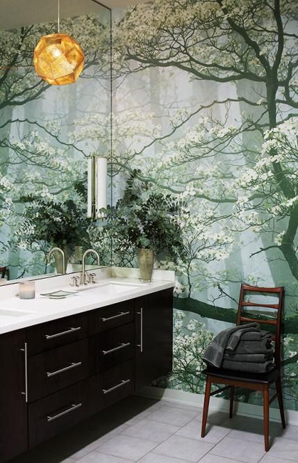
Just to clarify, what I meant, was that basically, you should choose mostly white (or cream) finishes because then you can have some flexibility with your wall colours (or even install a mural like the above pic). There’s just something elegant, timeless, not to mention, just plain CLEAN about a white bathroom.
So I thought I would take you over to my world for just a second, so that maybe, just MAYBE you’d understand why I make such rash and bold statements, hee, hee.
Because, this is the bathroom (below) or some version of it, that I mostly see, every single day of my life, in my business, when consulting with my clients. This is the bathroom we inherit. And it’s definitely not the one I find on Pinterest.
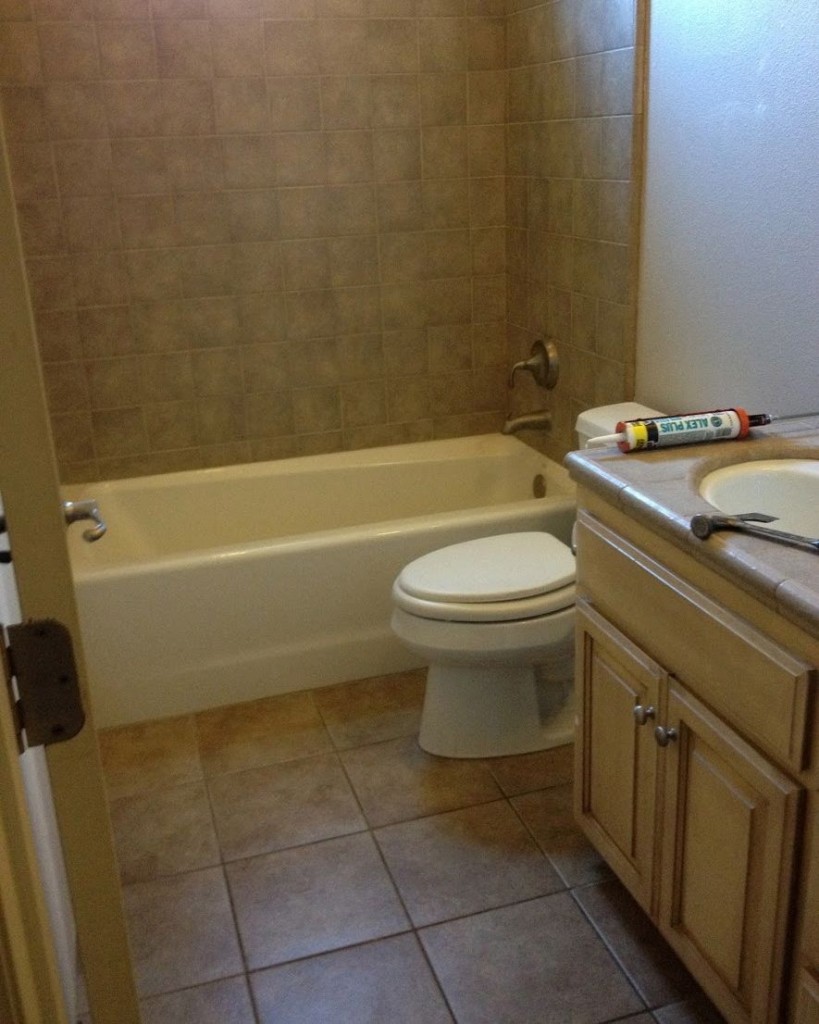
The ONLY redeeming feature about this completely uninspiring bathroom is that at least the small surround tiles are the same as the floor. The bathroom I usually see, is one where the surround tiles in no way relate to the floor tiles or even the countertop.
Did you Pin this one onto your dream bathroom Pinterest Board?
Oh, you didn’t?
Why not?
Well, keep reading, because there’s more.
Last week, I received this email from one of my readers:
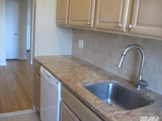
I follow your blog and I am enjoying learning what it is about a room that sometimes strikes me as “off”. We just bought an apartment in New York and all of the hard fixtures clash. Sadly, the previous owners “updated” the kitchen before putting it on the market and I have inherited a classic “case of the clashing beiges”.
I’m sure the previous owners thought they had made “safe” choices. I mean, they are all beige, right?
I am planning to gut the kitchen, creating an open floor plan. So it’s really not worth trying to salvage anything. But it could take a year of submitting plans to the co-op board before we get approval for that. So, meanwhile, I will have to find a way to live with it. Here is the official “before photo”. (Believe it or not, the bathroom is an even worse array of clashing beiges. We are gutting that first.)
I know that you are always looking for examples that you can use without offending anyone. Feel free to use our kitchen if you like — you won’t be offending me. Sally
Wait a minute? The first bathroom must belong to this kitchen right? Even the cabinets look identical.
But no, sadly the bathroom is actually in California. And, this kitchen, as stated above, is in New York.
So if you were the colour consultant or designer, called in to help choose a colour or solve this problem, what would you do?
Which colour would you suggest for the first bathroom, if that was all that could be done in the moment. What else would you recommend to make it livable for your client?
Or what if you got the second scenario I mentioned, where everything clashes? Then what?
Finally, what would be your best advice for the kitchen?
The answers to all these questions and much more will be coming up at my live Specify Colour with Confidence™ Training in Vancouver February 12 – 14. Register here.
Unless you’re someone who is always working with brand new finishes, you’re like most of us, who need to make the old work with the new as well as taking something ordinary and making it as beautiful as you can.
{source click on image}
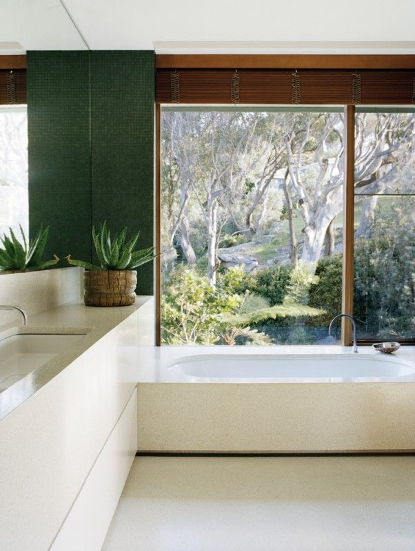
We can’t all have this bathroom, but we can certainly learn to create beauty starting with the right foundation as well as learn how to turn something bad into good whenever possible!
Join me next month! Register here.
PS. Thank you to my fabulous readers for submitting these photos! xo


Yes, yes, yes.
I just moved into a new house and everything needed to be painted and refinished–except, thankfully, the all-white kitchen and bathrooms!
They’re the original builder installs from 1990, but I don’t have to do much to update them. I’m changing out the white formica countertops in the kitchen, but only because I want something more heat-resistant.
Overall, the look is still simple and current. In my opinion, white is the only way to go if you don’t want to get on that renovate-every-ten-years bandwagon.
I agree with you on everything, all the time. You are my designing twin. We just recently gutted and remodeled a house we bought and everything is white and I love it more every day! Nothing clashes and it is fresh and beautiful! So you keep telling it, sister! Love your blog.
I have always hated white for it is so boring but, I do love a clean fresh white bathroom. I tried white in my master bedroom with an accent wall for what I call French blue and it is so fresh & pretty. I love it. Plus, I love your blog.
Love that mural- stunning!
I just have one question Maria- does white cabinetry usually dictate white walls/ceilings? (Not talking about backsplashes).
I ditto what Vicki just said; you are my designing twin too! And let me add that I love your sense of humor too. You rock girl!
I just recently specified a white kitchen for a client of mine–complete with white subway tile. Her immediate reaction was, “Everyone is doing white right now. I want something with more personality. Something that won’e look dated in two years.”
I had to explain that the reason I specified white was because it would not look dated in two years, and because it is the easiest color to add personality to.
Eventually she understood, but it was really hard to convince her that the glass tile she wanted was going to look dated a lot sooner than the subway tile!
Please bare with me. I’m not a designer. I thought white does not show well in dark rooms. I have a dark kitchen and bathroom. Short of hanging strobe lights nothing is going to make the room bright. Under these circumstances, I thought color rather than white should be used? Did I get this wrong?
Thanks.
Hi Monique, My home has the same problem. I have no windows in my bathrooms or in the kitchen. And I ran your same question to Maria years ago when we were updating everything. She told me to go with white inspite of the lack of light. I did & I’m so glad I took her advice. My cabinetry is white and I added color to the walls. The rooms look great.
Mary-Illinois
Not a designer either, but my opinion is to go with white everything, and paint out the walls in a dark hue. Personally, if there is cabinetry at all, I would consider painting that out too to match the walls, but keeping the floors, fixtures and counters white. Add some beautiful sconces, maybe a pendant if you have the space and you have a romantic getaway, and one that you can update whenever you want with just a splash of paint.
I meant to post my photo example here, not below.
http://www.flickr.com/photos/76281380@N05/11896061476/in/pool-2239493@N21
Thanks, everyone for the great responses. Much appreciated!
Yes! I am definitely on the white bandwagon too, and our kitchen will be all white soon. Yay!
I’m convinced! I’ll be remodeling my powder room by removing the paneling and putting in white subway tiles. I’m having trouble deciding on the flooring; I don’t want wood. What is your opinion of the wood-looking porcelain tiles? I know you recommend staying with a medium brown finish. I’m worried that I won’t find a white flooring tile that I like with the subway tiles. The room is off a carpeted hallway.
It’s disappointing that your class price will be jumping that much. Wish I could make the Feb class, but just can’t. The new price + travel makes it unlikely that I can do it at all. Just because we CAN raise our prices doesn’t always mean we should, unless we actually need to.
I think the kitchen cabinets in the New York apartment need to be painted, probably a creamy white that somehow will compliment the beige in the tlle. Don’t think that could hurt, especially if the remodel will be put off for a year.
Don’t know if you can see this photo, but this is what I mean. http://www.flickr.com/photos/76281380@N05/11896061476/in/pool-2239493@N21
My son just bought a house that a ‘flipper’ had redone. This guy did everything wrong, as I have learned from you. The busy beige horizontal, skinny, glass tiles clash with the way too busy beigish granite,. Grayish cabinetry and beige walls. They are busily repainting everything grays…it’s all wrong…but I kept my mouth shut…almost. Wish Home Depot would quit selling tile and granite to young male flippers!!
I agree with Beth. The price jump of 50% makes the per hour rate for three 8-hour days almost $100.00 per hour for classroom instruction. Granted you are THE color gal, Maria, but this jump puts the class right out of my budget. I had planned on attending this February, can’t make it for various reasons, and now it’s out of my reach totally. I’m really sorry about this, I wish you would reconsider. There are those of us who need this instruction to help expand their businesses but $100.00 an hour for classroom instruction is a bit rich. I echo Beth’s statement, just because you CAN increase your rate, should you? You have lost 2 students just in this little posting; how many more are quietly saying, “Well, that’s off the list. Money talks once again.”
I like your posts because you are realistic in decorating, you use common sense, gifted in color and design, share sooo much, make homes look beautiful. Unfortunately being honest sometimes doesn’t pay. I would hope you are worth at least $100 per hour that is a bargain, Pretend you are a man and let’s see where the prices go. Good for you Maria. Hang in there.
Dawn, I have been in the flooring business for 16 years and I agree with you on not putting wood flooring in the bathroom. Did you know that one of the most frequent State Farm claims is for replacing wood floors in kitchens and bathrooms because of water damage? Porcelain wood tile is a good option but only if it don’t plan on having a real wood floor outside the door. You don’t want two different woods right next to each other. The hottest flooring that’s out now is the luxury vinyl planks my fav is the one by US Floors called cortec. The best part is it’s 100% waterproof and it looks and feels like a wood floor. Our most popular seller right now in porcelain tile is the 12×24 in the grasscloth patterns for both walls and floors. Several manufacturers carry that look, good luck on your reno.
I have to add that I think this increase will open you up to copy-cat instructional systems. When the master becomes too expensive for the masses, the masses will go elsewhere. And probably learn from one of the master’s students.
Simple math says that it will take 4 students at the new rate to break even for the 2 you know you lost with this increase.
To me, ‘hang in there and see where the prices go’ means keep on increasing and when enrollment stops, you know you have reached the top of your marketable price. And there are only so many people up there.
Good luck.
Is it possible to tone down too busy backsplashes with paint? If so, what type of paint will adhere to tile near a sink?
I love your bold color usage, and your posts are always enlightening and fun.
Babs, I’ve wondered the same thing–about painting tile. I’ve seen painted fireplaces…heck, I even painted my old fake rock fireplace from brown tones to gray tones. Everyone thinks it’s the real thing. (I was fortunate to have gray mortar.)
I’ve heard that Japan paint sticks to glass, so would think it would stick to even slick tile.
I used Behr’s paint with primer on my bathroom walls. Didn’t use a drop cloth and there were plenty of splatters on my acrylic shower. It was hard to get the stuff off….so maybe it would work.
I use their little sample pots to paint furniture–even outdoor furniture. If you wanted to paint your own tile, perhaps you could get a sample pot and give a small area a try. Or just buy a piece of tile to test it out on.
I’m thinking of dry brushing Behr paint–very delicately–on my new luxury vinyl tile in a bathroom where I just couldn’t seem to get the wall color and floor to coordinate. Even with wainscoting separating the two, it bothers me. I figure just a few swipes of almost dry wall-color paint on a few areas on each tile might pull everything together. I have some extra tiles so will test it first!
Thanks, June, I will try out my acrylics on a tile. I think using primer first is probably a good idea. I have not heard of Japan paint, but I will research it.
I have painted my backsplash tiles and it worked out great. My sink is in the island, though, so no water on the tiles, but I don’t think that would be a problem.
I asked at Home Depot for high adhesive primer, they had it on display, you could try to scratch it off with your keys. So primer, then just some latex paint I had on hand. Then I stencilled a little design on a few spots. It has been over two years and I clean it when necessary.
I wanted to change the backsplash, but it was difficult to do for various reasons, so painted instead.
Babs, As a painting contractor, who has done tile refinishing, your best option would be to contact someone who does tub and tile refinishing. They will do the proper preparation so you don’t have peeling later. Then it can be recolored with a sprayed on catalyzed urethane that has the look and durability of porcelain. I would not risk trying to paint the tile yourself in an area exposed to moisture!
Anyone in the industry knows, that my course is THE colour course to take for anyone serious about understanding colour and taking their design business to the next level.
The more you know about creating beautiful spaces and the more information you can give your clients regarding the WHY something works or does not work which then gives them the confidence to work with you, again equals, more money in your pocket.
If you want to take advantage of the early bird rate for a future course, register today and make that note in the comments. And if you don’t think this is the best colour course you’ve ever taken by the end of the second day, I will give you a full refund.
So register today and come find out for yourself if it’s worth $100 an hour, risk free.
After seeing the color messes created by big name designers in the most recent House Beautiful, her color course is desperately needed whatever the price. For those who can’t afford her workshop, don’t be discouraged. There many low cost resources to continue your color education, many of which Maria has provided through her blog.
Good Luck to you Maria. There’s probably plenty of
people in the world who can afford your rates but I’m
with Linda on this one. I couldn’t afford you before the
rate increase. I’m not a designer…..just a regular person
who really wants to learn color but I’ll have to go elsewhere too.
So add me to the “I’d really like to but I can’t afford it”
list.
Love your blog tho!!
Hi Maria-
I’ve read every one of your blog entries and your e color book. I followed it like a bible when I remodeled my house. But now we are at the masterbath. It only has north facing windows, and was planning on putting Faux Carrara marble tile on floor, tub, and shower surround. But I’m afraid I’d I also paint the walls WHITE as you suggest that the room will feel too cold. Can you suggest a good cream that may work. I did Carrara marble in my kitchen, and have bm smoke and intense white paired with it. But that room gets so much more sunlight, it feels warm. Any suggestions would be appreciated
Your fan,
Kim
There is no cream that will look good with Carrara. Fortunately you are not stuck with white, you can actually choose a color (blue, green, even yellow or pink) since all you are using is white and gray so far. The other option is to do an all cream bath (solid cream colored tiles, cream paint, solid cream colored quartzite countertop) and then go with a warm color like a soft pumpkin orange. Good luck!
Maria- I have had a colour consult with you before. I am very happy with the results. I am on the edge of signing up for the course – so I can do it myself next time. However, I am wondering if the course is geared too much towards people in the decorating field to be worthwhile for me.
thanks,
Hi Kathy, Since this is MY system that we’re all learning and you can’t get this training anywhere else, designers are in exactly the same place as homeowners. The last course in Toronto was half colour enthusiasts and half professionals and it was great! Maria
Kathy, I, too,, am not a professional in the decorating field. I am a professional in a completely different field! I took Maria’s course a couple of years ago, and am so glad I did. It was fun, introduced me to a whole different way of thinking about my home and my office, and really educated ‘my eye’. I recommend it!
Maria,
Your explanation for raising the price of your course makes perfect sense.
I say yuck to all the depressing beige. White is crisp and bright and you can tell if it’s dirty or clean. We’ve been in our “new to us” used house for about 15 months and I can’t wait to get rid of my black/green granite countertops eventually, as I can never tell if I have wiped it or not. When I had white, I knew if it was dirty or clean. The beige pics above just seem to drain all the life out of me just looking at them. Thanks for all your advice Maria!
I really do totally agree with installing white baths and kitchens w one exception: if you hv a really favorite color say green i would suggest white cabinets but a beautiful green tile. Re the price for the class, i agree that $2400 is really high considering most students also hv to pay to fly and stay in a hotel for 2-3 nites. We’re talking over four grand for a wknd. Thats alot of money for new designers, students, etc. IMHO. Do love this blog though!
Re the class prices, I agree with Maria. Education is the best investment you can make for your career and learning from a professional never comes cheap and nor should it. After all, the professional has spent many years and heaven knows how many thousands of dollars on their education. No one should under value themselves.
I’m just thankful Maria has this blog. It’s saved me from some shocking and very costly potential disasters.
well, all this talk about white kitchens! i do like the fresh look of them and I agree that many granite choices are way busy. But, does anyone remember cleaning the grout between the tiles on the kitchen countertop? No wonder granite slabs were such a big hit. There are now many more choices for a countertop, thank goodness. I also wonder how white holds up over time? Just asking. It is beautiful new.
I think that $2497 for the three day class is pushing the limit, but good luck if you can get it.
Hi, Maria! Though I was a bit disappointed that your workshop price will increase after this time, I completely agree with it. I officially started my home staging and redesign business last May, and I can’t wait to participate in the fall class in Toronto!!! That’s your usual schedule, right? I love that you still want to keep it intimate and fun! There is not doubt I will gain both the knowledge and CONFIDENCE to take my business to the next level….in other words, off the ground! I’ve been “working” with color in my home for 30+ years (my house was on your “Choosing Front Door Color” webinar) and I am finally getting it right…most of the time. That’s my goal, “Hmmmm, I think so”, to, “This is the right color”. You posted a comment earlier about getting the early bird discount towards a future workshop. How do we proceed? I realize this was not the intent of this post, and now you may feel you have to create a price structure for future workshops; discount, no discount, sign up, don’t sign up, when, where, etc. EEEEeeeek! Honestly, price increase or not, I’m so excited to participate! Thank you for everything you share FOR FREE in your blog! Your followers are able to gain knowledge in choosing the correct colors in their homes and/or businesses with every post!! I’m also looking forward to the Personality Type Course next month! Take care, Maria!
Like you have said through out your blog, you can’t go wrong with black and white. I’m learning….