This post is written by my Senior Colour Designer Tricia Firmaniuk! I’m currently in Charleston finishing up my Specify Colour with Confidence here with 29 fabulous women! It was interesting because last week in Dallas, the grey trend was already OVER in a few areas. No surprise that warm colours like the one Tricia is talking about here are trending, read on to get the low down!
_____________________________________________
Not all trends are created equal. Sometimes, good taste prevails and something timeless becomes trendy. Witness: subway tile. Has it been trendy in recent years? The answer is a resounding yes. Does that mean it will be dated soon? Definitely NO. It will continue to be a classic choice. Why? Because it is simple, versatile and just plain pretty.
Terracotta is a colour that has been popping up everywhere lately in fashion and in interiors too. After an overload of browns and earthy colours in the Tuscan trend, admittedly, many of us are not yet ready for a warm dusty orange that is almost brown.
Related post: What’s Next After Subway Tile?

Valentino Spring/Summer 2019 from British Vogue
BUT, it’s also a material. And one with a long history in the built environment. It’s arguably a classic.
And it’s hard not to love the way the spicy colour of baked terracotta brings to mind the gorgeous patina of garden pots, patios, and Mediterranean architecture. It’s a classic material just like brick or wood.
Yet for many of us, this colour takes us right back to the 1990s when it was hot right along side all warm and earthy tones from gold to burgundy and pumpkin to sage.
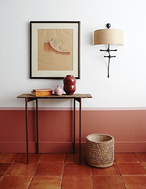
If the trend is calling your name, here’s how to make it look current and not dated: mix it with lots of fresh white, greige, cream, pale beige or grey.
I think this dusty orange is here as an antidote to all the white and grey we have been living with in recent years. Like oak and rattan, terracotta, both as a colour and a material, is a rising star right now because like classic cognac leather and wood, it’s a lovely counterpoint to cooler palettes.
Terracotta accents warming up a trendy gray wood floor Source
It’s really kind of an extra punchy and warm neutral which is what makes it such a useful colour. (Its undertone is orange, but it’s saturated enough to be considered a colour and not quite a neutral, it just depends where you draw the line). It’s softer and easier going than clear orange, but livelier than brown.
Which neutrals can you pair it with? Off White, Cream, Greige, Green Gray, Green Beige, Taupe, and even Blue Gray or Violet Gray in some cases. The undertones that you should be careful about are Pink Beige, Yellow Beige and Gold Beige. Terracotta has a pretty strong pink/orange thing going on and when it’s more yellow, Pink Beige could be a problem, while if it’s more pink Yellow and Gold Beige might not be ideal. In general though, it’s pretty versatile.
If you mix it with large doses of olive green and brown in a room, it’s sure to feel heavy and dated, but toss a bit of this cozy hue into an otherwise fresh room and it’s beautiful.
Let’s break down the different ways you could use terracotta in your rooms.
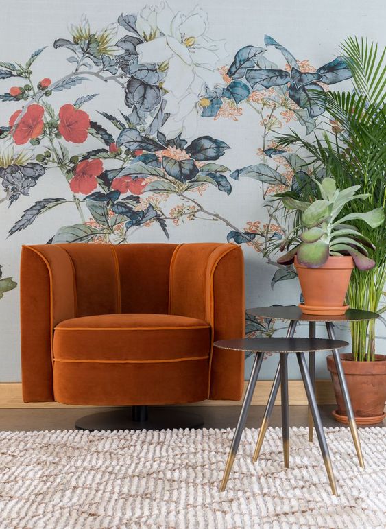
Terracotta as an Accent
As an accent colour in furnishings, textiles and case goods, go for it, and balance it with lots of fresh white and some contrasting hits of black or dark blue. It also does very well with leafy greens.
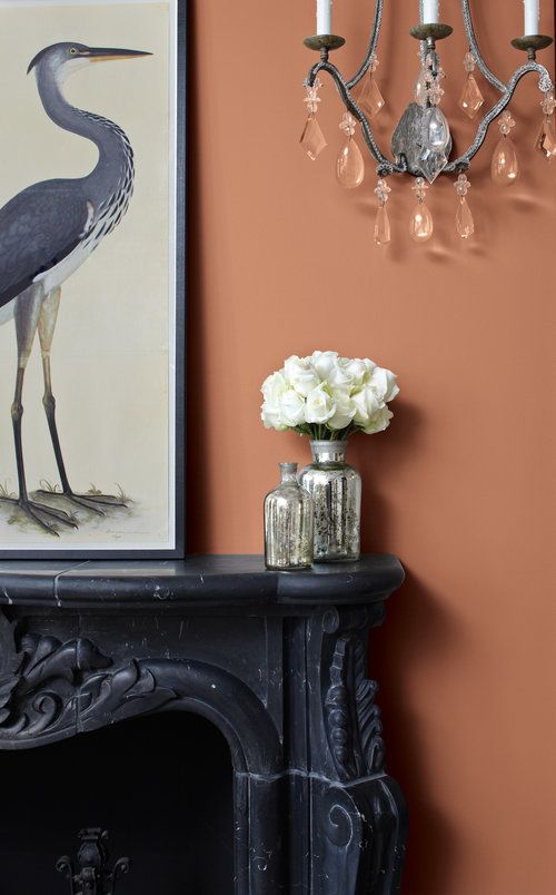
Terracotta as a Paint Colour
Sherwin Williams hopes we will all whip out our rollers with their introduction of Cavern Clay as their 2018 colour of the year, I think it could be fun to warm up a small cozy room like a powder room or study, but honestly, as a wall colour, it would require some very clever decorating and could easily be too much, so I think the application is somewhat limited. Certainly not many of us will be using it as our main wall colour in an open concept home.
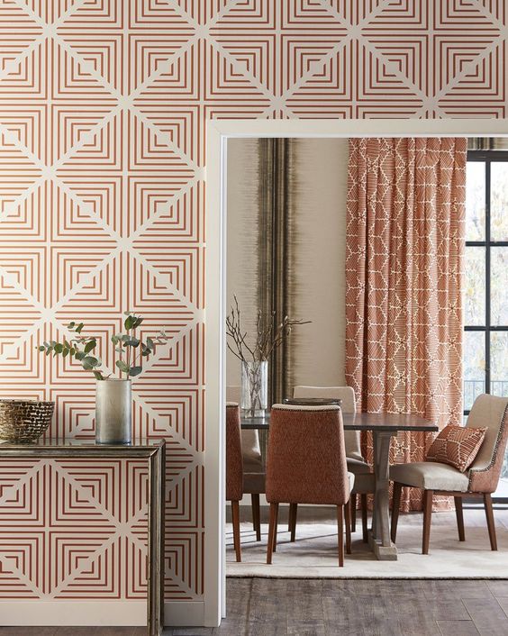
But it does look really gorgeous on the wall in this vignette below paired with soft black and cream.
And it’s really fun how they pulled the colour of the terracotta floor part way up the wall here for a custom look and accented it with soft pink. I think this is another reason terracotta is here right now, it’s a very good compliment to the trending blush pinks and apricots. Adding a deeper version of the hue is grounding and adds depth to a pink colour scheme that could otherwise look too precious.
I’m currently debating what colour I want to recover my vintage sofa in and a washed out terracotta/apricot colour is hot in the running. It’s just so pretty.
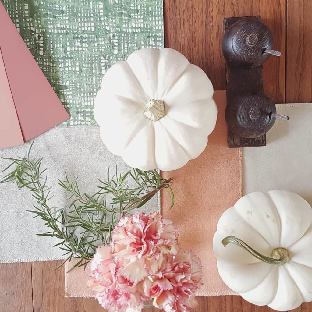
Apricot velvet sample for my sofa
Terracotta as a Material
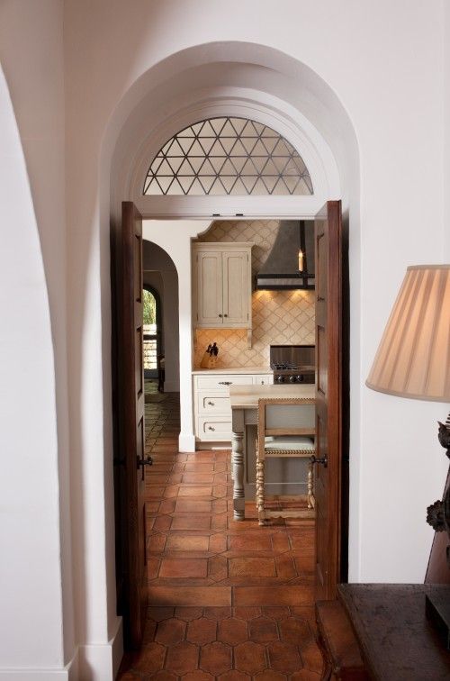
As a classic pave style floor, terracotta or saltillo tiles are absolutely classic in the right context.
Obviously, they look great in Spanish style homes like this one below.
My Google Chrome browser is currently speaking French which makes searching a French word with a particular context in English a bit tricky, haha. But, correct me if I’m wrong, a pave tile floor has the rustic look of outdoor pavers.
And terracotta or saltillo is right up there with the prettiest options for this style like creamy limestone. These types of floors are an inspired choice when you want to create some connection with your outdoor space in a kitchen with doors to the garden for example, or a mud room or sun room like this subtle, rustic room below.
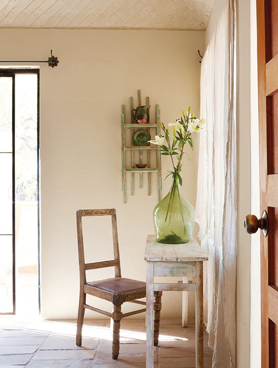
It’s fairly neutral, like a wood floor, but you would do best to repeat it at least a bit in your furnishings and decor with some warmer wood tones maybe, or some peach or blush accents.
And as it does come in a range of tones from pale orange beige or peach to deep mahogany so you can create an airier or richer look. I do think the paler ones look fresher and more current. And just like wood tones, a natural matte finish makes them look more current than a deep and glossy one.
This type of tile does tend to lend a rustic feel to a space if that is what you’re going for. It works to warm up an otherwise white or cream kitchen just like a classic hardwood floor. It’s doing just that in this kitchen below and also connecting the space to the garden.
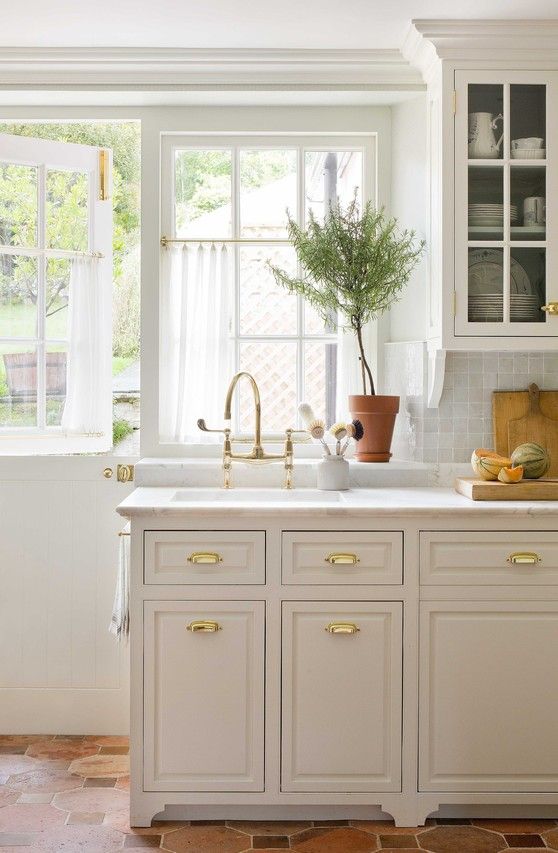

This terracotta floor (above) looks like it has been there forever and it was well handled with a soft cream and blush palette.
However, outside the context of a Mediterranean style house or a garden type setting, tread lightly with this choice. It could look forced or just plain wrong in a more contemporary space, or in a high rise condo with no connection to the ground for example. But if you do have this kind of house, and you do live in a warmer climate where hardwood is problematic, it’s worth considering. And if you have it already and are wondering whether you should rip it out, I hope I’ve given you some inspiration for how you could make it work so you can reserve more of your budget for the fun part, decorating!
And for the rest of us, a great way to indulge in the trend is to toss it in as an accent or try it out in the powder room, it’s a cozy choice for the cooler months ahead 🙂
I’ll keep you posted on what I decide to go with for my sofa refresh 😉
Are any of you loving this colour right now? Or considering or living with terracotta tiles? Do you feel it’s classic or trendy? We’d love to hear your thoughts.
Thanks Tricia! Here’s my Dallas class from last week!

There’s still time to attend my last course of the Fall season in Vancouver, November 28-20 here.
Related post:
The Best Way to Work with Staltilo Flagstone (Because it’s Pink)


You are not recovering that gorgeous yellow sofa in your living room are you?!!!
I had to laugh at you on Instagram saying it still feels like summer in Charleston. Real summer in Charleston averages a high of 91 degrees, Maria! Spring in Charleston begins in March. 😉
I had my living room done 18 years ago. We used
a salmon color, butter and sage green. I still very much love the look, our “garden room!”
LInda, I have peach and seafoam green!! I have had it for about 25 years and I still love it! It is my “garden room” also.
I have a city apartment in another state, with terracotta coloured granite benches and terracotta tiles and no budget to replace them! I ended up repeating the terracotta colour in cushions, artwork etc. I used a green grey for the main wall colour with the bedrooms in an indigo and used millennial pink and gun metal grey as my accents. The apartment feels really current!
It is to laugh to see dreaded Tuscan re emerge as an in colour. Soon honey oak cabinets will be in too. I’m still firmly anchored in that brown trend, so I’m delighted! In,Ike the idea of using cooler tones to make the warm brown look current. Thanks for the great photos to inspire me re decor choices!
Yes I have large terra-cotta tile in my kitchen and now I’m even more in love with it. Definitely think the 1-3rd wall paint looks like amazing idea for my kitchen repaint. Which is currently beige and looks fine. But with my cream cabinets I think a white wall with the lower terra-cotta and small pink stripe would look great. And my tile does have the pink tones vs the yellow. Thank you
In my family room I have a gorgeous hand knotted tribal area rug with with (not too dark ) terracotta background and as you said “one with a long history” . I can pair it with modern, traditional, MCM furniture and it always works.
Maria, this post was PERFECT timing! I have terra cotta floors in my kitchen and we are about to start our kitchen re-do starting with new kitchen aid appliances scheduled to arrive tomorrow…just in time for Thanksgiving! I am planning to have my cabinets painted and deciding the correct color of white/offwhite/cream is the current challenge as well as choosing the right countertop and backsplash. Also whether or not to glaze the cabinets. Oh how I would love your advise! This post has really got me thinking as I was nervous about putting white with the orangey color. We bought this house 2 years ago and the tile was here and I immediately loved it but always feel I need to give a disclaimer when people arrive lol. I’ve always loved terra cotta; we live in FL and my porch and patio are right off the kitchen so it’s always been the plan to keep it and make it work whether it’s “in” or not. Hearing that it’s making a come back makes it all the more sweeter. Thanks for your great insight. Love your blog! Jo-Lynne Shane is how I found you 🙂 ~karen h
Hi Karen,
I would not glaze your cabinets, that was a trendy tuscan finish, and I can help you choose the right cream in our eDesign department, here’s the one colour consultation!
https://mariakillam.com/product/interior-paint-colour-consultation/
Hope that helps! Maria
Love terracotta. Just recovered my family room sectional in terracotta. Also my laundry room is painted terracotta. For me it is never out of style.
I have always liked real terracotta floors and tiles and pots, so I am glad that it is a “trend” again. I always thought it was timeless. True, not right for every house, but quite versatile.
Personally I intensely dislike it–everything about it. I doubt very much it is really a trend–just a quick fad to see if we will “bite”. bet we don’t.
I have always loved the muted, muddy colors – dirty as Maria would say. And terracotta is my favorite neutral to mix with blues and greens.
Tricia, thank you for the great post! I love the fresh way terracotta was used in the last photo with the cream and blush! In 1990 we lived in an open concept south facing flat full of windows and flooded with sunshine. Terracotta was very popular back then. I painted the walls, floor to ceiling, in terracotta. Well, walking through the living area was like walking through the flames of hell! It was too much! I can’t even imagine what it would be like for me now – I think that it would bring on hot flashes! At the time, it seemed to me that I would get a dull headache when I would walk through there when the sun was shining.. It didn’t last a week – I painted it out. As Tricia mentioned, please tread lightly when using this colour! I just had to share my experience 😉
I’ve always loved Saltillo/terra cotta for floor, planters, etc and as a clothing color.
Hiwever, the builder of our
late-1970’s GEORGIAN townhomes chose it for the first floors of the 11 homes he built.
So wrong.
I can finally say it’s “on trend..”
Thank you for this! My tiny dining room is painted terracotta-Cavern Clay!- above the the wainscotting. I have always loved it as a color that just warmed my soul. I was so bummed to read the backlash on Cavern Clay. It had me seriously doubting my taste.
Additionally, I also hate the Tuscan trend now but for me is the combination of the Tuscan colors with gold that is the poison. On their own I love the cranberry and green-done against fresh walls they are wonderful. When done against a gold paint the problem starts. Lastly, I pray that oak cabinets come back in. My new house has an oak bar in the basement that my husband loves. I was able to persuade him to paint the rest of the oak white but not that.
Great article on this renewing color trend! I, unfortunately, am tired of the color because I live in a home built in 1992. Our kitchen has 12 x12 porcelain “terracotta” tiles. I’ve never cared for the orangey-undertones at all. The former owner and realtor described the floor as “Italian terracotta” tiles. That’s a big stretch! If they were, indeed, true terracotta tiles with age and patina, I’d consider keeping them, certainly. Planning a kitchen remodel, soon, and I will be installing a medium brown oak floor as Maria advises.
Really!? I’m just researching how to put new tile over old tile—much easier and cleaner than ripping out the old Tuscan tile. This return to terracotta would be great for me.
I’ve never been attracted to warm colors. So I don’t see a rust color happening in my home. Unless it’s mixed with mostly cooler colors in a fabric for pillows or window treatments.
A friend has terra cotta floors in her home. The only issue I have with them is that the grout lines are too thick. Otherwise they look great with her off-white cabinets. But it gives off a Spanish vibe & her home isn’t Spanish. So that would bothers me also.
Great post, Tricia. I guess I am a firm believer in sticking with colors you love regardless of the current hot color at Homegoods/Homesense or in the shelter mags. That being said, I am happy to see the warmer neutrals and creams making a comeback.
I have large terracotta tile floors throughout my laundry, entry and kitchen. Though I can appreciate them in other homes, I would do anything to get rid of them in mine! I just can’t go the super warm, orangey colour when the look I’m going for in my home is more modern yet classic. I currently have Bleeker Beige on the walls and plan to have it all painted either gray owl, horizon or classic gray. Hopefully that downplays the warm, orange tones! I have even thought of laying vinyl tile right over top, but I’ll try the paint trick first.
These are gorgeous examples of Terra Cotta – but honestly all i care about is where to find that scrumptious velvet you are considering for your sofa. I may die if i can’t cover something in that fabric!
Hi Cindy, it’s Sung performance velvet from Maxwell Fabrics 🙂
No. Unless you live somewhere sunny and the house style can handle it. If I was in that situation I would be all over off white/cream and dark blues.
Thank you! Several thousand times thank you as that’s the dollars that I was looking at to change out 1600 square foot of (fake but don’t look too fake) terracotta look tile through my open plan living and hall (although I would still prefer timber floors to get the feeling of flow to the wrap around deck) .
I am about to redo my kitchen and have limestone exposed brick walls that are golden undertones and pink terracotta tile. I can now see it come together in our Aussie bush setting with my off white/cream subway tile and custom off white/colour cream cuboards. At least if I get that colour wrong, they are easy to repaint.
As always, invaluable advice.
Terracotta tiles are great for a very warm climate but in most of the US and Canada they would seem out of place. They are hard underfoot and cold when the temps drop. As Tricia said, use it sparingly. I truly believe it’s a trend that will not catch on in the mainstream.
Noooooo! To me, terra cotta belongs in a hot climate with lots of sunshine. That’s the only time I’m fine with it.
Earth tones have made me sad all my life except when found in nature. I particularly dislike dark brown except on wood. It’s difficult to use happy and bright jewel tones with terra cotta.
I started decorating with grey and cheerful bright colours in the 80’s and do not intend to stop. The only problem with that is that it gets very difficult to find appropriate bright fabrics and accessories when earth tones are popular. In the 80’s it took me 4 years to find an attractive yellow print fabric that did not have birds on it; I persisted and never gave up. It appears that I better stock up now and then go on a decorating hold until this earthy trend is over.
I keep enjoying your posts Maria. Keep them coming.
What a timely post for me! I have clients who just purchased a house with terracotta granite counter tops in the kitchen with shades of terracotta and beige back splash. Also there are terracotta feature walls, drapes and orangy hardwood floors. It looks like houses that I designed in the early 90″s and I don’t like it at all now. We need to repaint the walls and come up with a color palette so you have given me new inspiration to keep the house looking current. Thank you! Good post and I love the example pictures!
In general, terracotta is too orange for me (I wouldn’t decorate with a color I wouldn’t wear) but I cannot see terracotta without thinking of my Aunt’s glorious terracotta and turquoise kitchen! It’s beautiful.
I have lots of Mediterranean genes which love terracotta and just enough Swedish genes to keep me from going overboard. Thanks for these beautiful photos. It’s helping my imagination create small ways to enjoy terra cotta without going overboard. And blend from outside into inside.
As I was out today running errands, I noticed that all the colored leaves on trees were a terra cotta color, no bright reds or yellows or orange but a rust color. Maybe Mother Nature is trying to tell me something!
“Certainly not many of us will be using it as our main wall colour in an open concept home.”
I did exactly that, and my open concept home also has 14 foot ceilings, so that is a lot of colour! Yes, I was slightly nervous beforehand, but it looks fantastic and people have asked to come back with their partners to show them it (anyone arriving at my front door can see the colour).
Not quite terracotta, it is Gingerbread from Janice Lindsays Desert Spice colours.
Always enjoy your posts!
Terra Cotta has been around for ages and could be considered classic for certain architecture only. No one is going to choose to put NEW Terra cotta tile in a new build or remodel. In the southwest US Spanish style homes this might be fine but that is it. While it’s good to know how to freshen existing tile you are stuck with I believe it will always look like the client is “making do”. I don’t personally believe it is a trend anyway. If the client loves the color then by all means use it, but not in tile. It is not a timeless look for most of North America.
I totally agree! It’s stunning in the right home, but I don’t see it making a great comeback for fixed installations like tile flooring…
How odd. My husband says I am always predicting design trends by accident, and two days ago I searched for the Ralph Lauren color I had painted an apartment from a decade ago. It happened to be a terracotta color. I asked him if maybe we could paint the office a similar color instead of the direction we were headed which was more cool tones. Our whole house has a ton of cool gray color! And this post appeared in my inbox the day after I brought up the suggestion. I could not believe it…
But it is good to know I am in good company!!!
Wow. Terracotta – that is a gorgeous color! And it’s amazing how you can pair it with other colors so it doesn’t lend a southwestern vibe to the interior. These photos are exquisite! I love how well terracotta goes with gray, too. So classy and warm.
I remember painting my front entry hall a beautiful terracotta colour in the early 90’s. The house had wonderful woodwork too. I couldn’t ever live with it again, too many old memories. Just like when I see hunter green now, no thanks, I don’t care for the flashbacks!
I have been waiting 15 years for terracotta ! We spent over 20 years vacationing in Arizona each winter and I fell in love with washed out terracotta.It was everywhere. In fact, I renovated my powder room (all white , thank you Maria) and added artwork and towels in terracotta. I’ve been afraid to do much more with my favorite color but thanks to your ideas and photos I will now try. I have alot of white and green in our master bedroom and now I’m determined to add washed terracotta accents.
Debbie, that is exactly how I would do it too. White background, terracotta accents. No terracotta walls for me!
I had terracotta paint color in the late 90s and while I loved it at first, it quickly became too warm and too oppressive. I think the trick is that if you are going to use terracotta paint color and fabrics, it’s best to choose lighter versions of the color instead of the medium or dark saturations. I love that apricot fabric you are contemplating! It’s very fresh looking while looking cozy as well.
I love these photos. I have always loved stone floors. I used a terra cotta paint in my small entry hall in a 1936 Tudor. It’s a small house but has some lovely classic features. The color is called ” brick dust” and is either Benjamin Moore or Pratt and Lambert. The woodwork is a glossy, very white. There is light from a transom in the front door. One wall has a mirror about 6 X 9 feet. And there is a white hall closet. Floors are marble tile with a central medallion of Diana surrounded by small lions.So there is not a cavelike box of color. it is just enough and is a nice contrast to the cream mixed with a tiny bit of tea rose pink on the living room walls. Also there is a lot of white woodwork and great light. I went ahead recently and painted the dining room an extremely strong orange- “fresh nasturtium ” also Benjamin Moore I think. Now that took a leap of faith ! I like it; no one else will venture too many judgements. In contrast to that the terra cotta is very tame and retiring. White woodwork helps with these colors. I feel certain I would not like it with dark woodwork.
Hi Maria I follow you on Instagram, love your work. just found this blog today so will be following that too. I live in New Zealand where a lot of things in the interior/exterior design world can be a little different to the USA.
Terra Cotta tiles everywhere was a trend here back in the 70’s 80’s. I’m not a fan. The trend here at the minute for new builds is Black roof, dark or white aluminium joinery (windows etc) Lots of grey/white/black exteriors.
Hello,
I’ve had terra cotta painted Spanish lace walls and ceiling for 20 years. Now that I’m thinking about painting again, I’m right back to terra cotta, but this time with more of a reddish tint… or, as my 9 year old would like… a cream or white. I think that our 17 foot tall ceilings would be too much of a light color, but I’m not sure. What is the color of the walls in the picture with terra cotta that has the large green vase? My other colors are deep blue and gray (couch).
Thank you,
Elizabeth