All throughout the grey trend (which is now on the way out) I heard comments like this from homeowners as well as designers alike “I would NEVER decorate with grey, it’s way too cold”.
Keep in mind, the person who makes this statement usually has only one colour in their head when they hear the word grey.
Battleship grey blue.
Battleships are usually a dark blue grey, I assume because they blend in with the ocean.

And when Terreeia and I were in Charleston last fall during one of our Specify Colour with Confidence workshops, we took a tour of the harbour and the tour boat took us right beside the Patriots Point Maritime Museum which happens to be an aircraft carrier similar to the one in Top Gun.
If you’re my age, you’ll remember that movie from the 80’s, AND there’s a sequel coming up, you can read about it here.
I was able to take some fun photos of it because we got really close on the tour boat.
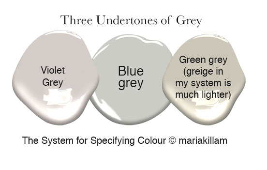
If you are familiar wth my System for Specifying Colour (below) you’ll already know that grey has three undertones, green, blue and violet.
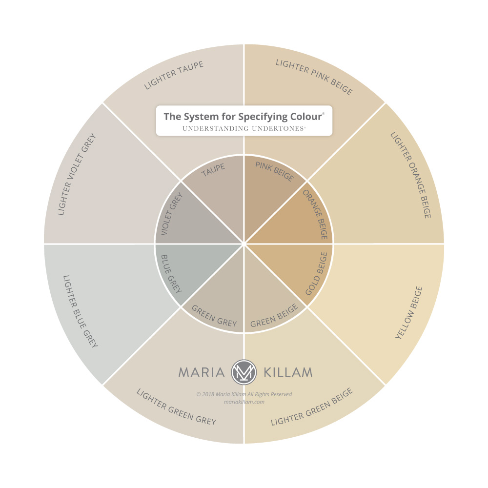
Once you start comparing any green or violet grey to an actual blue grey, well green grey (which is much more popular than violet grey) starts looking almost beige.
And that’s the reason most people call colours that range anywhere from taupes to green greys; GREIGE.
However, greige in my system is pale and light. More on that here.
To learn about which white is right for your house, download my White is Complicated eBook here.

And whenever I would show a client a colour in the realm of a green grey or taupe and they wrinkled up their nose and said “That looks beige”, that’s when I immediately knew that they were a blue person. Grey didn’t look grey to them unless their walls were blue.
While some people would think blue greys are too cold, a blue person probably wouldn’t feel that way.

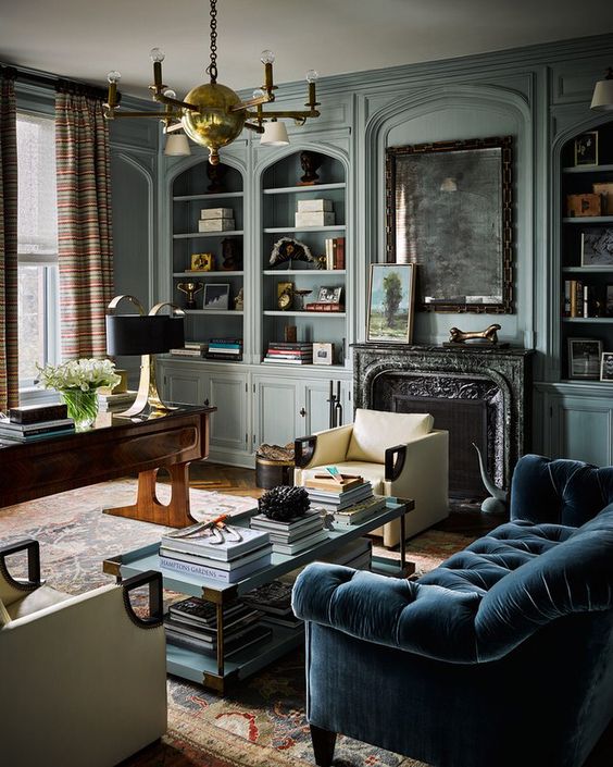
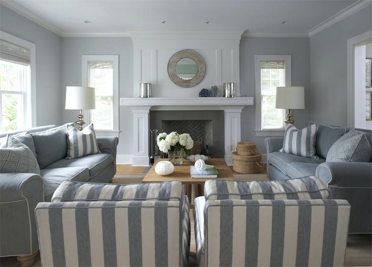
And, mostly we don’t specify straight blue greys (like this battleship) anyway, usually it’s more of a blue-green (like this room below) because it’s simply warmer.
via Jordan Lodoen

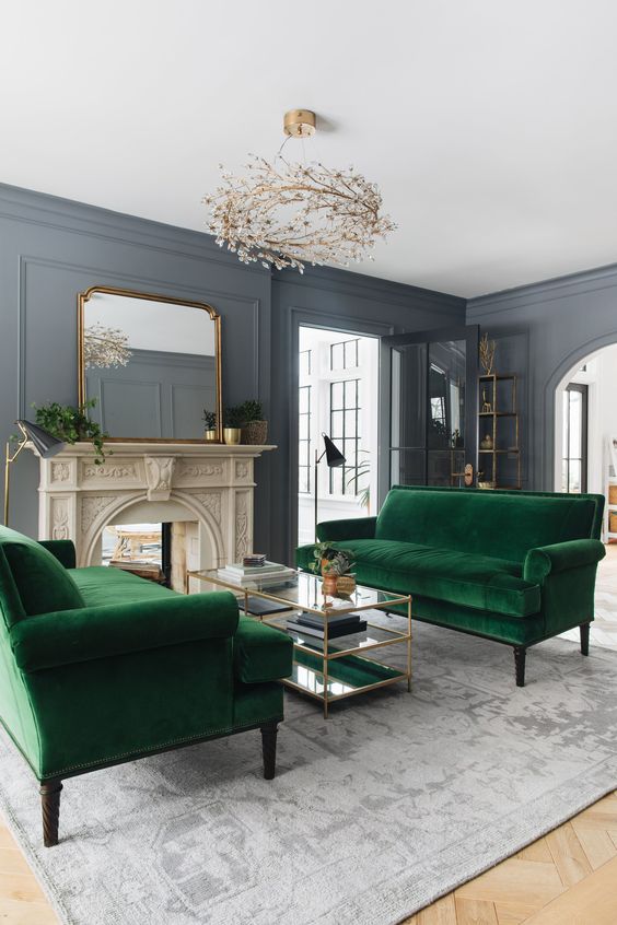
And if your walls are a blue grey, it looks so pretty when you warm it up with colour like these kelly green sofas (below):
This is the only room I could find that was painted a straight blue grey without any green in it. You can see that it feels somewhat cold without a balance of cold and warm colour. We could add many different accent colours here. For example, a yellow rug, yellow throw pillows and some yellow accessories would bring this room to life. Or, if colour is not your think, adding more of the colours in the basket would work too, see this post I wrote about that.
Link bait site image (original image not found)

Photos by Maria Killam
This mid-tone, dark grey is technically on it’s way out so this post would probably have been more timely had I written it seven years ago, but I was nowhere near a battleship back then! Now that I am travelling all around the country, I’ve seen a lot of things I’ve never seen before and I’m truly grateful.
However, before you get depressed that your house is painted a mid-tone shade of grey, just because the planet is painting the inside and outside of their house art gallery white, right now, doesn’t mean that it’s right for EVERYONE.
Grey needs colour to bring it to life so before you run out and paint your house white, try adding some colour like the last photo I just talked about.
Colour is happy.
And Colour is way more timeless than the current trendy neutral anyway.
Over to you my lovelies, did you think grey was cold until you learned about the different shades of grey?

Here’s Terreeia (pronounced Maria with a T) on the tour boat.
Happy Memorial Day Weekend to all my American followers! We love and appreciate you!
My Fall workshop dates are up! We will be in Vancouver, Chicago, Boston, Denver and Orlando.
Related posts:
Why Colour is Not Always a Personal Choice
White and Cream: The New Trend Taking Over Your Neighbourhood
Ask Maria: Now that Beige is Back is Painting my House Greige a Mistake?
How to Transform a Charcoal Sofa with Colour; Before & After


Your post made me smile at a memory. When my husband & friend painted our downstairs bathroom in Benjamin Moore Mount Saint Anne they both had minor freakouts thinking that I had picked a battleship gray colour as it went on. Thank goodness it dried to a beautiful green gray colour that everyone liked including me 🙂
Hi Christine,
I painted my bathroom that same color years ago. You’re right about how it looks when it’s wet verses when the paint has dried. It turned out to be a lovely color in my space.
I painted my formerly brown house a dark blue grey back in the early 90s. The trim is periwinkle blue and windows/gutters are white. It’s so pretty and I love how the periwinkle brings out the blue in the grey! I don’t think it ever looks cold, even when snow is everywhere ?
You have mentioned in the past that neutrals can be trendy. And that color is timeless.
Does this pertain to wall colors? Or furniture also?
Is a colored sofa more timeless than a white one?
A friend recently painted her interior SW Agreeable Gray. I haven’t seen it yet, but when I looked it up online, it’s definitely (and thankfully in my opinion) not a blue gray. When I searched online to figure out the undertone, bloggers refer to it as having a “beige” or “taupe” undertone. One referred to it as a brown gray, putty or mushroom gray. Obviously they don’t know your system! While I get what they’re saying, those words don’t help when you are picking trim and hard finishes or furniture. Based on your color wheel, I put it in the lighter green gray category. I finally found a YouTube review by your student Claire Jefford, and she did a great job of showing that it has a green undertone. It’s very pretty and I’m glad my friend chose it, even though she didn’t consult with me ahead of time. 🙂
We are in the middle of painting the entire house SW Agreeable Gray (40% lighter). It feels like a light neutral. In my house I see the taupe undertone more so than the green. I’m comparing it to BM Revere Pewter which had noticeably green undertones in my space (the house is surrounded by green lawn and trees and I’m pretty sure that’s what is causing Revere Pewter’s green undertone to be more prominent, especially in the North side of the house.
My entire interior is painted in Agreeable Gray..( our library is painted a deeper shade ) AG is a beautiful and soft shade that looks great in the bright sunlight or in the evening with lamps. People are always asking what color it is! I don’t think gray is going out of style at all!!
I love getting to see pictures of Terreeia and you together. I am so glad that you shared your relationship with her with the world. It’s really nice to see <3 And of course I also love your posts, I have learned so much from you! One day I would love to be able to take one of your live color training workshops with you.
With the free trial of HGTV I have watched Sarah Richardson’s latest endeavor. Kinda surprised to see her use grey both inside and out on the entire house. When grey goes out, it goes out fast. I remember that from the 1990s.
I love your analogy that battleship grey is like the ocean….how I never saw that before is crazy! So what other paint color is “happy” with a battleship grey in addition to a kelly green? I am taking a guess…a warm red like what’s on that top gun plane? Others?
Thanks for a fun, thought-provoking post!
Well if it’s a dark grey then generally darker colours that balance the grey. For example a pale yellow or pale peach might not be strong enough. But colours are what bring greys to life! Anything happy that isn’t too earthy or muted! Hope that helps, Maria
Too funny, (oh I would never decorate with grey – lol) Yes I did think grey was too cold until everyone started decorating with it, I didn’t know why I liked some grey rooms until I took your training. Liked your post Maria 🙂
I guess I’m a blue person because I love that shade of grey! Always have and probably always will. Thanks for another excellent post!
My neighbor painted the exterior of their house car primer grey and battleship grey. It definitely separates itself from Art Gallery White but not in a good way.