I’m in Atlanta at the Withit conference this week. My first guest post in the True Colour Expert™ series is from Sheri Bruneau!
October 2014 was a total game-changer for me. That was when I was fortunate enough to attend Maria’s Specify Colour with Confidence™ course in Vancouver.
Before attending the course, I worked with real estate agents, organizing and staging properties to get them ready to sell. Seeing the transformation, some of my clients wanted me to ‘stage’ their new homes to live in. I loved it! I was ready to expand my business to include making homes beautiful for people to live in, but I needed more education in this field. I consider myself a lifelong learner, and I wanted to learn all I could.
I had been a fan of Maria’s blog for years, and I knew that I was definitely learning from the best. Who knew that taking her course would not only make me confident in all my colour decisions, but also lead me down a completely new career path with home renovation clients?
What’s your favourite colour? Why?
My favourite colour has always been yellow. For me, yellow portrays happiness and warmth.
Born and raised in the prairie province of Alberta, and living in Calgary since I was nine months old, I still happen to be a beach girl at heart. I have no idea where that came from, but there is nothing better than feeling the warmth of the sun on my skin (and dipping my toes in the ocean).
Every time I see yellow, it not only warms me on the outside, it also warms me on the inside. Living in Alberta, our winters can sometimes be long and drawn out. While I am fortunate to live in an environment where the sun shines a lot during the winter, it’s still freezing cold outside.
Adding a touch of yellow in décor can often bring in warmth while it may be freezing outside.
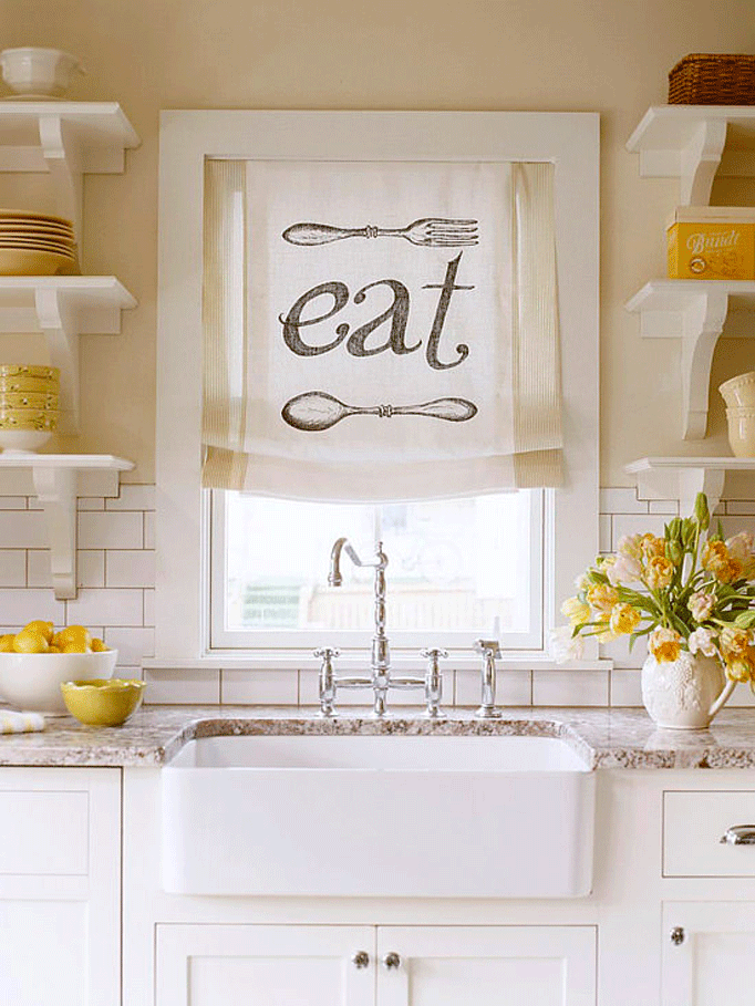 Source
What was your biggest colour/design mistake?
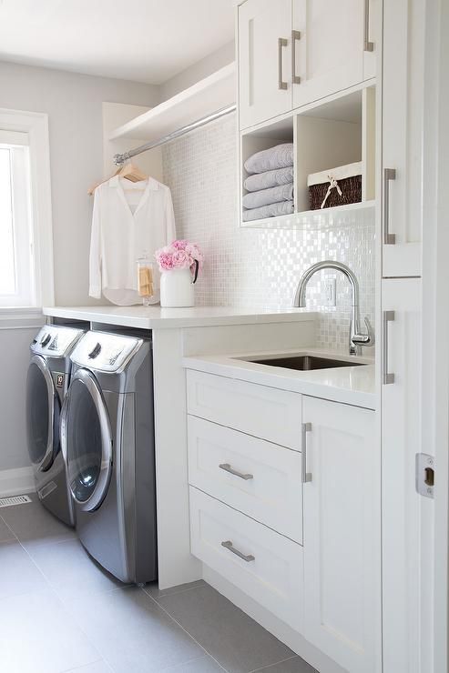
My biggest mistake involved a basement renovation … specifically, the laundry room. My client and I had chosen a specific counter sample, but when it wasn’t readily available, my general contractor chose a laminate that was “close.” (Red alert! Red alert!)
I gave him the go ahead after looking at the image quickly on my iPhone. That was the worst thing I could’ve done! When the counter was installed and I saw it, I knew it had to be ripped out. The white was totally wrong, and I knew I couldn’t ignore it. With everything else that was going on in the space (wall colour, flooring, etc.), I had to fix it. In the end, we went with a simple white counter.
While my client was disappointed that Rock of Ages was not readily available, she said she could live with the wrong white. Even though it was not my home, I could not live with the counter being wrong. Once the white counter was installed my client was very happy that I insisted on the change.
What is the most important colour lesson you’ve learned?
Compare, compare, and compare! Only when we compare colours can we be truly confident in knowing we have made the absolute best decision for our clients. This holds true not only for paint colour, but also for fabric, counters, cabinets, flooring, and everything else.
Just recently, I was helping clients choose a cream colour for their dated wood panelling. While my client thought we had the right colour, I knew it wasn’t the best colour. After comparing some more samples we did land on a different colour that worked a thousand times better for their space. I think of it like being a little bit like Goldilocks. Too soft, too hard, just right. The same holds true for colours: too dirty, too clean….just right!
 Source
When it comes to colour, what’s hot? Which colour do you think is timeless, and which colour trend would you love to see disappear?
Where I live, gray is becoming hotter and hotter. There is more gray in furniture and accessories. In addition to gray, I am also seeing a lot of coral, and the two make a really nice colour combination.
 Source
I think white is timeless. Whether we’re talking true white, off white, or cream, white is never dated. It’s such a flexible colour when it comes to decorating.
 Interior by Sheri Bruneau
The colour I would love to see disappear? Chocolate brown. Although I love a great piece of chocolate to eat, using the dark colour is not appealing for me when it comes to decorating. Don’t get me wrong, I love a nicely decorated dark room and I’m in love with this look below. I just think the chocolate brown has been overdone.
What is one of the biggest mistakes homeowners make with colour?
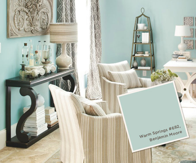
Many homeowners find something online and don’t realize it won’t work in their homes. Just because a colour looks great on Pinterest does NOT mean it will look great in your space. There is so much more to choosing colour. Working with your space and your fixed elements is so important in choosing the best colour for you.
Here’s an example of Benjamin Moore’s Warm Springs. The first picture is stunning and works well with the décor. The second picture? Well, just see for yourself how the same paint colour does not work well with the fixed elements (flooring, cabinets and counters).
 Source
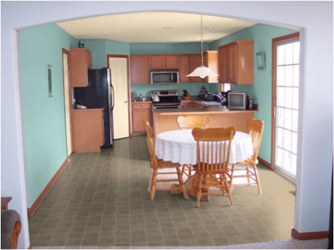 Source
What’s the biggest reason why this colour doesn’t work in this kitchen? Post your thoughts in the comments below:
What do you think are some big mistakes homeowners make when renovating?
I have three! But first, a disclaimer: I love home improvement shows. I think they provide great insight about renovation and design, and they can give us all kinds of great ideas. But they can also lead to some pretty big misconceptions:
- Your renovation will happen precisely NOTHING like it does on TV. No renovation will ever be complete in 30–60 minutes.
- TV renovation budgets are completely unrealistic where I live. There is not a whole lot you can do for $20,000. Don’t get me wrong. A lot can be done on a tight budget and I have worked with tight budgets. You just won’t be able to get the granite or quartz counters for that price plus new cabinets and flooring!
- Most renovation shows have designers working behind the scenes. Scott McGillivray from Income Property, for example, has designers who create design plans for his projects. If you head over to his Facebook page, you will see the comments from people and how shocked they are to find out he has a team of designers. While I love working with a variety of general contractors, they are not designers! They do not necessarily have the training to know what works and what doesn’t, and homeowners should not rely on them for this completely separate specialty.
 Source
Which part of participating in Specify Colour with Confidence™ created the biggest breakthrough for your business, and how did it help you move forward?
The biggest breakthrough I had was becoming educated in undertones. Before my training, I always went with my gut feeling, but now I see undertones objectively. I look at colour in a totally different light.
Learning about undertones and seeing them clearly has made me super confident in every decision I make for my clients. In addition, I educate my clients when I work with them. I discuss with them why a specific colour will not work in their space, and I provide them with a better choice that works with their fixed elements.
As a result, my business has taken off in a direction that I truly love. Not only am I working with clients who trust me, but they also continually refer me to their family and friends. A referral is the biggest compliment I could ever get.
There is something to be said about the magic of colour. Specifying fixed elements for a renovation or new build allows us to see a concept blossom into reality right before our eyes. When flooring, cabinets, counters, and backsplash get installed, and walls are painted, we get to see the magic of having a beautifully designed space come together. There is nothing better than that feeling of, “YES!” I am honoured to create that feeling over and over for my clients.
—
Thanks so much Sheri for your thoughtful advice! And don’t forget to post your opinion on the green kitchen in the comments! See more of Sheri’s work here.
If you’d like to become the next True Colour Expert™ in your area register here.


The walls are a cool color and everything else is warm. I see this all the time in real estate pictures, where the homeowners have tried to update an old kitchen with a current wall color. The room looks even more depressing than it would have with the old paint. I don’t care for the cream used on the door and ceiling, but the right cream used throughout would make the kitchen look brighter without making it shout, “Hi there! Look how old I am!” The white tablecloth is wrong too.
I couldn’t agree more! I too see that all too often.
The colors are complements….across one another on the color wheel. Both colors are fighting to become dominant.
The orangey color on the cabinets becomes stronger as does the blue green color on the walls.
The blue color appears to be a much more of a Clean color. The floor is more of a Dirty color. There is the typical conflict between Clean and Dirty. And the orange cabinets are too earthy for such a clean blue color.
The wall colour really makes the floor look dirty doesn’t it!
I think that the Warm Springs blue is too clean with the wood cabinets and earthy floor. It is also too dark with the dark cabinets, there is nothing light to contrast with it. When it is paired with the whites in the first photo, it sings! Great article SherI!
Thank you Cathy.
Great read Sheri! The kitchen colour does not relate to anything in that space and it’s also clean when compared to the other finishes that are more dirty. Fabulous comparison!
Thanks Claire!
Such a wonderful guest post Sheri! I love your website too, so great to see your beautiful work!
Thanks Jill!
Nice job, Miss Sheri! Great read and examples. The comparison of Warm Springs in the two rooms is powerful! It doesn’t work in the kitchen mostly because of a dirty floor/clean paint color conflict. The paint was chosen with no regard to what the fixed elements in the room dictate. Nothing relates.
These are actually my ‘go-to’ images for clients who may find a paint colour on Pinterest and want that colour in their home. A lot of explaining goes on to educate them in why that particular colour will not work in their home. As soon as they see these two, they are more open to seeing a better choice that would work with their fixed elements.
Actually the room could be pulled together with the correct accessories. There is no pattern in this room. Think Fiesta Ware colors.
I am not saying that this would be my first choice for painting this room. With this color of paint I would start but getting rid of the white in this room. The table cloth would be a starting point. Then the white doors need to go if the cabinets are to stay.
The flooring with the cabinet and table colors bother me more than the paint color.
If starting over I would paint the walls a medium gray with blue undertones. I see a bit of gray in the flooring – hard to tell on a monitor.
The white table cloth is a bit random isn’t it? This kitchen is a great example of why homeowners who are selling need to really take into consideration the power of paint colour. With the proper paint colour on the wall, the flooring would look less dirty and the entire space would be pulled together much nicer than what it is showing.
I think the black refrigerator looks out of place even tho there
is black in other places. It bothers me.
Carol
It is random, isn’t it?
Great article Sheri- some great advice! So true about knowing about undertones.
Thank you Sandi!
I think the main problem of the paint color in the kitchen is that the cabinets and table are very warm and the paint color is cool. They fight each other. The floor is also too cool for the cabinets.
Stained wood cabinets can be tricky. I like them in a super contemporary kitchen or a rustic kitchen. If this were my kitchen, I would paint those cabinets white!
Due to the kitchen cabinets as well as the baseboards throughout the home, this house falls into the cream foundation palette. If they would have known this, they would have easily been able to see that the wall colour was too clean.
They could certainly paint the kitchen cabinets however if they wanted to keep the flooring, the baseboards, casings, etc., they should be painting the cabinets a cream colour.
Great article and fabulous examples. Seeing is believing.
Thank you!
I hate saying that to fix it I’d paint literally everything, but given first preference I’d paint the cabinets and trim white, the table and chairs dark like the console in the inspiration pic, and the walls a soft light greyed green that gives some of the spring-like feel they’re obviously looking for but would play nicer with the floor.
I am the none-too-pleased owner of a lot of orange wood and the very last thing it needs is blue walls. Either paint/re-stain the wood or mute it with colours that don’t feed its contrast, IMO.
Thank you Josie for your response. This particular kitchen is a bit of a tricky one as doing one thing can open up an entire can of worms and/or create a domino effect.
I agree, the cabinets can be painted white (although I would paint them a cream based on the baseboards) and flooring (if the floor was staying).
Thank you for the very interesting and informative article, Sheri. (And thank-you, Maria, for hosting this!) I love your examples and that photo of the “kitchen wall-paint job gone wrong” compared to the same color, used beautifully, in the “designer” living room is Priceless!! PRETTY PLEASE, tell us what color(s) YOU would suggest to improve and update the look of that kitchen (assuming the cabinets were not going to be painted.) I’m dying to know, because, like so many of us, I have maple cabinets that look very similar!
As far as your original question about why the Warm Springs isn’t working well in that kitchen, my first reaction was that the paint color looks gaudy next to the more subdued and muted hues in the wood cabinets and floor. As you and others have stated, it seems to be a “clean vs. dirty” issue, but could it also be one of color intensity? Would a much paler shade of the same hue worked a little better with the cabinets? In the designer living room, the color appears much lighter and softer- I assume that is because it is a brighter, larger room. However, if I look at the color in the two photos at the same time, I can see that it really IS the same color!
Thanks again so much.
Hi Phyllis,
Assuming the cabinets would not be painted, we’re left with dealing with the cabinets AND the floor. There are 2 colours that I’ve picked out: Sherwin Williams Wool Skein (which is a green-beige) and Sherwin Williams Shoji White (which is a greige). In my opinion, the pantry door is also way too yellow. A softer cream would look nicer.
I hope that helps 🙂