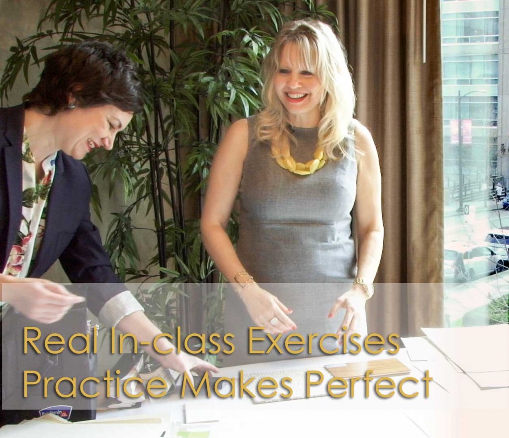
My course in Vancouver last week was the best ever! I know it seems like I always say that but truly I never lead the same course twice. I’m always adding, tweaking, and working to make delivering my system better and better.
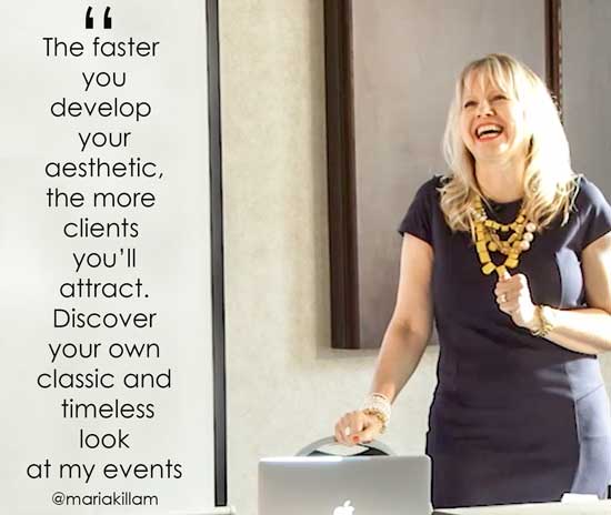
Last week I added a new conversation–or more accurately inserted a much bigger emphasis–about adopting a classic aesthetic, in the course. Why? Because knowing how to create a classic look gives your work broad and enduring appeal and the faster you get known for a particular look and feel, the quicker you’ll:
Get published
Establish your brand
Make more money
It took 10 years of working in the design industry to figure out what my look was and by then I had literally conducted thousands of consultations. After awhile, I stopped looking at the latest accent tile trends fads and thinking they were awesome, to looking at them like they were the thing that stood in the way of my client having a classic and timeless home. It was an epiphany that helped shape my aesthetic and point of view as a designer. And you need a position, otherwise you are just flailing around, getting caught up in the demands of your clients with no coherent opinion to offer.
For mobile users go here to view the video.
How often have you found yourself in this position:
“Oh my, this is what they chose, how do I make this work and make them happy?”
If you are helping a client choose finishes, fabrics, and colours for their home and they choose something that simply doesn’t work, doesn’t suit the style of the home or is the wrong colour, etc. THAT is on YOU.
Your job is to CONSULT with your client so that they end up with the most beautiful result. You are the professional that sees the big picture, the overall look, and you make sure that everything works within that context. If you don’t have the answer to the question WHY your recommendation is the better choice. . . well then, they might end up installing something they think is fab until it’s done and it’s not as great is they imagined.
And then what happens?
Neither of you is happy and your referral chain ends with them (maybe).
It might be time to change that conversation to a new one that goes like this:
Thank you Maria! And, thank you for an amazing course in Vancouver. I have already applied the skills I learned in your course in a colour consultation with Pink Beige, Orange Beige, Red, AND Chocolate Brown on every fixed element throughout the house!
The client wanted a ‘fresh’, trendy new colour on her walls….pure white and grey! Because of you and the course, I could say no, that won’t work and I was confident enough to explain why and offer her the best alternative! What a great feeling! Thank you!
Emily Collins, Open House Decor
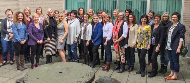
Here’s the new group of TCE’s from my Vancouver Class (above).
Back row, left to right: Jill Wolske, Tania Austin, Michelle McKee, Lisa Borton, Kathryn Quick, Susan Marr, Carrie Smurthwaite, Tamara Tang, Wendy Reilly, Jennifer Fyfe, Juliana Dare, Sylvia Rose Pratt, Emily Collins, Tracey Menchions
Front row, left to right: Julie Van De Wyngaerde, Jacquelyne Allen, Fiona Roeske, Maria Killam, Rocky Kirkeby, Dawn Devlin, Kym Cole, Christine Brenneis, Linda Erlam, Kim Sannar, Susan McCargar, Laura Nordstrom, Tricia Firmaniuk
I’d like to thank Maria and her team for the amazing experience at Specify Colour with Confidence workshop in Vancouver. The course was very enjoyable, informative, entertaining and inspirational.
Specify Colour with Confidence helped to clearly formulate branding ideas within my company vision. Maria emphasized we should articulate our own aesthetic as a key component, as this is ultimately why people will hire us. Confidence building is also a big part of the course outline that we all benefitted from.
Maria, you are an excellent teacher! I look forward to future learning and sharing with True Colour Experts in this wonderful world of design we live in!
Susan McCargar, HerStory Home
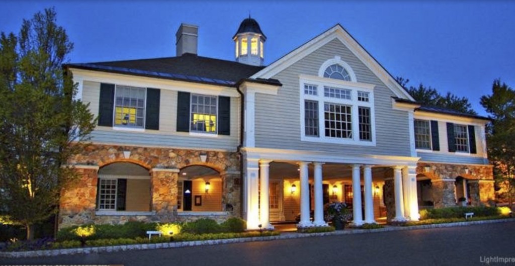
Olde Mill Inn
My course in Charlotte, North Carolina, right before High Point Market was sold out with a waiting list, so I added another course in New York! Okay it’s technically New Jersey, but close enough, right?
The course was held at this charming Inn in Basking Ridge, New Jersey. (Above)
It was just in time to spend an entire day with a lovely client I have been working with on-line for years, as well as celebrate my birthday in New York City (June 7). Hooray!
Make this the year you take your creative gifts and talents from the realm of intuition into being able to knowledgeably explain the WHY to your clients. And choose the correct neutral undertones in everything from fabrics to countertops, tile, carpets and more.
If you would like to transform the way you see colour, become a True Colour Expert.
Follow me on Instagram!


Heading to Dallas today…couldnt sleep I am so excited!
This is such an amazing course! Vancouver was so fun I can highly recommend it. If you’ve been on the fence trying to decide if you should go or not I say jump off that fence and get registered!
Everyone was incredibly supportive and Maria and all the staff work hard to make the 3 days an experience you will cherish.
Maria–I am writing this after only having read your introductory paragraphs….here’s what I have learned from being involved in singing (and voice training) since high school: when you have learned to practice scales, and learned the names and locations or the notes, etc., listened with a discerning ear to the classical pieces and their structure, over & Over again,
THEN……you might be ready to compose some jazz.
Just something to think about. Love, P.
Hi Maria,
I just viewed your video and am a bit confused about what the black block was you were holding.
Thx!
That’s a black quartz color sample for a countertop.
It’s black and green grey, sorry that wasn’t clear in the video I should have included it in the post.
My point was that if I was specifying white cabinets I would either choose a black and white or black countertop. NOT black and grey to start with.
Great question!
Maria