![]()
![]() In the beginning, I called my system; Understanding Undertones.
In the beginning, I called my system; Understanding Undertones.
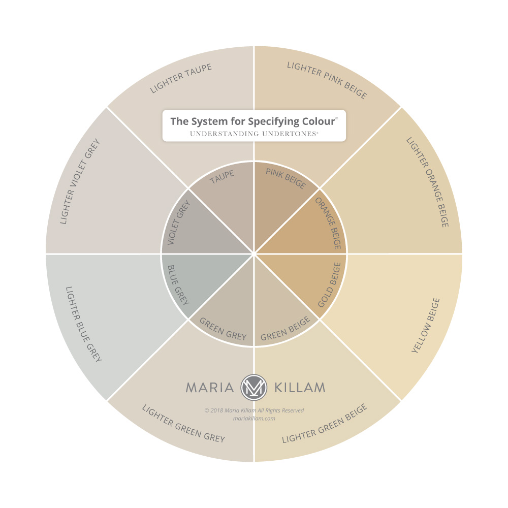
It’s THE System for Specifying Colour®, it’s not Colour Theory
It’s why I spend exactly three minutes discussing actual colour theory in my Specify Colour with Confidence workshops. I’m not kidding. Ask anyone who has completed it.
Give me this one in half strength, and mix that one in 1 1/2 strength. I’m sure you can relate to this.
That was not helpful either. Except now I had custom colours to manage with the painter.
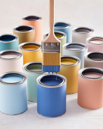
A custom periwinkle blue? Sure. But a neutral? Not necessary (image source)
Is a custom colour a better one?
Sometimes a designer will say their exterior or cabinet colour was ‘custom’ as if that makes it somehow better than a standard paint colour.
Custom always seems more special doesn’t it?
We all want to be unique. Personal growth and development courses are the same. Years ago, when I attended one of my first sessions, I remember sitting there and someone got up to share, and told what could easily have been MY story and I realized I was not alone, ie. special. I was just as human as everyone else.
Well, I’m saying paint colour is the same.
And I have a hot tip for you if this ever happens to you. Just pull out your fan deck and match it to the closest colour. In fact, have two fan decks to give you more colours to choose from. I guarantee that custom colour will be in there somewhere.
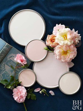
Image source
When Custom Colours are a good idea
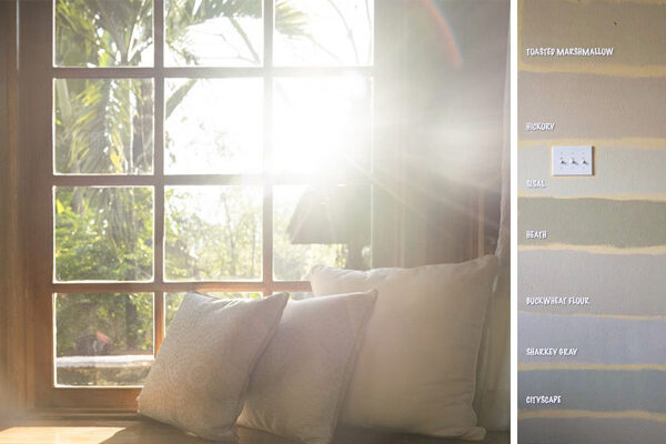
First, there is nothing wrong with a custom paint colour. Go for it, if that’s your thing, however a custom colour makes more sense to me if you are trying to match a chromatic colour that isn’t in your fan deck. Like matching a flower petal (above). This happens all the time in paint stores.
But a custom colour in neutrals is mostly not necessary once you have learned my system.
What makes my System for Specifying Colour® so good is that it’s just that, a system.
Here’s how this works
If this was your living room instead of one of my fabulous clients (Kareen), you would simply determine what the undertone of your sofa was (if you decided to paint the walls a neutral as most people would).
You would match it up to the closest colour, in this case BM HC-172 Revere Pewter.
Which is identified in my system as a green grey.
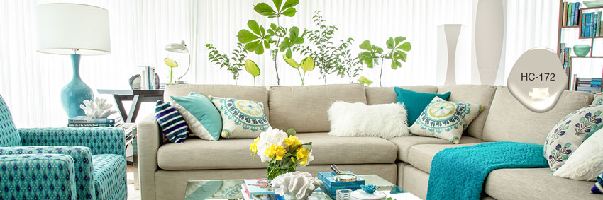
Then you simply go to my bonus book of colours and review all the green greys and decide how light or how dark you’d like to go.
That’s it.
This is when my large paint samples come in handy.
And the same goes for exterior.
There isn’t a single stone out there (for example) that doesn’t coordinate with one of the colours in my system.
That’s why the system works. And whenever you have a system, for anything you do in your life, you can achieve your goal much faster.
And here’s the best news:
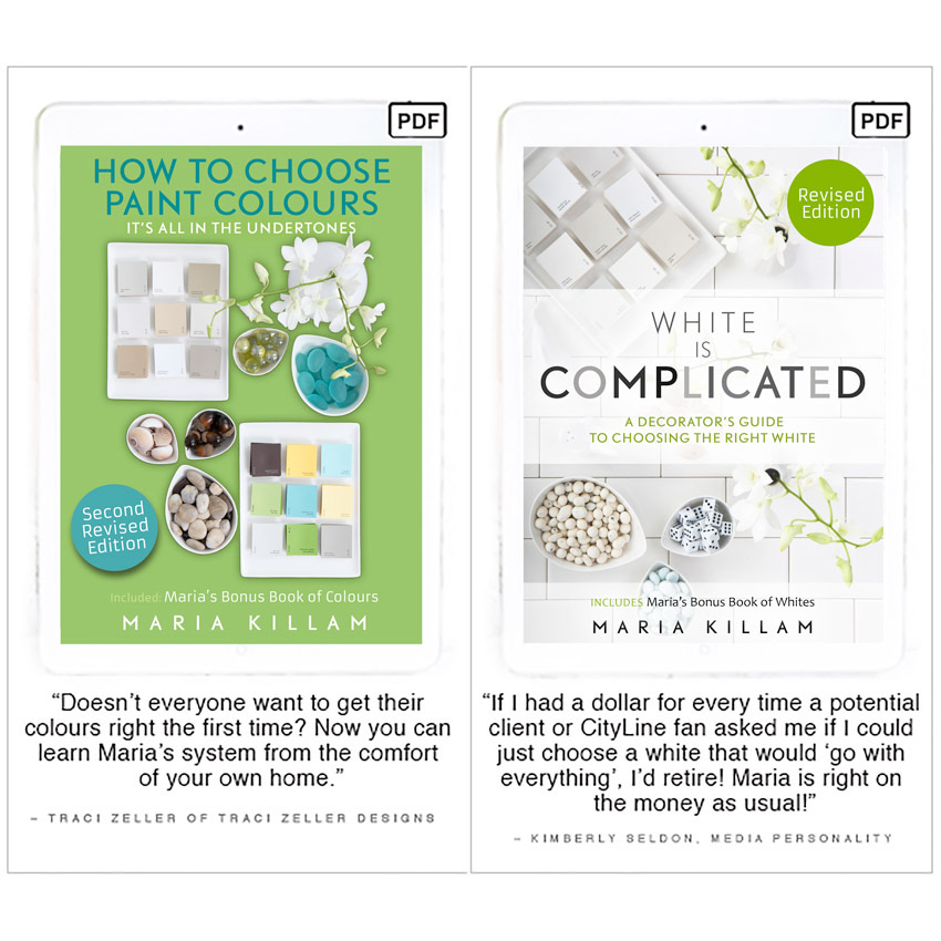
It’s NEW: My ebooks have just been updated and revised!
Black and white, the newest colour trend, has hit mainstream. It’s definitely been coming for a while and I’ve written many posts about it, but here’s how I know it’s hit the masses:
HUGE clue number 1
Almost EVERY. SINGLE. new build I drive by, is either black or white or a combination of both. And sometimes not done very well, I might add.
Even in Finland (I just came back after visiting friends and family there for 2 1/2 weeks with my Mom) we drove by a MAJOR shopping centre that was being built and the entire building was SOLID BLACK.
MASSIVE Clue Number 2
When I receive constant emails from readers who are complaining that their white walls have ‘turned’ green, or blue or peach, or SOMETHING other than white.
That’s when I know. This trend is here, it has arrived.
This Spring, I updated both my ebooks to reflect this change in colour trends AND that includes updates in the the bonus book of colours in the first one, AND the bonus book of whites in the second one (below):
When I first purchased my house some 15+ years ago, I made a naive and youthful statement that none of my walls would ever be a neutral color. I’m a lover of colourful furnishings and I thought my walls should also follow suit. And while I like to think of myself as a talented home decorator, I’ve never really been too fussy about choosing paint colors. If I liked the paint chip, it was good enough for me.
Then I discovered Maria’s blog and realized that I was totally going about it in the wrong way. Neutral walls are actually the blank canvas I needed for my colourful accents and decor (for my home). Maria has created a formula that I can apply over and over in my home and with my furnishings. This reference guide is sure to save me from future expensive mistakes. My husband is also very grateful. 😉 Kristy R.
And just for the record. You Are Special.
You read this blog, which means you are interested in creating a look and a feel in your home.
A place your friends and family love to be in and come home to.
We live in our homes every day, it’s wonderful when they feel good!
Both my eBooks come with a 100% Satisfaction Colour Me Happy Guarantee. If you are unsatisfied in any way, just send us an email and we’ll refund your money.


Maria yes black and white it definitely here .
What happened to the beige is on ?
I kept reading beige is back / white is out but never did see it …
I love white and black so I’m happy !!!
I guess if we wait long enough our turn comes !
Glad you had a great vacation and thanks for sharing with us !!
Beige is back but in textiles NOT for walls. That’s a good question! Maria
What if:
You bought a one-story boxy house.
You have few furnishings.
What color do you paint the walls?
Oh, and white IKEA cabinets are going in the kitchen in the open plan 70’s house.
And new laminate flooring, and we don’t know what color to go with for the floor either.
AND the house is dark. But no recessed lighting as there is big hate of those.
HELP!
Really. We need help!
Buy my ebooks! They will help you choose the right classic and timeless laminate flooring and paint colours. Maria
Hello Maria!
Are the revisited books worth buying if we already have the originals? I don’t want to miss a thing ?
“Bises” from a canadien temporarily living in France for an other year.
Hi Maria,
Thank you for all the valuable information you share and for providing free updates of your e-books.
I purchased both “How to Choose Paint Colours” and “White is Complicated” several years ago and I am wondering how I can receive your latest updates?
Thank you again and have a great day!
Sincerely,
May Becker