
My Mom knew the colour of the year before I did. About a week ago, I saw her knitting a scarf, and I said “Mom, that’s such an old, dated colour, are you really going to knit a scarf in that colour?”
“Well, I found this yarn and decided it would be fun to make one, she said.”
My mother doesn’t even like red.
So I’ve decided that if you’re around me, you can’t help but be on the pulse of colour as well because it’s the air I breathe : ).
I’ve certainly noticed Marsala in fashion, however there it’s called Burgundy. However, let’s keep an open mind shall we?
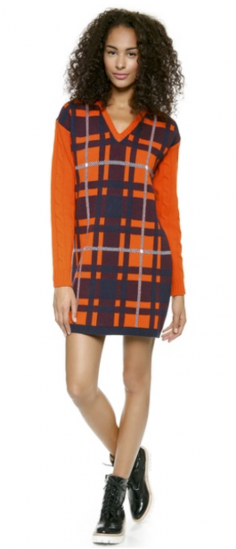
After all, what makes any new colour fresh is the colour combination. Like this mandarin orange and burgundy knit dress:
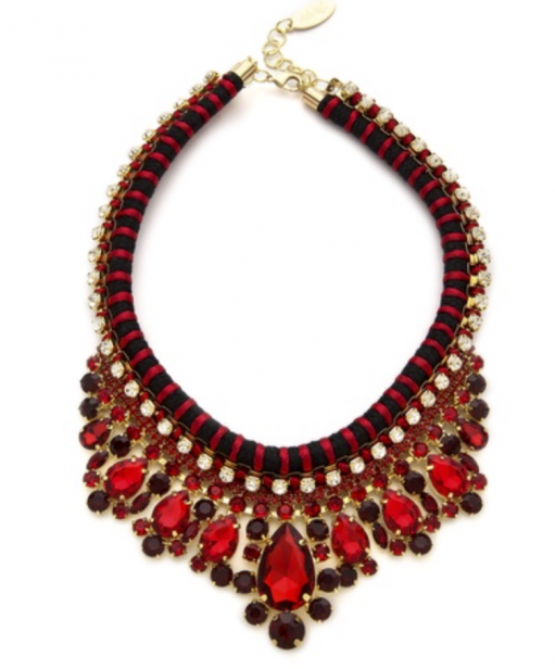
And this burgundy and bright red bib necklace: Wonderful for Christmas.
Pantone’s colour of the year in my interpretation should be one where most people are nodding “Yes, that’s right”, or “Dang, I should have guessed that!!”
A colour that is already permeating in our homes that we are embracing. In the past, that’s how it’s been.
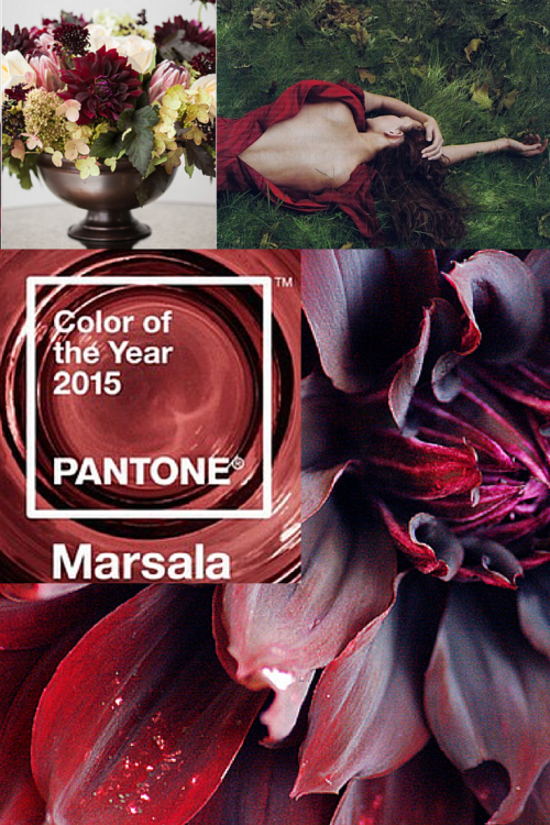
Via pinterest
However, this year it seems to be a prediction of colour to come? I am hard pressed to find an interior with a fresh use of Marsala because, well it’s not fresh, that’s for sure, however searches to find an interior done in orange and red which would feel more fresh came up empty handed. Here’s what my friend Lisa at Lisa Mende Design wrote about Marsala.
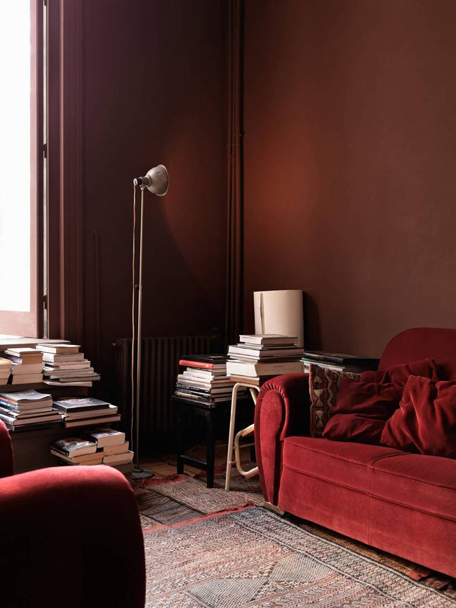
Mmmmmm, one place I love red is velvet. But even this red (above) is a little too bright to be considered Marsala!
What say you? Are you feeling it? Here’s my take on the trends of 2014 and what I see for 2015 on Centsational Girls blog this week!
Related posts:
My Take on Pantone’s 2013 Colour of the Year: Emerald
My Take on Pantone’s 2014 Colour of the Year: Radiant Orchid
My Take on Pantone’s 2012 Colour of the Year: Tangerine Tango
“If you would like to transform the way you see colour, become a True Colour Expert.


I was like – WHAT!!!! No Way
Not happening in my house.
Wouldn’t mind a blouse or a sweater in that color but not in Interiors. I’ve been talking people out of using that color (actually burgundy and maroons) and to get rid of it – and now it comes to haunt me. 🙁
wasn’t expecting this color at all. I was thinking more along the lines of lighter and fresher colors. Not very happy. I feel your pain Maria.
oh man I am soooo not feeling this one. Not sure why… Just feels like the 1980’s dirty mauve or the 1990’s burgundy lipstick? eeehhhhhh :/
I agree! Ok in a flower arrangement but that’s it!
I am still traumatized by the mauve of the 80s.
Ha! My nana was onto this colour before me! Her curtains, with the dingle-ball tassel fringe are this colour… and it makes it hard for me to process this as an upcoming colour. Yes, in fashion, but I’m not digging it in interiors!
I think Pottery Barn successfully uses a color similar to this in many of their rustic rooms. The difference is that their “Marsala” has depth to it and Pantone’s looks like they added white to it. Can you imagine trying to paint over that color? How many coats of primary!
Thanks for the shout out Maria! I actually kinda like your mom’s scarf perhaps it is the beautiful work she has done. The weird thing about this color is no one really knows the right shade.
When I saw it, it reminded me if the color many people used in their kitchens and living rooms around 2002-2005 in the Pacific Northwest. So I guess if you haven’t painted since then, wait another year!!
Funny I have had touches of burgundy in my house for years mostly in the living room and hall area rugs. My antique Duncan Phyfe dining room set came with burgundy cloth seats. My kids were little and into spilling so haven’t replaced them yet so always had things to bring the two rooms together. The wood has reddish tones too. It has been an accessory colour for awhile. With pets and kids cheaper rugs was always on the list. Latest rug is striped burgundy, cream, green, blue and dr brown. Basically the colours of my house. Even the replacement fabric for the dining room seats is fabric toile burgundy with cream background that I have had for years. Burgundy is a hard colour though to get right. I know from the 80’s burgundy and grey were common together.
The colour of the year looks more like a dark dusty rose then a burgundy though. Teal and rose ..viva the 80’s!
Lovely as a nail polish… but that’s about it. Not enough time has passed on this one to bring it back…. or so I hope!
ughhh sorry. no way to package this one to make it palatable to me. looks like ” old rose”..dingy dull…. deep …mauve or faded burgundy but WHY i ask??? marsala would be richer, deeper, more intense… this is insipid.
This is a color that they used to steer women to a lot on the show What Not To Wear. I have a couple of sweaters in this color and I like them.
I thought the same thing as katy and she described it perfectly – dirty mauve from the 80’s!
It’s not a color that I ever see my self using to decorate with. I think if you go back to the early 70’s there were a lot of people combining it with light pink. I knew someone who painted all of their wood trim in “marsala” and the walls were bubble gum pink.
Tragic.
No No No No – this particular color is one that has a horrible effect on my mood. I find it ugly, irritating, depressing, dirty, dulled.
Yep- doesn’t look like it was ever new or clean or wanted for that matter. Did someone decide that beautiful was out?
Well, actually I have been thinking the reds would look wonderful with the wood furnishings that we have been seeing. The cool grey wood with a burgundy would be divine. But I must say this looks more like a rust than a burgundy. It’s a warm tone and burgundy was a cool color in many ways to me!
Not my cup of tea, but your mom’s scarf will look beautiful for the holidays! Question: Would you consider it to be a muddy color or maybe “dusty” (which is what it appears to me)?
I agree with you and Pam. Toooooo dirty looking.
Definitely would be difficult to work with.
Maria, I have a separate question for you.
I was going to pick up some BM Baby Fawn paint but Sherwin Williams had a paint sale and so I asked them color match BM Baby Fawn. The color went up on the walls and now I am not too sure if it is the same color. Should we always keep the colors with the brands of the paints ?
I have many stories about painters that attempted to paint match between brands. It never comes out exact. I explain that like making cookies, if you use butter-flavored shortening you are going to get a slightly different result than using real butter. Paint has been the same way for my clients. Some are much closer than others. Depends upon your tolerance level and who is mixing.
If the undertone is correct in the first place, if it’s not an EXACTLY perfect match, it shouldn’t make THAT much difference in my opinion.
But it’s true that unless you saw with your own eyes the swipe on the BM chip blended in perfectly it probably isn’t a perfect match.
Maria
The scarf needs to go with one’s coloring. Your mom did a nice job. That color would look good as an accent for the right grey blue pink or cream. Not what I’m using in my own decor, yet I’ve had many compliments when wearing a similar color. When I lived in Manhattan, I wore a cashmere coat in a wine color because it made me happy. In the winter, when everyone wore black. And it was cold and gray.
Funny, though. My freshman year roommate used Madeira in the Thanksgiving gravy, but I had to buy it because she always got carded and I didn’t. LOL
I love it. My daughter came home from Vegas with a purse in this color. Gorgeous. I bought a scarf. Thinking of doing accessories in our home in this color next.
I wish Pantone Marsala was as pretty as the images you’ve shown- but I see it much ‘muddier’ with a brown tone. It’s my lipstick from 14 years ago! Lol. I can see a shimmery velvet or trim- but do not care for it. I expected more!!!
Not feeling that color.
I’m seriously hoping that isn’t the direction our home decorating Color is going.
I feel like we are moving in to the 80’s
Been so enjoying the lighter / fresher decor.
Had dark colors for so long am not longing for that look any time soon,
Maria love your remarks on the floor tile the hex and smaller tile in white or cream . I agree 🙂
What’s next – Hunter Green and Dusty Rose? It’s actually quite rich in the photos you’ve chosen to illustrate it – maybe I’d liken it to more of a ‘Scarlet Red?’
The first time I saw it, it reminded me of the mauve from the 1980-90s, except a bit more dirty looking. On the Pantone site, they have some beautiful pictures with the color, but I haven’t found many anywhere else. I think it will take people a bit of time to warm up to it. Am I in love with it right now? Not really…the the period in the 80s and 90s when mauve was in was not a good period in my life, and, as you know, color affects us emotionally.
Was reading comments about this color earlier this week and one designer’s comment (have to see if I can find it) was that if we’re going to name the color of the year after a food, let’s call it what it is, and she showed a couple of pics of refried beans. I thought that was quite appropriate.
I prefer BM’s colour of the year, Guildford Green.
Hmmm. Depressing? Affects mood? Ugh- I am so over all the GREY everywhere. Yes, it’s mod, clean, and STERILE. Every white subway tile with grey marble counter room I see makes me feel like I am about to enter the morgue and be embalmed. I won’t gash myself but if I did, the blue blood would come out! Stuff of royals and romance! Bring on Marsala!
Best comment I’ve read on this color controversy. Don’t like it, ignore it. I didn’t see a bunch of clients go hog wild over any of the colors of the year. I’m with you, I like this marsala.
omg it just hit me that you are predicting BLACK to be big and with all these moody rooms the marsala will go well with black!!!
When I saw the announcement about this on my internet homepage last week my first thought was. Egads, no way! Can’t wait to hear what Maria thinks about this one. And from what you’re NOT saying I take it you’re not to thrilled either.
Seriously, that is one sad n drab color. Dusty rose gone dirty, faded orangey burgundy, Awful.
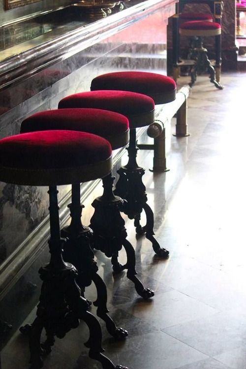
The wine color of the stools in the pic you posted is rich and beautiful, but nothing like that evil ugly stepsister Marsala!
If there was a shade like that in my 1960’s box of 64 Crayola crayons I can guarantee you it never made it out of the box. Shunned like burnt umber. Which I pray is not on the short list for hot color of 2016…. Even though it might coordinate with Marsala.
Ahh the perfect color scheme for hell’s waiting room! 🙂
Of all the colors, Pantone selected this one? It seems like I spent years getting rid of the mauves and burgundies!
Marsala is a colour for a cold climate. Imagine using it even sparingly in the tropics where it would just increase the heat in a room. I can currently see no use for it in Brisbane Aus. Last year I stayed in a gorgeous snow bound condo in Canada. A colour similar to Marsala was painted around the living room fireplace and it looked great although I did feel it looked a little dated in a relatively new building. Regardless of whether you like it or not I think we would all agree it is a strange and polarising choice from Pantone.
It is way too dusty/washed out, it wouldn’t go with any of the freshness that is so in style these days. It would have to be much more deep in colour to go with anything. No way this colour will be a hit any time soon, I say. 😉
I meant with regard to interior design, of course.
And as a side note, I find it screamingly ugly to combine a colour like this with orange. Yuck!! That is just another, “we have run out of good ideas, so now we give you all the bad ones…”
Yeah, I thought the same thing.
Cable Sleeve Plaid Dress
$433.00
$303.10 (30% off): Burgundy
Color: Burgundy
Wouldn’t take it if it were free.
Nope – don’t like it one bit. I got rid of it my bathroom a few years ago along with the awful towels in that colour. Wont be going anywhere near it.
I think Pantone’s COY concept is moving away from interiors and more toward fashion,cosmetics.
I like a good red like a good red wine or a deep blood red but your Marsala or Burgundy is a no go – dated, stale and uninspiring – I am from down under as well and this is not a colour I would be happy to use in a modern clients home but I have used a similar colour in a clients house at her request as it was a heritage listed home and we were trying to keep the regal look of the room with its detailed fret work, cornices, ceilings, vj walls and fire place – so the colour suited the character of the home and we used it with a similar toned sage green – so I suppose in the right application it can work. As for it being the pantone for 2015…….. well ??? – its not an all year round colour – we don’t paint our rooms or houses to change with the seasons – it should be left for specific character homes and detailing. The Pantone Colour for 2015 should be like every other year where can be be used all year round and in many facets of design – sorry Marsala is not a winner for me.
http://www.amazon.com/kate-spade-new-york/b?ie=UTF8&node=2594654011
Looks like Kate Spade is embracing the color.
That outfit is beautiful with the pink and black.
Yes, pretty for fashion. And the men look great with their “murses.”
This reminds me of the “custom” (I made them myself) balloon shades (remember those?) that I made for the living room of my first house purchased in the 80s. I shudder now to think of them. Of course my walls were a sickly pink colour (aka dusty rose) then. Oh lord!
I do not like this color. I am just going to refuse to use it. They can’t make me.
Hahaha! +1
I am not a fan of this color and cannot imagine using it in my home, however, recently I came across a photo of a gift box in “Marsala”, wrapped with a wide satin chartreuse ribbon, and the combination did have a modern, edgy look.
Four months ago I finally got rid of my 10 yr old ‘Marsala’ sofa. If you remember during our color consultation there was no good way to spin it to look up to date and fresh. I think that in clothing it looks good but I am not feeling it for the interior of my house … again !!
I’ve always wondered what the intent is for having a color of the year. Is it supposed to make us want to paint our homes…to sell paint?
If that’s the case, they failed miserably. At least in my home.
Some critics have compared it to dried blood. : (
My general take is that almost any color – aside from a particular canary poop yellow/green/brown chip that always stops me – can be used effectively somewhere, somehow.
If pushed I could see bits of this in a more autumnal setting. But I’d rather play with aqua and coral and charcoal and a bunch of greens, and, well, etc.
I think this will be about as successful as Radiant Orchid.
I just got out my old Christmas sweater set (5-6 years old) that I only wear to parties at this time of the year and it is a little darker version of this color. I have kept it because it I don’t want to buy anything new in red but it works at this time of the year.
Marsala was in the wallpapers that went with the mauve of the 80’s.
Sadly, some of that mauve/wallpaper-with-marsala has not been redecorated out of some vet clinics, nursing home bathrooms, hospital snack bars, etc…… I go into currently.
Very bad connotations of loss/grieving from those places.
Do not see ‘happy’ with marsala.
Garden & Be Well, XOT
Previous Pantone Colors of the Year have been clear and bright. This color is muddy and because of this, some folks may not embrace it, but if you go to the Pantone website (pantone.com) under the heading of “Why Marsala” you’ll see an interesting selection of colorways showing the color with everything from Coral to Bronze, Greens and Grey. Check it out. At first glance, I’m not a fan, but success with any color comes from where and how you use it. We’ll see.
I agree with Linda@designsnack. I feel Pantone is moving toward the fashion/cosmetic side of things. Last year, Sephora had many cosmetic lines that reflected the COY orchids. I haven’t visited a Sephora recently, but I’m sure we will see a lot of this Marsala in nail and lipstick colors. I think we can all agree that we are totally feeling the 80’s vibe of dusty rose and burgundy. This color would only look good in an 1880’s Victorian.
I agree with you! Think of the singer Lorde or the Kardashian sisters – very much into this colour in makeup and I think that is a big influence.
Think Target large christmas bags. That is the shade they use at this time year instead of their clear happy red.
It is baffling to see these colours come back. I just painted over what was probably BM’s Guilford Greeen in what will be my home office. It was not pretty. And I wrote last week about AkzoNobel’s copper orange – but not from the perspective of loving the colour (it looks like the terra cotta of the 80’s), but from the perspective of their optimistic outlook. The plus side of these questionable “colour of the year” picks is that it keeps the colour conversation going!
Not for me. Just had excellent quality and condition stair runner with a background of shall we say “Marsala” and area rugs pulled out. We bought this house two years ago and I love the house but that carpet and staircase finish (very dark red…let’s say almost “Marsala”) were so dated. Now, my staircase has been refinished (THAT WAS A BIG JOB) and the carpet is rolled up and sitting in my garage never to be reinstalled again in this house. Marsala does not work for me. I do like BM color of the year…..Guilford Green.
I don’t seem to ever like the Pantone color of the year. I think I’m current with decor style, but maybe I’m actually 10 years behind the times. I can’t imagine liking this color any time soon.
I love this rich bluish red color. it is the dominant accent color in my mid-century styled living room. I have a lot of tribal rugs and tribal pillows with deep blue-red, and I’ve added “oxblood” ceramic Mason lamps from Robert Abbey. (The other accent color is dark blue which is found in the tribal rugs and turkish platters.)
The walls are BM Revere Pewter, and I’m about to get a Room and Board Reese sectional in Tatum gray. I have bold paintings on the walls that also have dark reds and dark blues in them. I don’t think it looks dated. (I think rich reds and tribal textures work really well with clean mid-century shapes and surfaces.)
Marsala RGB is a very close match to Bricktone Red 2005-30 which I find very pretty when used judiciously (as with most Pantone COY).
It is VERY hard to get all the old color stories out of my mind at first glance. And even though it’s quite a direction change from the usual “clean and clear” colors they choose, I think Pantone chose a more universally applicable color this time.
Looks great with soft charcoal-blacks, winter whites and bones, dusty plums and teals, purple undertoned browns and taupes, and warm metals.
I do not like this colour at all ! and will never do ! A soft coral would have been much better… I think Marsala has a bit of pink in it that doesn’t show with burgundy…
All I can think of is the fabulous old
Rouge H Box Kelly bag from Hermes.
Not the new ones just vintage and shiny and
such a perfect neutral accessory.
when I saw the new color choice, I was “WHAT??” And definitely not feeling it, except I do like it with orange. A friend turned me on to that combo last year and I love it, although it looks better in a deeper shade than this.
So I polled my FB friends and got these comments. “Looks like an eraser.”, “cloth bandage”, “cat-nose pink”, and the most repeated comment was “Meh.” Not inspirational, not exciting, just boring and blech.
It looks like the color of retried beans in Mexican food. Think I will skip this one – LOL.
Not my decorating color, moving along…..
with the grey’s of the 80’s, the dusty rose & burgundy were the warm tones of choice. And boy did they take off. At the time they seemed fresh & new as we eradicated the boring beige 70’s & older avocados, harvest gold & coppers still ubiquitous hold overs from the 60’s. Burgundy became the colour we loved to hate. It was a bold statement & many embraced it. So much so that even fake cultured marble had burgundy veins. Irrespective that is looked like a recent ax murder had just occurred in the washroom.
This faded, old looking “marsala” is a transition colour as the colour wheel dances from the cooler hues we’ve been using into the smokey warmer undertones “soon to be seen at a station near you”. These steps from one hue to another are carefully generated from year to year and part of the planned obsolesce of the home & fashion industries. The colour forecasters know we wouldn’t buy unless we wished to jump on a new trend.
Personally I prefer slightly bolder, brighter hues, but no colour is ugly in itself, it is all about what you put with it, its undertone & also the quality of light in the environment.
Light sucking depressing colour in my opinion. My daughter’s bedroom was painted in this colour when we bought our house. As soon as we painted it a warm light cream with a pale blue printed wallpaper feature wall it just changed the whole feeling of the room. Not to mention the light that such suddenly appeared.
Awful color. Just awful.
Yesterday I saw four cars that color – like a word you never hear before and suddenly it’s everywhere?
The cars weren’t burgandy – they were a slightly paler, dustier versio of it. IOW, Marsala.
For kicks, I wore an old sweater in that color when I went out. It depressed me.
My 23 year old daughter who is uber cool (probably not cool to say ‘uber’) just sent me an addition to her Christmas list. You can probably guess what colour! You can see it at http://aritzia.com/en/product/diamond-mosaic-blanket/42512.html?dwvar_42512_color=9835#start=1
SO yout Mother must be pretty cool too
The only ones who will like this colour in decor are the ones who haven’t lived through it before…but the scarf is lovely.
Oh ladies how the media plays on our emotions.
Every year a new color a new trend.
Used to be we could get ten or more years out of design ….. No more
It’s all about wanting us to feel like we need the latest trend and buy / buy and more buy .
That is why designers like Maria are so special and needed. She so totally makes sense plus saves u money.
Go for the classic’s that have stood the test of time . Sure u r going to read white subway tile is going out of style on blogs , they want u to think that so you will want to take it out spend more.
If white subway tile isn’t for you that’s fine find a classic that is. Then all u have to do is change your paint colors / pillows etc.
I to for a long time got caught up in all the media
Wanting all the latest in tile flooring and etc .
I am going to go with the timeless and add what I love for color and love my bome as a reflection of us and not some trend . But keep my colors fresh .
Not many can keep up with the latest any more changes to quickly .
Dried blood, yuck.
(Maria’s Mom’s scarf looks like a prettier color — less muddy)
Marsala is a synonym for mulberry, dull cranberry, maroon, burgundy, wine and muddy red brown.
“A rose by any other name is still a rose”.
“Muddy red brown by any other name is still muddy red brown”.
Epic fail. But that’s okay: It reminds us not to be trendy.
A darker, duller version of the eighties dusty mauve. I see that even Pantone is using a more saturated, redder version of it in their promotional materials. This isn’t even burgundy, meh. Pantone’s whole palate for 2015 looks like a bad version of the eighties. Thankfully, we can all feel free to ignore it.
Hideous with orange! However, in clothing, I like wines and berry colors for tops. But, agree with several posts that it’s all about trying to get consumers to BUY stuff. It’s just a marketing game. I think the Color of the Year choices are becoming ridiculous since there are now so many that aren’t in any way related.