How do you refresh a white kitchen? Easily when you don’t have a lot of trendy tile or fixed colours to worry about. See the befores and afters of mine!
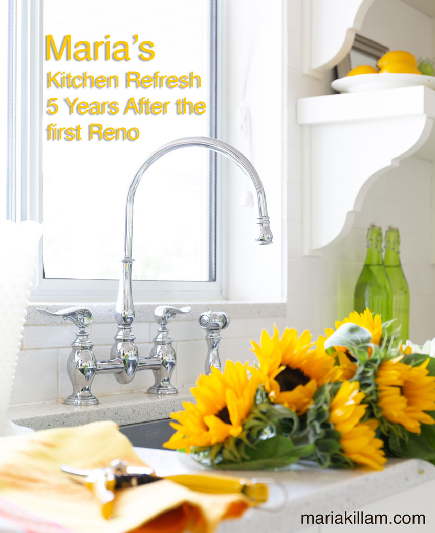
Okay so this is the month where you’re finally going to see the two bathrooms I renovated last July! At the same time, I decided to do a kitchen refresh as well, mostly to show you, my lovelies, why a white kitchen is so versatile.
So I’m starting with my kitchen first:
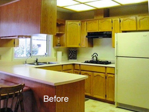
Here’s the original before pic again of my 80s oak cabinets:
And here it is after the first renovation 6 years ago:
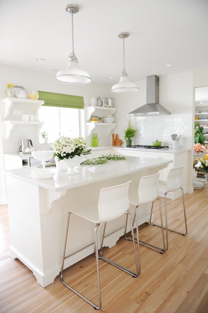
Photo by Tracey Ayton
And here it is with new pendant lights, a millwork hood fan, roman shades and counter stools!
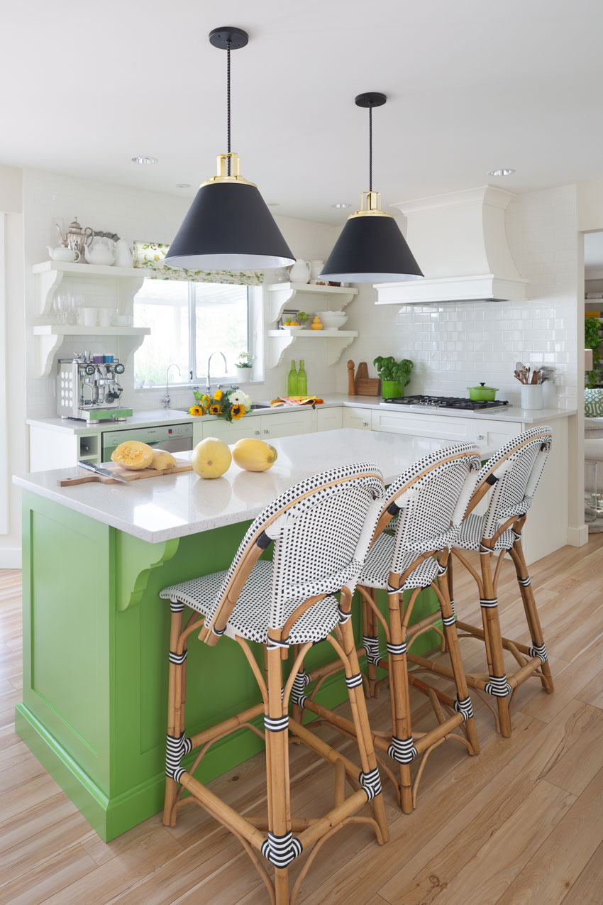
Millwork by Quality Cabinets in Vancouver Design by Jan Romanuk
And I painted the island a brighter, happier green.
Also, I had door panels added with moulding around the bottom, if you scroll back and look at my original island, it was simply flat with moulding installed around the bottom. I was on a budget originally, but my island has always bothered me, so I took this opportunity to make it look more like a piece of furniture (above).
Make no mistake, the best way to update a lot of kitchens is to rip out the weird and unusual shaped island your builder thought was so cool with drywall on one side (which I’ve seen so often).
That’s the only time you should consider painting it an accent colour as well. If you paint your island black, or brown or charcoal or a colour, make sure you are repeating that colour in your great room or adjoining room, that’s how you create flow.
Also, don’t paint your island UNLESS it looks like a piece of furniture like mine does now (it really didn’t before).
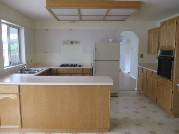
This is the before pic of the other angle of the kitchen after the uppers had already been removed.
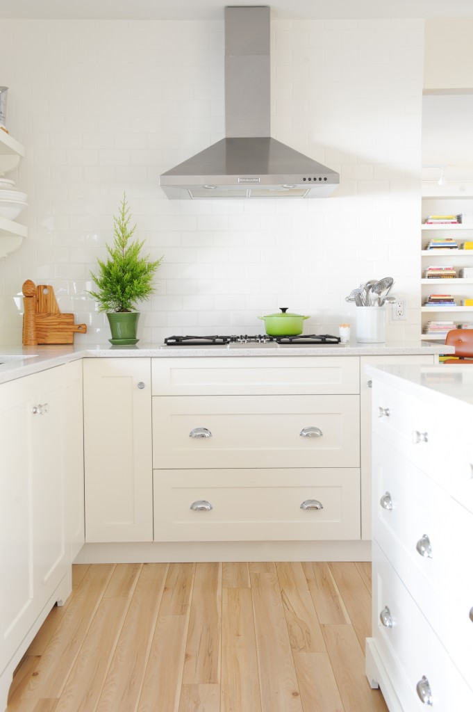
Stainless hood fans have had their 10 year trend moment but in the end, they really belonged in a more modern kitchen. However, they are definitely less costly than a custom millwork hood fan.
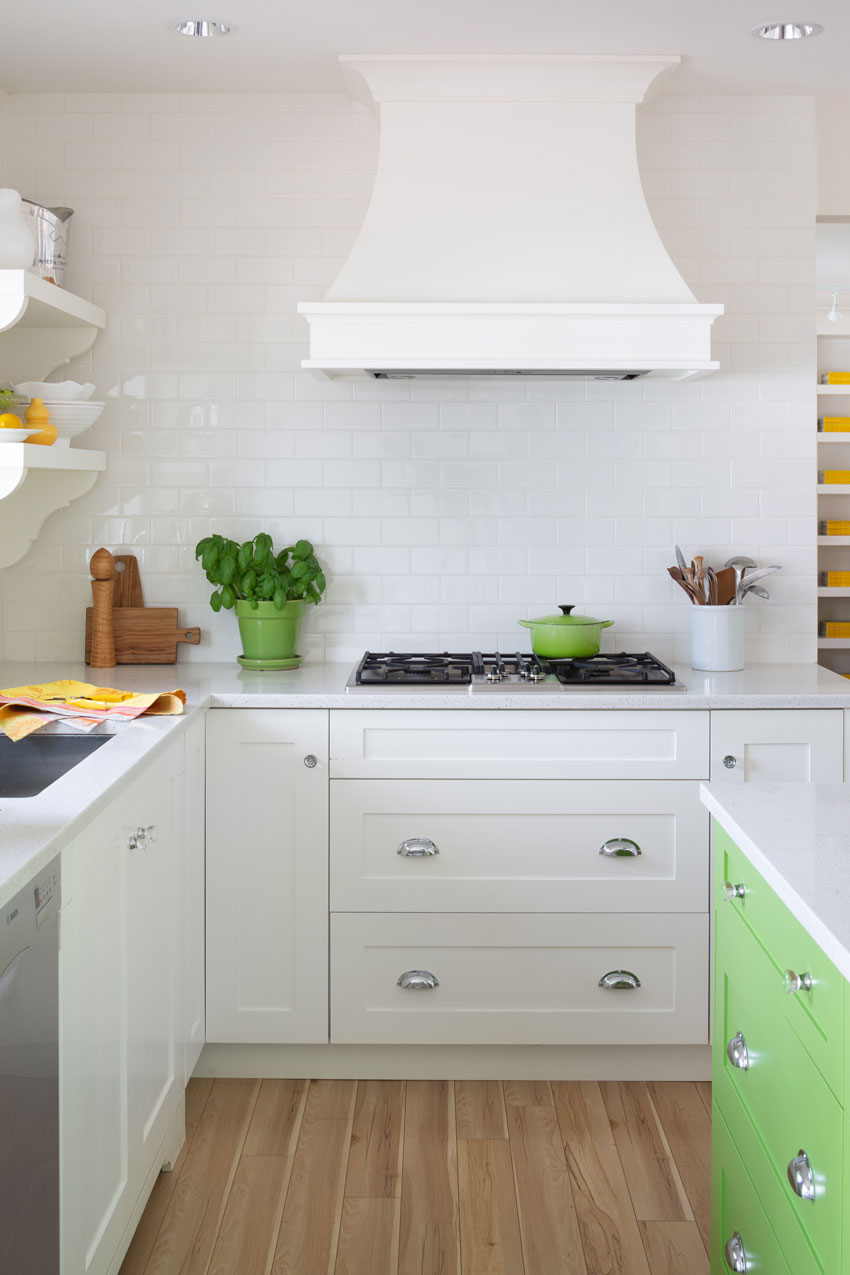
The new hood fan looks much more balanced and fits the space better. You can see that my green island (above) is brighter and cleaner if you compare it with my old roman shades (below).
Regarding storage, all my plates, bowls, flatware, cooking utensils are in the island. I have mugs for coffee above the espresso machine and all the rest of my glasses and dishes are in the pantry wall on the other side of the kitchen (keep scrolling to see the pantry wall, there is one more wall of cabinets beside the wall oven which is not shown in the photo).
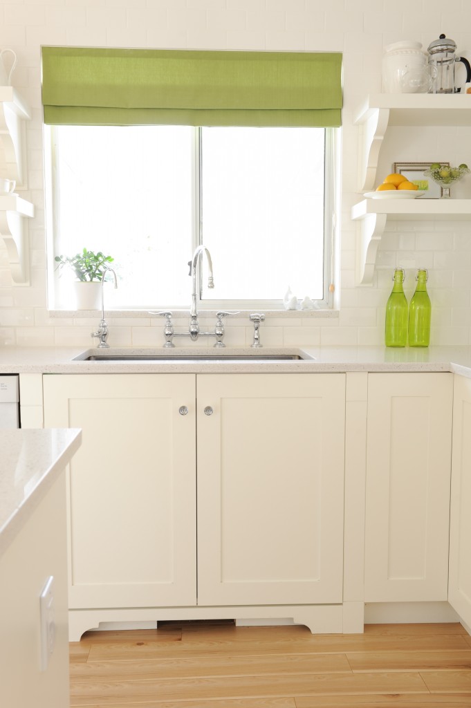
Here are my new roman shades (below)! In the end, a geometric would probably have been better with the graphic black shades but I’m really tired of all those prints, they have also been around for more than 10 years now. And I’m a flower girl.
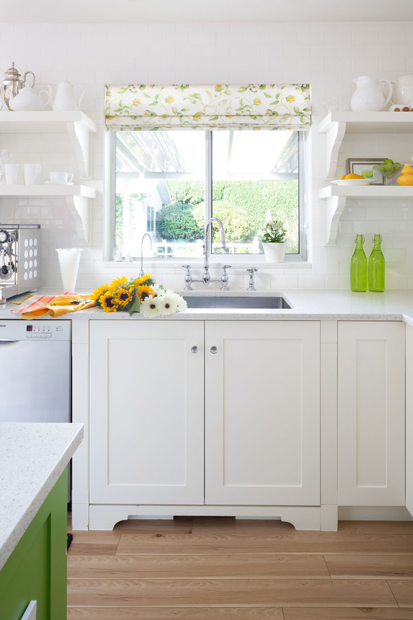
After (cabinets are Artisan White by Cloverdale Paint)
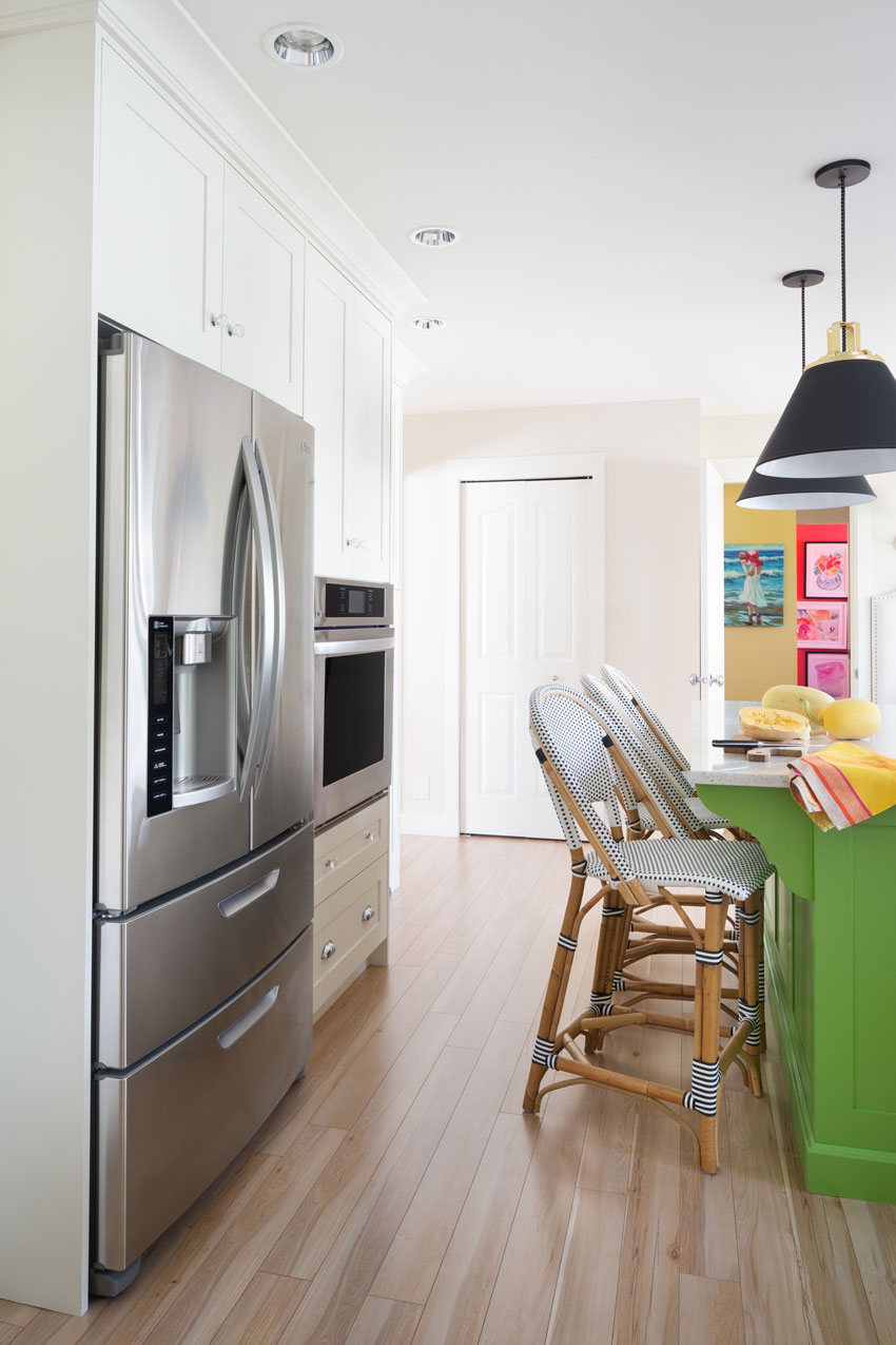
I love the way the colour flows into my laundry and powder room (seen from the doorway above).
For those of you that missed it, I did post my renovated powder room here last year.
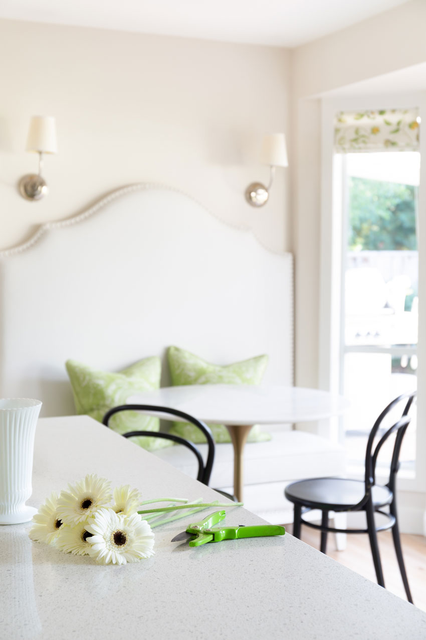
I also bought a new marble round table. It’s a better fit for this area. The only thing I don’t like about it is that it’s over 1″ taller than my old one making it immediately too high for me to sit and work on my laptop!
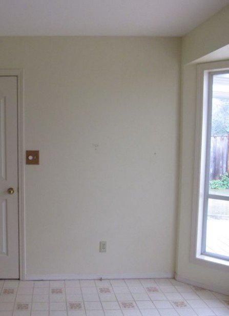
Before
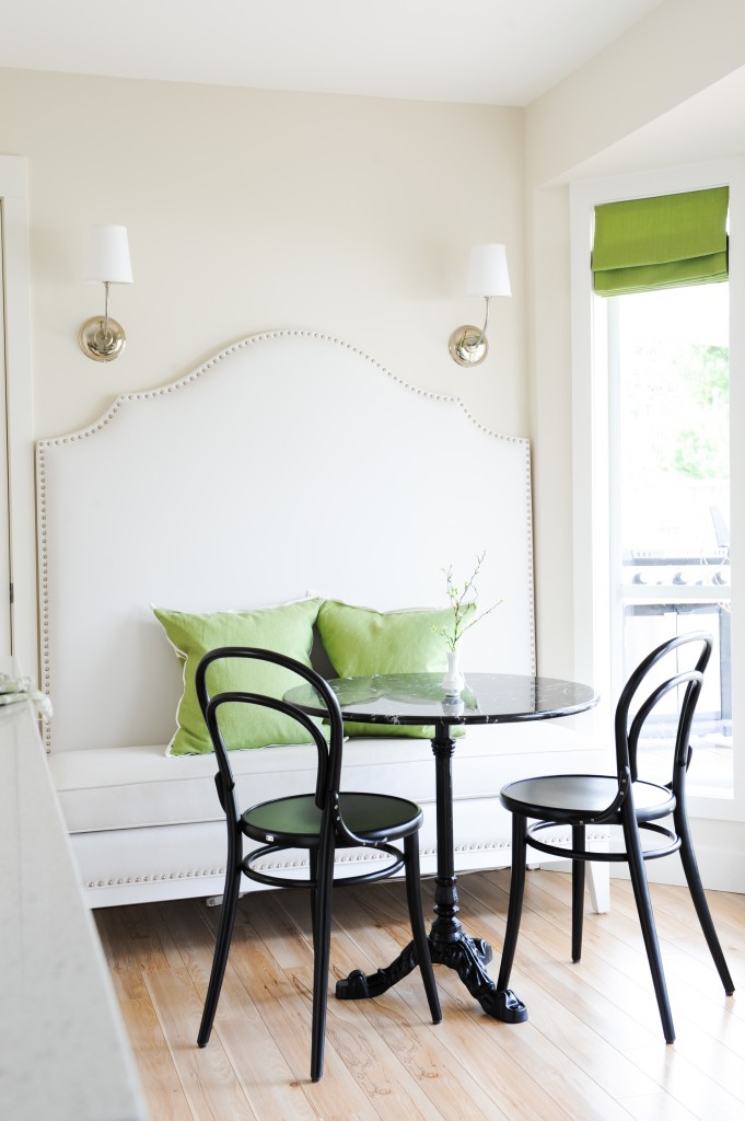
First renovation (above).
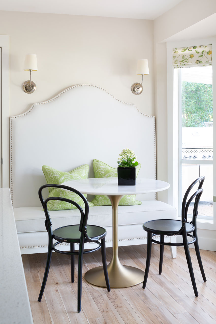
New Table World Market | current photos by Barry Calhoun Photography

Before

After (see my full house tour here)
It’s so easy to add colour and change up the look and feel when your kitchen is already white!
If you’d like help coordinating your kitchen finishes, we can help with my Create a Classic Kitchen package here.
PS. Amanda Gates interviewed me in Nashville after she’s completed my Specify Colour with Confidence Workshop in the Spring, watch the video here. There’s still seats left in the 3 courses coming up!
Related posts:
Tour my House; Learn the 6 Best Ways to Transition Colour
Which Shape is Correct for your Kitchen Island?
What NOT to do with your Kitchen Island Design





Hmmm … I LOVED everything about the first kitchen reno with maybe the exception of the small table and 2 bentwood chairs which just didn’t seem to mesh with the overall modern vibe — that lovely new tulip table is definitely a better fit! The door paneling on the island and custom hood are nice touches, too.
I totally get the need to refresh and change things up a bit after 6 years. But the larger, solid black pendants seem a little too heavy in this space, the bright green island a little too bossy, and the new island chairs just a tad too busy (still love the simplicity and unimposing lower back height of those IKEA stools!). I thought the previous base trim on the island was lovely and really married the design of the shelf and island counter brackets. It was much more distinctive (custom) than standard baseboard molding, and because it didn’t sit flush to the floor all around the bottom, it kept the space open and free-flowing — and to me it looked like a piece of furniture 😉 But every homeowner has to be happy with the space they live and cook in everyday, so I wish you much enjoyment in your refreshed kitchen.
The need after six years? More like 10 years for me. I only change colors if at all. Too much money and waste.
The important takeaway here is that it makes you happy.
Much of the original reno still appeals to me.
Some of the updates just feel (to me) like change for changes sake. (And that’s fine) Getting bored with your space is a valid reason for changing things up.
The open shelving looks like you’ve lived with the space long enough it’s now functional as well as pretty.
I like the new shade. Not so in love with the lights. In the photo they appear visually heavy and not relating to the rest of the room from that view point. But that’s possibly a matter of not being able to take in the whole space or how it relates to the other rooms we can’t see in the pic.
I liked the old bistro table. it’s almost as if the pendants were relating to the old table, but now that it’s gone the relationship is only the gold/brass of the base of the new table and fixture element on the lights. The gold/brass isn’t repeated anywhere else and that just makes it feel like the room is still unfinished.
I get wanting to replace the island seating. All that angular metal had the wrong feel (my toes cringe at the thought) but not so sure island color + wicker (without other woodlike elements) gets the job done. I do like the weaving on them. Visually that seems to work in the room and echo other similar patterns in your home.
Overall it isn’t bad, but it does feel like it’s still in transition.
Love it all, Maria! Your kitchen looks so fresh and cheerful!
I so agree with you about the versatility of white kitchens. Nice update on yours.
The bamboo (wicker?) on the chairs adds warmth. The added shaker panels to the back and sides of your island are a big improvement. May I make a suggestion? I quickly noticed that the ends of your bottom cabinets (far left and far right) do not appear to have shaker panels and look unfinished to me. It’s a small detail but finished ends give cabinets a more luxurious look. It wasn’t as noticeable before with the flat back and sides of your island.
At first sight, I thought the black lights appeared too heavy and not relating to anything but then I changed my mind once I saw some black on the opposite wall. Does the gold pedestal of your table relate to the nail heads on your bench?
Best of luck for better weather in Fiji.
No the nail heads are still silver! The gold relates to the black and gold pendants. . . . thanks for your comment Renee! x Maria
I love all the changes. That range hood is so much better than the stainless, and the table is perfect. And I reallly like the green on the island. Great way of showing how just a few changes can update a room so well.
I love the millwork changes on the island and new range hood. I love the fresh window shade. “Every room needs some black in it” seems to be true here. Lovely. The kitchen is bolstered by the bits of drama.
PS I love your little green cast iron Dutch oven.
I love what you did here. The key is that it is a “refresh” of a “renovation.” Akin to updating your wardrobe or makeup to reflect you current style. I think it has so much more personality and for one love the lighting, cabinet molding updates and hood modifications. I remodeled my kitchen 3 years ago and see areas that could be perked up and updated without spending too much money.
Thanks as always for the inspiration.
I made comments yesterday but it did not take for some reason. Anyway, you have certainly encouraged me to continue with my plans to paint my kitchen cabinets white. I have already painted the adjoining rooms (open plan) in SW Alabaster and now have to choose which white to paint the cabinets.
I love your new renovation except for the bar stools and the pendant lights. Both of them seem too large and too busy. The ones in the first renovation I really did like. The roman shades in the flower design are real pretty. I really like everything else!
I know you are enjoying the new renovation! I just love white because you can do all kinds of color with it and change it out when you want to!
Thanks Linda, yes my comments were broken yesterday and I had to call me web developer to fix the situation. Thanks for coming back to comment, 5 hours later when there was zero comments I was like “What??” haha. . . . Maria
I really like the new look of your kitchen. It has a lot more character to it. I like the pendents and new stools. Again, more personality and more you. The green is wonderful.
Love the evolution of your kitchen! The first Reno is clean and pretty. The second updated pics are more gutsy, more interesting. Love the black pendants. Black and the green of the island look great together with the white. Also like the stools which add texture and coordinate very well. And the venthood is a big improvement. Enjoyed seeing the impactful revisions made to the room… Beautiful.
The original renovation was picture perfect but this update gave your kitchen so much personality and warmth. New bar stools look cozy and comfy. I’d want to sit and have my breakfast there.
IMHO, love what you’ve done being the introduction of more colour, pattern and texture as not as sterile as ‘the before’ and do like the upgrades of new millwork. That said; the only thing that perhaps I may have done differently and depending upon the space; initially I would have considered a slightly longer Island (or a surface overhang) that what would have accommodated a stool at one end, rather than have three in a row which appear to be a tight fit. -Brenda-
P.S.: Hope you ladies are enjoying the warm temps, sunshine and beach!
As Mira said, your original renovation was “picture perfect” (like something you would see in a magazine – wait – we did see it in a magazine). The refresh communicates a real, live person’s kitchen (yours) and that’s delightfully appealing although it also invites more comments and criticisms. Personally I feel the black pendants are too big and too heavy and that may have to do with visual plane. The black table and chairs were great but they were waist level and below and the eye looked down, and they were also “open”. Had the pendants been of a different, more open design, they probably wouldn’t call as much attention to themselves and the eye wouldn’t register two solid blobs of black overhead. Although the barstools look comfortable, they do seem a tad busy and slightly crowded. Although I love that you painted the island (I remember that wonderful citron island you crushed on when you were first renovating your kitchen but Terreeia didn’t care for it and she was the main cook), I actually liked the original bottom better than the new one – that looked more like a piece of furniture to me. However – my own totally personal preference – I’d have taken two of your original shade in that wonderful yellow green and probably painted the island to match. The absolutely most perfect thing (and I couldn’t even do it in my kitchen) is that gorgeous new white hood. That really makes your kitchen.
P.S. You mentioned that the new table was an inch too high for you to sit and work on your laptop. You might look at a seat cushion that could be stored when you don’t need it (or covered) – they’re not very attractive. You might also need a small lift for your feet if your legs are short but that could be stored as well.
Thanks for your comment Sandy, the island can’t be longer because it wouldn’t fit in the space! Maria
I keep coming back to check your floors. Is that oak? Do you mind sharing more?
Hi Mira,
They were a high end laminate from Pravada floors which is a West Coast flooring company. At the time, I thought installing hardwood would be over renovating, but I’ve definitely over-decorated my house for the are where I live, haha. Maria
Thanks for the reply, Maria! They definitely don’t look like laminate. As far as decorating it, you’ve made yourself a lovely home. 🙂
Hi Maria, I like the original reno and the refresh!! I am embarking on a new build within two years and am struggling with what I want in my kitchen in this forever home. I get that white is so versatile and I do love the look but I cook virtually EVERYDAY and I struggle to keep my kitchen clean, especially at the stove area. Your kitchen looks like it has never been cooked in! I know you and Terreeia travel a lot so I’m wondering how much real cooking goes on in this kitchen? That white backsplash behind the stove looks pristine. I’d appreciate any comments from home-cooks that also have white cabinets and white backsplash and the cleaning issue.
She cooks ALL THE TIME, but the backsplash behind the stove doesn’t seem to get dirty, Oh I know why, because I’m a vegetarian, so she cooks all meat dishes outside on the BBQ because of the smell. So that’s why it doesn’t splatter. You could do a dark, contrasting grout, it still gives you all kinds of versatility with colours! Hope that helps, Maria
Thanks Maria, that explains a lot!
Love the new refreshed look Maria!
Hi Maria, when I made my original comment (it didn’t go through due to the glitch) I thought, “Wow, I can’t believe I’m the first to comment!” Ha,ha, I actually wasn’t. But anyway, I too wanted to chime in and tell you how lovely your kitchen update is. Everything is so cute and colorful. I can just imagine how happy you and Terrerria are with your refreshed space. I can’t wait to see the bathroom reveals!
Hi! What kind of paint did you use to paint the island?
The cabinet company who made the original cabinets made me new panels so they were sprayed in their spray box which is way more durable then painting them yourself! Maria
I loved your kitchen when it was originally done, and love the “refresh” also. I had my kitchen totally redone about 9 years ago and it still looks great. It is all white with a pale beige tile floor with a grey cast to it. My main question is about a new refrigerator. Should I stick with white as I have now, or should I go with stainless steel. The cabinets do have handles that would relate to stainless steel. I have always liked white refrigerators the best, but wonder if a stainless steel one would be a better choice now.
I love everything you did. It looks more grounded now, and more homey.
Love your changes … especially the bistro bar stools! What is the name brand and color of the countertop material you used, please? It looks great! Thanks.
My countertops are Caesarstone Nougat. Thanks! Maria
What undertone do those have? They seem pretty bright white.
This looks great Maria! I love the green but am trying to go more with grays or blues on the island and for accent colors. My question is can I use oil rubbed bronze cabinet hardware (already purchased) and lights with a similar white cabinet/white subway tile backsplash scheme? Same countertop? I already have oil rubbed bronze door hardware/lights, etc. in other rooms, so trying to connect all. Stainless steel (stove/fridge have some black accent) appliances, faucet yet to be purchased. Thank you so much in advance. You are inspiring & I am learning so much!
Hi Bette, without a photo it’s hard to say, it depends on what kind of hardware you bought, how busy it will look without something (like a darker countertop) to relate it too. Hope that helps, Maria
Maria –
Love those lights fun place to be on trend as big
Lights r in and so easy to change out when you decide to do something else .
Also love the green with the white and black .
The barstools adds some pattern and visual interest .
But most of all love that it has personality and isn’t cookie cutter .
After all isn’t that just what custom means ..
Easy to make our homes all look alike.
But it takes creativity and courage to design our spaces with personality!!
Kudos to you and your one of a kind creativity !!!