James Martin owns The Colour People who provide color design services to developers, builders, architects, property managers, and home owners.
James was an originator of the movement of Architectural Color Consultants and the first color consultant to offer color design services nationwide through their now much copied mail order design system. James and his team work in all 50 states and numerous foreign countries.

I met James this past April at my first CMG Conference in Seattle. He is the new President of the Colour Marketing Group and has been a member for 15 years. I am thrilled to post this fascinating interview on my blog this week!
 James Martin


That is why architects do such awful color work. They have to have things that perform the same way always- that they can be exact about. Color won’t help them. So they use colors that are boring or do nothing to explain the architecture and only become postage stamps of color on their buildings.

Color changes with the light. It changes with scale. It changes with finish. It changes with what is next to it. It changes with proportion. It rarely looks the same way twice. Isn’t that lovely!
To be a colorist you have to be completely intuitive about color. You have to feel the relationships and act based on what you have seen. And that is really the truth about color, you cannot learn it in school, you cannot learn it from a book, you can only learn about it by paying attention.
I look at every building I see, every room I go into, and ask myself did it work or not- and why? It is so simple, yet so difficult.
The zen thing again.

We just completed our Fall Conference in New Orleans (we do it a different place each time to learn in depth local flavors in color and design) and put out our palette of the colors that are “Next.”
You must know purple is hot, but also hot and due to get immediately more significant is yellow.
The yellow we have identified we call “Yellie Mae” a bright almost electric green influenced yellow.
We named it after one of the women whose houses we worked on in New Orleans during our CMG Gives Back part of our conference helping the still ongoing Katrina recovery efforts.

The trend I would love to see disappear is the New Modernism’s return to white. I love the new modernism but the whole “less is more” business has been proven for years to fly in the face of how people live and how they feel about housing.
I cannot understand why it continues to be seen as “cool” except that they fawn over it in architecture schools where they still refuse to teach color or recognize the power of color in our lives. Buildings are for living after all, something they should acknowledge up front when teaching design.

White is deadly, It is cold. It is lifeless and emotionless. Worse yet it absolutely kills art.
Art on a white wall becomes a figure/ground situation and you see it encapsulated as a postage stamp on the wall contained and as lifeless as if it were pinned up there like a dead butterfly.
Yes, I know all about art galleries and museums…but they are simply missing out by following the simplistic thinking that white does not affect your perception of the art.
The truth is color allows a painting to come to life and reach out well beyond its frame and touch you, envelope you, and fill up your room and your life as well.
Test it if you think I am wrong put two paintings on two opposite walls one white, one a color (doesn’t really matter much which color) and then take turns looking at them.
White is the color of death in the much more intuitive Asian cultures.
[MK] What do you think is one of the biggest mistakes homeowners make with colour?
I have known people who have lived with beige and white for 25 years, bored to tears, just because they thought it was a smart real estate decision. How sad.
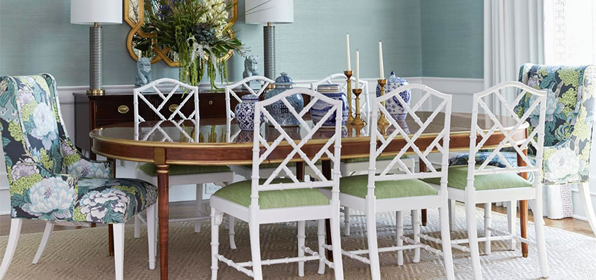
[MK] What is The Color People Pledge? All above images/color by The Colour People

Then it follows Truth is an essential

As is love, particularly empathy

Then music is an elemental part of my life. I play, I sing, I have music playing almost all the time at work and at home.
Lastly, Nature, my mountains, and the outdoors.

Sounds like I was a hippie, doesn’t it?
[MK] Thanks James, this was such a great interview!! My favourite part of Colour Expert interviews is I always get to look at colour from a new place, I love that!
If you would like to transform the way you see colour, become a True Colour Expert.
Related posts:
Colour is Context
5 New ways of looking at Colour; from the Experts
New to this Blog? Click here ; Subscribe to my Monthly Newsletter.
While you’re here, subscribe to this feed so you don’t miss out!


Great interview. I agree what James said about white – I rarely, rarely use it. I completely eliminated it from my homes and replace it with a cream. With all the gorgeous colors to choose from, white is not even on my top 20 although it does have it's place in certain applications.
Thanks!
Thank you so much for such an interesting interview with James! I especially appreciated the part about white in relation to art. And I didn't have any idea that they don't teach about the power of color in architecture school. This just seems so wrong!
"To be a colorist you have to be completely intuitive about color. You have to feel the relationships and act based on what you have seen. And that is really the truth about color, you cannot learn it in school, you cannot learn it from a book, you can only learn about it by paying attention."
…and there's a lot to say about just paying attention. A very wise color perspective indeed. Another great interview, MK.
I think this is one of the best interviews I've read – and not just in the design realm. Man, his words are simple but, wow, are they powerful. Thanks, Maria!
great interview. I agree with the white thing, but don't we say that about every trend on the way out – until it's back in again! lol
SO interesting! I lvoe that he said his only mistakes were in going too safe.
I have to say though (and you had to know this was coming from me 😉 that I LOVE LOVE LOVE white!!! haha I definitely don't see it as a "safe" choice bc it is often hard to pull off but I really do love it when done right!
anyway, great inteview!!!
xoxoxoxo
Very interesting – espcially the comments about white. Do you think he means all shades of white? Curious to hear your opinion on white.
Hi Notting Hill,
I'm guessing James is talking about the white on this screen as whites in the BM fan deck range include yellowy creams to linen shades.
James, if you are reading this, we would love your comments!
Maria
As everyone else said, what a wonderful interview! Simple, yet profound thoughts on color. And the images included are awesome! Thanks Maria!
Oh boy – I think I might be a minority in this argument…. I know this is a color blog and I have nothing against color, who could?
But white is basic, pure and honest. Comments like this;
"White is deadly, It is cold. It is lifeless and emotionless."
Are just plain hurtful and not true whatsoever!
White is calming, peaceful and sensitive, you just need the right white!
Everything James said about white contradicts his initial argument that one has to be open minded and see what the client wants, without any particular color or white in mind.
And I hate to say it but I can't tell you how many houses I've been in that I've had to turn back to SOME SHADE of white because of the previous designer's colour over-kill.
Sure, color can be amazingly influential and emotional, but it can also help define the architecture of a space in a good way and in a bad way – please don't say "I will never use white again".
White is what makes color look good – learn to love it cause it can be your best friend and make every other color in the room, including art look amazing!
Thanks Maria – this one really got my tail feathers ruffled up!
Hi Tonia,
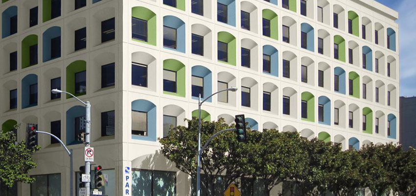
James does mostly exterior so I would guess that's why he has such a strong opinion on white. It's rare that an exterior looks good just painted a plain old white unless there is a lot of glass and other architectural features on it.
Plus speaking from a colourist perspective, people don't hire us to pick white (in general) they can do that on their own, and mostly do because they are afraid!
Maria
When he said white never use white. I agree %100. The white walls in all the bedrooms make me nuts. I'm looking forward to the day I can paint the wall another colour. The 'building contractor' white that is used in rental homes and one is never allowed to paint over. I hate white too! His art gallery comments were interesting about the white walls and art . . . I kept thinking if the gallery owner were to paint the walls for her art she would have to change the colour often to match the art. Man, this post spazzed me out too. I don't think I've ever commented so much.
Great questions, interesting answers, great interview…
Maria, Great interview!!I have just finished a yellow and purple painting. I will post it tomorrow!
Very good interview! I appreciate you sharing your knowledge, via your blog, about color! The interview wiith Mr.Martin, well, I found it freeing! I look at the background colors in nature, and can't recall ever seeing white as background color, seems to be green and browns, tans, etc. I also think though, it can be contextual to what region a person lives in. The first time we drove from Houston TX to west of San Antonio, then to the hill country, I was amazed at how the colors of everything changed because of the difference in sunlight! Whites do look good in the topics I think, especially white linen!
wonderful interview, Maria. Great answers, James. Thank you both for sharing with us! And re: the white debate, Maria you make an excellent point: "people don't hire us to pick white…and mostly do because they are afraid." When I see a beautifully done white room I always wonder how much more beautiful it could be in "color".
WOW, I stopped reading after the totally snobbish comment in reference to Realtors. I am a professional Realtor, I have class, my home is full of color and many people in my circle consider me a "tastemaker".. how tasteless James is to make such a statement….mmm…and he never made a mistake…..
I agree White is cold and when going to Heaven I see it could resemble death. Good for the Tropics though. The color in Victoria's House you posted on Monday how fun alive and warm with the right amount of white for balance.
Very interesting interview with James. I like the way he thinks.
maria; great questions, james; interesting answers.
we read these interviews for a professionals viewpoint and differing opinions are alright…….it is what makes the world so interesting.
i may not share every comment with james but i value his expertise and willingness to comment so freely.
my feathers are intact 🙂
debra
My darling Ivy,
Of course James does not mean anyone hip and cool such as yourself that reads this blog 🙂
Taking a stand as a professional and in this case for colour is what we have to do to make a living. And I'm sure he meant to say "many or most" instead of lumping everyone together into bland.
You are most certainly not that!!
xo
Maria
ps. I love all your comments though, it's all so interesting what everyone is posting!!
As an architect, I want to let Erin know that architecture schools do teach color in design and color theory. What blanket remarks by this gentleman.
As for Ivy, many realtors suggest a neutral palette, but not necessarily a colorless environment. I agree with her also that this man came off as pompous and unlikely to follow his clients wishes as he professed early in the interview.
As per Modernism, shame on him for not understanding the principles and importance in design. He eluded to architects not understanding how people live or the necessity for it in building design. Does he think that architects need re-education?
I think the next group to be offended are the museum and art gallery curators.
And, BTW, prior to my education and architecture degrees, I too was a graphic artist, so color has always been integral in my design.
He did mention the nature of the chameleon like attributes of color, of which I agree, but any trained designer would know this as fact also.
Sorry Maria, you caused a stir here.
Great interview, and such insight on the colour white!
So James has a little bit of a color 'tude. I've never met the man, but I'll take a defined color point of view over wishy-washy and effin boring any time.
A well-edited, wickedly-refined, and super definitive color perspective is the only thing that separates one color expert from another.
James chooses to edit with regard to white and has articulated a controversial opinion or two. I can understand how that could be interpreted as pompous. But I can also see how it could be viewed as answering the questions honestly and directly.
From a philosophical angle I wonder if there could be a fine line between pompous and opinionated expert. And perhaps the responsibility belongs to each of us to choose between the two. I chose to read the interview as one color expert's opinion.
Good day all! I apologize if I came off negative… didn't mean to do that….I respect Jame's opinion and enjoyed the interview… I guess I took the realtor comment a tad too personal…I am passionate about what I do as well…. LOVE your blog Maria..you know I come visit daily and will continue!!!
i love your sharing Maria. it's so great to read you blog, and every time you post these fantastic interviews, i feel so… happy! it's so fulfilling to learn with other creatives.
Good interview and good feedback.
I wonder if you could clarify what James meant by
"I have to create a sort of zen “beginner’s mind” situation every time I design a color scheme for someone."
This might be helpful for me when I need to design a colour scheme.
Thanks.
Hi Marlo,
Beginners mind (in my interpretation) is defined as setting aside all your past bias, opinions, and judgements and really looking at each project as if you were doing it for the first time (as opposed to a jaded, been there, done that, perspective).
Maria
Hi !.
You may , perhaps very interested to know how one can manage to receive high yields .
There is no initial capital needed You may begin to get income with as small sum of money as 20-100 dollars.
AimTrust is what you haven`t ever dreamt of such a chance to become rich
The firm represents an offshore structure with advanced asset management technologies in production and delivery of pipes for oil and gas.
It is based in Panama with affiliates around the world.
Do you want to become a happy investor?
That`s your choice That`s what you really need!
I feel good, I began to get real money with the help of this company,
and I invite you to do the same. If it gets down to select a proper companion who uses your funds in a right way – that`s it!.
I make 2G daily, and what I started with was a funny sum of 500 bucks!
It`s easy to join , just click this link http://hysomotega.servetown.com/equgowe.html
and go! Let`s take our chance together to get rid of nastiness of the life
With James colour comes alive and I'm grateful to you for sharing him with me. I love your site it make colour accessible and that's good for all of us.
You take care and thank you James, I learned a lot.
Fabulous interview!!! James has such an amazing passion for colour that really came out in each of his answers.
I totally agree with his comment that buildings are for living, and so they should be colourful. And that it's no fun going with "safe" colours like beige & white. Everybody needs colour in their lives!!
Kelly
Dear Author colourmehappyblog.blogspot.com !
I apologise, but, in my opinion, you are not right. I am assured. I can prove it. Write to me in PM.
Thanks Maria, very interesting and insightful.
I did, however, have a similar reaction to Ivy when I read "You know I have never really made a mistake". James might want to consider how that comes across on a personal and professional level – it doesn't make me respect him, it makes me pity him.
May I suggest that mistakes are the spice of life, or at least, they certainly make mine more interesting! I have made them in every shape and form (home, career, romance, friends) and some of my best learning and growth has come from them.
I for one hope I continue to make mistakes until the day I die.
i love reading everyone's reactions and comments almost as much as i enjoyed reading this interview. i think the distinction that James works primarily on -exterior- buildings is an important one. buildings that compliment and reflect their environment are rarely stark white…unless perhaps you live in Antarctica!
Great interview, Maria!