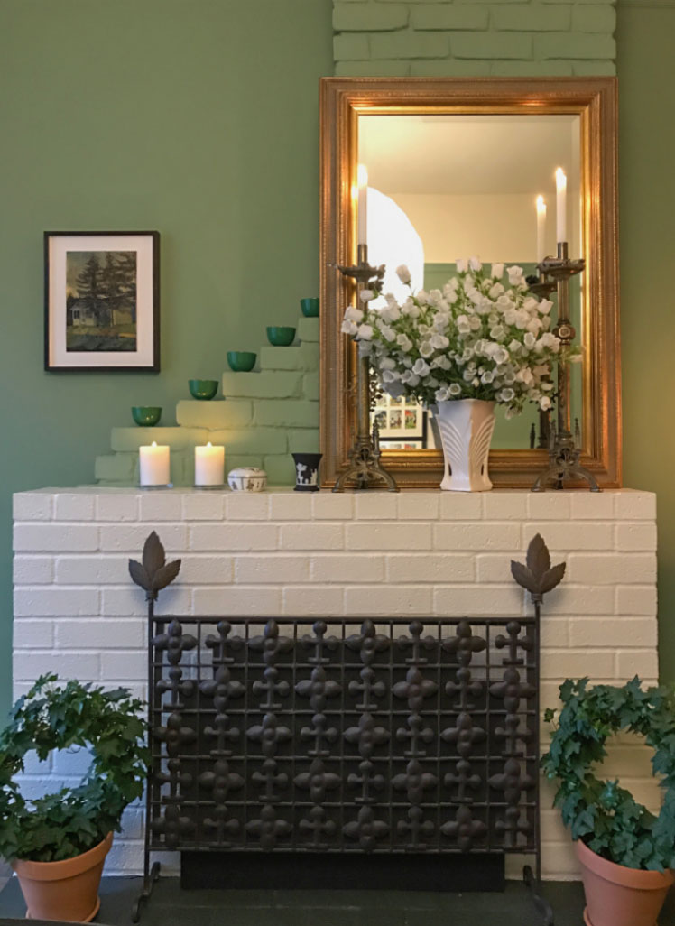
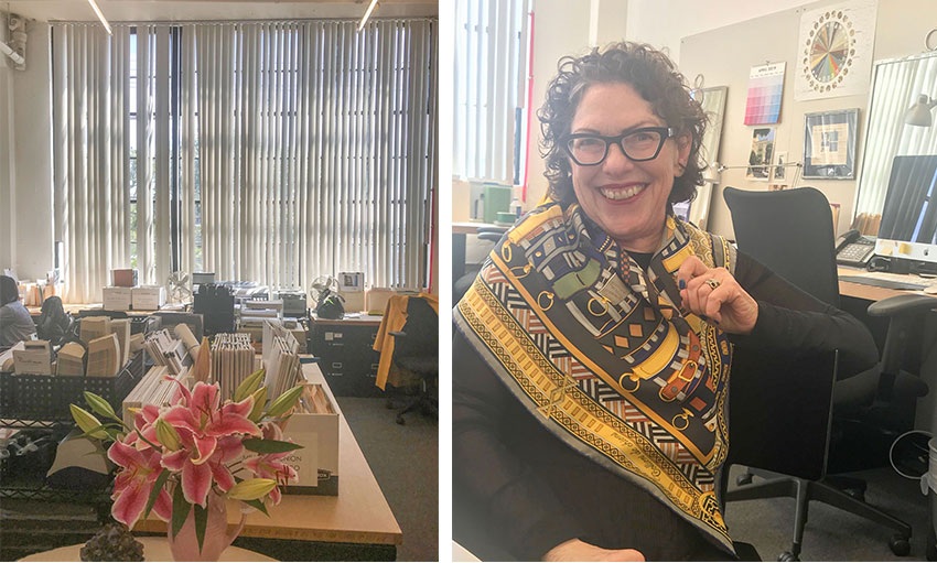
A glimpse of a vignette in Jill’s dining room (photography by Maria Killam)
I have been following Architectural Colour Consultant, Jill Pilaroscia for my entire colour career. That’s 20 years.
I first read about her work transforming a concrete block factory using colour (below) to enliven the space, in my early 30’s when I was studying colour.
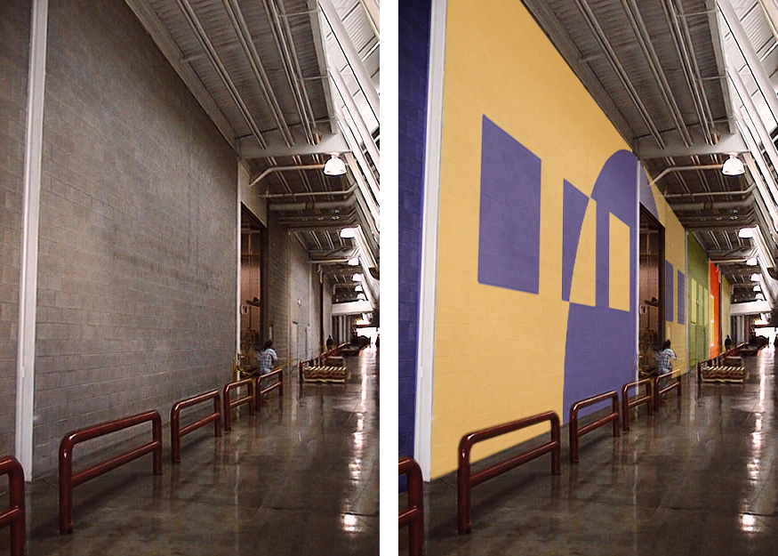
Colour design and Photography for Herman Miller by Jill Pilaroscia
I even went so far as to CHANGE the name of my original business which I had called ‘One Day Design’, to Custom Colour Studio when I moved to Toronto for a brief period of my life 15 years ago. Well, as they say imitation is the sincerest form of flattery, haha.
Back then, I had no idea that One Day Design was in fact a great name for a business because it sounded approachable, accessible and best of all, not expensive.
How many calls did I receive in Toronto after I changed the name to Custom Colour Studio? Two, in an entire year. Those were the days when people advertised in the yellow pages.
And why did I only receive two calls?
I’m sure you can guess.
Custom sounds expensive.
It seems like we learn the best lessons only after we make a mistake. I often talk about this in my live Specify Colour with Confidence workshops.
Sometimes when you accidentally do something right, you don’t give your decision enough credit. Like when I originally chose the right name for my business, One Day Design, and the phone started ringing right away.
It wasn’t until AFTER I made the mistake of deciding to get fancy with a new business name (even though the original one got new clients calling me) that I learned a big lesson. Don’t fix what isn’t broken.
Failure is the Opportunity to begin more intelligently. (source unknown)
Fast forward 15 years and two years ago when I held a Specify Colour with Confidence event in San Francisco and I received an email from Jill herself inviting Terreeia and I to dinner in her home.
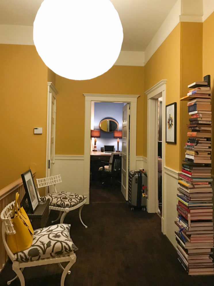
Jill’s entry in her lovely, colourful home in San Francisco (Photography by Maria Killam)
I was beyond thrilled to find out she had been following my blog and thought my advice was amazing!
Terreeia and I visited her lovely home we had a wonderful evening together sharing colour stories about our projects.
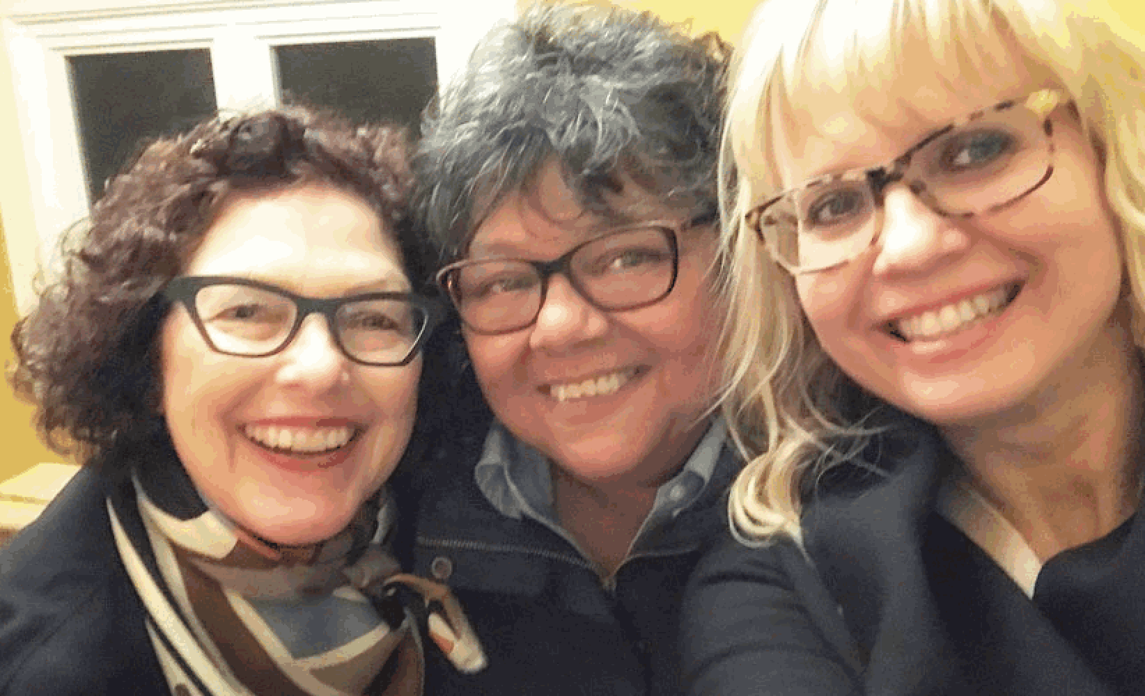
Jill Pilaroscia, Terreeia Rauffman and Maria Killam (Photography by Maria Killam)
We talked about the power of colour and our conversation turned to all of colour’s benefits in an environment. We touched upon colours ability to change the perception or size of a space making it appear taller, or wider, how time, weight and smell can be mitigated by colour, how a well coloured workplace can promote creativity and productivity and how educational environments can use colour science to support specific learning tasks.good
It took me right back to my colour studies many years ago!
You can’t be an expert on everything.
It’s funny, 11 years ago when I launched my design site (before it was simply a part of the blog like it is now), in my list of services, I talked about how I could consult with corporations on ‘Corporate colour’. When you’re new you say you can do EVERYTHING.
For example, one day I received a call from someone who was manufacturing covers for thermostats for hotel rooms. He told me what he was looking for, and I launched into a rant about how I happened to be in a hotel room at that moment, and I was looking at an ugly pink beige thermostat cover. I said of all the colours they should be, white, off-white and cream (to match the trim) would certainly be a good place to start.
Then I quoted what I would charge to help him choose colours and guess what? He didn’t hire me, because I had already given him part of the answer. For all I knew, that was the only answer he needed, haha.
The world of colour is big and getting bigger. The fact that in 2019, there’s space in this world for someone (me) to invent a system for identifying neutrals to get them right once and for all, instead of just guessing, and hoping and testing, says there is still much to be discovered in this wonderful world of colour.
In order to find YOUR niche, whether it’s consulting on complicated exterior and industrial projects like Jill, or mostly residential colour (like myself) you have to do whatever course is pulling you.
Your intuition knows the right thing to do next.
Anyway, today I’m excited to share one of Jill’s projects and a little of her thought process with you!
This past Spring when we were back holding a course in San Francisco, Jill and I met for dinner and the next day she invited me to visit her fabulous design studio.
And got to see some of the amazing work that she does in the world of colour.
Jill Pilaroscia (Photography by Maria Killam)
What is Wayfinding?
We moved on to the topic of color and its benefit for wayfinding.
Wayfinding you might be thinking (like I was)? What the heck does that mean?
Well, it’s all the ways businesses help a person to orient and find their sense of place. In other words, how to move through an unfamiliar space.
Because a lot of times, you only get words like, exit, entry, floor 3, etc. However, when you add the information layer of colour, it helps someone navigate their environment much easier.
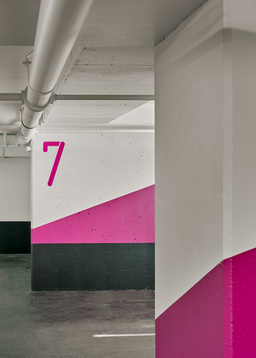
Jill’s project for 2001 Union Street Parking Garage relied on color and graphics to help end users pinpoint their location once they entered a ten floor underground garage (below).
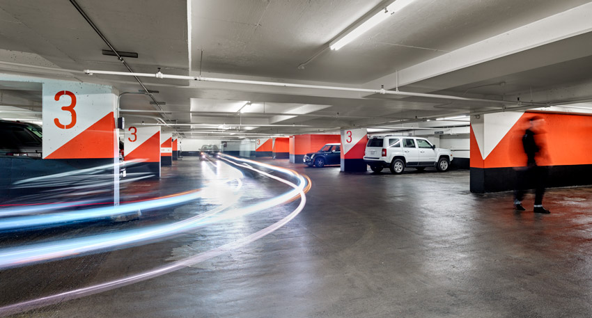 Photography by Mende Design & Cesar Rubio Photography
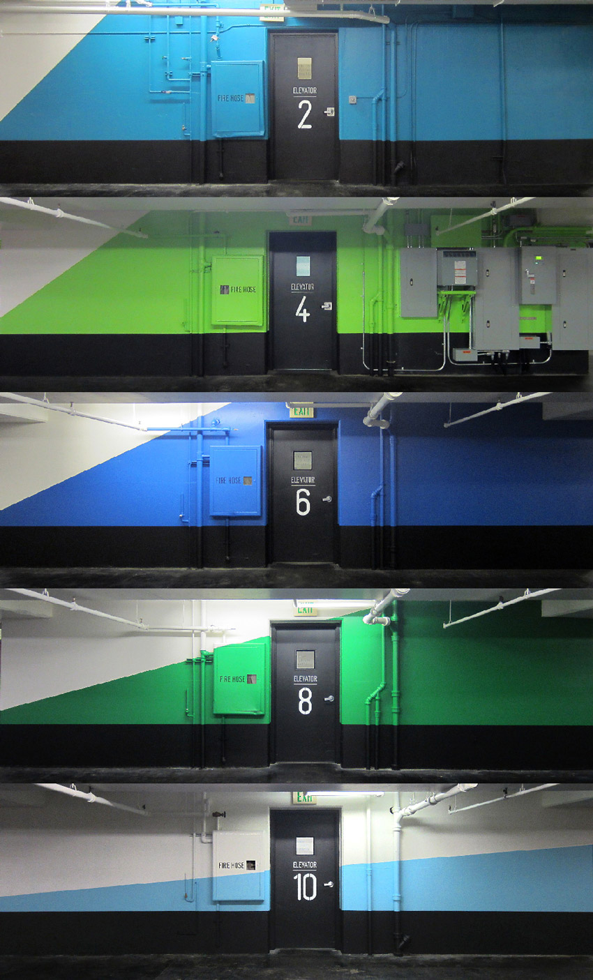
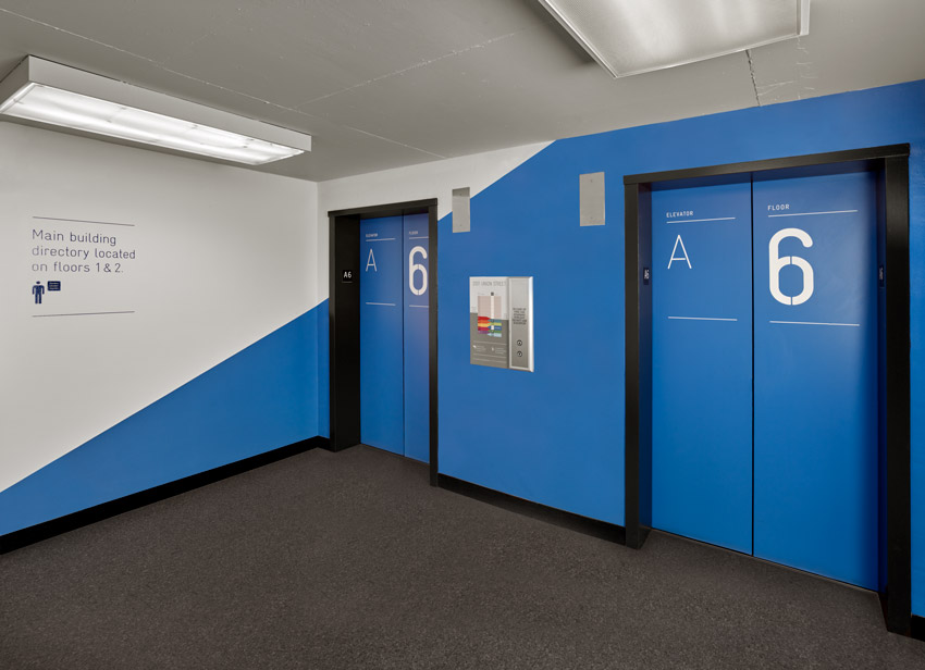
There were two different elevator banks (below) that delivered you to the street level and the five floors of offices above.
There were two types of elevator lobbies, one directly off the parking floor and the second lobbies were accessed through a doorway to a foyer room housing the elevator cabs.
The complexity of navigating the garage was a credible challenge.
 Photography by Jill Pilaroscia
We selected warm colors for the odd numbered floors and cool colors for even numbered floors. We played off this warm cool contrast to heighten the visual experience.
 Photography by Mende Design & Cesar Rubio Photography
As one drove down deeper to the lower floors the angles of the graphics decreased in size.
 Union Street Garage colour design by Jill Pilaroscia (Photography by Mende Design & Cesar Rubio Photography)
The story unfolded as a marriage of colour and graphics the Clients responded to. The Contractors performed the work at night to limit the disruption to a busy, active garage.
When I saw this project on Jill’s Instagram account, I asked if I could share it with you, I just love how creative it is!
[MK] What’s your favourite colour? What colour would you like to see banished from all paint decks?
[JP] My favourite colour is green, I named my daughter Emerald. I love any hue of green. It’s the colour of your heart chakra, it’s the colour of nature, it’s a calm, soothing, relaxing colour. It’s the middle of the spectrum, it’s not as hot as the reds, not as spiritual as purple and not as vibrant as yellow.Is there a colour I would like to see banished from all fan decks?
No, I don’t think there’s any bad colours but there are a lot of bad colour combinations.
[MK] What was your biggest colour/design mistake?
[JP] I chose a red that I thought would read more like a brick colour for an exterior, and it ended up way too vibrant (or clean in Maria’s terminology) and it literally seems to jump off the exterior of the building and was way too aggressive. So in the end I chose a much more muted (or dirty) colour and all was well.And everyone loved it and thankfully they hired me for their next project!
Another one, also happened early in my career, my ex-husband and I chose a colour for my daughter Emerald when she was about 10 years old. We chose a teal and thought we’d surprise her with her freshly painted room. Well the problem with the teal is that was also way too clean and vibrant. She came home and burst into tears. She refused to sleep in there until it was re-painted.
Another time, I chose a purple for Hewlett Packard, it was a deep aubergine colour for an accent wall and the engineers called it Barney purple. They didn’t change it but I had to work really hard to sell it in the context of the environment.
[MK] What is the most important colour lesson you’ve learned?
[JP] That everything is important in a colour environment. You have to think three dimensionally about your colour.Whats above your head (the ceiling) how it hugs you (the walls) how it grounds you (the flooring) and how it relates to other spaces that flow from one space to another.
You need to pay attention to the details about how you’re going to feel? Is it welcome? Is it austere? You have to consider everything.
For example,
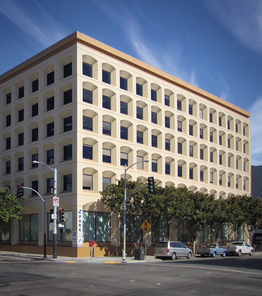
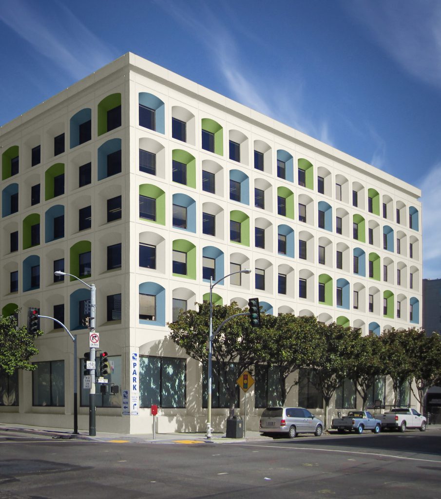
How do you make an invisible beige building stand out in its surroundings in order to attract new technology tenants?
By adding colour!
Here’s the before:
Here’s the fabulous after:
 Colour design by
 [MK] When it comes to colour, what’s hot? Which one do you think is timeless and which colour trend would you love to see disappear?
[JP] Trends deny the users response to colour. Everyone has a favourite colour, A child has their favourite crayon colour, we all have a favourite.Trend colours also don’t take into consideration, your personal reaction to colour.
If it’s a public space and it’s looking timeless, then the colours were coordinated beautifully. Every colour vibrates at a frequency that’s how it gets to your eyes.
And if you pick colours that are universally, graceful, lovely, resonant, they won’t go out of style because they are vibrating at a particular frequency that’s comfortable for humans. The above building is a perfect example. Because it’s not covered in varying shades of a trendy neutral (like grey) it is timeless and beautiful.
In general, I found found that many people lack colour confidence. They simply have not learned about the power of colour, they haven’t thought about how it makes them feel.
Trends are popular because if all else fails, and they don’t know what to do, they want to follow a rule, they want to do what’s safe.
[MK] What do you think is one of the biggest mistakes your clients make with colour?
[JP] Choosing colours that are too clean. Not understanding how intense colour can become when it’s amplified in terms of surface area. They don’t think about how one space flows to another and how the colours in rooms interrelate so that there is visual harmony when people move through their spaces.They tend to be isolationist, for example, “Oh I want to have a blue kitchen!” Or “I think my library needs to be charcoal”? Instead of thinking about their entire house as a unit and creating harmony from one room to the next.
[MK] How do you get clients to take a confident leap into color?
 San Mateo County Courthouse; Colour Design by Jill Pilaroscia (Photography by Paul Peck Photography)
Colour has a huge value add. There’s universal beauty that you’ve just put on the building that people can respond to. There’s a proportion and harmony of light or dark, clean or dirty, warm and cool colours.
Every human being has a biological response to colour. Colour enters your body through your eyes, triggers messages in your brain that then signal the cells in your body to react. There’s a psychological response which is based on the individual memories or recollections which were positive or negative experiences.
There’s a collective unconscious response to colour that we have. For example, people know that red translates to fire, don’t put your hands in there you’ll get burned, water is refreshing and life saving and so on.
Colour is like the 7th sense. You can’t experience it and remain neutral. You can’t not have a response, even if you don’t know you’re having a response it’s affecting you.
[MK] What are the 5 things in life you cannot live without?
[JP] Natural beauty and flowers
Good friends and a gin martini
Good books
Good music and travel!
Clean and orderly environment. Fresh pressed sheets.
I just want to colour everything I can because I think the world needs more beauty, harmony and peace. And beautiful colours create positive experiences for people. Or an individual plane and on a global plane. I’d love to be involved in any project that needs thoughtful colours.
You can see all of Jill’s extensive portfolio here.
I hope you enjoyed learning more about this colour expert in San Francisco! I was so excited to share Jill’s work with you and I’m thrilled after all these years of following her to call her my friend.
Remember my Colour Interview with Eileen Kathryn Boyd ? (see how similar some responses are)


WOW! What a wonderful transformation she did on that beige building! The blue and green is lovely. If someone described that building to me, I’d certainly be able to find it easily.
Enjoyable read.
“Color is like the 7th sense. You can’t experience it and remain neutral.” This reminds me of a week-long corporate training that I attended in the 90s in a windowless room painted a bad shade of pinky mauve because that color was supposed to be conducive to learning. I now can’t recall what that class was about but I can still feel the urge to run away from that room color after an 8-hour day!
What an insightful interview! Wonderful info about how color affects us inside.
Jill Pilaroscia is gifted. I live within 2 hours of the San Francisco Bay Area. There’s no doubt I’ve admired her work without realizing the genius behind it. Gazing into her portfolio, I couldn’t believe the transformation of the industrial manufacturing plant Bentley Mills in City of Industry, CA. The sunny yellow ceiling beams had me searching furtively for skylights! How could paint give the illusion of sunshine pouring in from above? Coupled with her thoughtful use of green below, I can absolutely see how the worker and visitor environment is vastly improved. Thank you Maria, for introducing us to your fellow color artist!
I loved the high level of questions and conversation in this piece. The transformation of the big beige building was wonderful. The tiny white daisies were beautiful. . . and the garage graphics were inspiring and intriguing.
My credit union is doing some renovations. Their staid dark royal blue and white logo is now superimposed on a large (height and width) offensive neon lime green like Garnier Fructis hair product containers.. (Excuse the judgemental tone – I love green and thought the new band at the top of the building was insulation or other material that was going to be painted or covered with brick.
They are updating the 10-year-old interior which was boring industrial tones of dark red and gray (and more) and this new green will be part of the interior. There is a great reason to use the drive-up window and the ATM. The paint cans will not even be opened before the new colors are dated.
Who did they ask for assistance? It must have been a corporate board decision trying to look new and different. They succeeded!
I agree; color is vibration and frequency that resonates with us each as individuals, just like music does. Thank you, Jill, for explaining how color affects us on so many levels. Good read!
Maria, I love the comment about Barney purple above. I now live in Loreto, Baja, Mexico, & I painted my house Barney purple. Ex-pats were aghast at first, but, you know, it fits beautifully with the Baja blue sky & the many greens & gem tones in my garden. Now, everyone loves it. Especially me. I continue to enjoy your blog after all these years. We’re talking years ago at the townhouse at Willow & 13th.
Who can make a courthouse beautiful? Jill. Thank you for the insightful interview!!
When I was in Interior Design school way back in the ’80’s, I chose to study color theory on my own. I learned that it affects a person both psychologically and physiologically . So I always had a meeting with my client (s) when I asked certain questions. It helped a lot in my field.
Brilliant. A superior read! You are amazing Maria with your blog. I like how Jill says we need to feel Color. I am currently at our log cottage surrounded by different shades of the wood seeing green through the windows. I always feel that the green of the trees and bush are apart of the inside.
Love the natural feeling.
Very insightful read:)
I love this post! Such talent! There sure is a lot of planning in what she does. I’m totally impressed!
Great post, thanks for sharing. Green is my favorite color, also husband’s so that’s a plus.
Love Jill’s tower of books in her hallway! Is there a bookshelf in there? If so, do you have a source? I could use a space saver like that. Thank you!
The incident about the daughter’s room reminds me of a little incident when I painted my stucco house. A famous movie was being filmed next door. At the time we were picking colors and I told the painter I was “considering” a color but had to test it first. Next thing I know the painter misunderstood and the entire house was painted this VIRBRANT clean color when I was out of the house that turned it into bubblegum because of the son’s reflection. Oh, the art director and movie people had wide smiles on their faces. I couldn’t wait for the sun to set. I learned to really mute down exterior colors after that because they end up being much more vibrant in the sunlight if you don’t.
About 23 years ago I was really intrigued by full-spectrum colors, specifically Donald Kaufman. I painted my livingroom one of his colors. However, not fully understanding the depth of this color, the color was vibrating off of each wall, plus the neighbors red stucco roof had turned it orange. I quickly overpainted and brought the color back down to a neutral.
Considering how the outside elements work on interiors and exteriors has been an interesting teacher.