I’m finally back from my amazing vacation. Italy was a whirlwind, and I’ll have lots to share with you. We had some wonderful tour guides in Rome, Florence, Verona, and Venice. It was fascinating and very educational.
I hope you enjoyed the guest posts by my True Colour Experts™ these past three weeks! I was online just enough to make sure my emails didn’t get out of control, and I loved the comments and how much you all gave them your love and support! I missed my community of readers, and I’m so happy to be back!
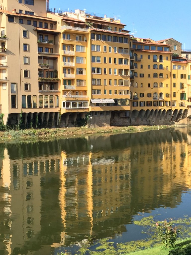
One thing I noticed about the exteriors in Italy was the use of mostly cream over white. Even when a paint colour was quite light, the trim colour was often still cream. It made me realize the reason white seems so fresh and new, is that it IS! ; )
Whites will yellow over time (depending on what it is). This is why it’s important to understand the continuum of whites that I talk about in my ebook, White is Complicated: A Decorator’s Guide to Choosing the Right White. In that book, I show you when white looks bad and when cream looks bad.
Getting white right is much more about understanding the continuum of whites than it is about undertones.
Okay, back to Italy. As some of you already know, you can’t paint your house or building any colour you want in most communities; the municipality provides a list you have to choose from, and it appears to be mostly in the pink, orange, yellow, and green family.
In fact, in Cortona, our guide told us that you get a list of approximately 7 or 8 shades of yellow, and that’s it.
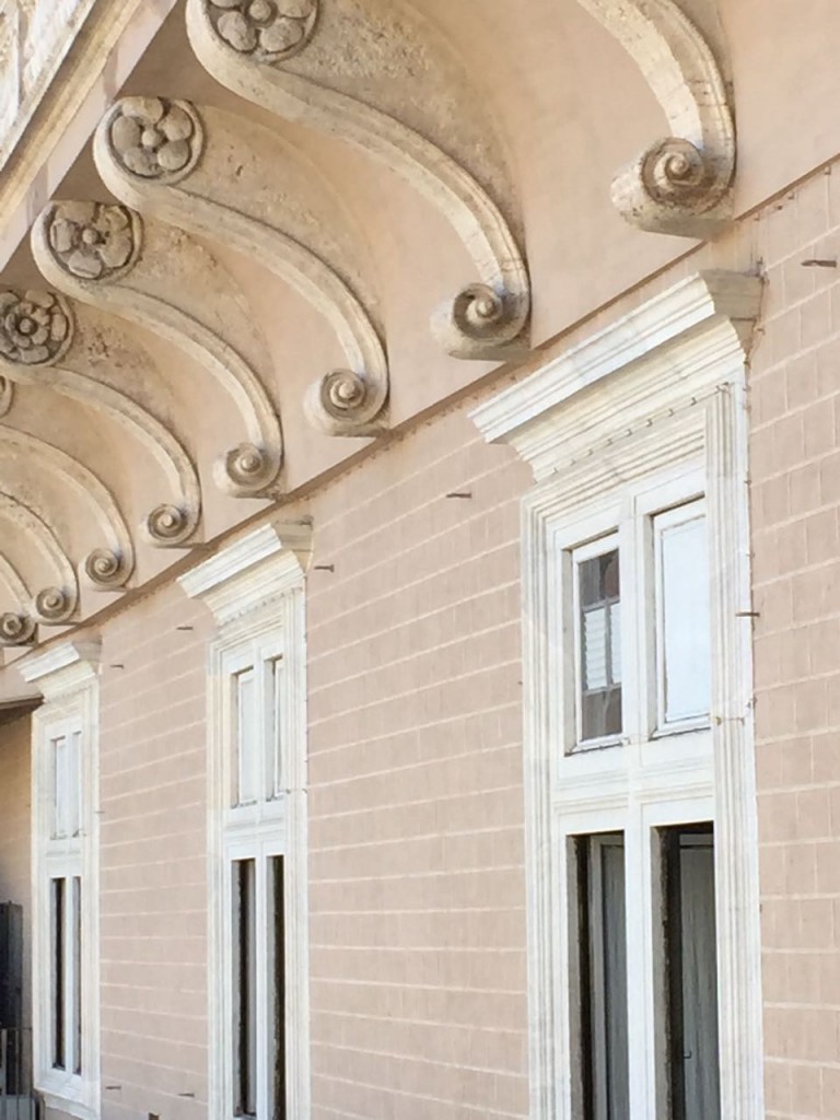
Light or dark versions of oranges, yellows, and pinks look the best with a Mediterranean-style roof (like I talked about here), so what you end up with is a lovely, colourful, and harmonious result. It’s also the reason why almost everywhere you look, you want to snap a photo. It’s hard to say that about the average city in North America.
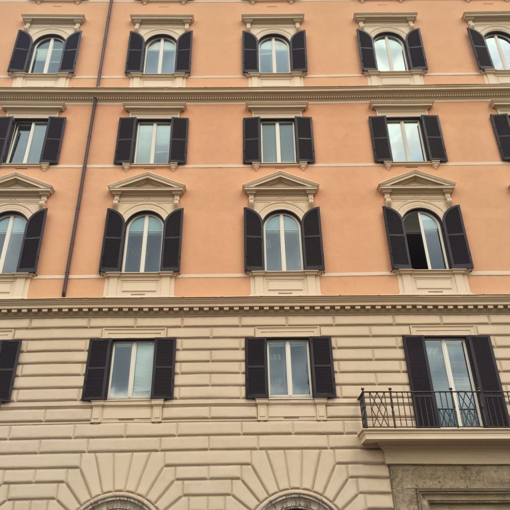
Shutters in Italy are functional, and they open and close. Which is why they look so fabulous on the buildings.
You can sometimes get away with adding smaller shutters to an exterior with larger windows, but it is definitely on a case-by-case basis.
The faded blue you see on the shutters in the photo above was the same everywhere. I saw very few exteriors painted in blue, and they were not in the city.
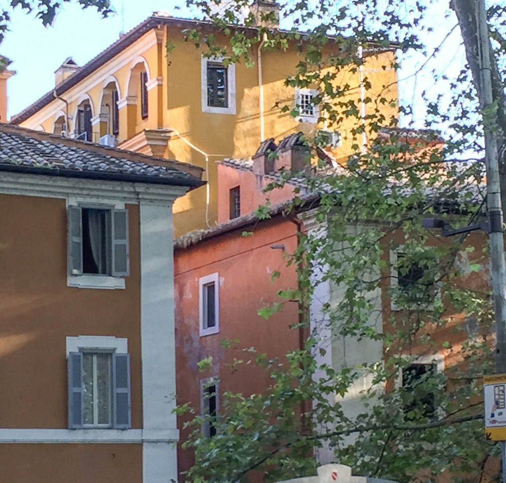
I noticed that even when clean and dirty colours were right beside each other, they didn’t look bad because everything was still varying shades of the same colours.
Here’s where breaking the clean and dirty rule mostly worked!
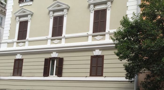
The green beige shades on this exterior (above) seemed to also be the go-to neutral shade for trim in Italy, as shown in the first image on this post.
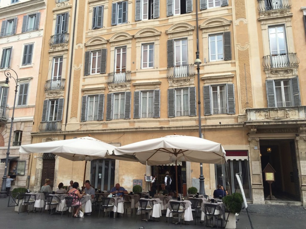
Seeing pink beige anywhere was really rare. Mostly, shades of pink were mixed with peach, coral, orange, and yellow.
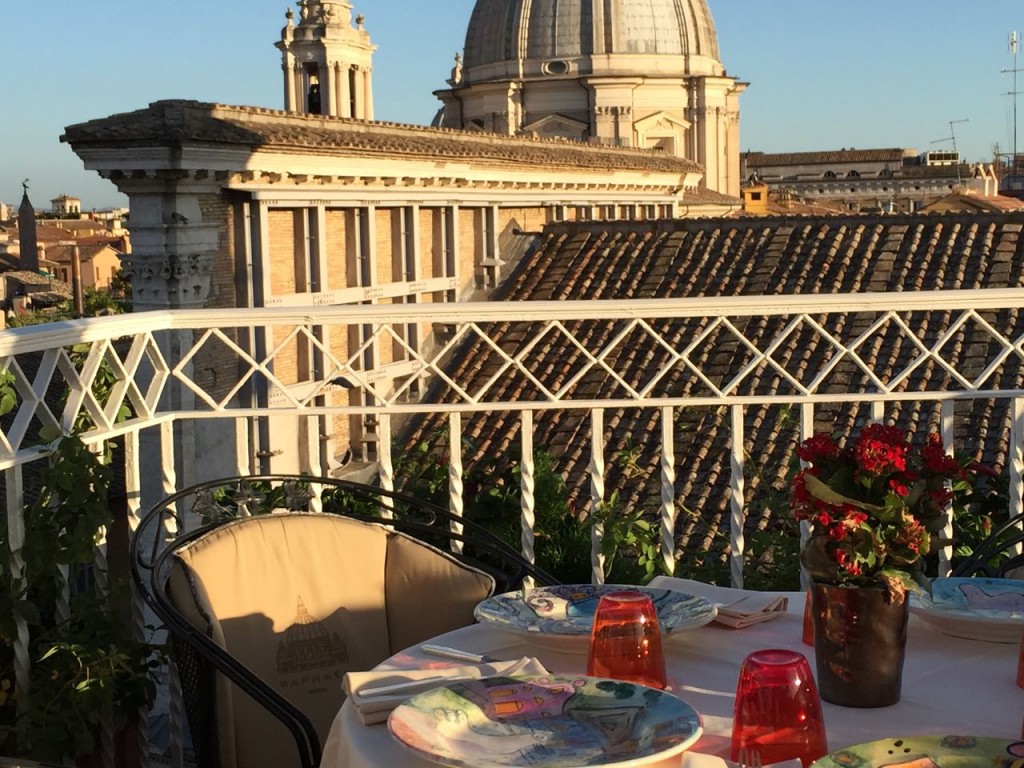
When we found ourselves on this rooftop restaurant in Rome for dinner one evening (above), I decided that next time, I’m booking a room at a hotel like this because it was mostly hotels that had restaurants located on the roof.
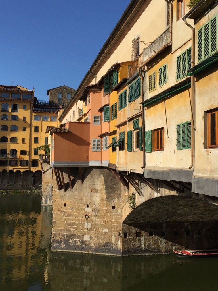
The picture above was taken in Florence. Along with the green beige that’s everywhere, you’ll also find mostly forest green shutters.
In Italy, forest green is not dated and 80s!
My yellow was everywhere, and I loved it!
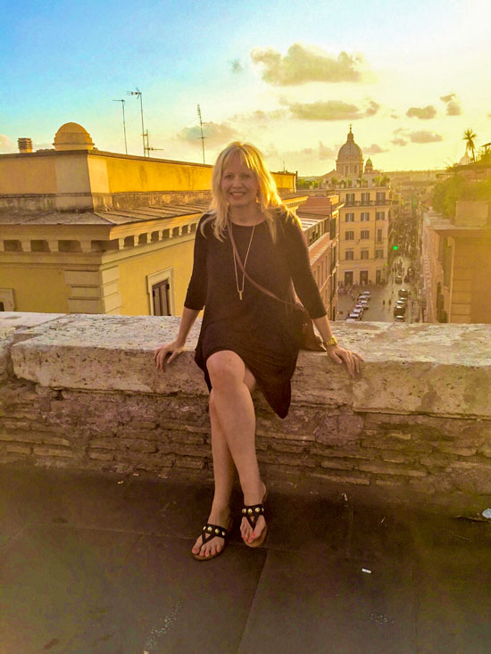
Rome was really hot!! I brought this easily packable black jersey dress that I wore many times on this trip.
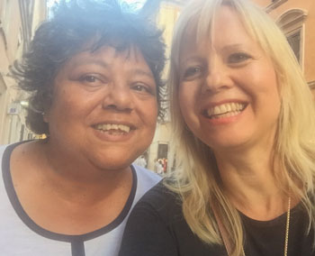 Terreeia & Maria
Okay, so here’s the undertone lesson of the day…
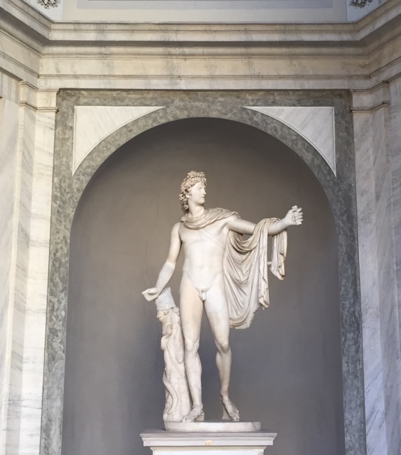
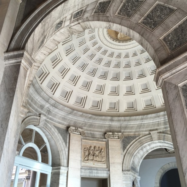
I took this picture in the Vatican museum. Notice all the different undertones of neutrals here (above and below).
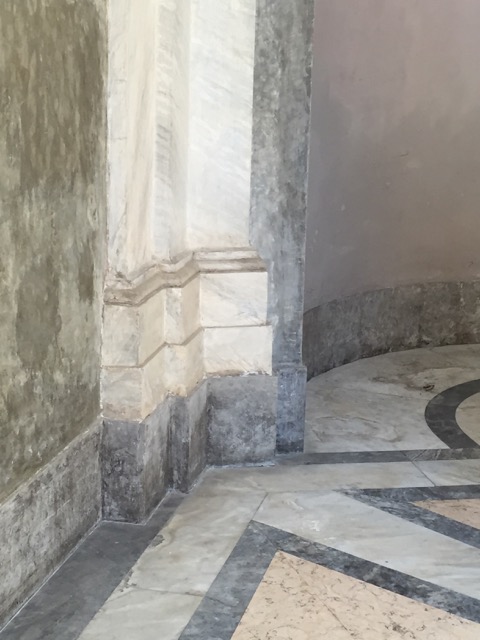
Do you know what they are? My True Colour Experts do, and so should you if you are a design professional.
Discovering undertones through my Specify Colour with Confidence™ training should be the very first step in any design/colour career.
During Day 3, when we talk about the Business of Colour, I’ll reveal my business model and you’ll discover how to conduct colour consultations online. Something you cannot do without my training.
And for those of you asking when I’ll next be in your city? Well, hopefully I’ll eventually get there, but if all it takes is a short flight (much easier than coming to Canada), then you should get here ASAP.
How long can you pretend that you understand colour as well as you know you should?
Before you found my website, you could live inside the illusion that most designers do until they discover that they don’t know what they don’t know (undertones) from my 3-day, groundbreaking, revolutionary training.
And that illusion is this:
“Colour is hard. It’s either hit or miss, and all you can do is test it. Sometimes you get it right, and sometimes you don’t.” This is an actual quote from the stage by a celebrity designer!
Colour is NOT hard. It’s just a system that you can ONLY get here, with me, live. So register here, I can’t wait to meet you!!
xoxo, Maria
P.S. I’m off to have a Spritz, my new favourite cocktail from Italy (below).
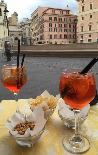 Terreeia’s and my spritzes in Rome!
Ingredients:
3 parts Prosecco
2 parts Aperol
2 splashes of soda, poured over ice and garnished with a slice of orange
Saluti! (Cheers!)
Related posts:
Why Pink Beige Should be Banished Forever
The 4 Categories of White Everyone should Know
A Dirty Answer to a Clean Question


Interesting and welcome home! Thanks again for having me as a guest poster! 🙂
Great photographs Maria! You are right that nothing seems to look bad in Italy, even mixed clean and dirty colours. Looks like you had a wonderful trip, thanks for sharing. Looking forward to hearing more about your adventure as well as seeing more beautiful images from this magical place. 🙂 xo
We just returned from Italy last week. I love the look and colors from there. I like the warmth and age of the colors and structures. They really speak to me. That must be why I have so much trouble liking the “new” white and bright.
Our Maryland village also mandates a tight list of exterior colors for “harmony” — every one of them a depressing brown shade. I seriously believe it’s undermined community morale, mood, and perhaps even property values. Oh, the power of color! I’m thinking of starting a campaign to help us transition out of these hideous hues.
Fun and helpful post. Saluti !
I hope you had some time to relax & not think about colors.
Welcome back! Looks like you had a wonderful time! I’m so glad you went–the drapes vs Italy was a tough decision.
Welcome back! Your pics are beautiful! Thanks for letting me travel vicariously — I’ve never been to Italy. It looks like the quality of the light is sublime.
Sigh..so much beauty there- thanks for sharing Maria! Was in Rome this Easter, my favourite city ever! One day, there was Rick Steeves filming near the Coliseum as we were walking around a corner; the next day we run into Owen Wilson in a little piazza getting off his bike. He was so kind and friendly. (We found out later he was there to film Zoolander 2 with Ben Stiller).
Rome is so walkable but the temperatures were in the low 20’s at that time- so perfect for all day walking. Can’t wait to see your other Italy related postings!
Welcome back, Maria! Glad you enjoyed your trip. Cute pic of you and Terreeia!
Love the colors of Italy!-they so belong! I am also a fan of of the of the spritz! So ORANGE!
Maria, Welcome home. We (your readers) also missed you! It was fun however reading all of the guest posts. Lots of talented designers!
Love your pictures of Italy. I am so glad that you were able to go. It is something you never forget. I have only been to Rome to Sicily but also loved every minute.
Looking forward to seeing more of your exciting trip to Italy and learning about the undertones of the old buildings. Remember they did not have the same pigments that we use today.
So glad that you are back.
I love the picture of you with the yellow & blue background.
I’m starting to plan our trip to Rome next fall to visit our Air Force friends stationed at the US Embassy. I’m worried about good walking shoes!
These posts will inspire me to make sure I observe and take lots of pictures while I’m there!
The ONLY shoes that work for me in the summer that I can walk all day with are the most basic flip flops. I guess I could wear the velcro walking shoes but I feel like such a tourist in those because they are so ugly. I tried Birkenstocks but they hurt my feet so bad I couldn’t walk. So flip flops it is. . .
Welcome home to both of you. Looking forward to more pictures and analysis. I wish Terreeia would write a guest post describing her observations of you in Italy. Your joy is such a delight.
Karen
.OMGosh Maria! I was convinced you would FALL LOVE WITH ITALY and never return! Not that I would blame you:-). Italy is my Neil’s Mom’s home place. I feel Rome beckoning me from my kitchen sink every so often. I so want to see the art treasures in Fierenze! I think it’s so silly and insting that we Anglisize every Italian city name! What’s so hard about saying Roma? Or Fierenze? That name so well describes that city. The passion and warmth of the people is incredible. I bet it had it’s wonderful effect on you! Such a blessing, right? Bask in those memories a little longer. Love, Paula.
Meant to type “insulting” ( to the Italians) that we change their names. After all they don’t say , ” New Yorka”……!
Welcome back! Glad you both had a great vacation. I have so enjoyed your guest posts. They were so wonderful and enlightening, thank you Guest posters!! I was very, very impressed with the idea of it and the way you laid out the questions.
Ciao bellas!
Italy is so gorgeous – what a fun trip! I haven’t been there since I was in high school, and I probably didn’t appreciate it as much as I should have!
Maria,
I wish you had gone to Burano, the lace makers
island near Venice. All the houses are painted different colors depending on the family who lives there. It would have blown your little
color cells in your head to the point of explosion. I loved it.It is worth a visit to Mr. Google.
I did go to Burano. . . will post those pictures too! It was amazing!
Welcome home, Maria. Beautiful images! Glad that you and Terreeia had a wonderful time. (BTW, love her hair style.) -Brenda-
P.S.: How’s your foot?
My foot is much better thanks 🙂
I was happy my sprain that happened right before my trip did not impact the huge amount of walking required on this kind of trip!!
x
Maria
Such natural looking colours that have stood the test of time. I love the yellows and oranges of those old old buildings. Thanks Maria for sharing your holiday with us. You and Terreeıa look lovely in Italy 🙂
Glad you two had a wonderful time, but hey, it’s Italy! How could you not? Am looking forward to hearing more about it, and seeing your photos.
I love the Italian colors since I still love the Tuscan color scheme! IMO, it’s classic, not over! No bright white and gray for me. I’m an old cream girl at heart. Love the patina.
I think colors look very different in different areas because the climate and sunlight is different, so what works in Italy might not work in Canada. I’m glad you enjoyed your vacation and look forward to reading about your observations.
I lived in Germany for 11 years. Various shades of green to teal to turquoise and blue are popular colors for trim and shutters all over Europe, and you never see the synthetic paste-on types. I believe the color has been popular for a long time and was inspired by verdigris (aged copper). It looks terrific with all colors of stone and brick and natural stucco.
Also, paint tends to come in just a few standard pigments in Europe rather than thousands of custom blends, so one sees less color variation in general. Computerized mixing may change this, but generally custom paints are more expensive and painters still mix by eye and proportion with basic white. Many home interiors are painted just plain white because that is the cheapest and most readily available paint. Most tourists don’t visit hardware or home center stores on vacation, but I found the differences interesting.